← OpenDesign CURATED · OPEN · FREE
Aeon
A premium digital publication for longform essays on ideas, science, and culture.
editorial longform
01
Identity DNA
longform ideas essays philosophy science
A prestigious academic journal reborn as a modern digital publication.
02
Color
#0C776DAccent
#000000Ink
#666666Ink soft
#FFFFFFBG
#F5F5F5BG soft
#999999Muted
rgba(0,0,0,0.1)Line
Clean, high-contrast black on white with a subtle teal accent.
03
Typography
didone-serif · humanist-sans · monospace
display 56px · 700h1 42px · 700h2 28px · 700body 16px · 400caption 13px · 400Navigation and labels use monospace font · Article titles use didone-serif font · Body and sans-serif elements use humanist-sans font
04
Spacing
4px
8px
16px
24px
32px
48px
64px
96px
Standard 4px base grid with consistent padding and gaps.
05
Surfaces
sm · 4px
md · 0px
lg · 0px
pill · 999px
Thin 1px borders using rgba(0,0,0,0.1)
0px 4px 6px -4px rgba(0,0,0,0.1) · 0px 10px 15px -3px rgba(0,0,0,0.1)
06
Layout
1280 container
3 columns
24px gutter
768 / 1024 breakpoints
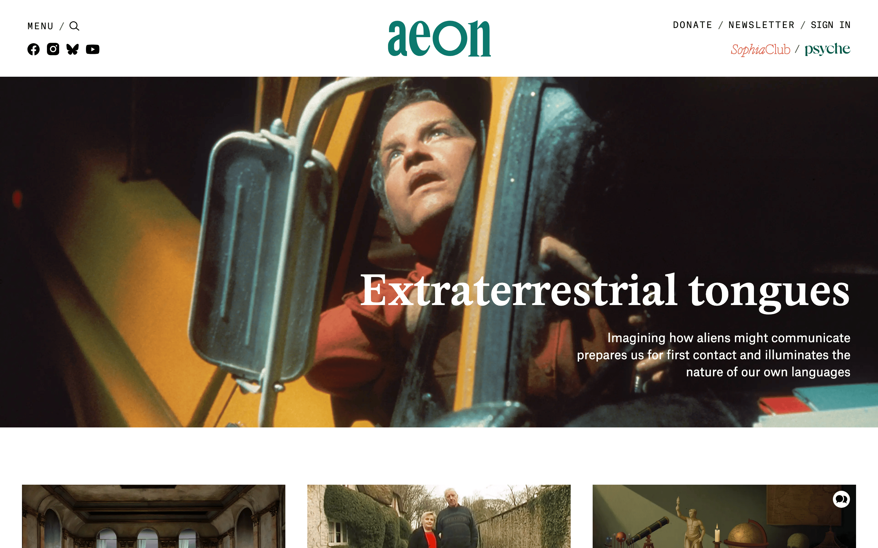
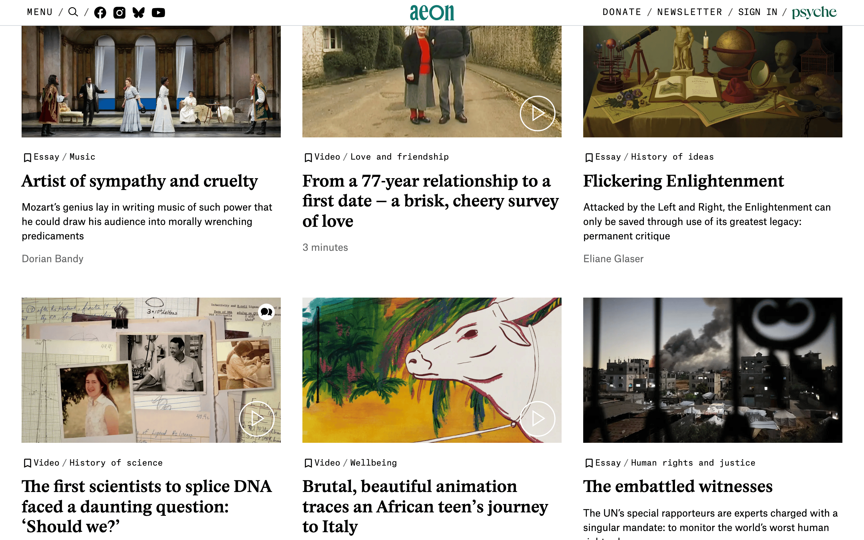
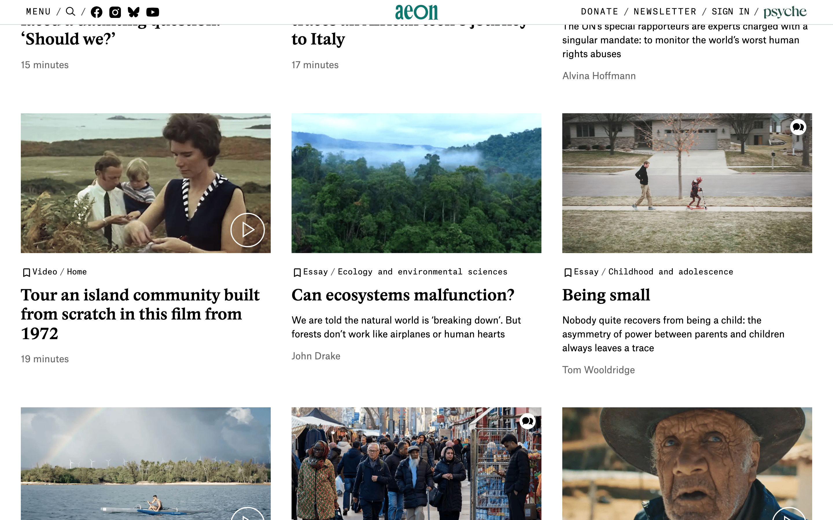
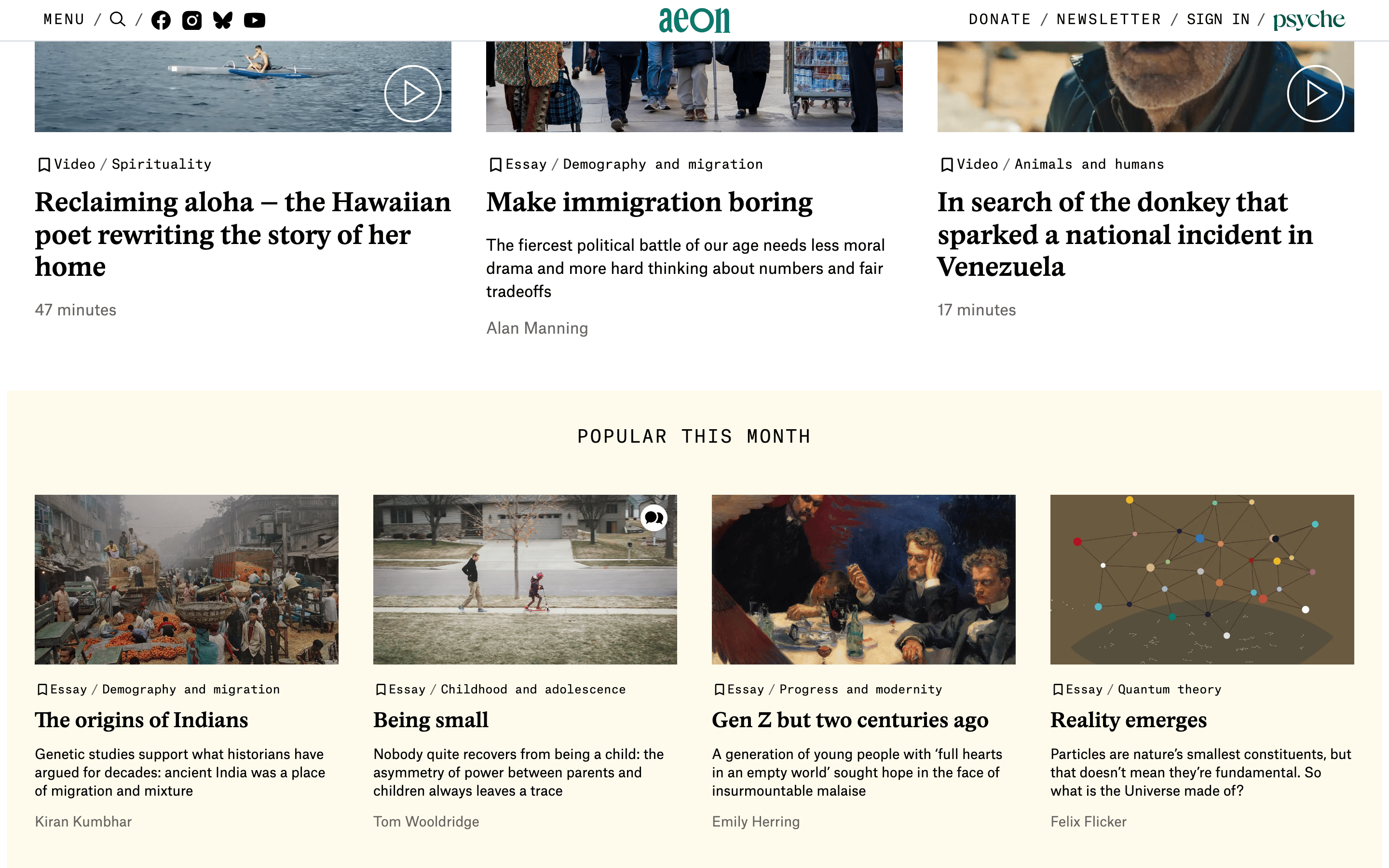
Multi-column grid for article cards with full-width hero images.
07
Motion & Interaction
150ms micro
300ms small
800ms medium
cubic-bezier(0.4, 0, 0.2, 1) easing
Smooth color and background-color transitions on interactive elements. · Subtle opacity transitions.
Subtle color shifts or opacity changes on links and buttons. · Standard pointer cursor with immediate response.
08
Components
button Minimal, often text-based links with subtle hover transitions. card Image-heavy article cards with strict typography hierarchy below. chip None visible, uses simple text labels for categories. input Minimal search or newsletter inputs. hero Full-width cinematic image with large overlaid serif text. 09
Voice & Don'ts
Tone Academic, intellectual, and inquisitive. Headlines Bold, large serif headlines that state a clear, provocative idea. CTAs Understated text links, rarely bold buttons. don't use a dark mode — screenshot shows a light, white-background interface don't use bright, saturated primary colors — screenshot shows a dominant white, black, and muted teal palette don't use sans-serif for headlines — screenshot shows large, bold didone-serif for article titles don't use a dense, multi-column layout for body text — screenshot shows generous whitespace and clear hierarchy don't use heavy borders or shadows for every card — screenshot shows clean, borderless image-to-text transitions don't use playful or rounded UI elements — screenshot shows sharp, clean lines and minimal decoration Avoid: overly casual language Avoid: sensationalist headlines Avoid: visual clutter 10
Inside the pack — real screenshots
桌面首屏(hero) 桌面滚动分段(90% viewport 步进,作为视觉证据) 桌面滚动分段(90% viewport 步进,作为视觉证据) 桌面滚动分段(90% viewport 步进,作为视觉证据) 桌面滚动分段(90% viewport 步进,作为视觉证据) 桌面滚动分段(90% viewport 步进,作为视觉证据) 桌面滚动分段(90% viewport 步进,作为视觉证据) 桌面滚动分段(90% viewport 步进,作为视觉证据) 桌面滚动分段(90% viewport 步进,作为视觉证据) 移动首屏 Captured from the live site · real computed styles
11
System prompt
Aeon is a premium digital publication for longform essays on ideas, science, and culture. The design is a clean, high-contrast editorial layout featuring a white background (#FFFFFF) and black ink (#000000). The primary accent color is a muted teal (#0C776D) used sparingly for the logo. Typography relies on a sophisticated contrast between a didone-serif for headlines and a humanist-sans for body text, with monospace used for navigation labels. Critical constraints: Never use dark mode or heavy background colors; avoid sans-serif for display text; do not clutter the interface with unnecessary UI elements or bright, saturated colors. The layout prioritizes longform reading with generous whitespace.
More from the library en · zh-CN · zh-TW · ja · ko
OpenDesign · curated web aesthetics for AI-readable design DNA · opendesign.cc
Why we curated this: Aeon is an excellent reference for premium digital publishing, demonstrating how to balance high-end serif typography with a modern, clean grid layout.
浙ICP备2021038972号-5