A sophisticated print magazine adapted for the web with a bold, distinctive pop.
02
Color
#FFEE42Accent
#000000Ink
#F8F4ECBG
#767676Muted
rgba(0,0,0,1)Line
Muted, warm neutrals dominate the canvas, punctuated by a single, intense high-chroma yellow for critical interactive elements.
03
Typography
transitional-serif · humanist-sans
display42px · 700
h224px · 700
body16px · 400
Use a high-contrast transitional serif for major headings to evoke print magazine prestige. · Use a geometric humanist sans-serif for UI elements, navigation, and body text for clean legibility. · Apply wide letter-spacing to sans-serif text to enhance its modern, airy feel.
04
Spacing
4px
8px
16px
24px
32px
48px
64px
96px
generous padding and whitespace to support the editorial layout and let images breathe
05
Surfaces
sm · 4px
md · 8px
lg · 12px
pill · 999px
minimal, using thin black borders for inputs and navigation underlines
06
Layout
1280container
12columns
24pxgutter
768 / 1024breakpoints
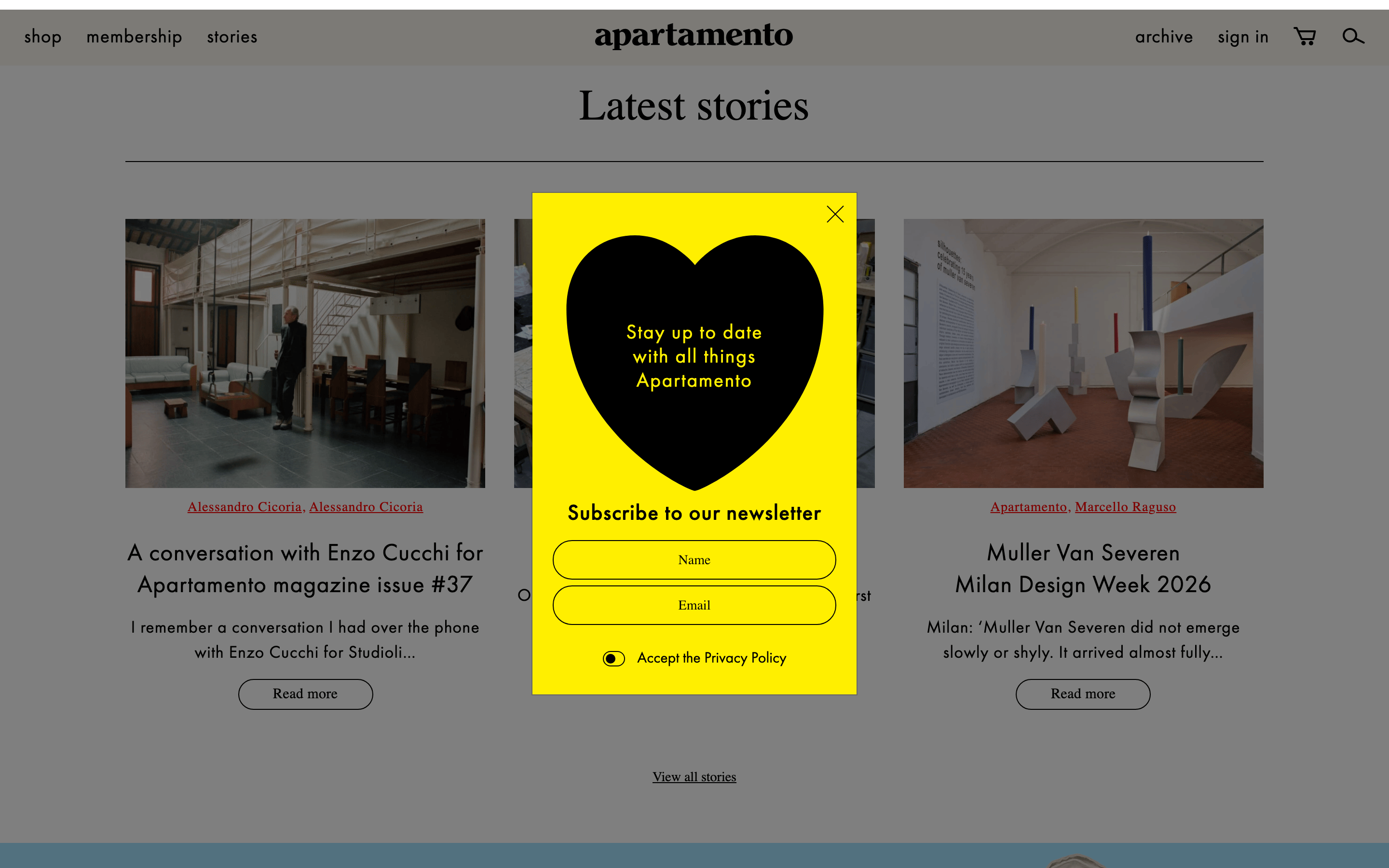
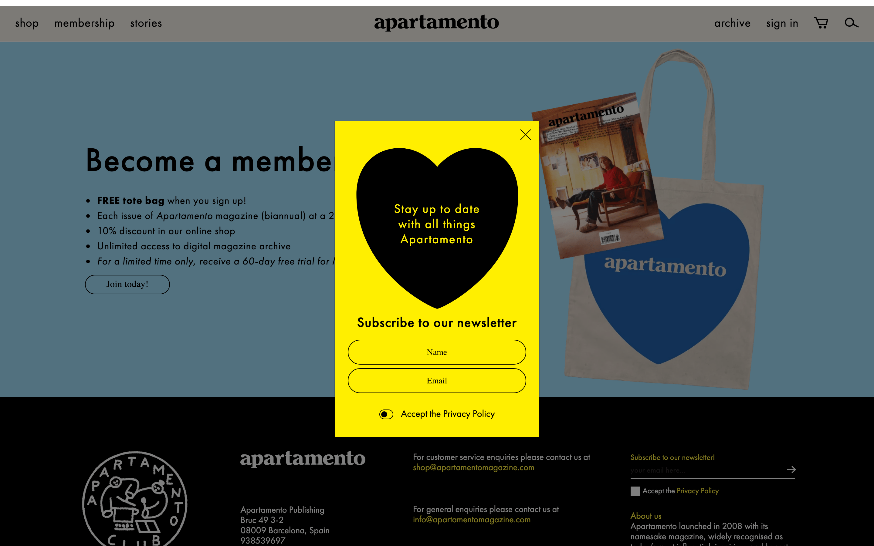
Classic magazine grid with a dominant, full-width hero image and a structured column layout for article cards.
07
Motion & Interaction
150msmicro
300mssmall
400msmedium
cubic-bezier(0.25, 0.1, 0.25, 1)easing
fade-in modals · smooth transitions on interactive elements
subtle color shifts or underlines on text links · standard pointer cursor on interactive elements
08
Components
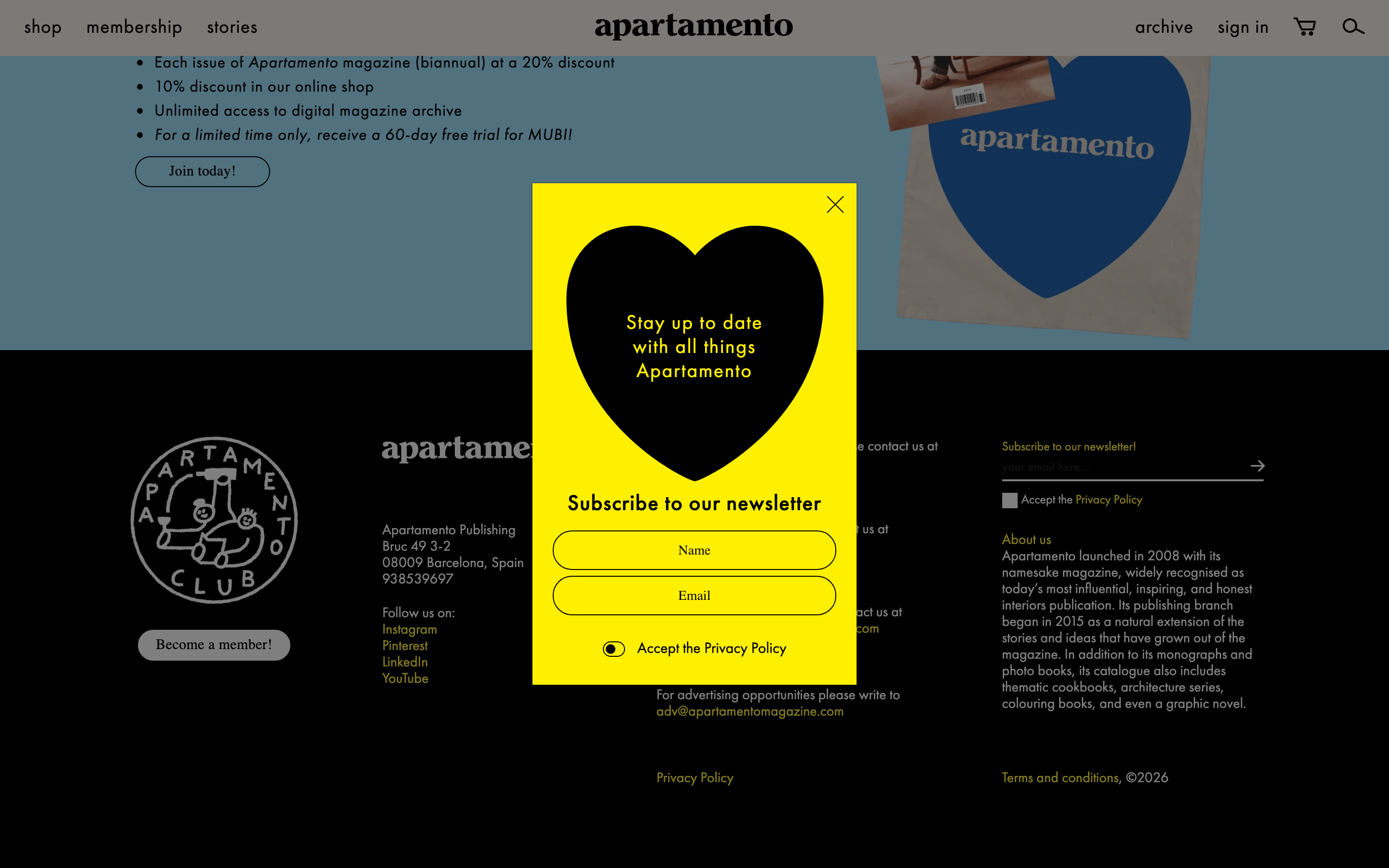
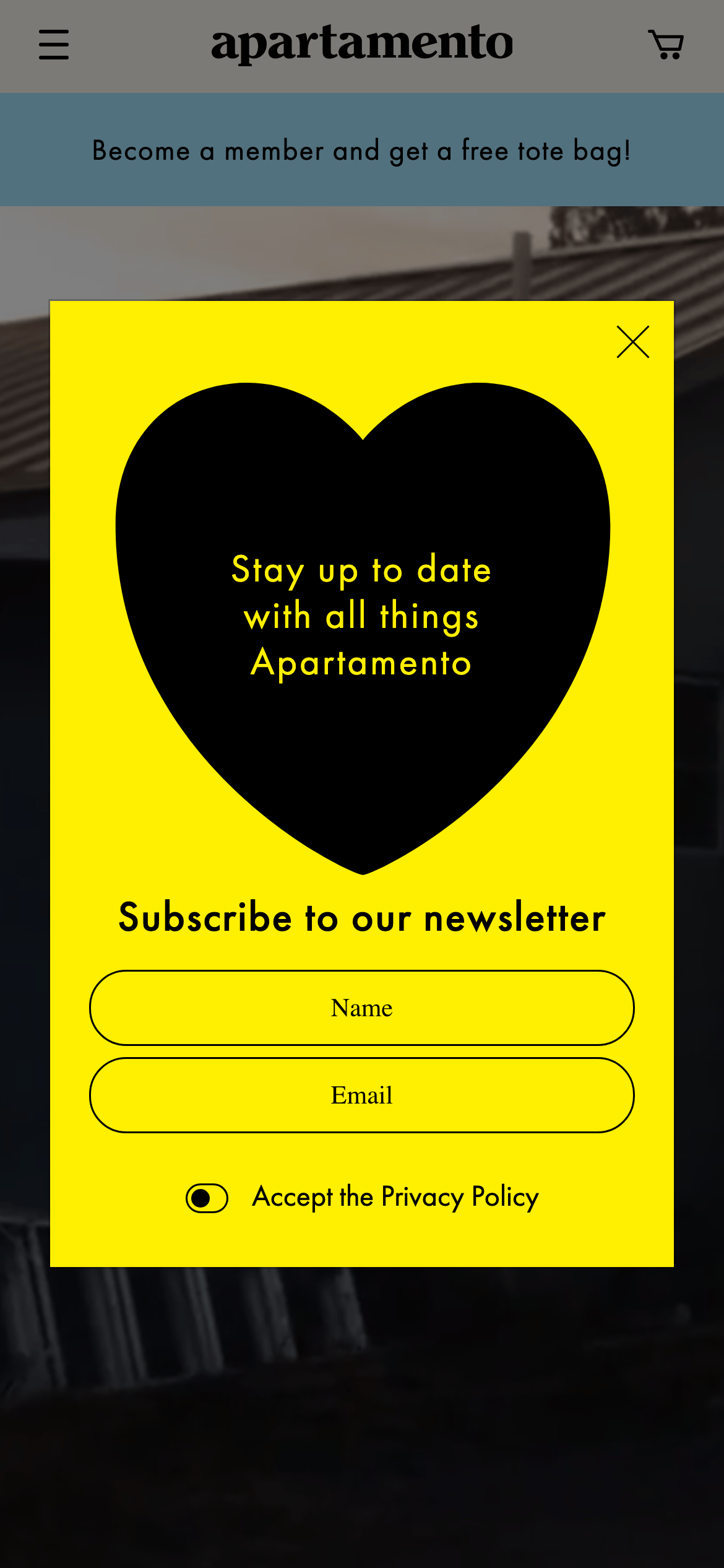
buttonMinimal text-based buttons with pill-shaped rounded borders.
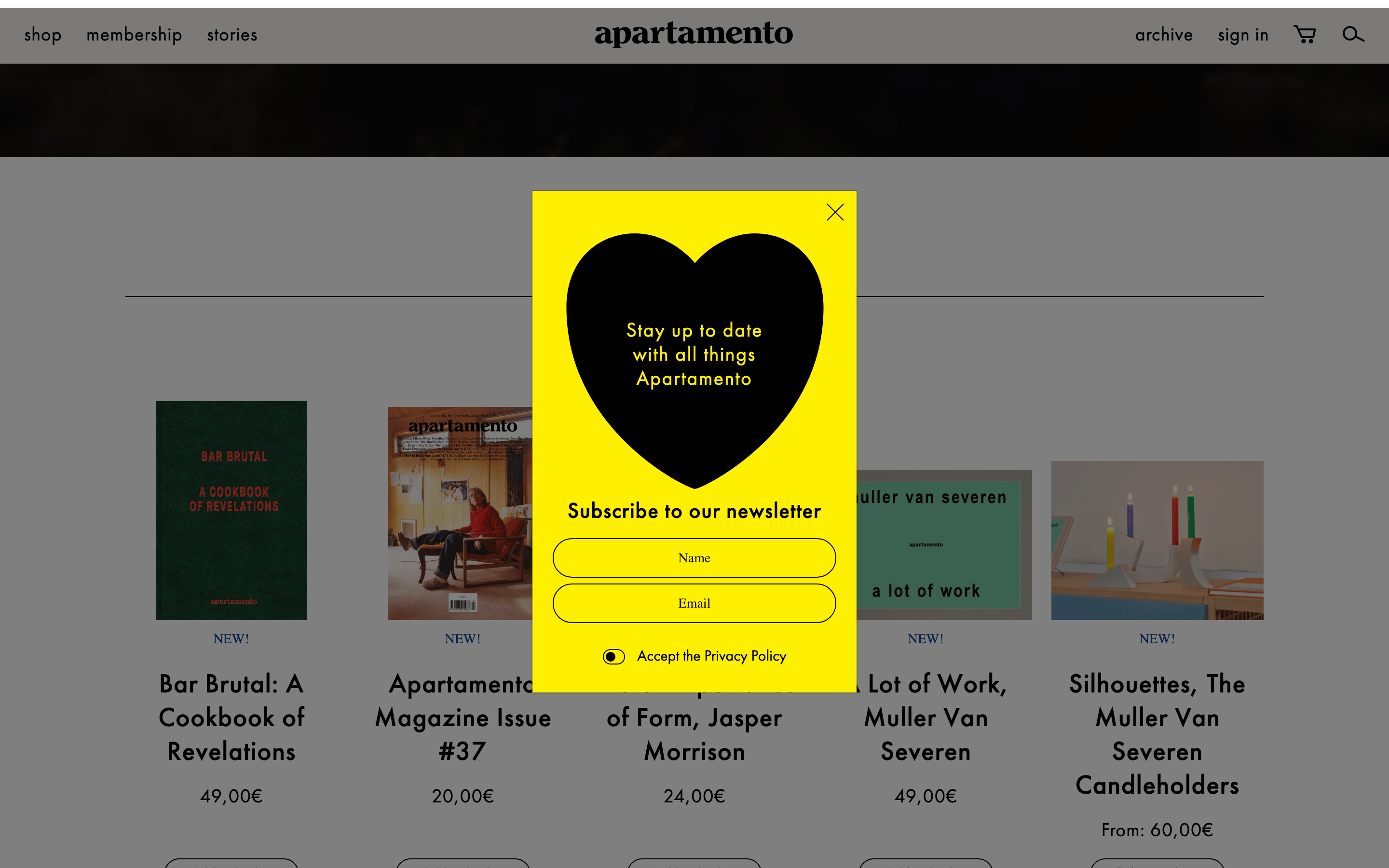
cardContent cards featuring large editorial photography, serif titles, and sans-serif metadata.
chipSimple text links or tag-like elements.
inputHigh-contrast rounded pill inputs with black borders on a vibrant yellow background.
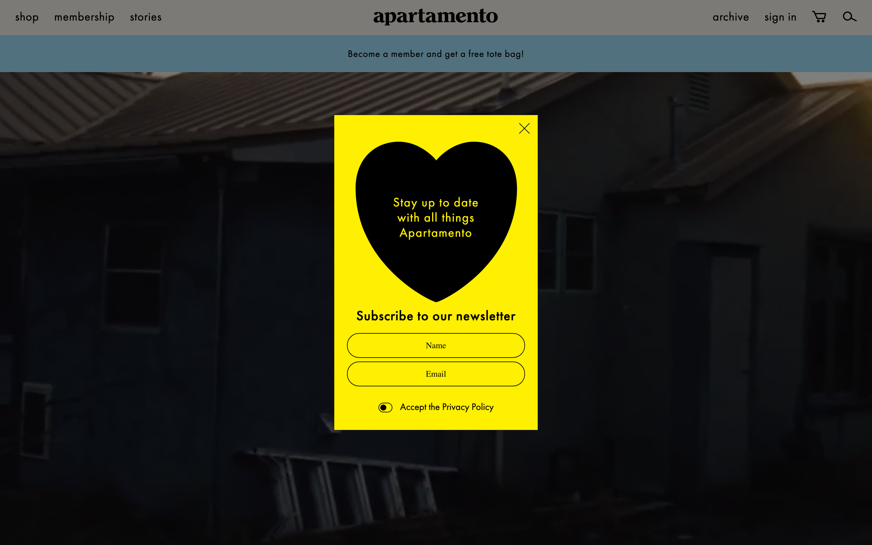
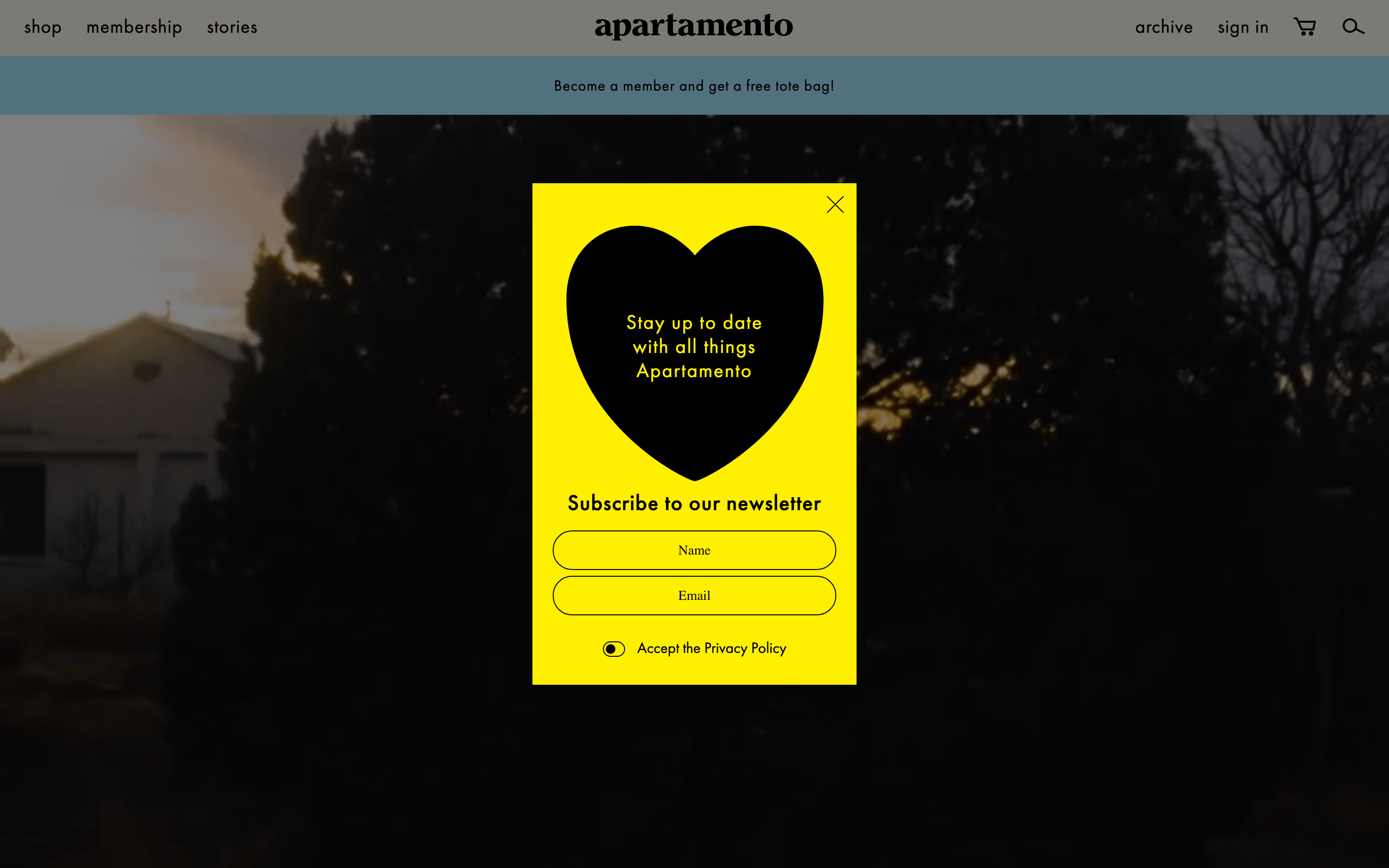
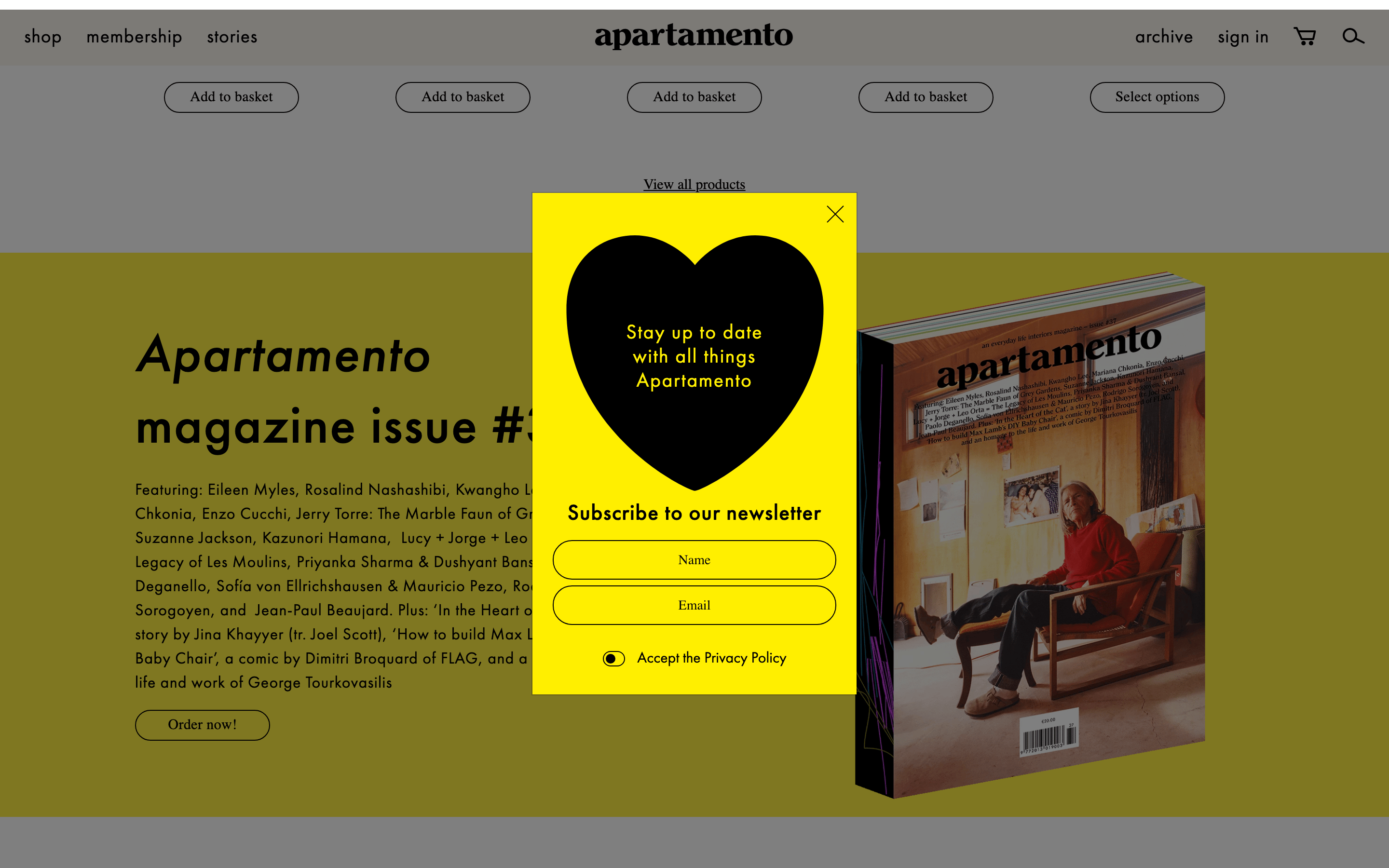
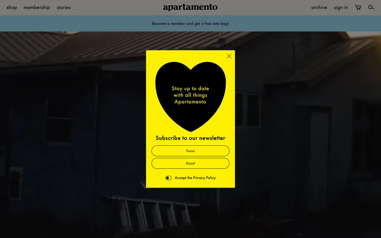
heroFull-viewport photographic hero with a central, striking graphic modal overlay.
09
Voice & Don'ts
Tonesophisticated, inviting, and cultured
HeadlinesDirect, bold, and slightly understated, relying on typography for impact.
CTAsClear, straightforward, and integrated into the editorial flow.
don't use a stark white background — screenshot shows a warm off-white (#F8F4EC) base
don't make every button bright yellow — screenshot shows yellow is strictly reserved for the modal overlay
don't use a sans-serif for major headings — screenshot shows a high-contrast transitional serif for 'Latest stories'
don't use heavily rounded squares for inputs — screenshot shows extreme pill-shape rounding
don't clutter the layout with dense UI patterns — screenshot shows a clean, breathing editorial grid
don't add complex drop shadows to UI cards — screenshot shows completely flat, shadowless components
Captured from the live site · real computed styles
11
System prompt
Design a sophisticated editorial website inspired by Apartamento Magazine. Use a warm off-white background (#F8F4EC) and black (#000000) ink. Typography should feature a transitional serif for major headlines and a geometric humanist sans-serif for navigation and body text. Use a bold, vibrant yellow (#FFEE42) sparingly as a high-contrast accent for critical overlays like newsletter modals, but keep the rest of the interface restrained and elegant. The layout should be an airy editorial grid with generous whitespace. Never use drop shadows, loud gradients, or aggressive marketing language. Maintain a calm, cultured, and premium feel throughout.
Bring this taste to your agent
Hand your AI agent a machine-readable spec of this design — tokens, type, motion, the whole DNA.