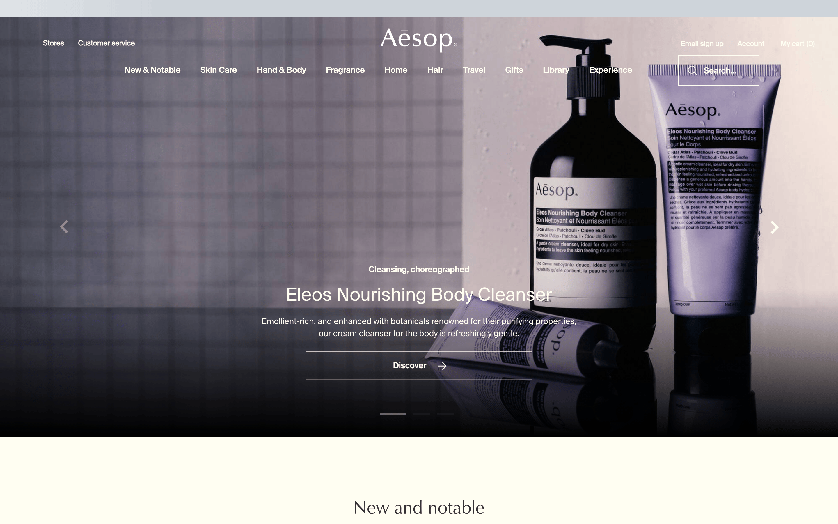
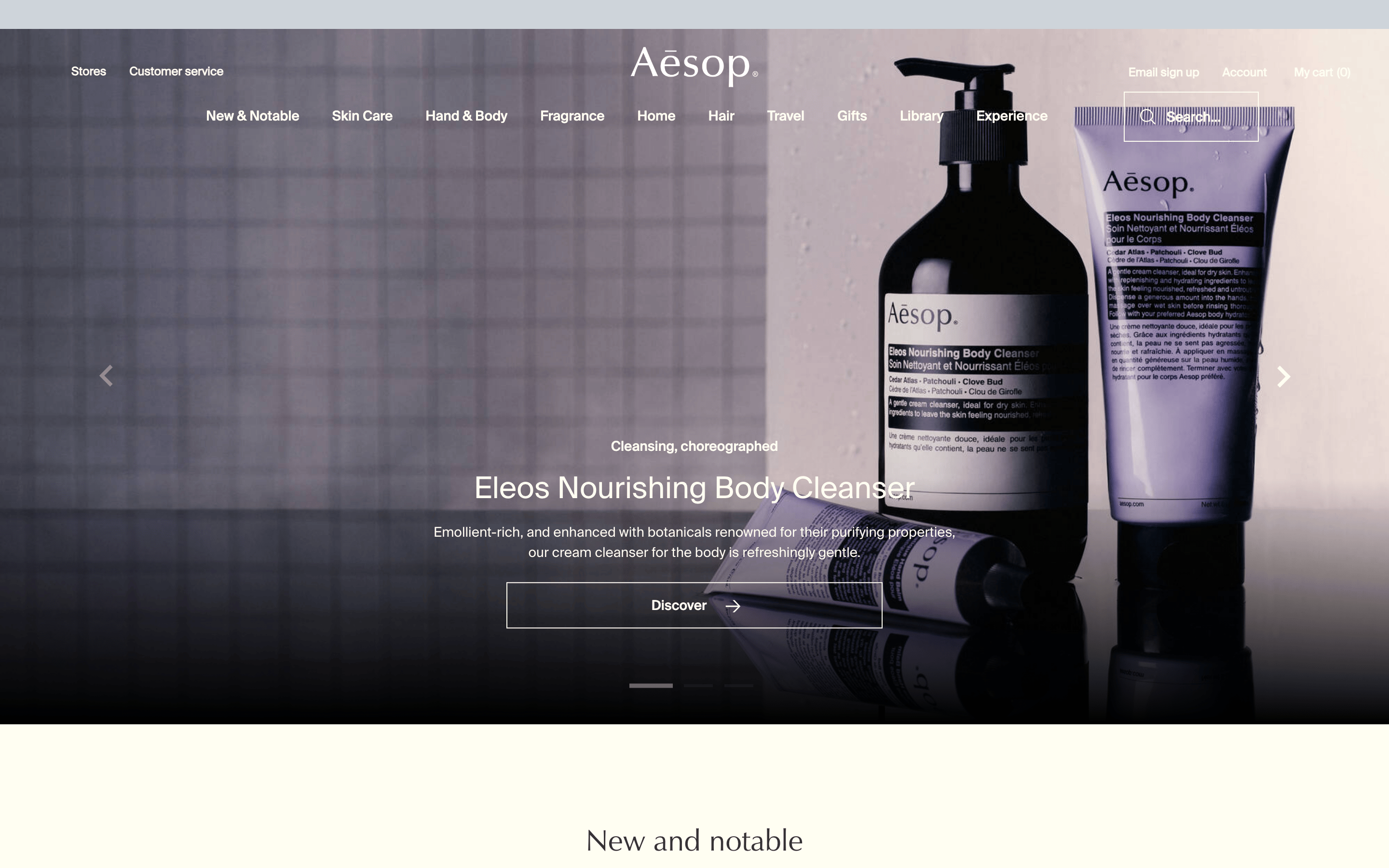
A digital gallery for botanical apothecary products
02
Color
#333333Ink
#666666Ink soft
#FFFEF2BG
#93938DMuted
rgba(51, 51, 51, 0.2)Line
High-contrast, restrained palette prioritizing typography and product imagery.
03
Typography
humanist-sans
display31px · 400
h131px · 400
body14px · 400
caption11px · 400
label12px · 400
Use humanist-sans for all primary text elements. · Maintain light to regular font weights (400) for a refined feel. · Ensure generous line-height (1.2-1.3) for readability.
04
Spacing
4px
8px
12px
16px
24px
32px
48px
64px
96px
Consistent 4px grid with moderate scale steps.
05
Surfaces
sm · 0px
md · 0px
lg · 0px
pill · 999px
1px solid rgba(51, 51, 51, 0.2)
rgba(255, 254, 242, 0.2) 0px 2px 4px 0px
06
Layout
1280container
12columns
24pxgutter
768 / 1024breakpoints
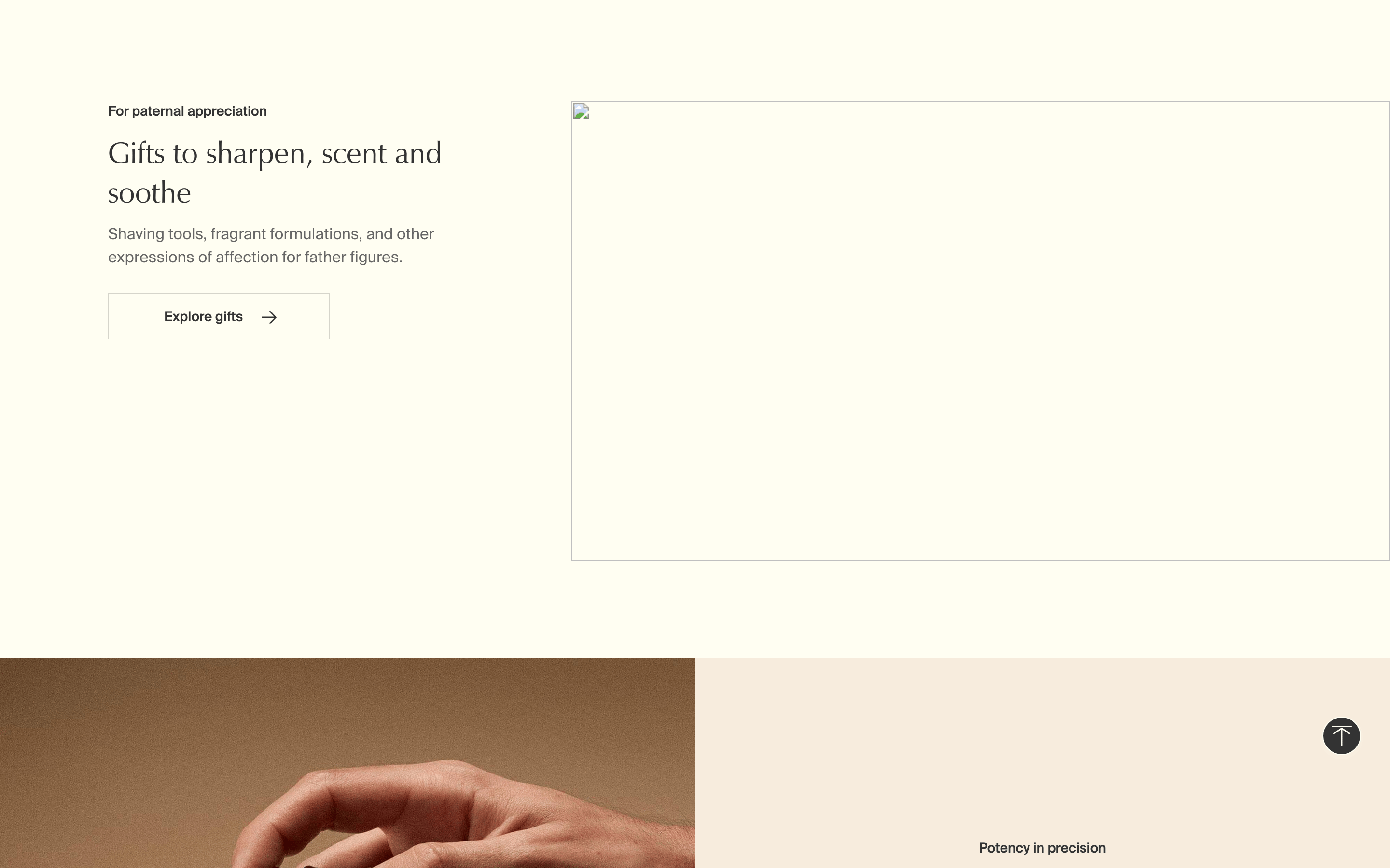
Asymmetric grid with large product photography and centered text blocks.
07
Motion & Interaction
200msmicro
250mssmall
500msmedium
cubic-bezier(0.4, 0, 0.2, 1)easing
Smooth background-color transitions on hover. · Subtle transform effects on interactive elements.
Subtle background-color change and cursor update. · Immediate visual feedback via transition.
08
Components
buttonGhost/outline style with thin borders and uppercase text.
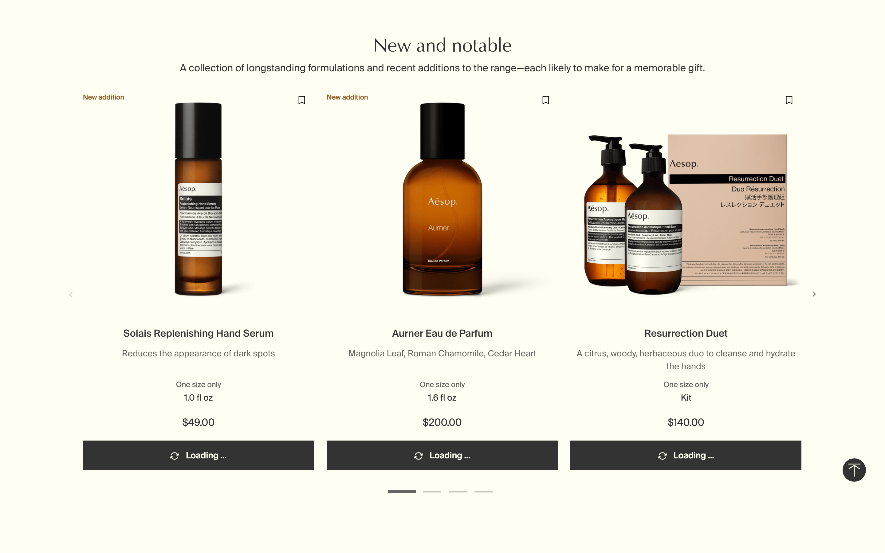
cardClean cards with minimal borders and centered product images.
chipSubtle, bordered filter chips for product attributes.
inputMinimal search input with a thin border and icon.
heroFull-width photographic background with centered text overlay.
09
Voice & Don'ts
ToneSophisticated, poetic, and informative.
HeadlinesBrief, evocative titles.
CTAsUnderstated, using arrows or simple text like 'Discover'.
Don't use bright, saturated accent colors — the palette is muted and neutral.
Don't use heavy, bold font weights — the design relies on light and regular weights.
Don't use rounded corners or soft shadows — the aesthetic is sharp and precise.
Don't use complex, multi-colored gradients — the background is a flat, warm off-white.
Don't use cluttered layouts — prioritize generous whitespace and large imagery.
Don't use loud, urgent call-to-action text — keep it understated and elegant.
Captured from the live site · real computed styles
11
System prompt
Design a restrained, premium e-commerce experience for a curated skincare and fragrance brand. The palette uses a warm off-white (#FFFEF2) background with dark gray (#333333) ink and muted (#93938D) accents. Typography is exclusively humanist-sans with light to regular weights (400) for a refined, airy feel. Critical donts: never use bright accent colors; avoid heavy font weights; and maintain generous whitespace. The layout should feel like a digital gallery, with large product photography and centered text blocks.
Bring this taste to your agent
Hand your AI agent a machine-readable spec of this design — tokens, type, motion, the whole DNA.