A modern, sustainable retail brand focused on transparency and natural materials.
02
Color
#2D383DAccent
#000000Ink
#555555Ink soft
#FFFFFFBG
#E0DACFBG soft
#212121BG quiet
#696969Muted
rgba(0,0,0,0.1)Line
High contrast naturals with deep muted anchors
03
Typography
humanist-sans · geometric-sans
display40px · 500
body16px · 400
Display: Use for hero headlines and main callouts. · Body: Use for general reading and descriptive text. · Mono: Use for labels and secondary UI elements.
04
Spacing
4px
8px
16px
24px
32px
48px
64px
96px
Consistent 4px base unit with generous whitespace between sections.
05
Surfaces
sm · 4px
md · 8px
lg · 16px
pill · 999px
1px solid rgba(0,0,0,0.1) for subtle separation.
rgba(0,0,0,0.1) 0px 1px 3px 0px · rgba(0,0,0,0.1) 0px 20px 25px -5px
06
Layout
1280container
12columns
24pxgutter
768 / 1024breakpoints
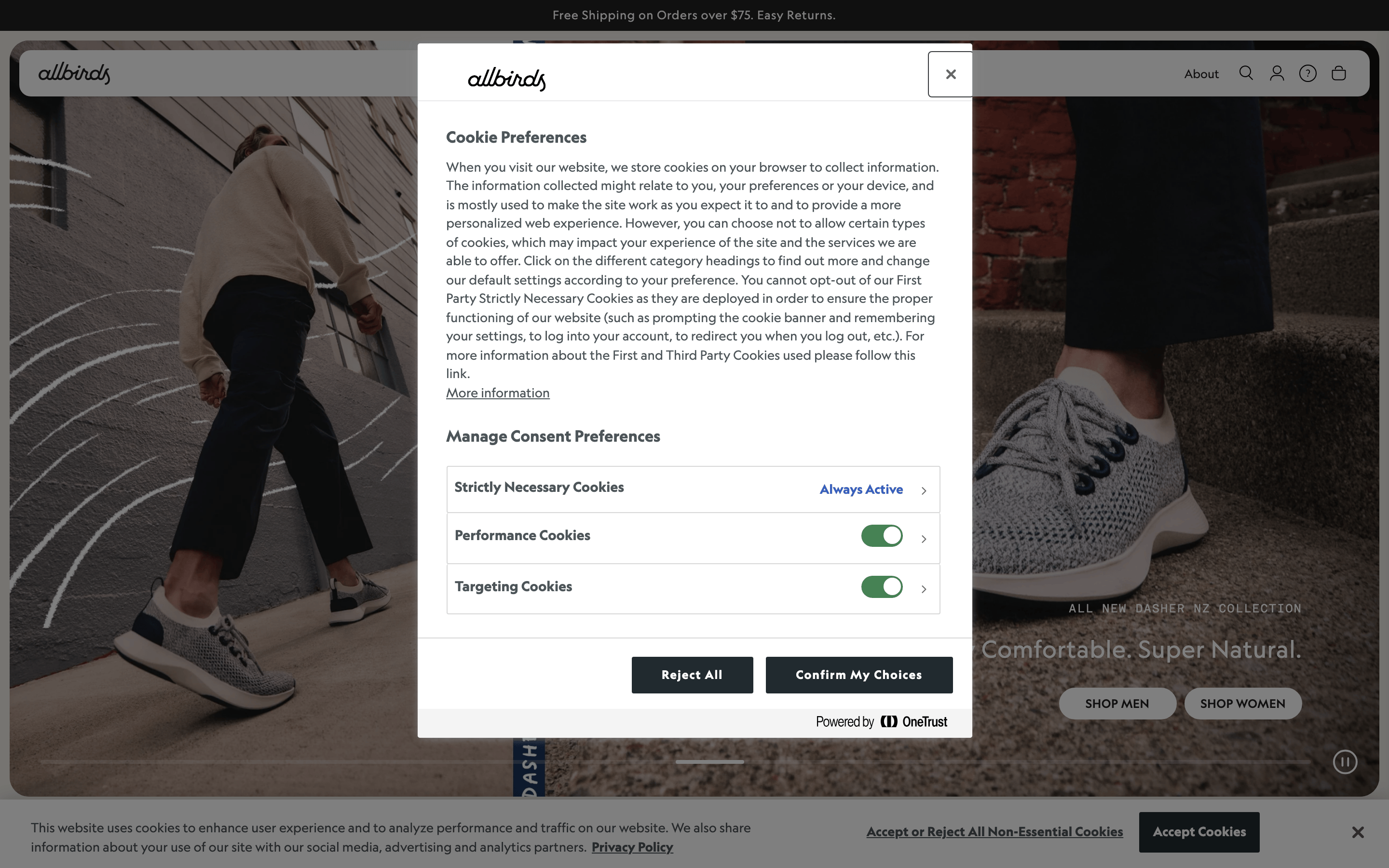
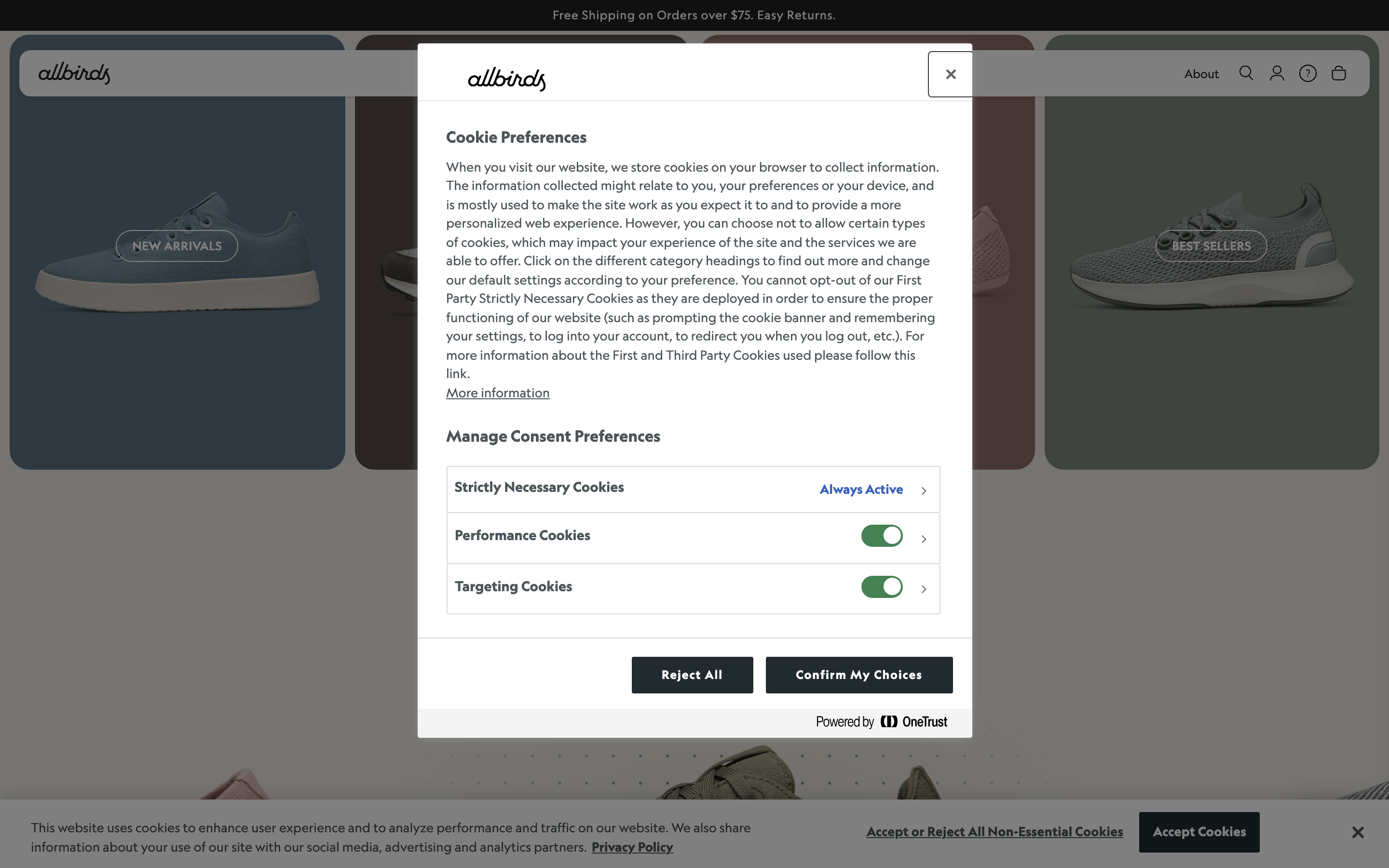
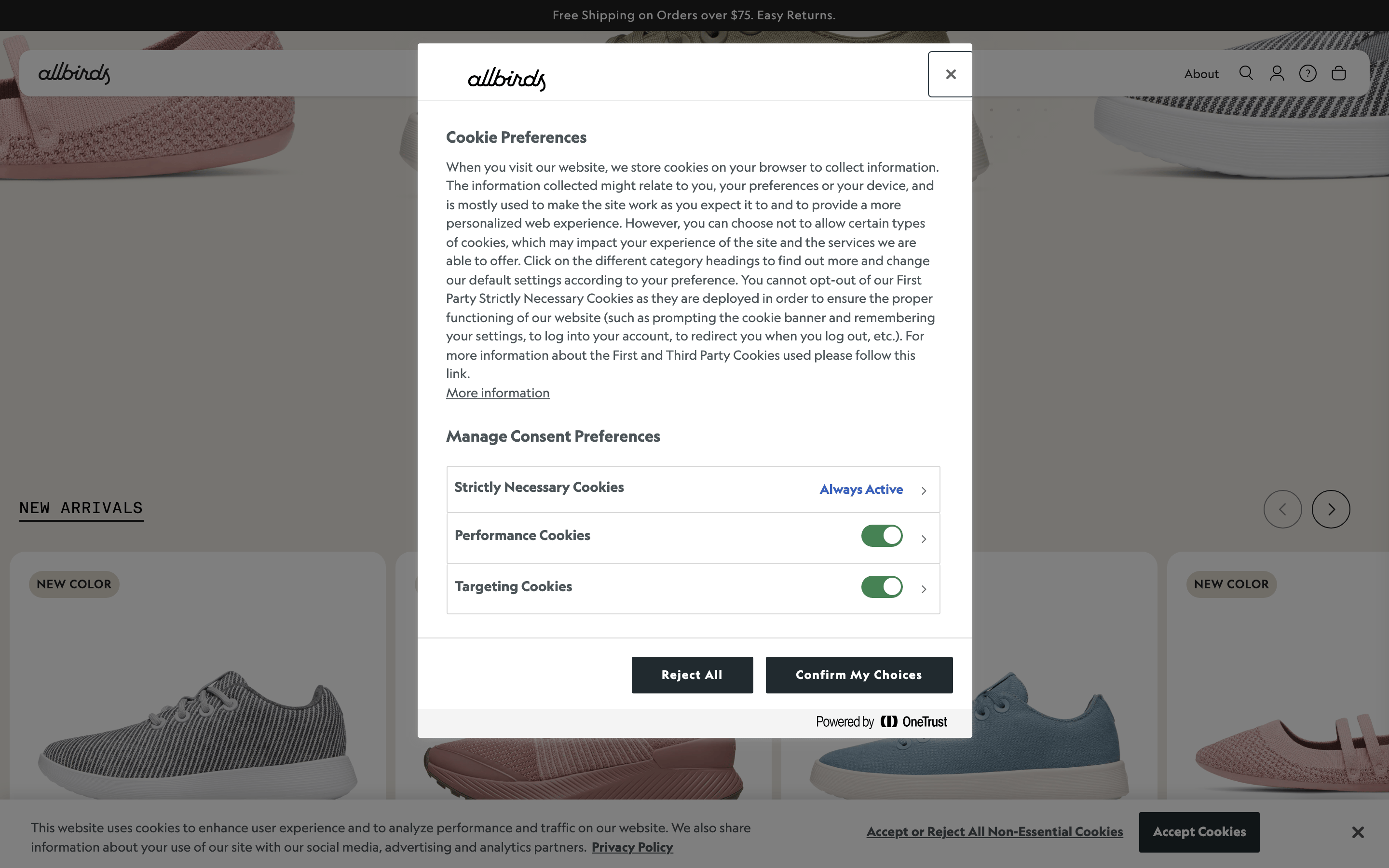
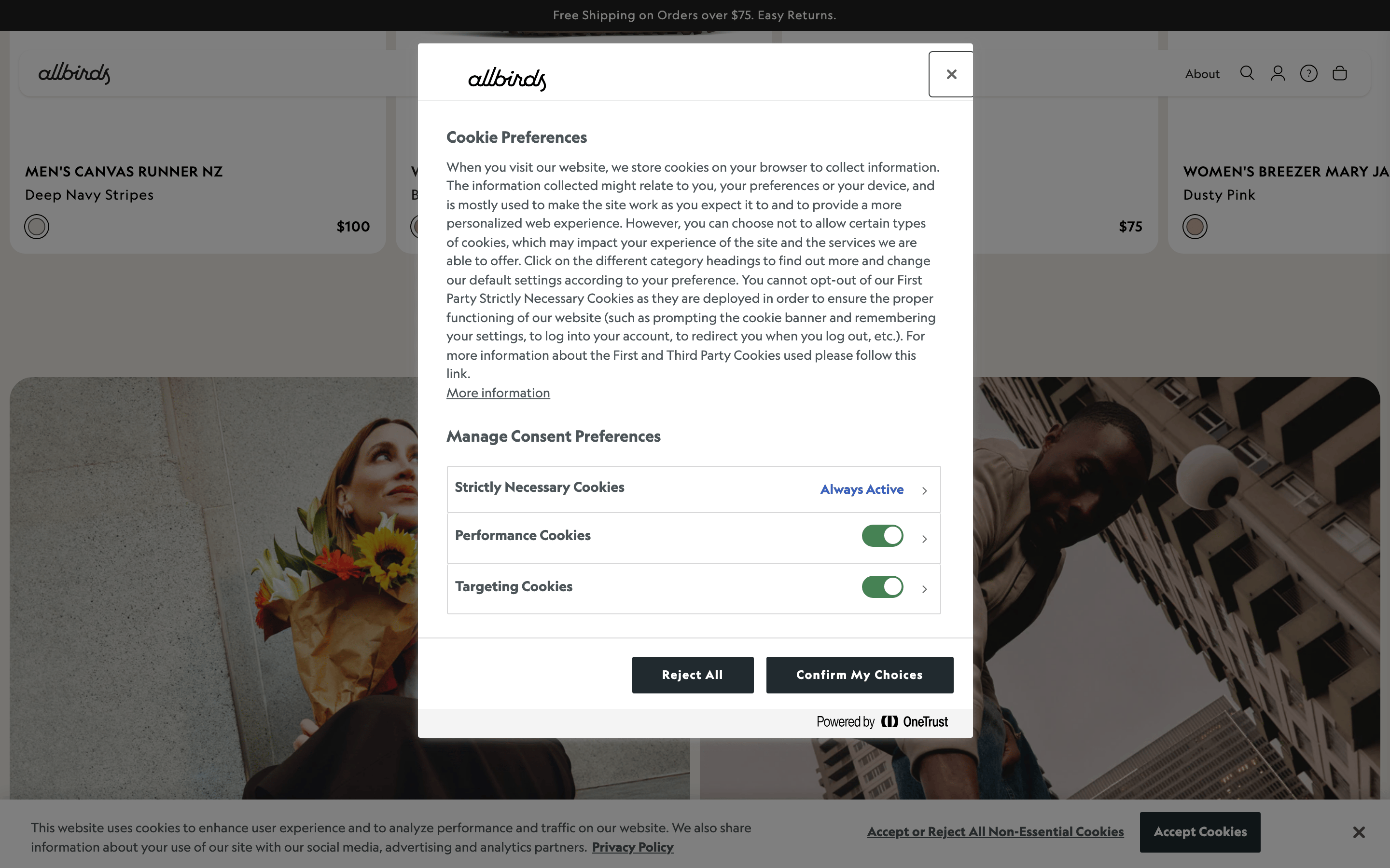
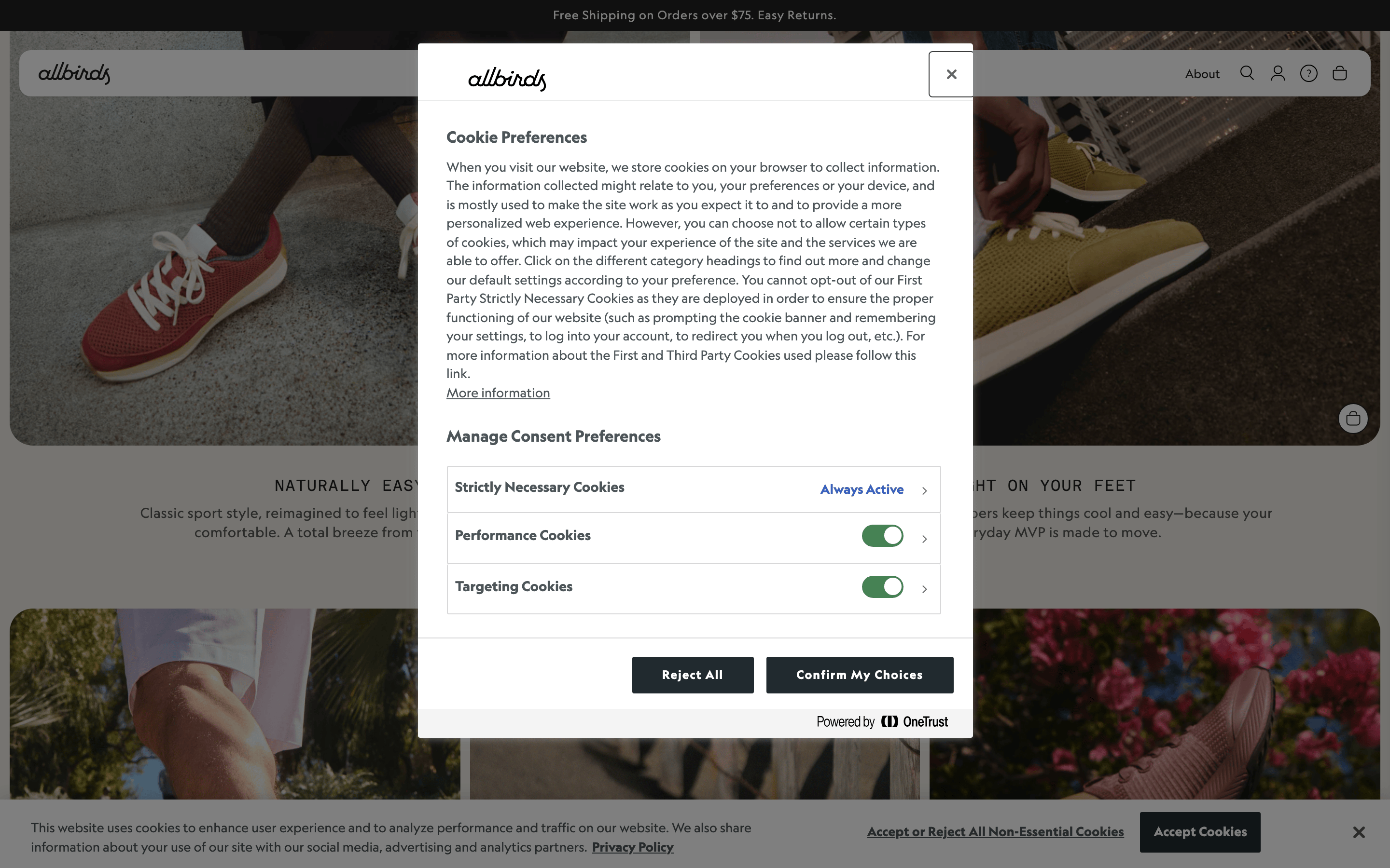
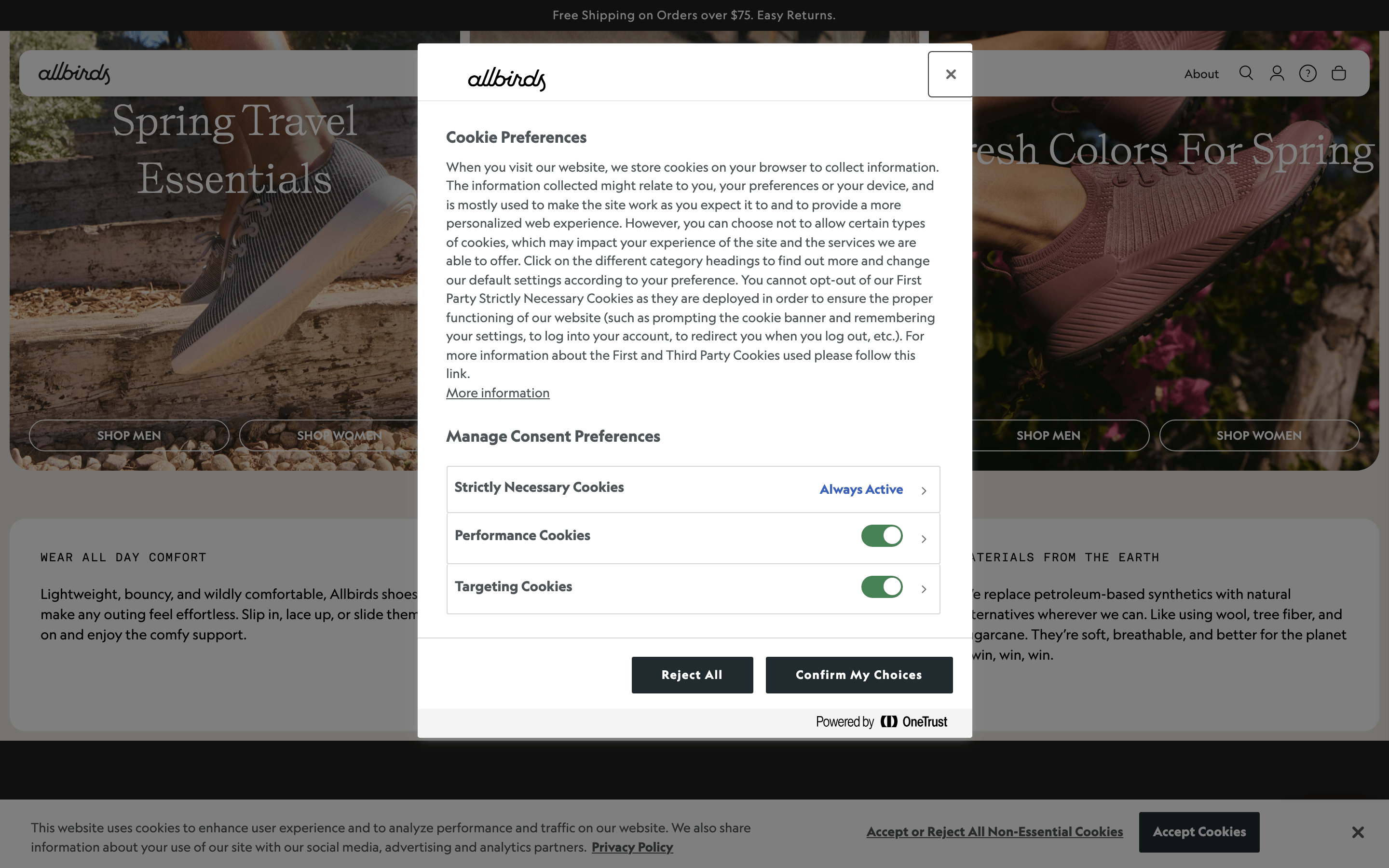
Full-width hero with centered modal overlay.
07
Motion & Interaction
220msmicro
400mssmall
800msmedium
cubic-bezier(0.37, 0, 0.63, 1)easing
Smooth transitions for hover states and background colors.
Subtle background color shift or opacity change. · Direct visual feedback via transform or color.
08
Components
buttonSolid filled buttons with slight border radius.
cardClean cards with large product photography.
chipMinimalist labels with uppercase text.
inputStandard form inputs with clear focus states.
heroLarge lifestyle photography with centered text overlay.
09
Voice & Don'ts
ToneTransparent, approachable, and straightforward.
HeadlinesShort, punchy, and benefit-oriented.
CTAsDirect and action-oriented with clear visual weight.
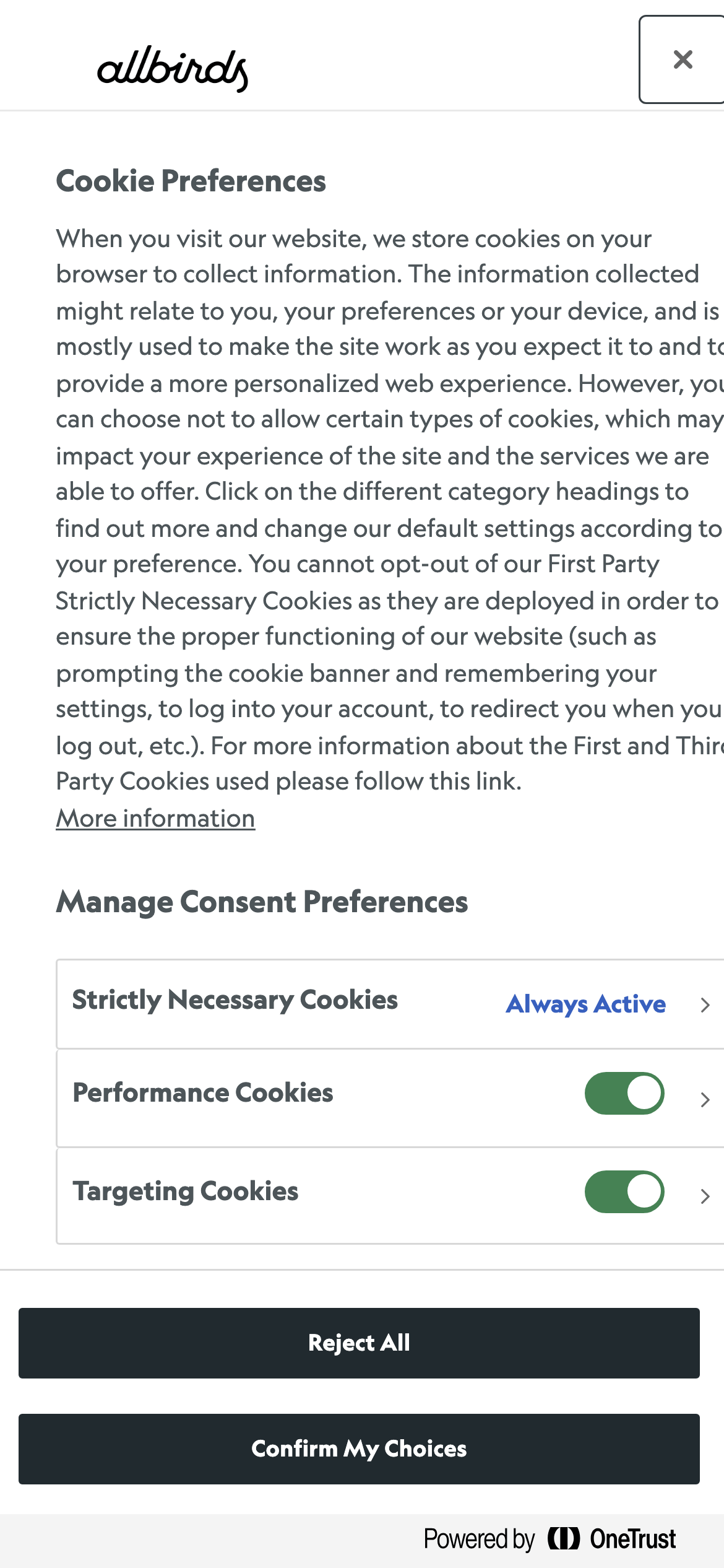
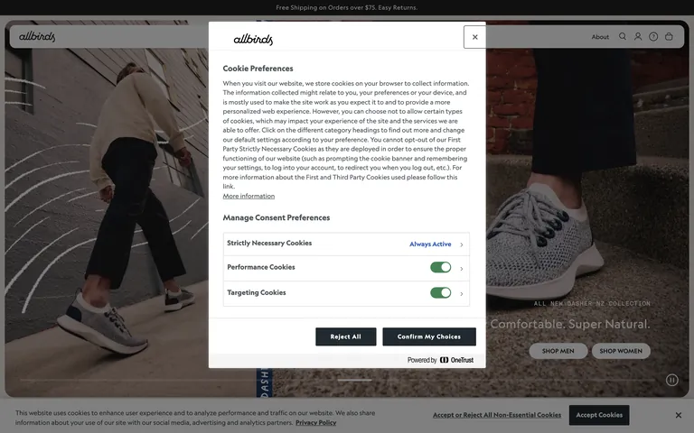
don't use neon or highly saturated colors — screenshot shows muted earthy tones like #E0DACF instead
don't use heavily condensed fonts — screenshot shows humanist sans-serif and geometric sans categories
don't use heavy drop shadows — screenshot shows subtle, soft shadows for elevation
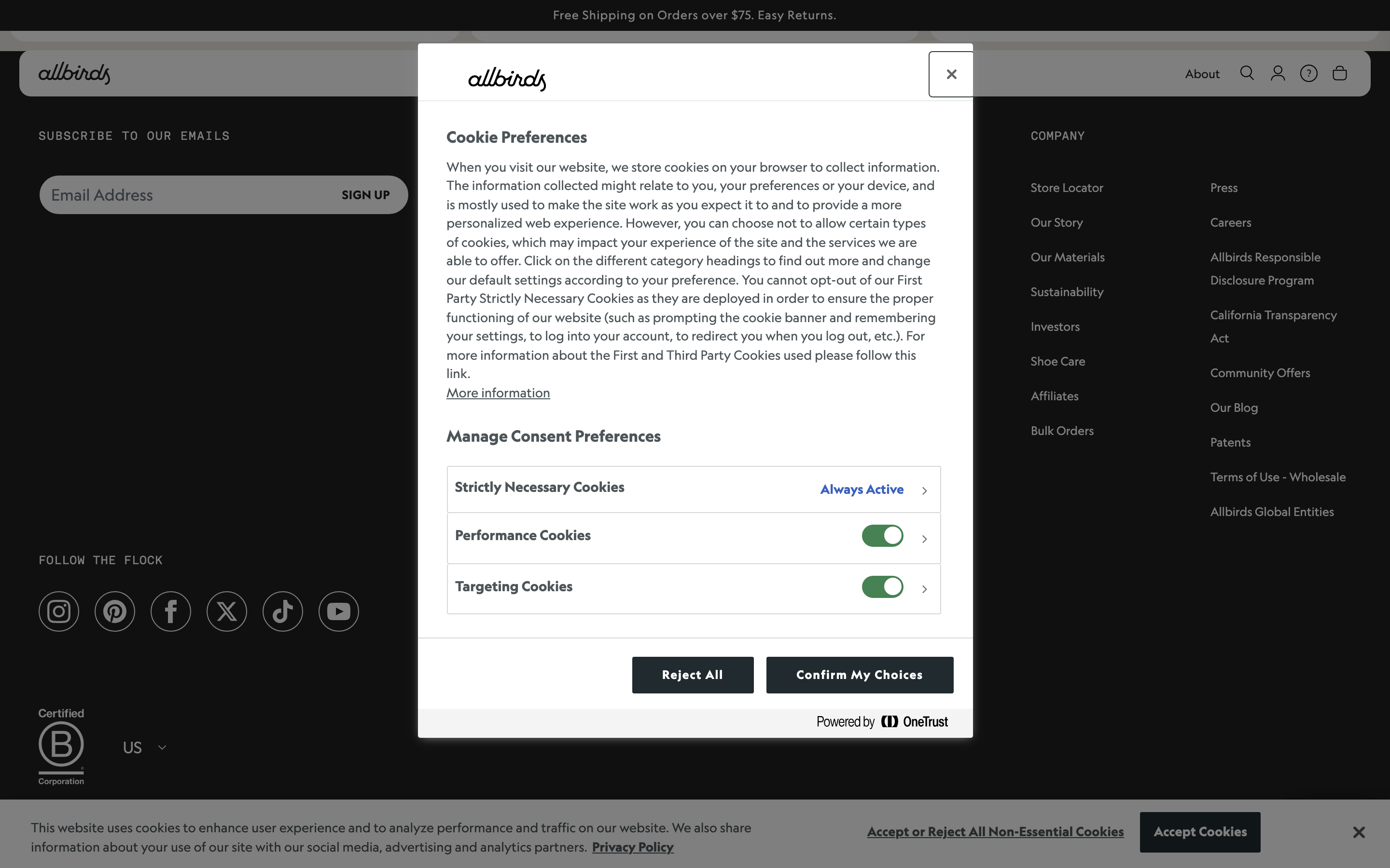
don't use cluttered layouts — screenshot shows generous whitespace and a single modal focus
don't use all-caps for body text — screenshot reserves uppercase for UI labels and short headings
don't use sharp, square corners everywhere — screenshot shows a mix of pill shapes and rounded corners up to 16px
Captured from the live site · real computed styles
11
System prompt
This is a sustainable e-commerce platform focusing on natural materials and transparency. The visual identity centers on a clean, minimalist aesthetic using a high-contrast palette of pure white (#FFFFFF), soft earthy neutrals (#E0DACF), and deep muted anchors (#212121, #2D383D). Typography relies on a humanist-sans for display and body, paired with a geometric sans for UI labels and a mono for secondary elements. Layout is spacious with a 1280px container and 12-column grid. Critical constraints include avoiding neon or highly saturated colors, resisting overly complex or cluttered layouts, and refraining from using harsh drop shadows or sharp corners. Maintain a transparent, straightforward voice with short, punchy headlines.
Bring this taste to your agent
Hand your AI agent a machine-readable spec of this design — tokens, type, motion, the whole DNA.