← OpenDesign CURATED · OPEN · FREE
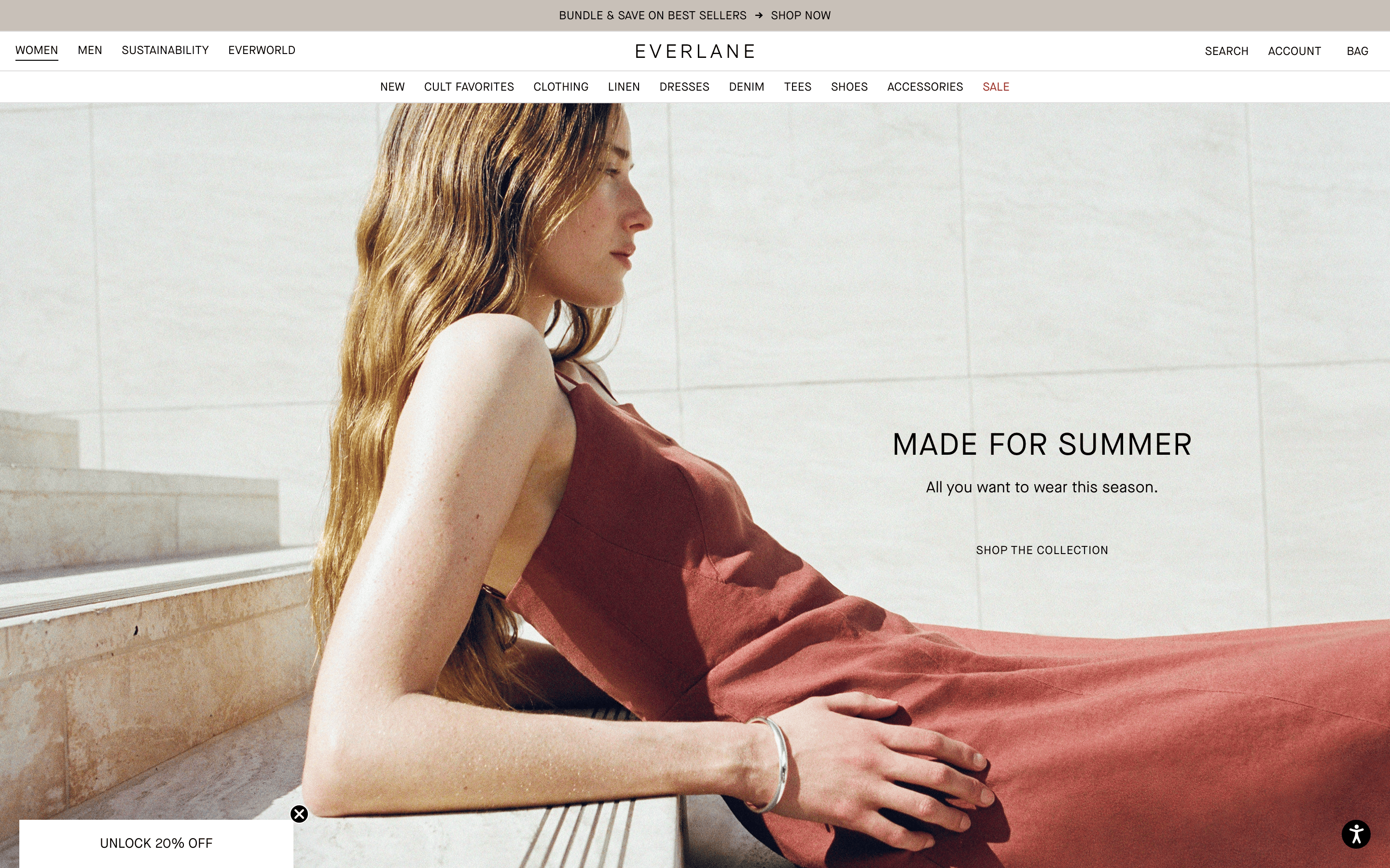
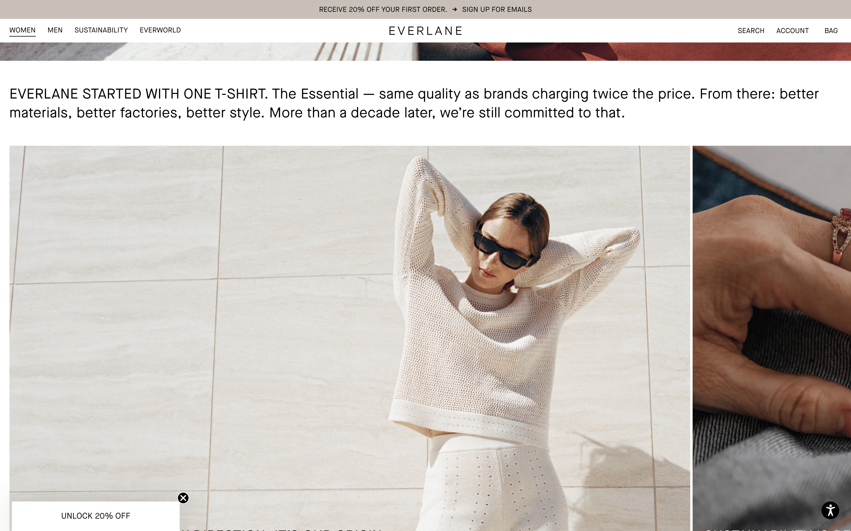
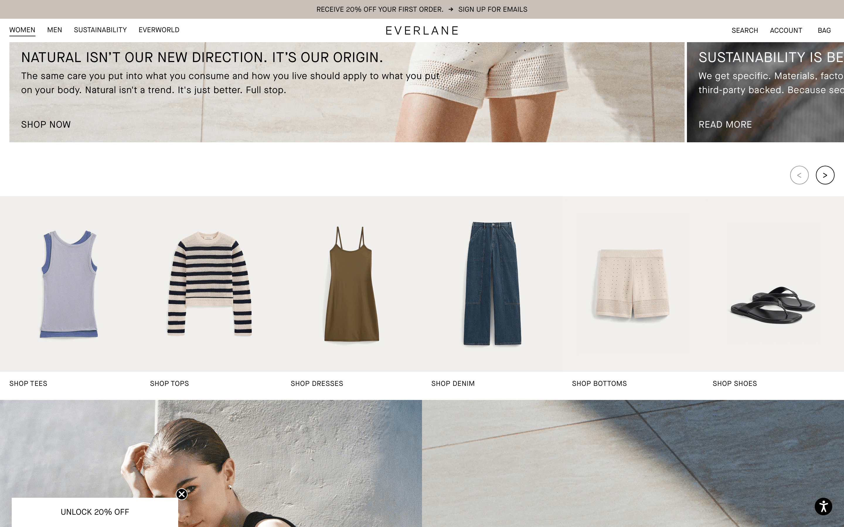
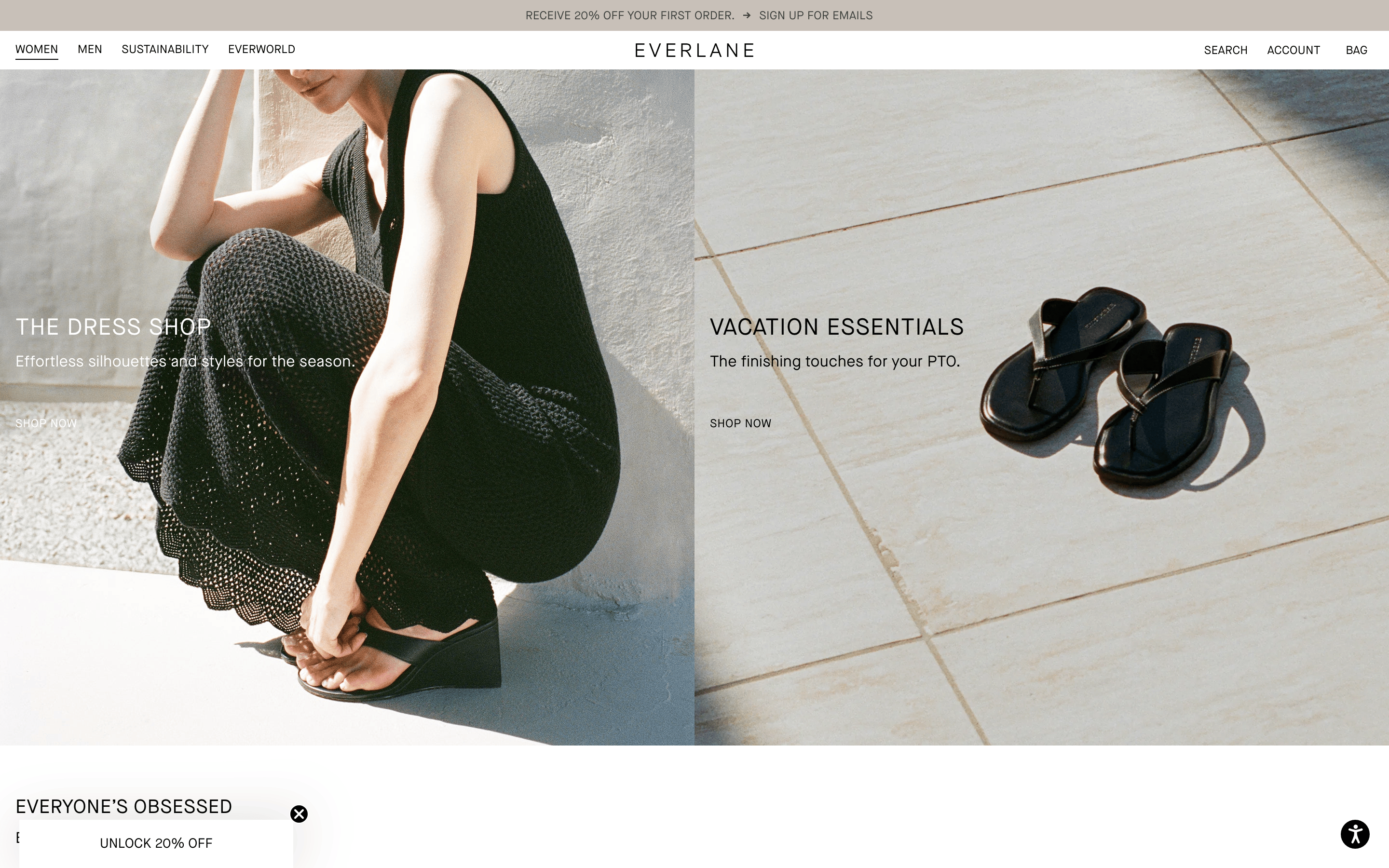
Everlane
Clean, minimal aesthetic focused on high-quality photography and typography with a neutral palette.
ecommerce minimal
01
Identity DNA
transparency radical transparency minimal essential timeless
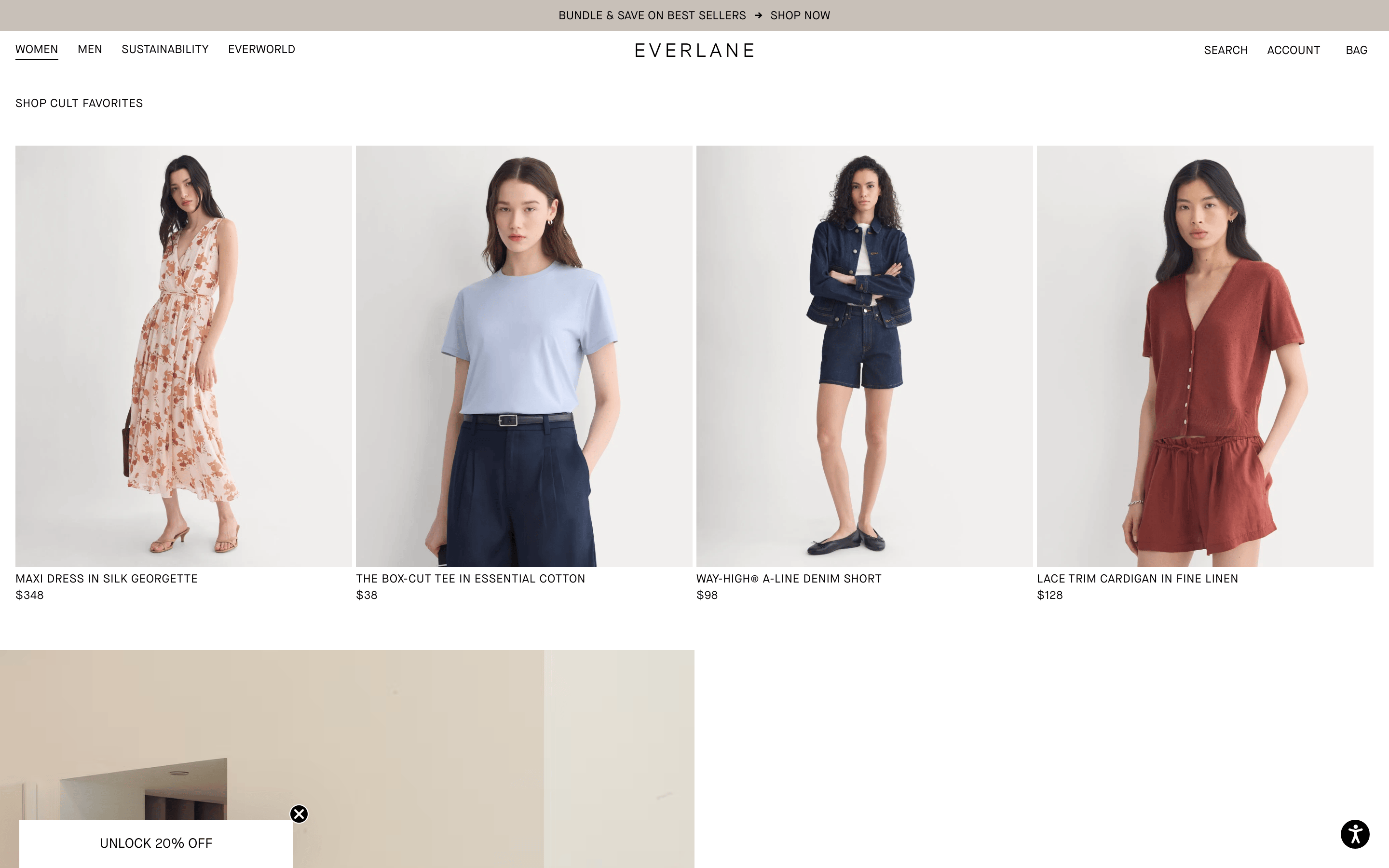
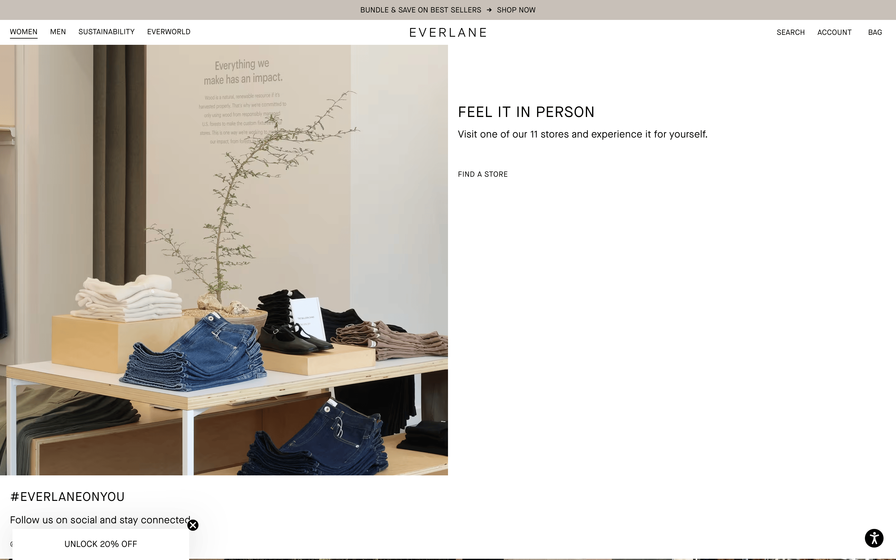
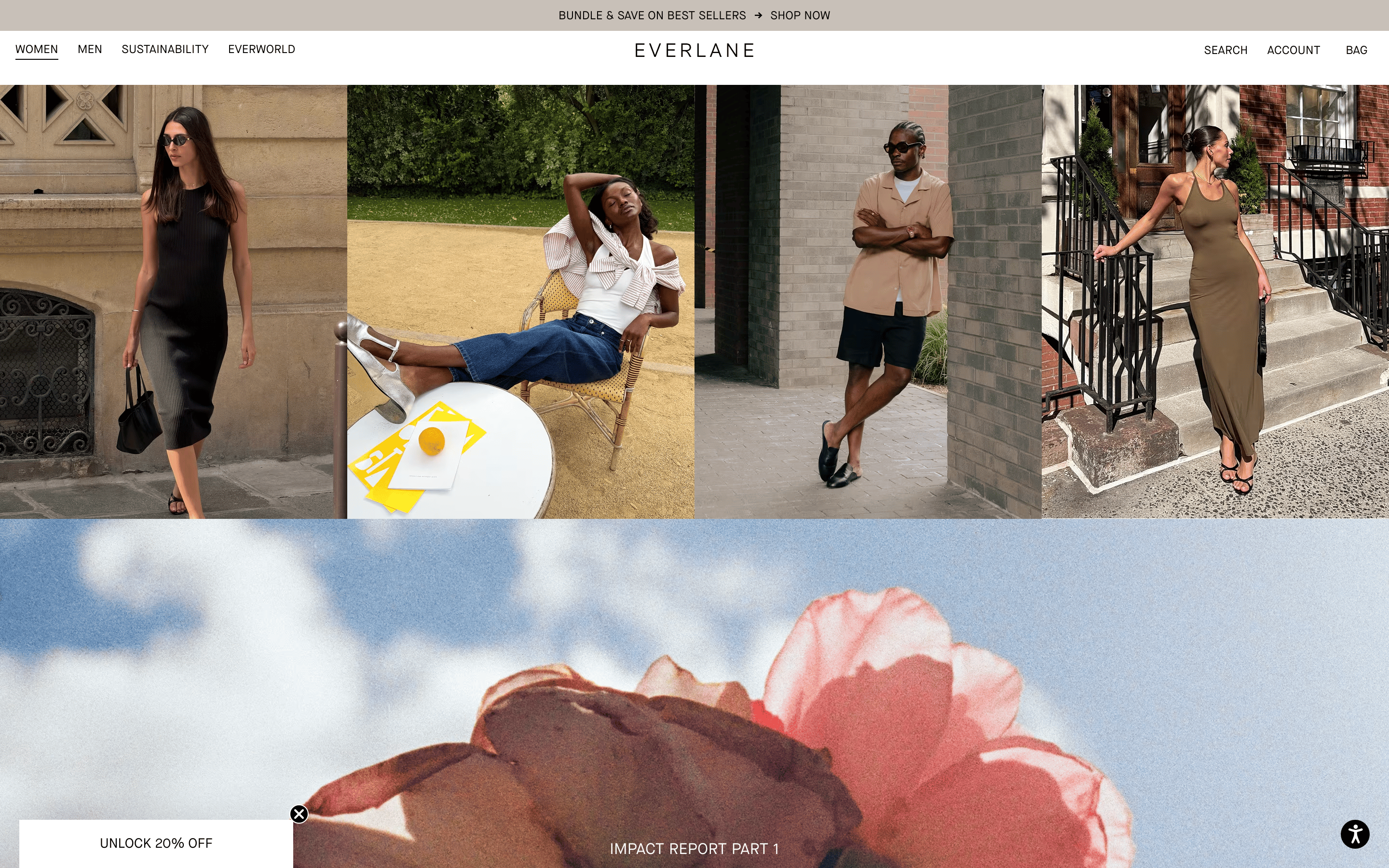
A curated gallery of essential garments
02
Color
#121212Ink
#4C4C4CInk soft
#FFFFFFBG
#F8F6F5BG soft
#EFEFEFBG quiet
#737373Muted
rgba(18, 18, 18, 0.1)Line
Neutral palette with photography providing the primary visual interest.
03
Typography
grotesque-sans · monospace
display 56px · 400heading 24px · 400body 16px · 400small 12px · 400All primary text is uppercase with generous letter-spacing.
04
Spacing
4px
8px
12px
16px
20px
24px
32px
48px
64px
96px
Consistent use of a 4px base unit for spacing.
05
Surfaces
sm · 0px
md · 0px
lg · 0px
pill · 999px
Minimal, mostly 1px solid borders for subtle separation.
rgba(0, 0, 0, 0.15) 0px 4px 20px 0px
06
Layout
1280 container
12 columns
24px gutter
768 / 1024 breakpoints
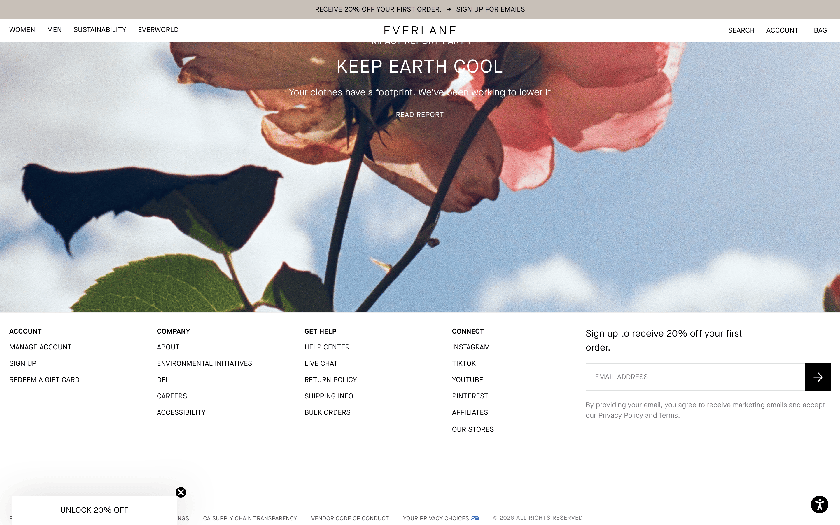
Grid-based layout with generous white space.
07
Motion & Interaction
100ms micro
200ms small
400ms medium
cubic-bezier(0.37, 0.01, 0, 0.98) easing
Subtle opacity transitions for hover states · Font-size transitions for interactive elements
Subtle opacity reduction on text and image elements. · Standard pointer cursor on interactive elements.
08
Components
button Minimal text-based buttons with uppercase text and generous letter-spacing. card Simple rectangular cards with clean photography and minimal typography below. chip Simple text chips with uppercase text. input Minimal text inputs with subtle bottom borders. hero Full-width photographic hero with overlaid text and a call to action. 09
Voice & Don'ts
Tone Confident, minimal, and direct. Headlines Short, punchy, all-caps statements. CTAs Action-oriented, uppercase text. Don't use decorative or script fonts — screenshot shows a clean, geometric grotesque sans-serif. Don't use rounded corners on cards or containers — screenshot shows sharp, rectangular edges. Don't use bright, saturated accent colors — screenshot uses a strict neutral palette of black, white, and grays. Don't use heavy drop shadows or complex 3D effects — screenshot shows minimal, subtle shadows. Don't use center-aligned text for body copy — screenshot shows left-aligned or centered only for headlines. Don't use lowercase for navigation and section headers — screenshot shows all-uppercase text with wide letter-spacing. Avoid: Avoid overly decorative fonts. Avoid: Avoid bright, saturated colors in the UI. Avoid: Avoid cluttered layouts or excessive visual elements. 10
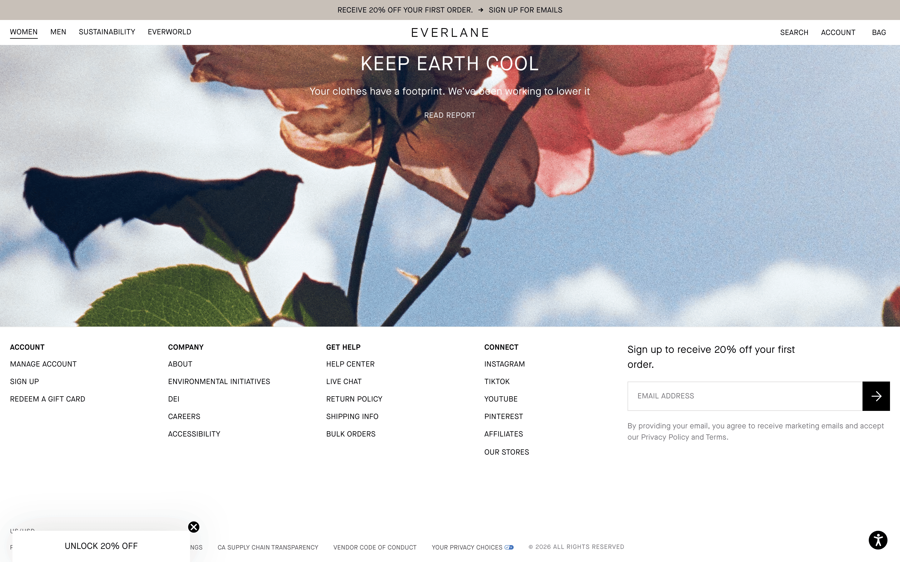
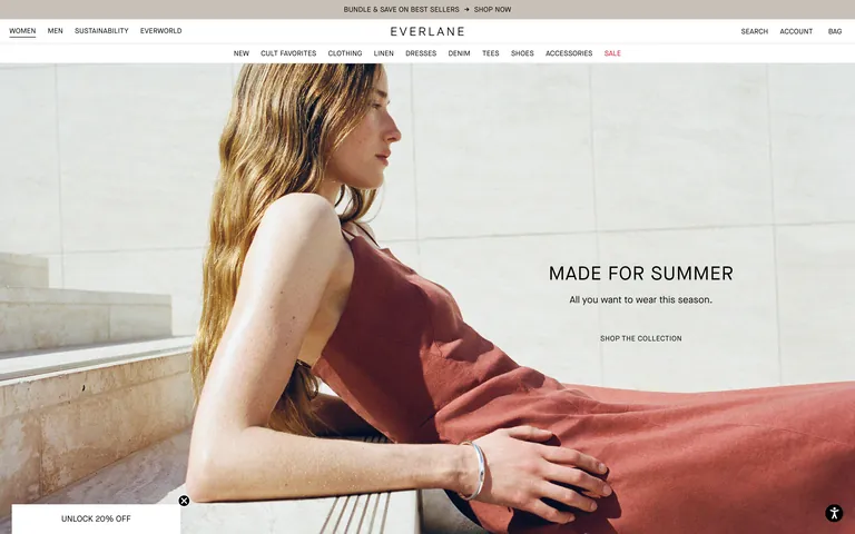
Inside the pack — real screenshots
桌面首屏(hero) 桌面滚动分段(90% viewport 步进,作为视觉证据) 桌面滚动分段(90% viewport 步进,作为视觉证据) 桌面滚动分段(90% viewport 步进,作为视觉证据) 桌面滚动分段(90% viewport 步进,作为视觉证据) 桌面滚动分段(90% viewport 步进,作为视觉证据) 桌面滚动分段(90% viewport 步进,作为视觉证据) 桌面滚动分段(90% viewport 步进,作为视觉证据) 桌面滚动分段(90% viewport 步进,作为视觉证据) 桌面滚动分段(90% viewport 步进,作为视觉证据) 移动首屏 Captured from the live site · real computed styles
11
System prompt
This is a premium, minimal e-commerce site for a modern clothing brand. The design DNA is built on a strict neutral palette of white (#FFFFFF), off-white (#F8F6F5), and near-black (#121212). Typography is a clean grotesque sans-serif, used almost exclusively in uppercase with wide letter-spacing for navigation and headings. Layout is grid-based with generous white space, allowing high-quality photography to dominate. Key critical donts: do not use bright accent colors, do not use decorative fonts, and do not use rounded corners on major components. The overall feel is restrained, premium, and focused on product photography.
More from the library en · zh-CN · zh-TW · ja · ko
OpenDesign · curated web aesthetics for AI-readable design DNA · opendesign.cc
Why we curated this: This site is an excellent reference for how a highly restrained, monochromatic UI can effectively showcase a premium product line through typography and photography.
浙ICP备2021038972号-5