← OpenDesign CURATED · OPEN · FREE
Antinomy Studio
A minimalist, typography-forward portfolio site for a global creative studio.
studio webgl
01
Identity DNA
Creative Studio Global Contemporary Design Agency Premium
A refined digital gallery for a high-end creative studio.
02
Color
#000000Ink
#FFFFFFBG
rgba(0,0,0,0.1)Line
Absolute monochrome baseline with high-contrast text and photography-driven color.
03
Typography
geometric-sans
display 54px · 400body 24px · 400caption 12px · 400All text uses ABC Diatype (geometric-sans) · Uppercase for navigation and small labels · Heavy negative letter-spacing for display sizes
04
Spacing
4px
8px
16px
24px
32px
48px
64px
96px
Generous whitespace between sections to let photography and typography breathe.
05
Surfaces
sm · 0px
md · 0px
lg · 0px
pill · 0px
No visible borders or rounded corners; purely flat, edge-to-edge imagery.
06
Layout
1440 container
12 columns
24px gutter
768 / 1024 breakpoints
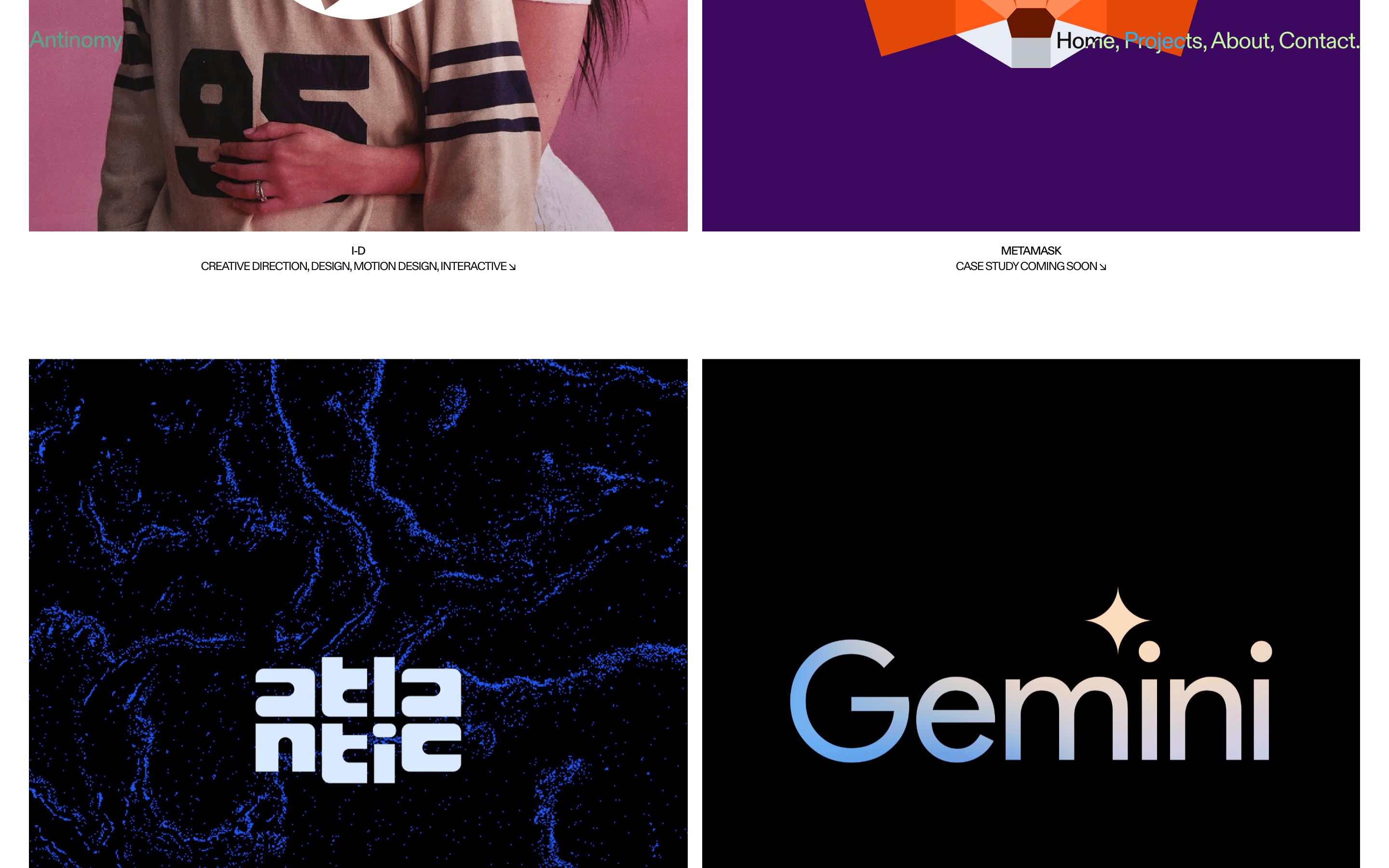
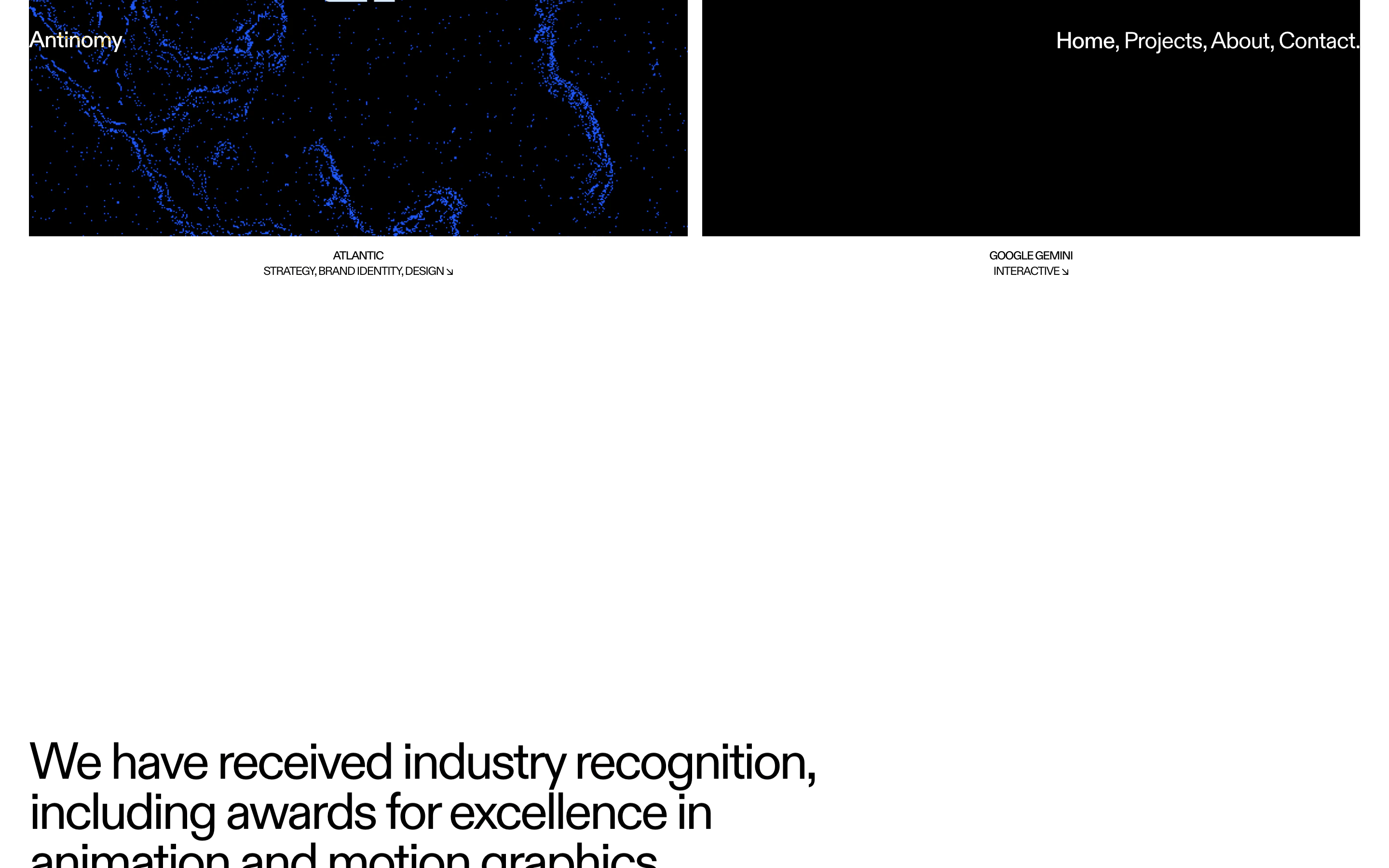
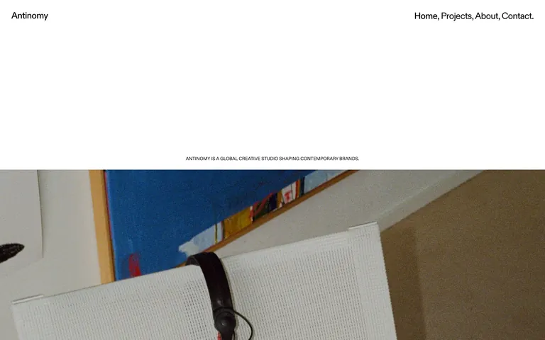
Full-width hero with centered text, followed by a two-column project grid.
07
Motion & Interaction
300ms micro
400ms small
800ms medium
cubic-bezier(0.19, 1, 0.22, 1) easing
Fade-in opacity · Smooth transform transitions · Image reveals
Subtle opacity changes or cursor updates. · Immediate navigation to project pages.
08
Components
button Minimal or absent; interactions are primarily link-based. card Edge-to-edge project images with centered uppercase text below. hero Large, centered typography on white background, transitioning into a full-width hero image. 09
Voice & Don'ts
Tone Authoritative, professional, and understated. Headlines Large, centered, sentence-case statements. CTAs Invisible or plain text links. Don't use rounded corners — the site uses sharp, 0px radius edges. Don't use drop shadows — the UI is entirely flat with no depth effects. Don't use complex background colors — the site relies almost exclusively on solid white. Don't use decorative fonts — the system uses a single geometric sans-serif family. Don't clutter the layout — the design prioritizes massive amounts of negative space. Don't use multi-colored buttons — there are no visible high-chroma UI components. Avoid: Visual clutter Avoid: Rounded UI elements Avoid: Complex gradients Avoid: Loud color palettes 10
Inside the pack — real screenshots
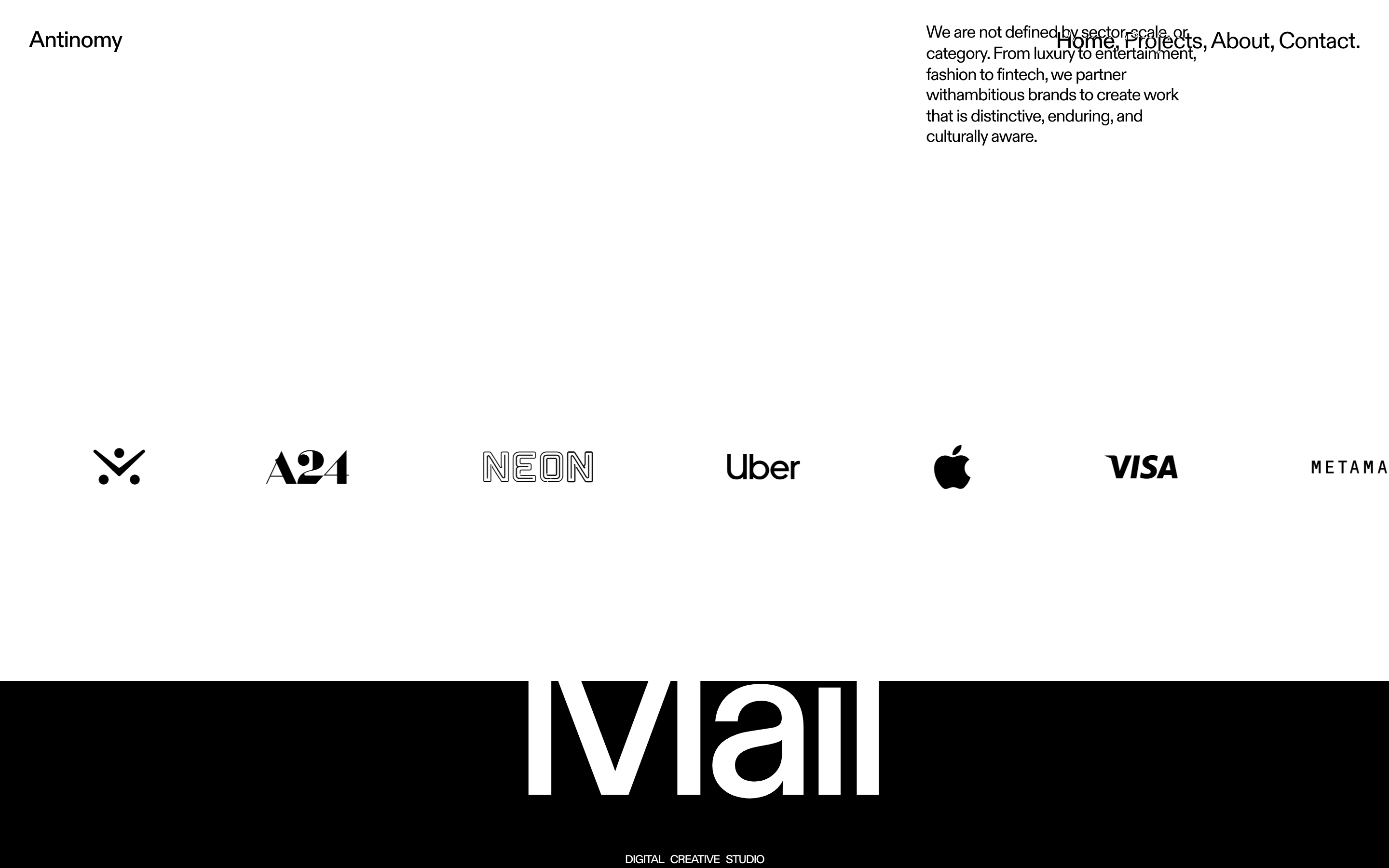
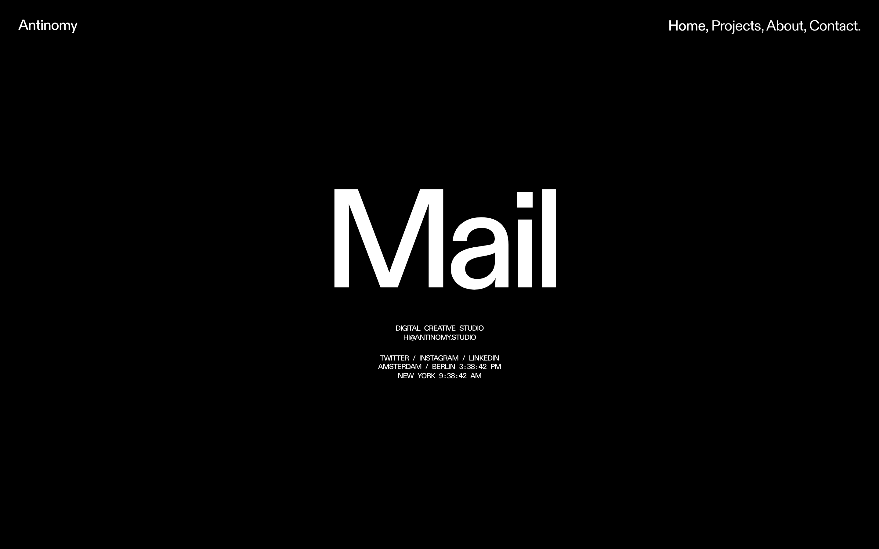
桌面首屏(hero) 桌面滚动分段(90% viewport 步进,作为视觉证据) 桌面滚动分段(90% viewport 步进,作为视觉证据) 桌面滚动分段(90% viewport 步进,作为视觉证据) 桌面滚动分段(90% viewport 步进,作为视觉证据) 桌面滚动分段(90% viewport 步进,作为视觉证据) 桌面滚动分段(90% viewport 步进,作为视觉证据) 桌面滚动分段(90% viewport 步进,作为视觉证据) 桌面滚动分段(90% viewport 步进,作为视觉证据) 桌面滚动分段(90% viewport 步进,作为视觉证据) 移动首屏 Captured from the live site · real computed styles
11
System prompt
This is a portfolio site for Antinomy, a global creative studio. It uses a highly refined, minimalist aesthetic centered on a single geometric sans-serif font (ABC Diatype) and a strict black-and-white color palette (#000000 ink on #FFFFFF background). The layout is characterized by massive negative space, centered display typography with heavy negative letter-spacing, and full-bleed project photography. Key critical donts: never use rounded corners, never add drop shadows, and never introduce complex background colors. The site is a masterclass in restraint and typography-led design.
More from the library en · zh-CN · zh-TW · ja · ko
OpenDesign · curated web aesthetics for AI-readable design DNA · opendesign.cc
Why we curated this: This site is worth including as a premier example of 'restrained' agency portfolio design, where typography and whitespace are the primary tools for establishing authority and a premium brand identity.
浙ICP备2021038972号-5