A curated gallery of design work in a refined, typographically-driven space.
02
Color
#000000Ink
#949494Ink soft
#FFFFFFBG
#EEEEEEBG quiet
rgba(0,0,0,1)Line
Strict monochrome palette prioritizing maximum contrast and neutral presentation for the work.
03
Typography
transitional-serif
display56px · 500
body16px · 450
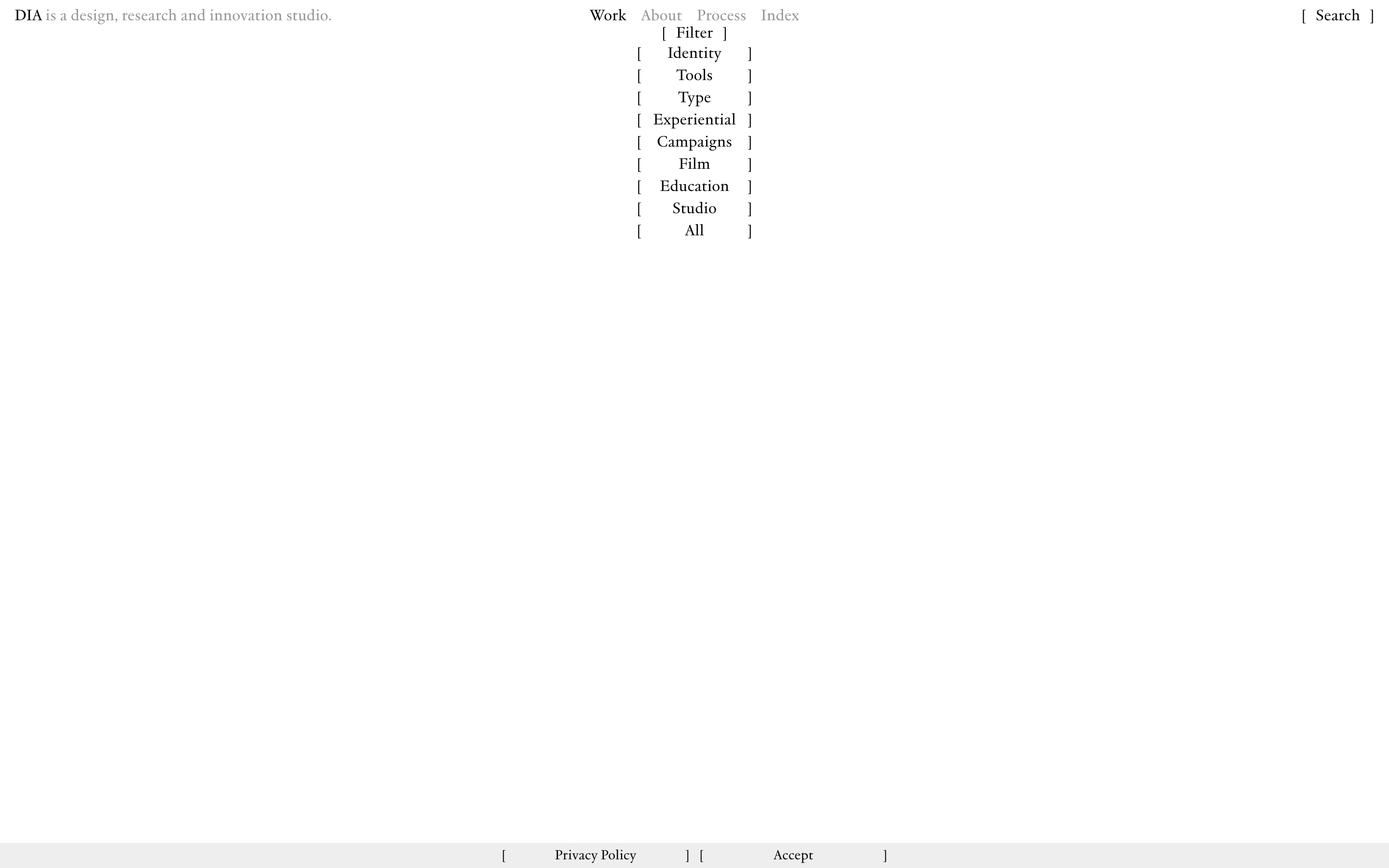
Use a serif typeface (JJannon) for all UI elements. · Maintain tight line-heights (approx 1.1) for a compact, dense typographic feel. · Use square brackets as standard UI delimiters for actions and filters.
04
Spacing
4px
8px
16px
24px
32px
48px
64px
96px
Tight, grid-aligned spacing with minimal vertical padding, prioritizing density.
05
Surfaces
sm · 0px
md · 0px
lg · 0px
pill · 0px
No visible UI borders; separation is achieved through whitespace, color contrast, and grid alignment.
06
Layout
1440container
12columns
16pxgutter
768 / 1024breakpoints
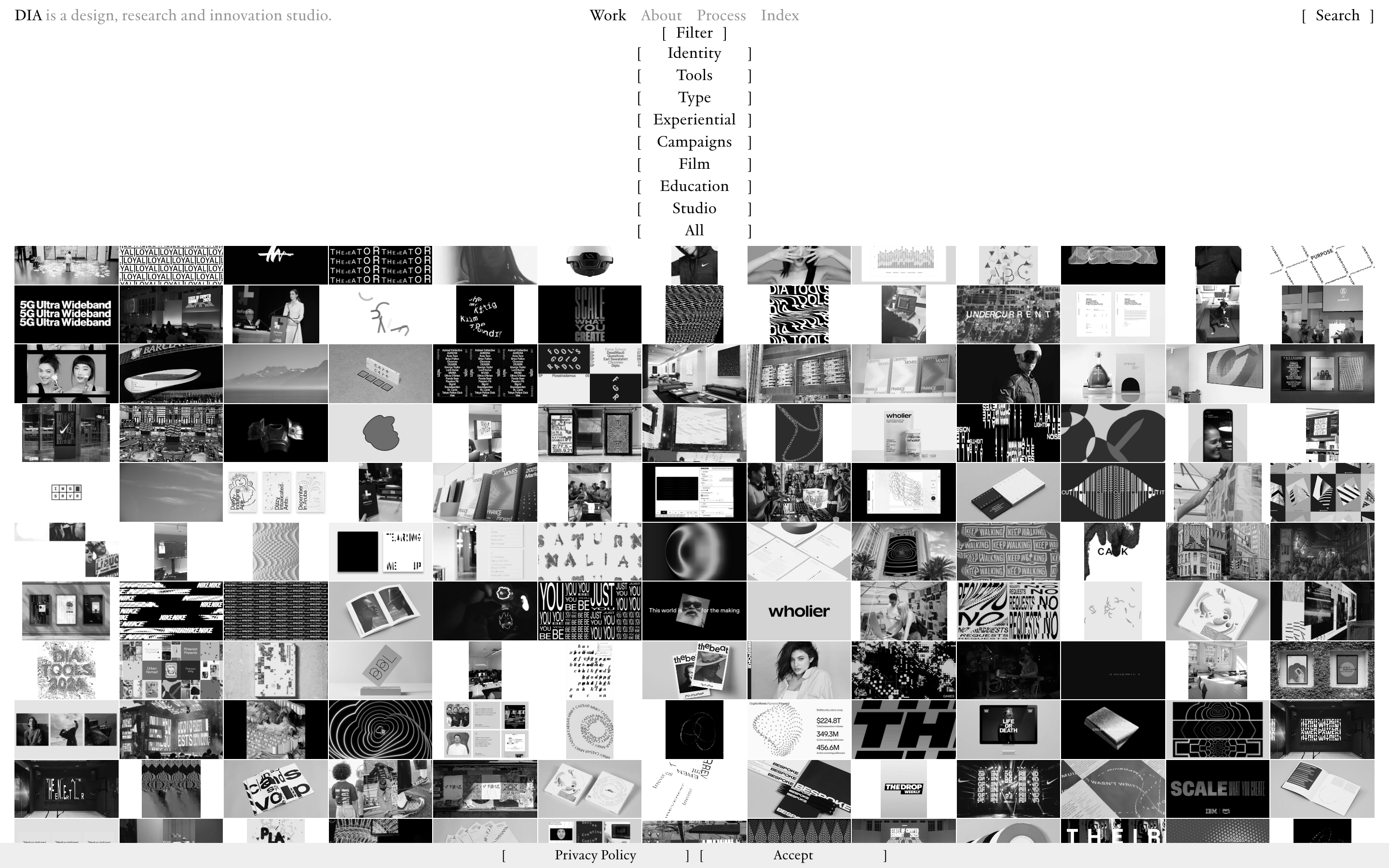
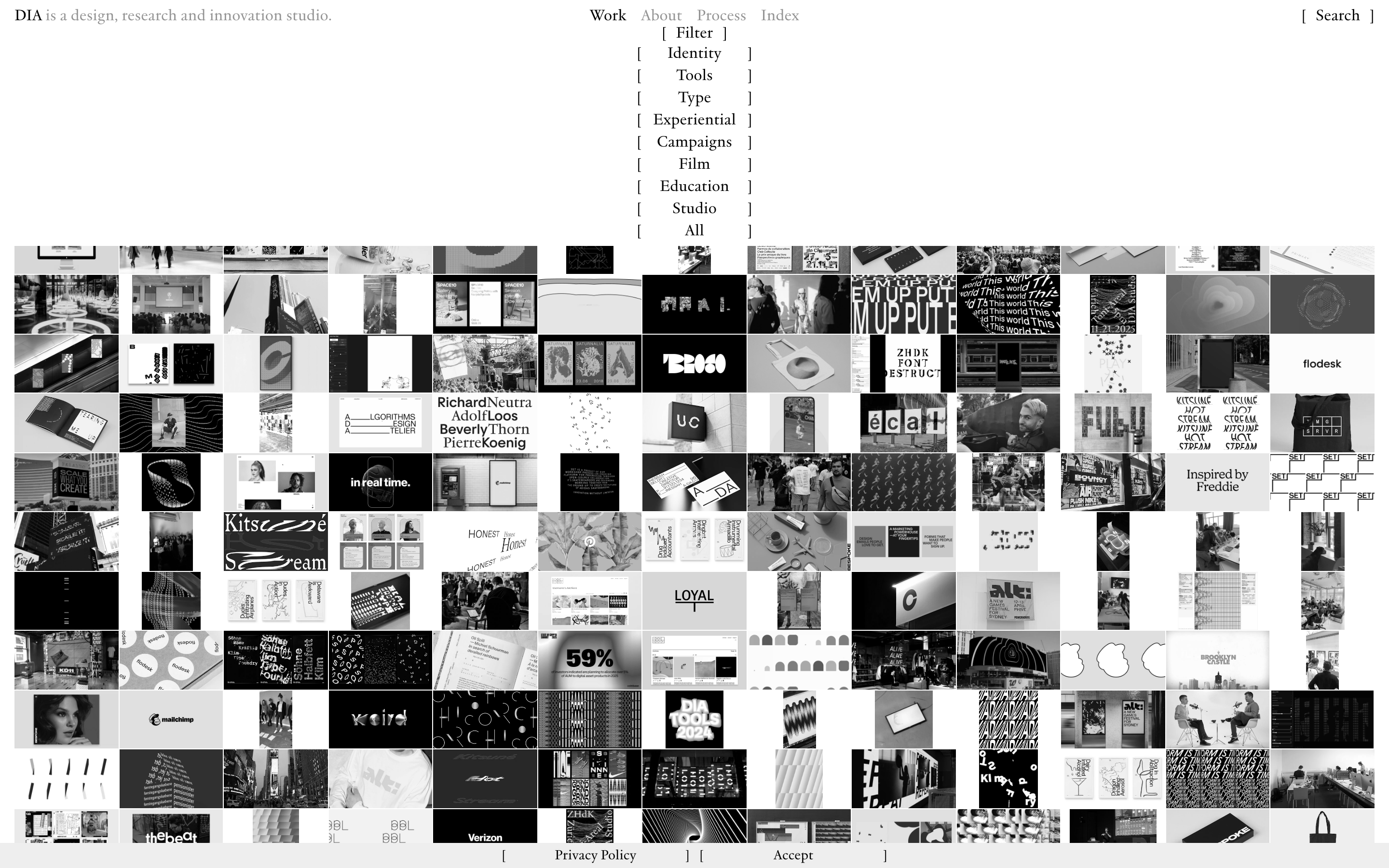
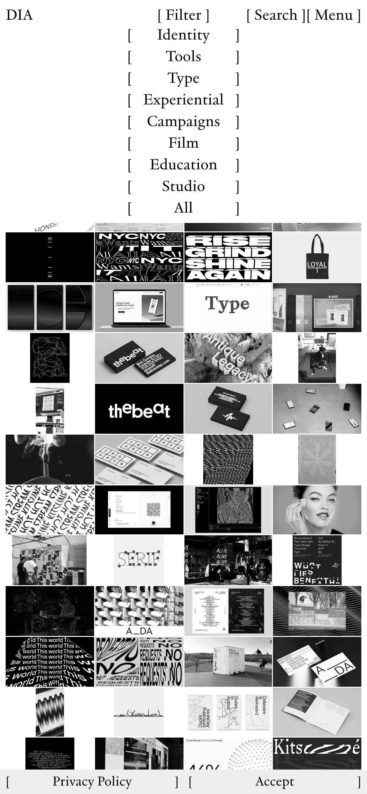
A strict, dense masonry grid layout with images of varying aspect ratios fitted tightly together.
07
Motion & Interaction
0msmicro
200mssmall
0msmedium
cubic-bezier(0.25, 0.1, 0.25, 1)easing
opacity fade on hover for gallery items
Subtle opacity change on image thumbnails to indicate interactivity. · Direct navigation to project pages or category views.
08
Components
buttonNo traditional buttons; interactions are handled via plain text links enclosed in square brackets.
cardProject cards are purely photographic thumbnails presented in a dense, borderless grid without overlays.
chipCategory filters are text-based list items enclosed in square brackets.
inputSearch is represented by a simple text prompt enclosed in square brackets.
heroThe hero section is not a single large image, but rather a continuous, unbroken mosaic grid of work extending from the top of the viewport.
09
Voice & Don'ts
ToneProfessional, confident, and reserved.
HeadlinesDeclarative and direct, using a classic serif font.
CTAsSubtle and typographic, using square brackets instead of traditional buttons.
Don't use rounded corners — the UI is strictly sharp and rectangular.
Don't use a strong accent color — the site relies entirely on a monochrome palette.
Don't use button components — interactions are text links in square brackets.
Don't use drop shadows — the UI is completely flat.
Don't use sans-serif typography — the site is strictly serif-based.
Don't create a masonry grid with large vertical gaps — the grid is tightly packed.
Captured from the live site · real computed styles
11
System prompt
This site is a design studio portfolio using a strict monochrome palette (#000000 ink on #FFFFFF and #EEEEEE backgrounds). The typography is exclusively transitional serif (JJannon) with tight line-heights. The layout is a dense, borderless masonry grid of photographic work. Interactions use square-bracketed text links rather than traditional buttons. Key hex colors are #000000 for text/borders and #FFFFFF for the background. Critical donts: avoid any rounded corners, never use sans-serif fonts, and do not introduce any accent colors. The design prioritizes a refined, editorial feel that lets the work speak for itself through high contrast and a grid-based structure.
Bring this taste to your agent
Hand your AI agent a machine-readable spec of this design — tokens, type, motion, the whole DNA.