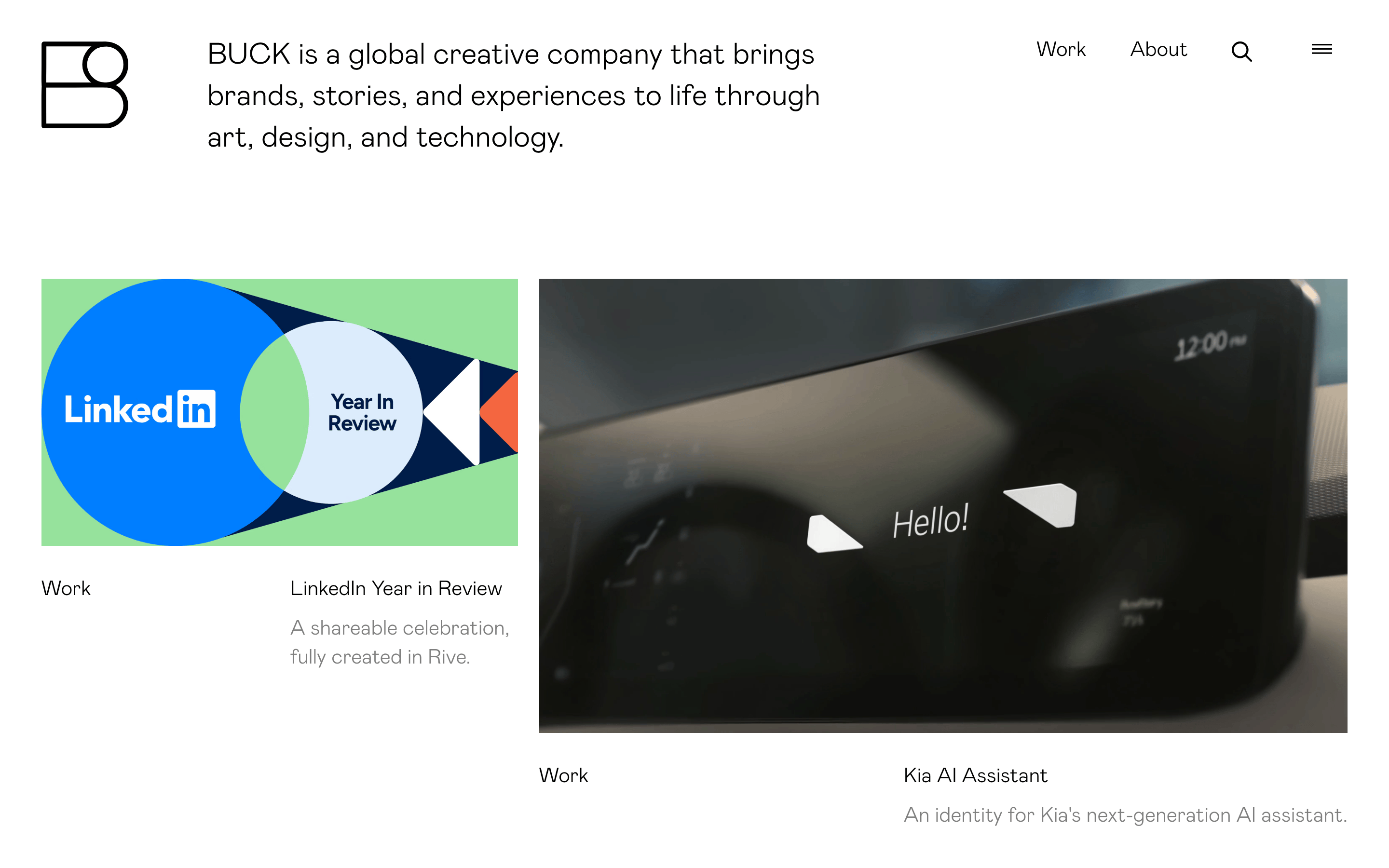
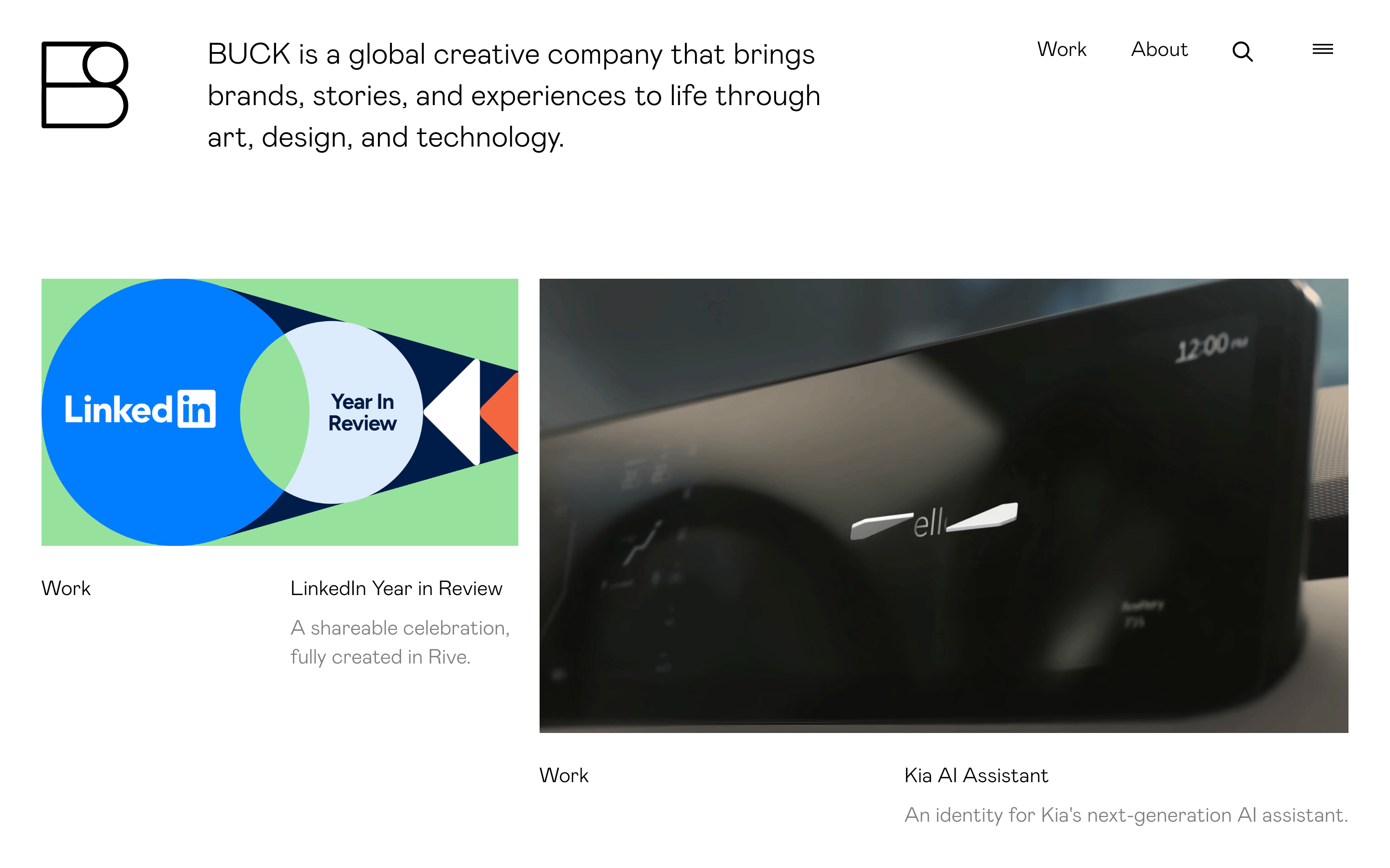
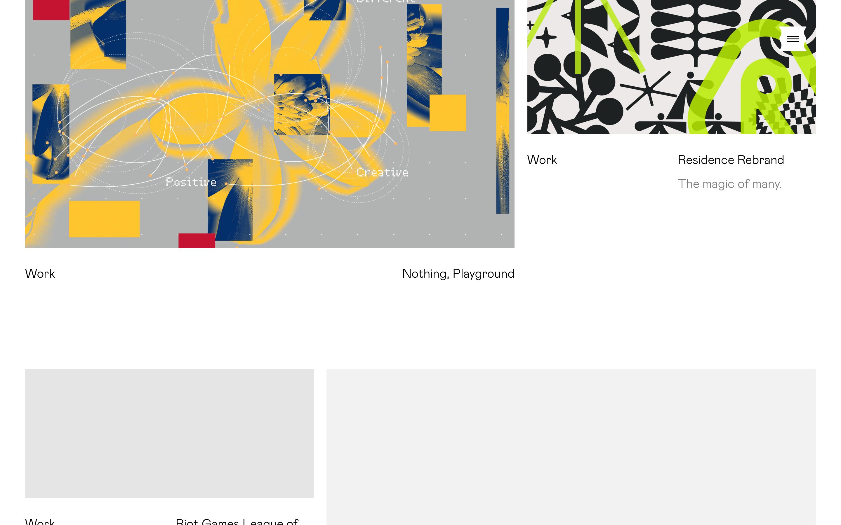
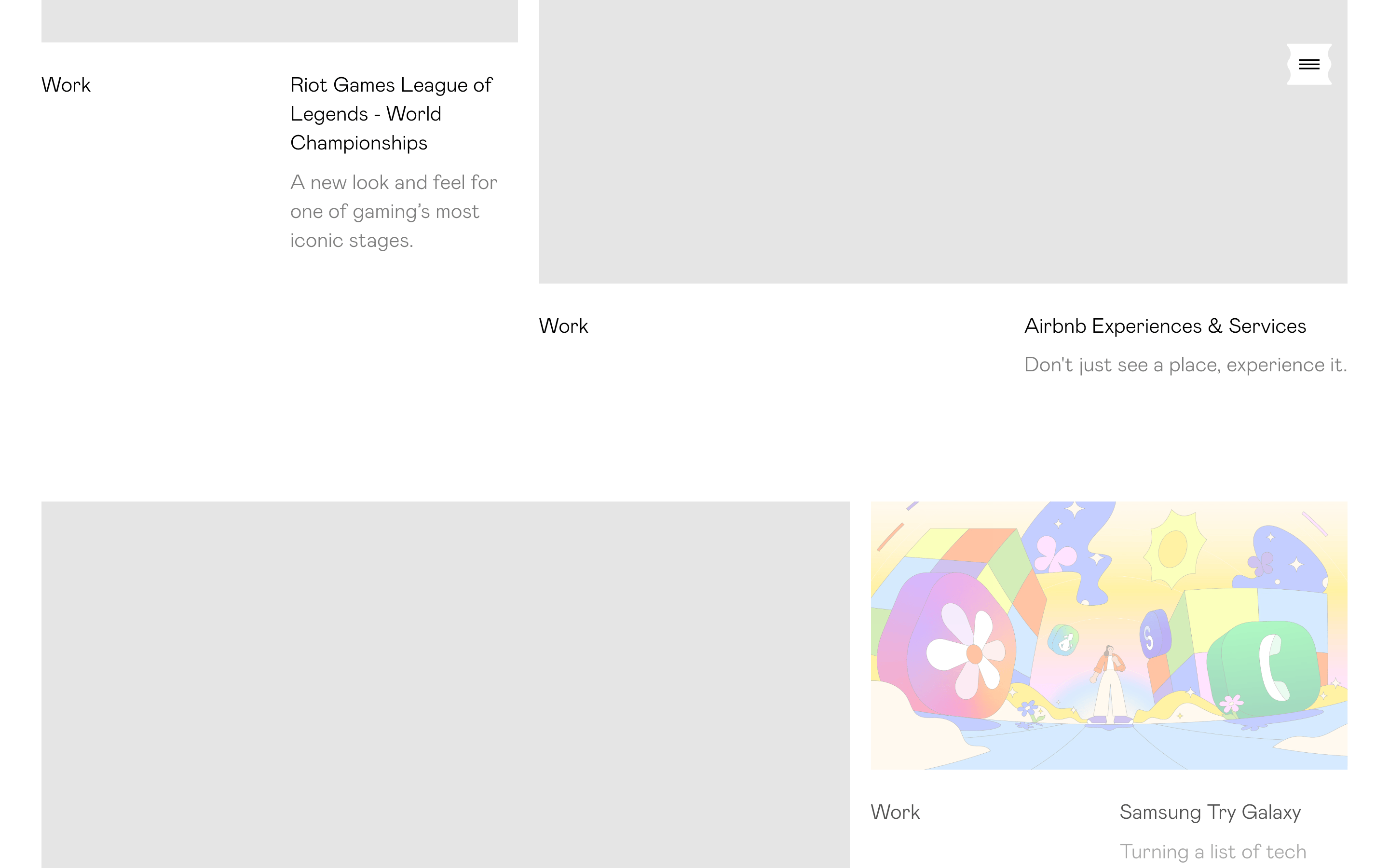
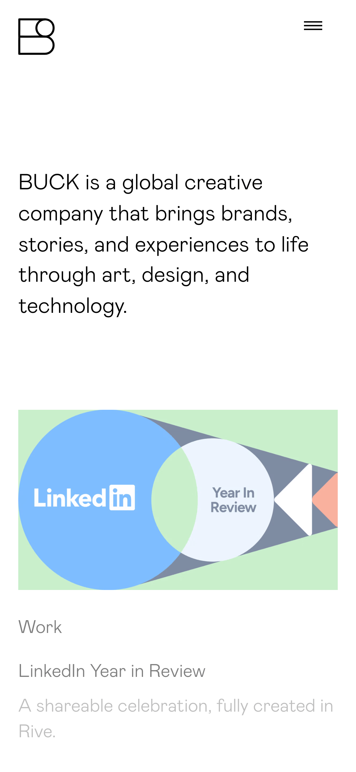
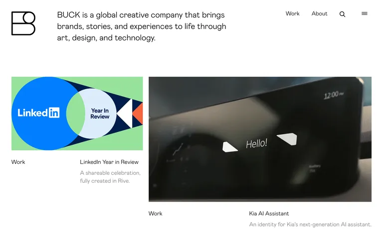
A high-end creative agency portfolio showcasing large-scale motion and brand work.
02
Color
#F4C054Accent
#000000Ink
#FFFFFFBG
#F2F4F8BG soft
#9CA3AFMuted
rgba(226, 232, 240, 1)Line
Extreme minimalism with a strict black-and-white canvas, using vibrant project imagery as the only source of color.
03
Typography
geometric-sans · monospace
display50px · 100
body21px · 100
The primary typeface (Mabry) is used exclusively across all elements. · Headings and body text both utilize an ultra-light weight (100). · Text transforms to uppercase are frequently applied for project categories.
04
Spacing
4px
8px
16px
24px
32px
48px
64px
96px
Asymmetric, with large generous padding around project thumbnails and a clear vertical flow.
05
Surfaces
sm · 0px
md · 0px
lg · 0px
pill · 9999px
Extremely thin 1px solid borders used sparingly, primarily for structural separators or interactive elements.
06
Layout
1440container
12columns
24pxgutter
768 / 1024breakpoints
A loose, masonry-like grid where project cards of varying sizes are placed with wide gutters.
07
Motion & Interaction
200msmicro
300mssmall
750msmedium
cubic-bezier(0.4, 0, 0.2, 1)easing
Smooth transitions on background-color changes. · Subtle hover effects on project cards. · Staggered reveal of grid items on scroll.
Subtle background-color shifts or slight opacity changes on project thumbnails. · Direct navigation to project case studies, often with a smooth page transition.
08
Components
buttonMinimalist text-based buttons, often in uppercase, relying on thin weights for elegance.
cardA clean container holding a large full-bleed image followed by structured text metadata (Category, Title, Description).
chipUppercase text labels used to categorize work without traditional box or pill styling.
inputSearch functionality likely uses a minimalist icon-triggered input or full-screen overlay.
heroA bold, large-scale typography block that states the company's mission in a single continuous flow.
09
Voice & Don'ts
ToneProfessional, authoritative, yet understated.
HeadlinesUltra-light, large-scale sans-serif type that conveys confidence through simplicity.
CTAsMinimalist, relying on navigation links rather than prominent call-to-action buttons.
Don't use bold weights for headings — screenshot shows ultra-light (100) weights for all primary text.
Don't add drop shadows to project cards — screenshot shows completely flat, clean surfaces.
Don't use a colorful background — screenshot shows a strictly pure white (#FFFFFF) canvas.
Don't use rounded corners on containers — screenshot shows sharp, rectangular thumbnails.
Don't use decorative borders — screenshot shows clear separation through whitespace and minimal line weight.
Don't use complex, multi-layered grid layouts — screenshot shows a relatively simple, staggered 2-column flow.
Avoid: Heavy, bold typefaces for body copy.
Avoid: Cluttered layouts or dense paragraphs.
Avoid: Decorative flourishes or unnecessary borders.
Captured from the live site · real computed styles
11
System prompt
BUCK is a global creative agency portfolio. The design DNA is extreme minimalism, utilizing a pure white (#FFFFFF) background and black (#000000) text to ensure the vibrant project imagery is the focal point. Typography is a clean geometric-sans (Mabry) used consistently at an ultra-light weight (100), creating a sophisticated, airy feel. Key colors are limited to the site's stark black-and-white contrast, with a singular warm gold accent (#F4C054) occasionally used for highlights. Critical constraints: do not use bold font weights for headlines, do not add shadows or complex borders to cards, and do not use multi-column text layouts; always prioritize generous whitespace and let the work speak for itself.
Bring this taste to your agent
Hand your AI agent a machine-readable spec of this design — tokens, type, motion, the whole DNA.