a digital Swiss vault for your notes and workflows
02
Color
#000000Ink
#666666Ink soft
#FFFFFFBG
#FFF2D2BG soft
#FFBCC3BG quiet
#808080Muted
rgba(0,0,0,0.1)Line
High-contrast black and white foundation with a single warm gradient and a distinct serif highlight for emphasis.
03
Typography
humanist-sans · monospace
display76px · 300
display-emphasis76px · 400
h224px · 500
body18px · 400
small14px · 400
Use the italicized serif for stylistic emphasis within the hero section only. · Maintain a strict black and white primary text hierarchy. · Use generous negative tracking for large display typography.
04
Spacing
4px
8px
16px
24px
32px
48px
64px
80px
96px
120px
80px vertical rhythm between major sections
05
Surfaces
sm · 6px
md · 16px
lg · 16px
pill · 100px
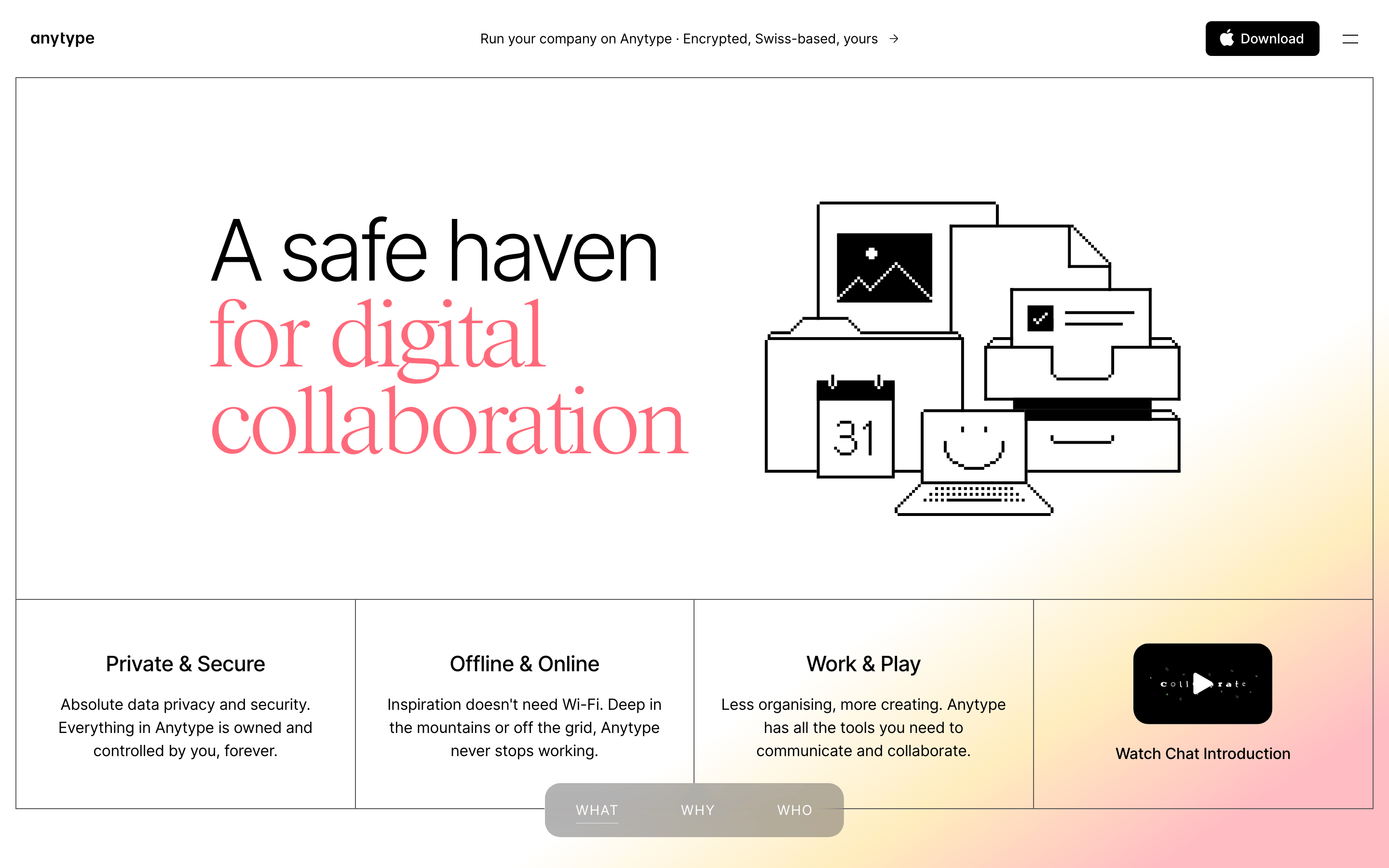
Thin black outlines (1px) defining grid cells and a hero container with rounded corners
06
Layout
1280container
12columns
24pxgutter
768 / 1024breakpoints
Large hero section followed by a three-column grid of features, separated by a subtle grid system.
07
Motion & Interaction
150msmicro
500mssmall
1000msmedium
cubic-bezier(0.4, 0, 0.2, 1)easing
Smooth opacity transitions for overlays and element fades. · Standard cubic-bezier easing for background color and border changes. · Longer duration (1s) for specific decorative or hero elements.
Subtle color or opacity transitions. · Standard cursor pointer interaction for buttons and links.
08
Components
buttonPill-shaped buttons with solid black backgrounds and white text, or transparent backgrounds with black text.
cardText-heavy feature cards separated by a 1px black grid layout.
chipFloating pill navigation at the bottom center with a semi-transparent background and blurred effect.
inputStandard text fields with minimal styling.
heroA large bordered container with massive typography on the left and a black-and-white line art illustration on the right.
09
Voice & Don'ts
ToneDirect, reassuring, and focused on user control and privacy.
HeadlinesLarge, impactful statements with occasional serif italics for warmth.
CTAsClear, action-oriented text inside high-contrast pill buttons.
don't use multiple bright accent colors — the screenshot shows a predominantly black, white, and muted gradient palette
don't use heavy drop shadows or glows — the screenshot shows flat, outlined elements with no shadows
don't use a dense, cramped layout — the screenshot shows generous whitespace and a clear grid structure
don't use thick, rounded containers — the screenshot shows thin (1px) black borders for most sections
don't use an all-serif typography system — the screenshot shows a sans-serif foundation with serif used only for emphasis
don't use a dark mode as the primary theme — the screenshot shows a white background with black text
Captured from the live site · real computed styles
11
System prompt
This is a clean, privacy-focused productivity app landing page. Use a black and white foundation with a warm, subtle gradient in the hero background. The primary typography is a humanist sans-serif (inter), used with generous negative tracking for headlines, and a serif font for italicized emphasis. The layout is structured and grid-based, using thin black borders to define sections. Maintain high contrast and ample whitespace. Do not use drop shadows, avoid dense layouts, and never use multiple high-chroma accent colors. Focus the design on clarity, sovereignty, and a refined, non-aggressive aesthetic.
Bring this taste to your agent
Hand your AI agent a machine-readable spec of this design — tokens, type, motion, the whole DNA.