Video MessagingProductivityAsync CommunicationEnterprise
A clean, high-trust enterprise dashboard that prioritizes clarity and action.
02
Color
#1868DBAccent
#292A2EInk
#FFFFFFBG
#E9F2FEBG quiet
#101214Muted
rgba(41,42,46,0.1)Line
Clean, high-contrast palette with a singular, vibrant blue for primary actions.
03
Typography
grotesque-sans · humanist-sans
display64px · 700
heading48px · 700
body18px · 400
Use grotesque-sans for impactful display text and humanist-sans for approachable body copy. · Maintain tight line heights (1.0-1.1) for large headlines to create a dense, modern feel.
04
Spacing
4px
8px
16px
24px
32px
48px
64px
96px
Consistent 4px base with generous vertical spacing (111px) between major sections to ensure breathing room.
05
Surfaces
sm · 4px
md · 8px
lg · 12px
pill · 9999px
Thin, subtle borders using the primary ink color at low opacity.
Centered, single-column layout for hero sections, transitioning to multi-column grids for feature sets.
07
Motion & Interaction
100msmicro
150mssmall
300msmedium
cubic-bezier(0.4, 0, 0.2, 1)easing
Subtle, fast transitions for micro-interactions like hover states and color changes. · Slightly longer transitions for modal or panel reveals.
Immediate color transition on primary buttons and interactive elements using a smooth easing curve. · Subtle scale or opacity shift to provide tactile feedback.
08
Components
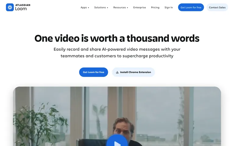
buttonHighly rounded (pill-shaped) primary buttons with bold blue background and white text, contrasted with subtle secondary buttons.
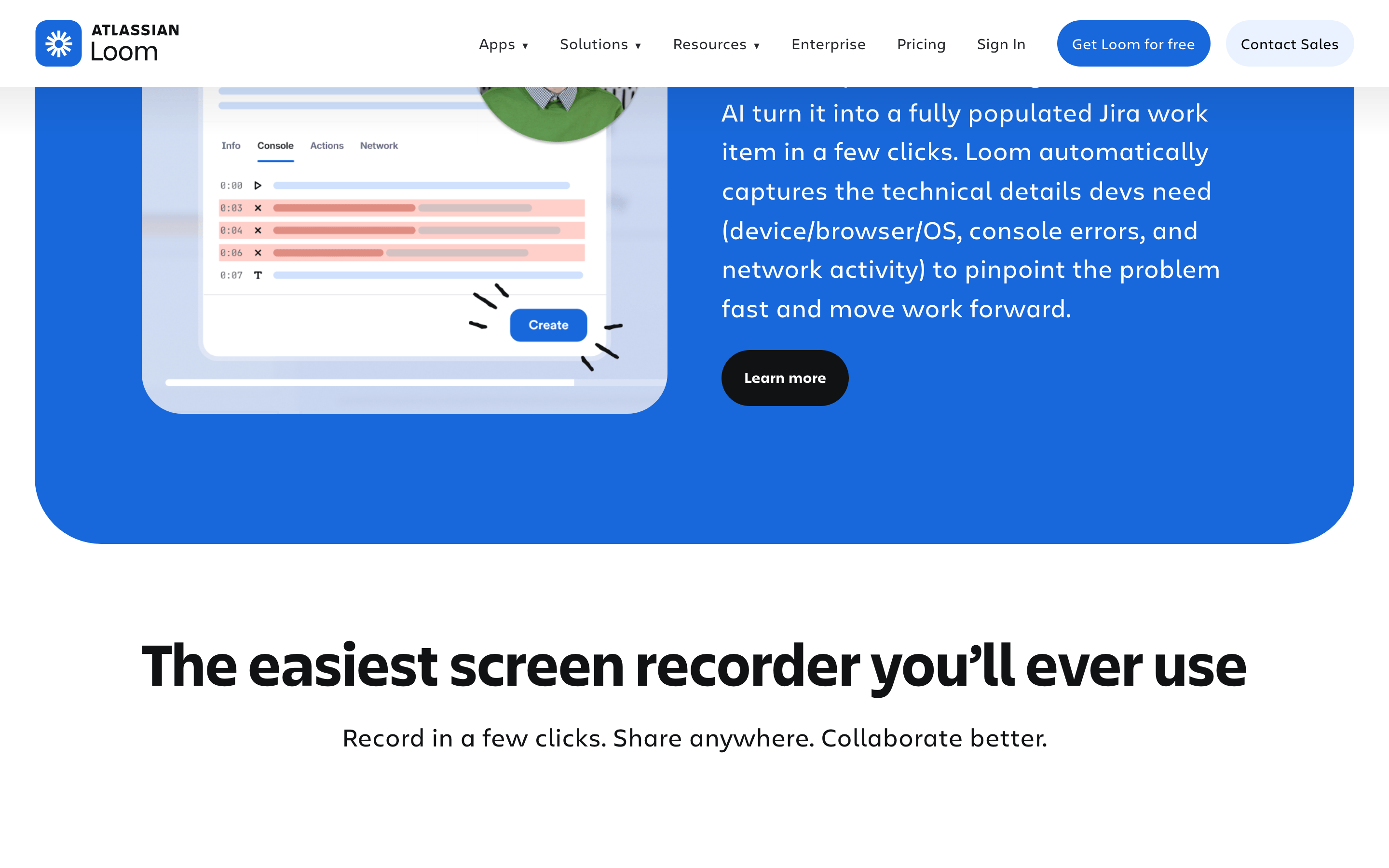
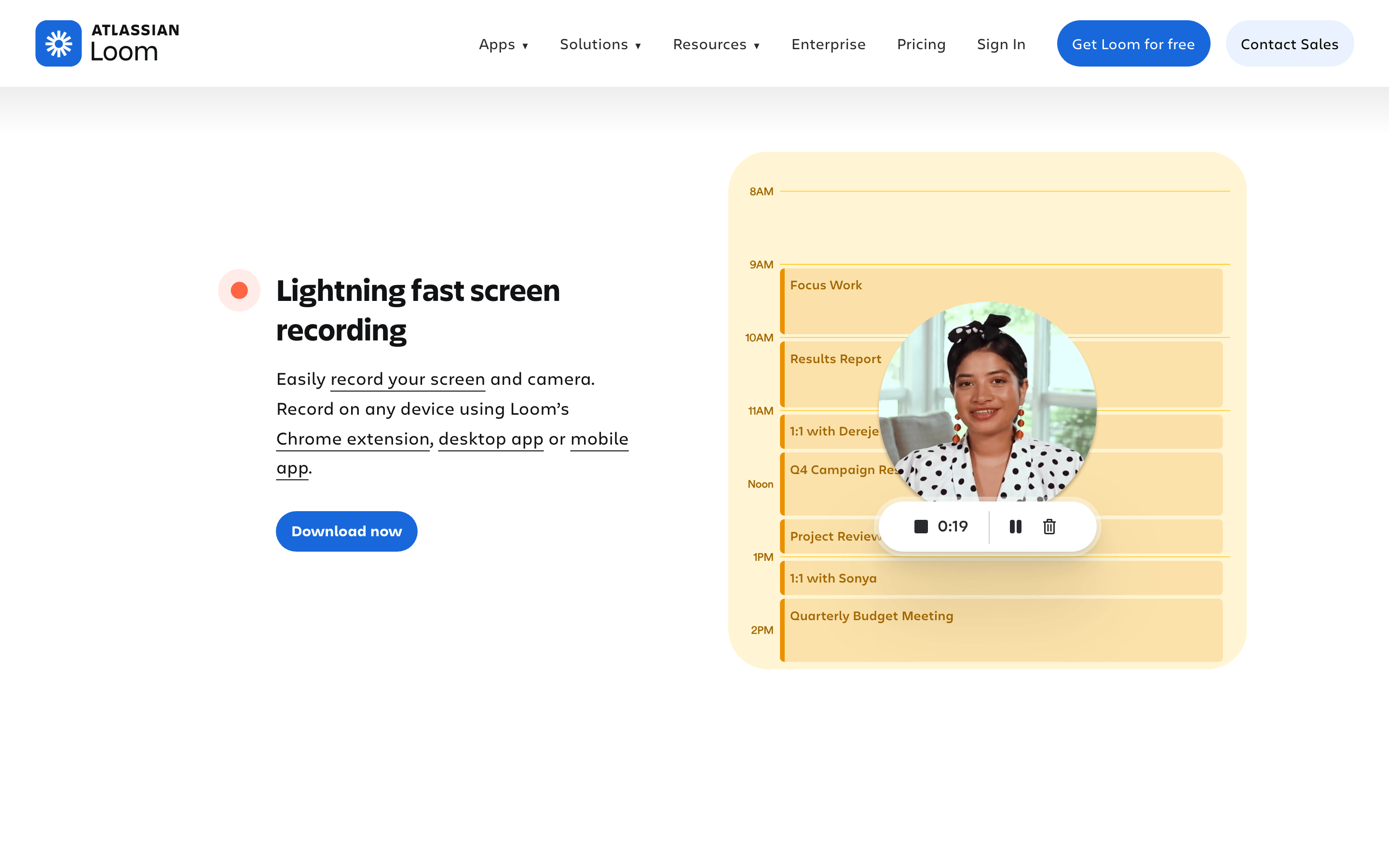
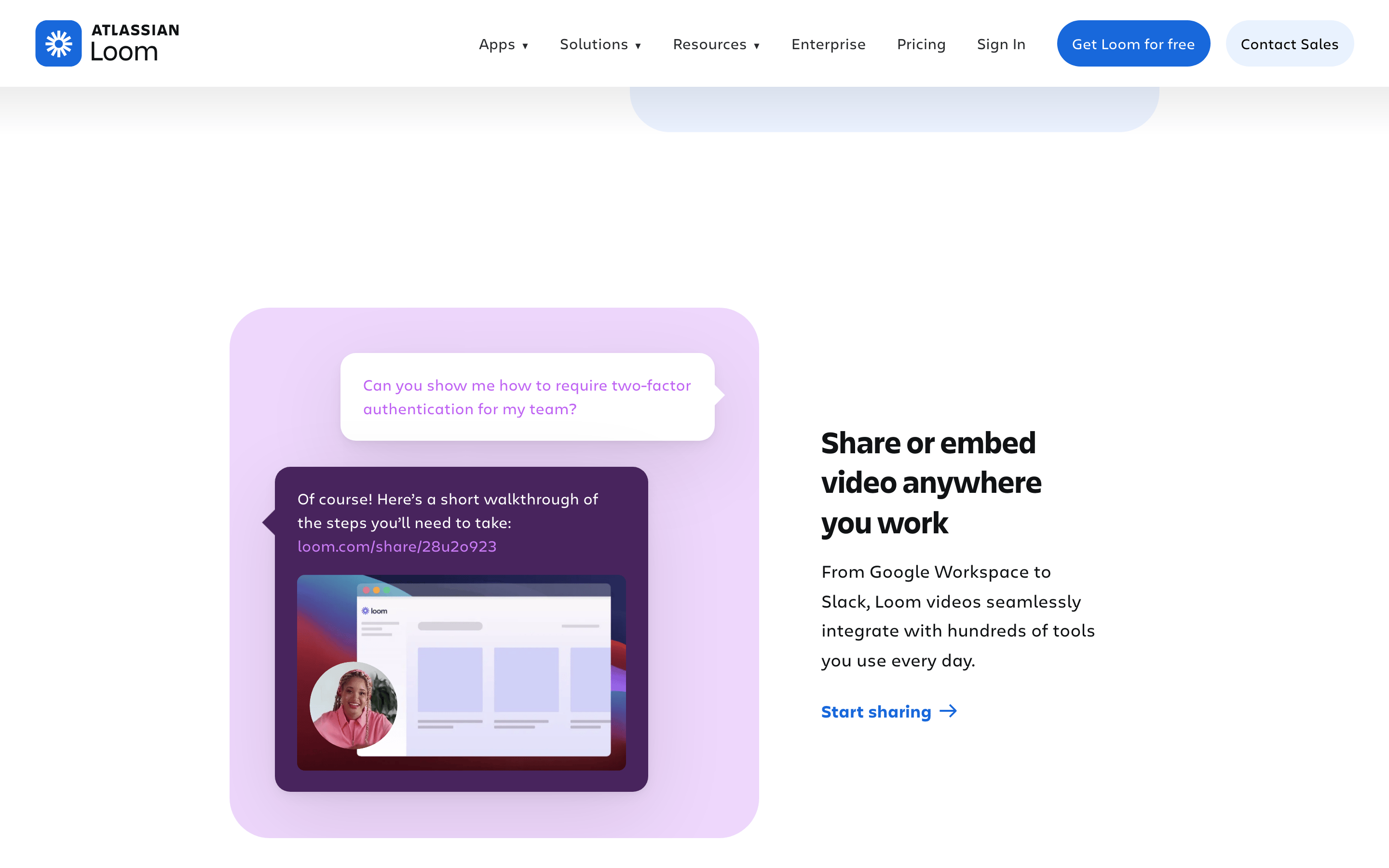
cardLarge, rounded-corner containers used for showcasing features or use cases, often containing imagery and descriptive text.
chipPill-shaped badges or labels used for categorization.
inputClean, bordered input fields with clear labels and sufficient padding.
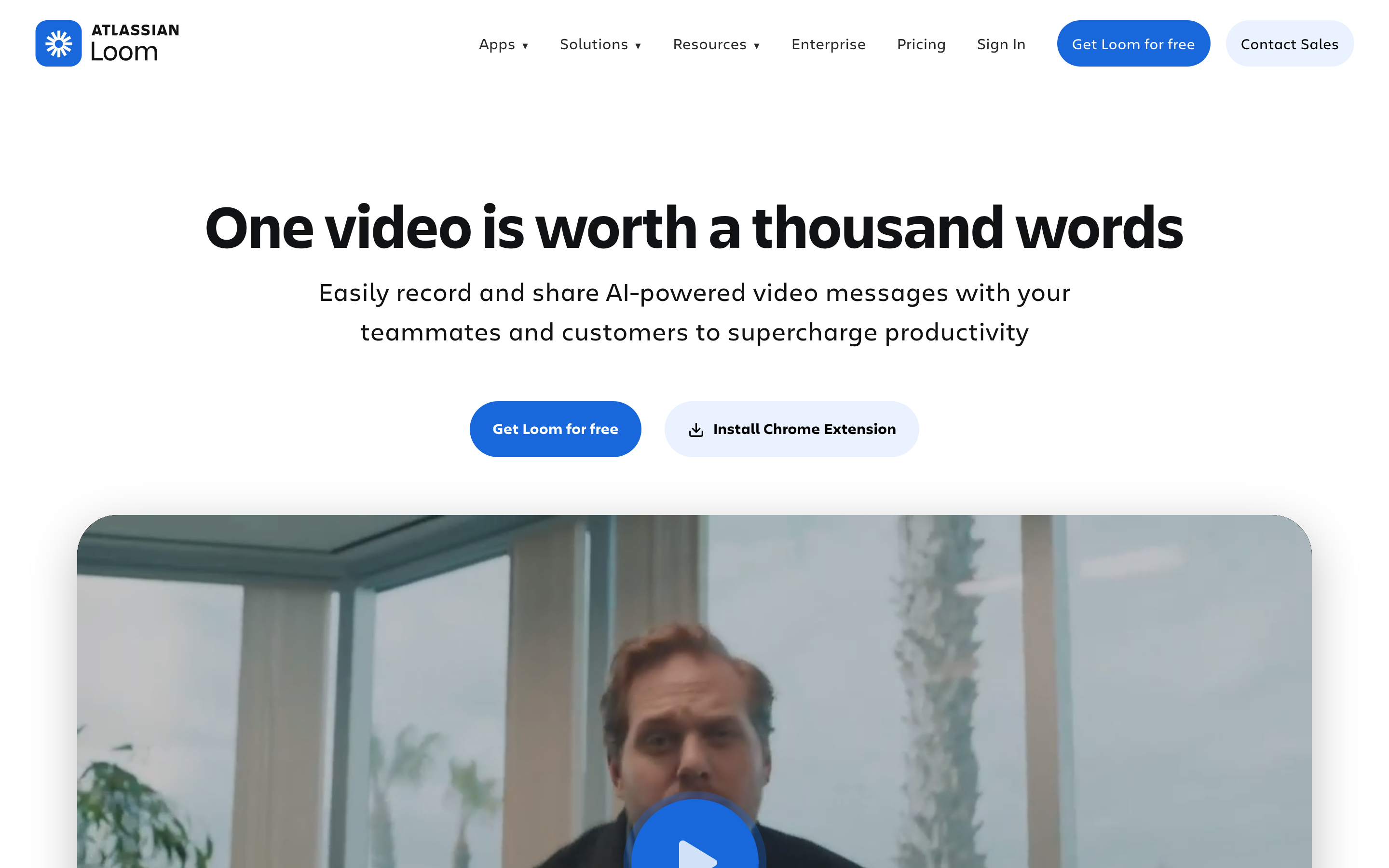
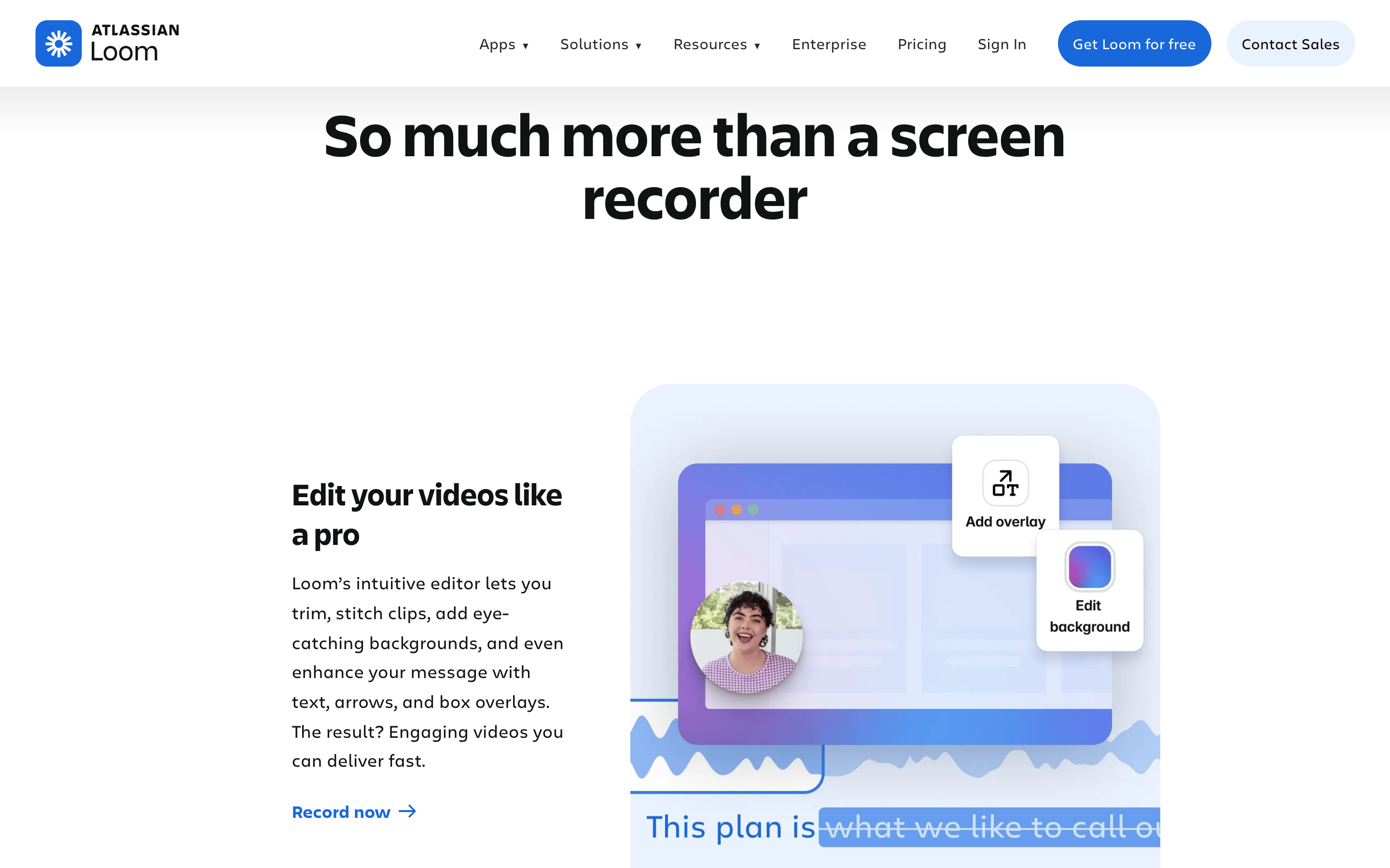
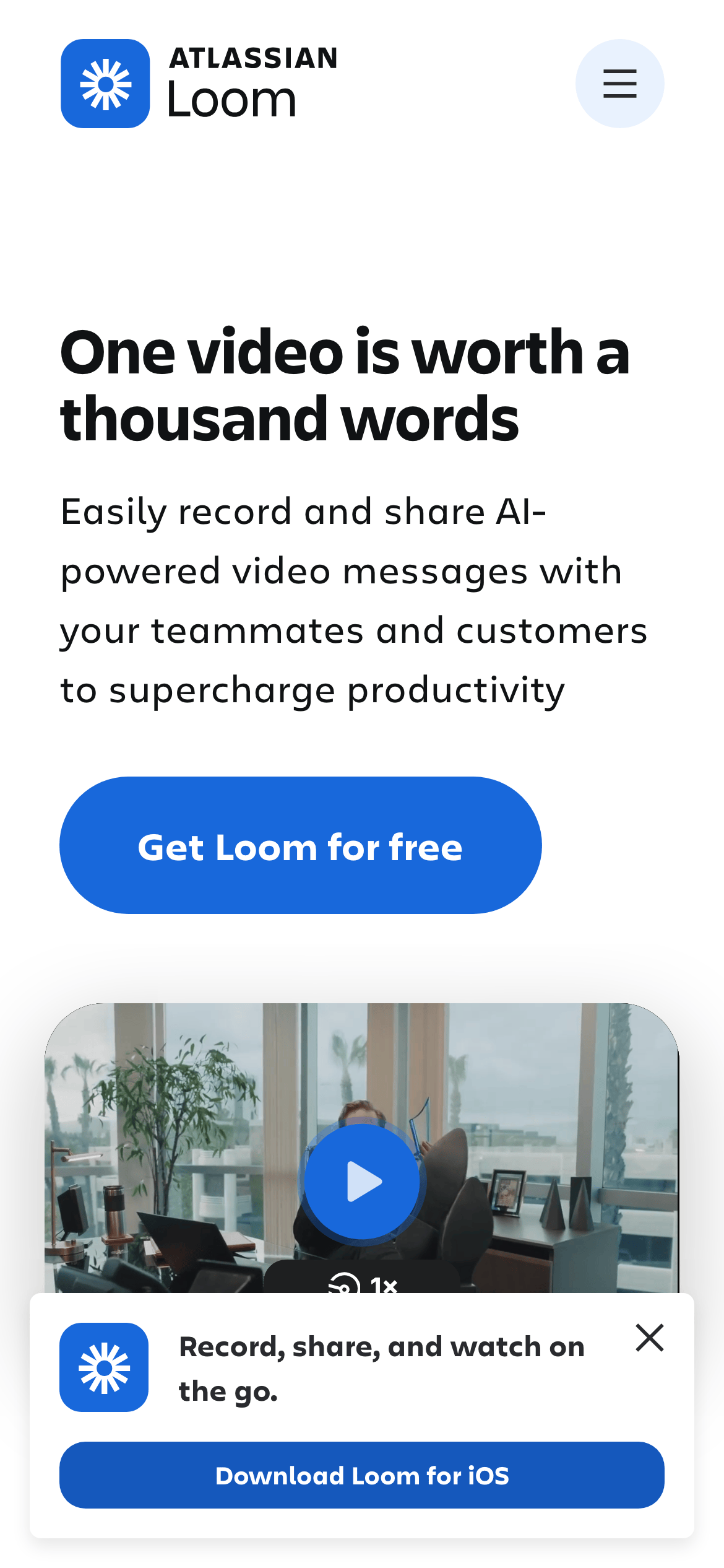
heroA dominant, centered text block with a large headline, supporting paragraph, and primary call-to-action, followed by a wide video or image element.
09
Voice & Don'ts
ToneProfessional, clear, and encouraging, focusing on efficiency and value.
HeadlinesShort, impactful sentences that directly state the benefit or feature.
CTAsAction-oriented verbs (Get, Install, Learn more) in a bold, clear format.
Don't use sharp, rectangular corners on buttons — screenshot shows heavily rounded, pill-shaped buttons.
Don't rely on a complex multi-color palette — screenshot shows a dominant blue accent against a neutral base.
Don't use small, dense text for primary messages — screenshot shows large, bold display type for headlines.
Don't create cluttered layouts with tight spacing — screenshot shows generous vertical gaps between major sections.
Don't use decorative or serif fonts for body copy — screenshot uses clean, modern sans-serif families.
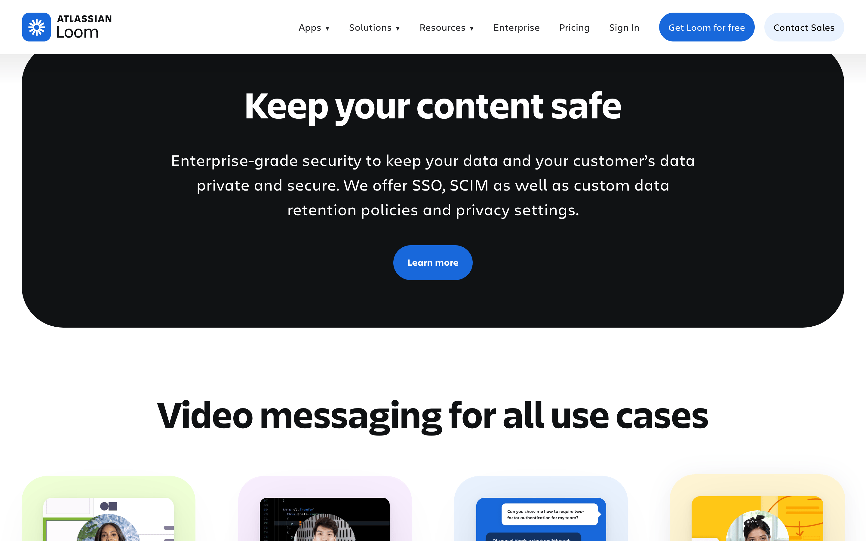
Don't use harsh, dark backgrounds for the entire page — screenshot shows primarily light backgrounds with targeted dark sections.
Captured from the live site · real computed styles
11
System prompt
Loom's design is a clean, high-trust SaaS aesthetic prioritizing clarity and action. It uses a primarily white (#FFFFFF) and light blue (#E9F2FE) background with a dominant, vibrant blue (#1868DB) accent for primary CTAs. Typography features a bold grotesque-sans for display headlines and a clean humanist-sans for body text. Critical donts: avoid sharp corners (pill shapes are used), avoid complex color schemes (keep it minimal), and avoid small text for primary messages (use bold, large display type). The layout is spacious and centered, with subtle shadows and fast, smooth transitions for micro-interactions.
Bring this taste to your agent
Hand your AI agent a machine-readable spec of this design — tokens, type, motion, the whole DNA.