← OpenDesign CURATED · OPEN · FREE
Mem
A clean, warm, and intelligent SaaS landing page for a personal AI-powered note-taking application.
productivity notes
01
Identity DNA
AI-first knowledge management minimalist warm approachable
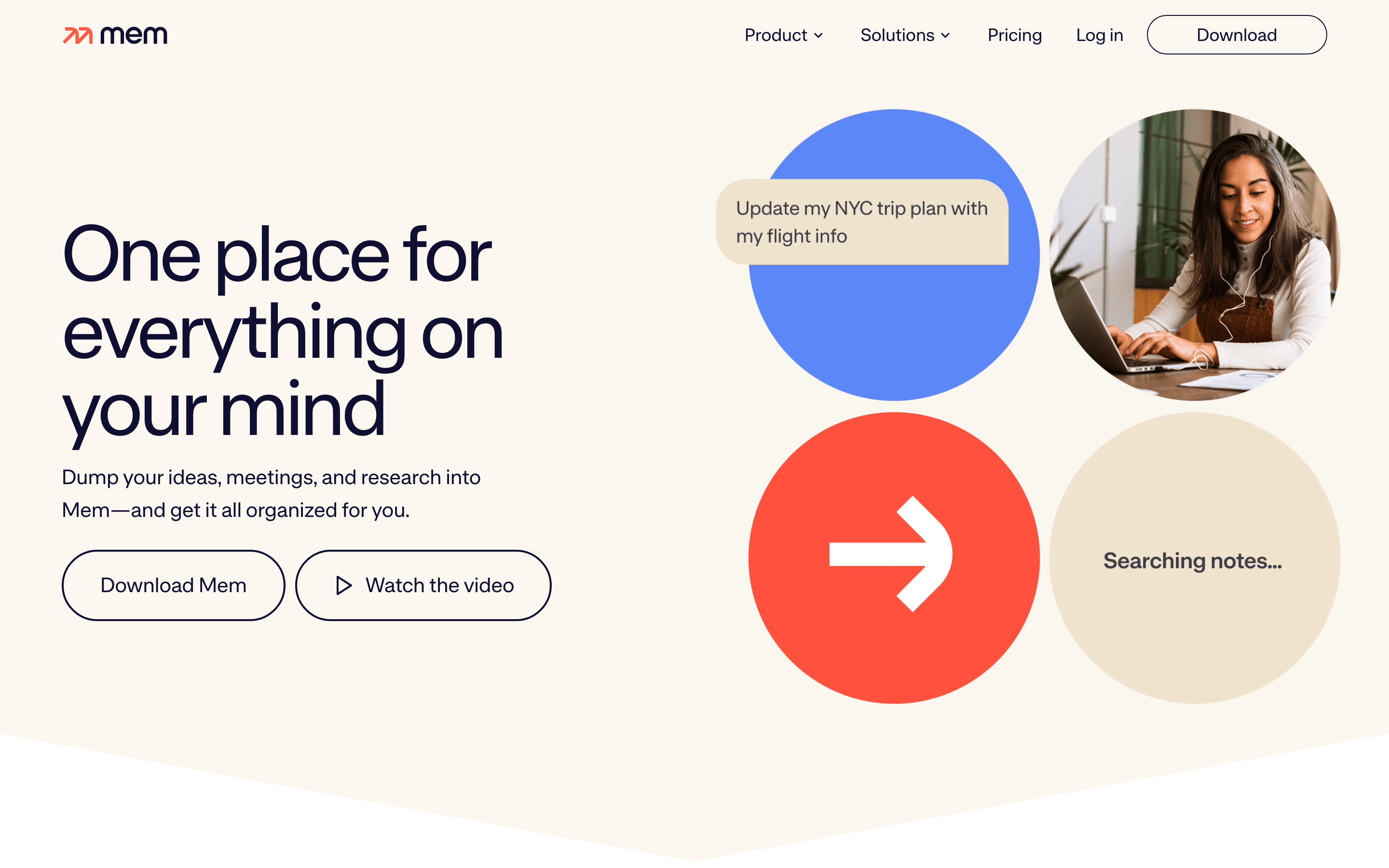
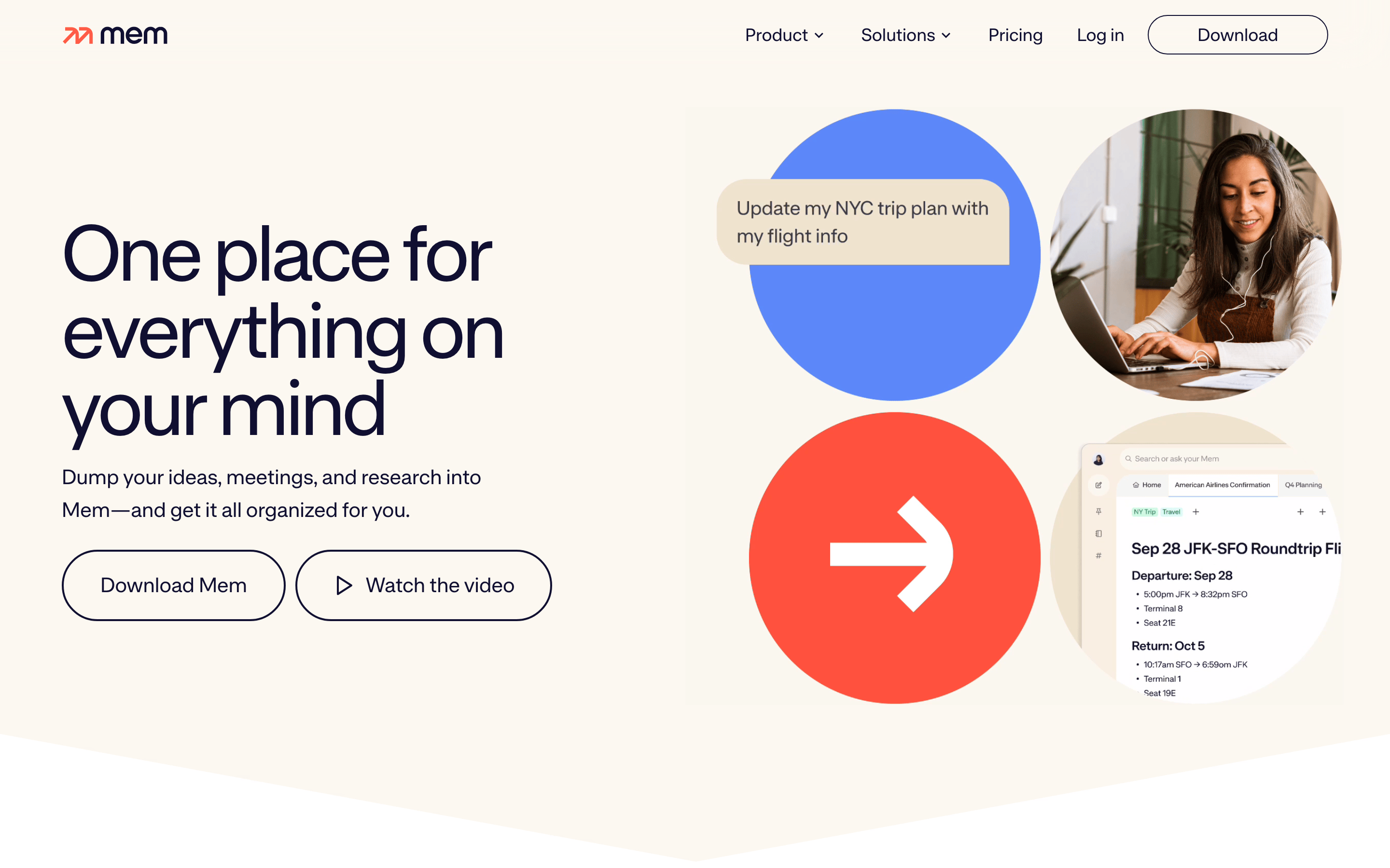
An elegant, warm digital notebook that anticipates your needs.
02
Color
#100F31Ink
#FCF8F1BG
#707070Muted
rgba(16, 15, 49, 0.15)Line
Warm off-white background paired with deep navy typography for a calm, readable experience.
03
Typography
humanist-sans · monospace
display 80px · 400heading 32px · 400body 16px · 40004
Spacing
4px
8px
16px
24px
32px
48px
64px
96px
Consistent vertical rhythm driven by 4px base and generous padding.
05
Surfaces
sm · 4px
md · 8px
lg · 60px
pill · 100px
1px solid #100F31 on primary interactive elements
none
06
Layout
1280 container
12 columns
24px gutter
768 / 1024 breakpoints
Centered container with asymmetric hero layout.
07
Motion & Interaction
220ms micro
400ms small
800ms medium
cubic-bezier(0.25, 0.1, 0.25, 1) easing
smooth transitions
Subtle opacity or color shift on hover. · Immediate visual feedback.
08
Components
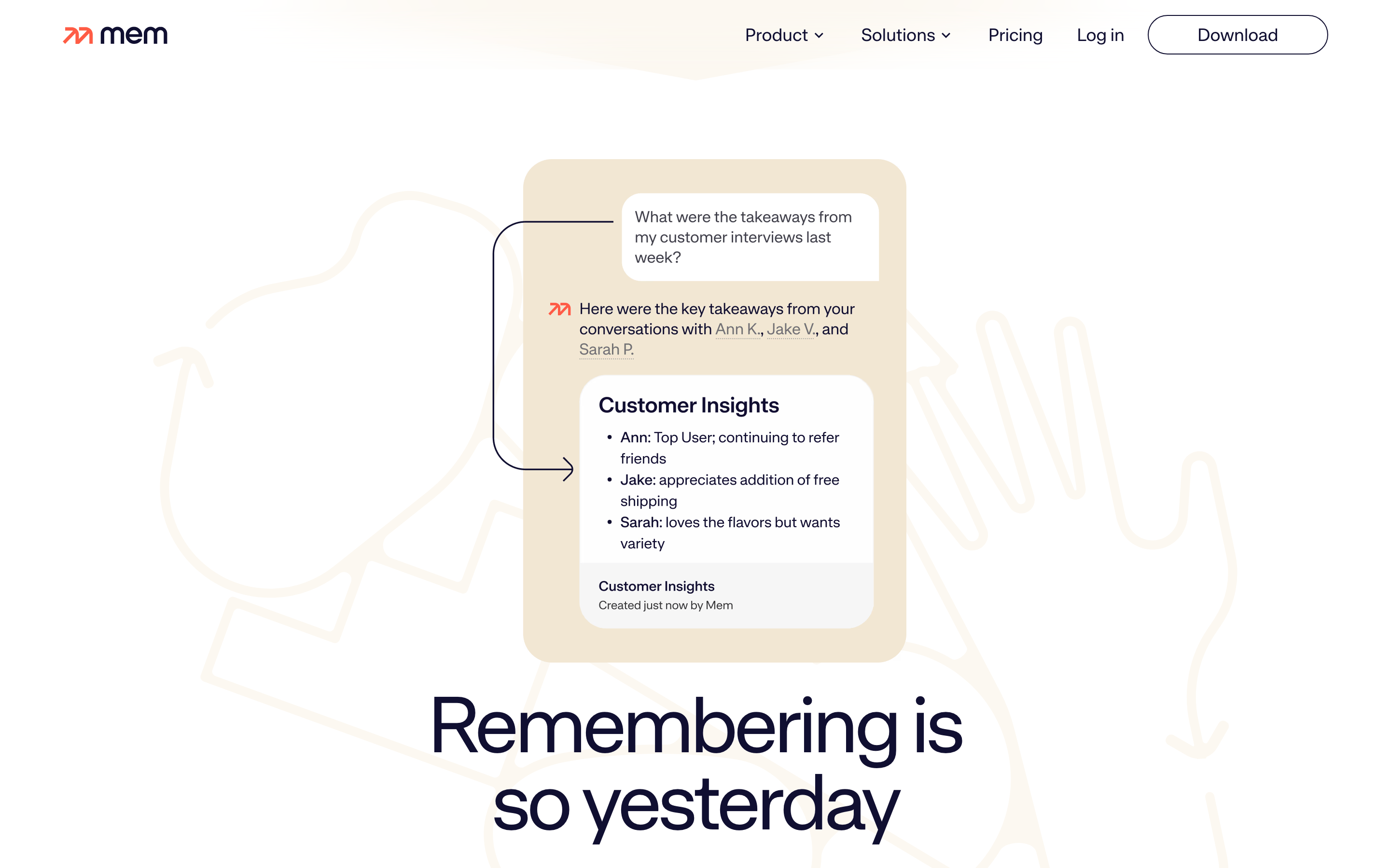
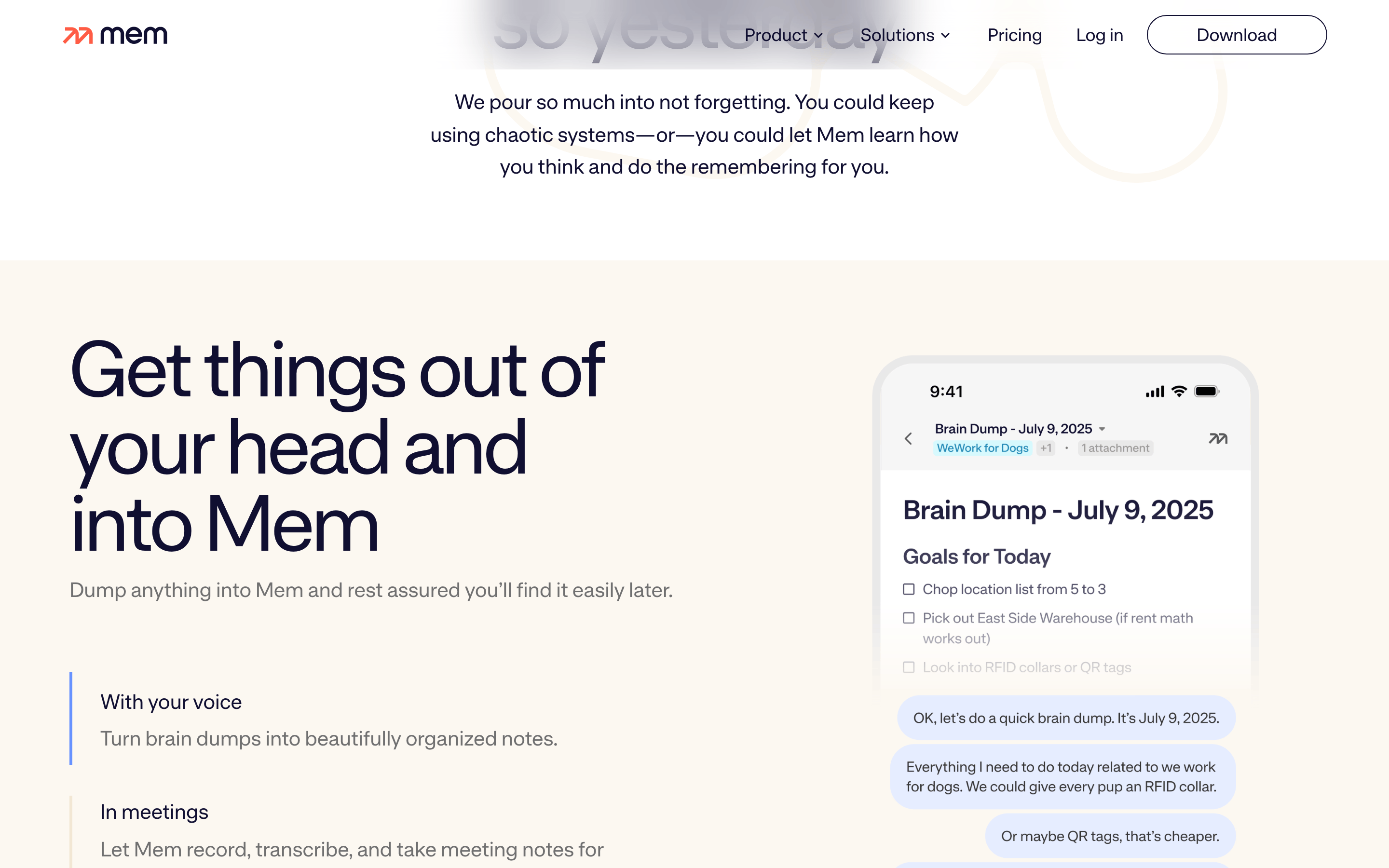
button Pill-shaped outline buttons with 100px border-radius and dark navy stroke. card Implied by circular image containers with soft shadows. chip N/A input Search bar with rounded corners and orange focus ring. hero Split layout with large typography on the left and overlapping circular elements on the right. 09
Voice & Don'ts
Tone Helpful, friendly, and confident. Headlines Direct and benefit-oriented, e.g., 'One place for everything on your mind'. CTAs Clear action-oriented labels like 'Download Mem' and 'Watch the video'. Don't use a white background — the screenshot shows a warm cream (#FCF8F1) background. Don't use a bright primary blue for buttons — the screenshot shows outline buttons with navy borders. Don't use a heavy sans-serif for headlines — the screenshot uses a lighter-weight humanist-sans. Don't use sharp corners on containers — the screenshot shows pill-shaped buttons and circular image elements. Don't use a dark mode as the primary interface — the screenshot clearly shows a light theme. Don't use centered text for long headlines — the screenshot shows left-aligned hero text. Avoid: overly technical jargon Avoid: aggressive sales language Avoid: complex metaphors 10
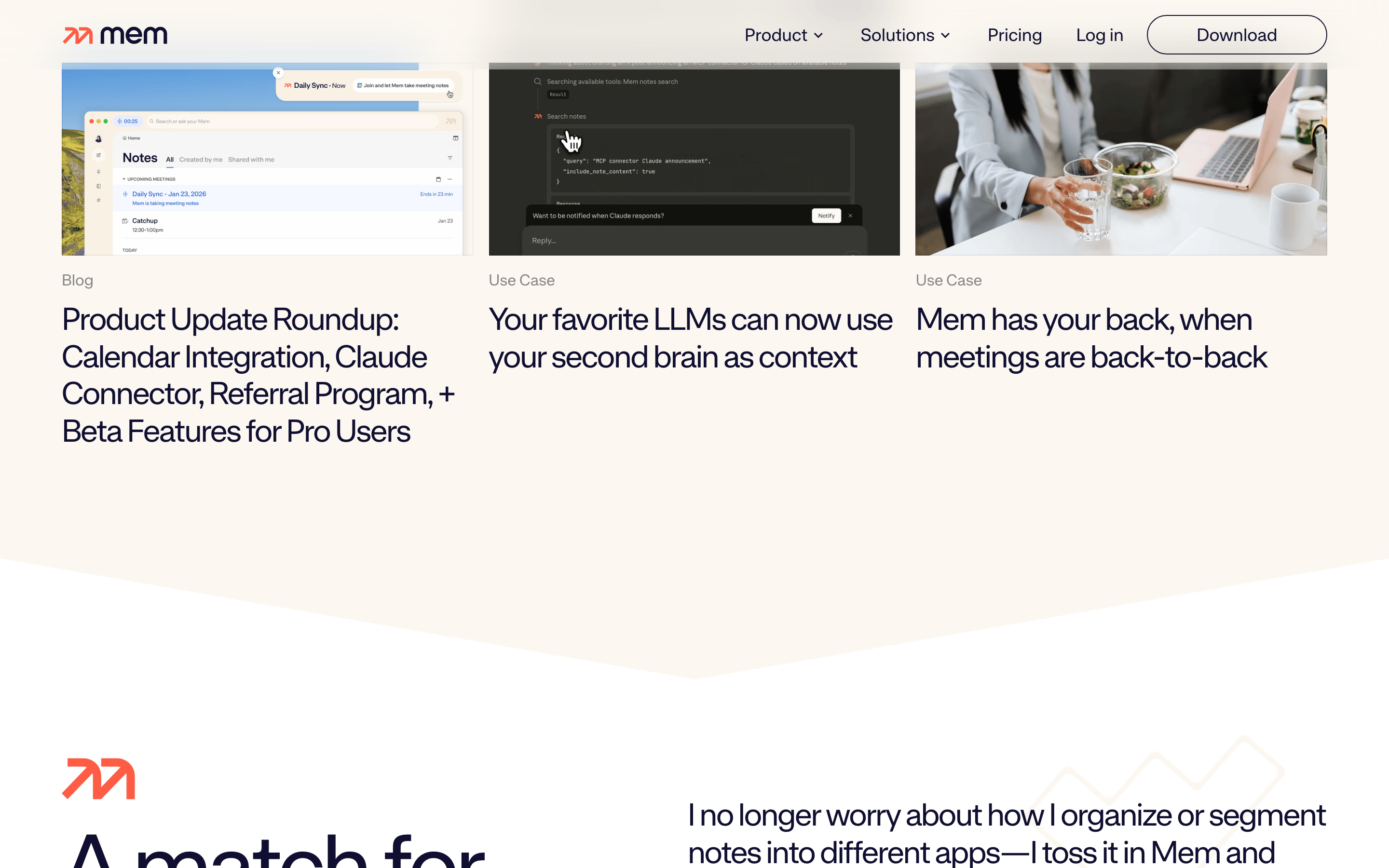
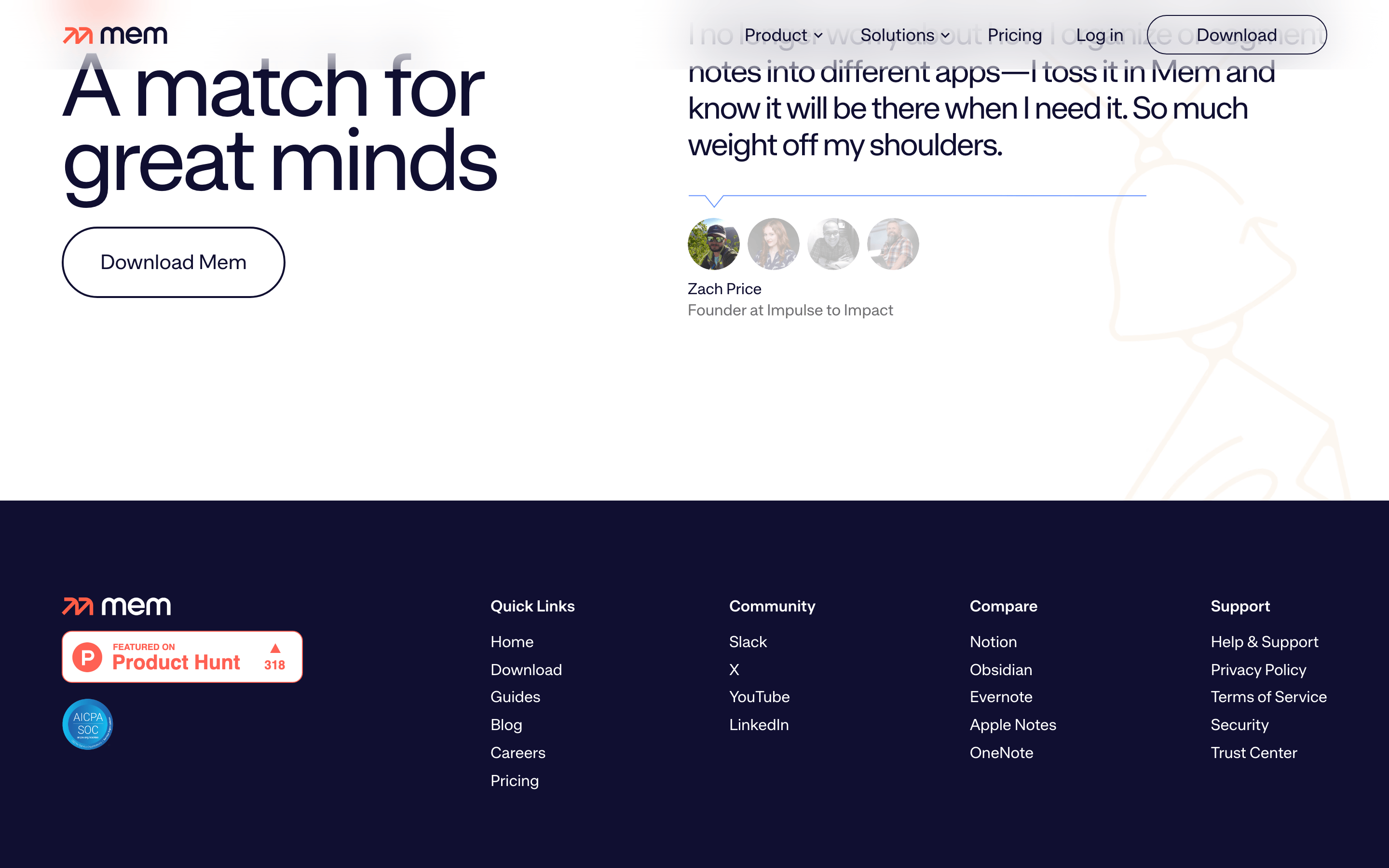
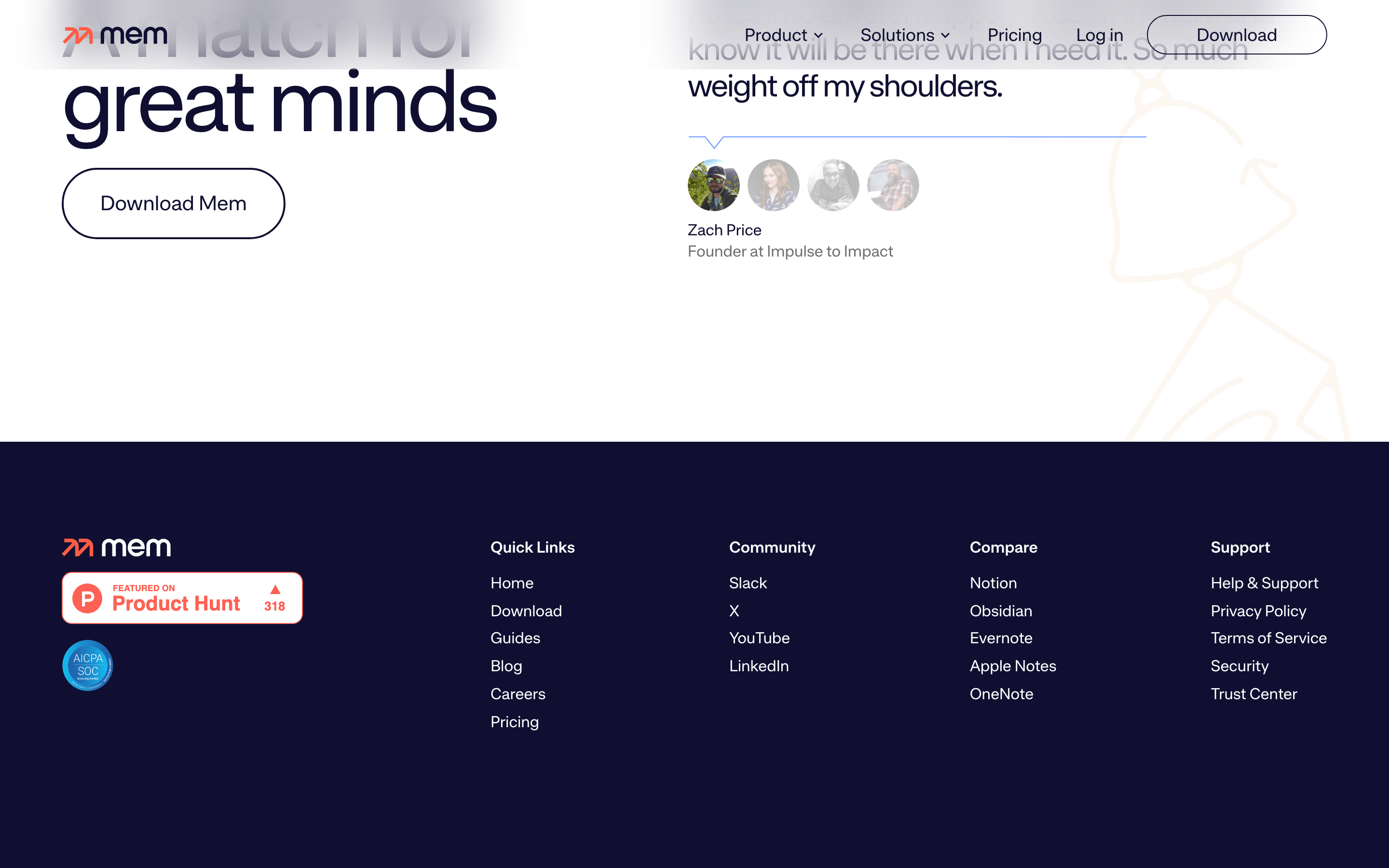
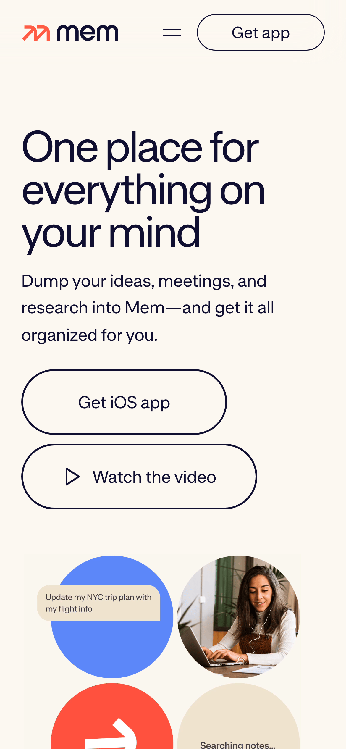
Inside the pack — real screenshots
桌面首屏(hero) 桌面滚动分段(90% viewport 步进,作为视觉证据) 桌面滚动分段(90% viewport 步进,作为视觉证据) 桌面滚动分段(90% viewport 步进,作为视觉证据) 桌面滚动分段(90% viewport 步进,作为视觉证据) 桌面滚动分段(90% viewport 步进,作为视觉证据) 桌面滚动分段(90% viewport 步进,作为视觉证据) 桌面滚动分段(90% viewport 步进,作为视觉证据) 桌面滚动分段(90% viewport 步进,作为视觉证据) 桌面滚动分段(90% viewport 步进,作为视觉证据) 桌面滚动分段(90% viewport 步进,作为视觉证据) 移动首屏 Captured from the live site · real computed styles
11
System prompt
Mem is a clean, warm, and AI-focused SaaS application for personal knowledge management. It uses a light cream background (#FCF8F1) paired with deep navy (#100F31) typography for a calm, readable experience. The design relies on a humanist-sans font family with generous spacing and pill-shaped UI components. Critical design rules: avoid white backgrounds, avoid harsh primary blue buttons, and use left-aligned, benefit-oriented headlines instead of centered text. The overall aesthetic is minimalist, friendly, and focused on clarity and ease of use.
More from the library en · zh-CN · zh-TW · ja · ko
OpenDesign · curated web aesthetics for AI-readable design DNA · opendesign.cc
Why we curated this: This site is an excellent example of a clean, warm, and approachable SaaS landing page that uses AI as a core value proposition.
浙ICP备2021038972号-5