Dark, high-contrast canvas for readability and visual rest.
03
Typography
geometric-sans · monospace
display56px · 500
h240px · 700
h332px · 700
body16px · 400
small14px · 400
micro12px · 400
Use geometric-sans for all headlines and UI elements. · Maintain tight negative tracking for large display text. · Ensure high contrast between ink and background for readability.
04
Spacing
4px
8px
16px
24px
32px
48px
64px
96px
Consistent 4px base grid with generous whitespace to emphasize content.
05
Surfaces
sm · 4px
md · 8px
lg · 12px
pill · 30px
1px solid rgba(150, 150, 152, 0.1)
0px 4px 12px rgba(0, 0, 0, 0.3)
06
Layout
1280container
12columns
24pxgutter
768 / 1024breakpoints
Centered content with a single-column layout for long-form reading and testimonials.
07
Motion & Interaction
220msmicro
400mssmall
800msmedium
cubic-bezier(0.4, 0, 0.2, 1)easing
Subtle hover transitions on interactive elements. · Smooth scrolling and page transitions.
Subtle background or opacity changes on interactive elements. · Immediate feedback with a slight scale or color shift.
08
Components
buttonPill-shaped buttons with solid accent color and high contrast text.
cardDark, rounded containers with subtle borders for testimonials and app screens.
chipSmall, rounded tags with low-contrast backgrounds and text.
inputMinimalist text inputs with clean borders and no decorative elements.
heroLarge, centered headline with a brief description and social proof logos.
09
Voice & Don'ts
ToneProfessional, confident, and focused on user value.
HeadlinesDirect, action-oriented, and benefit-driven.
CTAsSimple, clear, and encouraging.
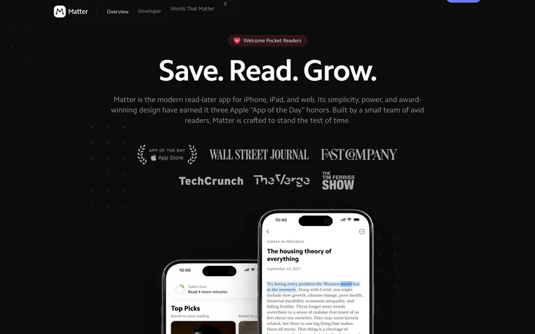
Don't use light backgrounds — screenshot shows a dark theme.
Don't use serif fonts for body text — screenshot uses a sans-serif typeface.
Don't use busy or chaotic layouts — screenshot shows clean, centered content.
Don't use a wide range of colors — screenshot relies on a limited palette.
Don't use small, cramped buttons — screenshot uses generous padding and pill shapes.
Don't use low-contrast text — screenshot maintains high contrast for readability.
Avoid: Avoid overly casual or slang-heavy language.
Captured from the live site · real computed styles
11
System prompt
A modern, award-winning read-later app for focused reading and growth. The design uses a dark, high-contrast canvas with a primary accent of #6D7EEC and ink of #FFFFFF on a #0D0D0D background. Typography is geometric-sans with tight tracking for headlines and generous whitespace for readability. Critical donts: avoid light backgrounds, avoid serif fonts for body text, avoid cluttered layouts, avoid a wide color range, avoid small buttons, and avoid low-contrast text. The overall feel is calm, refined, and focused on content.
Bring this taste to your agent
Hand your AI agent a machine-readable spec of this design — tokens, type, motion, the whole DNA.