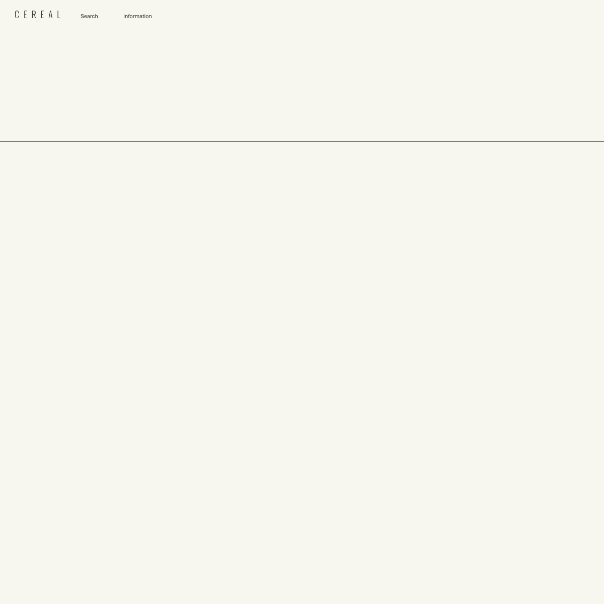
Don't use decorative shadows or rounded corners — screenshot shows sharp edges and flat surfaces.
Don't use prominent call-to-action buttons — screenshot shows only minimal text links.
Don't fill the page with content — screenshot shows an almost entirely empty body area.
Avoid: Bright colors
Avoid: Heavy typography
Avoid: Visual clutter
Avoid: Dense information layouts
Avoid: Decorative elements
11
System prompt
This is an ultra-minimalist editorial website for a lifestyle magazine. It features a warm off-white (#F5F2EE) background with near-black (#2A2A2A) text. The typography is a geometric sans-serif used with generous letter-spacing, particularly for the uppercase logo. The layout is dominated by vast whitespace, with a single horizontal rule separating the header from the content area. Critical donts: Do not use bright or saturated accent colors; Do not use heavy or bold font weights; Do not create dense or cluttered layouts; Do not use prominent, button-style CTAs; Do not apply rounded corners or drop shadows to elements.
Bring this taste to your agent
Hand your AI agent a machine-readable spec of this design — tokens, type, motion, the whole DNA.