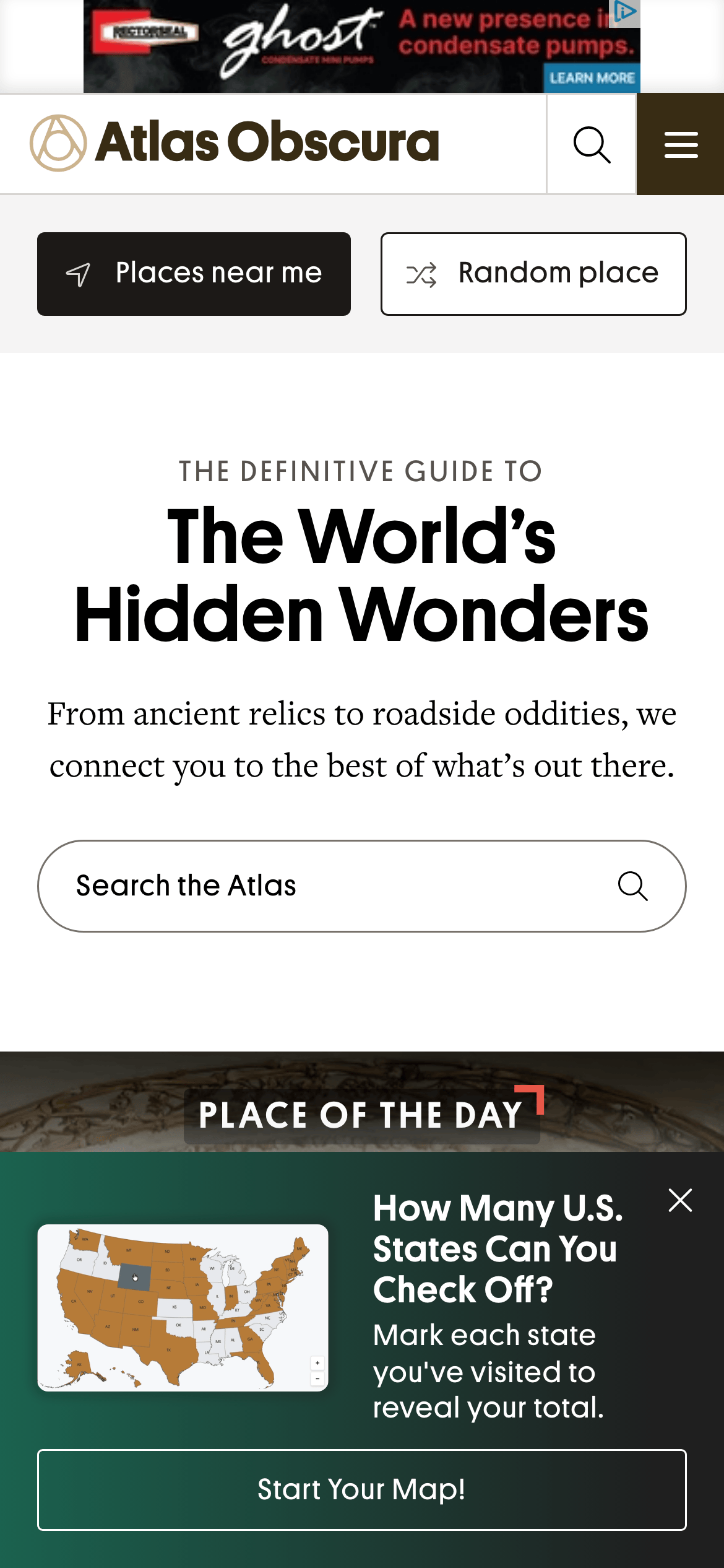
A vintage explorer's journal meets modern digital discovery
02
Color
#E21F26Accent
#000000Ink
#383434Ink soft
#ffffffBG
#f7f7f7BG soft
#f1f1f1BG quiet
#808080Muted
rgba(0,0,0,0.1)Line
High contrast black-on-white editorial base with a single vibrant red accent for brand recognition and emphasis
03
Typography
transitional-serif · humanist-sans
display56px · 700
subtitle14px · 700
body16px · 400
caption14px · 400
Headlines use a serif typeface for a classic editorial feel · Body text and UI elements use Open Sans for readability · Kicker text uses uppercase letters with tracking for emphasis
04
Spacing
4px
8px
16px
24px
32px
48px
64px
96px
Standard 4px base grid with generous whitespace in editorial sections
05
Surfaces
sm · 4px
md · 0px
lg · 0px
pill · 999px
1px solid rgba(0,0,0,0.1) for cards and inputs
rgba(0,0,0,0.24) 0px 0px 5px 0px
06
Layout
1280container
12columns
24pxgutter
768 / 1024breakpoints
Clean top navigation bar followed by a full-width centered hero section with search functionality
07
Motion & Interaction
220msmicro
400mssmall
800msmedium
cubic-bezier(0.25, 0.1, 0.25, 1)easing
Smooth transitions for hover states · Smooth scrolling for page navigation
Subtle color transitions on interactive elements · Immediate response with visual feedback
08
Components
buttonBlack pill-shaped button with white text and icon for primary actions like 'Places near me'
cardImage-heavy editorial cards with minimal borders
chipOutlined rounded buttons for secondary actions like 'Random place'
inputFull-width rounded search input with placeholder text and integrated search icon
heroLarge centered headline with kicker text, description, and prominent search bar
09
Voice & Don'ts
ToneAuthoritative yet inviting and curious
HeadlinesGrand, evocative serif headlines that spark curiosity
CTAsClear, action-oriented buttons with descriptive labels
don't use dark mode or dark backgrounds — screenshot shows a predominantly white (#ffffff) background
don't use playful rounded corners on containers — screenshot shows sharp rectangular edges on the hero section
don't use multiple competing accent colors — screenshot shows a single dominant red (#E21F26) accent
don't use thin, light sans-serif fonts for headlines — screenshot shows bold, weighted serif typography for the main title
don't clutter the interface with excessive shadows — screenshot shows a very clean, flat design with minimal drop shadows
don't use small, cramped text — screenshot shows generous line-height and padding for comfortable reading
Captured from the live site · real computed styles
11
System prompt
This is a premium editorial travel and curation platform focused on discovering hidden wonders. The visual identity relies on a stark black-and-white base (#000000 ink on #ffffff background) with a single vibrant red accent (#E21F26) for brand marks and emphasis. Typography combines classic transitional-serif for headlines with humanist-sans (Open Sans) for body text. The layout is a clean, full-width editorial grid with generous whitespace. Key features include rounded pill-shaped inputs, sharp-edged containers, and bold uppercase kicker text. Don't use dark mode, don't add unnecessary shadows or borders, and don't clutter the interface with multiple accent colors.
Bring this taste to your agent
Hand your AI agent a machine-readable spec of this design — tokens, type, motion, the whole DNA.