← OpenDesign CURATED · OPEN · FREE
Aplos
A premium direct-to-consumer brand for sophisticated botanical beverages, featuring rich dark imagery and refined serif typography.
Consumer Photographic Premium Clean Product
01
Identity DNA
Non-alcoholic Sophisticated Botanical Wellness
A modern luxury apothecary for zero-proof spirits.
02
Color
#000000Ink
#646464Ink soft
#F2F1EDBG soft
rgba(180,174,172,1)Line
High-contrast monochrome foundation with warm, off-white surfaces for readability and focus.
03
Typography
transitional-serif · humanist-sans
display 40px · 400subtitle 26px · 400body 13px · 40004
Spacing
Strict multiples of 3px with 12px and 24px as primary gutters.
05
Surfaces
sm · 3px
md · 5px
lg · 12px
pill · 999px
Subtle 1px borders and inset box-shadows to define input fields and containers.
rgb(180, 174, 172) 0px 0px 0px 1px inset
06
Layout
1280 container
12 columns
24px gutter
768 / 1024 breakpoints
Full-bleed dark hero with large, centered modal overlays.
07
Motion & Interaction
200ms micro
300ms small
800ms medium
cubic-bezier(0.645, 0.045, 0.355, 1) easing
Smooth background and color transitions for interactive elements · Transform animations for fill and hover states
Subtle color and background transitions on interactive elements. · Immediate visual response with a standard pointer cursor.
08
Components
button High-contrast black pill or large-radius buttons with white text for primary actions. card Split-view modal with a cinematic image on one side and a clean, functional form on the other. input Clean text inputs with subtle 1px inset box-shadows and slightly rounded corners. hero Large-scale photographic hero with atmospheric lighting and overlaid typography. 09
Voice & Don'ts
Tone Sophisticated, confident, and inviting. Headlines Large, refined serif headlines with tight letter spacing. CTAs Direct and action-oriented, such as 'Shop Now' or 'Continue'. don't use bright accent colors — screenshot shows a strict black, white, and off-white palette don't use rounded buttons with large radii — screenshot shows buttons with a more subtle, modern radius of 5px don't use generic sans-serif fonts for display — screenshot shows transitional-serif for all major headlines don't use busy, multi-column layouts — screenshot shows a clean, focused split-view modal and full-bleed hero don't use light, airy backgrounds for the main site — screenshot shows a dominant deep black background don't use aggressive drop shadows — screenshot shows subtle inset box-shadows and borders for definition Avoid: Loud, neon colors Avoid: Playful or overly casual language Avoid: Busy, cluttered layouts Avoid: Generic sans-serif headlines 10
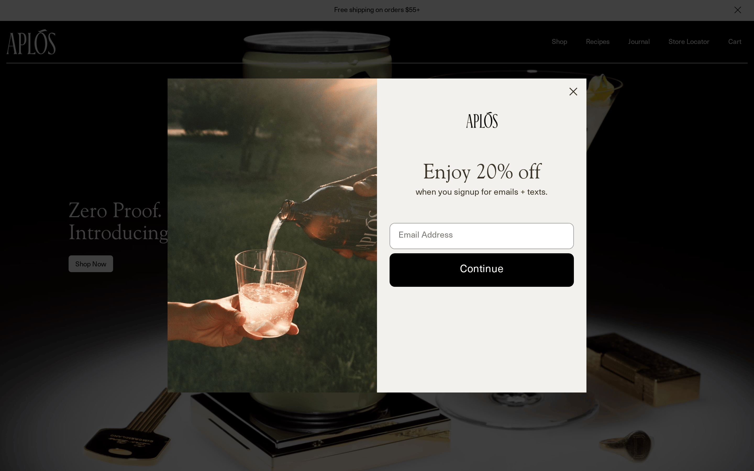
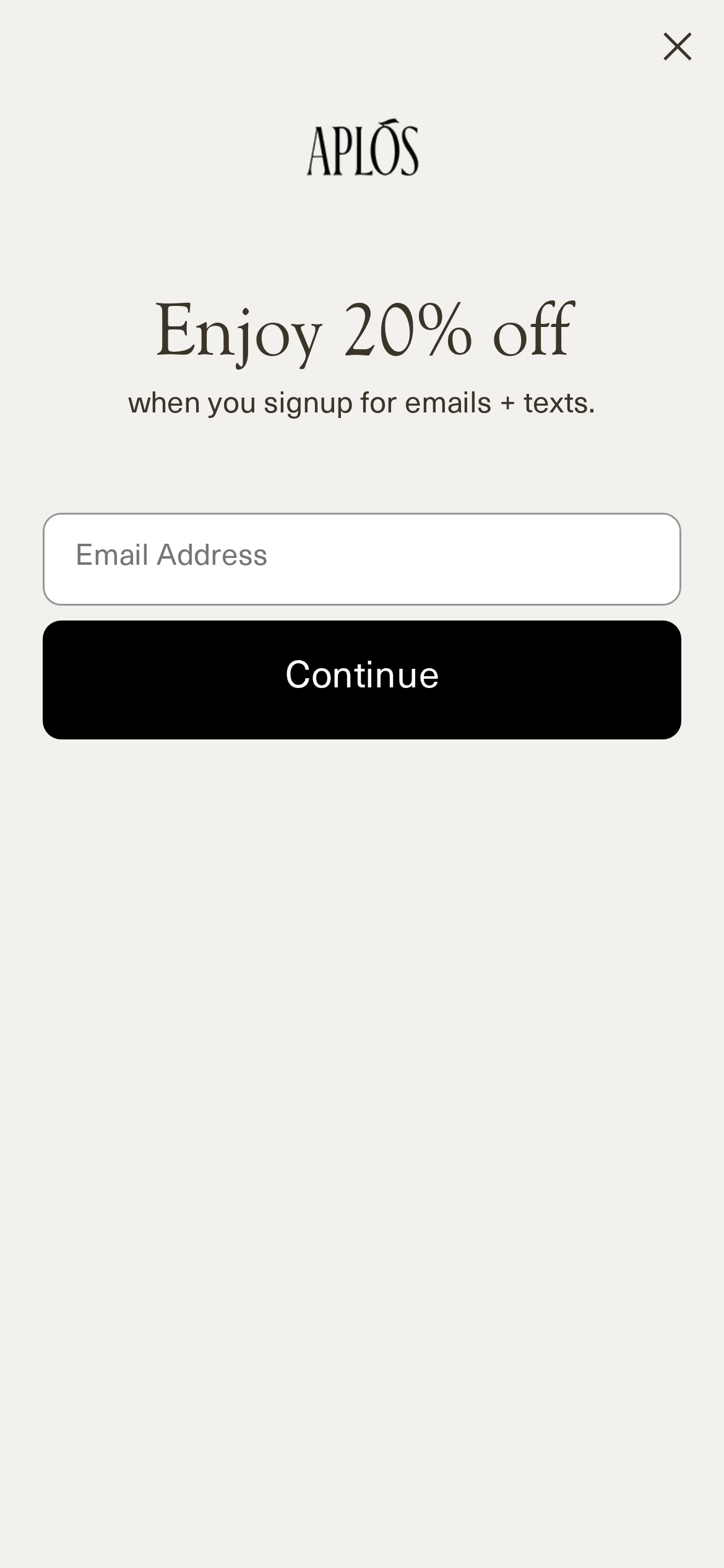
Inside the pack — real screenshots
桌面首屏(hero) 桌面滚动分段(90% viewport 步进,作为视觉证据) 桌面滚动分段(90% viewport 步进,作为视觉证据) 桌面滚动分段(90% viewport 步进,作为视觉证据) 桌面滚动分段(90% viewport 步进,作为视觉证据) 桌面滚动分段(90% viewport 步进,作为视觉证据) 桌面滚动分段(90% viewport 步进,作为视觉证据) 桌面滚动分段(90% viewport 步进,作为视觉证据) 桌面滚动分段(90% viewport 步进,作为视觉证据) 桌面滚动分段(90% viewport 步进,作为视觉证据) 移动首屏 Captured from the live site · real computed styles
11
System prompt
This design represents a premium, direct-to-consumer beverage brand specializing in zero-proof spirits. It leverages a sophisticated, minimalist aesthetic dominated by deep black (#000000) and warm off-white (#F2F1ED) surfaces. Typography is anchored by a refined transitional-serif for display and a clean humanist-sans for body and UI elements. Key interaction patterns include high-contrast, large-radius primary buttons and subtle inset borders for form fields. Critical constraints: strictly avoid vibrant accent colors, never use generic sans-serifs for headlines, and maintain the restrained, photographic-forward layout.
More from the library en · zh-CN · zh-TW · ja · ko
OpenDesign · curated web aesthetics for AI-readable design DNA · opendesign.cc
Why we curated this: This site is a strong example of using a limited color palette and high-quality photography to establish a sophisticated, modern brand identity.