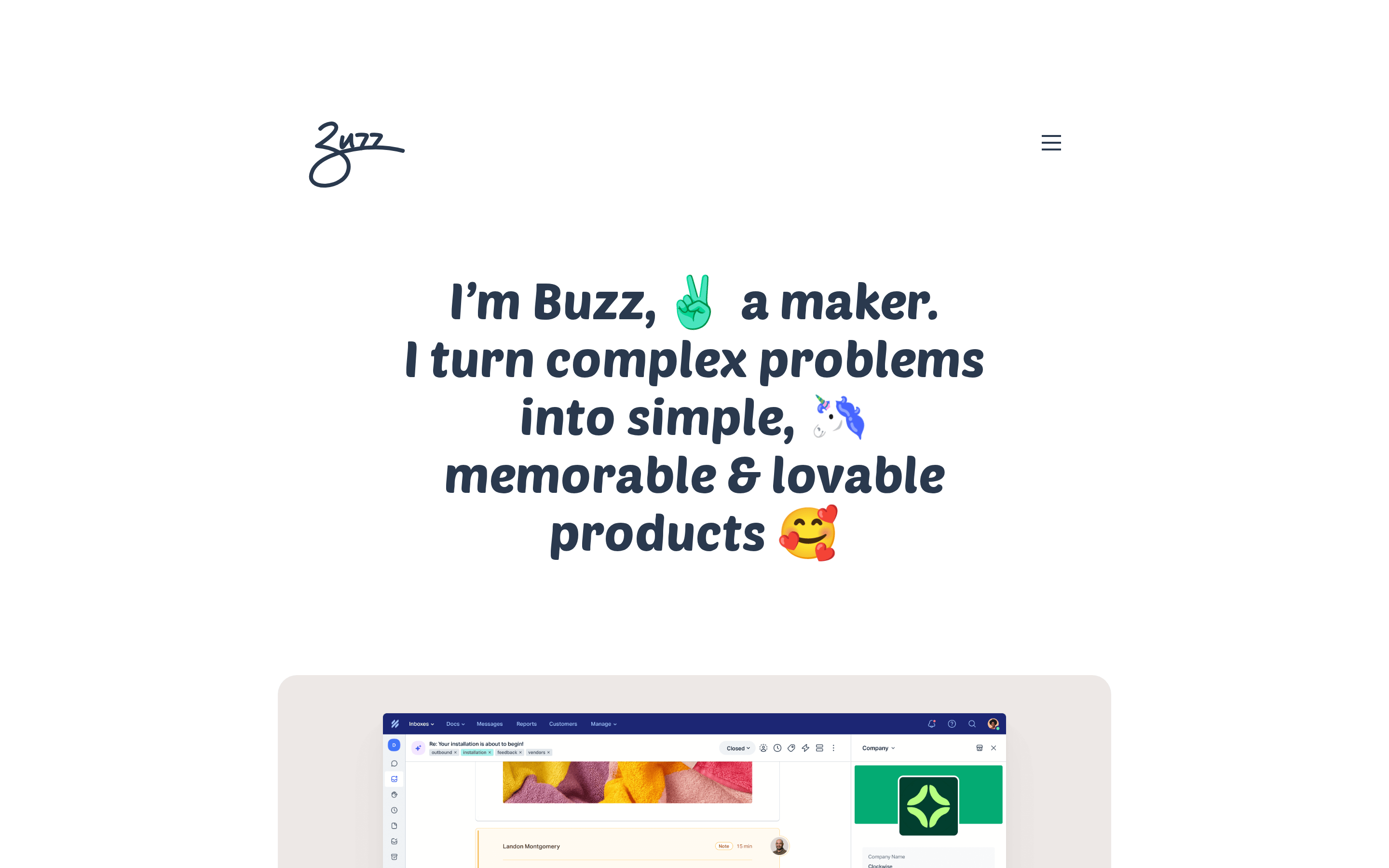
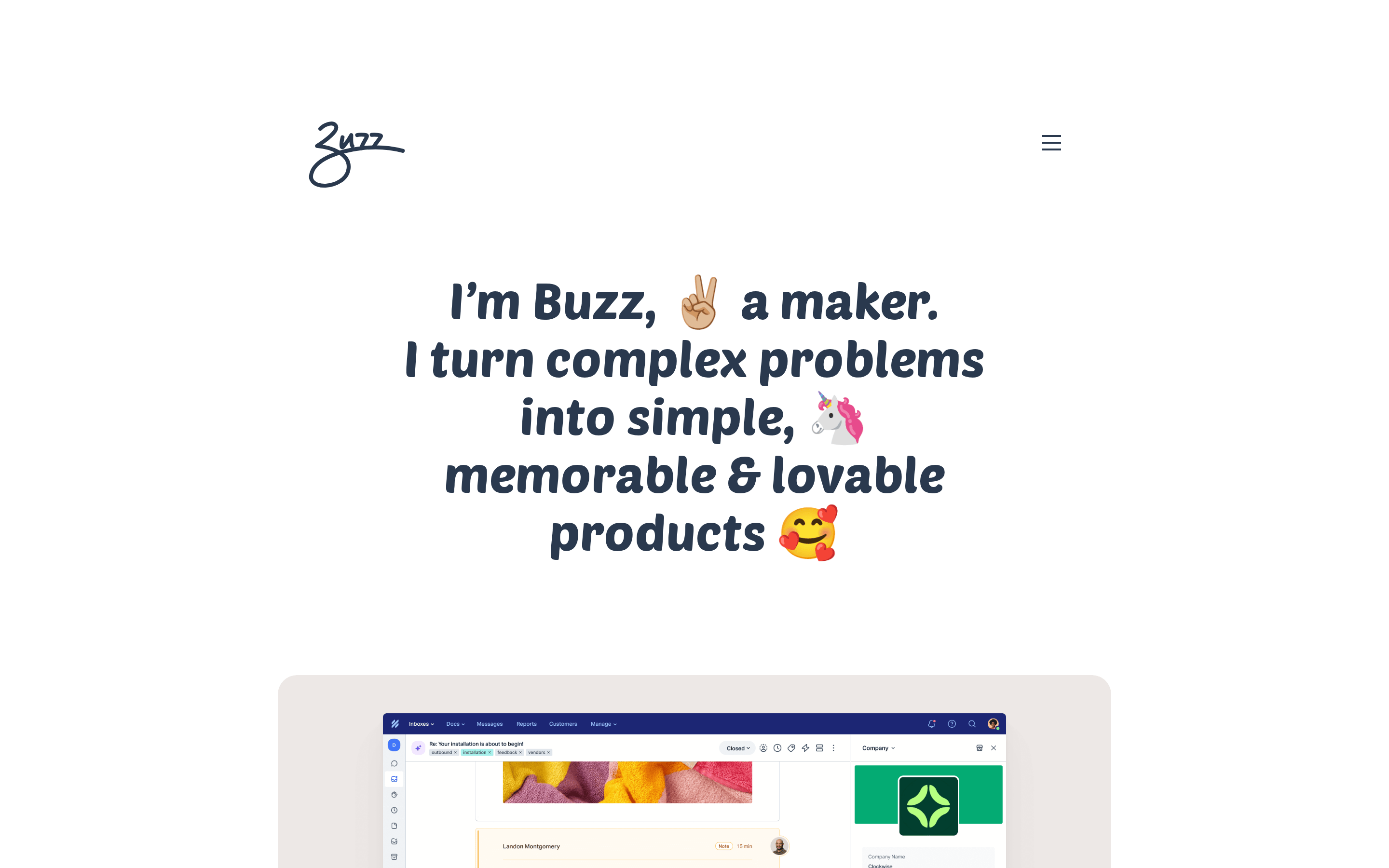
A friendly neighborhood maker showcasing their digital creations.
02
Color
#2A394EInk
#FFFFFFBG
rgba(42, 57, 78, 1)Line
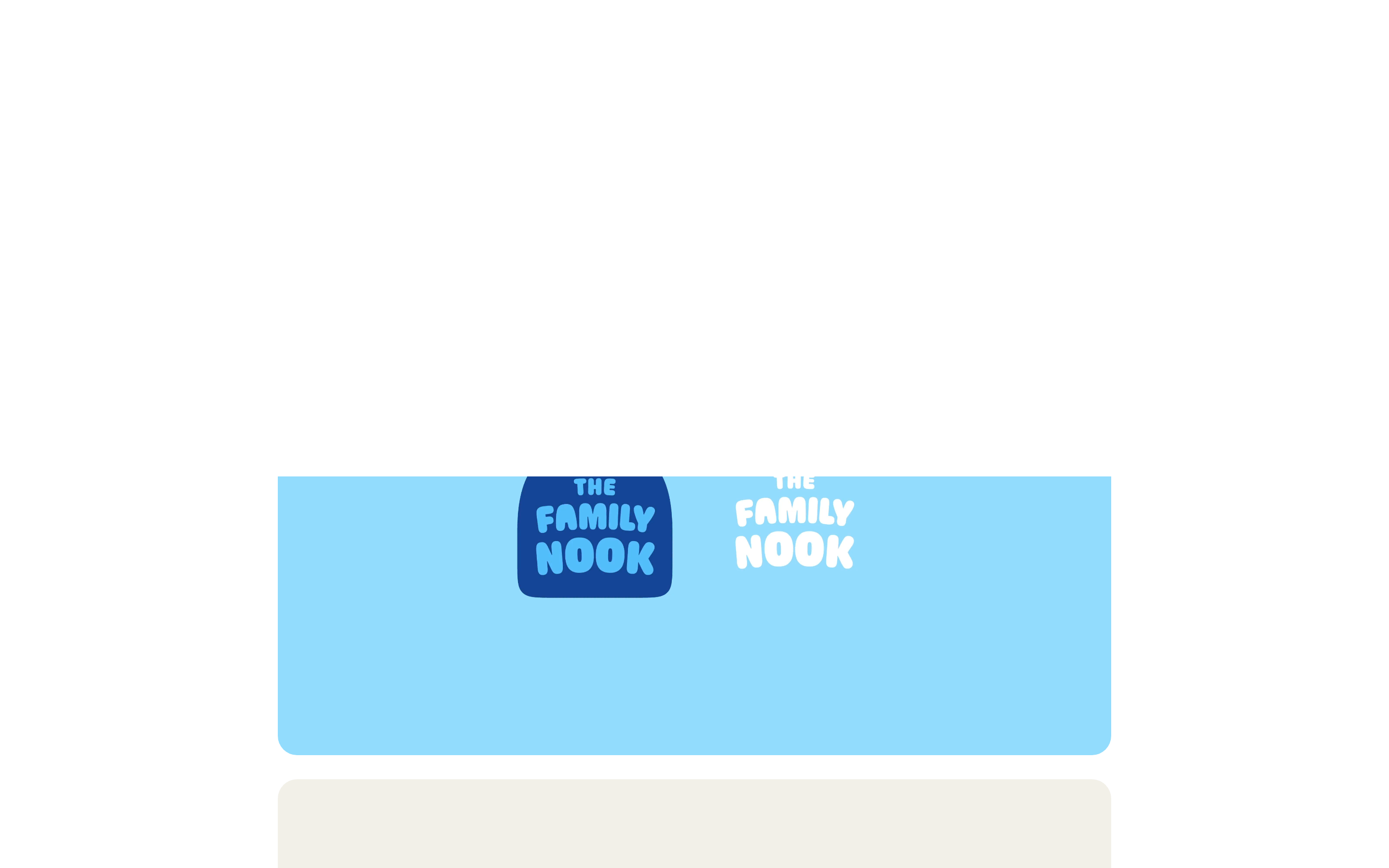
Clean white canvas with dark navy typography for high contrast and readability.
03
Typography
humanist-sans · geometric-sans
display46px · 500
body15px · 400
Use Roboto for body text and Poetsen One for bold display headlines. · Keep line heights generous (1.6 for body) for readability. · Avoid tight letter spacing on large headlines to maintain a friendly feel.
04
Spacing
4px
8px
16px
24px
32px
48px
64px
96px
Generous whitespace with 150px side padding on desktop to focus attention on central content.
05
Surfaces
sm · 4px
md · 8px
lg · 20px
pill · 999px
Solid 2px borders in dark navy for subtle UI elements.
0 4px 20px rgba(42, 57, 78, 0.05)
06
Layout
1280container
12columns
24pxgutter
768 / 1024breakpoints
Single-column centered layout with generous vertical spacing between sections.
07
Motion & Interaction
220msmicro
400mssmall
800msmedium
cubic-bezier(0.4, 0, 0.2, 1)easing
Smooth fade-in and transform transitions for elements entering the viewport.
Subtle opacity or color shift on interactive elements. · Immediate visual feedback with slight scale or color change.
08
Components
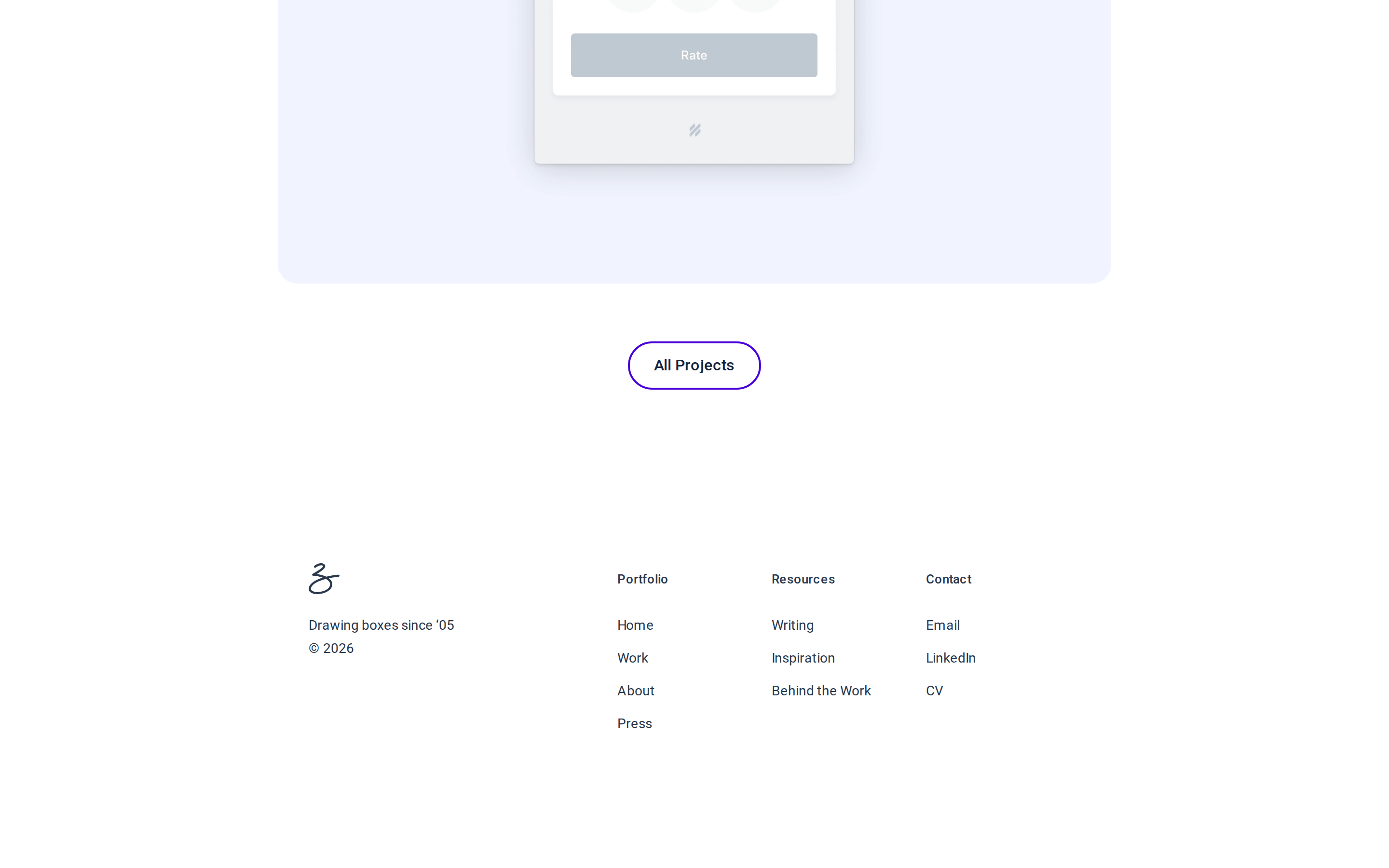
buttonRounded pill buttons with solid dark backgrounds and white text.
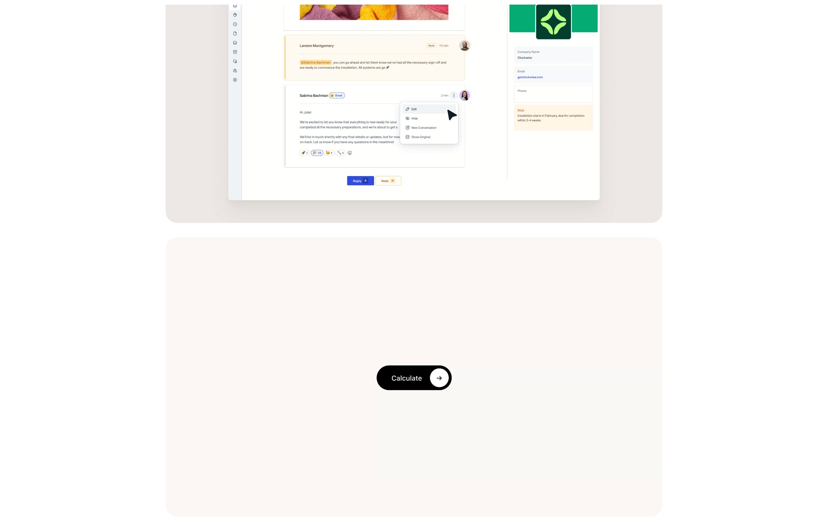
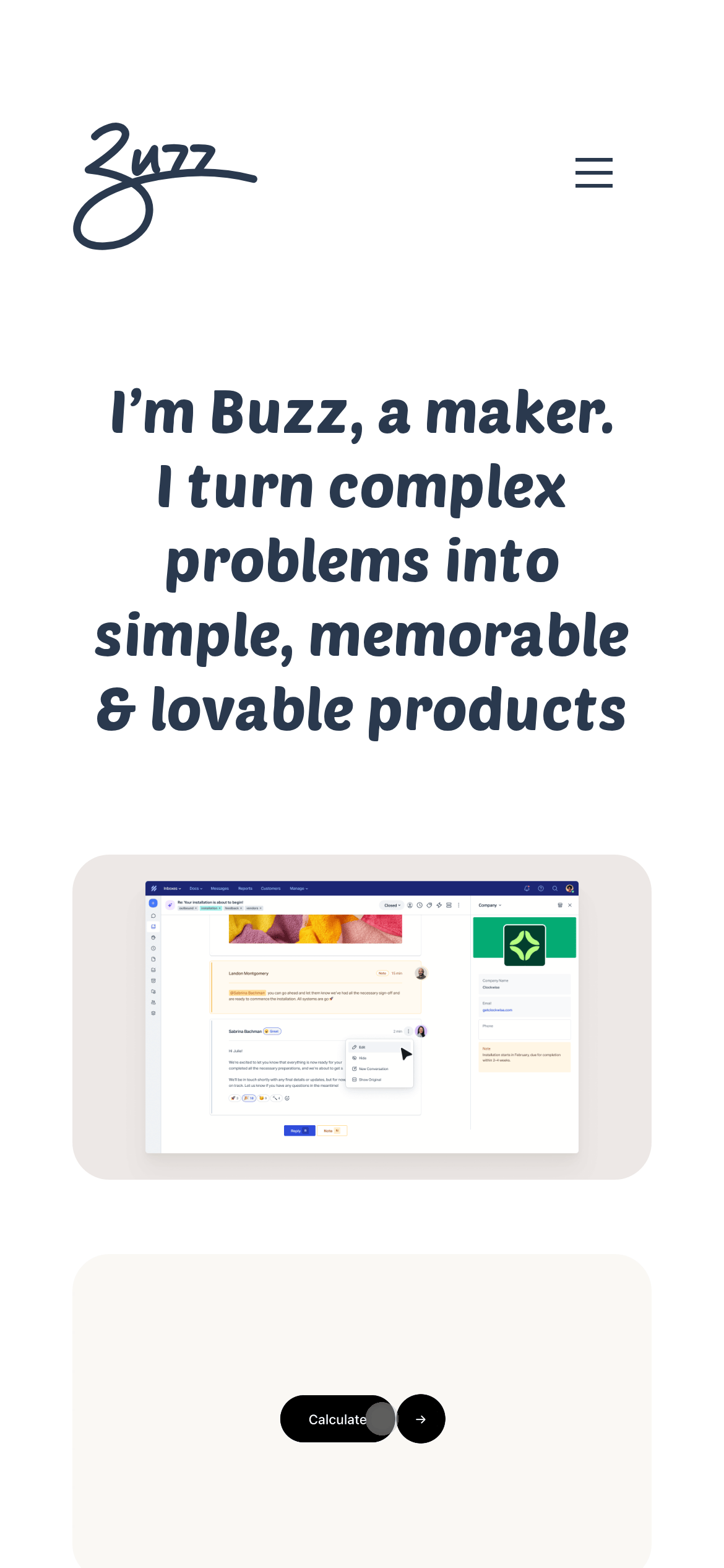
cardRounded containers with soft beige backgrounds showcasing project screenshots.
heroLarge centered headline with playful emojis, followed by a project showcase card.
09
Voice & Don'ts
ToneFriendly, approachable, and confident.
HeadlinesFirst-person conversational statements with playful emojis.
CTAsClear action-oriented text on solid dark buttons.
Don't use stark, cold color palettes — screenshot shows warm white with friendly dark navy text.
Don't use sharp, angular corners on cards — screenshot shows large 20px rounded corners.
Don't use small, cramped typography — screenshot shows large, readable display type at 46px.
Don't use complex, multi-column layouts — screenshot shows a clean, single-column centered design.
Don't use dense, text-heavy sections — screenshot shows generous whitespace and breathing room.
Don't use aggressive, corporate language — screenshot shows friendly, first-person conversational tone.
Captured from the live site · real computed styles
11
System prompt
This is a personal portfolio site for a maker named Buzz. It positions itself as a friendly, approachable creator who turns complex problems into simple, lovable products. Key hex colors include a clean white background (#FFFFFF) and dark navy text (#2A394E). Typography categories include humanist-sans for display and geometric-sans for body, using Roboto as the primary font family. The layout is centered and spacious with generous padding. Critical donts: don't use sharp corners (use 20px radius), don't use small cramped type (use large 46px headlines), don't use cold corporate language (use friendly conversational tone). The design emphasizes whitespace, rounded elements, and playful emojis to create a warm, inviting feel.
Bring this taste to your agent
Hand your AI agent a machine-readable spec of this design — tokens, type, motion, the whole DNA.