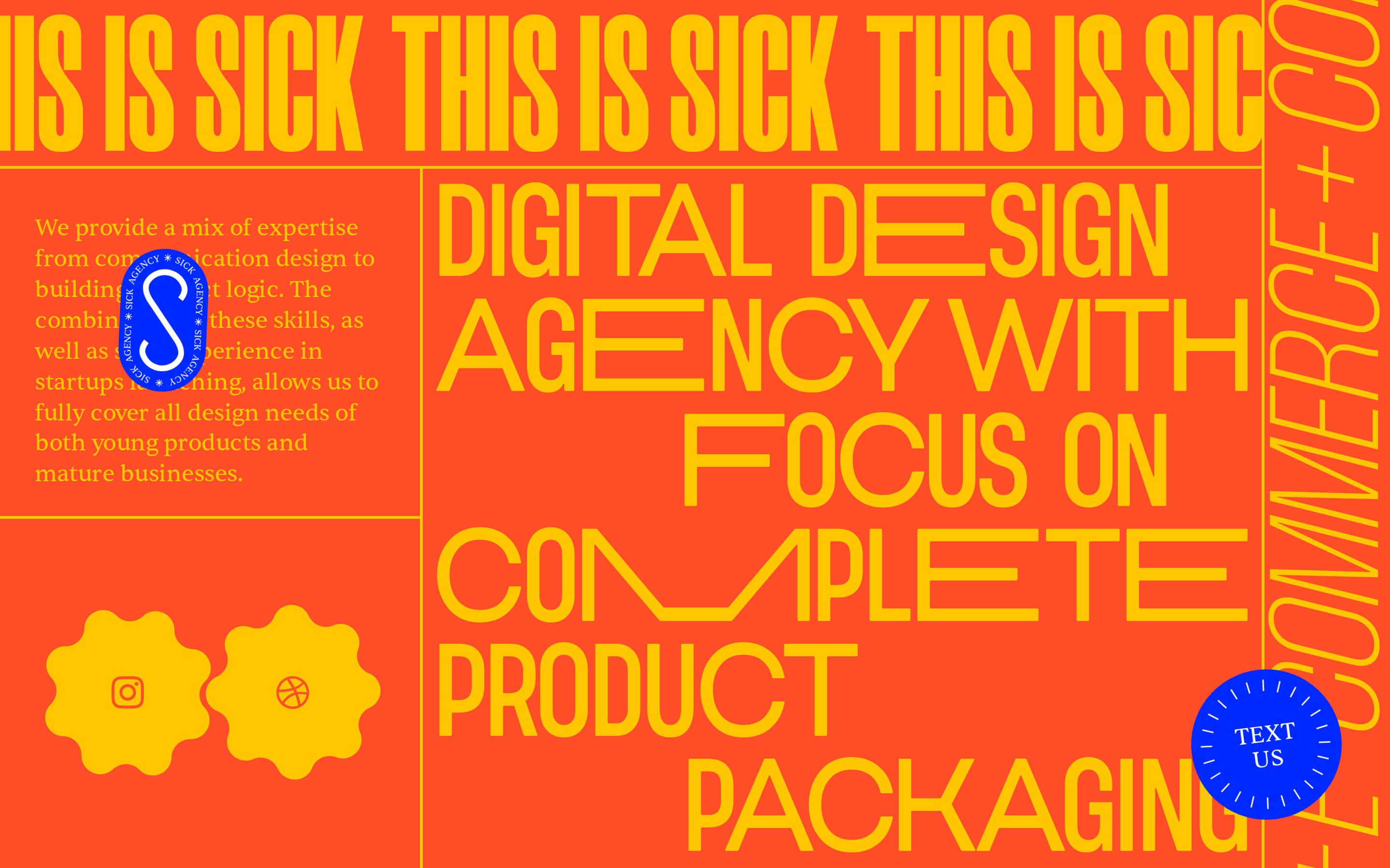
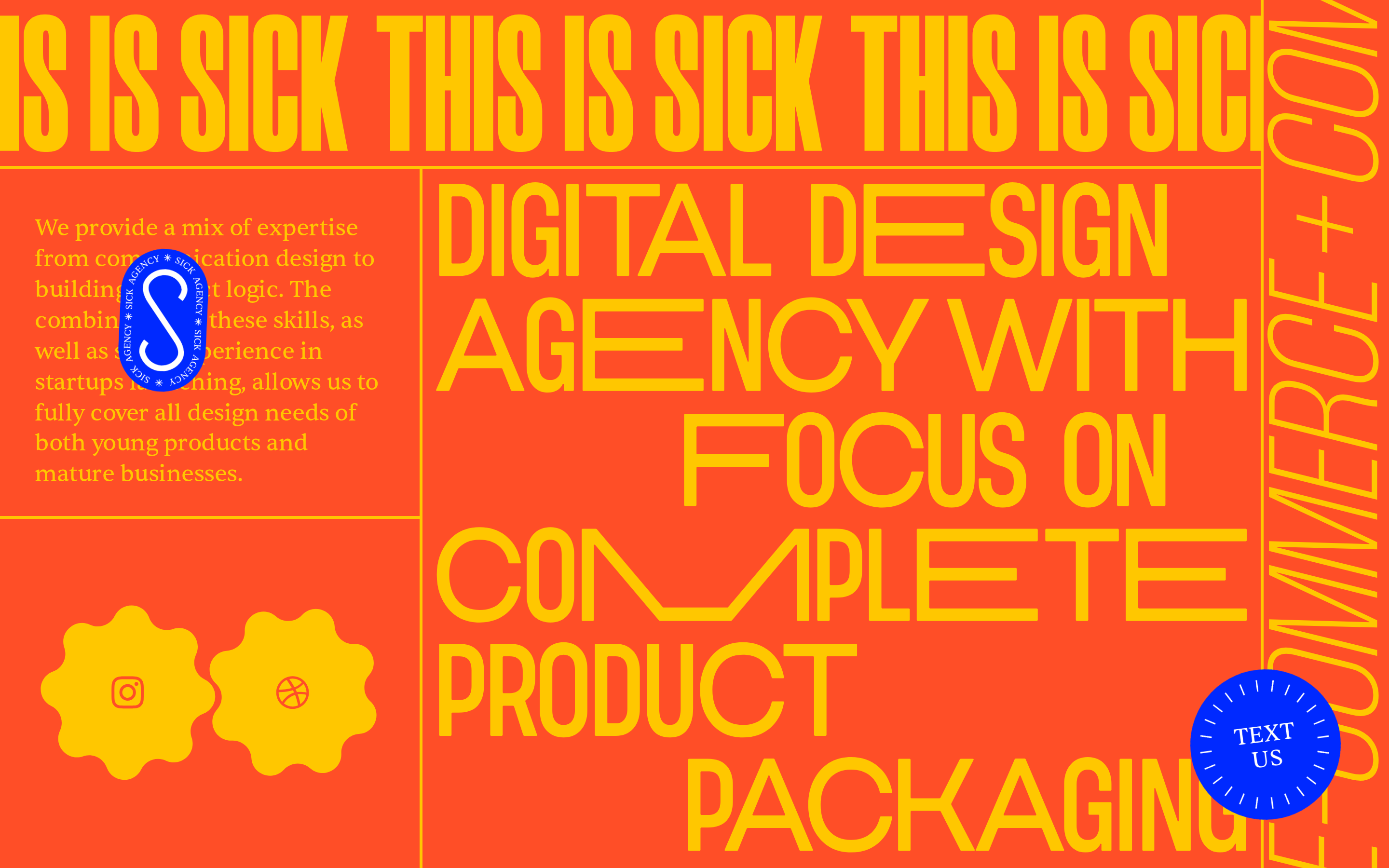
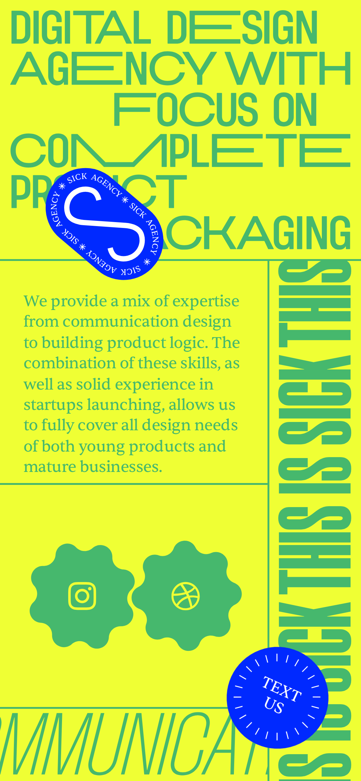
High-contrast, energetic palette using a primary orange background with bold yellow typography and a striking blue accent for interactive elements.
03
Typography
condensed-grotesque · transitional-serif
display200px · 900
display-sm160px · 900
body24px · 400
Use uppercase for display type · Maintain tight letter-spacing for condensed grotesque display font · Use transitional-serif for body copy to provide contrast
04
Spacing
4px
8px
16px
24px
32px
48px
64px
96px
Asymmetrical and tight, dictated by the dense typographic layout rather than a strict grid.
05
Surfaces
sm · 0px
md · 0px
lg · 0px
pill · 999px
Solid 1px lines in the background color (#FFC700) used to divide layout blocks.
06
Layout
1440container
12columns
16pxgutter
768 / 1024breakpoints
Asymmetrical, dense block-based layout with strong vertical and horizontal dividing lines.
07
Motion & Interaction
220msmicro
400mssmall
800msmedium
cubic-bezier(0.34, 1.56, 0.64, 1)easing
Bouncy spring transition on interactive elements · Smooth opacity fade-in
Subtle scale or color transition with a bouncy easing curve. · Standard pointer interaction with immediate feedback.
08
Components
buttonCircular, blue badge with white text and a dashed border.
cardTypographic block defined by border lines rather than shadow or background color.
chipStarburst-shaped container for social icons.
heroFull-width, dense typographic composition with overlapping elements and vertical text.
09
Voice & Don'ts
ToneBold, confident, and slightly irreverent.
HeadlinesShort, punchy, and often in all-caps.
CTAsDirect and commanding (e.g., 'TEXT US').
don't use thin fonts — screenshot shows extremely bold, heavy weights.
don't use wide letter-spacing — screenshot shows tight tracking on display type.
don't use muted, desaturated colors — screenshot shows highly vibrant orange and yellow.
don't use rounded rectangles for primary buttons — screenshot shows circular, dashed badge buttons.
don't use generous white space — screenshot shows a dense, tightly packed layout.
don't use sans-serif for body text — screenshot shows a transitional-serif font for paragraphs.
Captured from the live site · real computed styles
11
System prompt
This is a highly expressive digital design agency website focusing on complete product packaging. The primary palette consists of a vibrant orange background (#FF4E27) with bold yellow typography (#FFC700) and a striking blue accent (#0029FF). The typography is a mix of a condensed grotesque for massive display headlines and a transitional-serif for body copy. Critical design rules: 1) Prioritize massive, heavy-weight typography over imagery. 2) Maintain a dense, tight layout with minimal white space. 3) Use bold, high-contrast colors and avoid any muted or desaturated tones. 4) Avoid standard rectangular UI components in favor of expressive, custom shapes like starbursts and dashed circular badges. 5) Keep letter-spacing tight and use uppercase for display elements to maintain visual impact.
Bring this taste to your agent
Hand your AI agent a machine-readable spec of this design — tokens, type, motion, the whole DNA.