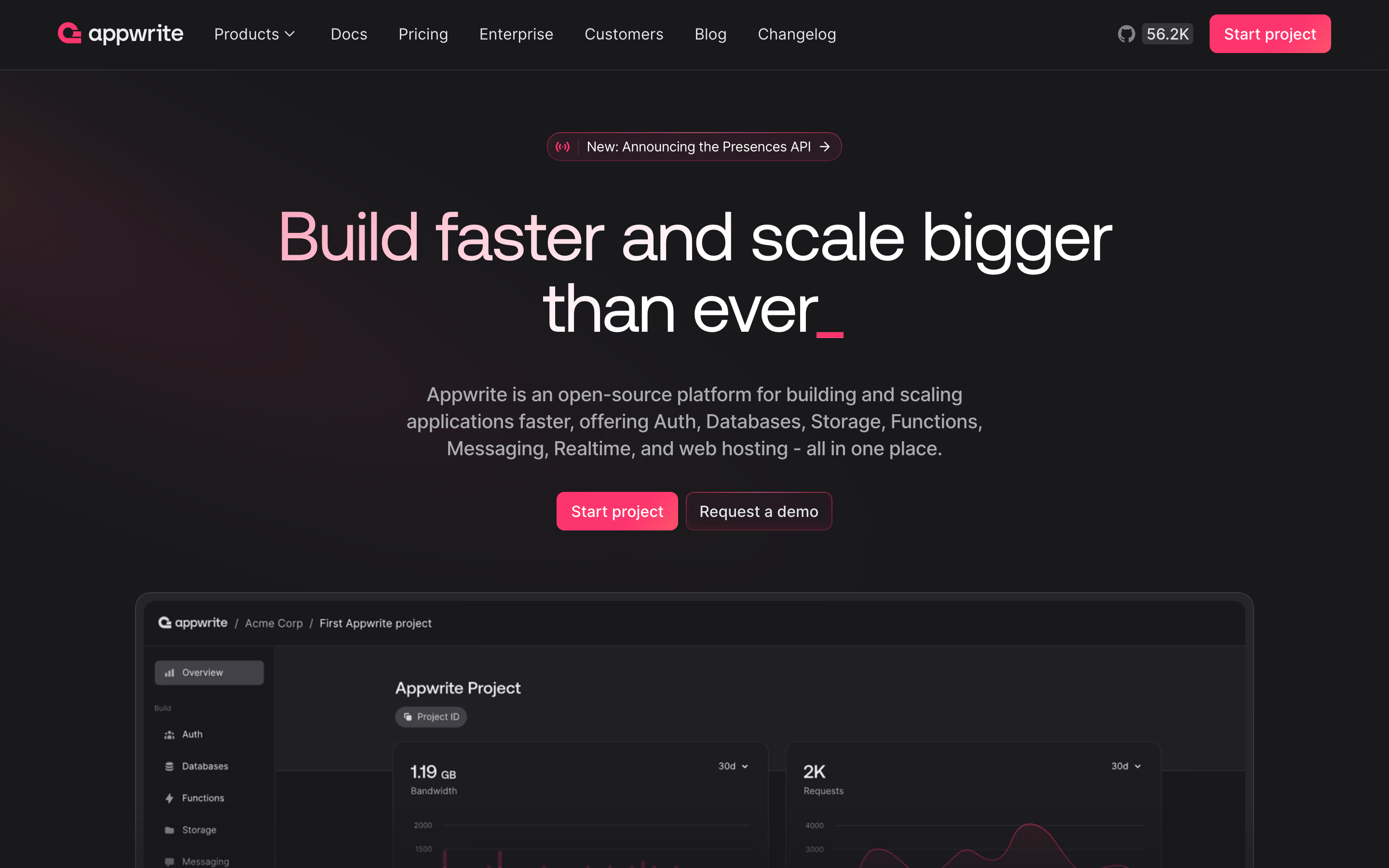
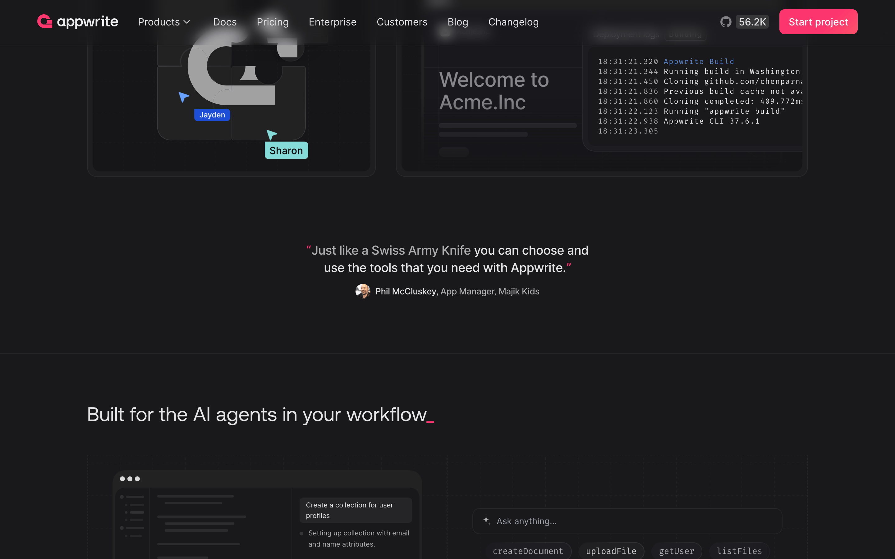
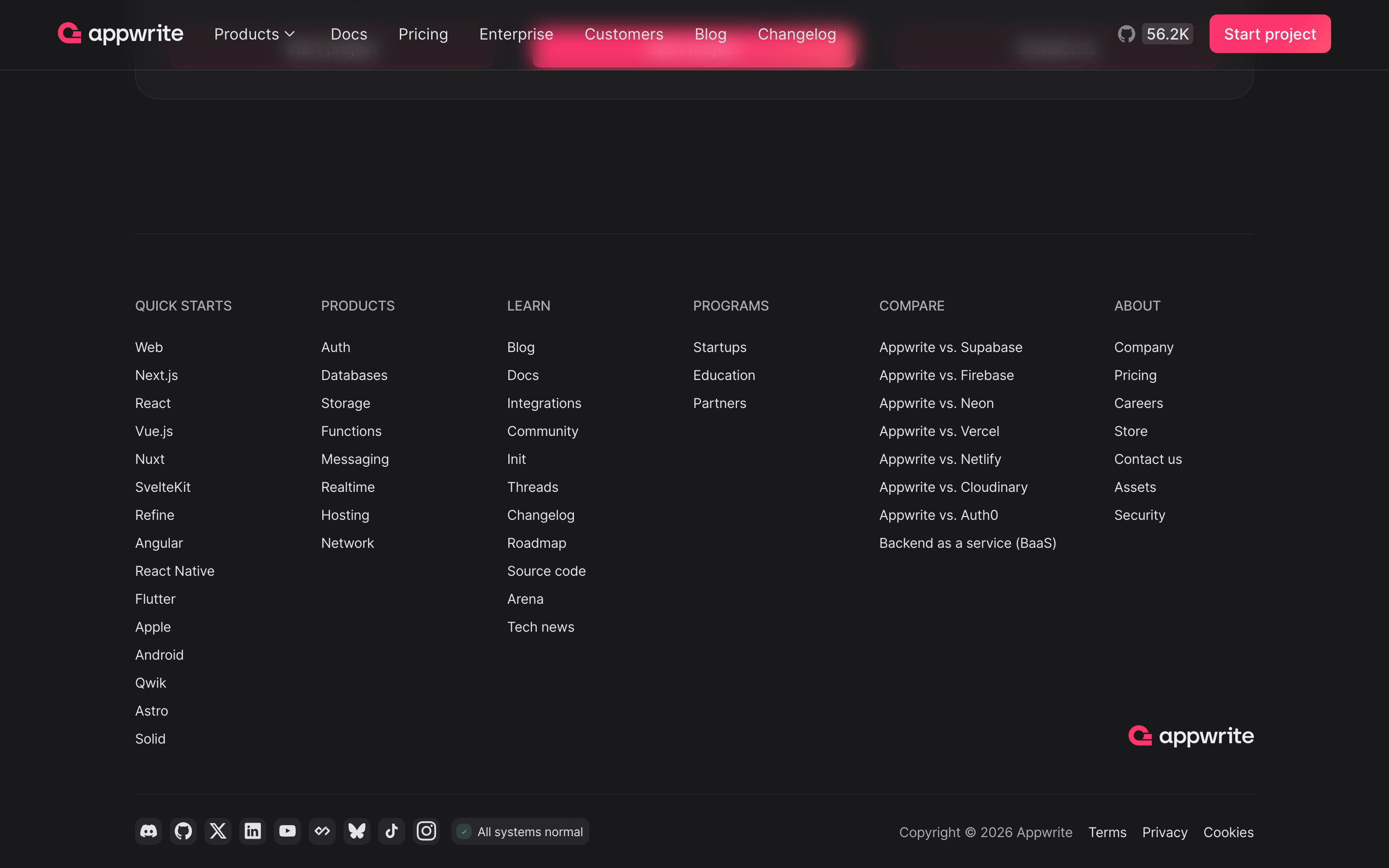
A dark, sophisticated command center for building modern applications.
02
Color
#fd356eAccent
#ffffffInk
#acacafInk soft
#19191cBG
#1d1d21BG soft
#202023BG quiet
#57575cMuted
rgba(172, 172, 175, 0.2)Line
Dark mode base with high-contrast white text and a singular, vibrant pink accent for primary actions.
03
Typography
grotesque-sans · humanist-sans · monospace
display64px · 500
heading40px · 500
body16px · 400
Display text uses a heavy grotesque typeface with tight tracking. · Body text defaults to a highly legible humanist sans-serif. · Monospace font is strictly for code snippets and technical identifiers.
04
Spacing
4px
8px
12px
16px
24px
32px
48px
64px
96px
A strict 4px grid system that maintains consistent visual density.
05
Surfaces
sm · 4px
md · 8px
lg · 12px
pill · 999px
Subtle 1px borders in rgba(172, 172, 175, 0.2) define card boundaries without breaking the dark immersion.
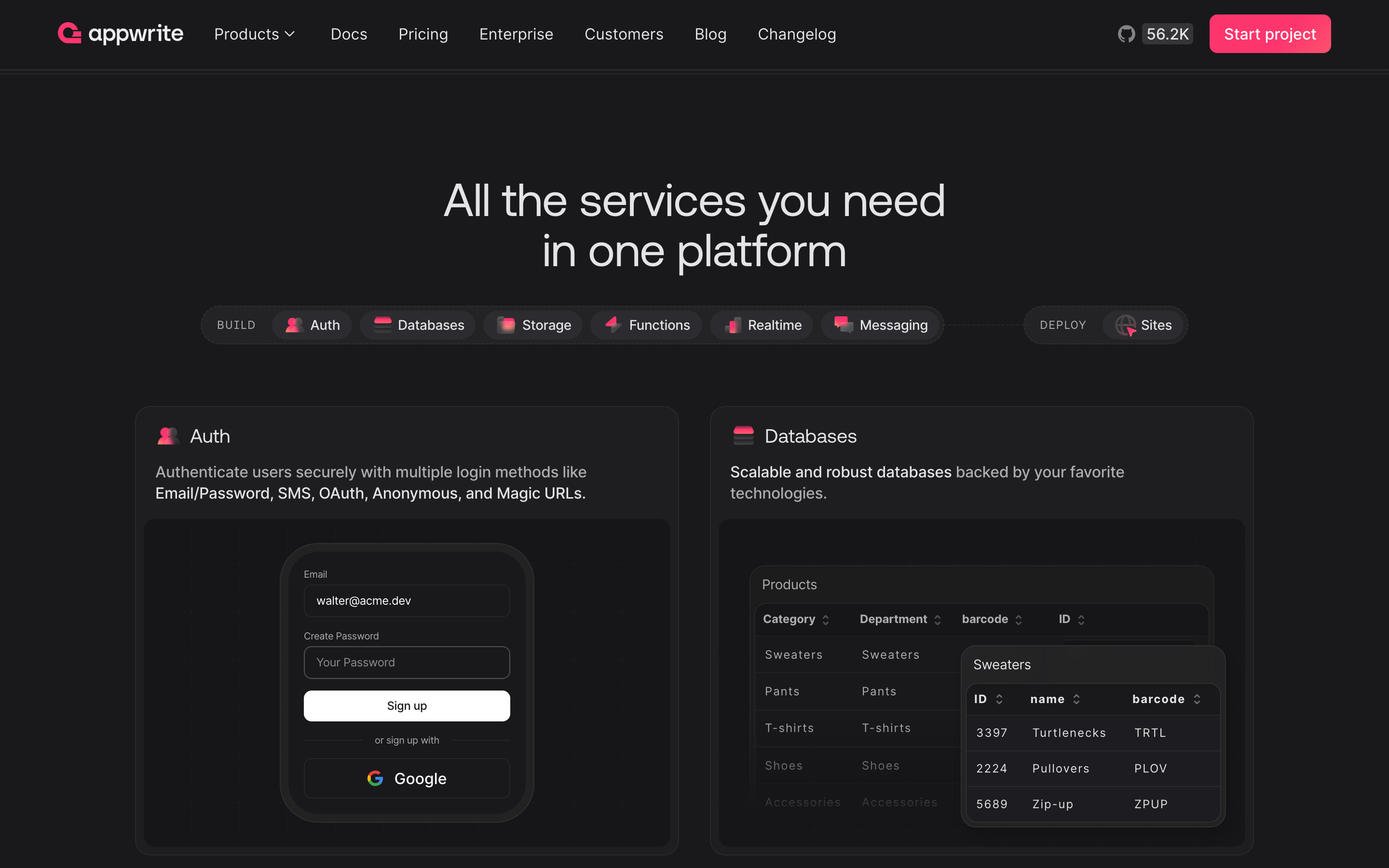
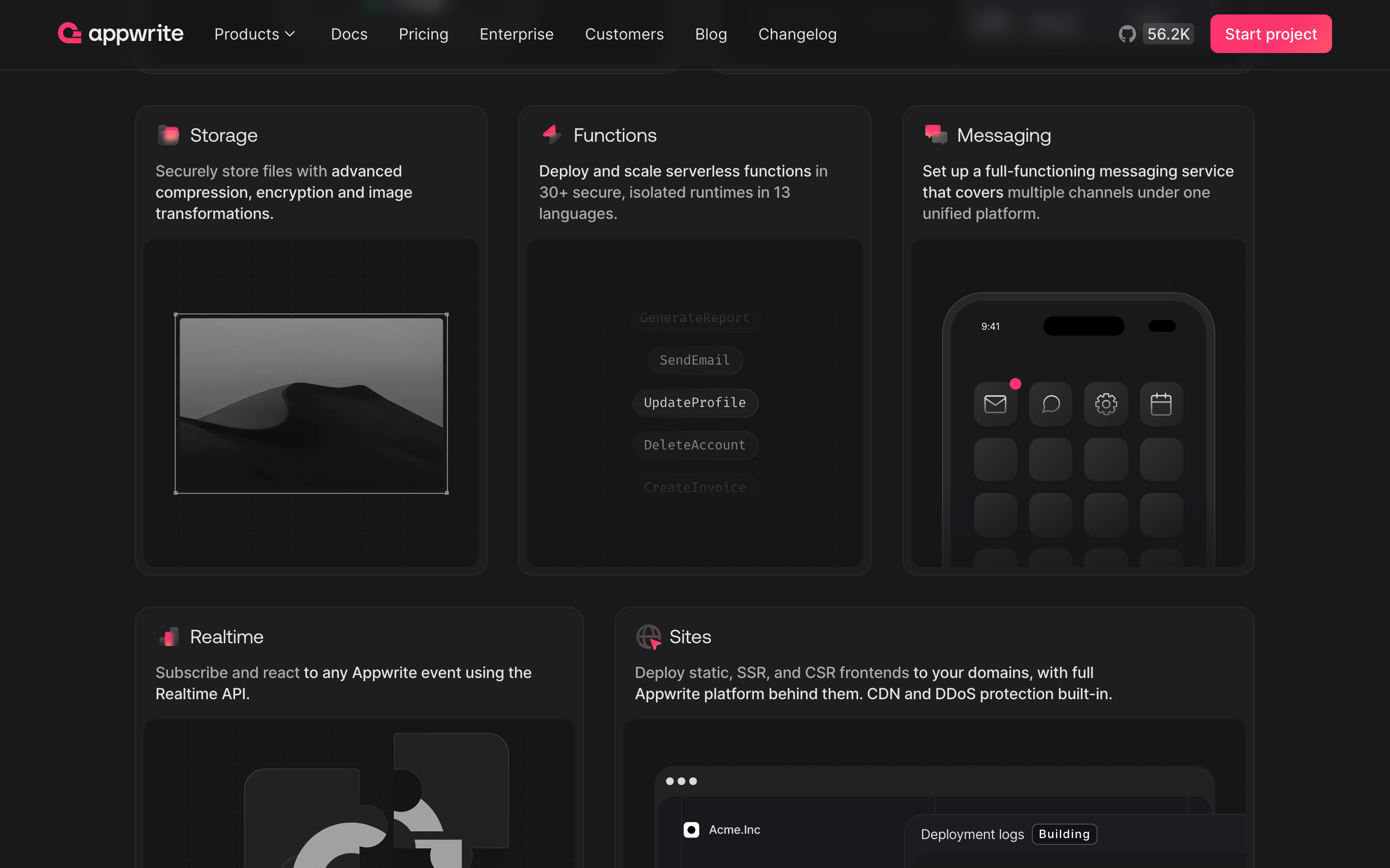
A centered single-column layout for hero sections, transitioning to a multi-column grid for feature and case study sections.
07
Motion & Interaction
150msmicro
300mssmall
400msmedium
cubic-bezier(0.4, 0, 0.2, 1)easing
Opacity fades for secondary elements. · Smooth color and border transitions on interactive states.
Subtle opacity or background-color shifts on hover for interactive elements. · Immediate visual feedback via scale or color change.
08
Components
buttonPrimary buttons use the vibrant pink accent (#fd356e) with pill-shaped corners and white text. Secondary buttons are transparent with subtle borders.
cardDark, elevated panels with subtle borders and generous internal padding.
chipPill-shaped tags with a semi-transparent background and subtle border.
inputDark themed inputs with subtle borders and rounded corners.
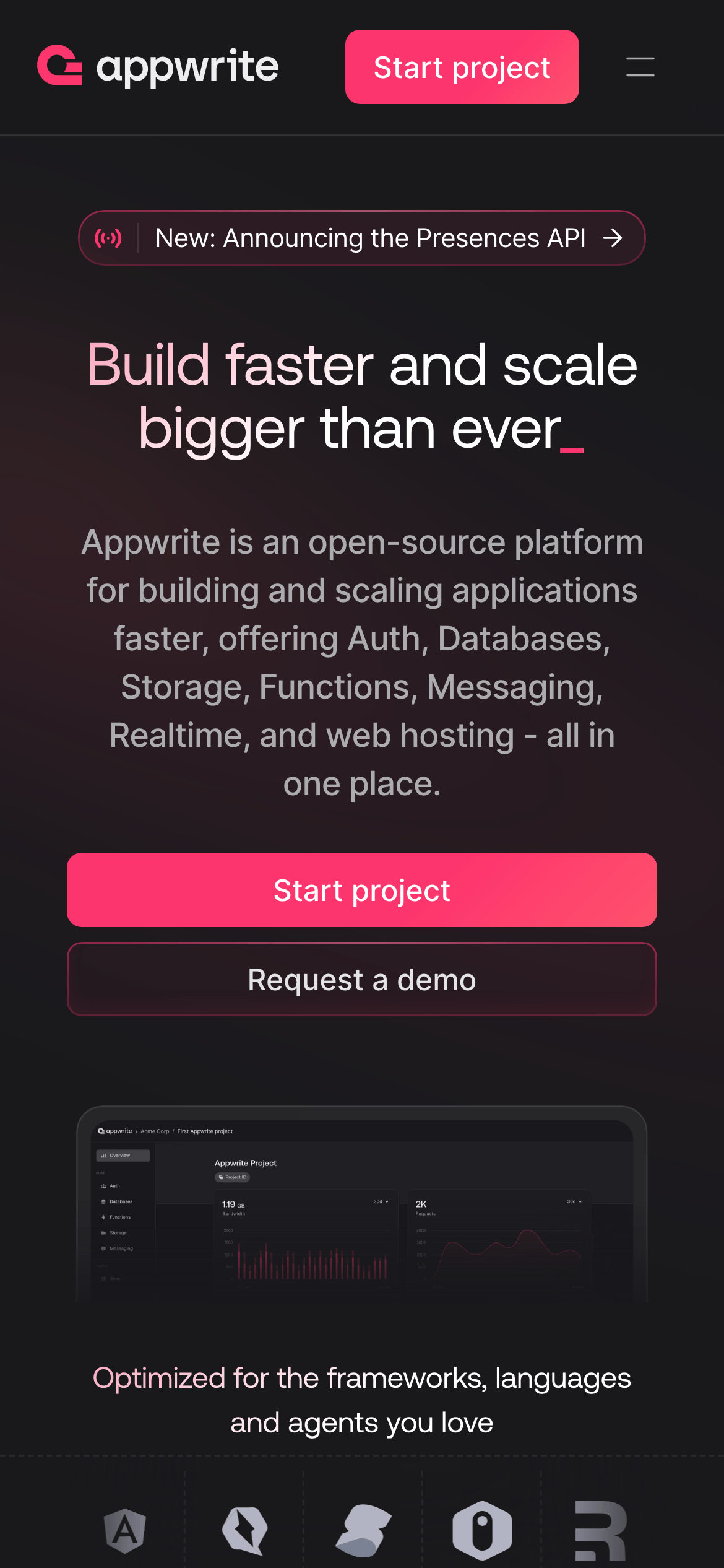
heroA massive, centered typography block with a vibrant accent line and a high-fidelity product screenshot.
09
Voice & Don'ts
ToneProfessional, direct, and empowering, focusing on developer efficiency and scale.
HeadlinesBold, direct, and action-oriented, often using present tense verbs.
CTAsClear and action-oriented, such as 'Start project' or 'Request a demo'.
Don't use light backgrounds — screenshot shows a deep dark theme (#19191c).
Don't use serif fonts for headlines — screenshot shows a clean, modern grotesque sans-serif.
Don't use muted or pastel accent colors — screenshot shows a highly saturated pink (#fd356e).
Don't use sharp corners on primary buttons — screenshot shows pill-shaped (999px) radius.
Don't use high-contrast white backgrounds for cards — screenshot shows dark, slightly elevated surfaces.
Don't use wide tracking on large headlines — screenshot shows tight, negative tracking.
Captured from the live site · real computed styles
11
System prompt
Appwrite is an open-source Backend-as-a-Service (BaaS) platform for developers, featuring a dark, sophisticated UI. The primary color palette consists of a deep dark background (#19191c), high-contrast white text (#ffffff), and a vibrant pink accent (#fd356e) for primary calls to action. Typography combines a bold grotesque sans-serif for headlines with a humanist sans-serif for body text, maintaining a clean and modern aesthetic. Critical design constraints: never use light backgrounds or pastel accent colors; always maintain high contrast for readability on dark surfaces; and strictly use pill-shaped (999px radius) corners for primary action buttons to ensure visual consistency.
Bring this taste to your agent
Hand your AI agent a machine-readable spec of this design — tokens, type, motion, the whole DNA.