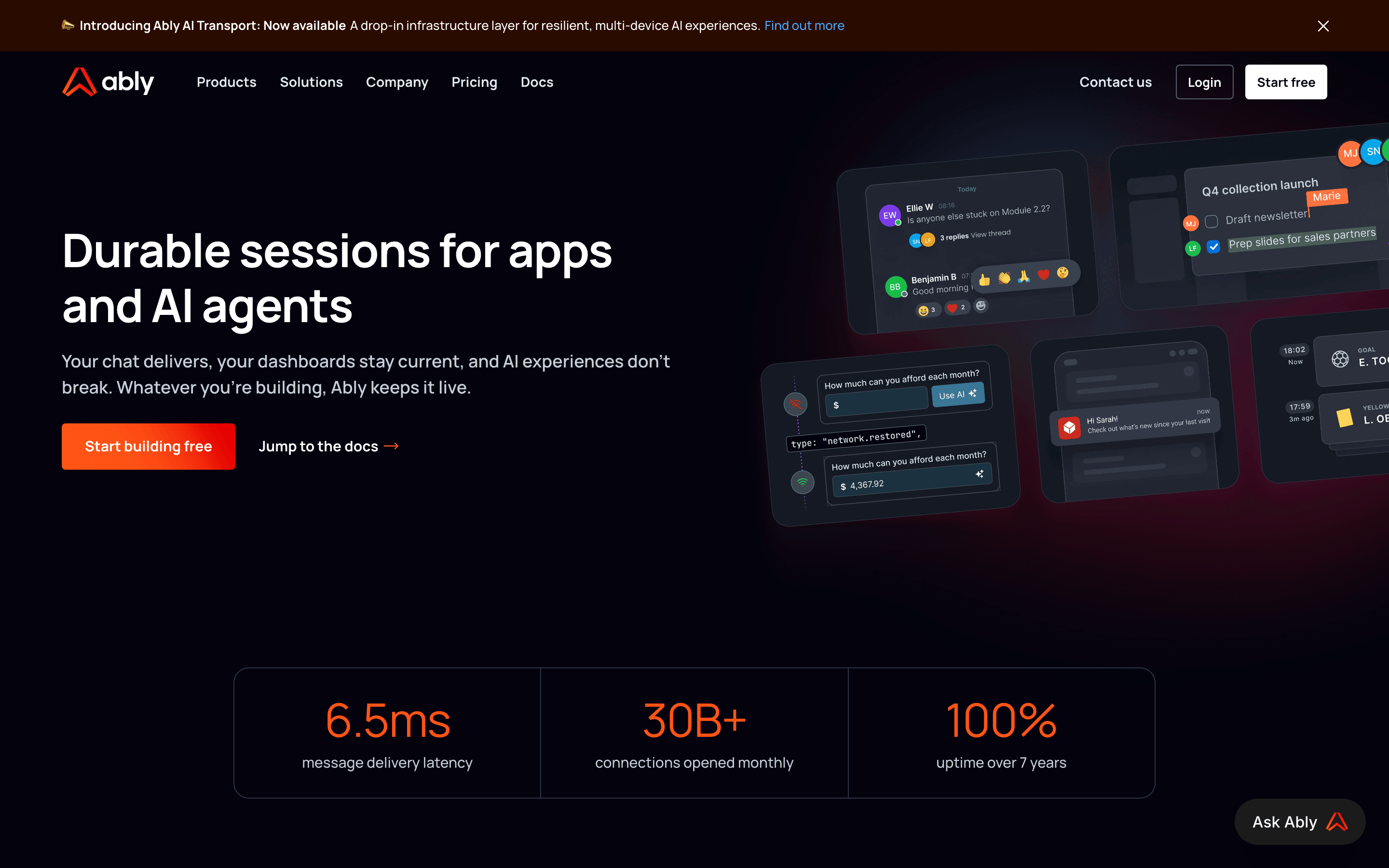
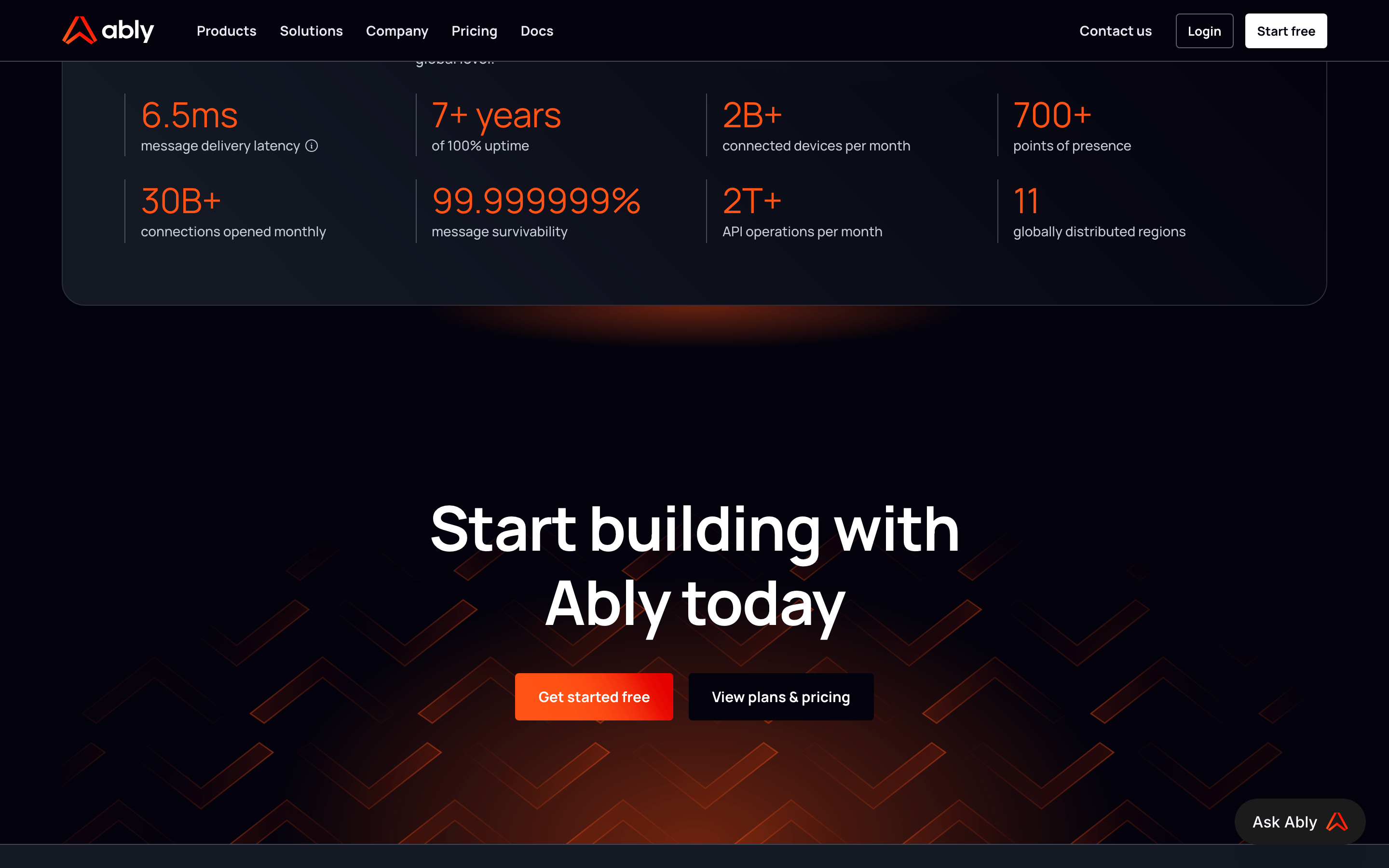
A high-performance engine room for modern, multi-device digital experiences.
02
Color
#FF5416Accent
#FFFFFFInk
#C6CED9Ink soft
#03020DBG
#141924BG soft
#3F4555BG quiet
rgba(226,232,240,1.0)Line
High-contrast dark mode with a vibrant, energetic orange accent for high-priority actions.
03
Typography
geometric-sans · humanist-sans · monospace
display56px · 500
body17px · 500
Use a clear typographic hierarchy with large, bold display text for key messages. · Ensure sufficient contrast between white/gray text and the dark background.
04
Spacing
4px
8px
12px
16px
24px
32px
48px
64px
A consistent 4px base unit provides structure and predictable spacing throughout the layout.
05
Surfaces
sm · 4px
md · 8px
lg · 12px
pill · 999px
1px solid rgba(226,232,240,1.0) for subtle separation and 1px solid rgba(255,255,255,0.25) for interactive elements.
0px 4px 4px 0px rgba(0,0,0,0.25)
06
Layout
1280container
12columns
24pxgutter
768 / 1024breakpoints
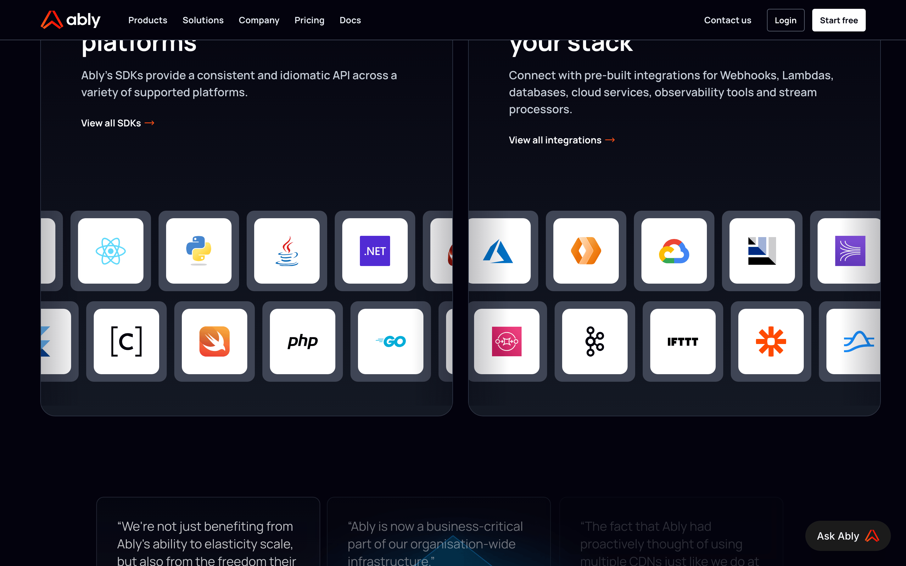
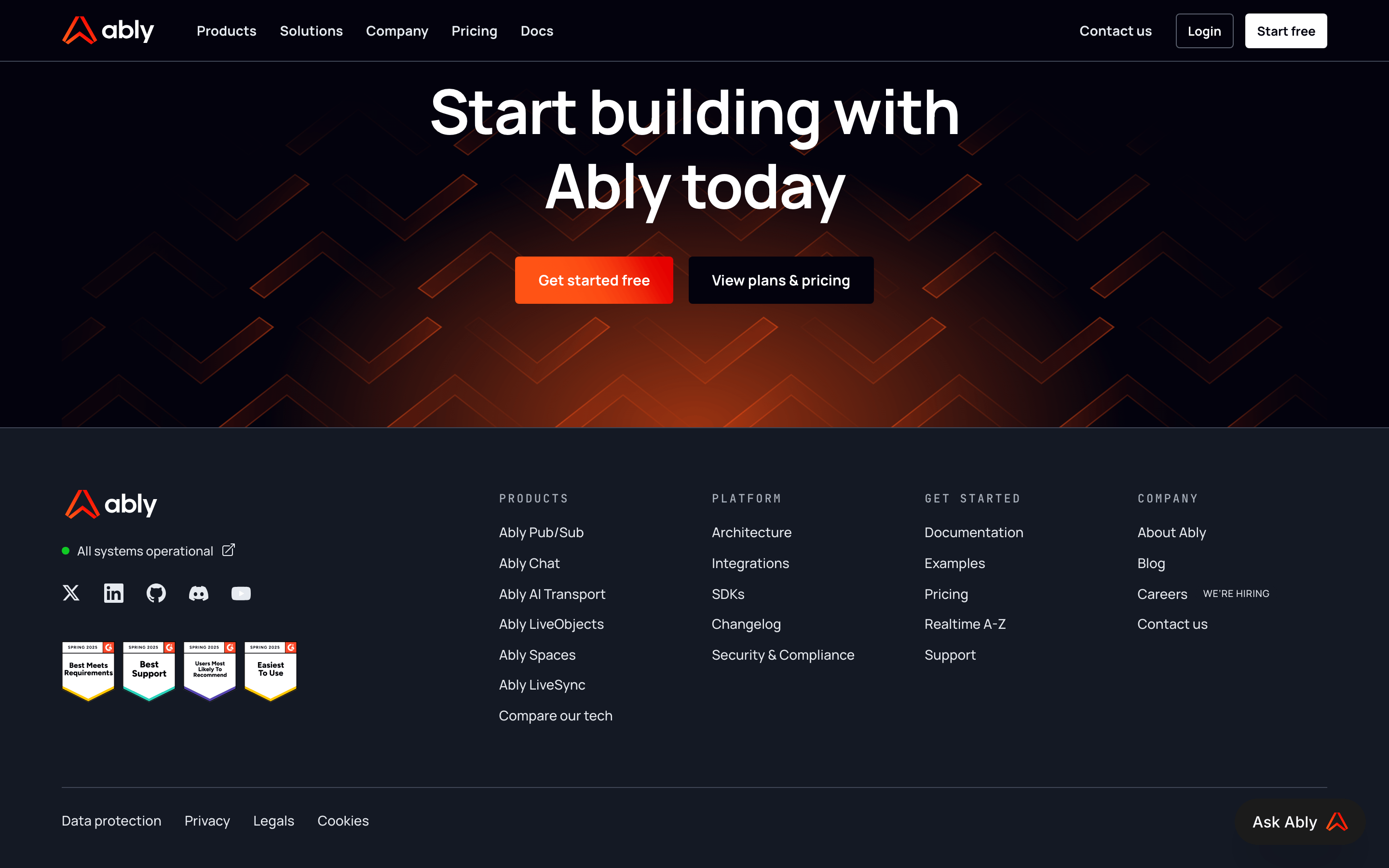
A structured 12-column grid system with a centered container, featuring distinct sections for hero content, stats, and use-case cards.
07
Motion & Interaction
150msmicro
250mssmall
500msmedium
cubic-bezier(0.4, 0, 0.2, 1)easing
Smooth transitions for interactive states like hover, color changes, and layout shifts.
Visual feedback through color changes, opacity adjustments, or subtle padding shifts. · Immediate response with standard interactive feedback, often transitioning the element to its active state.
08
Components
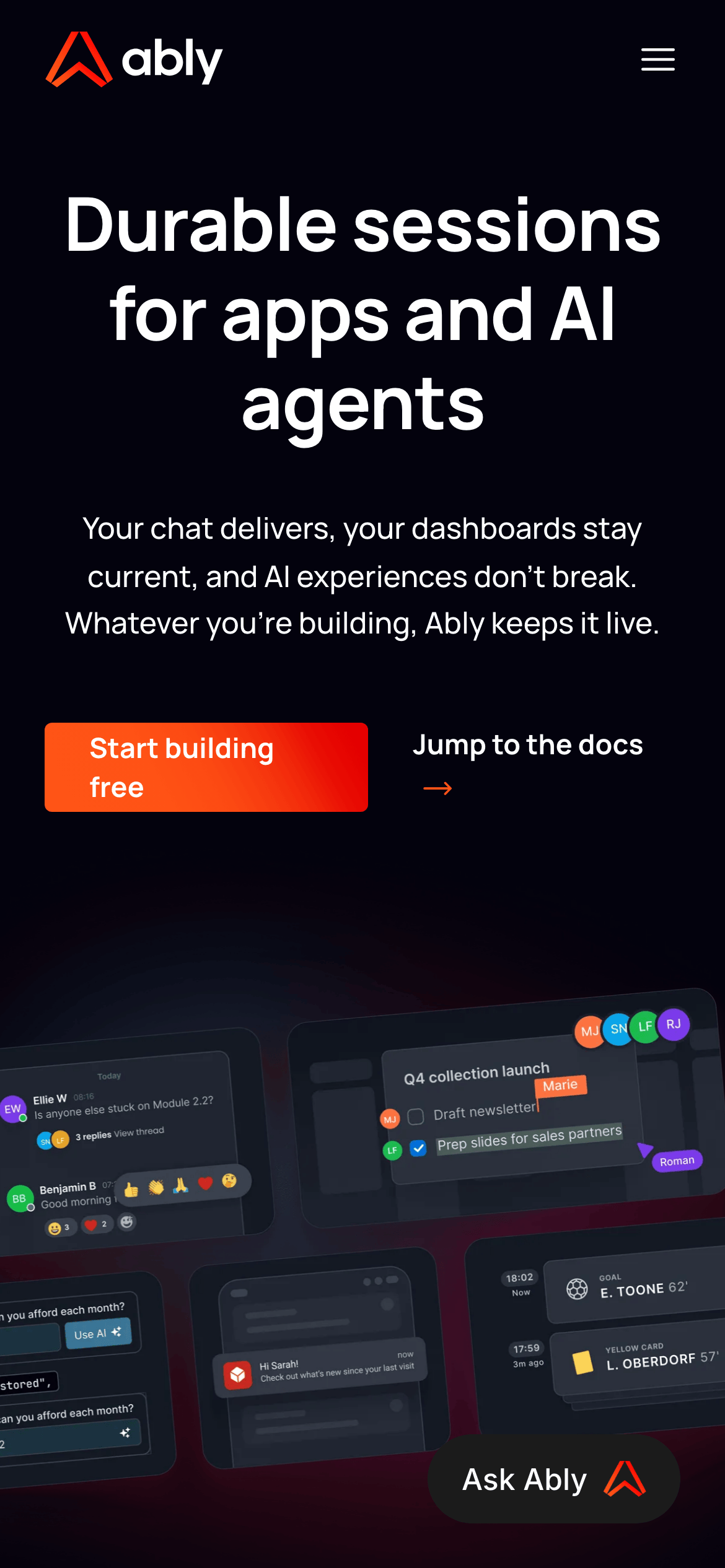
buttonBold, solid-colored primary buttons (often orange gradient) and outlined secondary buttons, both with large padding and rounded corners.
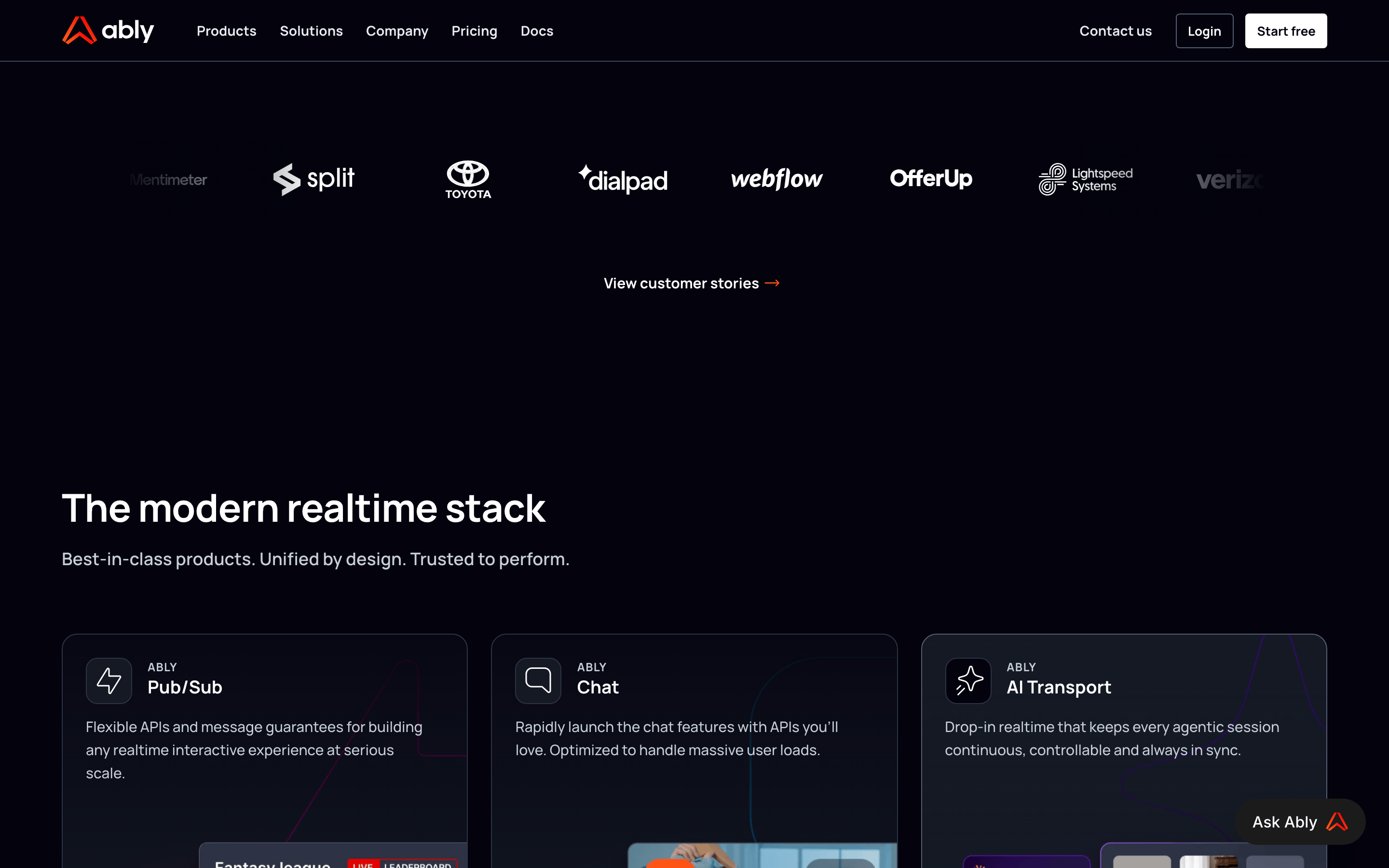
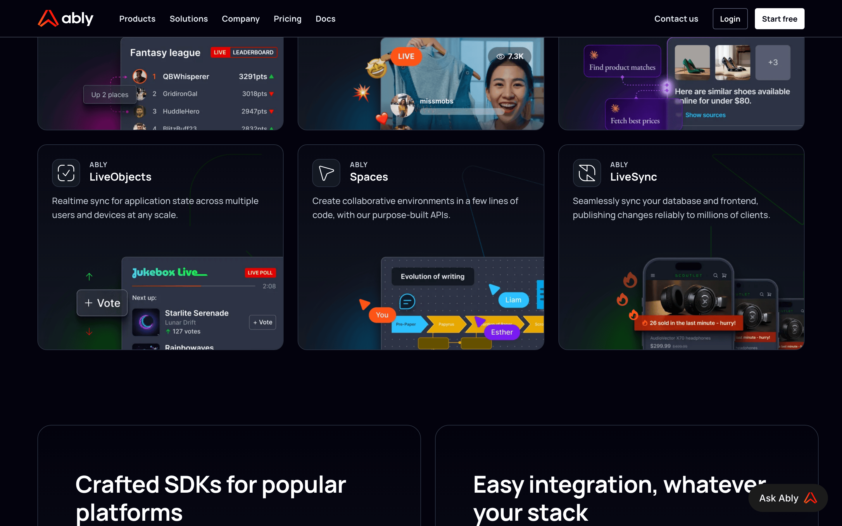
cardDark-themed cards with rounded corners, used to showcase use cases with imagery and concise descriptions.
chipSmall, rounded tags or badges used for status or categorization within the UI.
inputDark-themed input fields with clear borders and specific states for interactive elements.
heroA large, left-aligned hero section with a compelling headline, descriptive text, and prominent call-to-action buttons.
09
Voice & Don'ts
ToneConfident, authoritative, and developer-focused, emphasizing reliability and performance.
HeadlinesDirect, benefit-oriented, and concise, often using strong verbs and impactful numbers.
CTAsActionable and clear, using verbs like 'Start' and 'Jump to' to guide the user.
Don't use a light theme — screenshot shows a dark background (#03020D) with white text.
Don't use a primary blue accent — screenshot shows a vibrant orange (#FF5416) for key actions.
Don't use rounded corners smaller than 4px — screenshot shows a consistent use of 8px-12px for cards.
Don't use complex sans-serif fonts — screenshot shows clean geometric and humanist sans-serifs.
Don't use small, cramped spacing — screenshot shows a generous 24px gutter and large padding.
Captured from the live site · real computed styles
11
System prompt
This is a developer-focused SaaS website for a real-time infrastructure platform. The design DNA is built on a deep, dark color scheme (#03020D background) with high-contrast white (#FFFFFF) and soft gray (#C6CED9) text, anchored by a vibrant orange (#FF5416) accent. Typography is primarily clean, modern sans-serif (humanist and geometric categories), with a clear hierarchy from large, bold headlines to readable body text. Critical design constraints: never use a light theme, never use blue as the primary accent, and avoid cramped layouts. The overall feel is professional, reliable, and highly functional, designed to appeal to technical decision-makers.
Bring this taste to your agent
Hand your AI agent a machine-readable spec of this design — tokens, type, motion, the whole DNA.