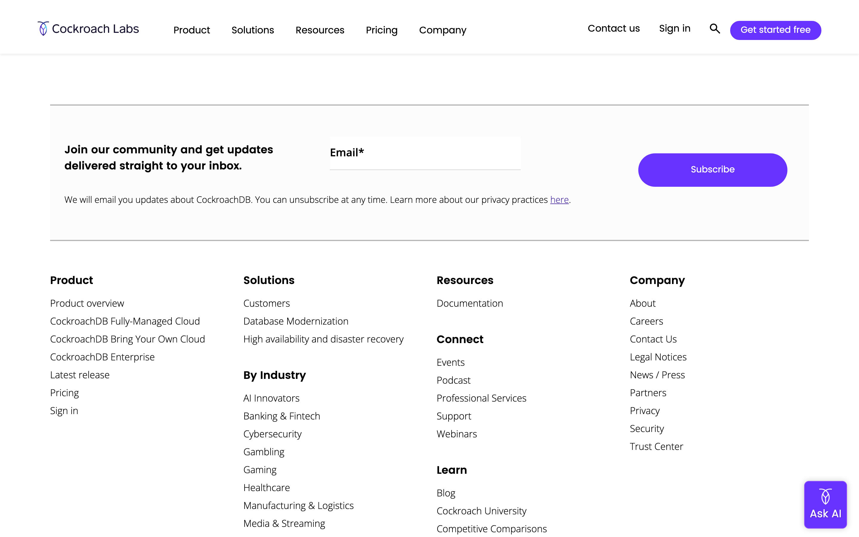
A modern infrastructure company that positions its database as the foundational system of record for business-critical applications.
02
Color
#6933FFAccent
#000000Ink
#333333Ink soft
#FFFFFFBG
#FCFCFDBG soft
rgba(234, 236, 240, 1)Line
High-contrast, clean interface using a vibrant purple accent to highlight primary actions against a monochrome base.
03
Typography
humanist-sans
display56px · 600
heading40px · 500
body18px · 400
Use humanist sans-serif (Poppins/Open Sans) for a friendly yet professional technical feel. · Maintain tight negative letter-spacing for large display type to create a cohesive visual block. · Ensure body text has ample line-height (1.5-1.7) for technical readability.
04
Spacing
4px
8px
16px
24px
32px
48px
64px
96px
Standard 4px grid based spacing with consistent 24px gutters for layout alignment.
Full-width hero sections alternating with centered content containers.
07
Motion & Interaction
200msmicro
300mssmall
800msmedium
cubic-bezier(0.4, 0, 0.2, 1)easing
Smooth color and background transitions on hover (0.2s). · Rightward movement for interactive elements or arrows.
Subtle color shifts or background fills for links and buttons. · Immediate response with standard cursor pointer.
08
Components
buttonHigh-contrast solid purple (#6933FF) for primary actions, pill-shaped with white text. Secondary buttons are outlined with purple borders and dark text.
cardClean, minimal cards with subtle borders and slight shadows for elevation.
inputStandard form inputs with light grey borders and 8px border-radius.
heroLarge, left-aligned text over a geometric, light blue/cyan gradient background.
09
Voice & Don'ts
ToneProfessional, confident, and authoritative, focusing on reliability and scale.
HeadlinesBold, declarative statements that position the product as a critical infrastructure choice.
CTAsAction-oriented and direct, emphasizing free entry points or team consultation.
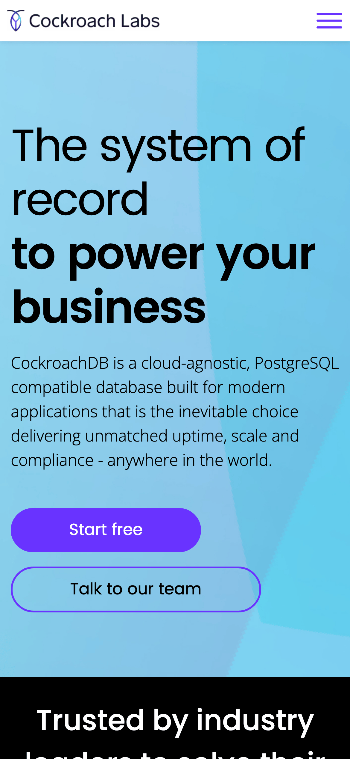
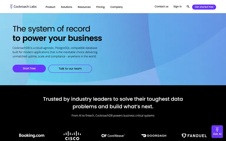
Don't use a wide, decorative serif font — the screenshot shows a clean, modern humanist sans-serif approach.
Don't use a muted, desaturated color palette — the screenshot features a vibrant, high-chroma purple accent.
Don't use complex, heavy drop shadows — the screenshot uses very subtle, soft elevation for depth.
Don't center-align all hero text — the screenshot shows the main headline and supporting copy aligned to the left.
Don't use decorative or handwritten font styles — the screenshot maintains a strictly professional, clean aesthetic.
Don't use dark backgrounds for primary CTAs — the screenshot uses a bright purple solid fill for the 'Start free' button.
Avoid: Overly playful language
Avoid: Vague marketing buzzwords without technical backing
Avoid: Dense, unformatted technical jargon in hero sections
Captured from the live site · real computed styles
11
System prompt
Cockroach Labs is a developer-focused SaaS platform for cloud-native databases. Its design is clean and authoritative, utilizing a humanist sans-serif type system (Poppins/Open Sans) and a monochrome palette (black/white/grey) punctuated by a vibrant purple accent (#6933FF). The layout is structured around large, bold typography and generous whitespace to convey reliability and scale. Critical design rules: avoid decorative serifs, avoid desaturated palettes, avoid complex heavy shadows, and maintain the distinct purple accent for all primary user actions. It targets technical decision-makers with a premium, trustworthy feel.
Bring this taste to your agent
Hand your AI agent a machine-readable spec of this design — tokens, type, motion, the whole DNA.