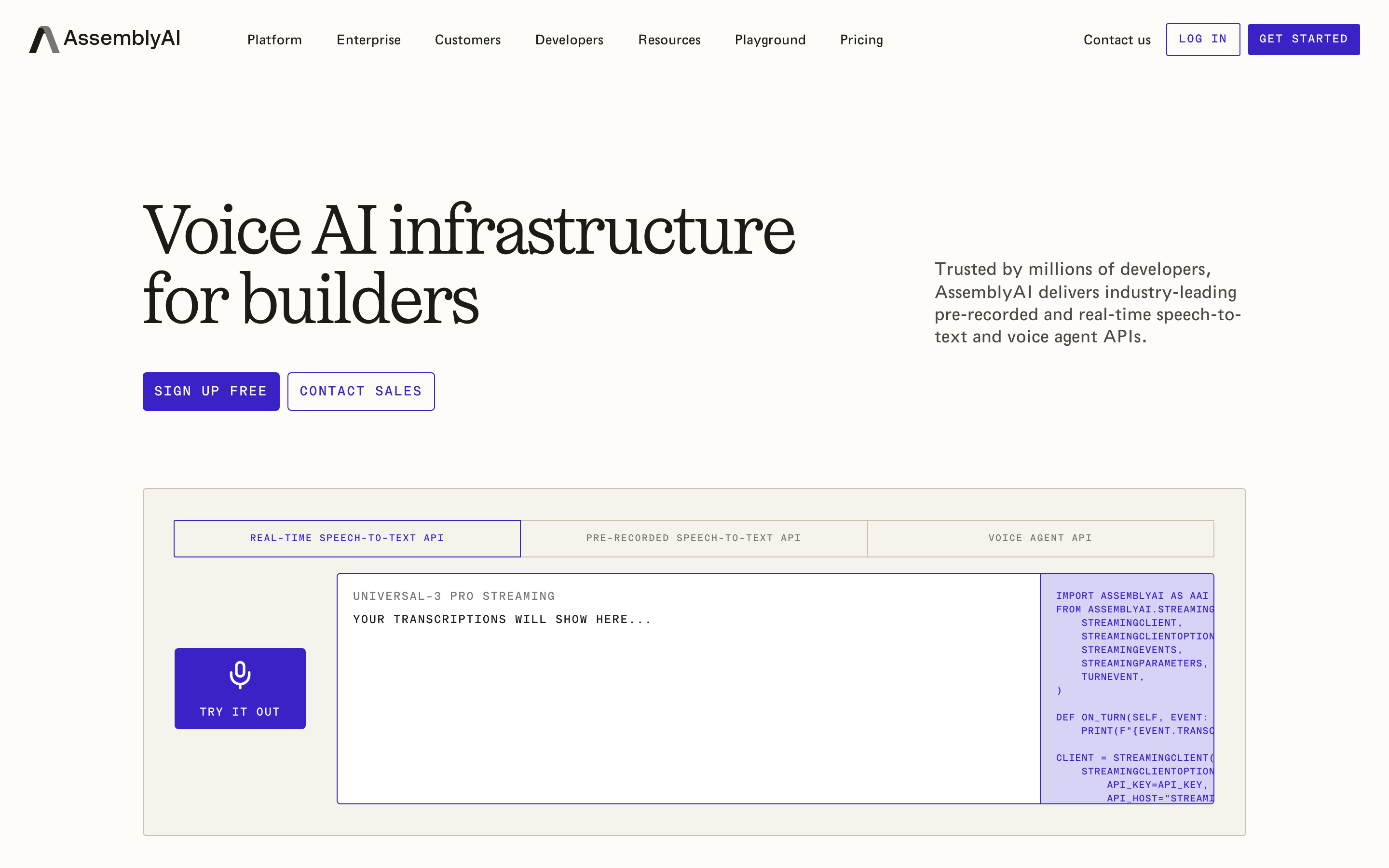
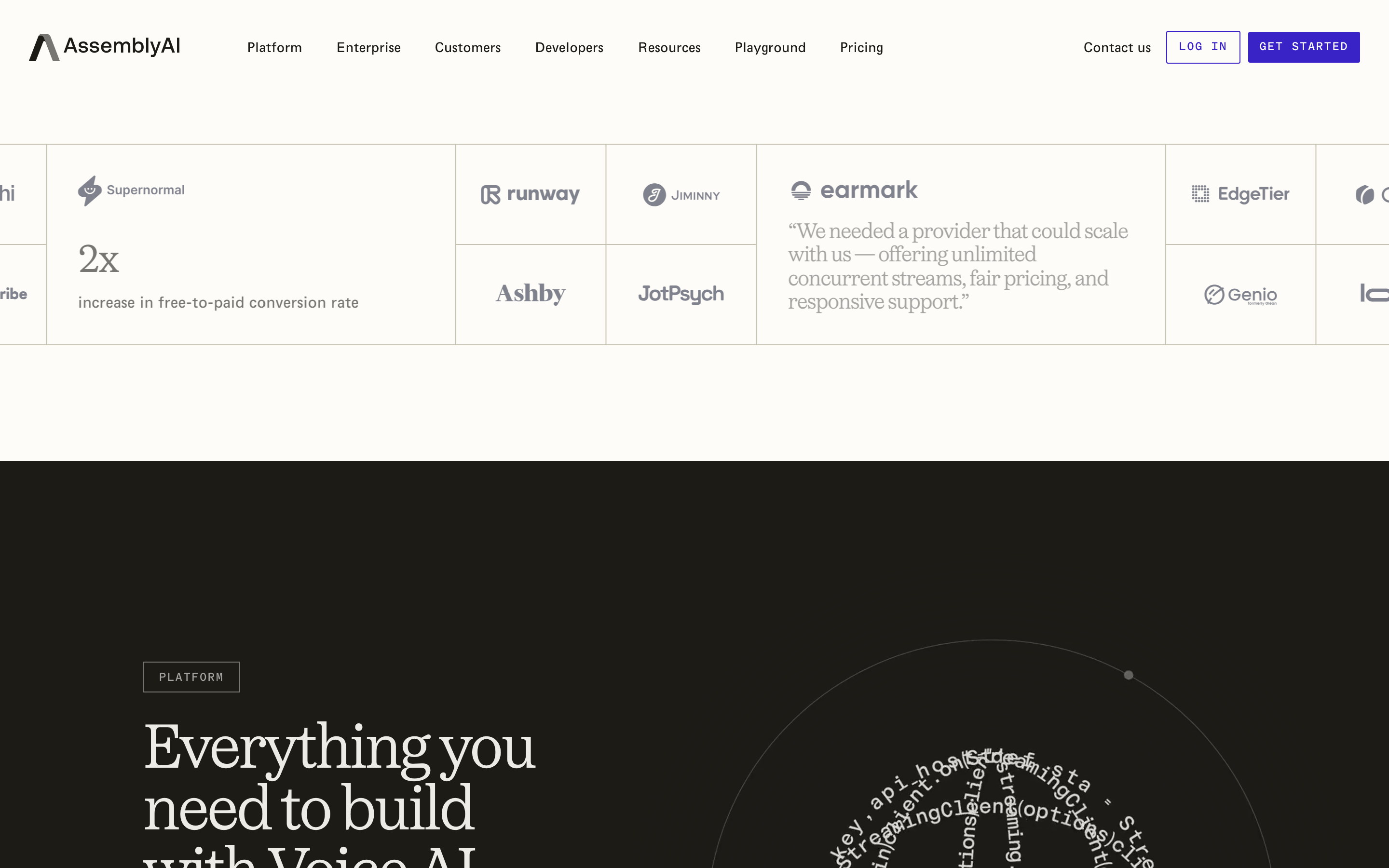
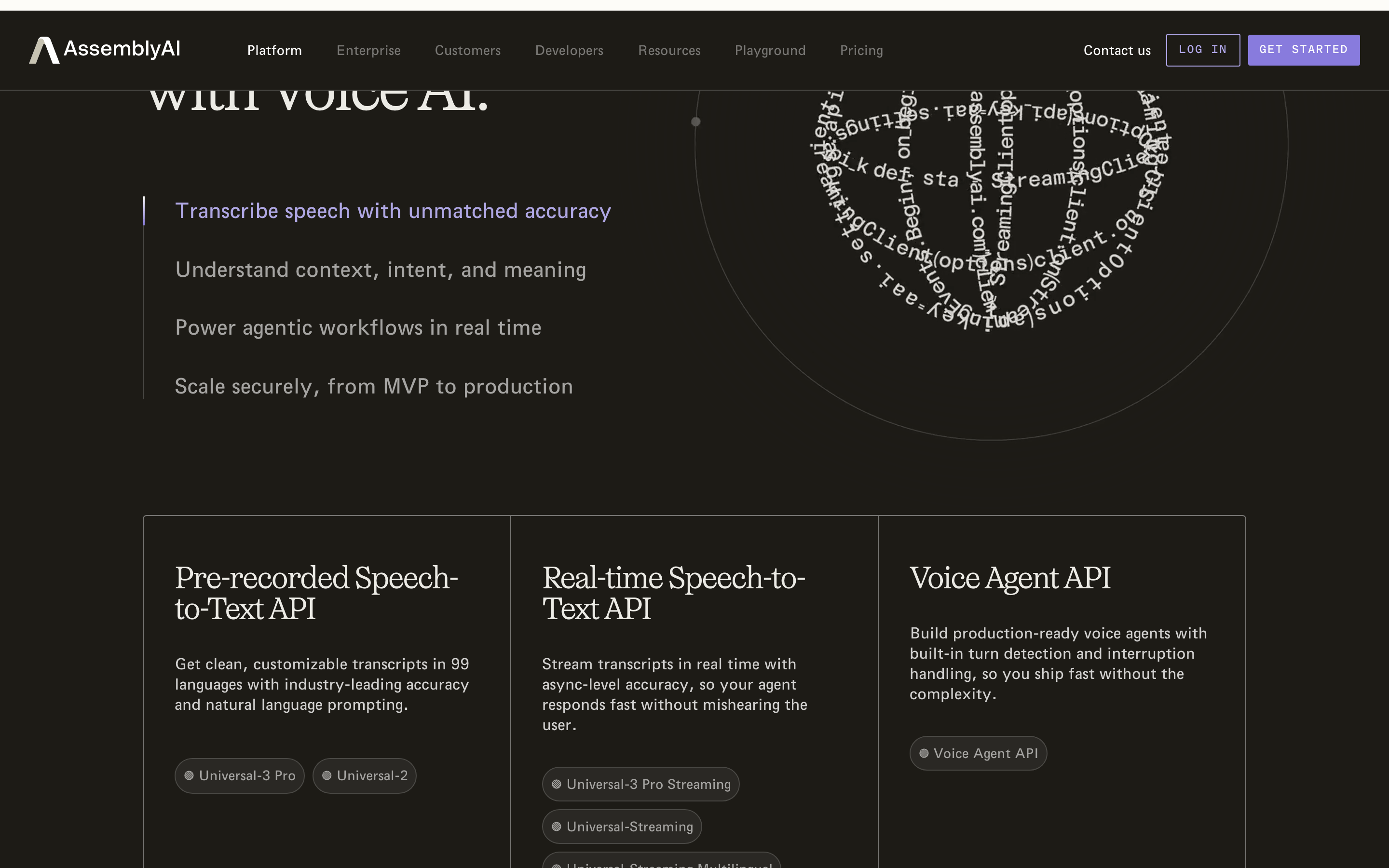
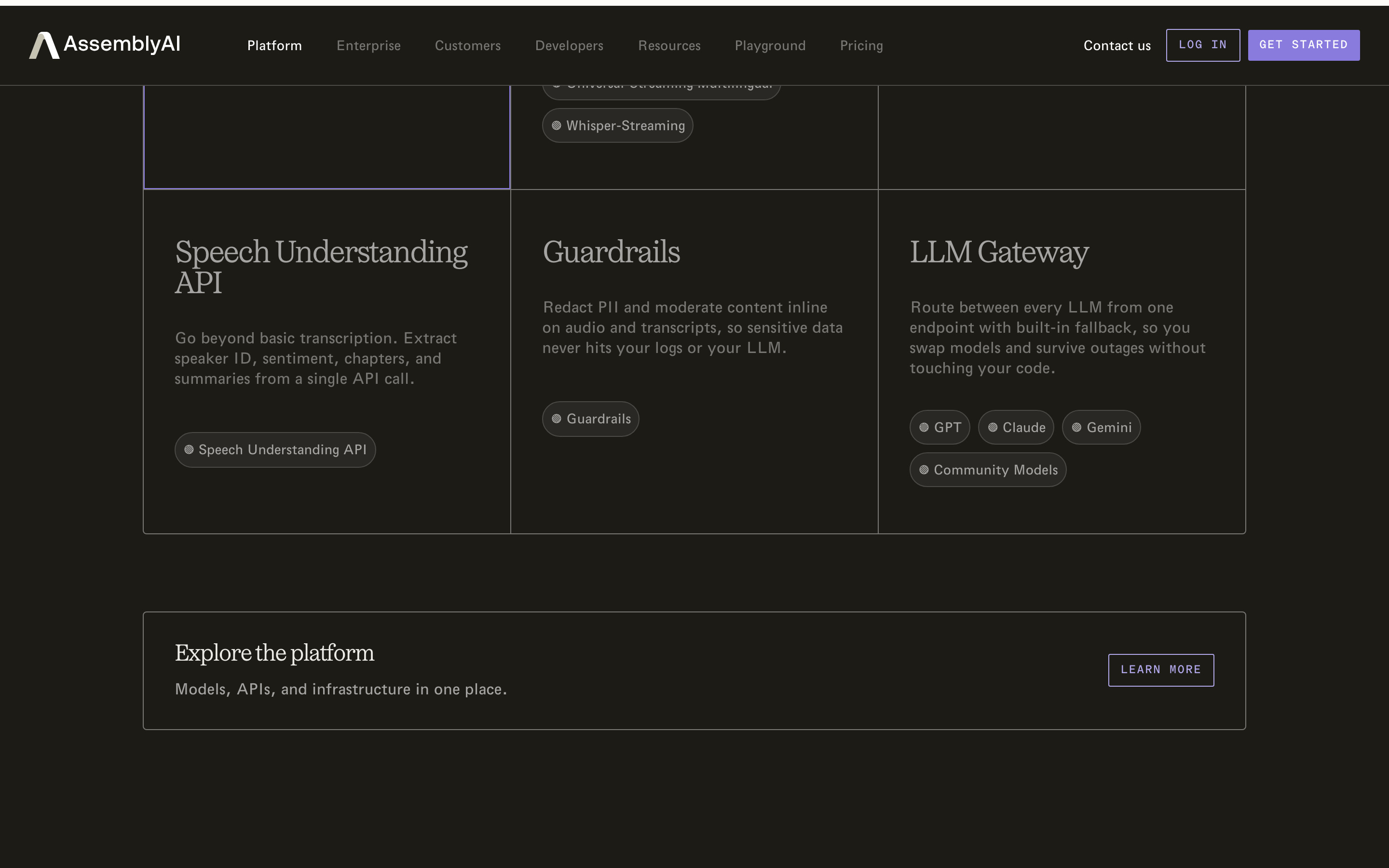
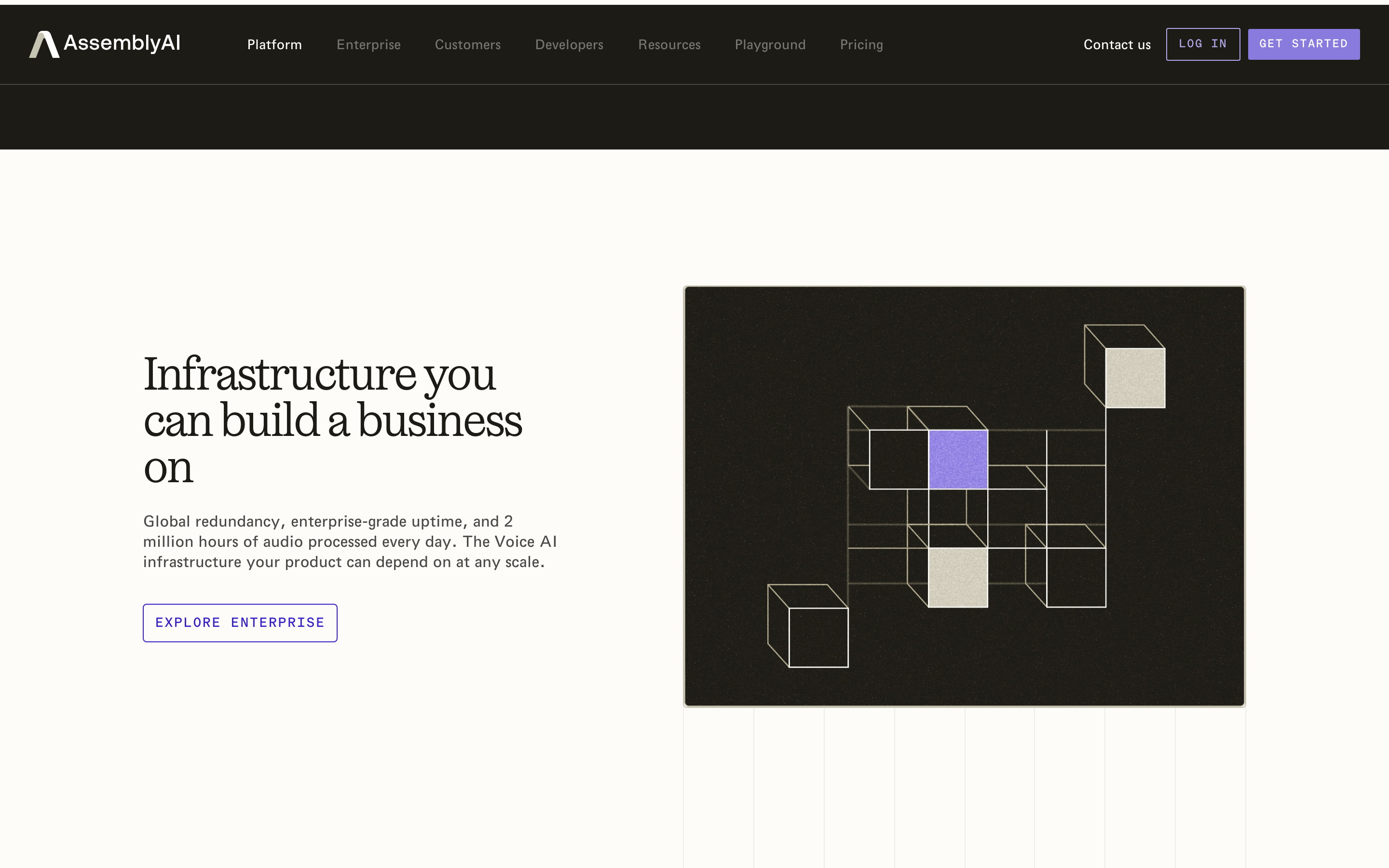
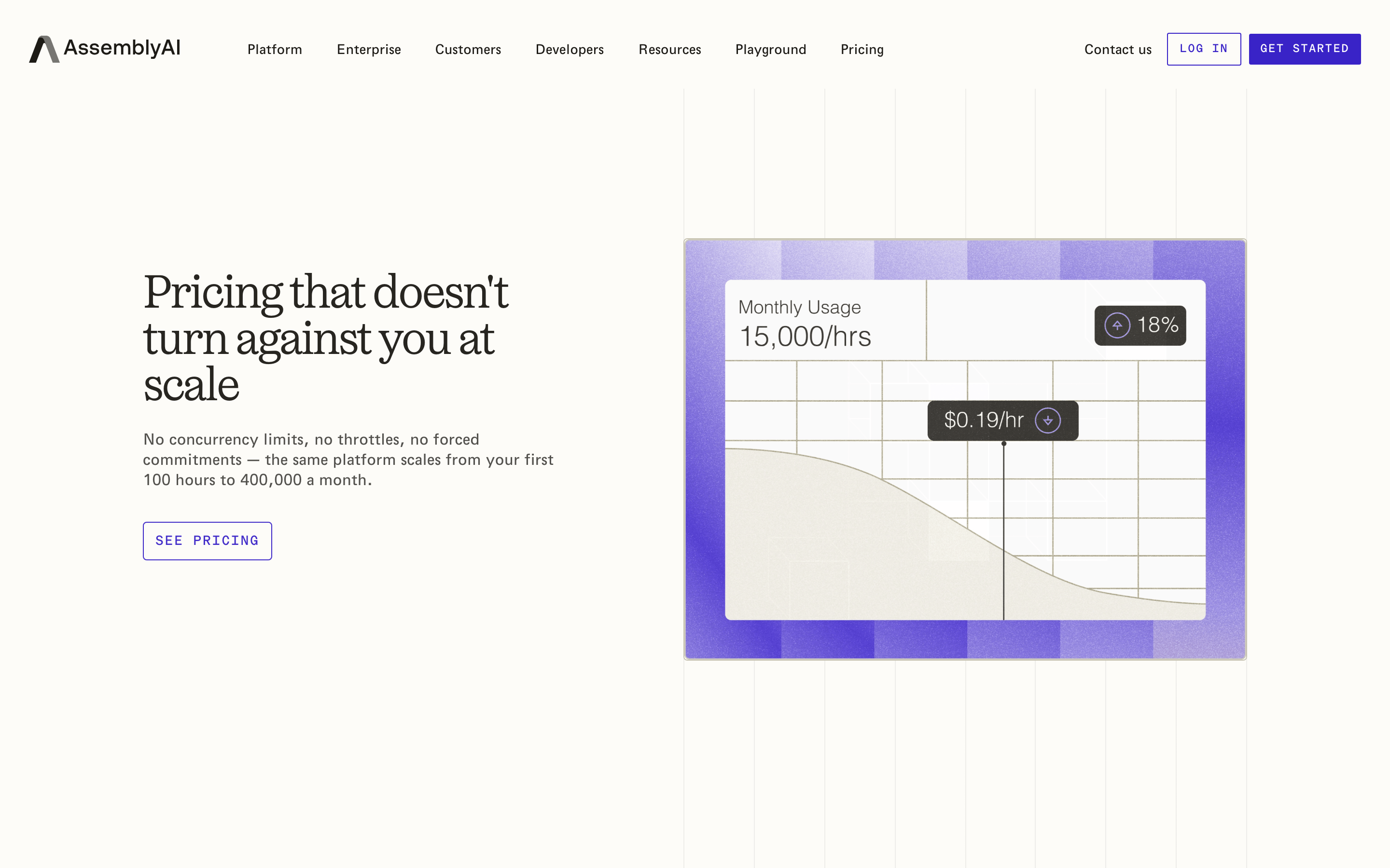
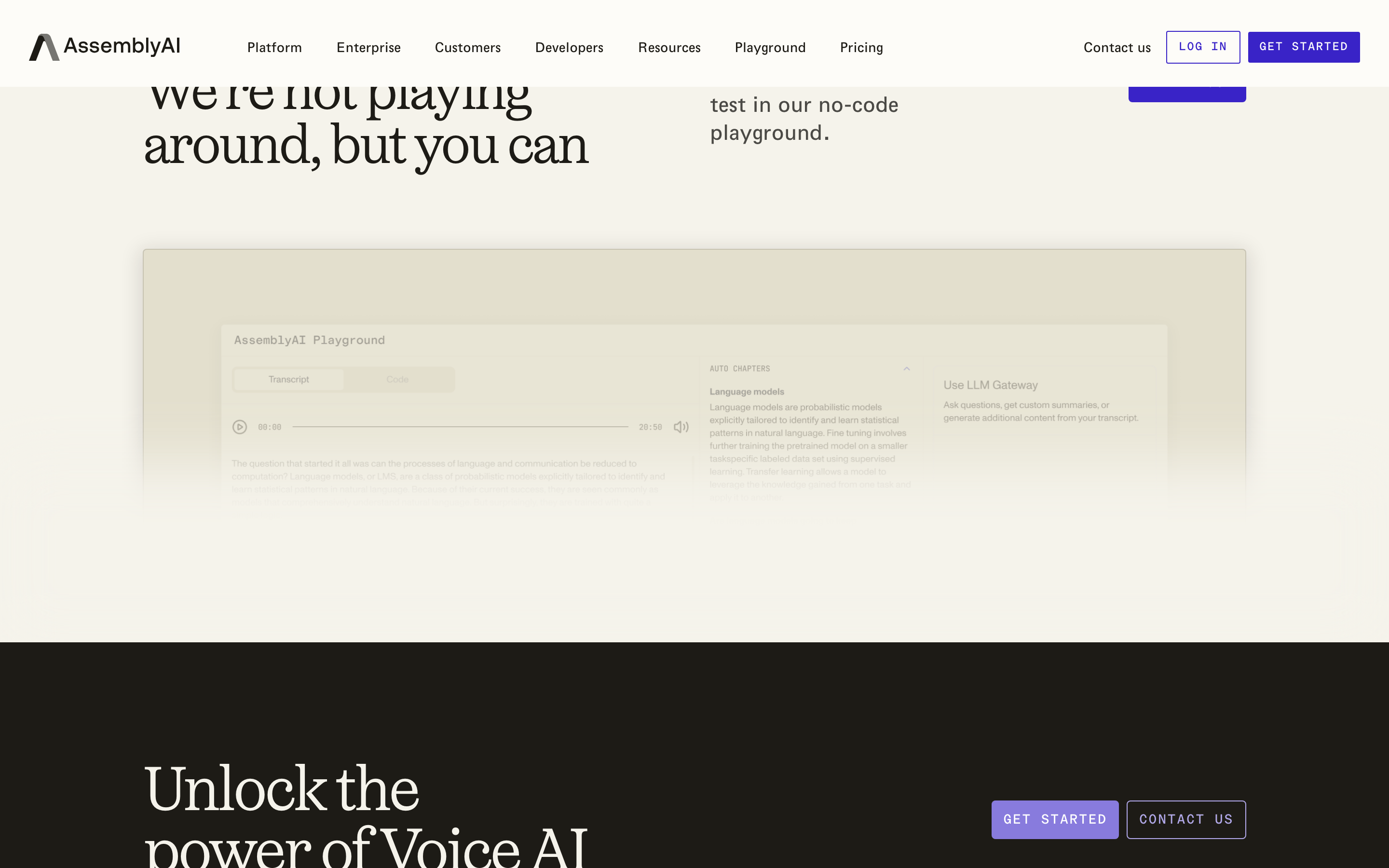
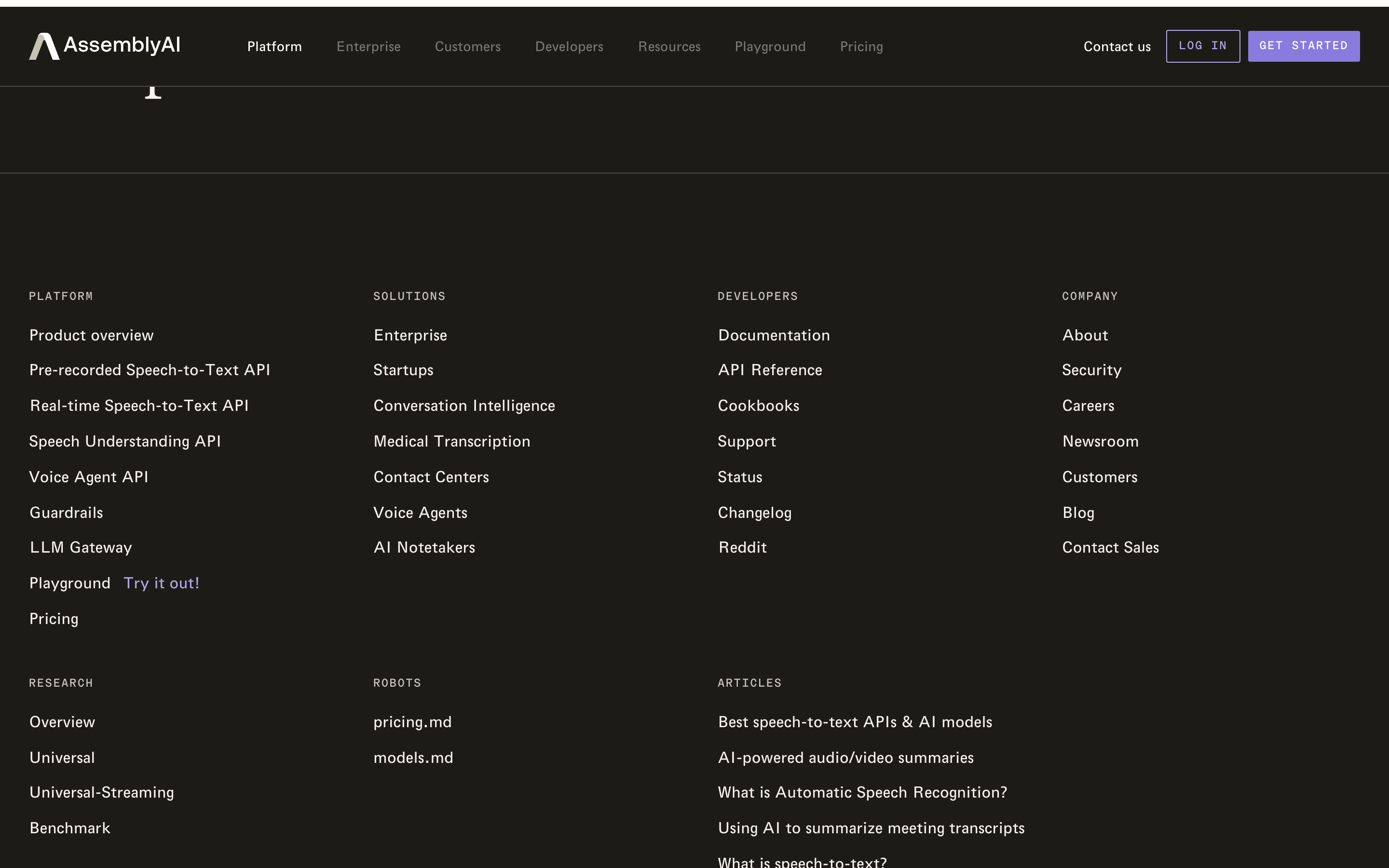
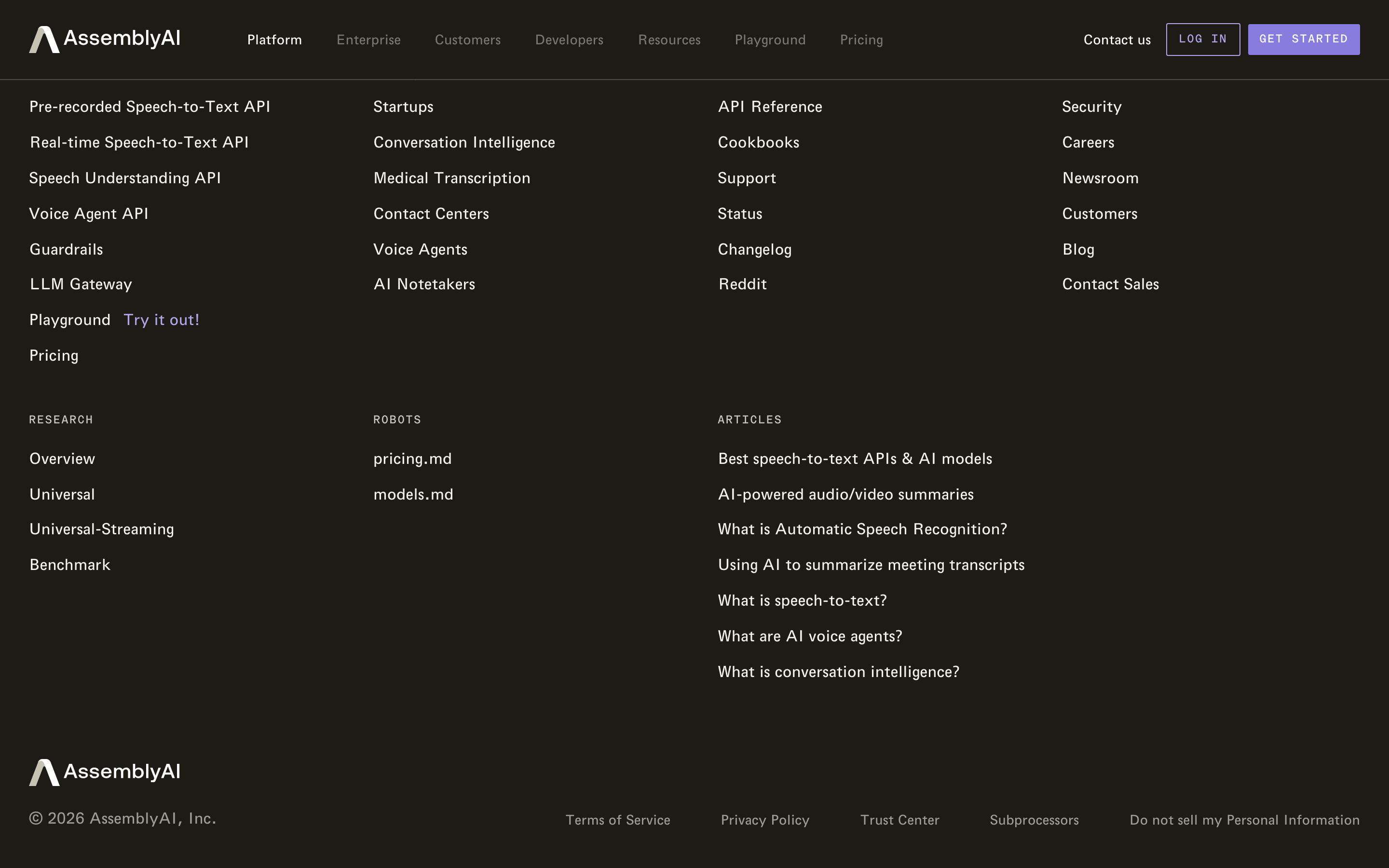
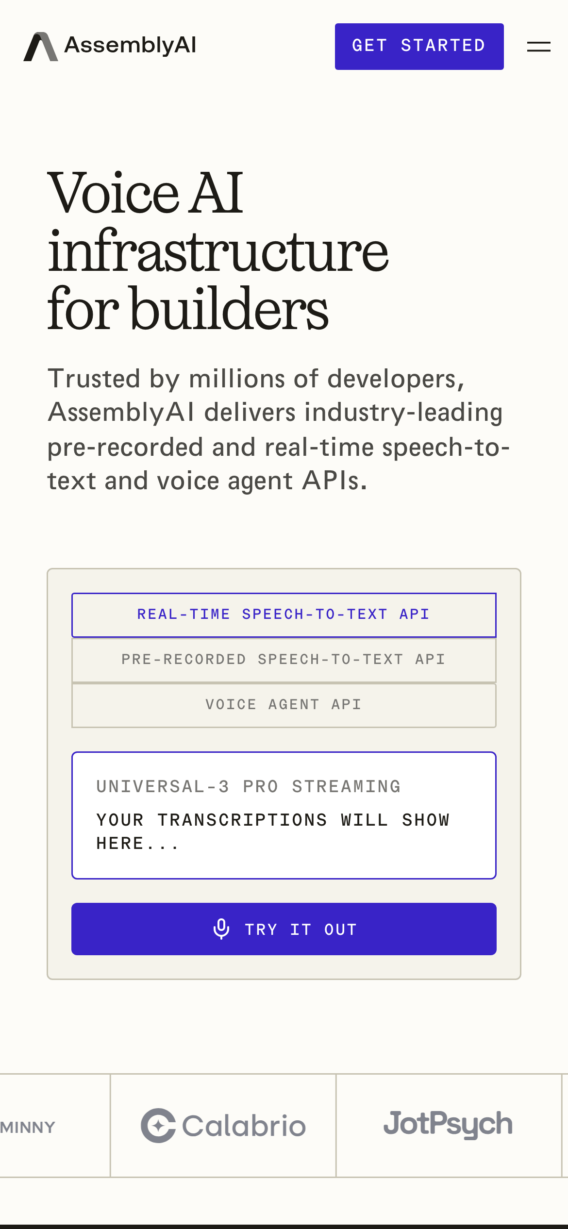
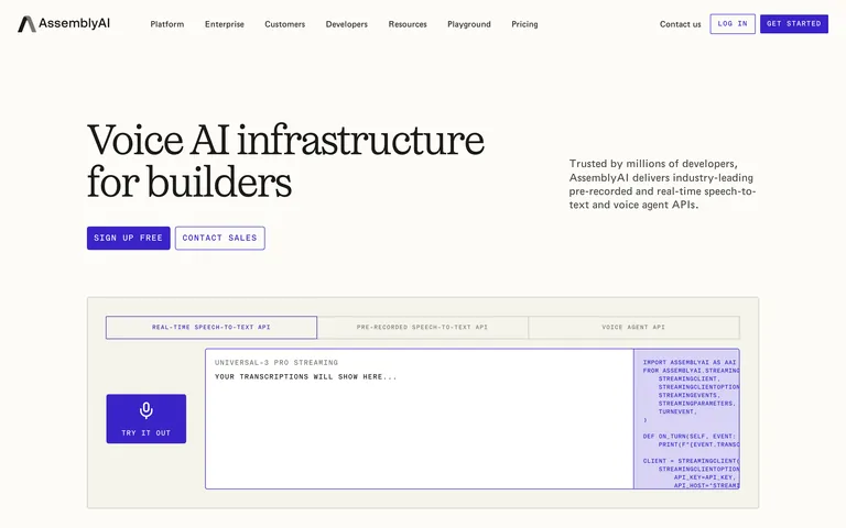
Clean, high-contrast base with a single bold accent for primary actions.
03
Typography
transitional-serif · geometric-sans · monospace
display64px · 400
body16px · 400
mono14px · 400
Use transitional serif for large display headlines · Use geometric sans for body and navigation · Use monospace for code snippets and technical UI elements
04
Spacing
4px
8px
16px
24px
32px
48px
64px
96px
Consistent 8px base grid with generous whitespace for clarity.
05
Surfaces
sm · 2px
md · 4px
lg · 8px
pill · 999px
Subtle, thin borders using muted dark colors to define containers without heaviness.
0px 4px 20px 4px rgba(29, 27, 22, 0.12)
06
Layout
1280container
12columns
24pxgutter
768 / 1024breakpoints
Generous spacing with a clear hierarchical structure between navigation, hero, and content sections.
07
Motion & Interaction
220msmicro
400mssmall
800msmedium
cubic-bezier(0.4, 0, 0.2, 1)easing
Subtle transitions on hover and focus for interactive elements · Smooth state changes for UI components
Subtle color or opacity changes on buttons and navigation links. · Immediate visual feedback through state changes.
08
Components
buttonBold, uppercase buttons with high contrast between filled (accent) and outlined variants.
cardClean containers with thin borders and subtle shadows, often housing interactive or technical content.
chipUppercase, monospace labels with thin borders, used for API categories.
inputMinimal styling with clean borders, focusing on functionality.
heroLarge, bold serif headlines paired with concise sans-serif subtext and clear calls to action.
09
Voice & Don'ts
ToneProfessional, authoritative, and developer-focused.
HeadlinesLarge, impactful serif headlines that convey scale and importance.
CTAsDirect, uppercase, and action-oriented.
Don't use playful or rounded fonts — screenshot shows a mix of transitional serif and geometric sans.
Don't use bright, multi-color gradients — screenshot shows a clean, mostly monochromatic palette with a single accent.
Don't clutter the interface with too many elements — screenshot shows generous whitespace and clear hierarchy.
Don't use lowercase for primary calls to action — screenshot shows all uppercase for buttons and technical labels.
Don't use heavy, bold weights for body text — screenshot shows a consistent 400 weight across most text.
Don't use complex, layered shadows — screenshot shows a single, subtle box-shadow on elevated elements.
Captured from the live site · real computed styles
11
System prompt
This is a clean, professional website for a voice AI infrastructure company. The design uses a transitional serif font for large display headlines and a geometric sans-serif for body text, creating a sophisticated yet modern feel. The primary accent color is a deep blue/purple (#3923C7), used for key actions like 'SIGN UP FREE' and 'GET STARTED'. The background is a warm off-white (#FDFCF8) with a slightly darker off-white (#F5F3EB) for subtle surface differentiation. Text is primarily a very dark brown/black (#1D1B16) for high contrast. Critical donts: avoid playful fonts, avoid multi-color gradients, and avoid cluttering the interface. The layout is spacious with generous padding, emphasizing clarity and technical precision.
Bring this taste to your agent
Hand your AI agent a machine-readable spec of this design — tokens, type, motion, the whole DNA.