The foundational infrastructure layer for voice intelligence, akin to Stripe for payments.
02
Color
#00F099Accent
#FFFFFFInk
#E1E1E5Ink soft
#0F0F13BG
#1F1F24BG soft
#88888CMuted
rgba(44, 44, 51, 1)Line
Dark mode dominance with vibrant teal accents to highlight innovation and developer-focused tools.
03
Typography
geometric-sans · humanist-sans · monospace
display56px · 700
body-lg18px · 400
body-sm14px · 400
mono14px · 400
Display sizes use tight tracking (-1.2px) for impact. · Body text maintains generous line-height (1.55) for readability. · Font weights are strictly 400, 500, 600, and 700. · Geometric sans-serif for headlines conveys modern technical precision.
04
Spacing
4px
8px
16px
24px
32px
48px
64px
96px
Consistent 4px grid system with generous vertical spacing (32px, 48px, 64px) to separate distinct content blocks.
Centered content with clear section breaks. Hero uses full-width with centered text, transitioning to a multi-column grid for features and partners.
07
Motion & Interaction
150msmicro
200mssmall
300msmedium
cubic-bezier(0.4, 0, 0.2, 1)easing
Smooth color and background transitions on hover (0.15s-0.2s). · Subtle opacity and filter changes for interactive elements. · Gradient animations for visual emphasis on key phrases.
Subtle background color shifts and text color changes on buttons and links. · Immediate visual feedback through state changes (e.g., button depress or color shift).
08
Components
buttonPrimary buttons are solid white with dark text; secondary buttons are transparent with a vibrant teal border. Both use pill-shaped radius.
cardDark grey cards (#1F1F24) with subtle borders, rounded corners (8-12px), and consistent internal padding (32px).
chipPill-shaped badges for categories or features, using the teal accent color for active states.
inputDark input fields with subtle borders and light text, following the dark theme aesthetic.
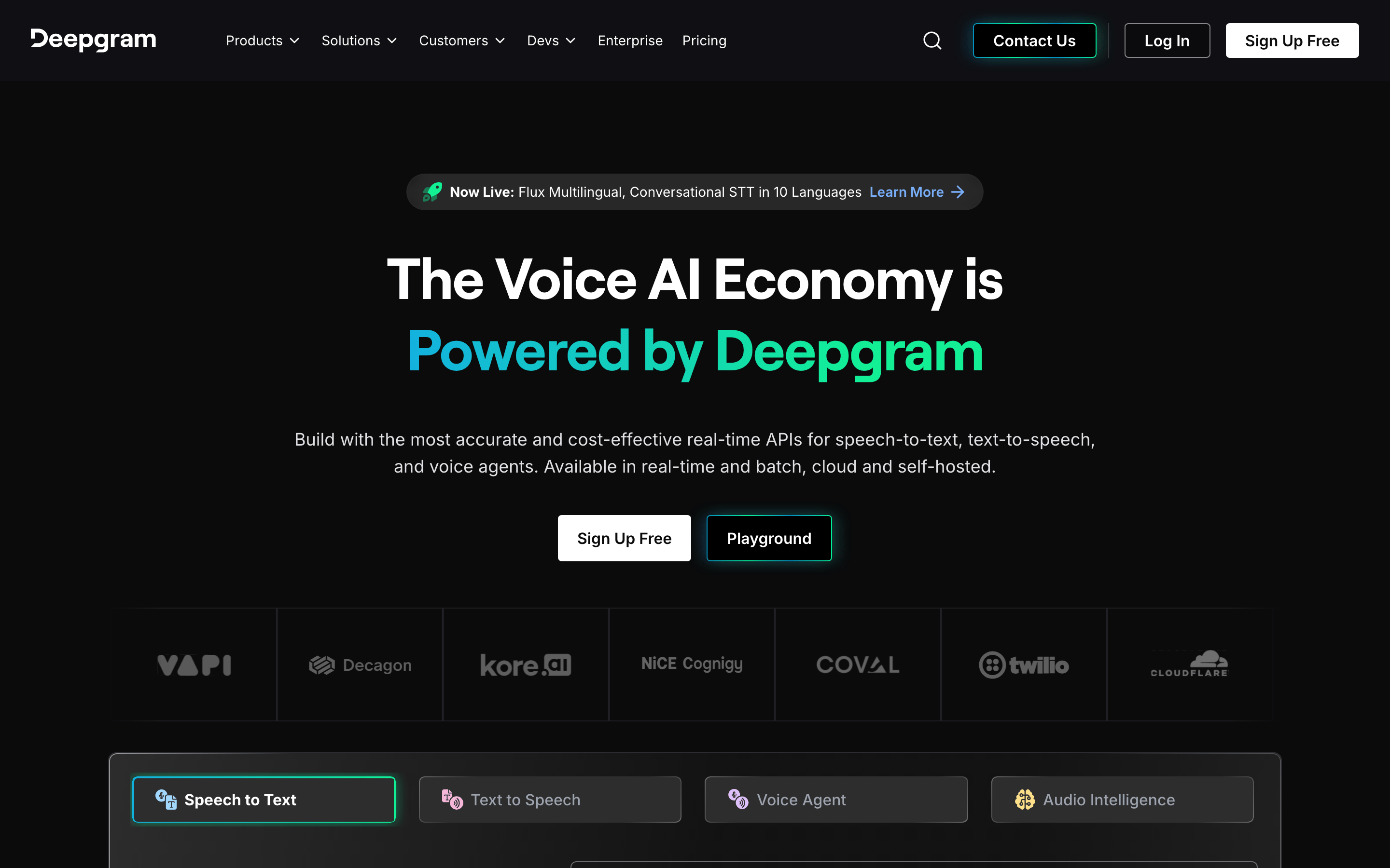
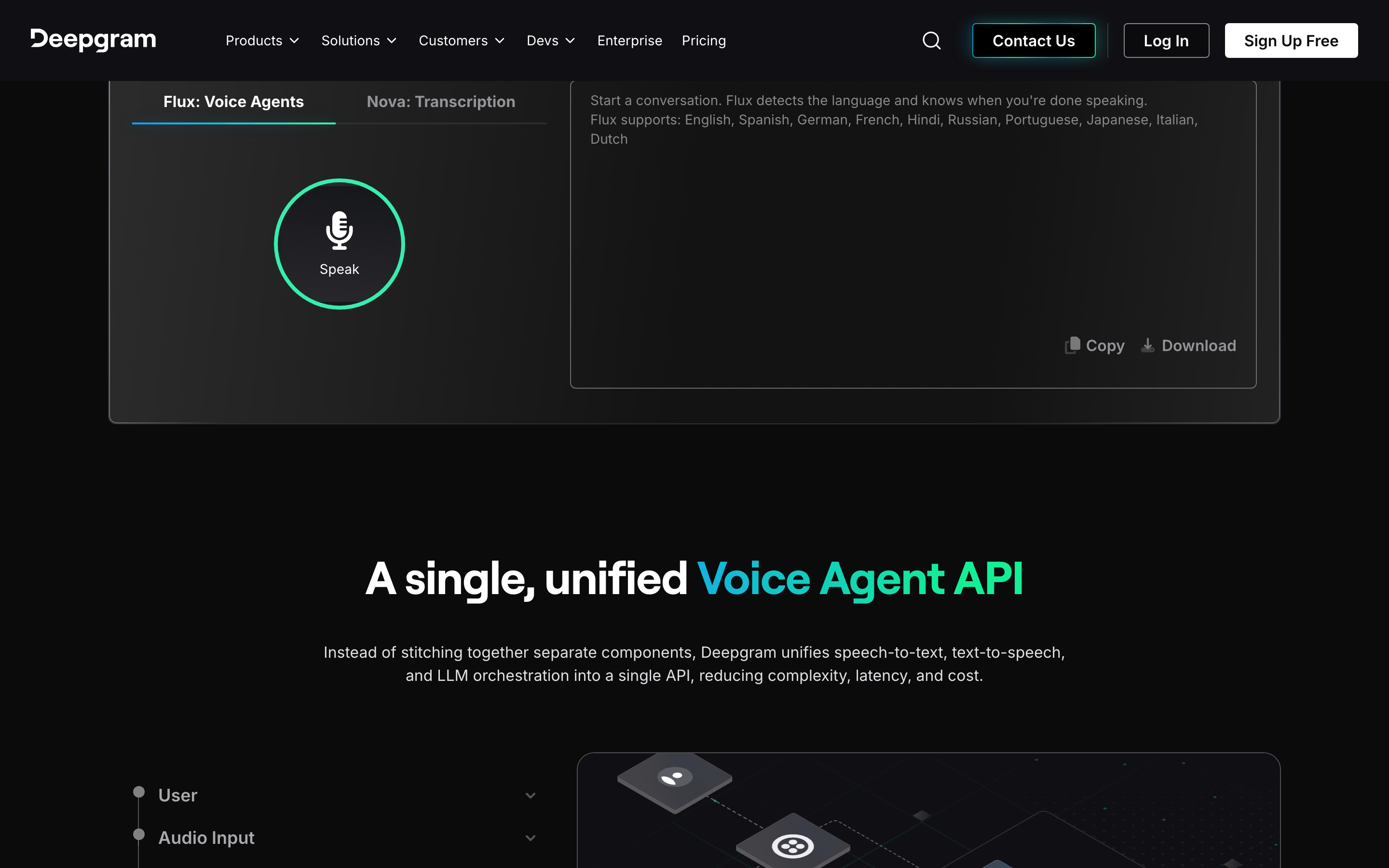
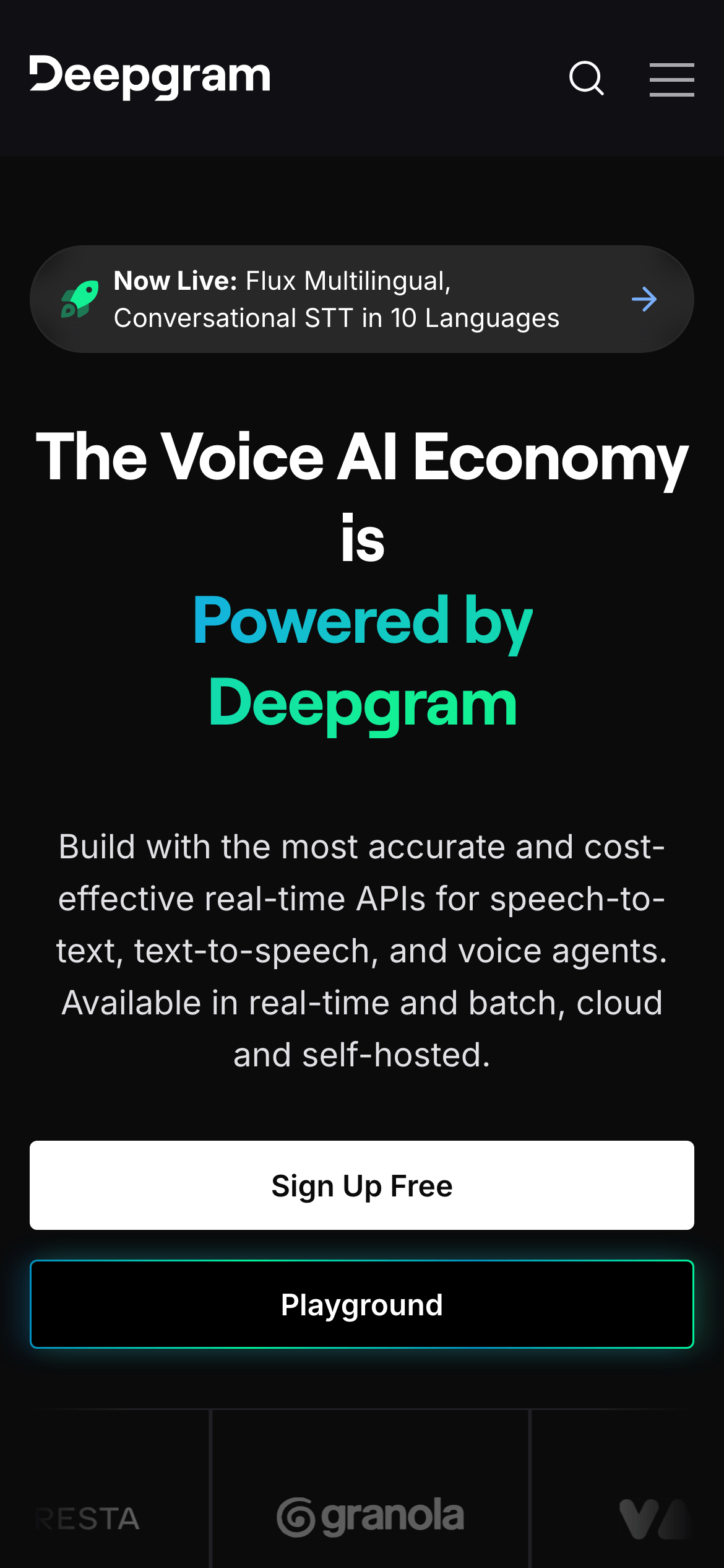
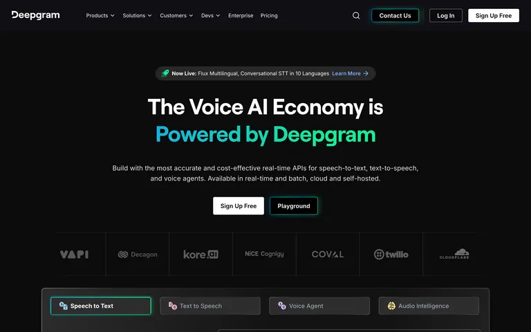
heroMassive, centered headline with vibrant teal gradient text ('Powered by Deepgram'), followed by descriptive text and two prominent CTAs.
09
Voice & Don'ts
ToneConfident, technical, and forward-looking.
HeadlinesBold, declarative statements that emphasize market leadership and technical superiority.
CTAsDirect and action-oriented ('Sign Up Free', 'Start Building', 'Playground').
Don't use light or pastel backgrounds — screenshot shows a deep dark theme (#0F0F13) as the primary canvas.
Don't apply gradients to every element — screenshot uses vibrant teal gradients sparingly, only on the main headline text.
Don't use small or cluttered typography — screenshot features large, bold display sizes (56px+) with generous line-height.
Don't use rounded corners on all elements — screenshot uses sharp or subtly rounded corners (4-12px) on cards and buttons, not fully circular except for pill badges.
Don't use a multi-color palette — screenshot is dominated by dark tones, white text, and a single vibrant teal accent color.
Don't hide primary actions — screenshot prominently displays 'Sign Up Free' and 'Playground' as large, high-contrast CTAs in the hero section.
Captured from the live site · real computed styles
11
System prompt
Deepgram's design system is a dark-mode-first, developer-focused SaaS aesthetic. It positions the brand as a premium, technical infrastructure provider for Voice AI. Key colors are a deep charcoal background (#0F0F13), crisp white ink (#FFFFFF), and a vibrant teal accent (#00F099) used for emphasis. Typography relies on geometric and humanist sans-serif categories with large display sizes (56px+) and tight tracking for headlines. Critical donts: Never use light backgrounds, avoid excessive gradients (use them only on key headlines), and don't shrink CTAs—they must remain large and prominent. The layout is clean and centered, using a 12-column grid with generous spacing to maintain a sense of scale and technical sophistication.
Bring this taste to your agent
Hand your AI agent a machine-readable spec of this design — tokens, type, motion, the whole DNA.