← OpenDesign CURATED · OPEN · FREE
Aura Bora
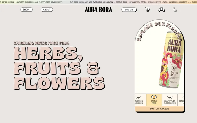
A playful, illustration-heavy beverage brand that uses bold, outlined typography and soft pastels to convey natural, zero-calorie sparkling water.
beverage dtc
01
Identity DNA
playful whimsical natural energetic organic
A friendly, illustrated storybook about natural flavors.
02
Color
#000000Ink
#FFF9EDBG
#FFE2E2BG soft
#E5E5F1BG quiet
#FDE4AAMuted
rgba(0,0,0,1)Line
High-contrast black outlines on soft, organic pastels create a friendly, approachable aesthetic.
03
Typography
grotesque-sans · monospace
display 120px · 800h1 80px · 800h2 32px · 800body 17px · 400caption 13px · 400Uppercase for labels and navigational elements · Highly variable letter spacing for display text
04
Spacing
8px base grid with generous padding for whitespace
05
Surfaces
sm · 0px
md · 10px
lg · 15px
pill · 999px
1px solid black
6px 6px 0px rgba(0,0,0,1)
06
Layout
1280 container
12 columns
26px gutter
768 / 1024 breakpoints
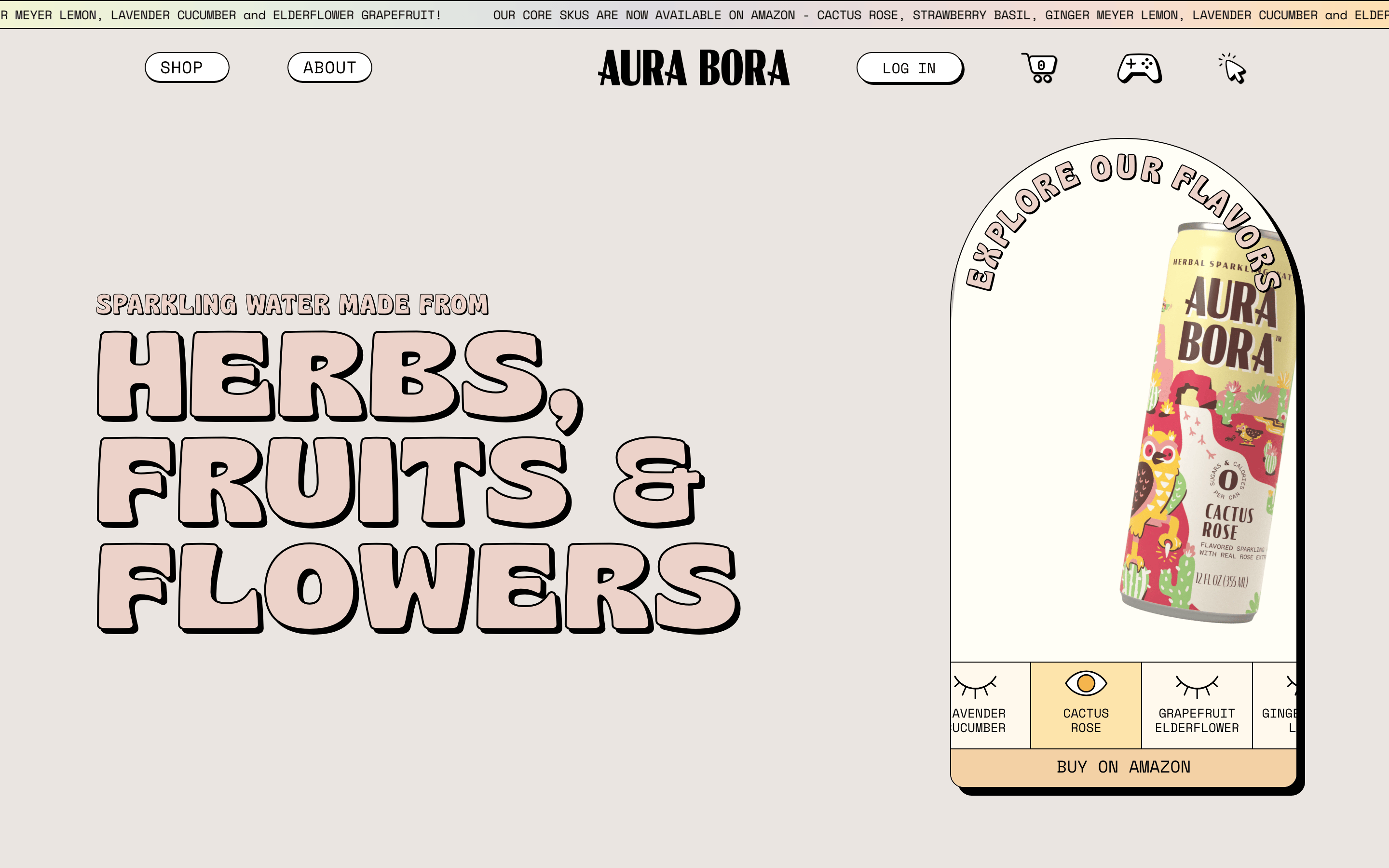
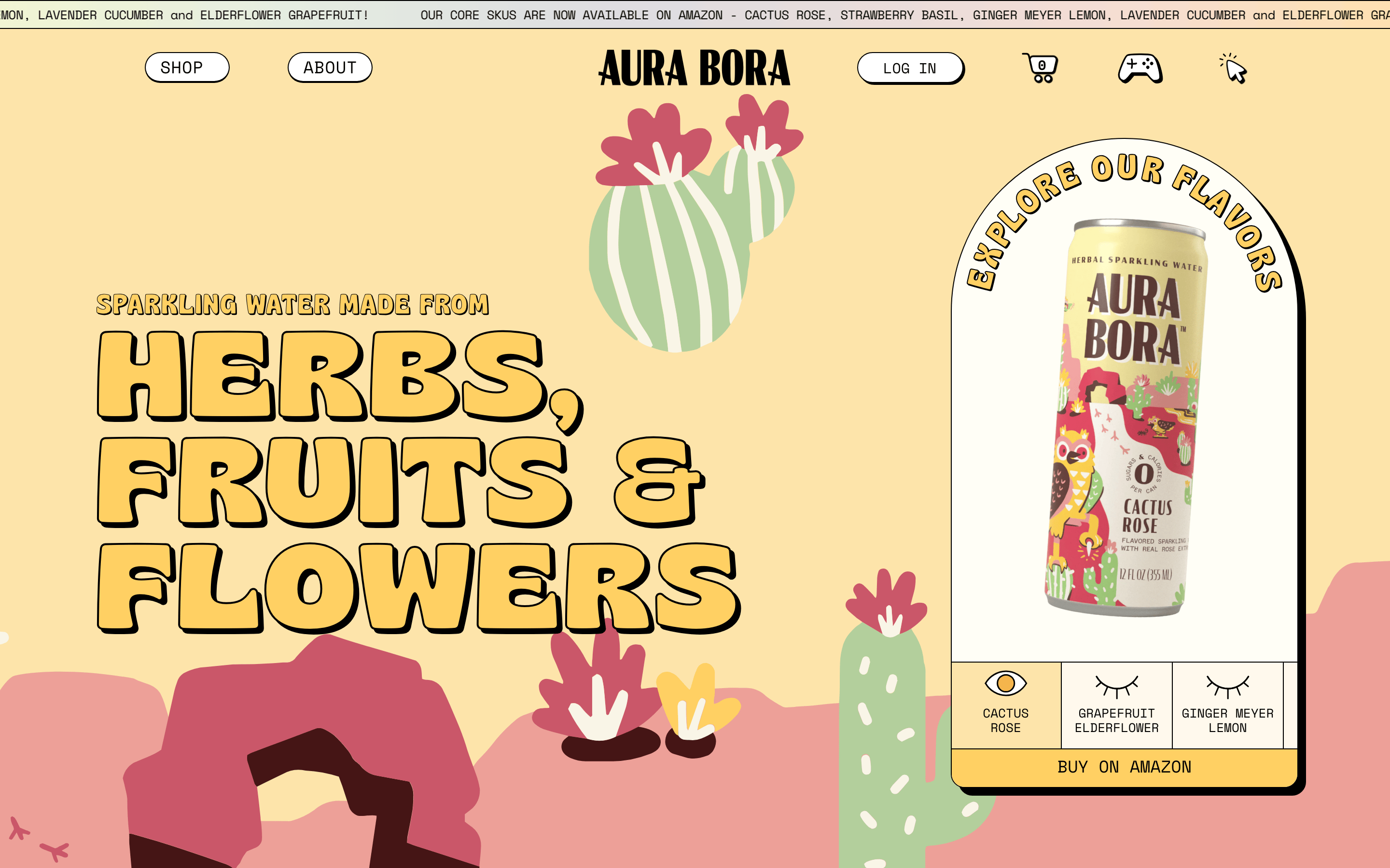
Centered hero with large typography left and product display right
07
Motion & Interaction
200ms micro
300ms small
800ms medium
cubic-bezier(0.4, 0, 0.2, 1) easing
Scrolling marquee · Hover scaling on buttons
Scale transform and background color shift · Subtle press effect
08
Components
button Rounded pill shape with black outline and transparent or solid background card Rounded corners with thick black outlines, often featuring whimsical illustrations chip Simple text with black border input Rounded rectangular fields with black borders hero Split layout featuring massive outlined typography and a product illustration 09
Voice & Don'ts
Tone Friendly, playful, and approachable Headlines Bold, massive, and heavily outlined in uppercase CTAs Clear, simple calls to action with pill-shaped borders Use complex gradients — screenshot shows solid pastel backgrounds Use thin, delicate lines — screenshot shows thick 1px black outlines everywhere Use elegant serif fonts — screenshot shows bold, rounded grotesque and monospace Use dark, moody color palettes — screenshot shows light, airy pastels Use rounded rectangles without borders — screenshot shows distinct black outlines Use cluttered layouts — screenshot shows generous whitespace and focused sections Avoid: Complex jargon Avoid: Sterile aesthetics Avoid: Heavy shadows 10
Inside the pack — real screenshots
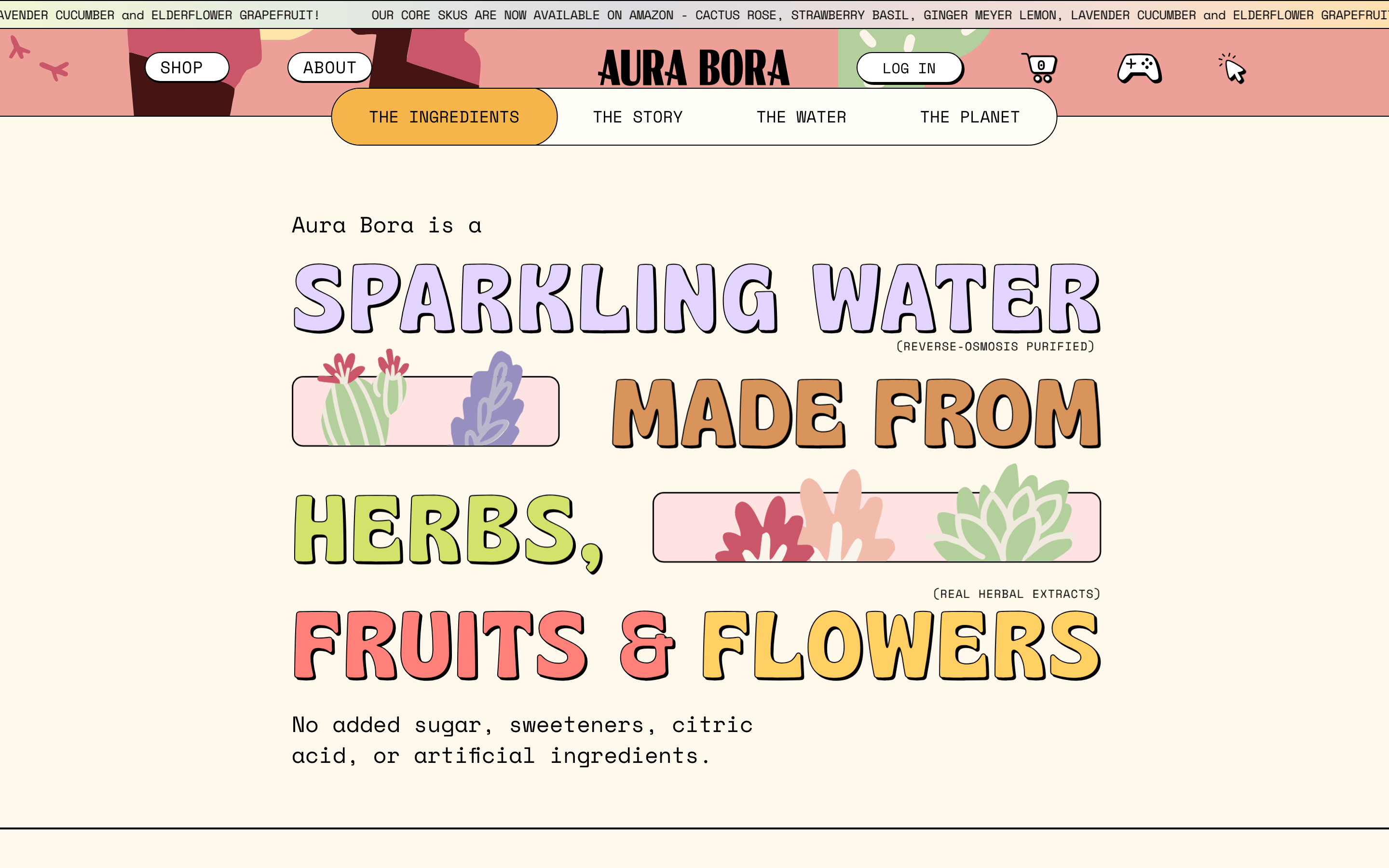
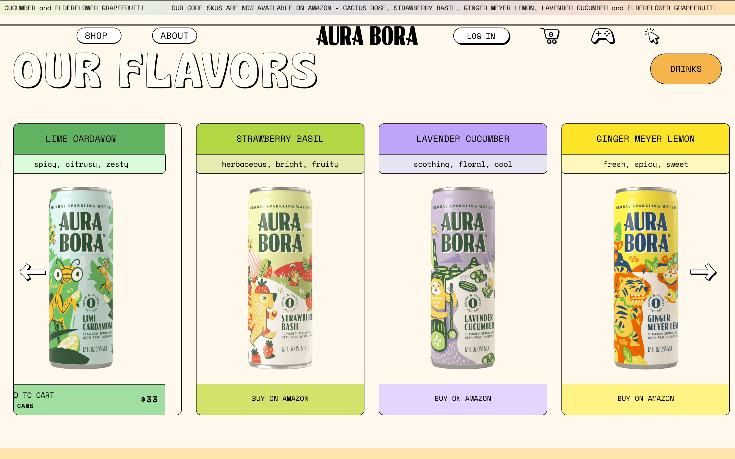
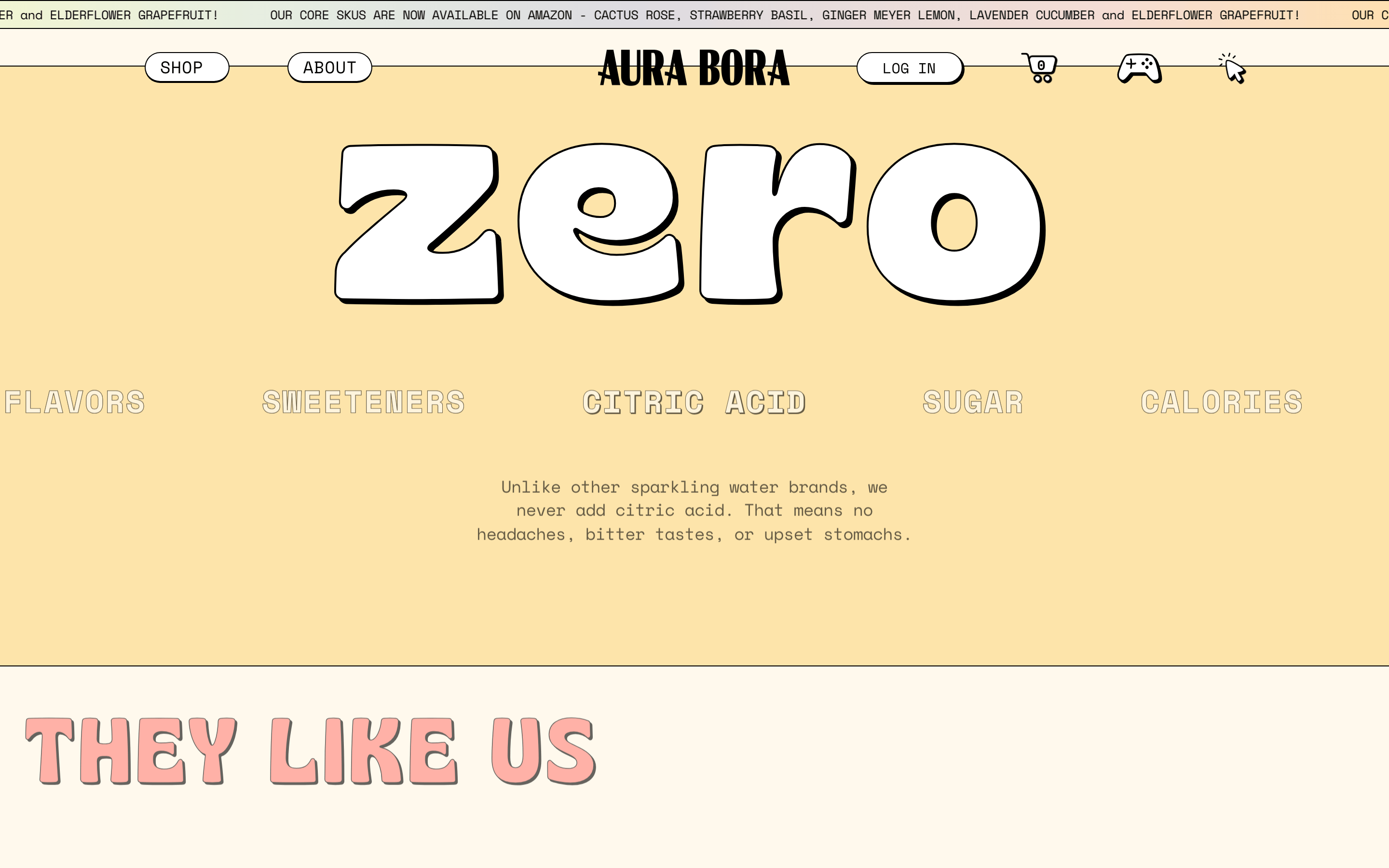
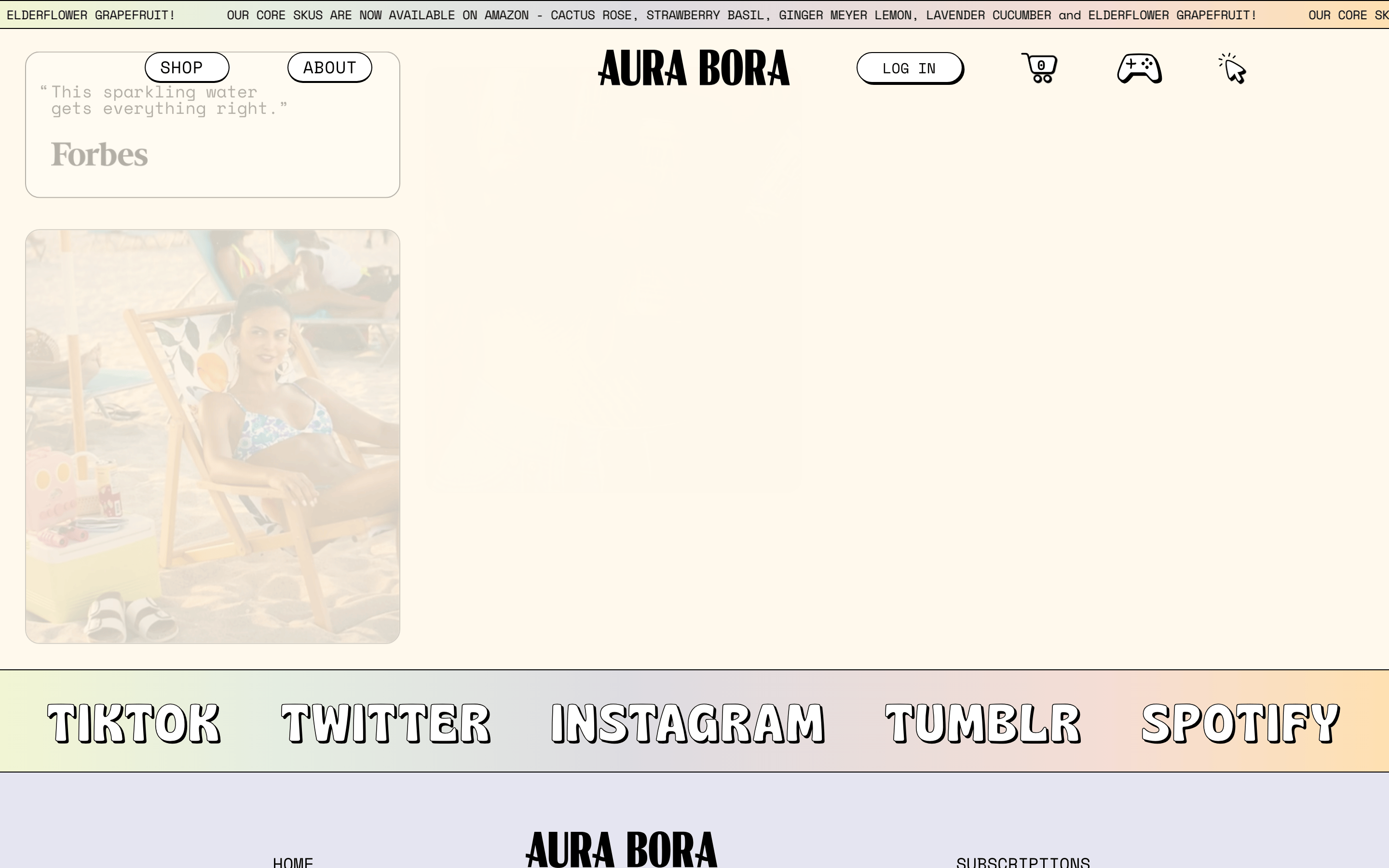
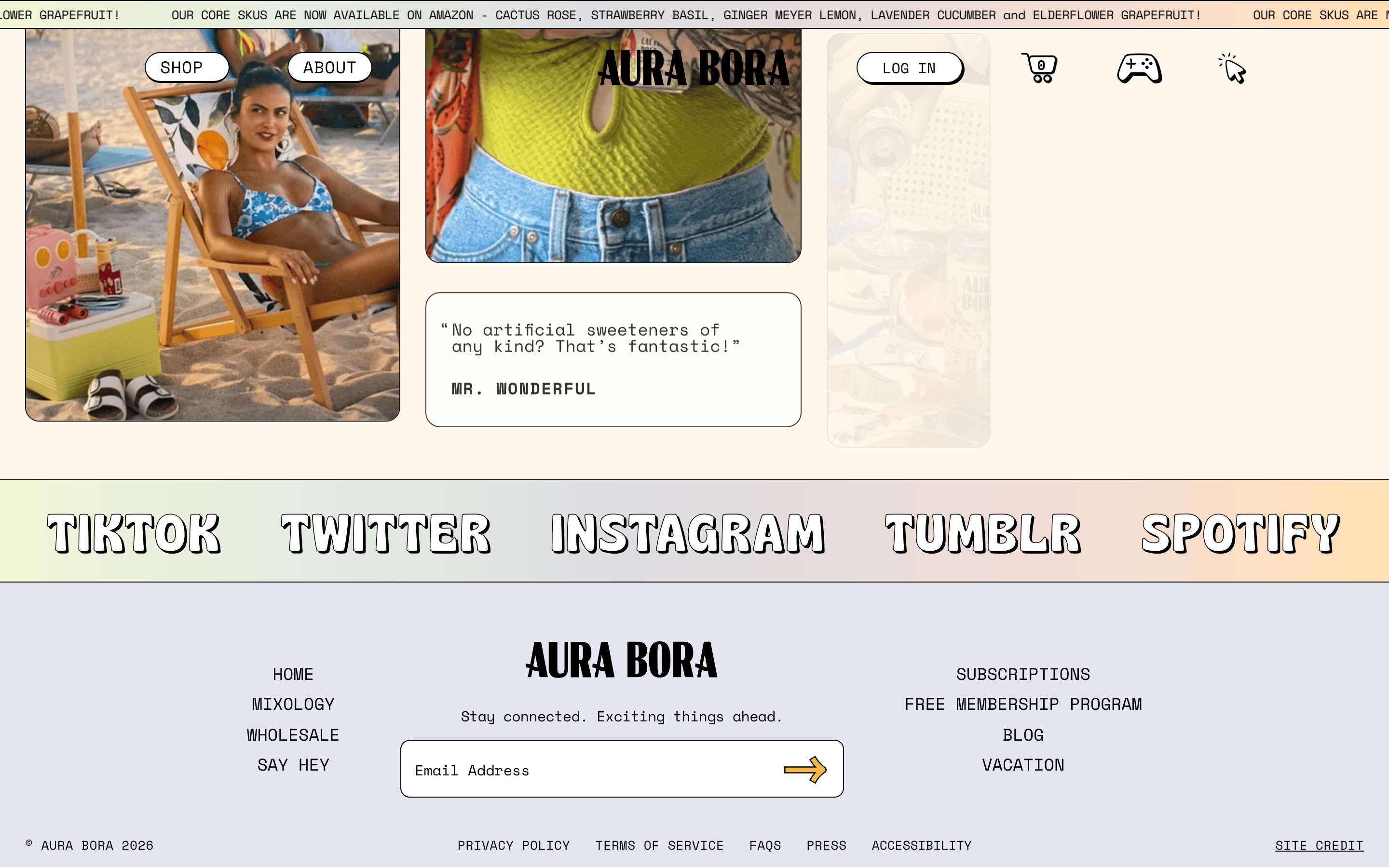
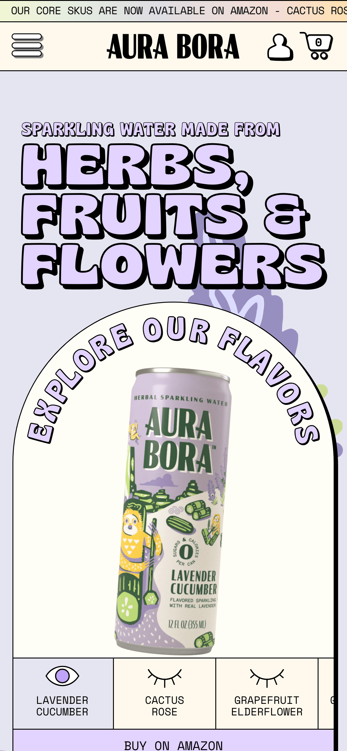
桌面首屏(hero) 桌面滚动分段(90% viewport 步进,作为视觉证据) 桌面滚动分段(90% viewport 步进,作为视觉证据) 桌面滚动分段(90% viewport 步进,作为视觉证据) 桌面滚动分段(90% viewport 步进,作为视觉证据) 桌面滚动分段(90% viewport 步进,作为视觉证据) 桌面滚动分段(90% viewport 步进,作为视觉证据) 移动首屏 Captured from the live site · real computed styles
11
System prompt
Aura Bora is a playful, consumer-focused sparkling water brand. Its identity is built on a whimsical, organic aesthetic using soft pastels like #FFF9ED and #FFE2E2, contrasted with sharp, 1px black outlines (#000000). The typography is a bold mix of a thick grotesque display font for massive headlines and a structured monospace for body text and UI elements. A critical part of the design is the use of thick shadows or outlines on components and text to create a sticker-like, illustrative feel. Do not use delicate or elegant serif fonts. Avoid dark or high-tech color palettes. Always maintain generous whitespace and clear, uppercase labeling for navigation.
More from the library en · zh-CN · zh-TW · ja · ko
OpenDesign · curated web aesthetics for AI-readable design DNA · opendesign.cc
Why we curated this: This site is a great example of using bold, illustrative typography and simple pastel colors to create a highly memorable and approachable consumer brand identity.
浙ICP备2021038972号-5