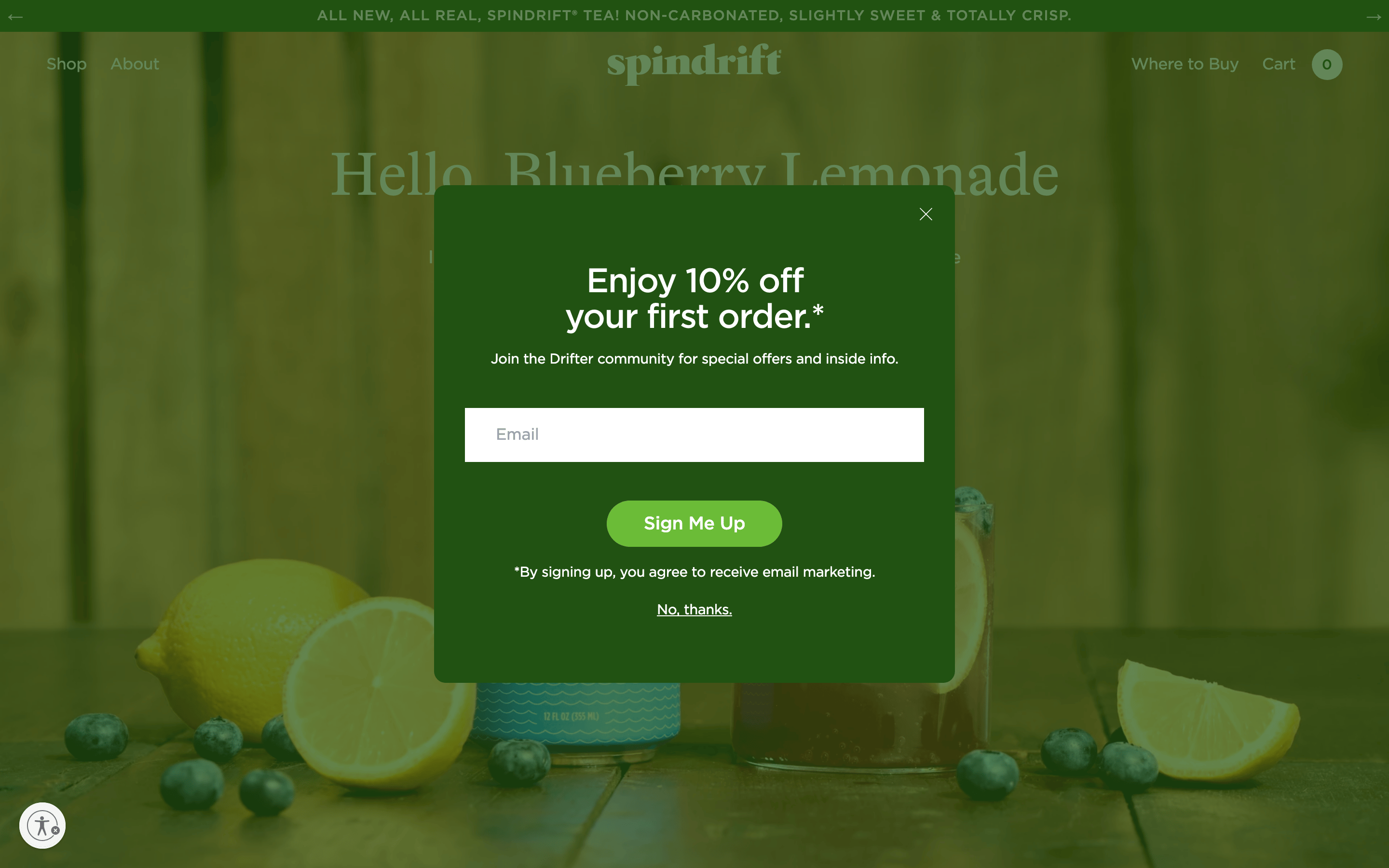
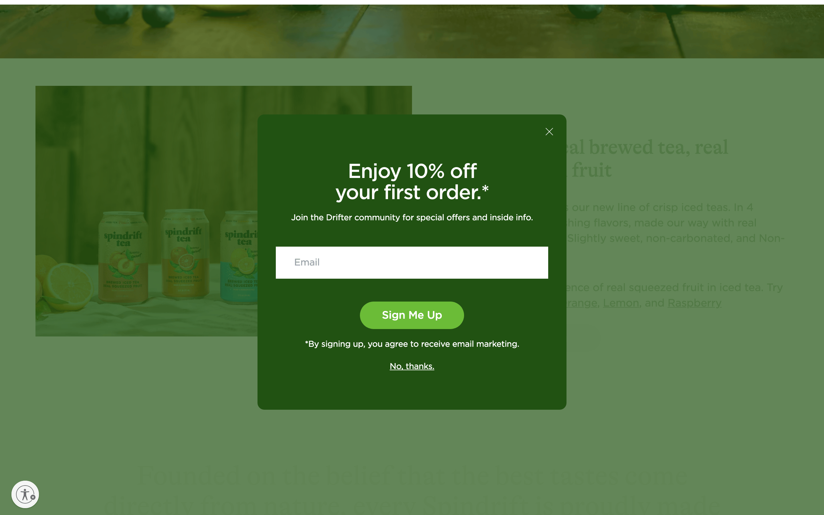
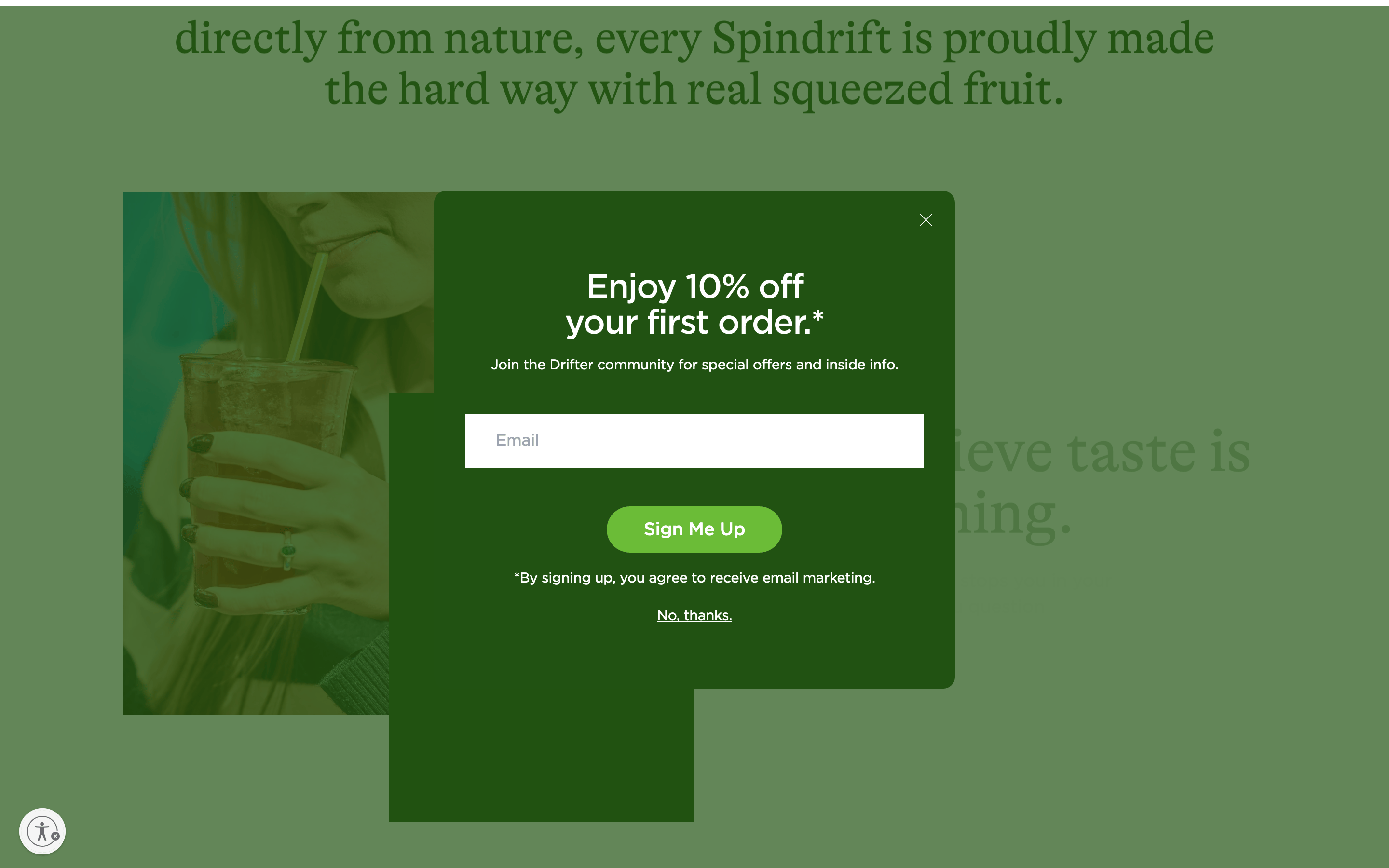
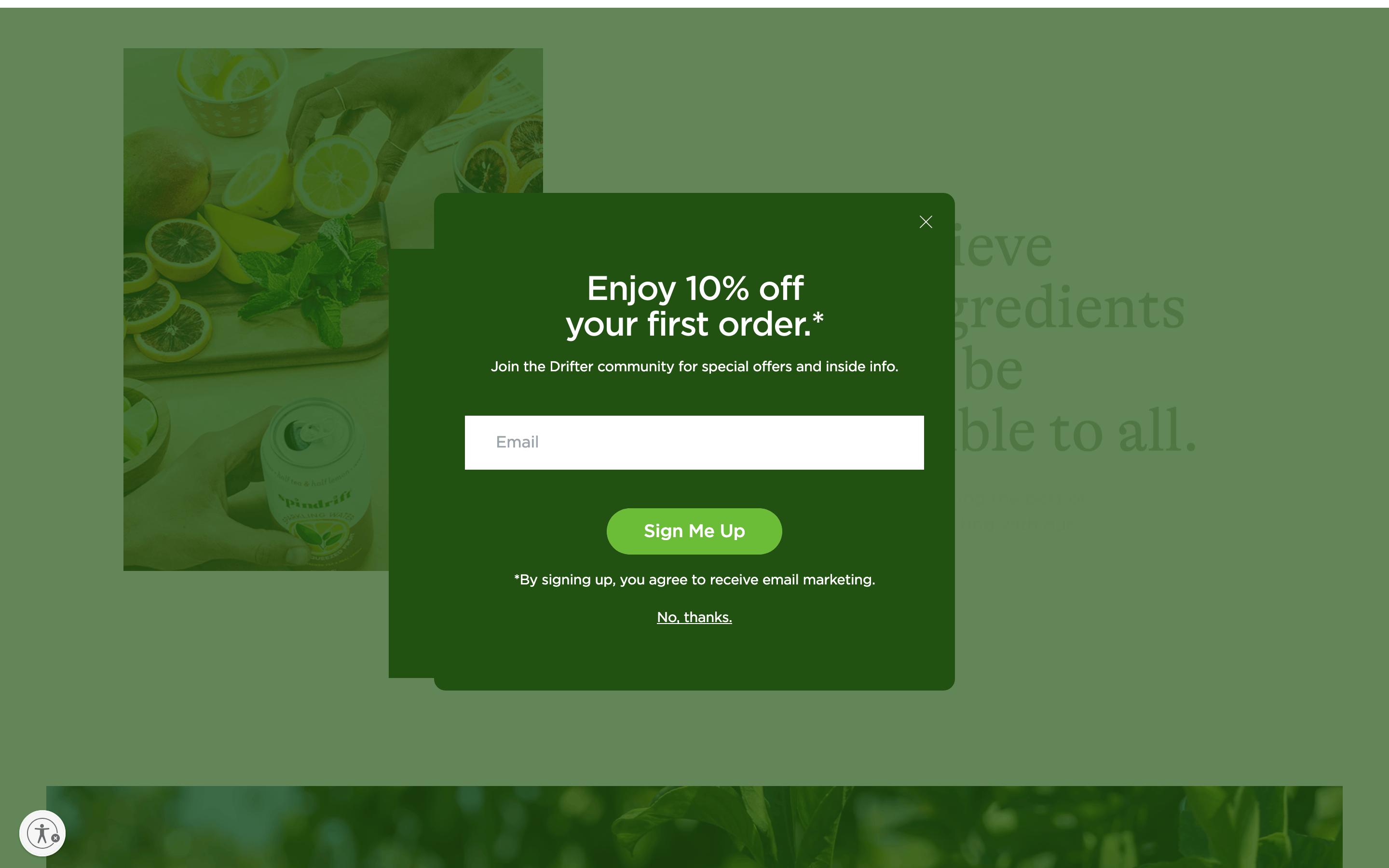
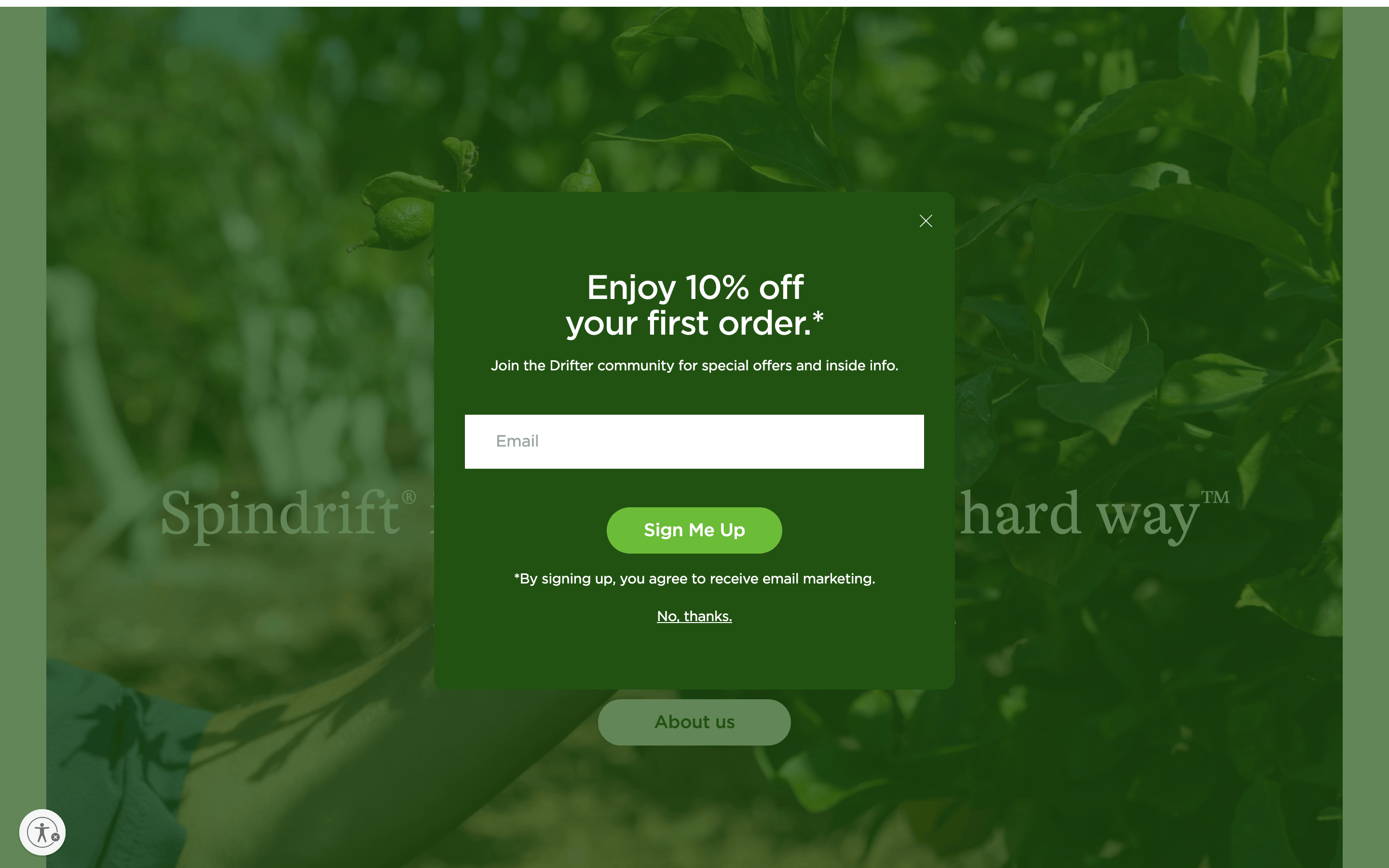
A high-end organic juice bar with a rustic-modern aesthetic.
02
Color
#6bbc37Accent
#ffffffInk
#363638Ink soft
#215212BG
#f5f5f5BG soft
#f9f6f0BG quiet
rgba(33, 82, 18, 1.0)Line
Earthy, organic palette dominated by deep greens and crisp whites.
03
Typography
geometric-sans · humanist-sans
display56px · 400
h136px · 400
h228px · 400
body16px · 400
small14px · 400
Display and body typography use geometric-sans and humanist-sans categories. · Headlines use tight tracking for a modern, compact feel. · Bold weights are rarely used, relying on size for hierarchy.
04
Spacing
4px
8px
12px
16px
24px
32px
48px
64px
96px
Clean 4px base grid with generous vertical spacing for editorial flow.
05
Surfaces
sm · 4px
md · 8px
lg · 12px
pill · 9999px
Clean and minimal, often using the primary green color for subtle accents.
Captured from the live site · real computed styles
11
System prompt
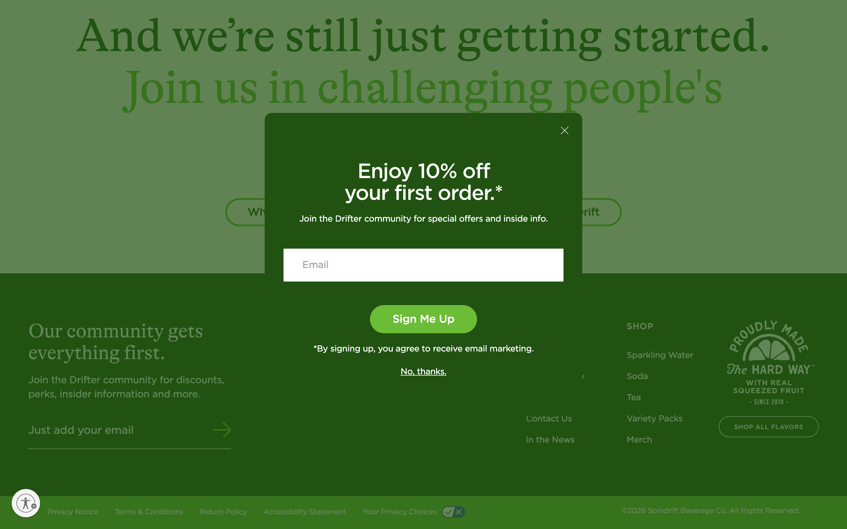
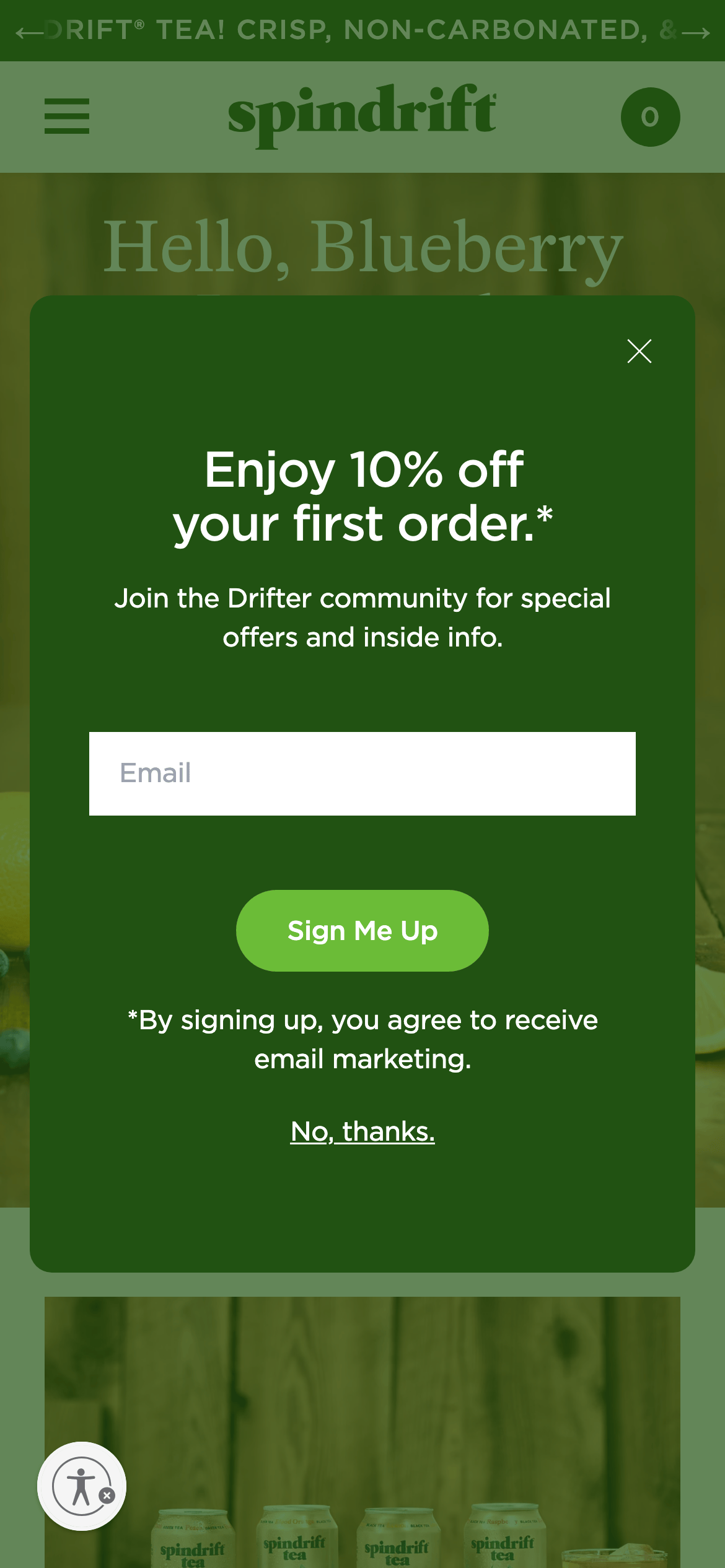
Spindrift is a premium DTC beverage brand with a natural, organic aesthetic. The visual language is defined by a dominant deep green (#215212) palette paired with warm off-whites (#f9f6f0) and a vibrant lime accent (#6bbc37). Typography is clean and modern, using geometric-sans and humanist-sans categories with tight tracking. Key elements include full-bleed photographic backgrounds, pill-shaped buttons, and generous whitespace. Critical rules: do not use cold, clinical whites; avoid heavy, complex drop shadows; and never use sharp, right-angle buttons for primary actions.
Bring this taste to your agent
Hand your AI agent a machine-readable spec of this design — tokens, type, motion, the whole DNA.