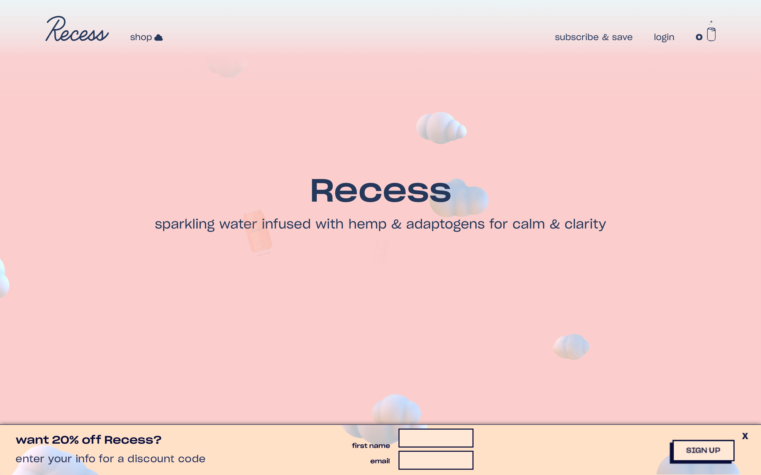
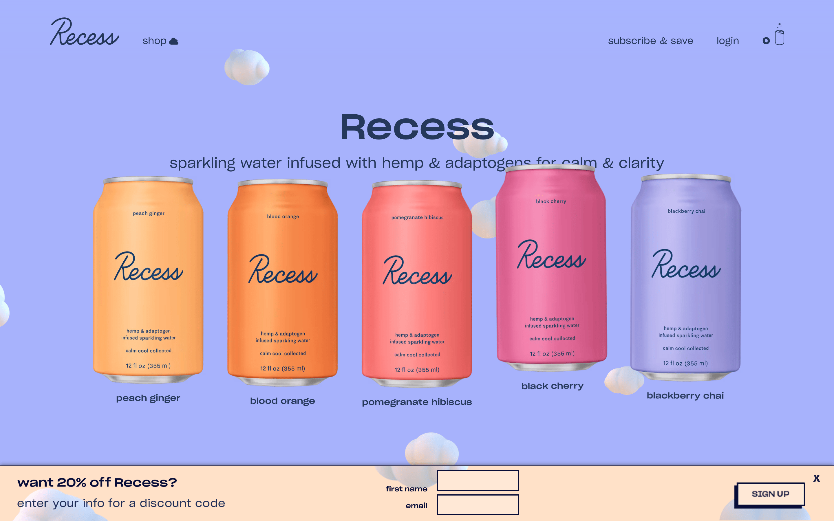
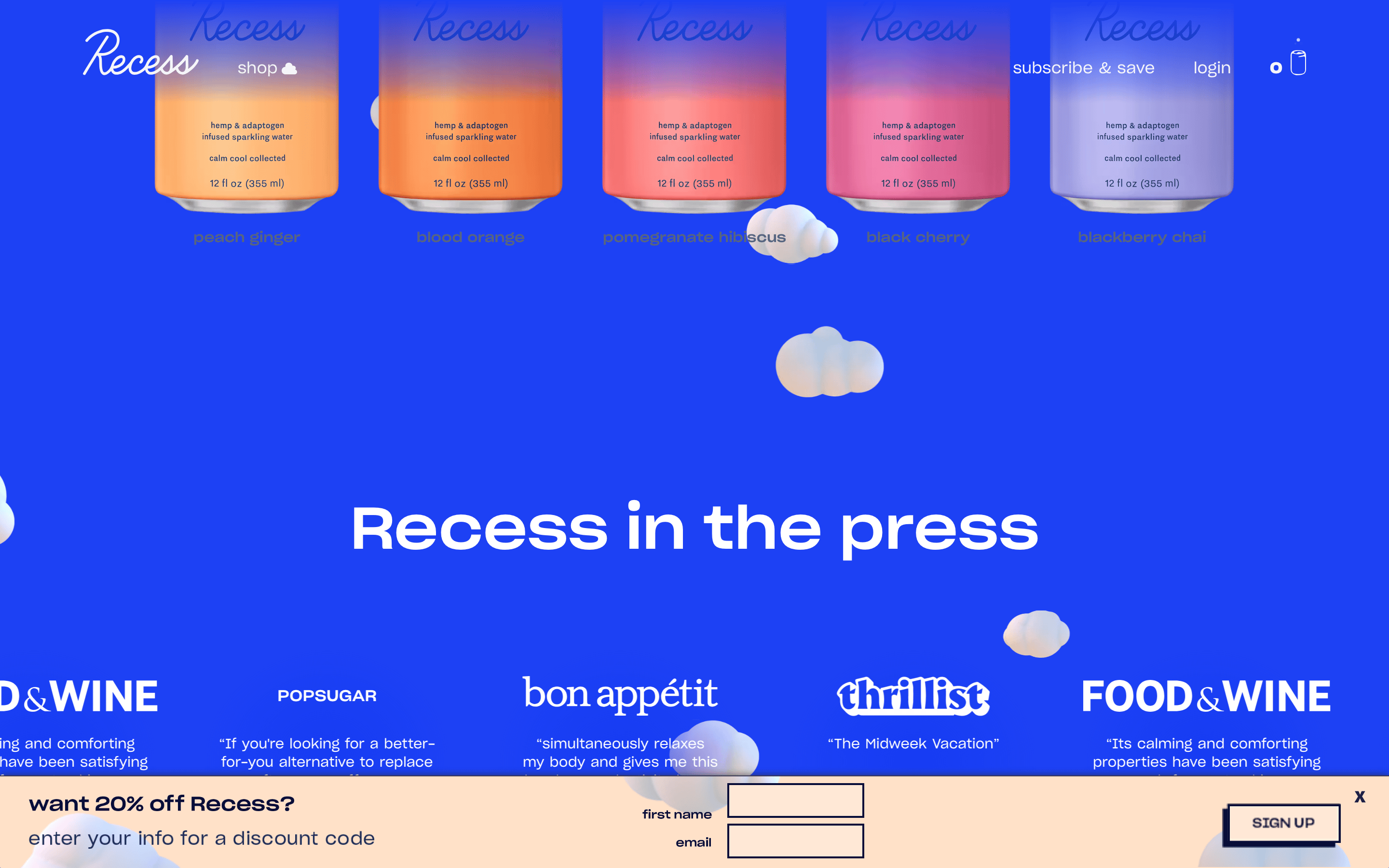
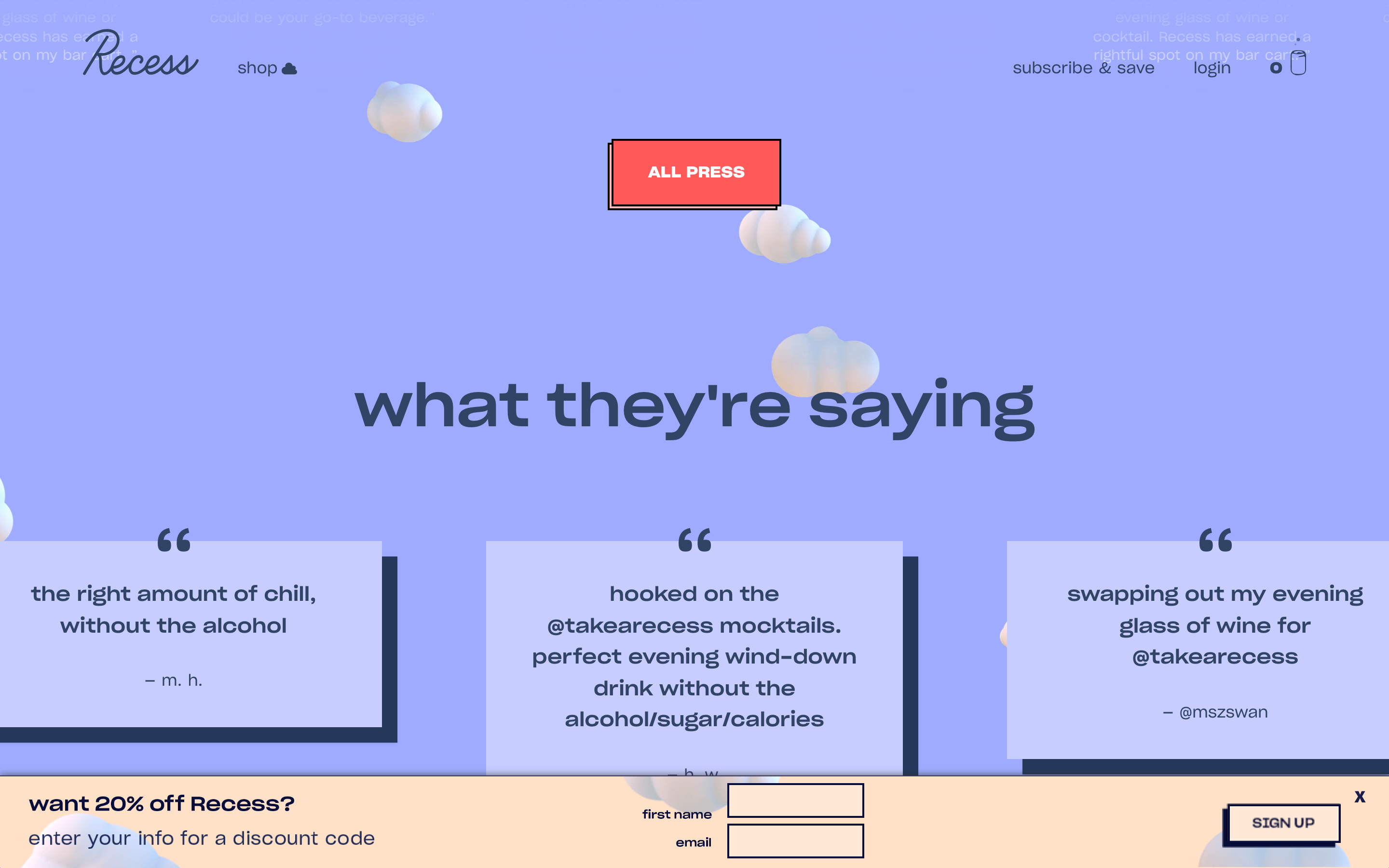
A calm, sophisticated beverage brand that blends modern minimalism with playful, whimsical elements.
02
Color
#25385BInk
#394A6AInk soft
#C8D8FFBG
#E8F0FFBG soft
rgba(37, 56, 91, 1)Line
Soft, pastel backgrounds with high-contrast dark navy text for readability.
03
Typography
grotesque-sans
display60px · 700
h140px · 700
body16px · 400
caption14px · 400
Use tight letter spacing for large headlines to create a solid typographic block. · Maintain consistent line heights across different font sizes for rhythmic reading.
04
Spacing
4px
8px
16px
24px
32px
48px
64px
96px
A consistent 4px base scale providing standard web spacing.
05
Surfaces
sm · 0px
md · 4px
lg · 12px
pill · 999px
Solid 2px dark navy borders on buttons and inputs.
06
Layout
1280container
12columns
24pxgutter
768 / 1024breakpoints
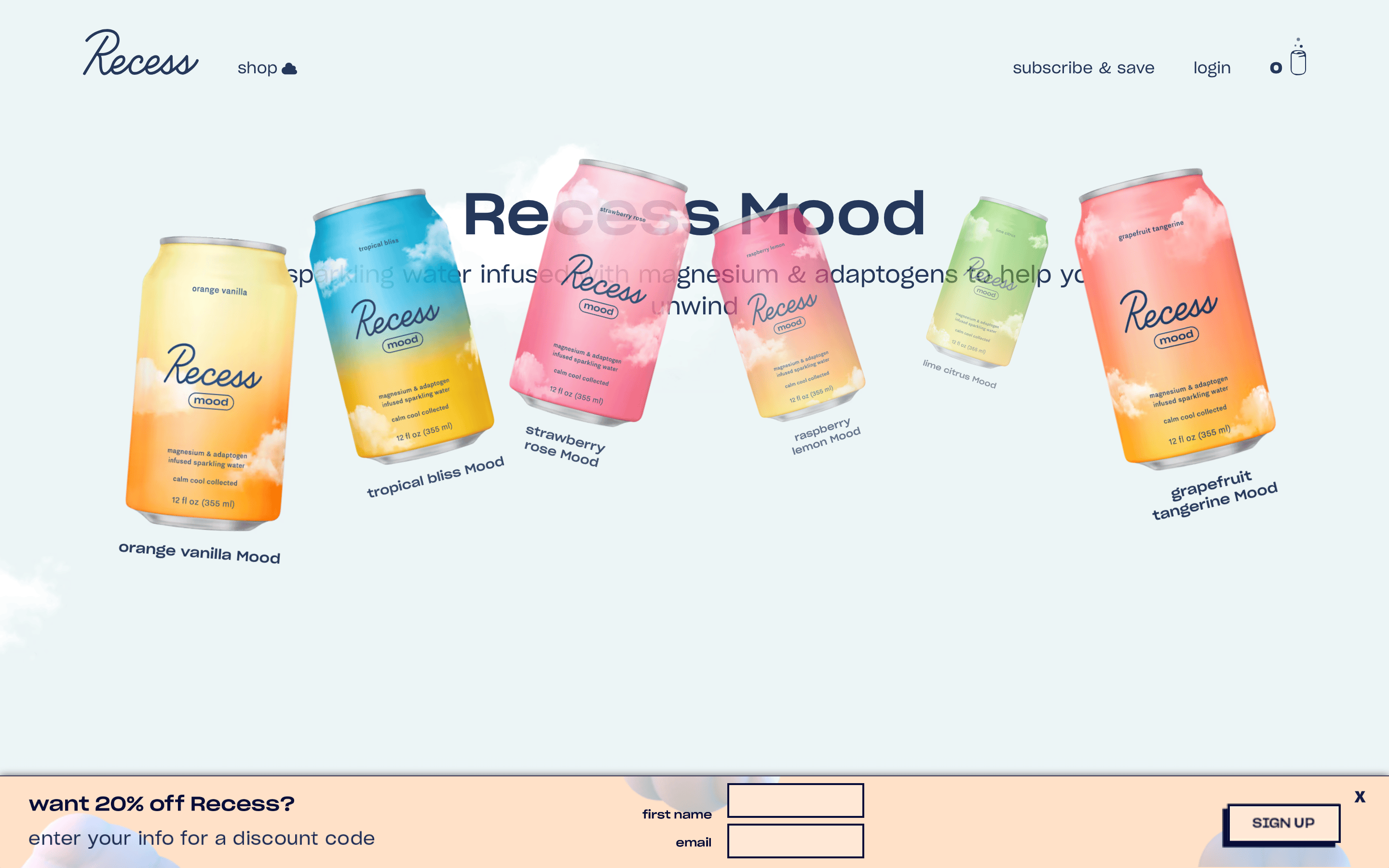
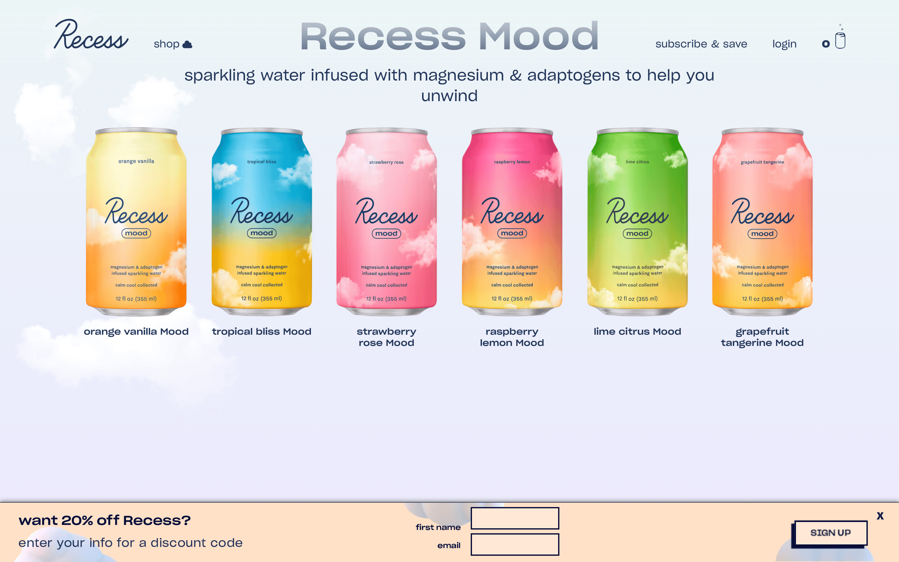
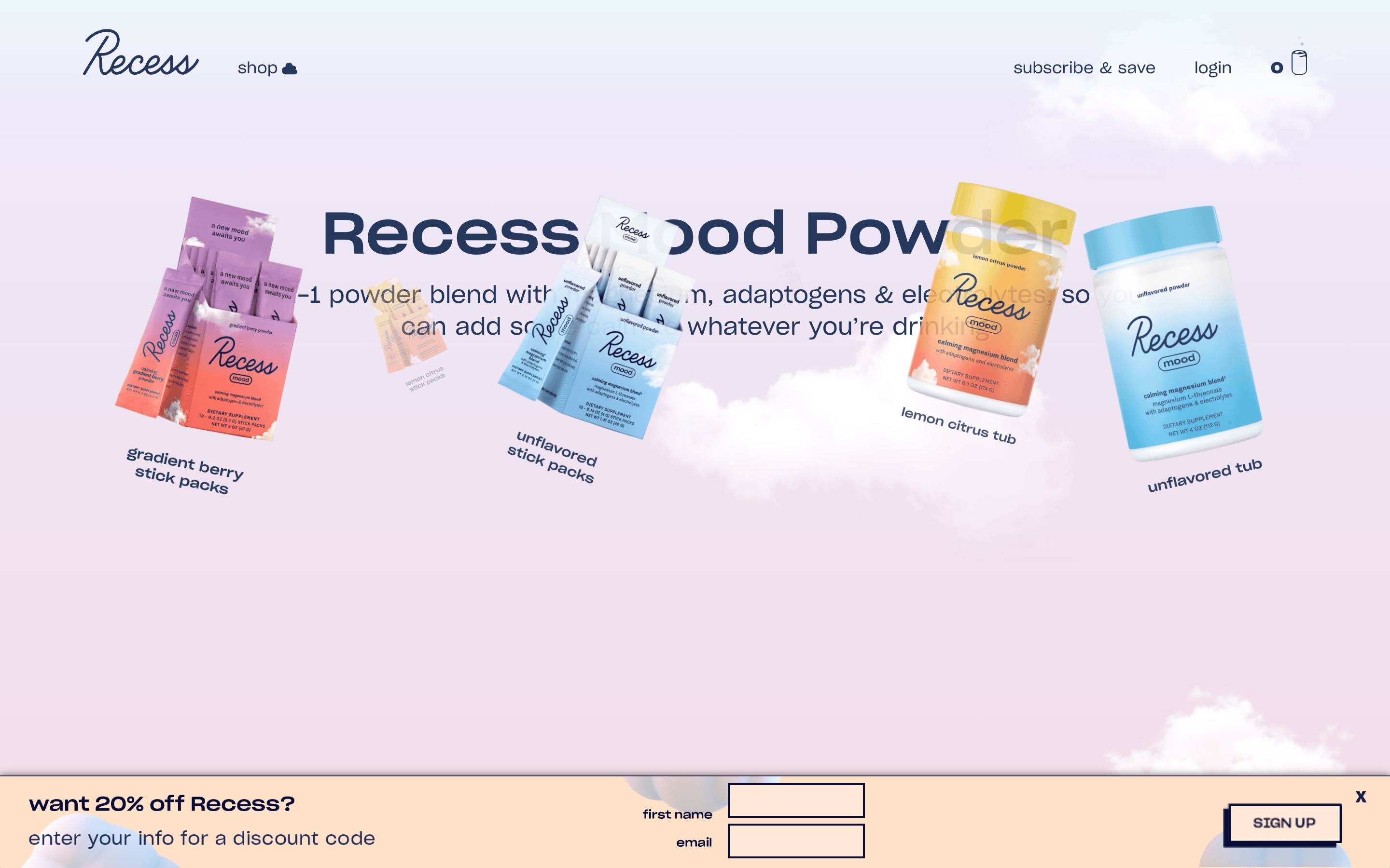
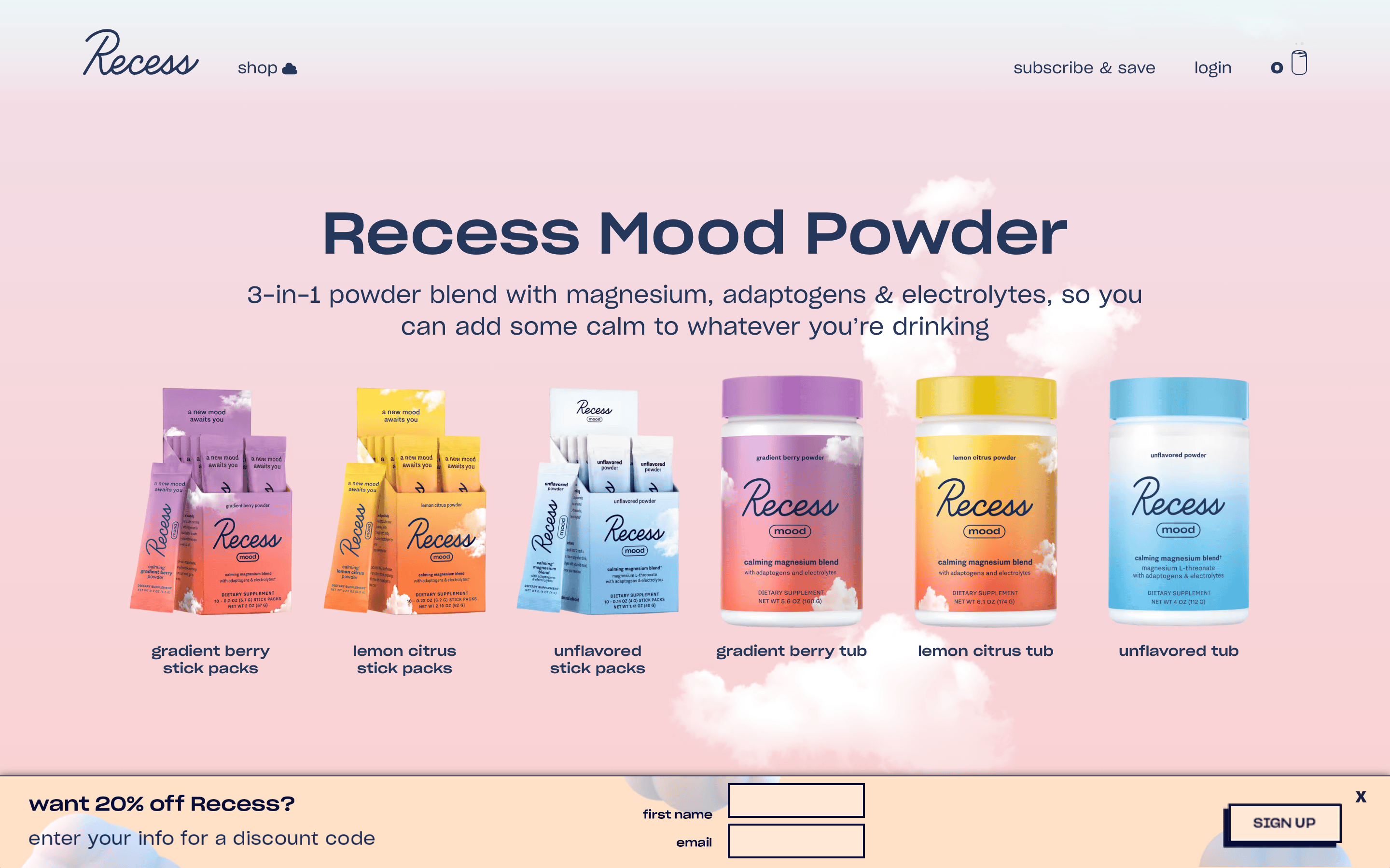
Asymmetric hero layout with text on the left and imagery on the right.
07
Motion & Interaction
150msmicro
300mssmall
600msmedium
cubic-bezier(0.175, 0.885, 0.32, 1.275)easing
Smooth opacity and transform transitions on hover. · Parallax-like effects on background elements.
Subtle color or opacity shifts. · No visible custom click animations.
08
Components
buttonA high-contrast solid navy button with white text, or a navy outline button.
cardNot prominently visible; imagery is placed directly on background shapes.
chipNot visible in the screenshot.
inputStandard rectangular inputs with solid dark navy borders.
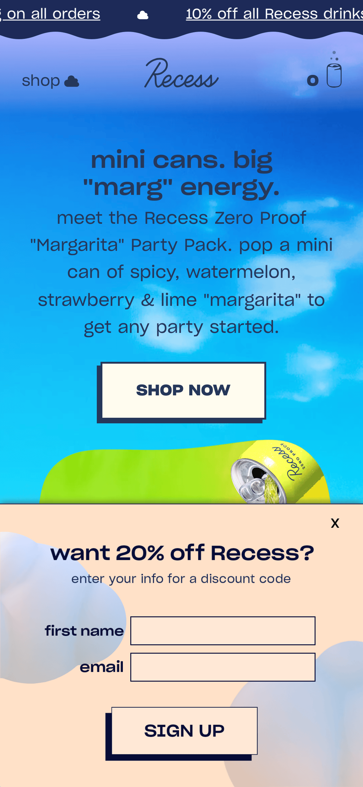
heroA large, asymmetric hero section with a bright sky background and a prominent green curved shape.
09
Voice & Don'ts
TonePlayful, casual, and confident.
HeadlinesShort, punchy, and conversational.
CTAsDirect and action-oriented.
Don't use a generic sans-serif font — the site relies on a specific, characterful grotesque-sans family.
Don't use dark mode — the site's identity is built on bright, airy, pastel backgrounds.
Don't use complex grid layouts — the hero section uses a clear, asymmetric split.
Don't use heavy drop shadows — the design is flat and relies on color contrast for depth.
Don't use bright neon accents — the palette is composed of soft pastels and deep navy.
Don't use serif typography — the entire site uses a consistent sans-serif system.
Captured from the live site · real computed styles
11
System prompt
Positioning: A premium, playful beverage brand targeting a modern, health-conscious consumer. Key hex colors: #C8D8FF (background), #25385B (ink), #163BF3 (accent blue), #A8B2FF (soft background). Font categories: Characterful grotesque-sans for a bold, modern look. Critical donts: Do not use dark mode, avoid complex grids, and do not use heavy shadows. Keep the voice casual and punchy, mirroring the brand's relaxed energy.
Bring this taste to your agent
Hand your AI agent a machine-readable spec of this design — tokens, type, motion, the whole DNA.