← OpenDesign CURATED · OPEN · FREE
Athletic Brewing
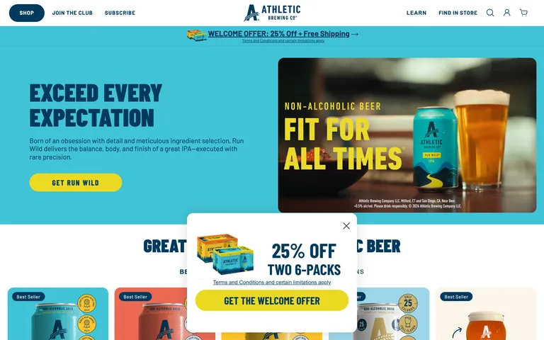
A bold, nature-inspired e-commerce experience for premium non-alcoholic beer.
beverage dtc
01
Identity DNA
Non-Alcoholic Beer Athletic Quality Health-Conscious Active
A premium outdoor lifestyle brand that happens to brew beer
02
Color
#EBD923Accent
#003A5DInk
#FFFFFFBG
#414042Muted
rgba(0,58,93,1.0)Line
High-contrast pairing of deep navy and bright yellow for bold, energetic communication.
03
Typography
condensed-sans · geometric-sans
display 64px · 900display-sm 40px · 900body 16px · 400caption 12px · 400All headings use uppercase transformation · Maintain generous vertical spacing between elements · Ensure high contrast between text and backgrounds
04
Spacing
4px
8px
16px
24px
32px
48px
64px
96px
Generous, air-driven spacing to let products breathe.
05
Surfaces
sm · 4px
md · 16px
lg · 16px
pill · 10000px
1px solid rgb(0, 58, 93)
rgba(0, 0, 0, 0.08) 0px 4px 16px 0px · rgba(0, 0, 0, 0.04) 0px 2px 10px 5px
06
Layout
1280 container
12 columns
24px gutter
768 / 1024 breakpoints
Centered content with a prominent top navigation and full-width promotional banners.
07
Motion & Interaction
100ms micro
200ms small
300ms medium
cubic-bezier(0.4, 0, 0.2, 1) easing
Quick 100ms transitions for hover states · 200ms ease-in-out for visibility changes · 300ms transitions for background colors
Subtle color shifts or shadow increases on interactive elements. · Immediate feedback with micro-interactions on buttons.
08
Components
button High-contrast primary buttons (yellow background, navy text) with pill-shaped rounding. card Image-focused product cards with clear badges (e.g., 'Best Seller'). chip Small, pill-shaped tags used for product attributes. input Clean, minimal form fields with standard border styling. hero Large, split-layout or full-bleed sections with bold typography and high-quality photography. 09
Voice & Don'ts
Tone Confident, active, and mission-driven. Headlines Bold, imperative, and often all-caps. CTAs Direct and action-oriented, e.g., 'GET RUN WILD' or 'FIND IN STORE'. don't use thin or light font weights for headlines — screenshot shows heavy 900-weight typography don't use a muted or pastel color palette — screenshot shows high-saturation navy, cyan, and yellow don't use rounded squares or soft corners for buttons — screenshot shows extreme pill-shaped rounding don't use small, dense layouts with tight padding — screenshot shows generous whitespace and large touch targets don't use decorative serif fonts — screenshot uses clean, athletic sans-serifs don't use dark mode as the primary theme — screenshot uses a light background with dark text Avoid: Passive or overly formal language Avoid: Complex terminology unrelated to the product Avoid: Overly cluttered or busy visual layouts 10
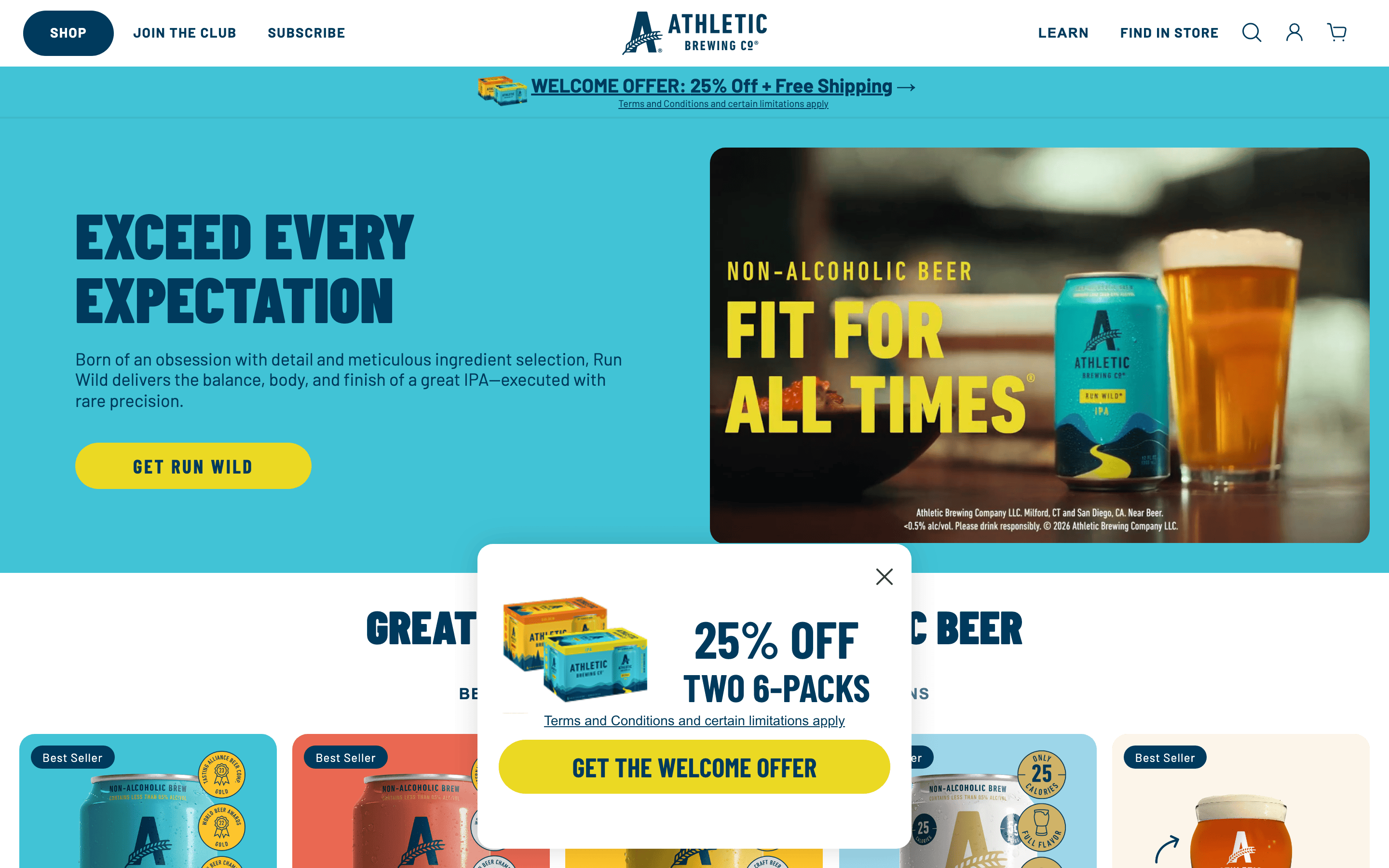
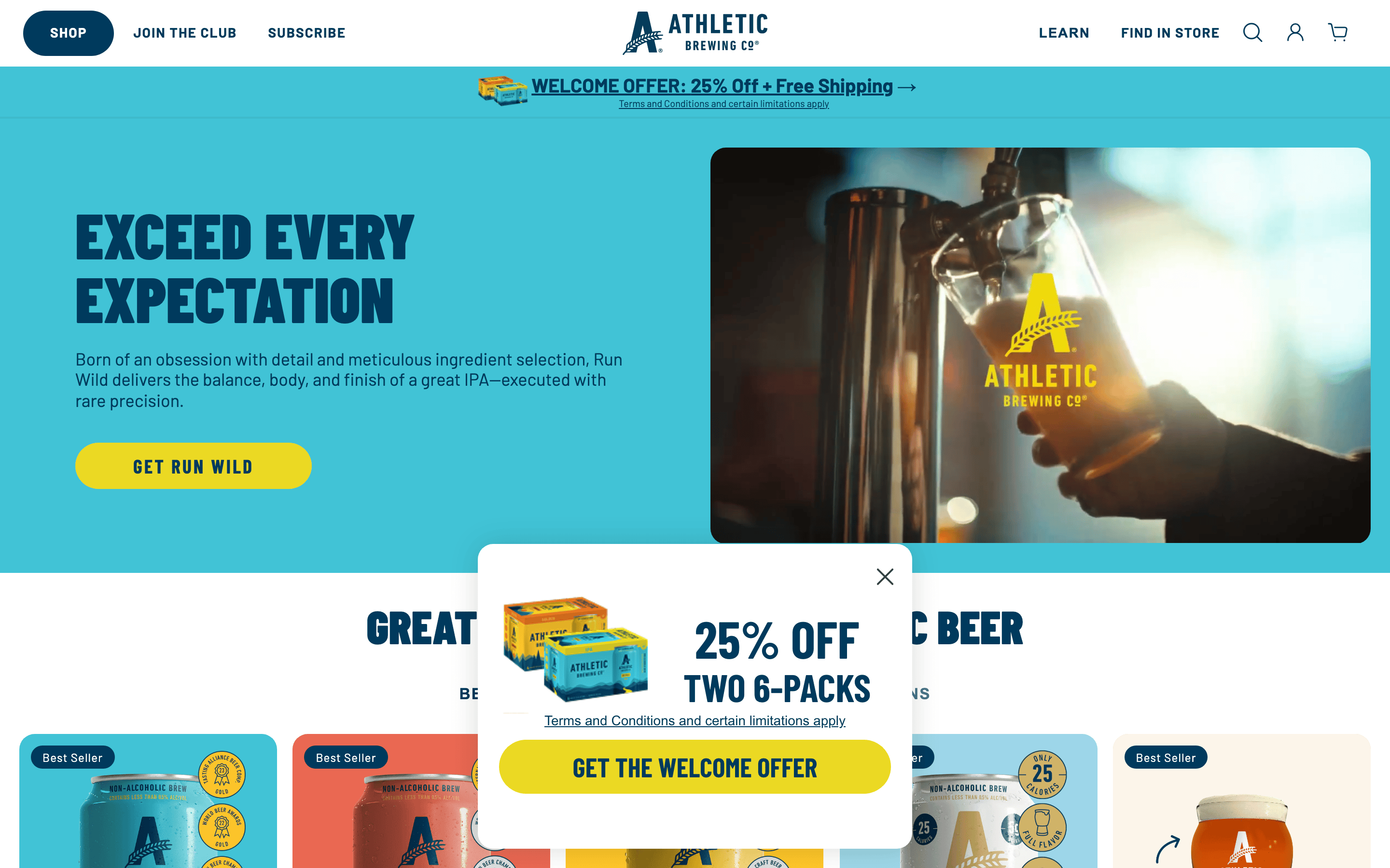
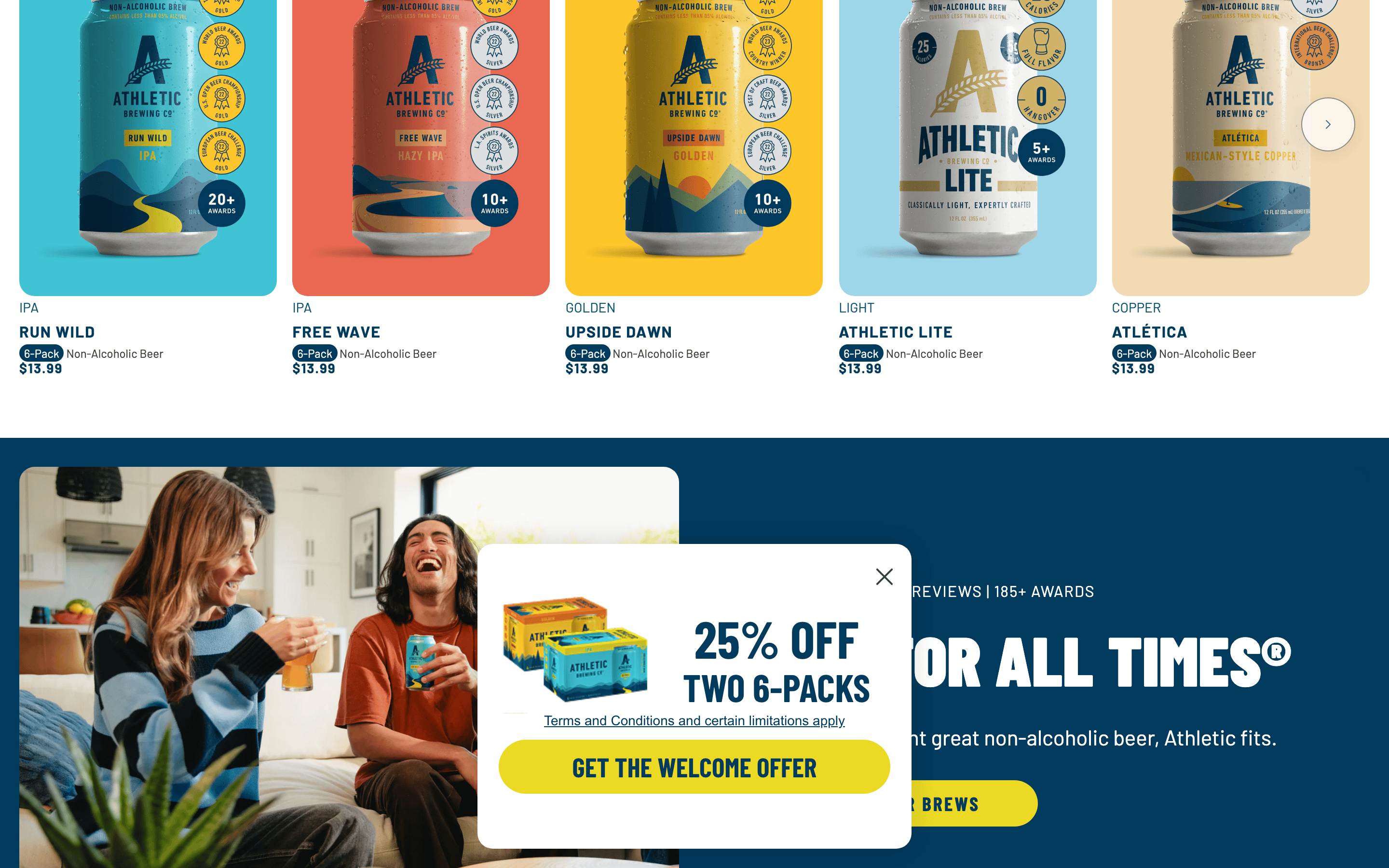
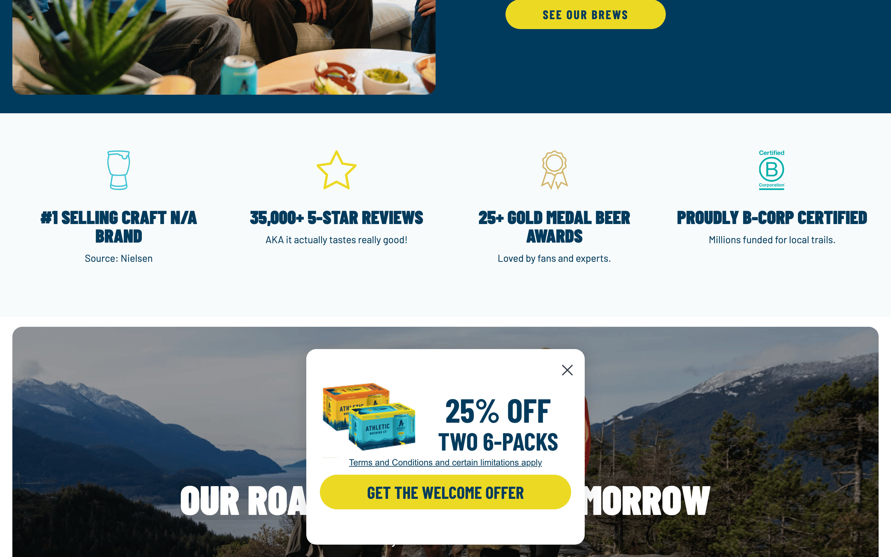
Inside the pack — real screenshots
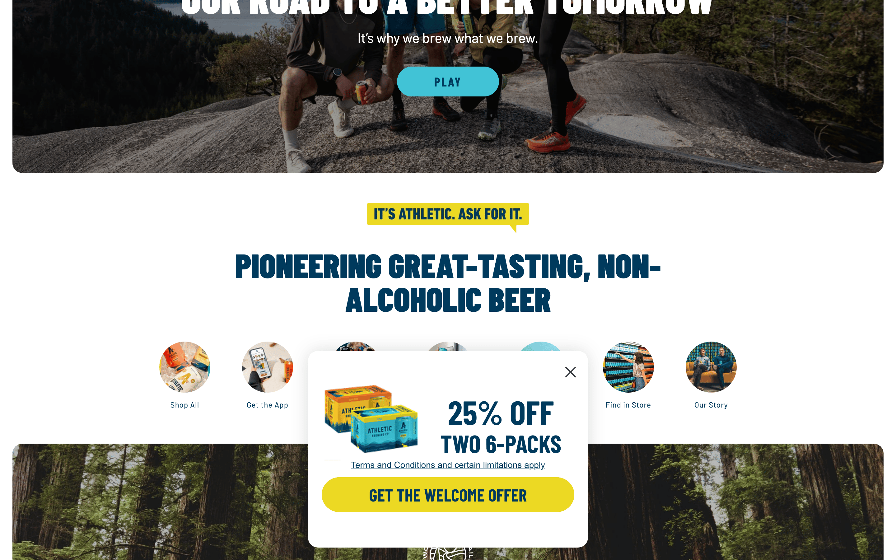
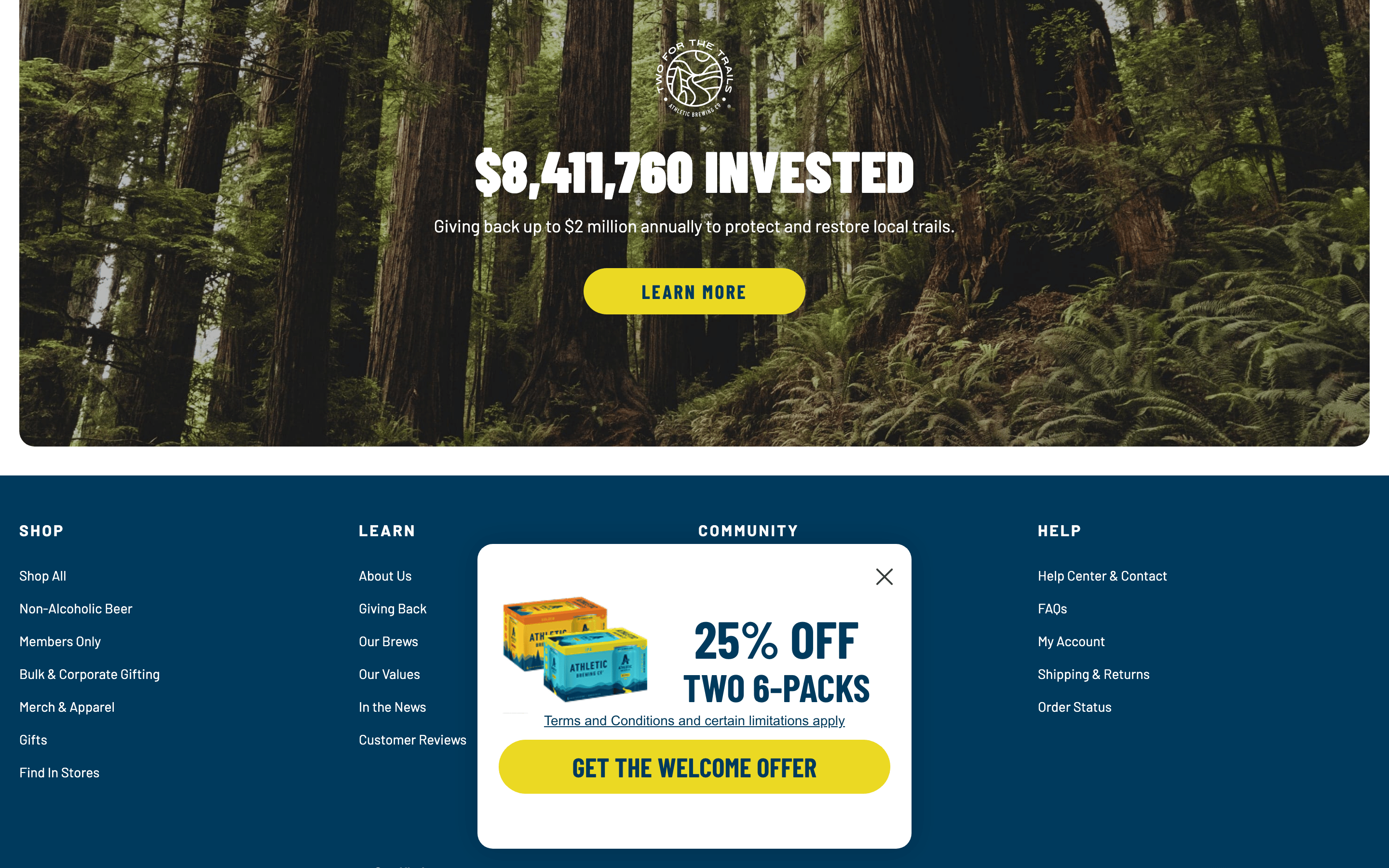
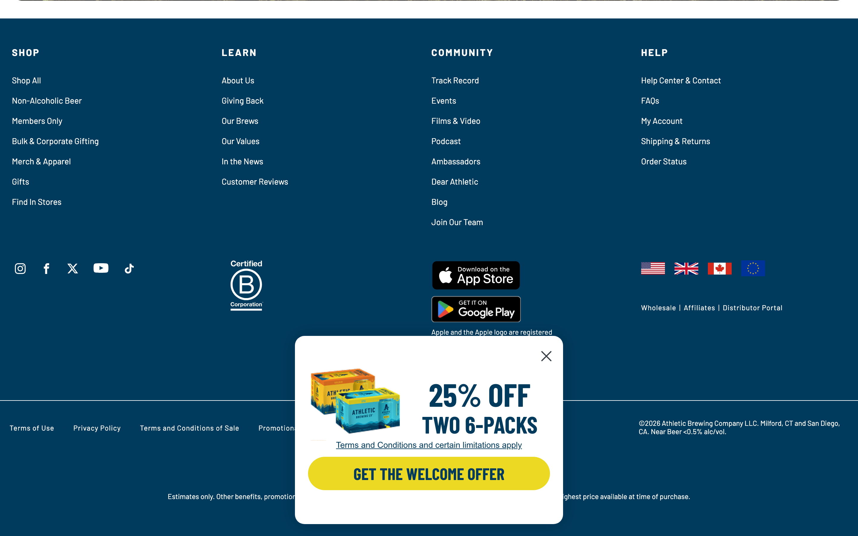
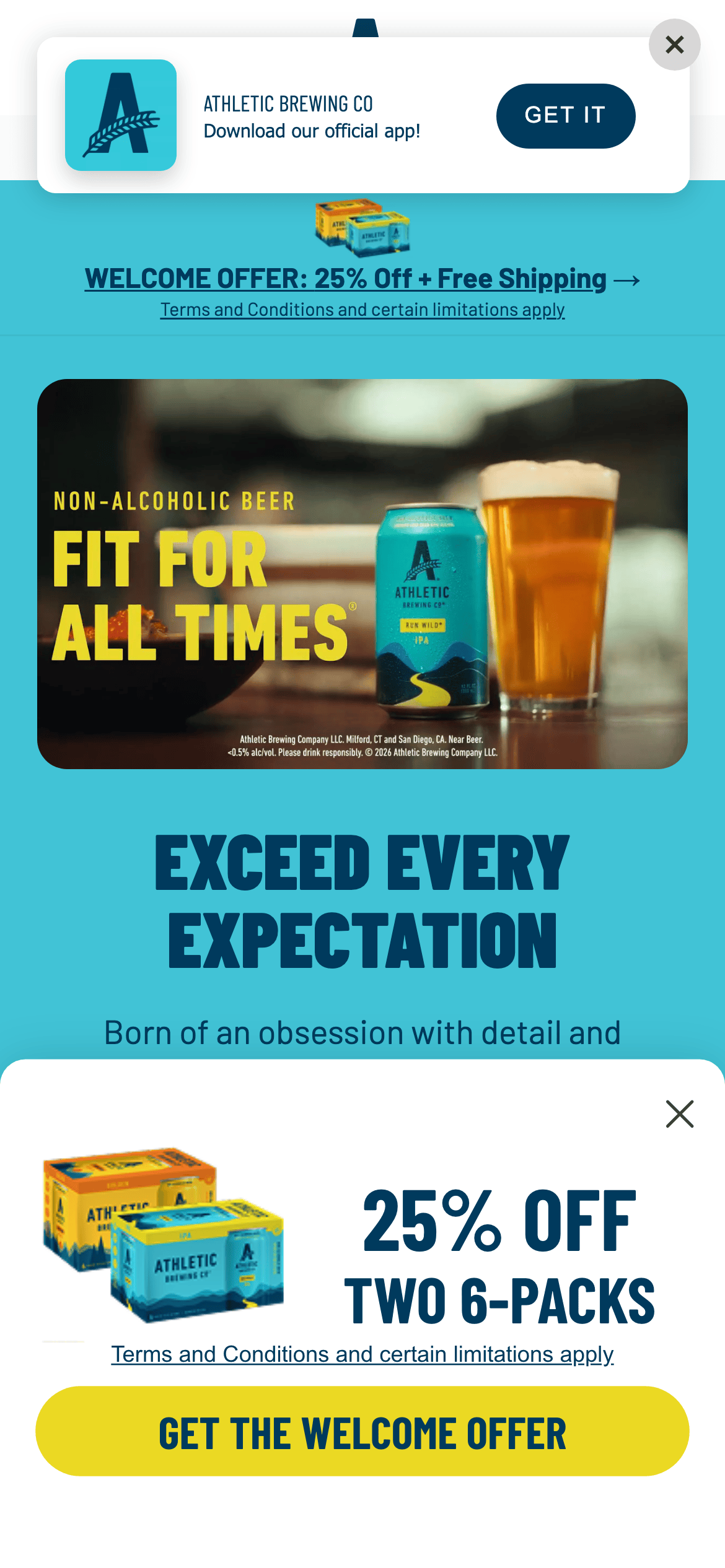
桌面首屏(hero) 桌面滚动分段(90% viewport 步进,作为视觉证据) 桌面滚动分段(90% viewport 步进,作为视觉证据) 桌面滚动分段(90% viewport 步进,作为视觉证据) 桌面滚动分段(90% viewport 步进,作为视觉证据) 桌面滚动分段(90% viewport 步进,作为视觉证据) 桌面滚动分段(90% viewport 步进,作为视觉证据) 移动首屏 Captured from the live site · real computed styles
11
System prompt
The Athletic Brewing site is a premium DTC e-commerce platform for non-alcoholic beer. It uses a high-contrast palette of deep navy (#003A5D) and vibrant yellow (#EBD923) on white backgrounds, creating a bold and energetic feel. Typography is dominated by condensed sans-serifs for display and geometric sans-serifs for body text, almost always in uppercase for headlines. Key design features include generous spacing, pill-shaped buttons, and high-quality lifestyle photography. Critically, do not use thin font weights, muted colors, or square corners on buttons. Layouts are spacious and centered, prioritizing product visibility and clear calls to action.
More from the library en · zh-CN · zh-TW · ja · ko
OpenDesign · curated web aesthetics for AI-readable design DNA · opendesign.cc
Why we curated this: Worth including as a prime example of a modern DTC beverage brand using bold typography and high-contrast colors to communicate an active lifestyle.
浙ICP备2021038972号-5