← OpenDesign CURATED · OPEN · FREE
beehiiv
An all-in-one platform for growing and monetizing newsletters.
publishing newsletter
01
Identity DNA
Newsletter Publishing Creator Economy Growth Monetization
The operating system for modern newsletter publishers
02
Color
#2F39BAAccent
#FFFFFFInk
#C4C4D6Ink soft
#060419BG
#0a0821BG soft
#100e30BG quiet
#6B6B82Muted
rgba(255, 255, 255, 0.1)Line
Dark background with high-contrast white text and vibrant accents
03
Typography
geometric-sans · humanist-sans · monospace
display 60px · 700h1 48px · 700body 16px · 400Use geometric sans-serif for display headlines · Use humanist sans-serif for body text · Use 500 weight for navigation and secondary text
04
Spacing
4px
8px
12px
16px
24px
32px
48px
64px
96px
4px base unit, growing in 4px increments
05
Surfaces
sm · 4px
md · 8px
lg · 12px
pill · 9999px
1px solid rgba(255, 255, 255, 0.1)
0 4px 6px -1px rgba(0, 0, 0, 0.1) · 0 10px 15px -3px rgba(0, 0, 0, 0.1) · 0 20px 25px -5px rgba(0, 0, 0, 0.1)
06
Layout
1280 container
12 columns
24px gutter
768 / 1024 breakpoints
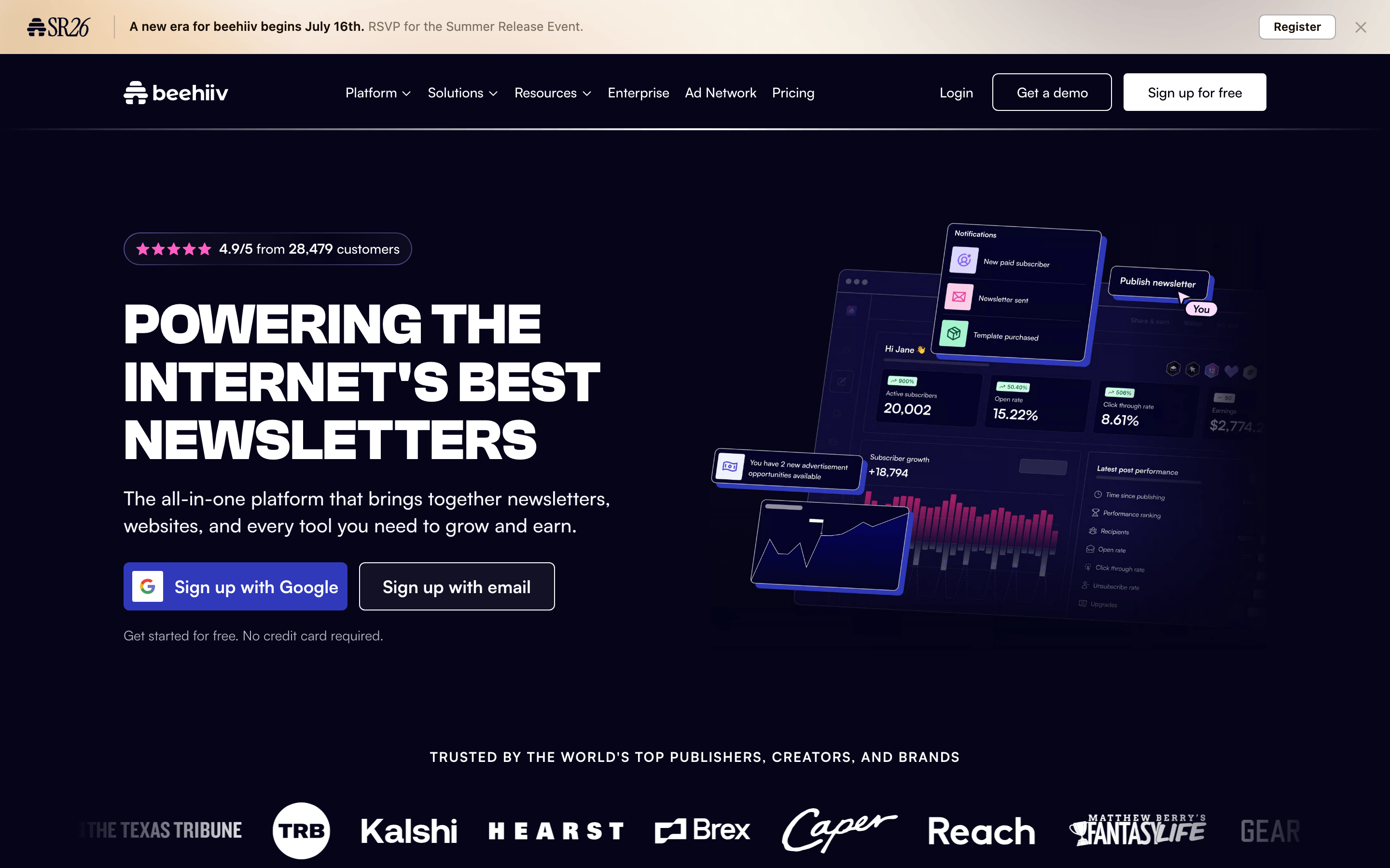
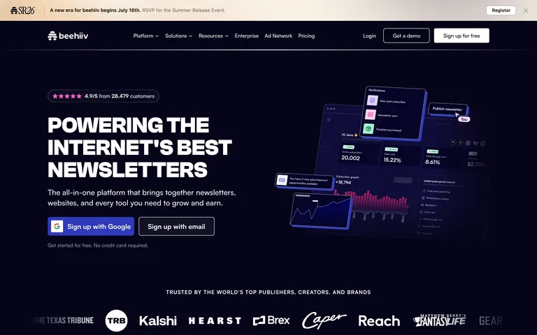
Full-width hero with centered text and side-by-side dashboard UI
07
Motion & Interaction
150ms micro
150ms small
300ms medium
cubic-bezier(0.4, 0, 0.2, 1) easing
Smooth color and background transitions on hover · Scale transforms on interactive elements
Color and background color transitions over 150ms · Scale transform on active state
08
Components
button Primary uses solid blue gradient, secondary uses transparent with white border card Semi-transparent dark cards with subtle borders chip Small rounded tags for navigation input Dark input fields with subtle borders hero Large bold headline with supporting text and CTA buttons 09
Voice & Don'ts
Tone Confident, professional, and forward-looking Headlines All caps, bold, geometric sans-serif CTAs Action-oriented, clear, and benefit-focused Don't use thin, light fonts — screenshot shows bold, weighty headlines Don't use bright white backgrounds — screenshot shows deep navy/dark theme Don't use small, cramped spacing — screenshot shows generous padding and gaps Don't use muted, low-contrast text — screenshot shows high-contrast white on dark Don't use rounded, bubbly shapes — screenshot shows clean, sharp geometry Don't use complex, multi-color gradients — screenshot shows focused, single-accent gradients Avoid: Jargon Avoid: Passive voice Avoid: Uncertainty 10
Inside the pack — real screenshots
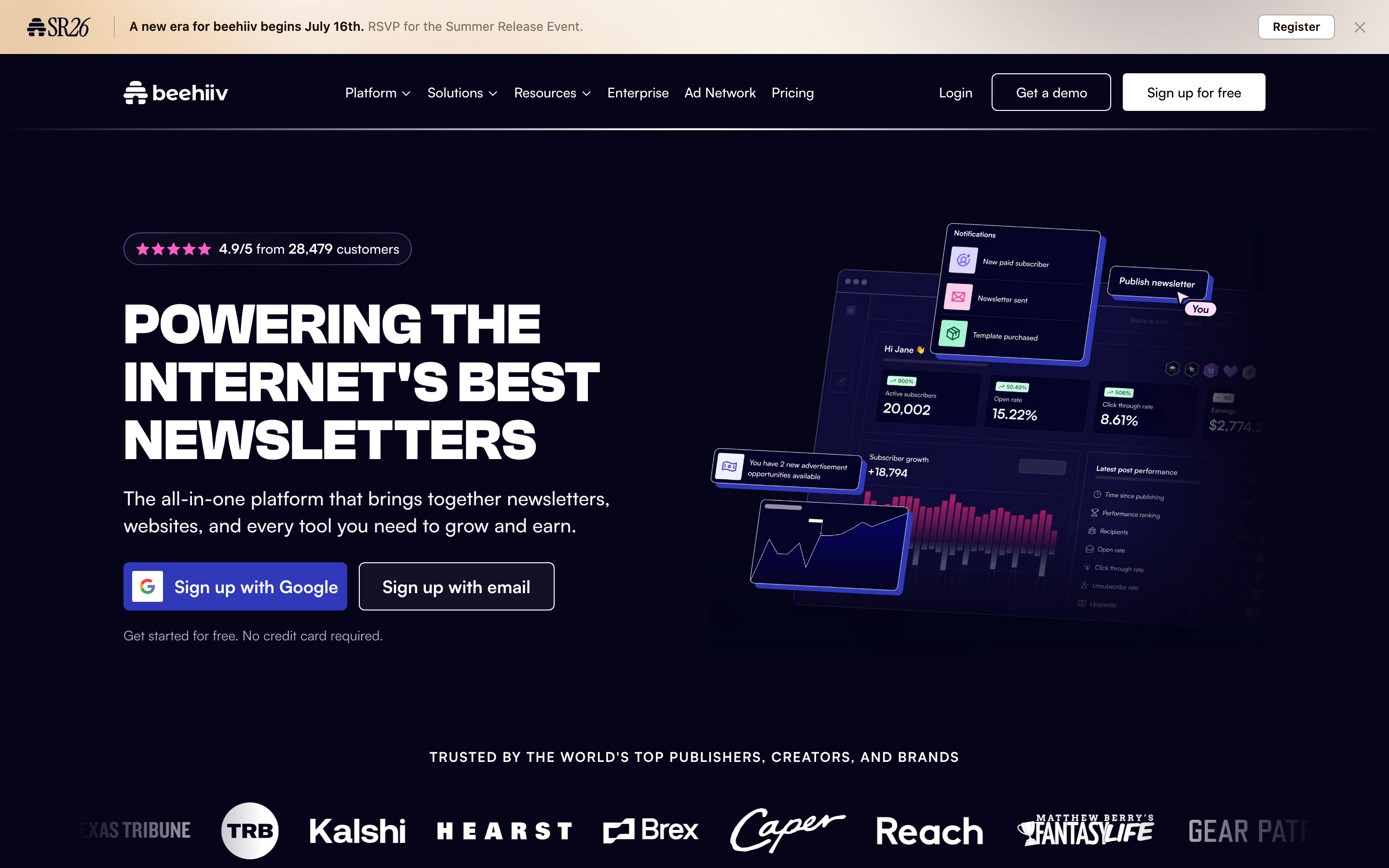
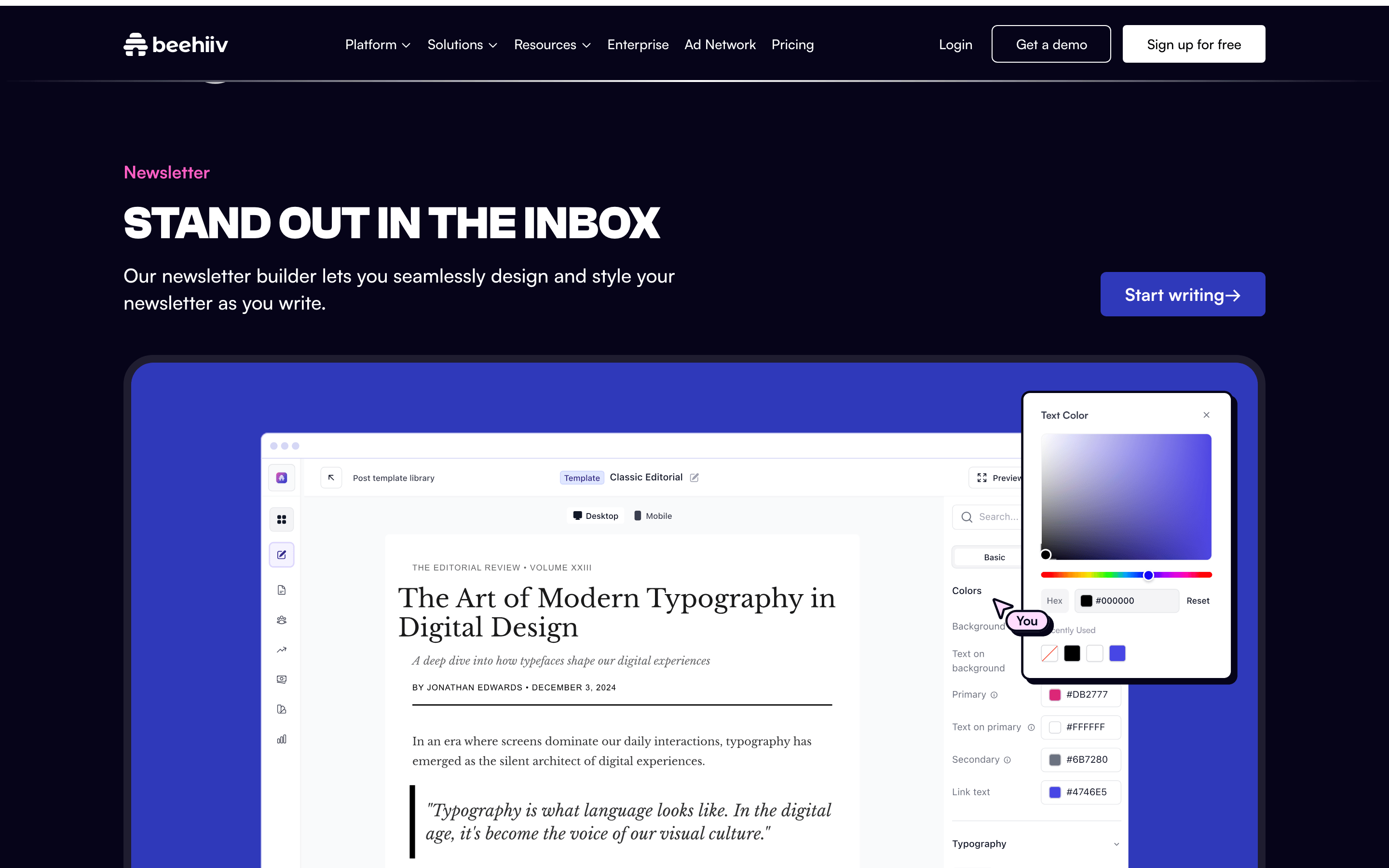
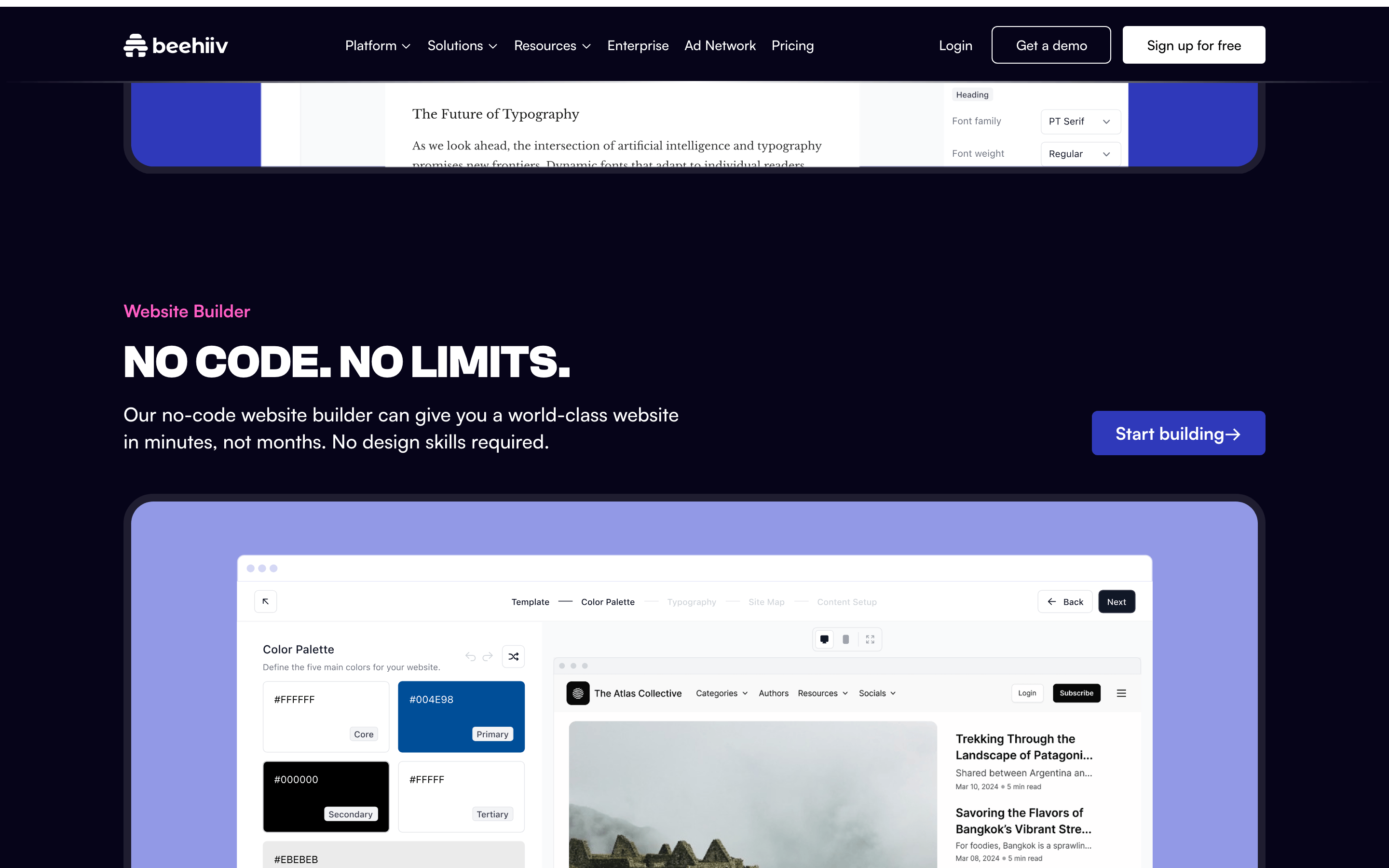
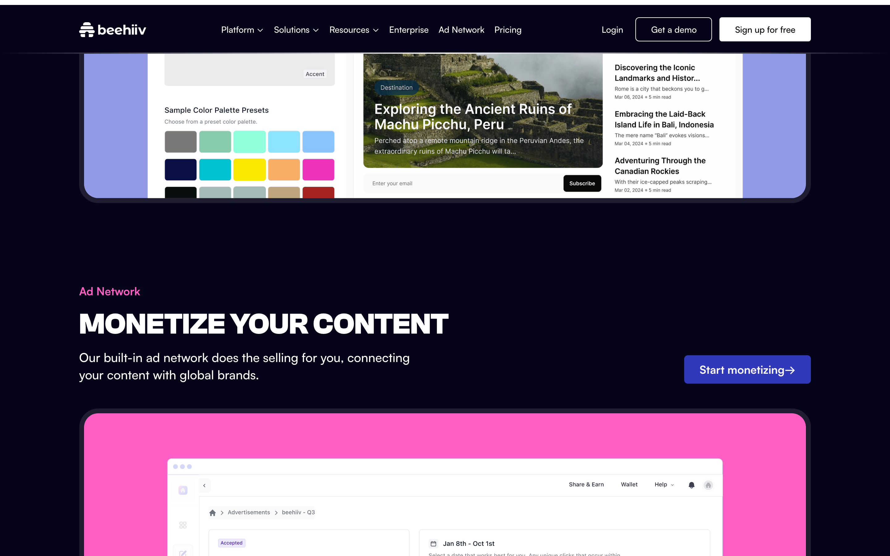
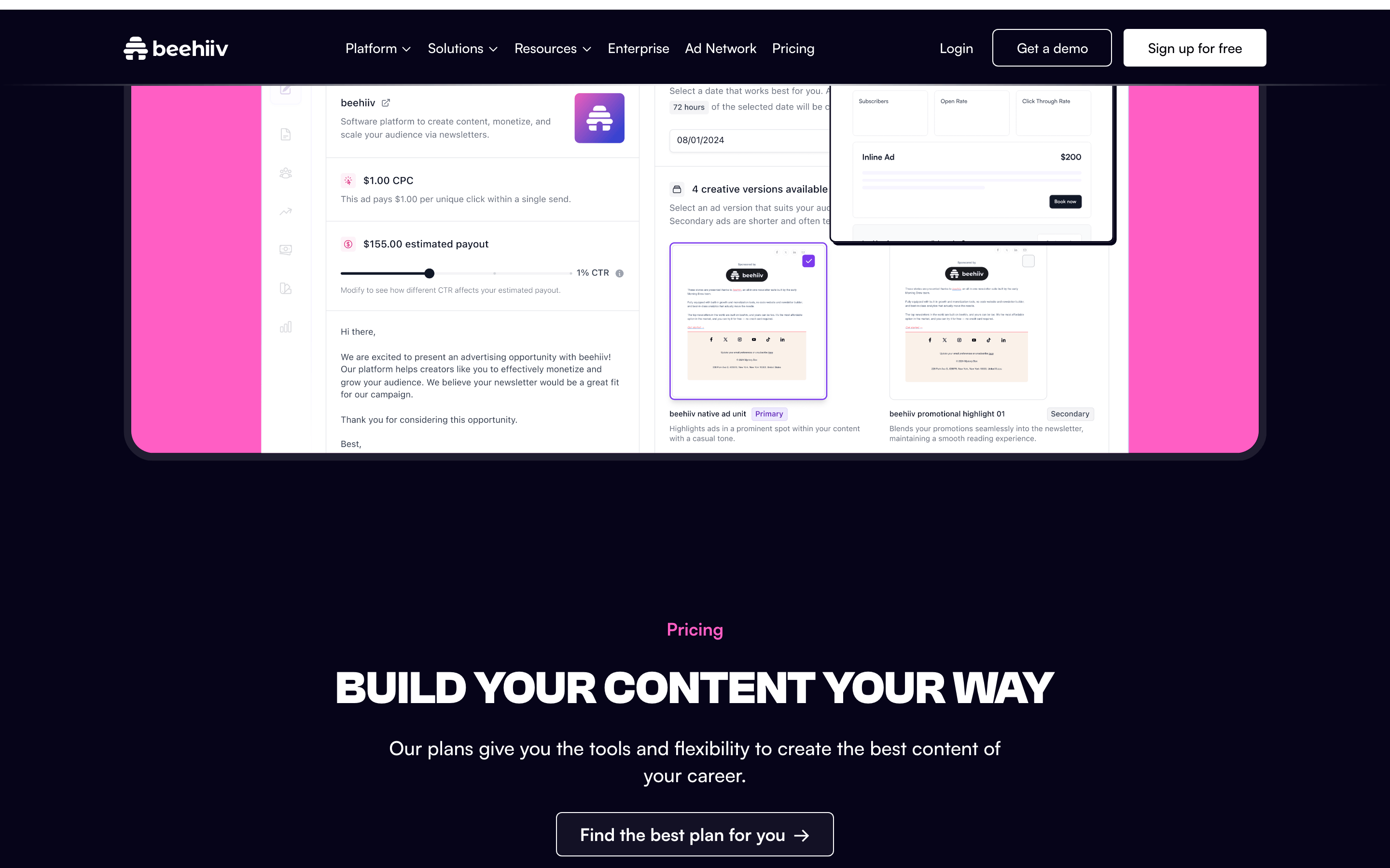
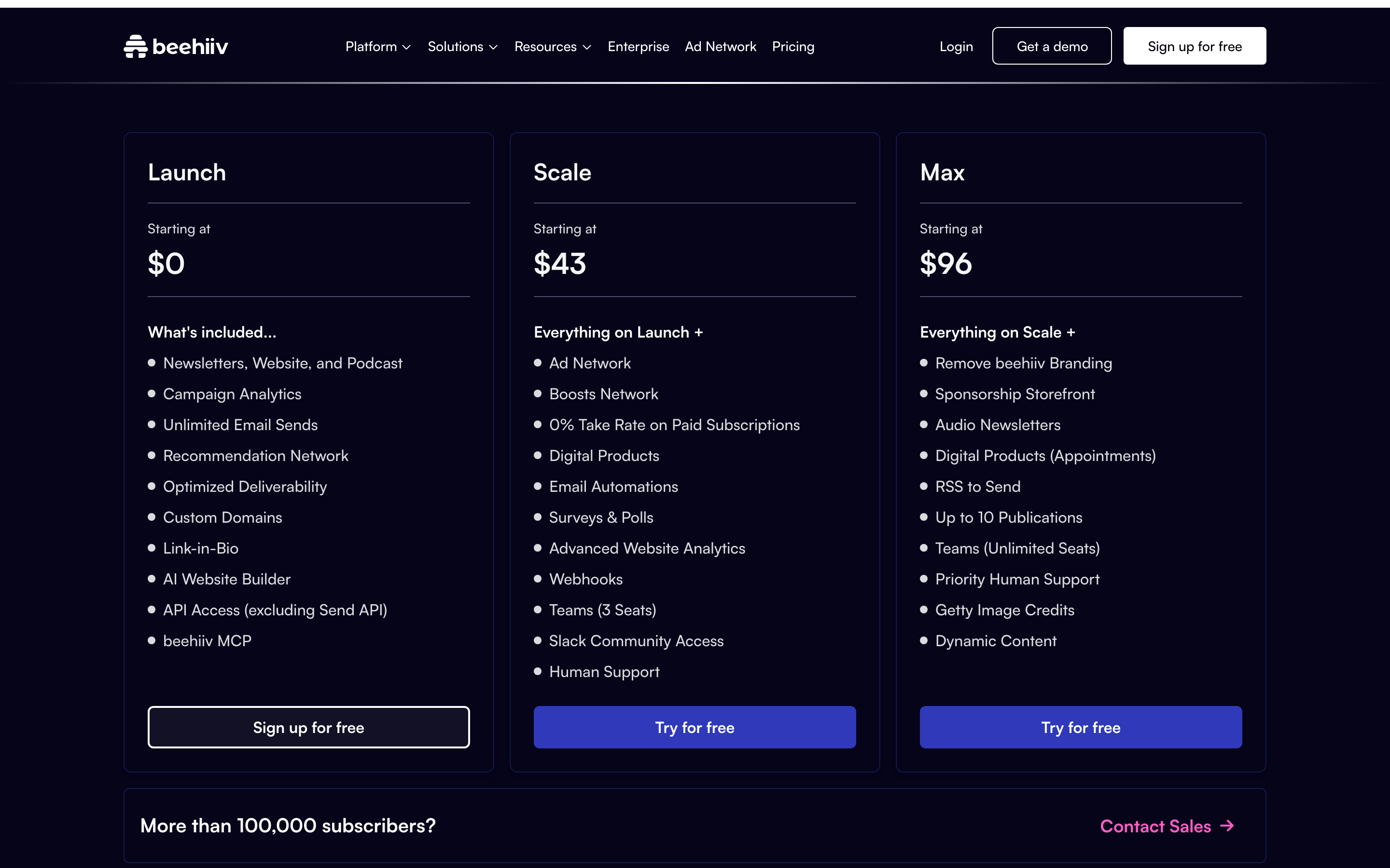
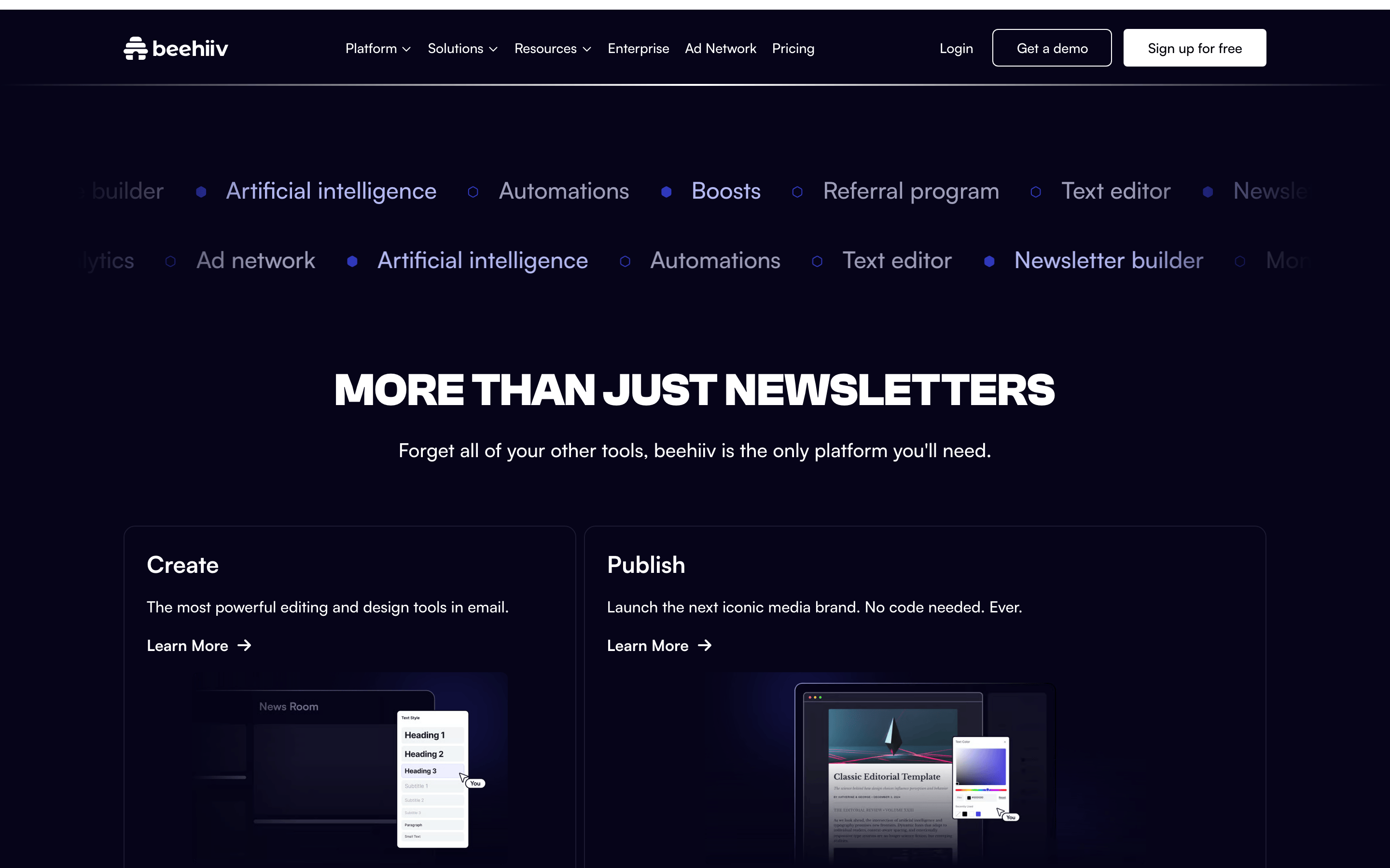
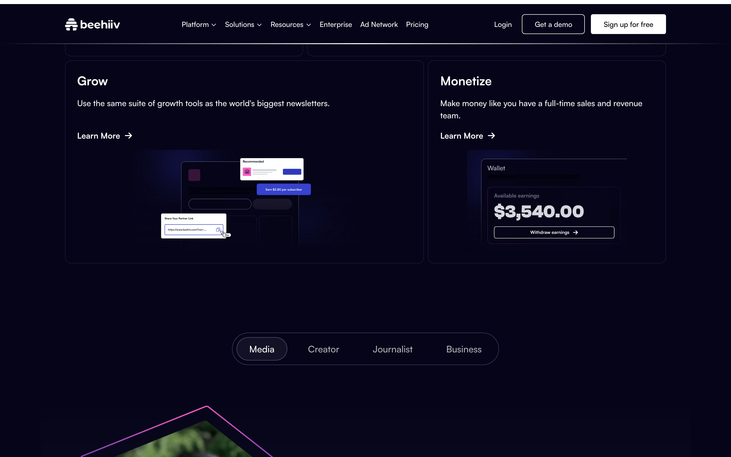
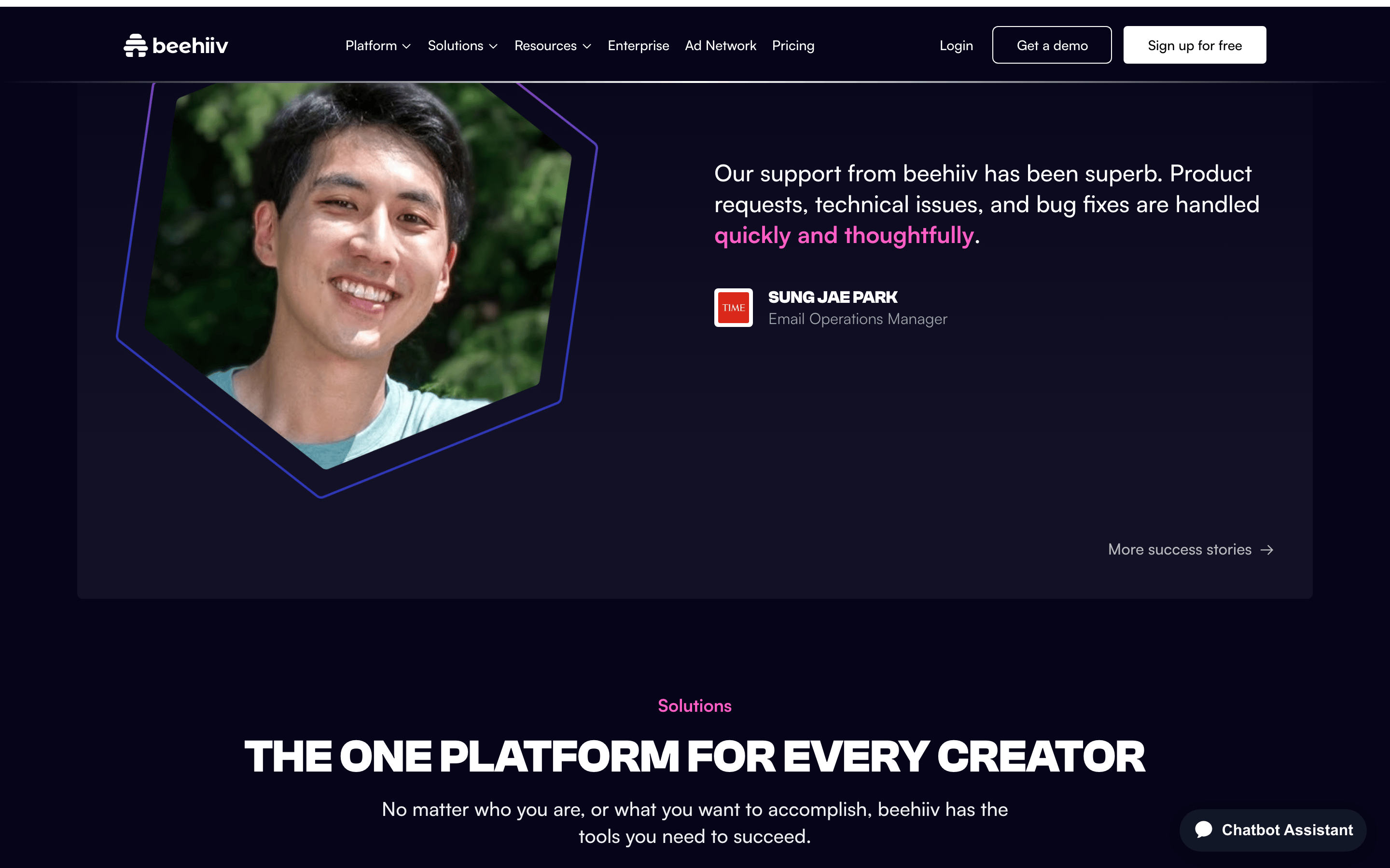
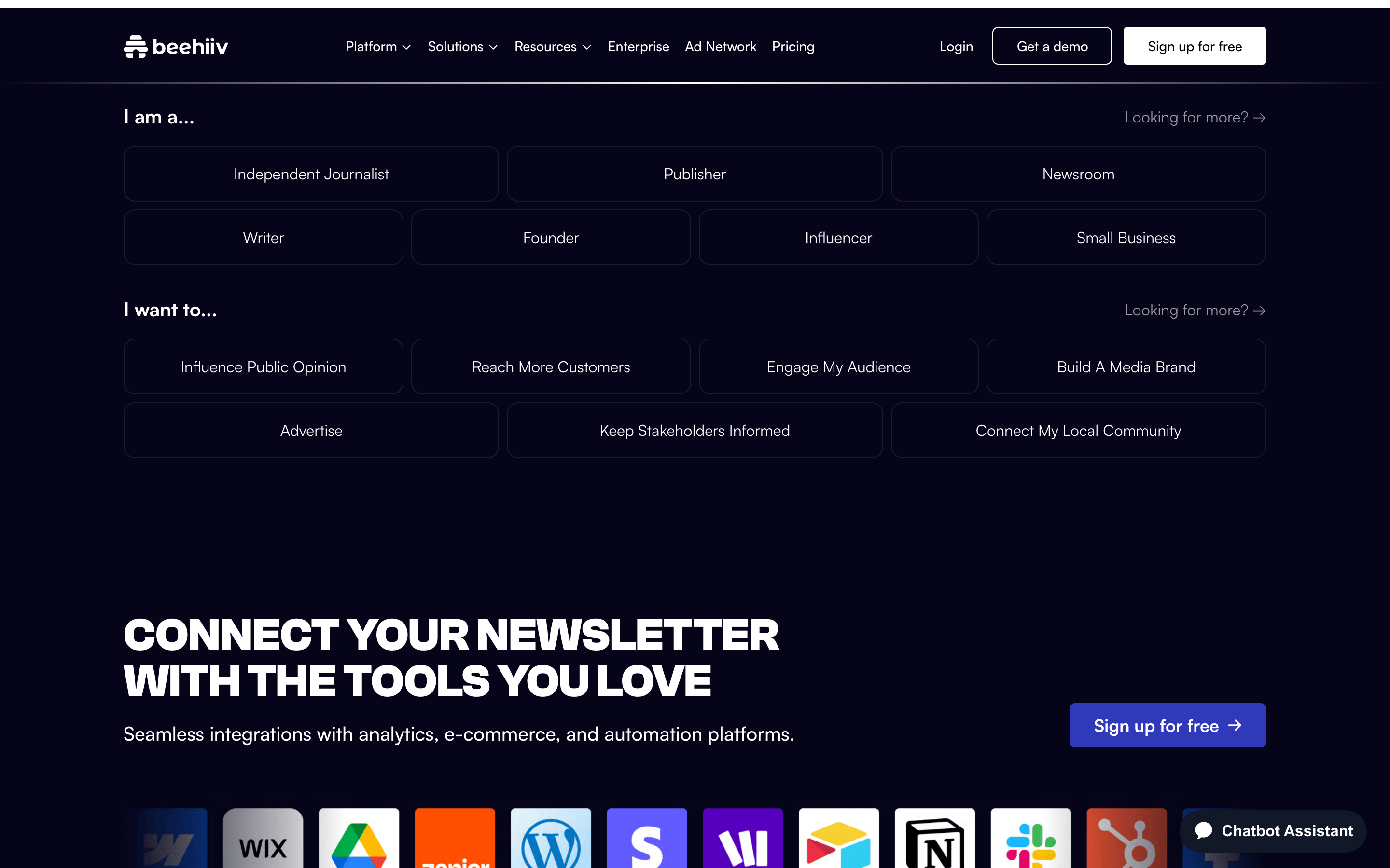
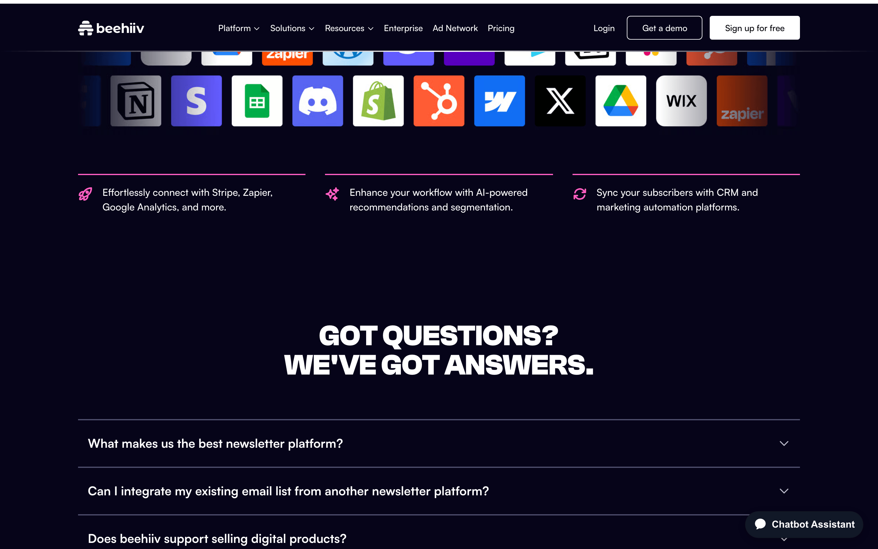
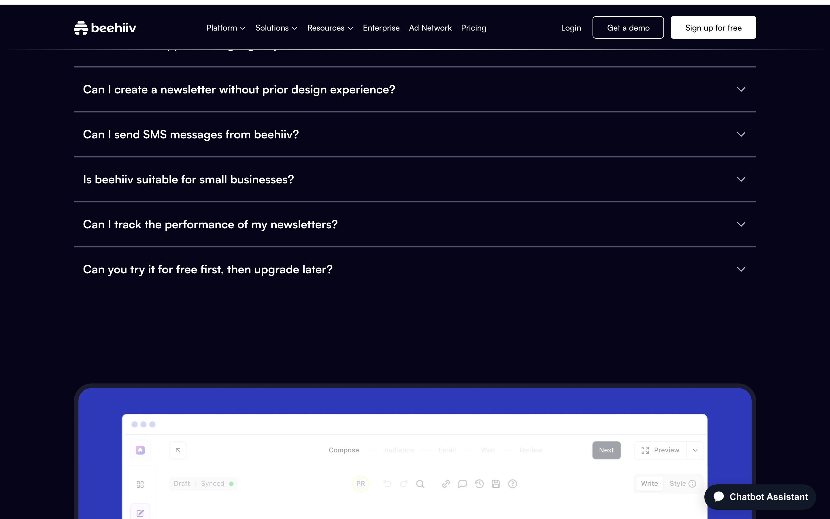
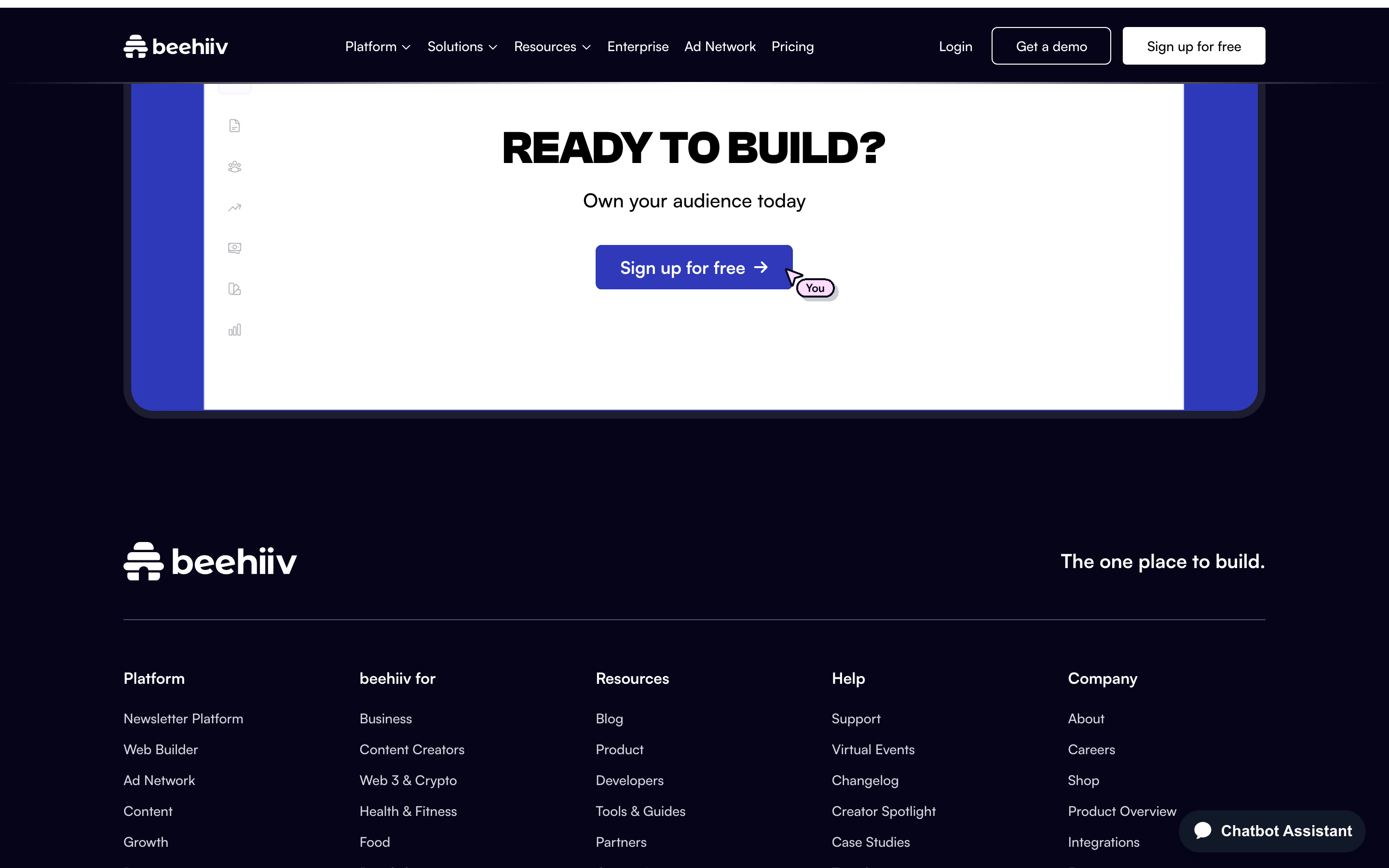
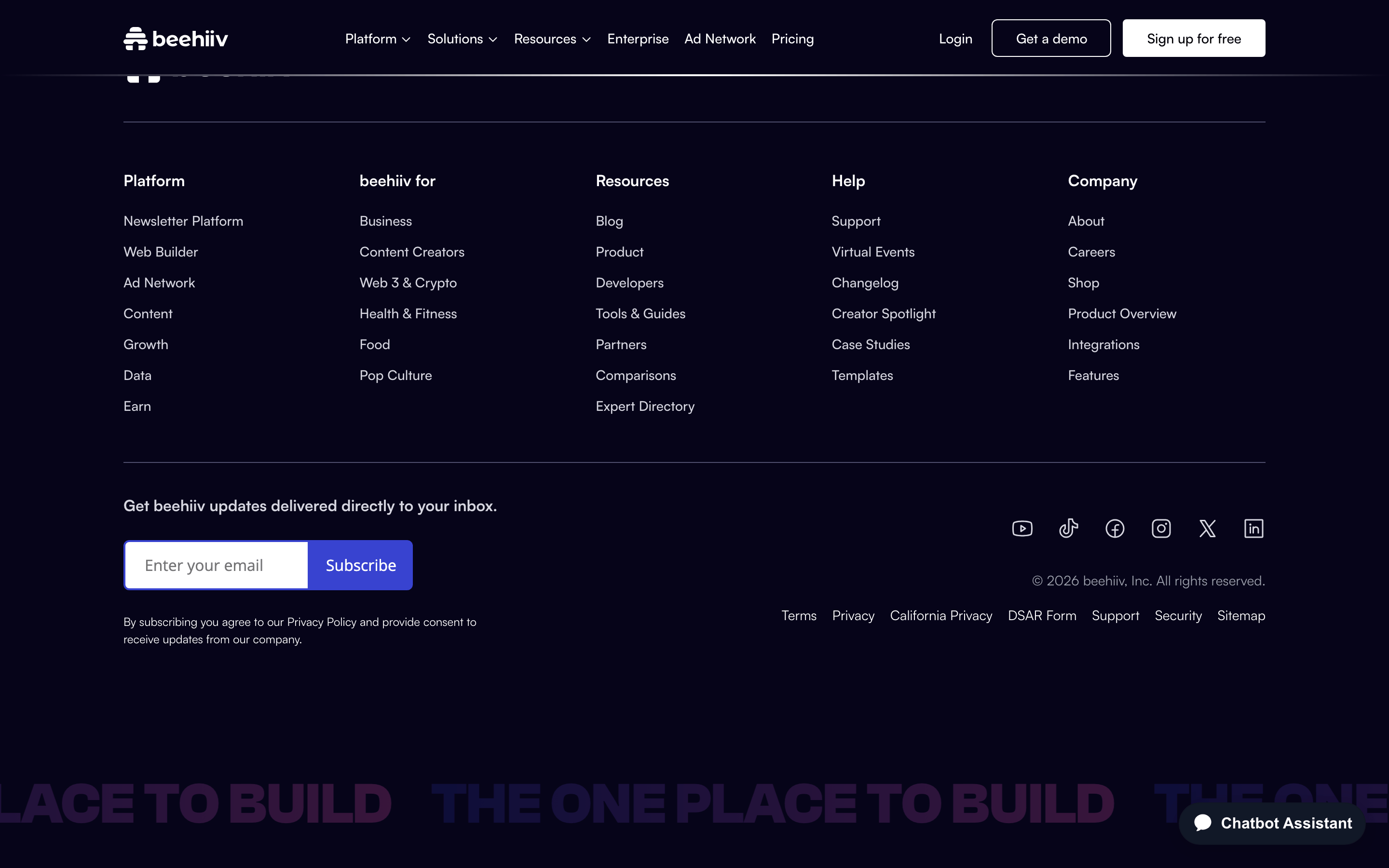
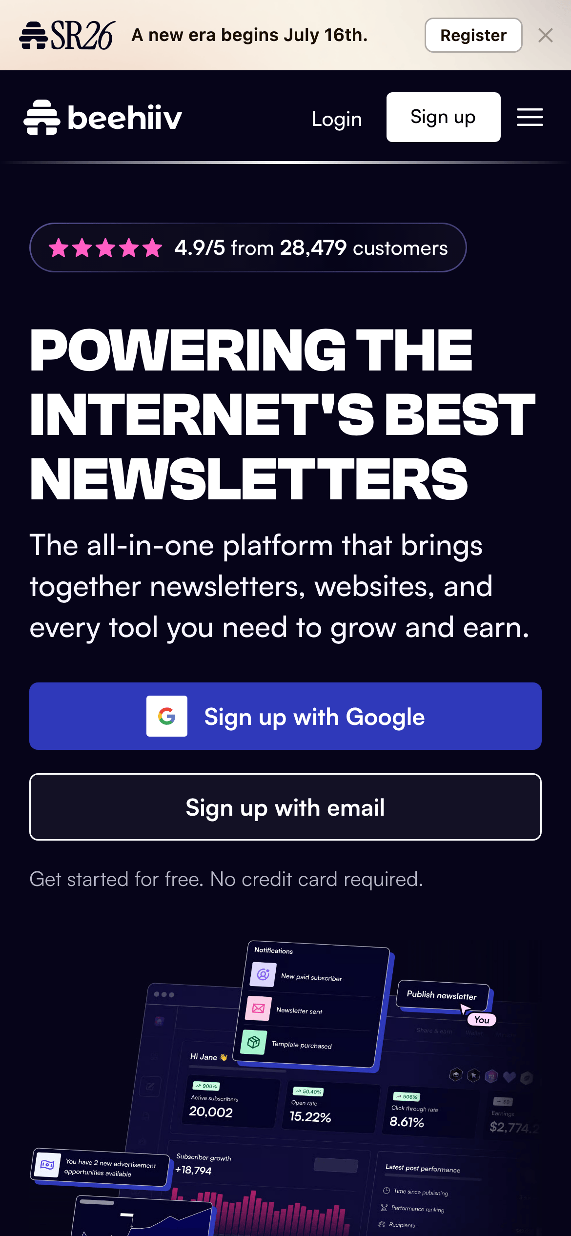
桌面首屏(hero) 桌面滚动分段(90% viewport 步进,作为视觉证据) 桌面滚动分段(90% viewport 步进,作为视觉证据) 桌面滚动分段(90% viewport 步进,作为视觉证据) 桌面滚动分段(90% viewport 步进,作为视觉证据) 桌面滚动分段(90% viewport 步进,作为视觉证据) 桌面滚动分段(90% viewport 步进,作为视觉证据) 桌面滚动分段(90% viewport 步进,作为视觉证据) 桌面滚动分段(90% viewport 步进,作为视觉证据) 桌面滚动分段(90% viewport 步进,作为视觉证据) 桌面滚动分段(90% viewport 步进,作为视觉证据) 桌面滚动分段(90% viewport 步进,作为视觉证据) 桌面滚动分段(90% viewport 步进,作为视觉证据) 桌面滚动分段(90% viewport 步进,作为视觉证据) 桌面滚动分段(90% viewport 步进,作为视觉证据) 移动首屏 Captured from the live site · real computed styles
11
System prompt
beehiiv is a premium SaaS platform for newsletter creators, positioned as the operating system for growing and monetizing newsletters. The design uses a deep navy background (#060419) with high-contrast white text and vibrant blue (#2F39BA) and pink (#FF5EC4) accents. Typography combines a geometric sans-serif (Clash Grotesk) for bold headlines with a humanist sans-serif (Satoshi) for body text, both set at a 4px base rhythm. Critical donts: avoid thin fonts (everything is bold/weighted), avoid bright white backgrounds (dark theme is dominant), avoid cramped spacing (generous padding throughout). The system emphasizes confident, forward-looking language and clear, benefit-focused CTAs.
More from the library en · zh-CN · zh-TW · ja · ko
OpenDesign · curated web aesthetics for AI-readable design DNA · opendesign.cc
Why we curated this: This site exemplifies modern SaaS design with its bold typography, dark mode aesthetic, and clear hierarchy.
浙ICP备2021038972号-5