A clean, editorial-focused platform that feels like a modern, digital magazine or a curated feed for independent writers and readers.
02
Color
#FF6719Accent
#363737Ink
#777777Ink soft
#FFFFFFBG
#F4F4F4BG soft
#EEEEEEBG quiet
#999999Muted
rgba(0,0,0,0.1)Line
White background with high-contrast ink for readability; a single, vibrant orange accent provides energy and call-to-action focus.
03
Typography
transitional-serif · humanist-sans · monospace
display40px · 600
h124px · 600
h220px · 600
body15px · 400
caption13px · 400
Use the serif font family for prominent headlines and editorial display. · Use the system sans-serif stack for body text, navigation, and UI elements. · Maintain clear hierarchy through size and weight differences between titles and body.
04
Spacing
4px
8px
12px
16px
20px
24px
32px
48px
Consistent 8px-based vertical rhythm for spacing between elements, with 4px increments for tighter gaps.
Fixed left sidebar navigation (desktop), central feed column, right sidebar for login/search (desktop); single-column stack with bottom navigation (mobile).
07
Motion & Interaction
220msmicro
250mssmall
400msmedium
cubic-bezier(0.19, 1, 0.22, 1)easing
Smooth 250ms transitions for color, background-color, and border properties on interactive elements. · Transform transitions for hover states. · No complex animations; motion is subtle and functional.
Subtle background-color or text-color changes on interactive elements like links and buttons. · Immediate feedback via standard browser focus states.
08
Components
buttonSolid orange for primary CTAs ('Create', 'Start your Substack'); secondary buttons use white background with a subtle border or light grey fill.
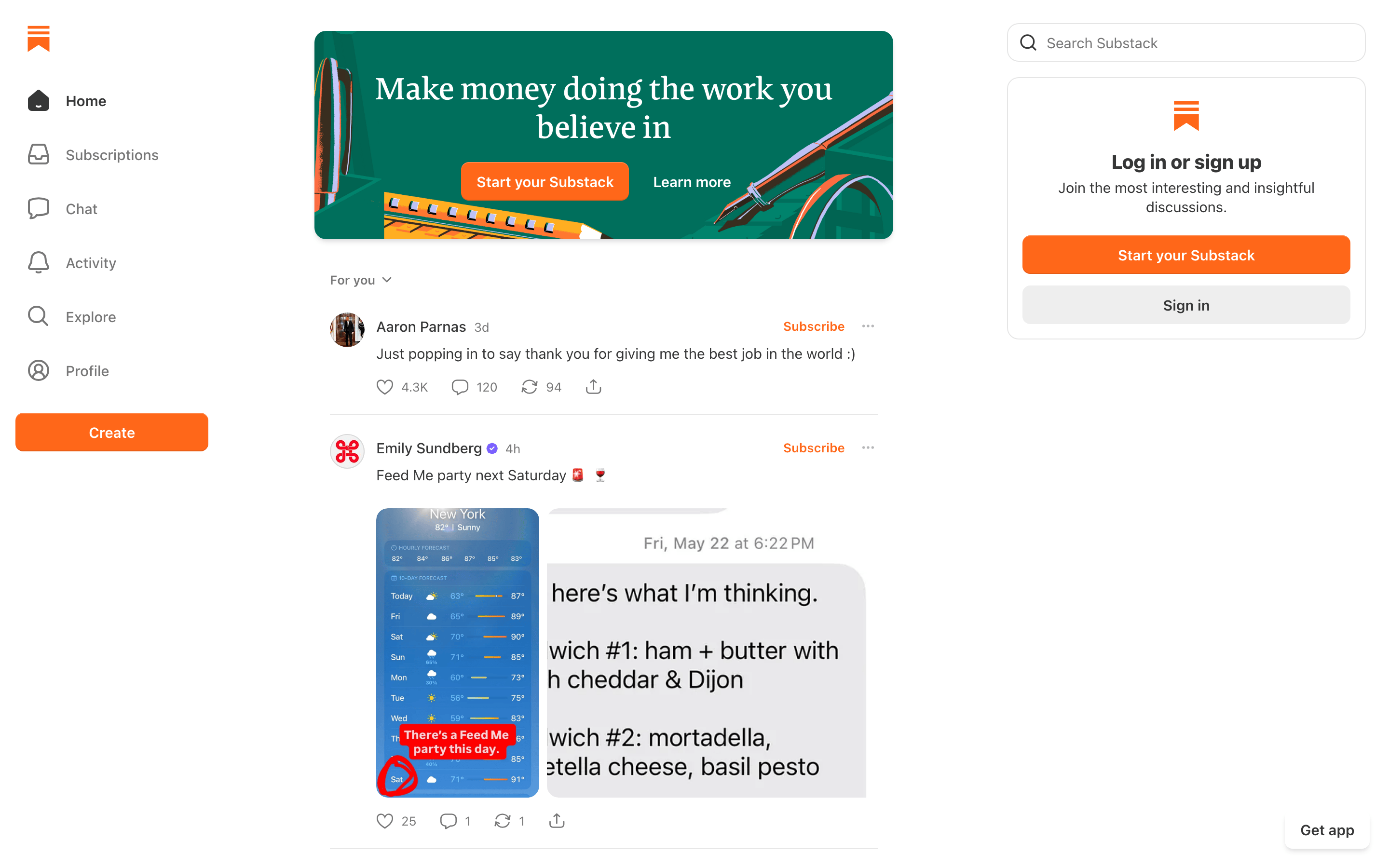
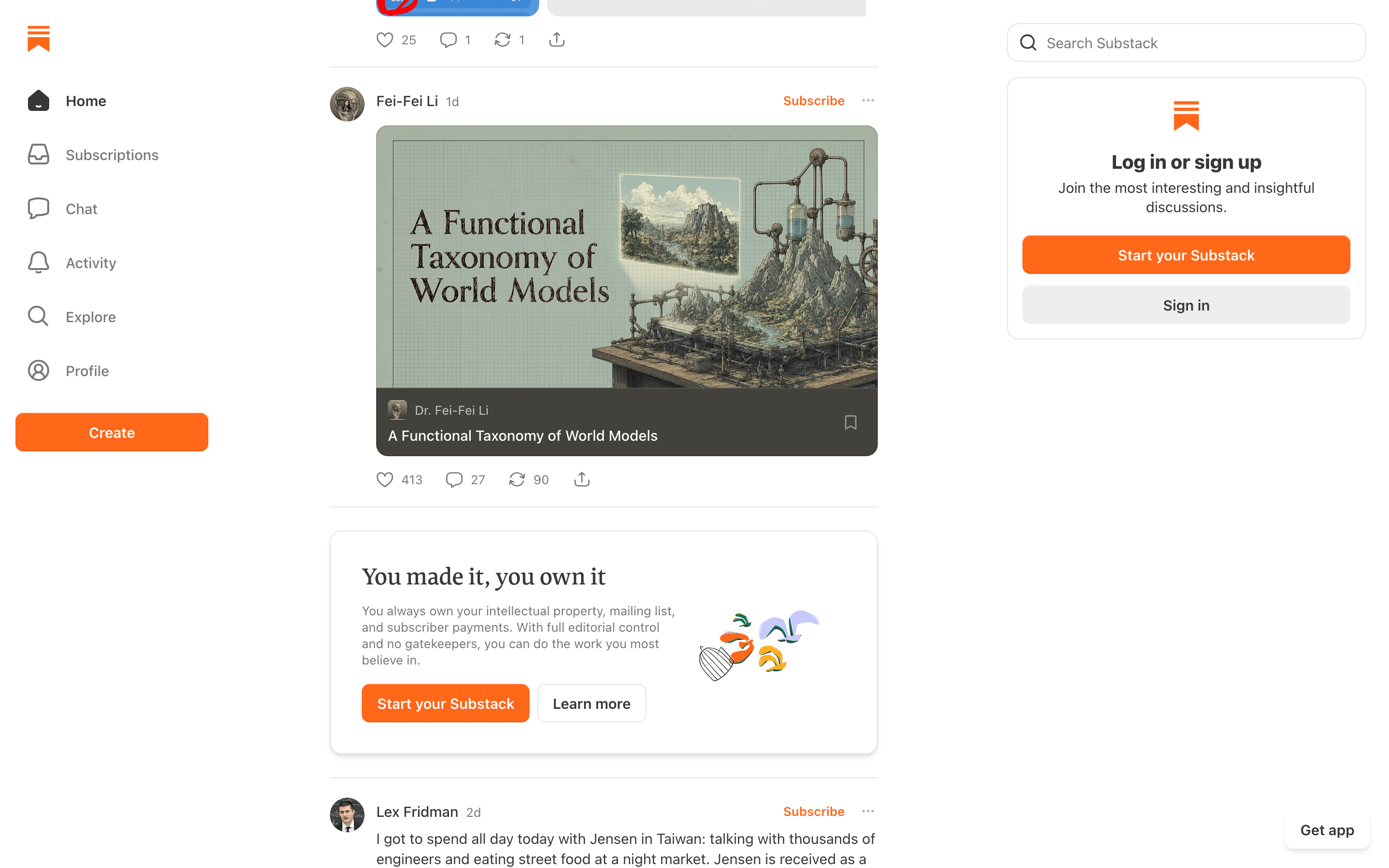
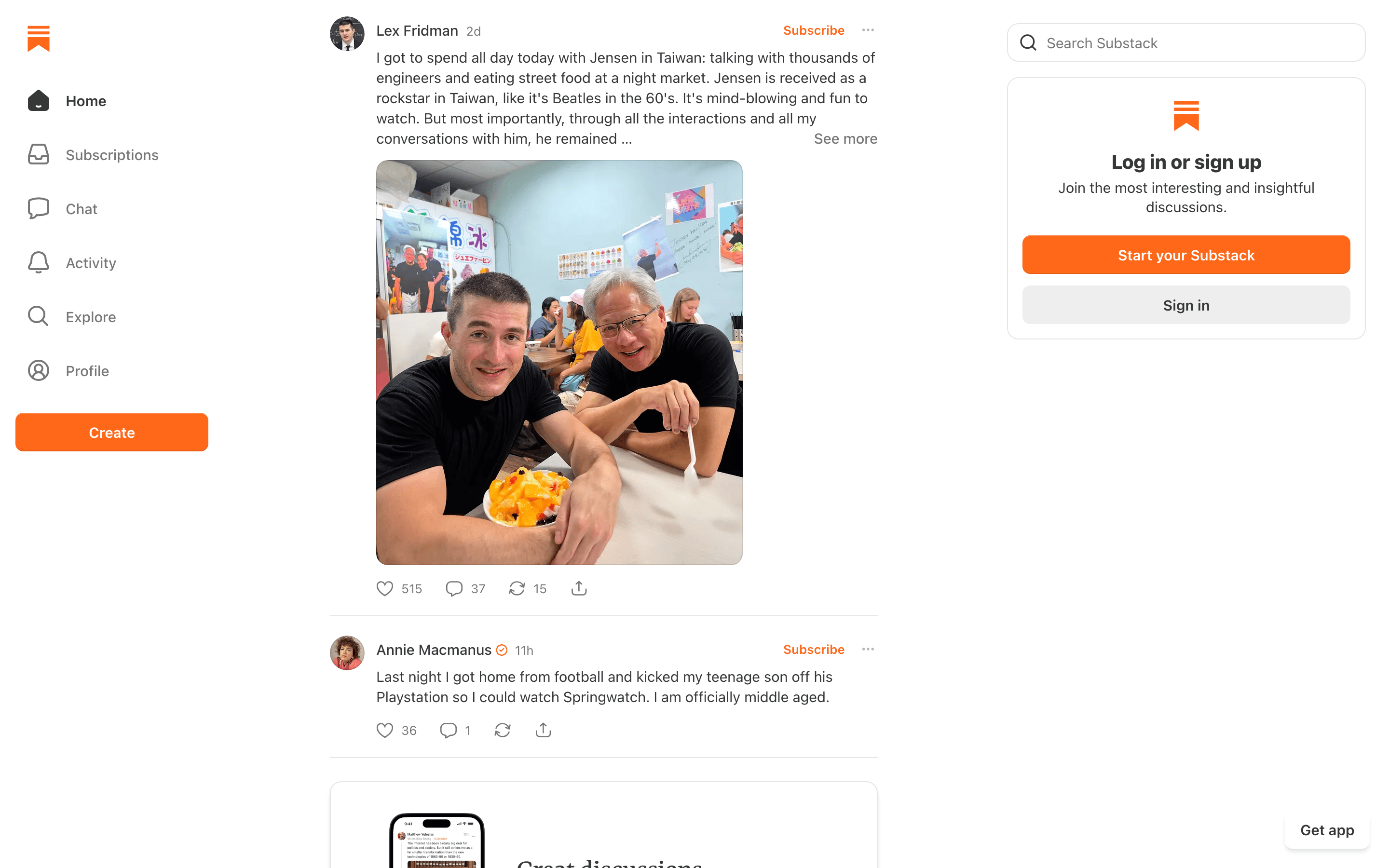
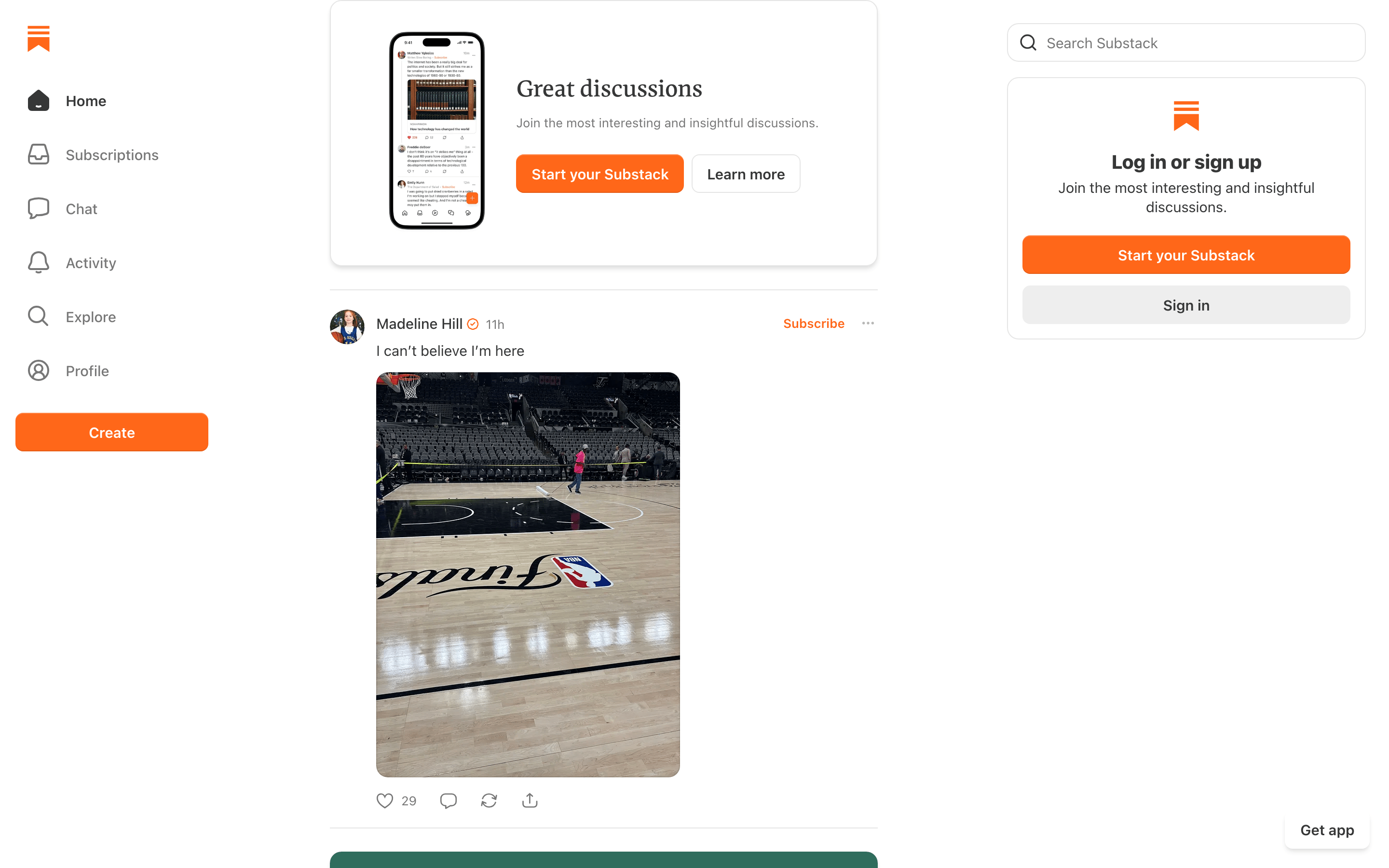
cardFeed items are separated by thin borders, featuring an author avatar, metadata, text content, media, and an action bar (like, comment, share).
chipMinimal use; the 'Subscribe' text acts as a secondary action link.
inputSearch fields use a clean white background with a subtle border and rounded corners.
heroA large, dark teal banner with a serif headline and two distinct CTA options (solid orange button vs. white text link).
09
Voice & Don'ts
ToneConfident, straightforward, and creator-focused.
HeadlinesConcise and empowering, often using a serif font for a more editorial feel.
CTAsDirect and action-oriented, using clear verbs like 'Start', 'Sign in', 'Log in'.
Don't use a dark theme — the screenshot shows a predominantly white background with light grey accents.
Don't use multiple accent colors — the screenshot shows orange as the single, dominant high-chroma color.
Don't use rounded cards for the main feed — the screenshot shows items separated by simple horizontal lines.
Don't use a sans-serif font for major headlines — the screenshot shows serif fonts (like Cahuenga/Spectral) for display text.
Don't use heavy, drop shadows on cards — the screenshot shows very subtle or no shadows on feed items.
Don't use a dense, multi-column grid for content — the screenshot shows a single, focused column for the main feed.
Don't use decorative elements or illustrations in the UI — the screenshot shows a clean, functional layout with icons and photos only.
Captured from the live site · real computed styles
11
System prompt
This design is for a publishing and newsletter platform. It prioritizes readability and content discovery with a clean, white-background layout. The primary accent is a vibrant orange (#FF6719) used for CTAs and branding. Typography uses a mix of a serif font (like Cahuenga or Spectral) for display headlines and a system sans-serif stack for body text. The layout features a fixed sidebar (desktop), a central feed, and a right sidebar for login, transitioning to a single-column mobile layout with bottom navigation. Critical don'ts: don't use dark mode, don't introduce multiple accent colors, and don't use complex animations.
Bring this taste to your agent
Hand your AI agent a machine-readable spec of this design — tokens, type, motion, the whole DNA.