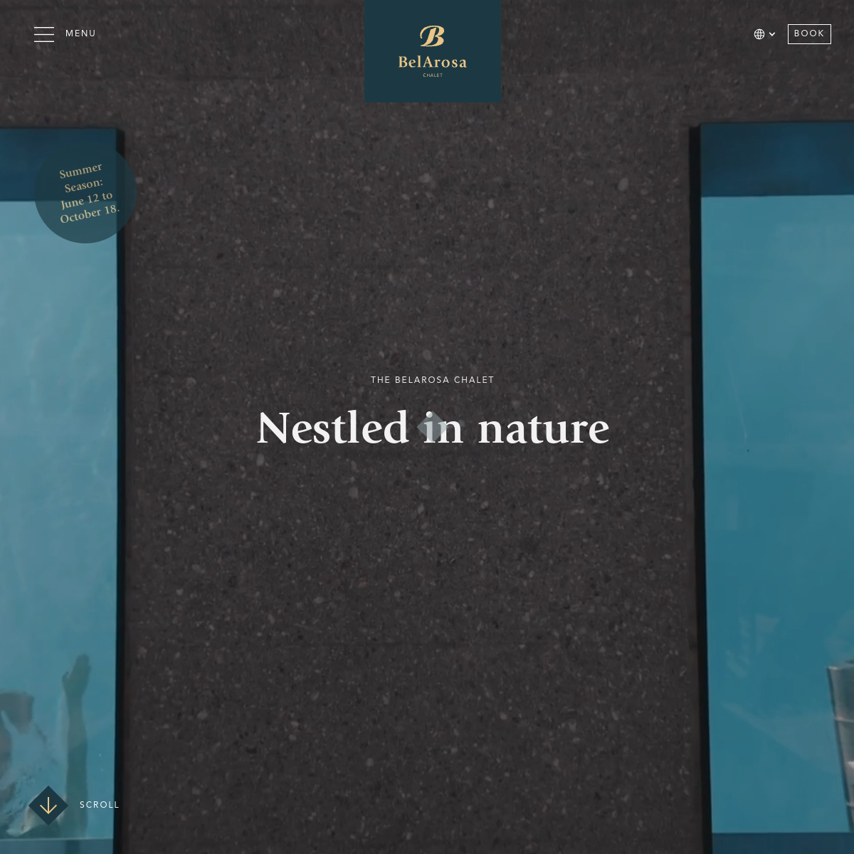
Photographic dominance with warm gold accents for luxury cues.
03
Typography
transitional-serif · sans-serif
display72px · 400
display12px · 400
Use transitional-serif for all display text. · Use uppercase with wide tracking for secondary labels. · Use a warm gold color for accents and logos.
04
Spacing
4px
8px
16px
24px
32px
48px
64px
96px
Generous white space to let the photography breathe.
05
Surfaces
sm · 0px
md · 0px
lg · 0px
pill · 999px
Thin white lines for navigation elements like the BOOK button.
06
Layout
1440container
12columns
24pxgutter
768 / 1024breakpoints
Full-viewport hero with centered text and minimal navigation overlays.
07
Motion & Interaction
220msmicro
400mssmall
800msmedium
cubic-bezier(0.4, 0, 0.2, 1)easing
Subtle scroll-down indicator. · Potential parallax or slow-zoom on the hero image.
Subtle opacity change on interactive elements. · Immediate response on the BOOK button.
08
Components
buttonMinimalist, outlined rectangle with uppercase text.
cardInvisible; relies on the full-bleed image as the primary surface.
chipCircular floating element with text overlay (season info).
heroFull-bleed photographic background with centered typography.
09
Voice & Don'ts
ToneSophisticated, calm, and inviting.
HeadlinesEvocative and poetic, focusing on the experience.
CTAsDirect and action-oriented.
Don't use bright, neon colors — the palette is muted and earthy.
Don't use a sans-serif for main headlines — the site uses a transitional serif.
Don't clutter the hero with multiple CTAs or text blocks — it's minimal and focused.
Don't use rounded corners on primary containers — the design favors sharp, architectural lines.
Don't use heavy drop shadows — surfaces appear flat and integrated with the background.
Don't use a busy or patterned background — the design relies on high-quality photography.
Avoid: Loud or high-contrast color combinations.
Avoid: Cluttered layouts with multiple competing elements.
Avoid: Casual or overly playful language.
11
System prompt
A luxury mountain chalet website with a serene, photographic focus. The palette is dominated by the dark, earthy tones of the background image (#2D3336) and clean white text (#FFFFFF), with a warm gold accent (#C7B98D) for branding. Typography uses a transitional-serif for display and a clean sans-serif for body, with wide-tracked uppercase for labels. The layout is minimal, full-bleed, and editorial. Critical donts: never use neon colors, avoid sans-serif headlines, and keep the interface uncluttered to let the photography speak. The overall feel is calm, refined, and premium.
Bring this taste to your agent
Hand your AI agent a machine-readable spec of this design — tokens, type, motion, the whole DNA.