High-contrast, achromatic palette focused on typography and imagery
03
Typography
didone-serif · monospace
display280px · 700
heading28px · 300
body14px · 400
Use Space Mono for all UI and body text · Use Meno Display Condensed for the hero brand name · Keep navigation text clean and uppercase or sentence case
04
Spacing
4px
8px
16px
24px
32px
48px
64px
96px
Generous whitespace and padding
05
Surfaces
sm · 0px
md · 0px
lg · 0px
pill · 999px
1px solid #1A0A0E
06
Layout
1440container
12columns
24pxgutter
768 / 1024breakpoints
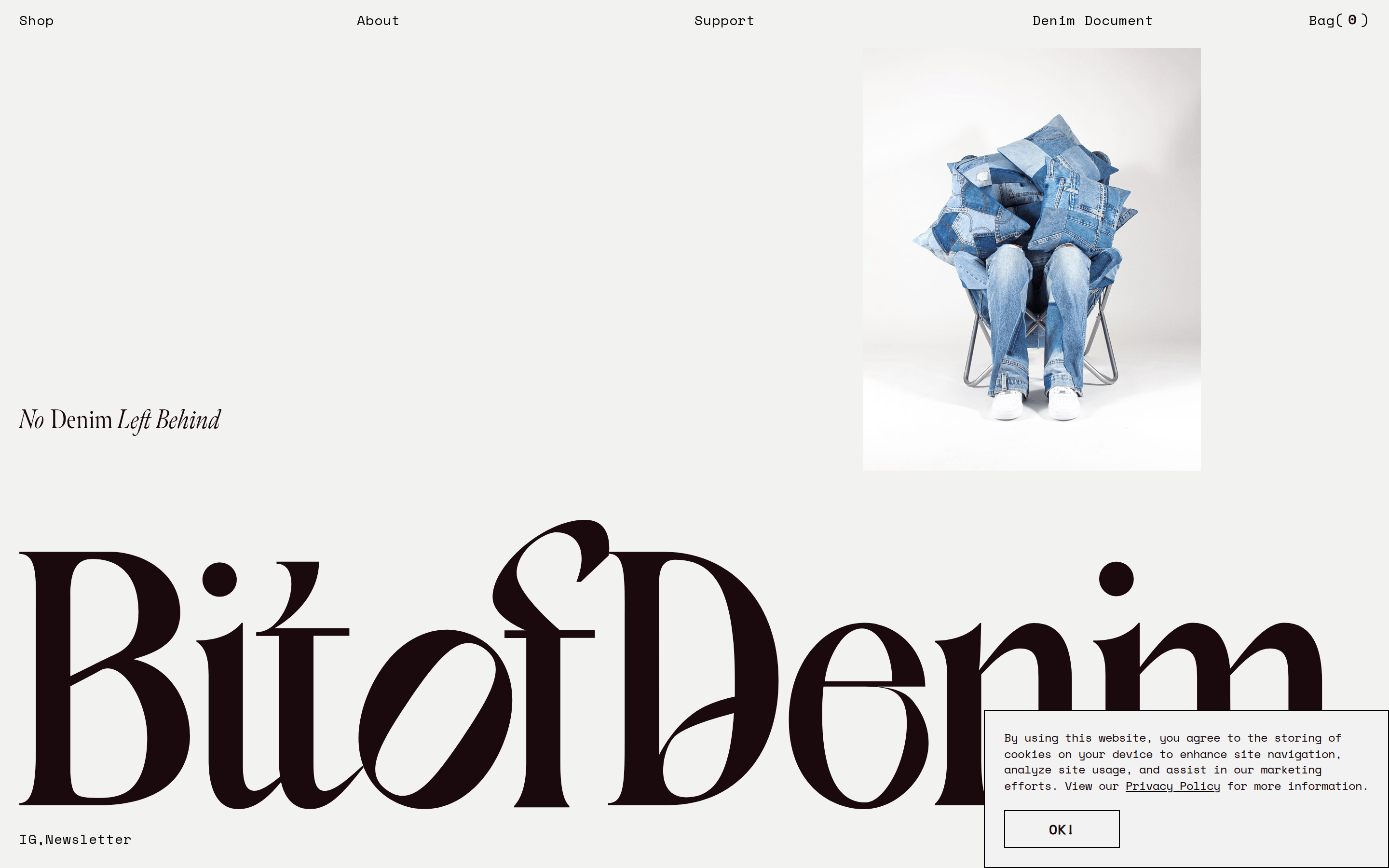
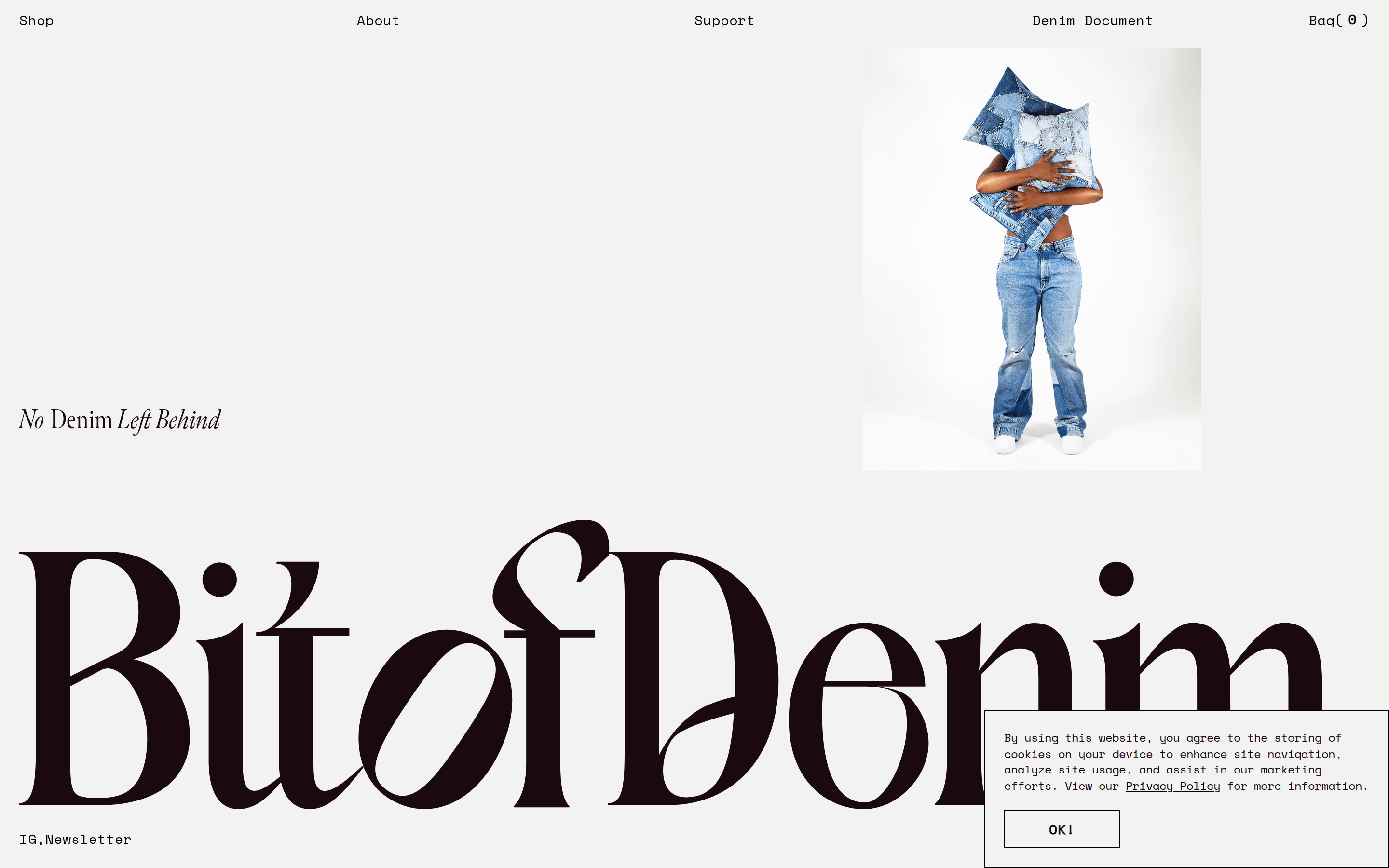
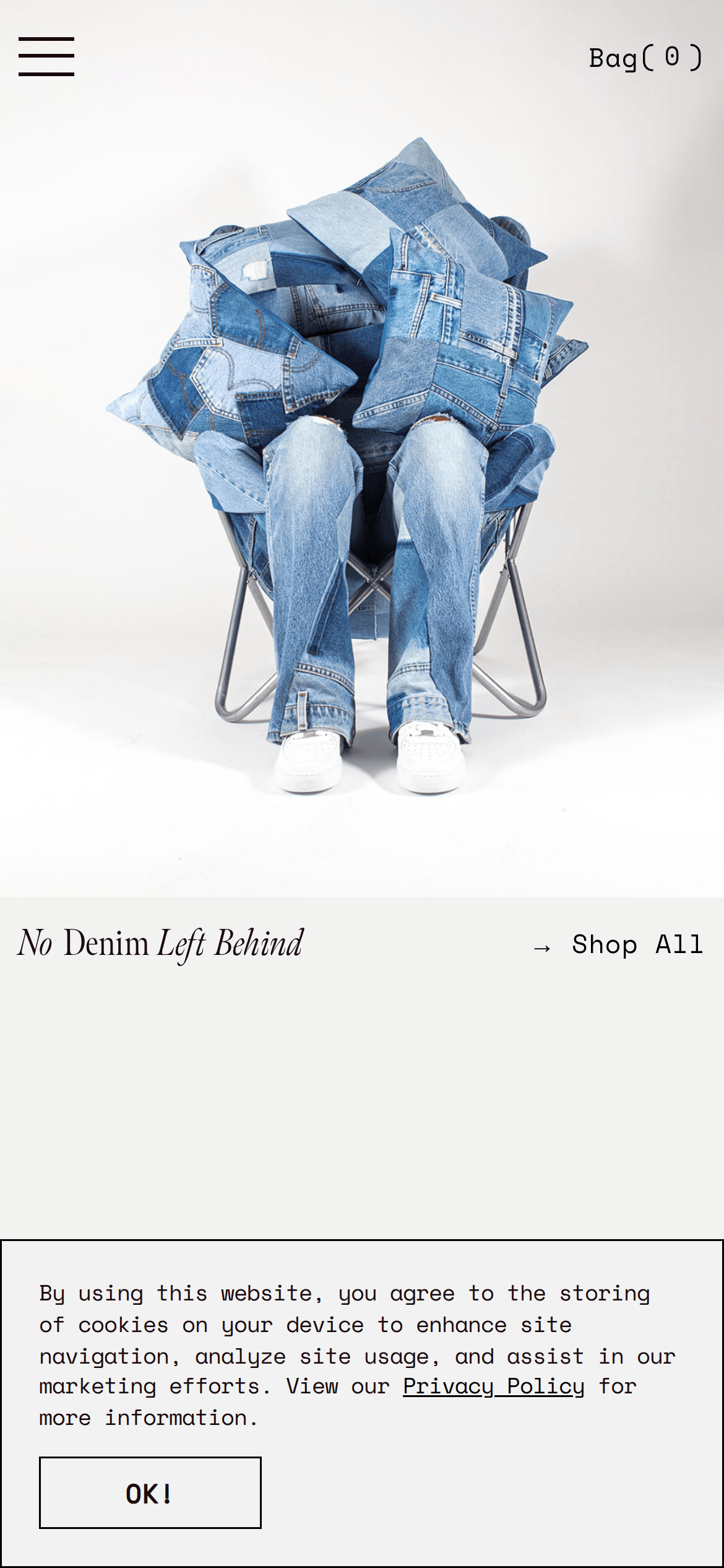
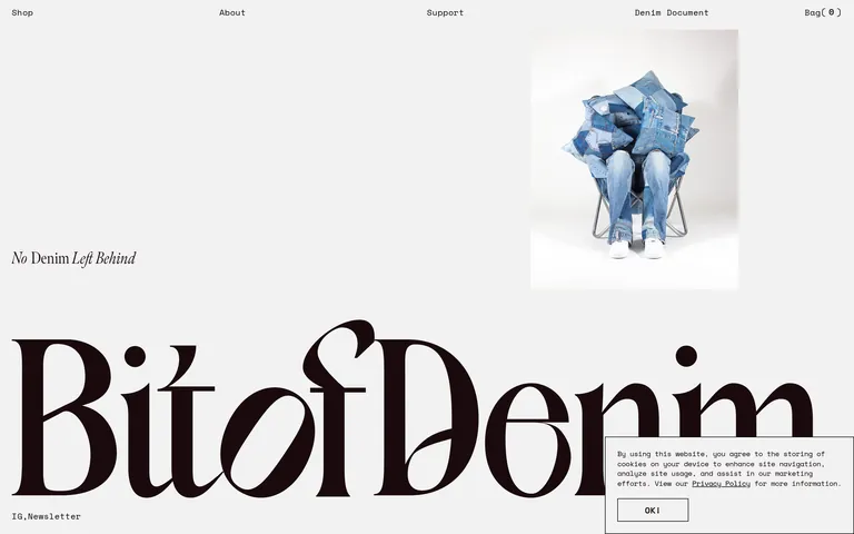
Full-width hero with asymmetric layout and generous negative space
07
Motion & Interaction
220msmicro
400mssmall
800msmedium
cubic-bezier(0.25, 0.1, 0.25, 1)easing
Opacity fades · Image slideshows
Subtle opacity change · Immediate response
08
Components
buttonMinimal, outlined rectangle with uppercase text
cardNo visible cards, product images are presented directly
inputSimple outlined text input
heroLarge typography paired with a studio photograph
09
Voice & Don'ts
ToneQuiet, confident, and editorial
HeadlinesShort, impactful phrases like 'No Denim Left Behind'
CTAsSimple and functional, e.g., 'Shop All' or 'OK!'
don't use gradients — screenshot shows flat, solid backgrounds instead
don't use rounded corners on containers — screenshot shows sharp, rectangular edges
don't use drop shadows — screenshot shows elements without elevation effects
don't use bright accent colors — screenshot shows a strictly monochromatic palette
don't use sans-serif for navigation — screenshot shows a monospaced font
don't clutter the layout — screenshot shows generous negative space and minimal elements
Captured from the live site · real computed styles
11
System prompt
This is a minimalist, editorial-style e-commerce site for upcycled denim products. The design relies on a high-contrast, achromatic palette with a light gray (#F2F2F1) background and near-black (#1A0A0E) typography. The hero features a massive didone-serif display font, while all other UI elements use a monospaced font. Key colors are #F2F2F1 and #1A0A0E. Critical donts: avoid using gradients, avoid using rounded corners on containers, and avoid cluttering the layout with unnecessary elements. The layout is spacious with generous negative space, emphasizing typography and photography.
Bring this taste to your agent
Hand your AI agent a machine-readable spec of this design — tokens, type, motion, the whole DNA.