← OpenDesign CURATED · OPEN · FREE
Dovetail No
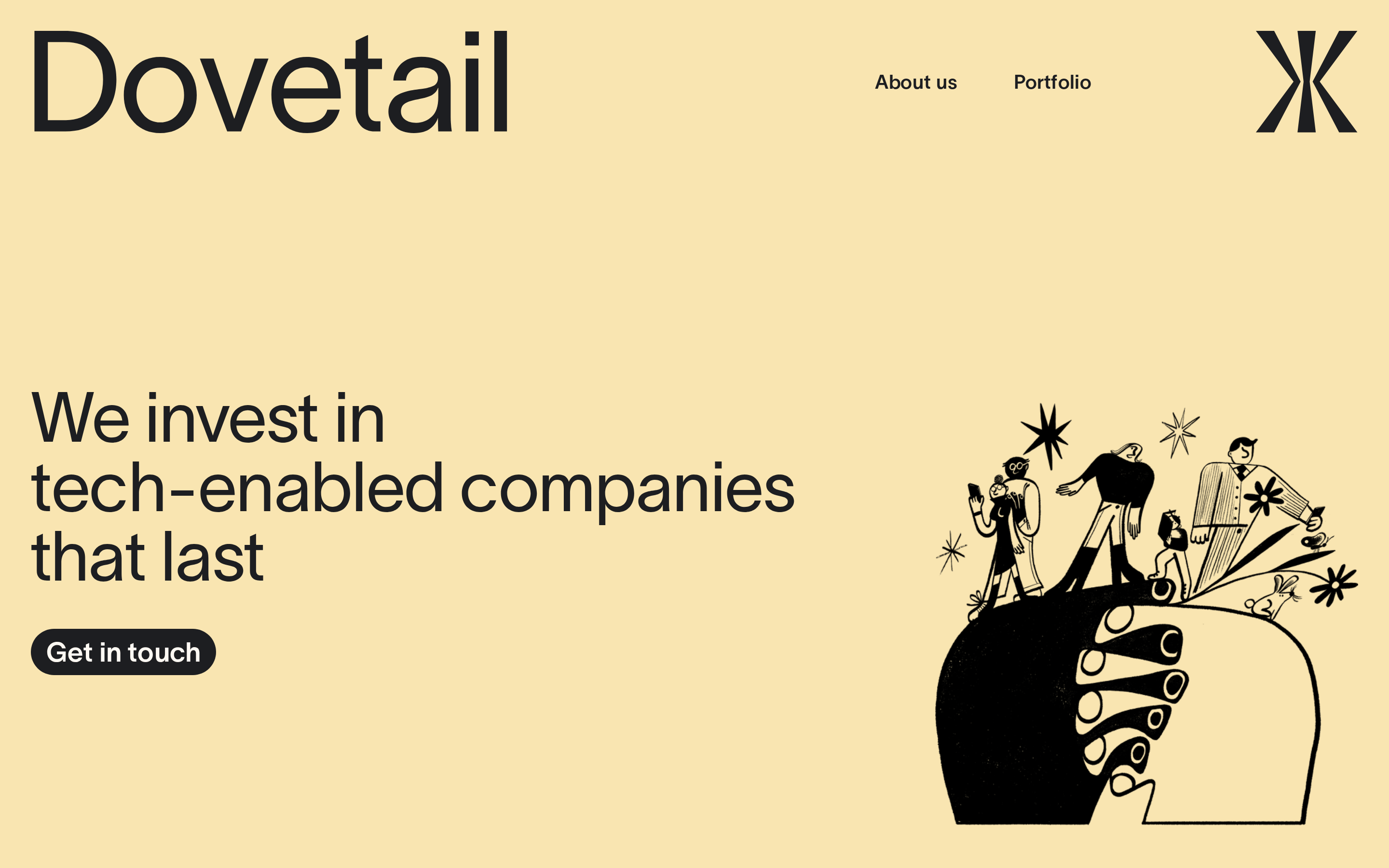
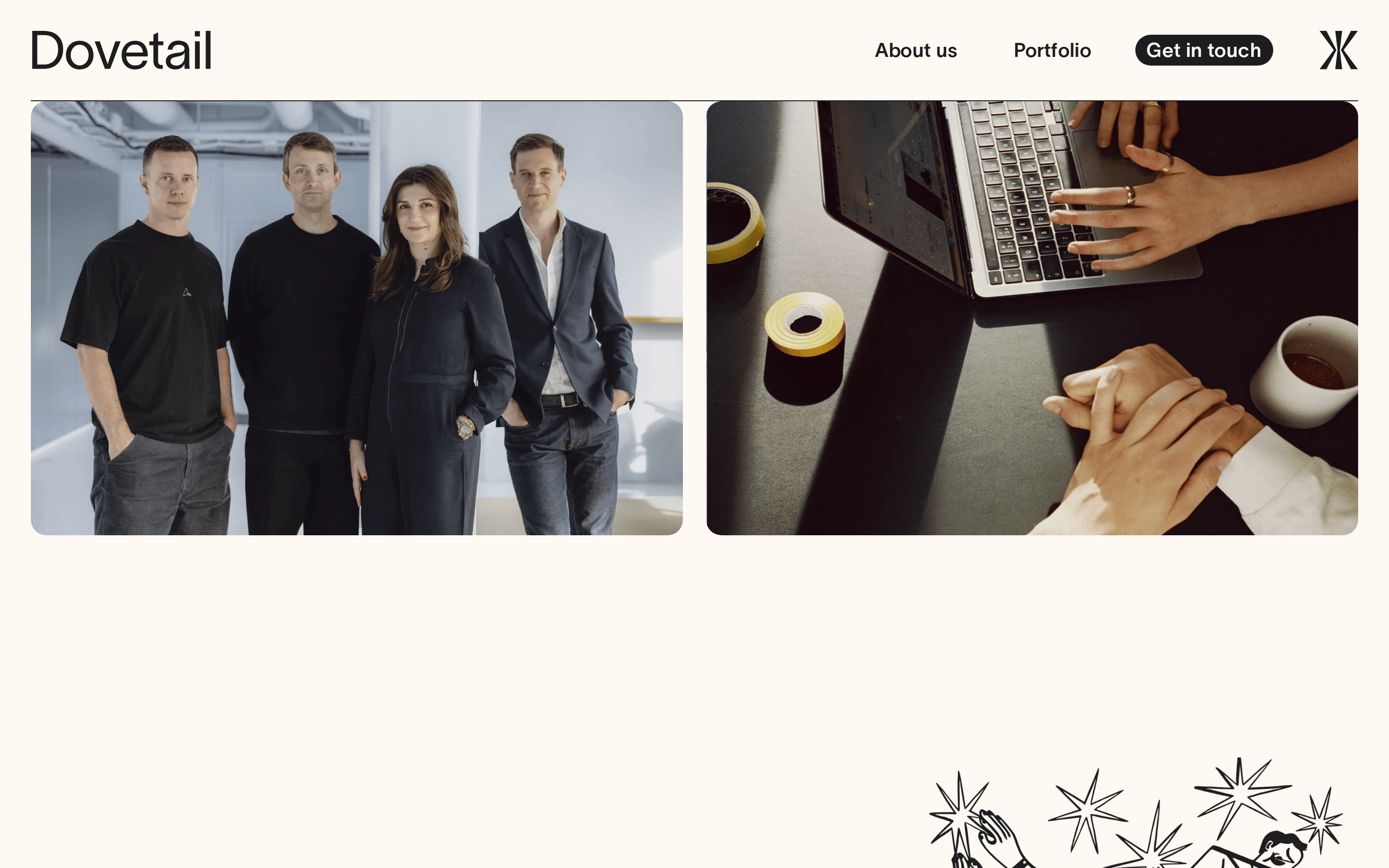
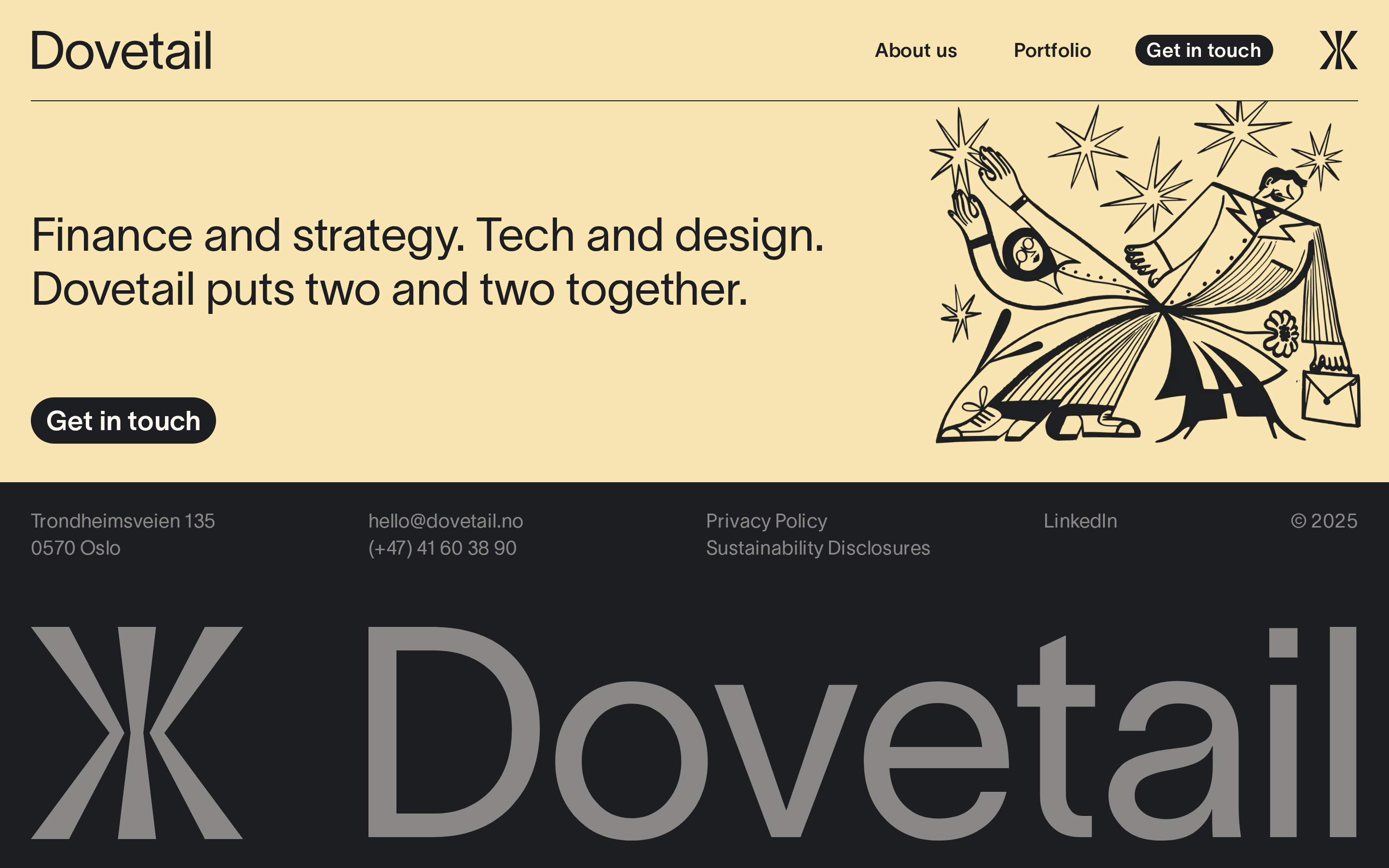
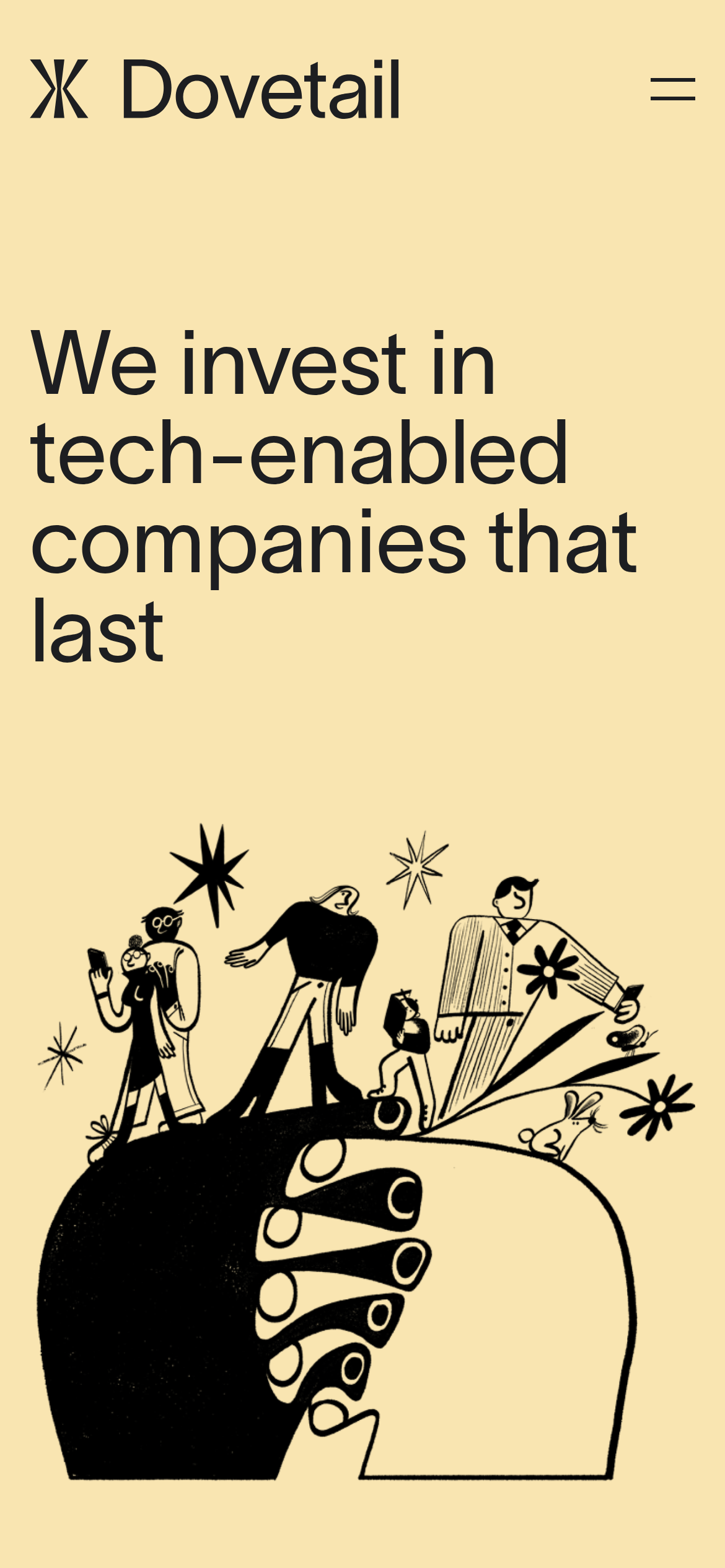
Investing in tech-enabled companies that last.
Fintech Premium Editorial Bold Typography
01
Identity DNA
Investment Technology Partnership Design Longevity
A premium Swiss studio crafting investment vehicles for tech longevity.
02
Color
#1D1E21Ink
#F9E5B1BG
#9CA3AFMuted
rgba(229,231,235,1)Line
Warm, high-contrast palette dominated by a single tint and near-black ink.
03
Typography
humanist-sans
display 56px · 500heading 48px · 400body-lg 28px · 400body 22px · 400caption 16px · 40004
Spacing
4px
8px
16px
24px
32px
48px
64px
96px
8px based vertical rhythm enforced by line-heights and padding.
05
Surfaces
sm · 4px
md · 16px
lg · 24px
pill · 9999px
No borders on containers; occasional 2px dividers or 1px borders.
06
Layout
1280 container
12 columns
24px gutter
768 / 1024 breakpoints
A two-column split layout with large typography balanced by abstract illustrations.
07
Motion & Interaction
150ms micro
200ms small
400ms medium
cubic-bezier(0.4, 0, 0.2, 1) easing
Color and fill transitions on hover
Subtle color or opacity transition on navigation links and buttons. · Immediate visual feedback via transitions.
08
Components
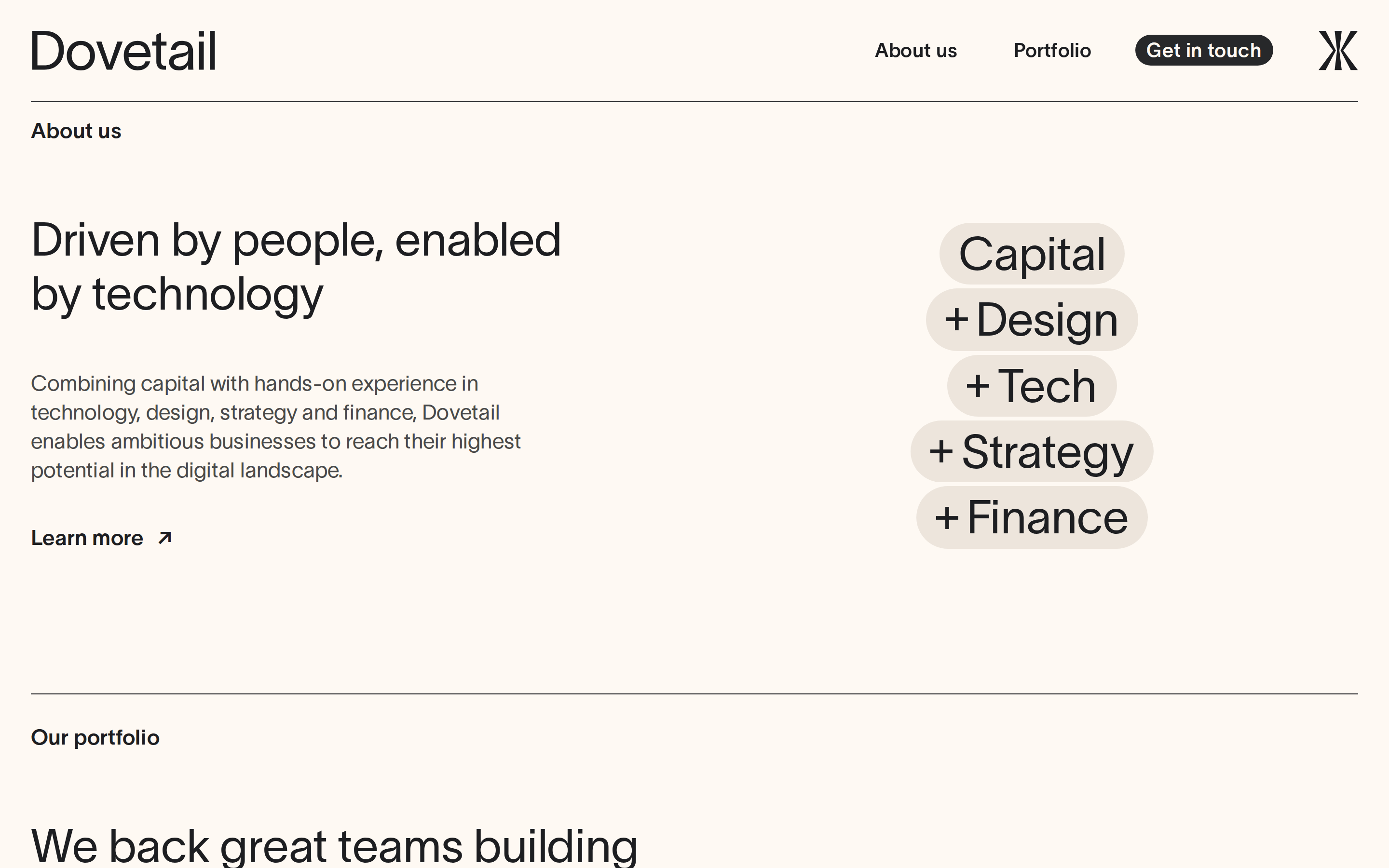
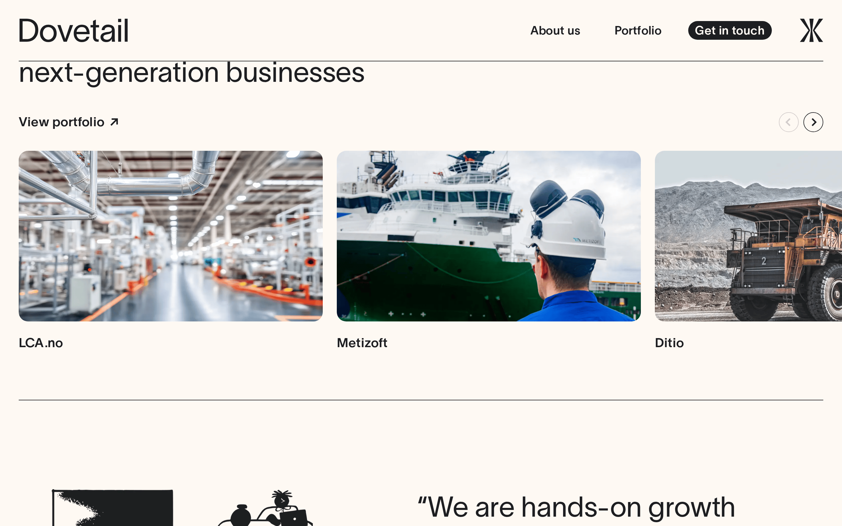
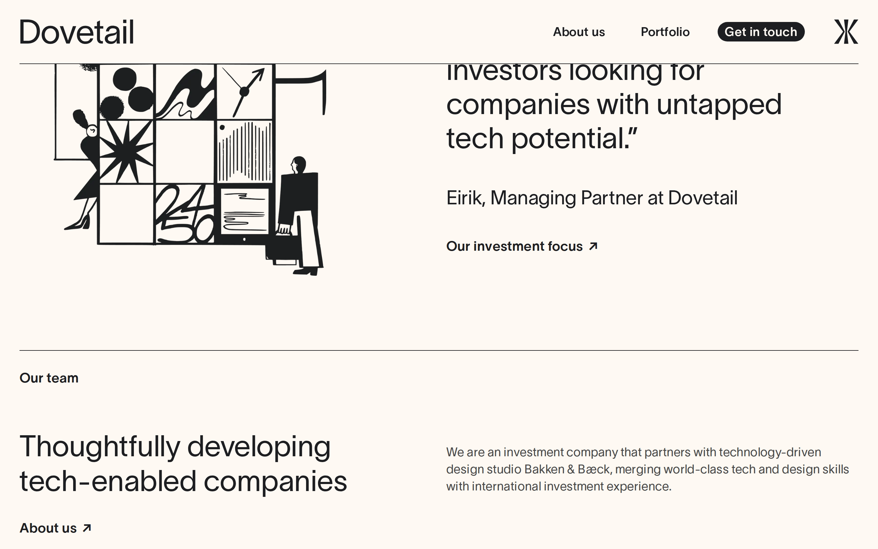
button High-contrast pill-shaped button with inverted colors (white text on black bg). card Clean, text-driven cards with minimal or no visual borders. chip Simple, unbordered navigation links. input N/A hero A massive typographic statement balanced by a large, abstract illustration. 09
Voice & Don'ts
Tone Confident, direct, and premium. Headlines Large, bold, and statement-driven, often using negative tracking. CTAs Simple, action-oriented, and highly legible. Don't use bright accent colors — screenshot shows a strict two-tone palette. Don't use playful or decorative typefaces — screenshot shows a clean humanist sans-serif. Don't add drop shadows to containers — screenshot shows flat, shadowless surfaces. Don't use complex gradients — screenshot shows a single, solid warm background. Don't clutter the layout with small elements — screenshot shows a spacious, typography-driven hierarchy. Don't use rounded cards with borders — screenshot shows open space and minimal visual containers. Avoid: Flashy gradients Avoid: Neon colors Avoid: Playful emojis Avoid: Dense paragraphs Avoid: Complex iconography 10
Inside the pack — real screenshots
桌面首屏(hero) 桌面滚动分段(90% viewport 步进,作为视觉证据) 桌面滚动分段(90% viewport 步进,作为视觉证据) 桌面滚动分段(90% viewport 步进,作为视觉证据) 桌面滚动分段(90% viewport 步进,作为视觉证据) 桌面滚动分段(90% viewport 步进,作为视觉证据) 桌面滚动分段(90% viewport 步进,作为视觉证据) 移动首屏 Captured from the live site · real computed styles
11
System prompt
Dovetail is an investment firm with a premium, design-led digital presence. The primary palette is warm and high-contrast, featuring a dominant sandy yellow background (#F9E5B1) paired with near-black ink (#1D1E21). Typography is a clean humanist sans-serif used at large scales with tight tracking for a modern, confident feel. Critical design constraints: 1) Never use playful or decorative fonts; 2) Avoid bright accent colors or complex gradients; 3) Do not use drop shadows or dense, cluttered containers. The layout is spacious and editorial, balancing large statements with bold, abstract illustrations.
More from the library en · zh-CN · zh-TW · ja · ko
OpenDesign · curated web aesthetics for AI-readable design DNA · opendesign.cc
Why we curated this: This site is a great example of how a limited color palette and strong typography can create a premium, authoritative brand identity for a financial or investment firm.