← OpenDesign CURATED · OPEN · FREE
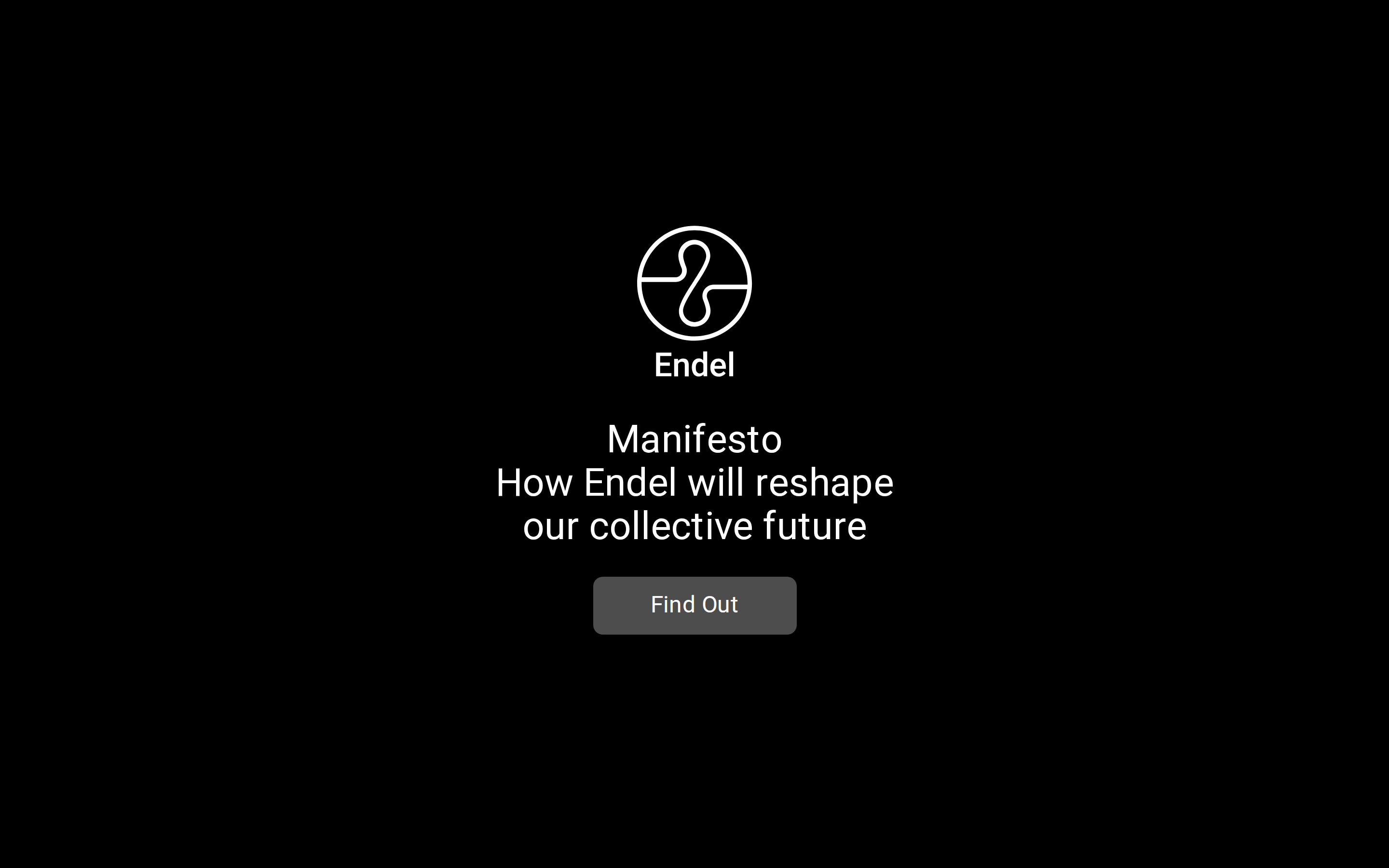
Manifesto Endel
A dark, minimalist manifesto page that delivers a focused brand message with restrained typography and a singular call to action.
Dark Mode Premium Editorial Minimal Product
01
Identity DNA
manifesto reshaping collective future Endel
A clean, focused manifesto landing page that prioritizes core messaging over visual complexity.
02
Color
#FFFFFFInk
#000000BG
#6F6F6FMuted
rgba(111, 111, 111, 1)Line
High-contrast monochrome palette with a single muted gray for secondary UI elements.
03
Typography
humanist-sans
display 40px · 400h1 24px · 400body 16px · 400All text uses font-family: Roboto, sans-serif · All text uses font-weight: 400 · Headlines use slightly tighter letter-spacing for visual impact
04
Spacing
4px
8px
16px
24px
32px
48px
64px
96px
Vertical spacing is generous, creating clear separation between the logo, headline, and call to action.
05
Surfaces
sm · 4px
md · 10px
lg · 16px
pill · 999px
No visible borders except for the button, which uses a solid background.
06
Layout
1280 container
12 columns
24px gutter
768 / 1024 breakpoints
Centered, vertically stacked layout with all content aligned to the center axis.
07
Motion & Interaction
220ms micro
400ms small
800ms medium
cubic-bezier(0.25, 0.1, 0.25, 1) easing
All elements have a transition property set to 'all'.
Buttons change state on hover. · Single primary action button.
08
Components
button Primary CTA with a muted gray background (#4D4D4D), white text, and a 10px border-radius. hero Full-viewport black background with centered logo, headline, and CTA. 09
Voice & Don'ts
Tone Authoritative and visionary. Headlines Declarative and centered. CTAs Direct and action-oriented ('Find Out'). Don't use a light background — the screenshot shows a pure black (#000000) background. Don't use multiple font weights — the screenshot shows only font-weight 400 used consistently. Don't add a bright accent color — the screenshot shows only white and muted gray (#6F6F6F). Don't use a complex layout — the screenshot shows a simple, centered, vertically stacked structure. Don't use drop shadows on cards — the screenshot shows no shadowed elements. Don't use decorative patterns — the screenshot shows a solid black background. Avoid: Complex sentences Avoid: Decorative elements Avoid: Multiple competing actions 10
Inside the pack — real screenshots
桌面首屏(hero) 桌面滚动分段(90% viewport 步进,作为视觉证据) 桌面滚动分段(90% viewport 步进,作为视觉证据) 桌面滚动分段(90% viewport 步进,作为视觉证据) 桌面滚动分段(90% viewport 步进,作为视觉证据) 桌面滚动分段(90% viewport 步进,作为视觉证据) 桌面滚动分段(90% viewport 步进,作为视觉证据) 桌面滚动分段(90% viewport 步进,作为视觉证据) 桌面滚动分段(90% viewport 步进,作为视觉证据) 桌面滚动分段(90% viewport 步进,作为视觉证据) 桌面滚动分段(90% viewport 步进,作为视觉证据) 桌面滚动分段(90% viewport 步进,作为视觉证据) 桌面滚动分段(90% viewport 步进,作为视觉证据) 桌面滚动分段(90% viewport 步进,作为视觉证据) 移动首屏 Captured from the live site · real computed styles
11
System prompt
You are generating a design system for a minimalist, dark-themed manifesto website. The palette is strictly monochrome: pure black (#000000) background with white (#FFFFFF) primary text and a muted gray (#6F6F6F) for secondary elements like the call-to-action button. The typography is Roboto, a humanist-sans font, used exclusively at font-weight 400 across all elements. The layout is centered and vertically stacked. Key dos: use high contrast, maintain generous vertical spacing, keep the interface minimal. Key donts: never introduce a bright accent color, never use decorative patterns or shadows, never use multiple font weights. The voice is authoritative and visionary. This system should feel premium, focused, and deliberate.
More from the library en · zh-CN · zh-TW · ja · ko
OpenDesign · curated web aesthetics for AI-readable design DNA · opendesign.cc
Why we curated this: This site is worth including as a masterclass in minimalist, high-contrast dark mode design that uses extreme restraint to create a premium, focused experience.