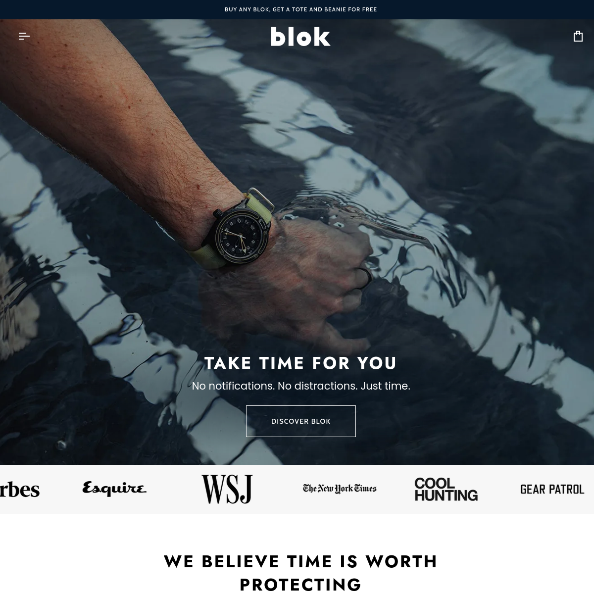
Deep navy background creates high contrast for the vibrant blue hero shape and colorful product details.
03
Typography
geometric-sans · grotesque-sans
display56px · 700
h148px · 700
Uppercase for primary headlines with wide tracking. · Mixed-case for descriptive body text.
04
Spacing
4px
8px
16px
24px
32px
48px
64px
96px
generous vertical spacing to let bold elements breathe
05
Surfaces
sm · 0px
md · 0px
lg · 0px
pill · 999px
sharp, clean edges on buttons and shapes
06
Layout
1440container
12columns
24pxgutter
768 / 1024breakpoints
Full-width hero section with asymmetric layout, followed by a centered text block and a logo strip.
07
Motion & Interaction
220msmicro
400mssmall
800msmedium
cubic-bezier(0.25, 0.1, 0.25, 1)easing
Subtle color shifts or outline changes on interactive elements. · Immediate response.
08
Components
buttonOutline style with uppercase text and sharp corners.
cardNot prominently featured in the visible area.
chipNot prominently featured in the visible area.
inputNot prominently featured in the visible area.
heroLarge, impactful image of the product on a dark background with an organic blue shape, accompanied by bold uppercase typography and a clear call to action.
09
Voice & Don'ts
ToneConfident, modern, and playful.
HeadlinesShort, punchy, uppercase statements.
CTAsClear, direct, uppercase commands.
Don't use soft, pastel colors — the screenshot shows a deep, high-contrast navy background with a vibrant blue accent.
Don't use rounded corners on buttons or cards — the 'FIND YOUR BLOK' button has sharp, square corners.
Don't use serif fonts for headlines — the primary display font is a bold, geometric sans-serif.
Don't center all text — the hero section uses right-aligned text to balance the left-heavy product image.
Don't use a single-color background — the hero features a dynamic, organic blue shape over a dark navy base.
Don't avoid uppercase text — the design heavily relies on wide-tracked, uppercase headlines for impact.
Avoid: Overly technical jargon
Avoid: Passive voice
Avoid: Cluttered layouts
11
System prompt
This is a bold, playful product landing page for a modern analog watch brand, 'Blok'. The design DNA centers on high contrast, using a deep navy background (#0A1929) with a vibrant blue accent shape (#3574E0) and sharp, geometric sans-serif typography. The layout is asymmetric and impactful, letting the colorful product photography stand out. Critical design principles include using sharp corners instead of rounded borders, employing wide-tracked uppercase for headlines, and maintaining a dark, moody base with bright pops of color. Do not use soft pastels, rounded components, or serif fonts, as the visual identity is built on bold, geometric forms and high contrast.
Bring this taste to your agent
Hand your AI agent a machine-readable spec of this design — tokens, type, motion, the whole DNA.