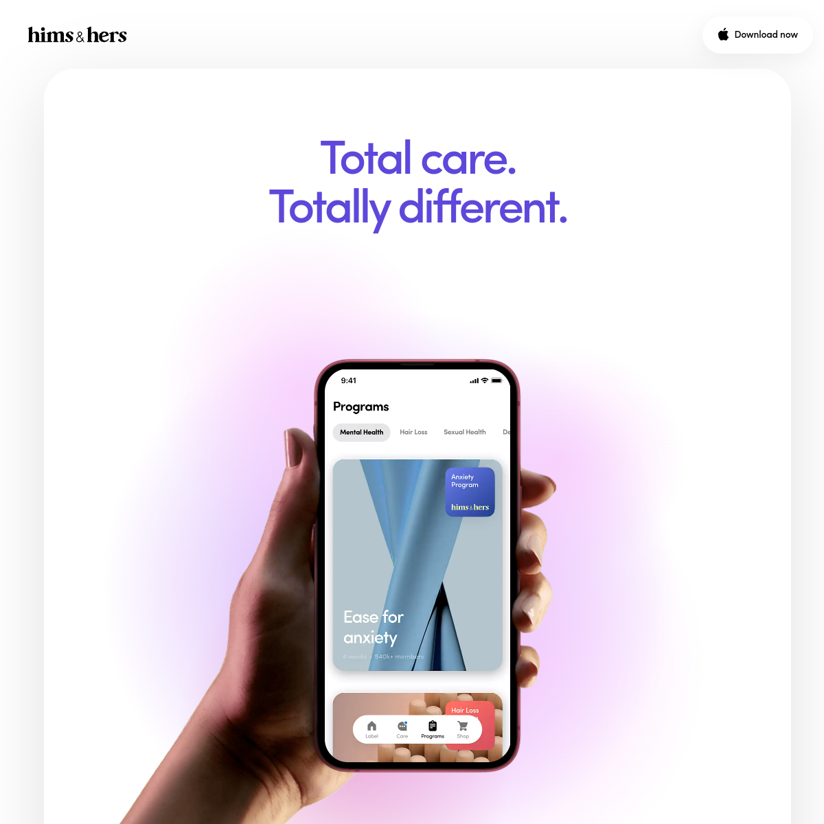
A premium wellness boutique that feels both clinical and comforting.
02
Color
#5A5AE6Accent
#1A1A1AInk
#4A4A4AInk soft
#FFFFFFBG
#F8F8FABG soft
#F2F2F5BG quiet
#9A9AAEMuted
rgba(0, 0, 0, 0.06)Line
Clean white space anchors the layout, with soft gradients and a distinct indigo accent providing visual interest without overwhelming the calm atmosphere.
03
Typography
transitional-serif · humanist-sans · monospace
display64px · 500
heading-132px · 500
Headlines use a transitional serif for a premium, editorial feel. · Body text and UI elements use a clean humanist sans-serif for readability. · High contrast between display serif and body sans-serif creates a modern, approachable tone.
04
Spacing
4px
8px
16px
24px
32px
48px
64px
96px
Consistent, generous spacing emphasizes the calm, uncluttered, and premium feel of the layout.
05
Surfaces
sm · 4px
md · 8px
lg · 16px
pill · 999px
Subtle, almost invisible borders are used to define containers without adding visual weight.
0 4px 24px rgba(0, 0, 0, 0.06)
06
Layout
1200container
12columns
24pxgutter
768 / 1024breakpoints
Centered single-column layout on mobile, expanding to a max-width container on desktop, maintaining a strong vertical axis.
07
Motion & Interaction
150msmicro
300mssmall
500msmedium
cubic-bezier(0.4, 0, 0.2, 1)easing
Smooth fade-ins for content loading. · Subtle parallax effects on scroll.
Subtle color shift or shadow elevation on interactive elements. · Immediate visual feedback with slight scale or color change.
08
Components
buttonPill-shaped buttons with solid backgrounds and clean typography.
cardCards feature soft rounded corners and subtle drop shadows, using imagery and typography rather than heavy borders.
chipPill-shaped category tags with subtle backgrounds for filtering.
inputClean, rounded input fields with subtle borders and sufficient padding.
heroLarge, centered headline paired with a prominent device mockup and soft gradient background.
09
Voice & Don'ts
ToneConfident, approachable, and reassuring.
HeadlinesShort, punchy, and benefit-driven (e.g., 'Total care. Totally different.').
CTAsDirect, action-oriented, and low-friction (e.g., 'Download now').
Don't use harsh, bright primary colors — screenshot shows a soft palette with a muted indigo accent.
Don't use aggressive drop shadows or heavy borders — screenshot shows subtle shadows and almost invisible lines.
Don't use all-caps for body text or secondary UI elements — screenshot shows standard sentence case.
Don't overcrowd the layout with elements — screenshot shows generous white space and a single focal point.
Don't use sharp, square corners on interactive elements — screenshot shows rounded corners and pill-shaped buttons.
Don't use purely sans-serif typography for everything — screenshot shows a distinct serif font for the main headline.
Avoid: Clinical jargon
Avoid: Overly aggressive sales language
Avoid: Cluttered visual elements
11
System prompt
This is a premium telehealth and consumer wellness brand (hims & hers). The design uses a clean white background with soft gradients and a muted indigo accent (#5A5AE6). Typography contrasts a transitional serif for bold headlines with a humanist sans-serif for UI and body text. The layout is spacious, calm, and highly focused, centered around a mobile app mockup. Key donts: Do not use harsh neon colors; avoid heavy drop shadows or borders; do not crowd the interface; avoid all-caps body text; do not use square corners on buttons or cards; do not use only sans-serif fonts for all text.
Bring this taste to your agent
Hand your AI agent a machine-readable spec of this design — tokens, type, motion, the whole DNA.