A premium design studio portfolio focusing on clean, refined product presentation.
02
Color
#484036Ink
#666E72Ink soft
#ECECE4BG
#FAF5EBBG quiet
#CACAB0Muted
rgba(72, 64, 54, 0.15)Line
Earthy, desaturated warm neutrals create a calm, premium backdrop that lets photography dominate.
03
Typography
geometric-sans · humanist-sans
display45px · 400
heading29px · 400
body28px · 400
Display text uses geometric sans with tight tracking for dramatic impact · Body text uses humanist sans for readability with generous line-height · All text is regular weight (400) for a calm, refined feel
04
Spacing
4px
8px
16px
24px
32px
48px
64px
96px
Generous vertical padding (100-300px) creates breathing room between sections
05
Surfaces
sm · 4px
md · 4px
lg · 4px
pill · 999px
Minimal, using thin lines in muted ink color for subtle division
06
Layout
1280container
12columns
24pxgutter
768 / 1024breakpoints
Full-bleed hero images with generous vertical spacing, content centered with ample padding
07
Motion & Interaction
220msmicro
400mssmall
800msmedium
cubic-bezier(0.25, 0.1, 0.25, 1)easing
Smooth transform and opacity transitions on interactive elements · All transitions standardized at 0.4s for consistency
Subtle color or transform changes with 0.4s transition · Immediate visual feedback through transform
08
Components
buttonMinimal, uppercase text links with subtle transitions
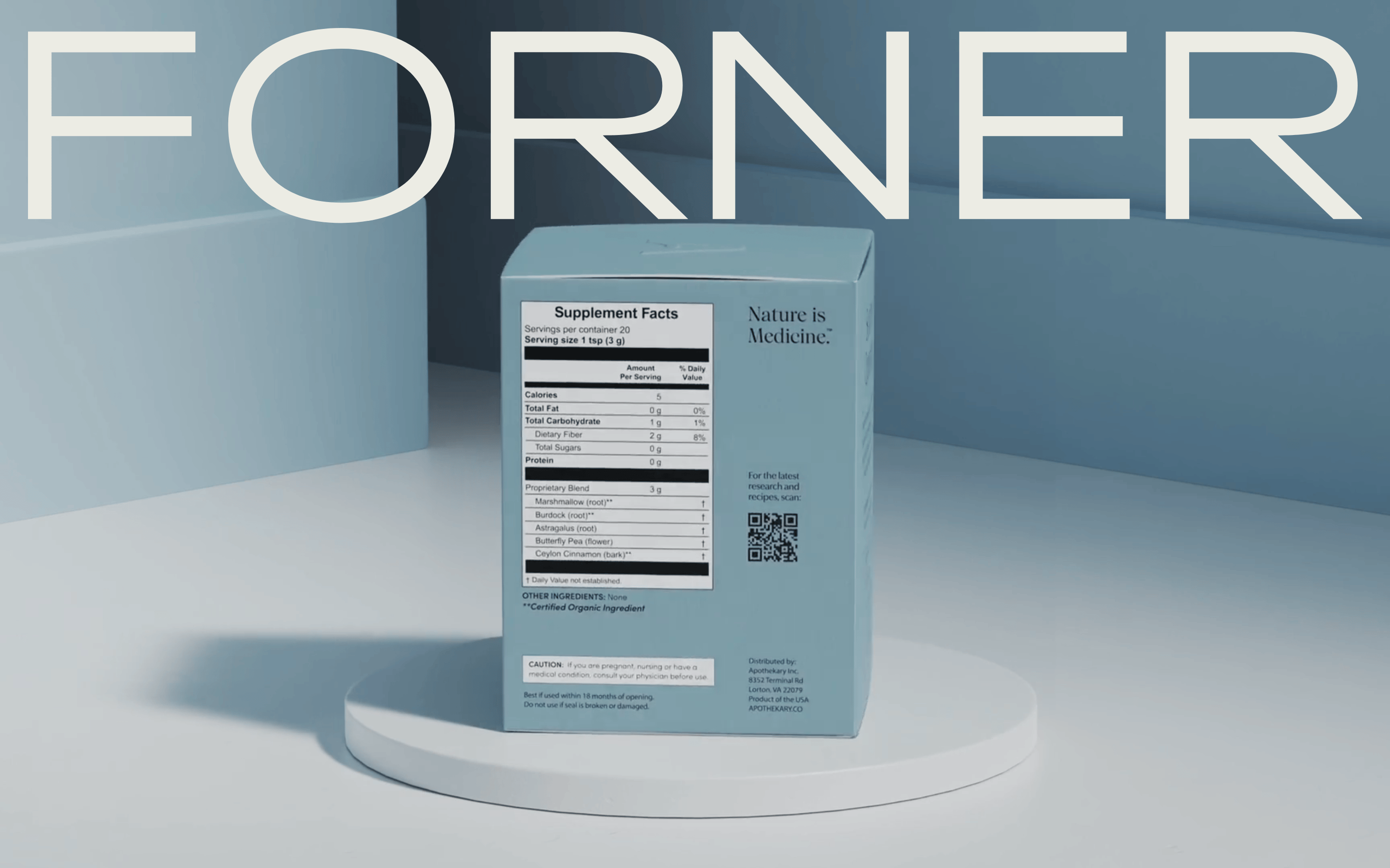
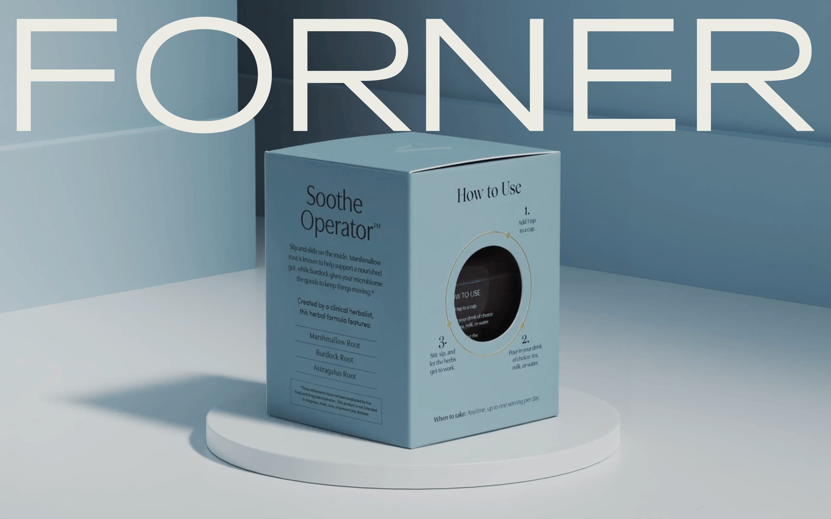
cardClean, image-forward presentation with generous whitespace
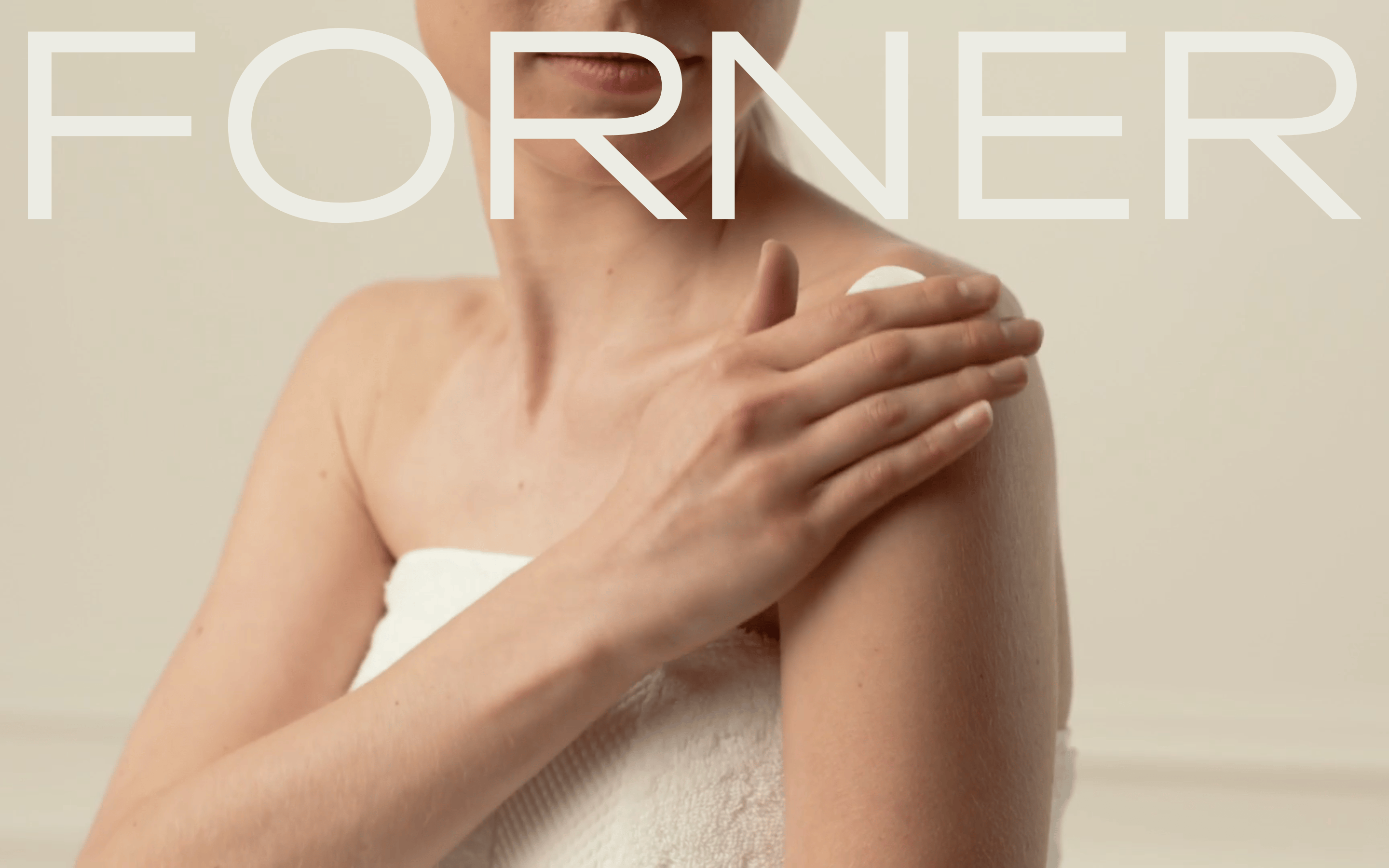
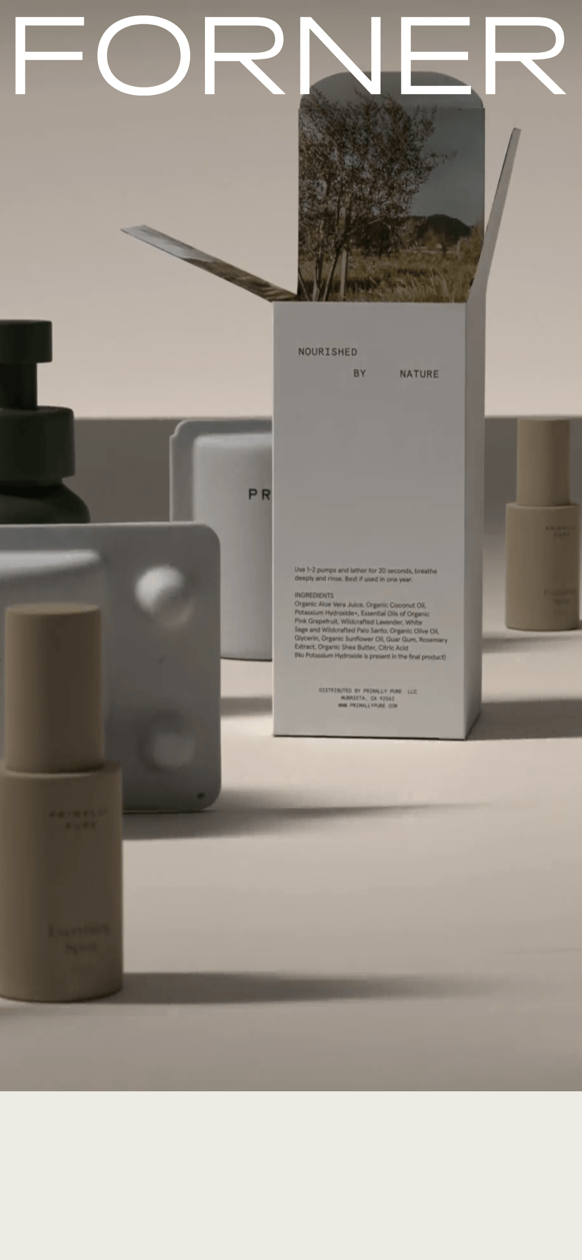
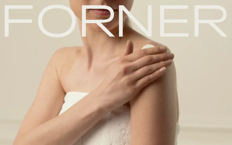
heroLarge full-bleed photographic hero with oversized brand typography overlay
09
Voice & Don'ts
ToneRefined, understated, and premium
HeadlinesLarge, clean typography with generous spacing
CTAsMinimal, uppercase text links with subtle interactions
Captured from the live site · real computed styles
11
System prompt
Forner Studio is a premium design portfolio with refined, editorial aesthetics. Key colors are earthy neutrals: warm off-white (#ECECE4), deep ink (#484036), and muted accent (#CACAB0). Typography combines geometric sans for display with humanist sans for body, all at regular weight. The layout uses full-bleed photography with generous vertical spacing (100-300px). Critical donts: avoid saturated colors, skip heavy shadows, no decorative serifs, maintain spacious layouts, never use bright white backgrounds, and keep animations subtle. The site emphasizes calm, premium product presentation through minimal UI and strong visual hierarchy.
Bring this taste to your agent
Hand your AI agent a machine-readable spec of this design — tokens, type, motion, the whole DNA.