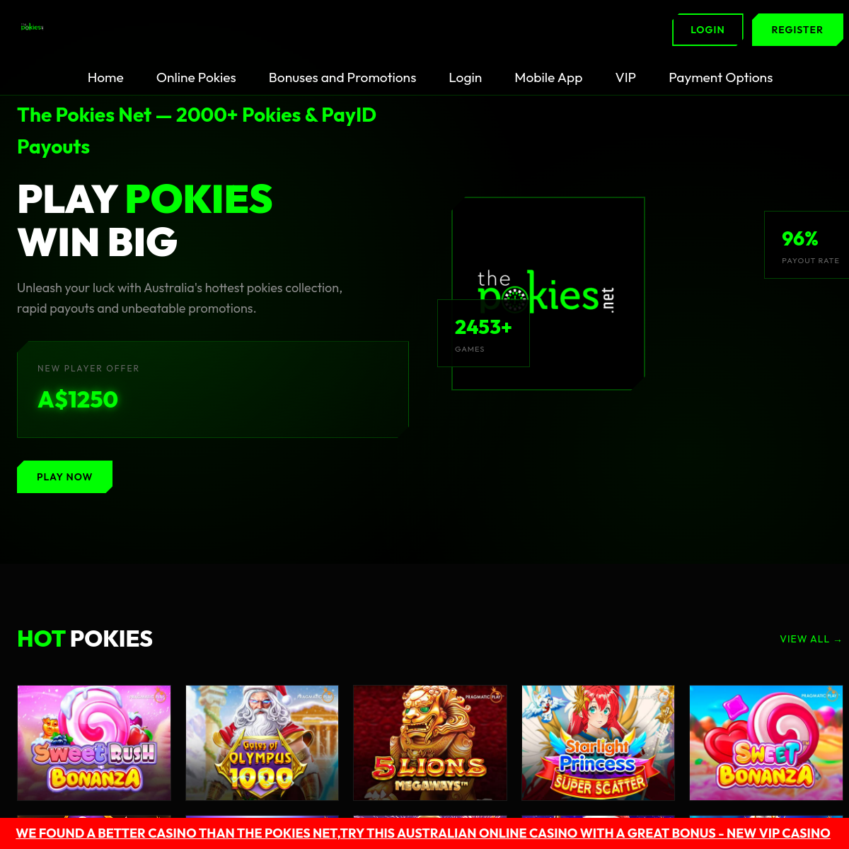
A sleek digital gateway to online gaming, using stark contrast to drive immediate action.
02
Color
#00ff00Accent
#ffffffInk
#999999Ink soft
#000000BG
#0a0a0aBG quiet
#555555Muted
rgba(0, 255, 0, 0.2)Line
High-contrast dark mode with electric green accents to highlight key calls to action and brand elements.
03
Typography
grotesque-sans
display56px · 900
heading24px · 700
body16px · 400
Use all-caps for secondary navigation and small labels. · Maintain tight tracking for large display text.
04
Spacing
4px
8px
16px
24px
32px
48px
64px
96px
4px grid with generous vertical padding to separate distinct sections.
05
Surfaces
sm · 0px
md · 0px
lg · 0px
pill · 0px
Sharp, unrounded edges on all interactive elements and containers.
06
Layout
1280container
12columns
24pxgutter
768 / 1024breakpoints
Full-width hero section with a two-column split, followed by a horizontal grid of game cards.
07
Motion & Interaction
150msmicro
300mssmall
500msmedium
cubic-bezier(0.25, 0.1, 0.25, 1)easing
Subtle hover states on interactive elements, no complex animations visible.
Color shifts or subtle brightness changes on primary buttons and links. · Immediate visual feedback without significant scale changes.
08
Components
buttonHigh-contrast, rectangular buttons with solid backgrounds and sharp corners.
cardSimple rectangular cards with minimal borders, primarily used for game thumbnails.
chipSmall, uppercase text labels with subtle background contrast.
inputNot clearly visible, but likely sharp-edged to match the overall aesthetic.
heroFull-height, dark-background section with massive bold typography and a prominent call to action.
09
Voice & Don'ts
ToneDirect, urgent, and promotional.
HeadlinesMassive, bold, and often uppercase to command attention.
CTAsShort, imperative phrases like 'PLAY NOW' and 'LOGIN' on high-contrast buttons.
Don't use rounded corners — screenshot shows sharp, 90-degree edges on all buttons and cards.
Don't use soft or muted color palettes — screenshot shows a stark black, white, and electric green scheme.
Don't use decorative shadows — screenshot shows flat surfaces with no depth cues.
Don't use serif or humanist typefaces — screenshot shows a bold, modern grotesque sans-serif.
Don't use complex gradients or overlays — screenshot shows solid color blocks and high-contrast text.
Don't use playful or organic shapes — screenshot shows strictly rectangular and linear compositions.
Avoid: Subtle gradients
Avoid: Soft shadows
Avoid: Rounded corners
Avoid: Muted colors
Avoid: Complex iconography
Avoid: Decorative elements
11
System prompt
This is a promotional website for an online pokies platform. The design is characterized by a stark, high-contrast dark mode using a black background (#000000) and a vibrant, electric green accent (#00ff00). The typography is dominated by a bold, uppercase grotesque-sans font for headlines, creating a sense of urgency and impact. Key elements are sharp and rectangular, with no rounded corners or soft shadows. Critical design constraints: 1) Maintain extreme contrast between dark backgrounds and bright accents. 2) Use sharp, unrounded geometry for all UI components. 3) Keep the visual language minimal and direct, avoiding decorative elements or subtle gradients.
Bring this taste to your agent
Hand your AI agent a machine-readable spec of this design — tokens, type, motion, the whole DNA.