← OpenDesign CURATED · OPEN · FREE
Getcoco
A playful, utility-focused SaaS landing page that uses bold typography and vibrant accents to market a social selling app.
SaaS App UI Bold Typography Clean Mobile UI
01
Identity DNA
Social Selling Instagram Growth Commerce
A vibrant, approachable toolkit for modern social entrepreneurs.
02
Color
#23C4F7Accent
#000000Ink
rgba(0,0,0,0.6)Ink soft
#FFFFFFBG
#F7F7F7BG soft
#808080Muted
rgba(0,0,0,0.1)Line
High-contrast neutral base with a single vibrant electric blue accent for primary actions.
03
Typography
geometric-sans · monospace
display 64px · 700h2 32px · 700body 14px · 500Use Geometric Sans (GT America) for all text. · Use bold weight (700) for headlines and medium weight (500) for body text.
04
Spacing
4px
8px
16px
24px
32px
48px
64px
96px
Consistent padding of 24px, 40px, and 48px is used to separate content blocks.
05
Surfaces
sm · 3px
md · 16px
lg · 24px
pill · 100px
1px solid rgba(0,0,0,0.1) for interactive elements like inputs.
0px 1px 3px 0px rgba(0, 0, 0, 0.1) · 0px 0px 0px 1px rgba(0, 0, 0, 0.1)
06
Layout
1280 container
12 columns
24px gutter
768 / 1024 breakpoints
Standard centered container layout with generous vertical spacing.
07
Motion & Interaction
200ms micro
400ms small
800ms medium
cubic-bezier(0.23, 1, 0.32, 1) easing
Smooth background-color transitions on hover for buttons.
Buttons and interactive elements change background color smoothly. · Immediate visual feedback with cursor pointer on interactive elements.
08
Components
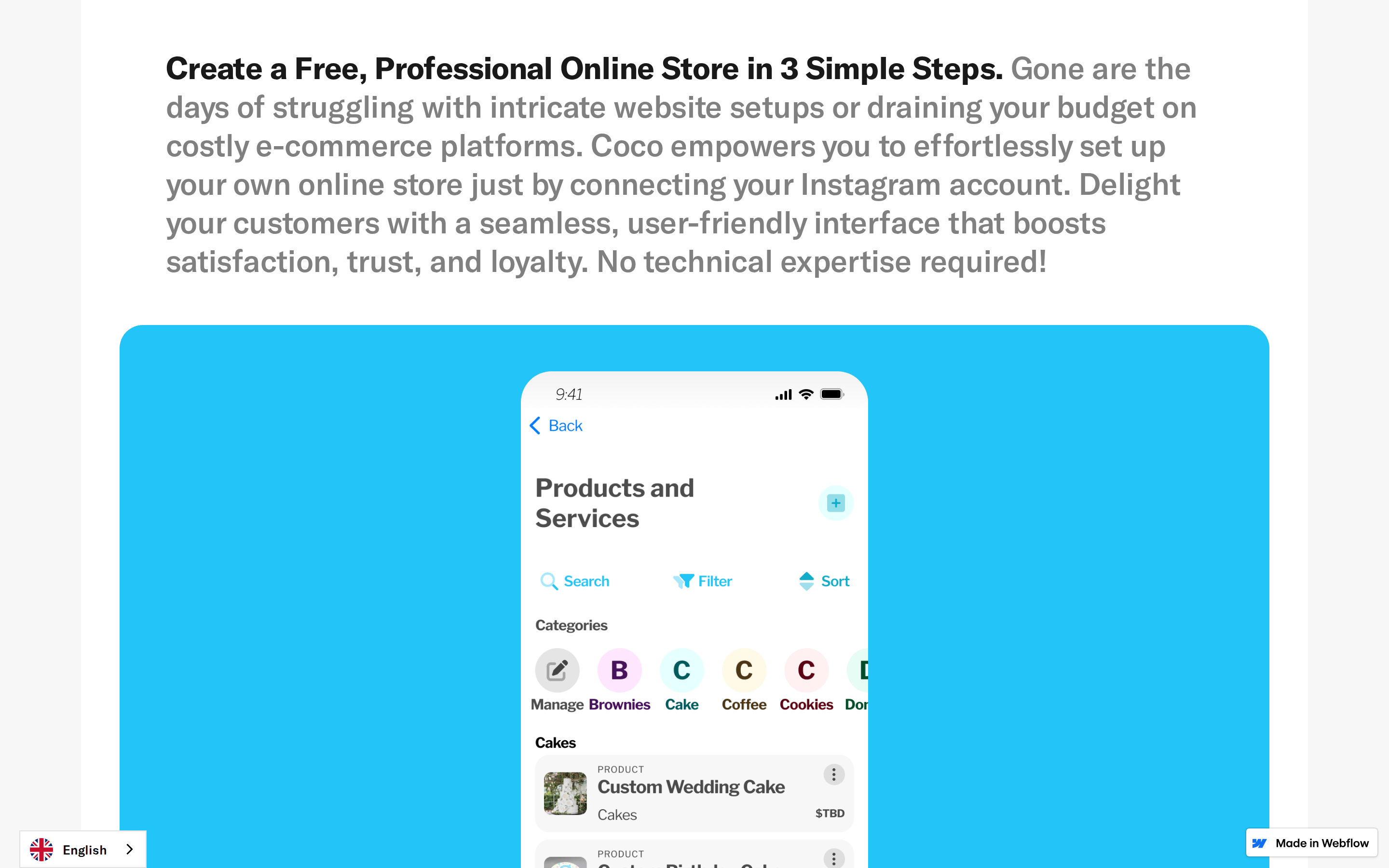
button Primary CTA is a pill-shaped button with a vibrant blue background and white text. Secondary is a plain text link. card Cards use very large border-radius (24px-32px) and minimal borders. chip Status indicators in the app UI use pill-shaped backgrounds with vibrant colors. input Inputs feature a subtle inset shadow and rounded corners. hero A bold, centered headline followed by a large video/media container and descriptive text. 09
Voice & Don'ts
Tone Confident, empowering, and slightly playful. Headlines Short, punchy, and benefit-oriented with a large, bold geometric font. CTAs Direct and action-oriented, using bright colors to draw attention. Don't use small, tight fonts — screenshot shows large, bold geometric type. Don't use muted, earthy palettes — screenshot shows a bright, high-contrast palette with vibrant accents. Don't use sharp corners — screenshot shows highly rounded, pill-like shapes. Don't use thin, light weights — screenshot shows medium to bold weights for clarity. Don't use dark mode — screenshot shows a predominantly white background with dark text. Don't use complex, busy layouts — screenshot shows a clean, spacious, single-column layout. Avoid: Overly formal or corporate jargon. Avoid: Passive language. Avoid: Complex sentence structures. 10
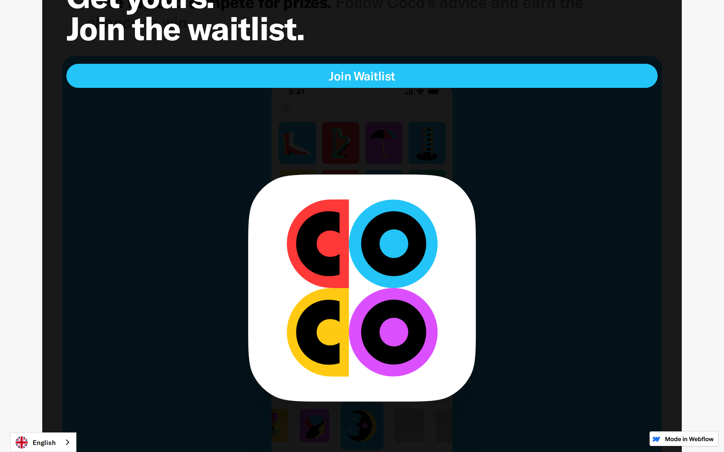
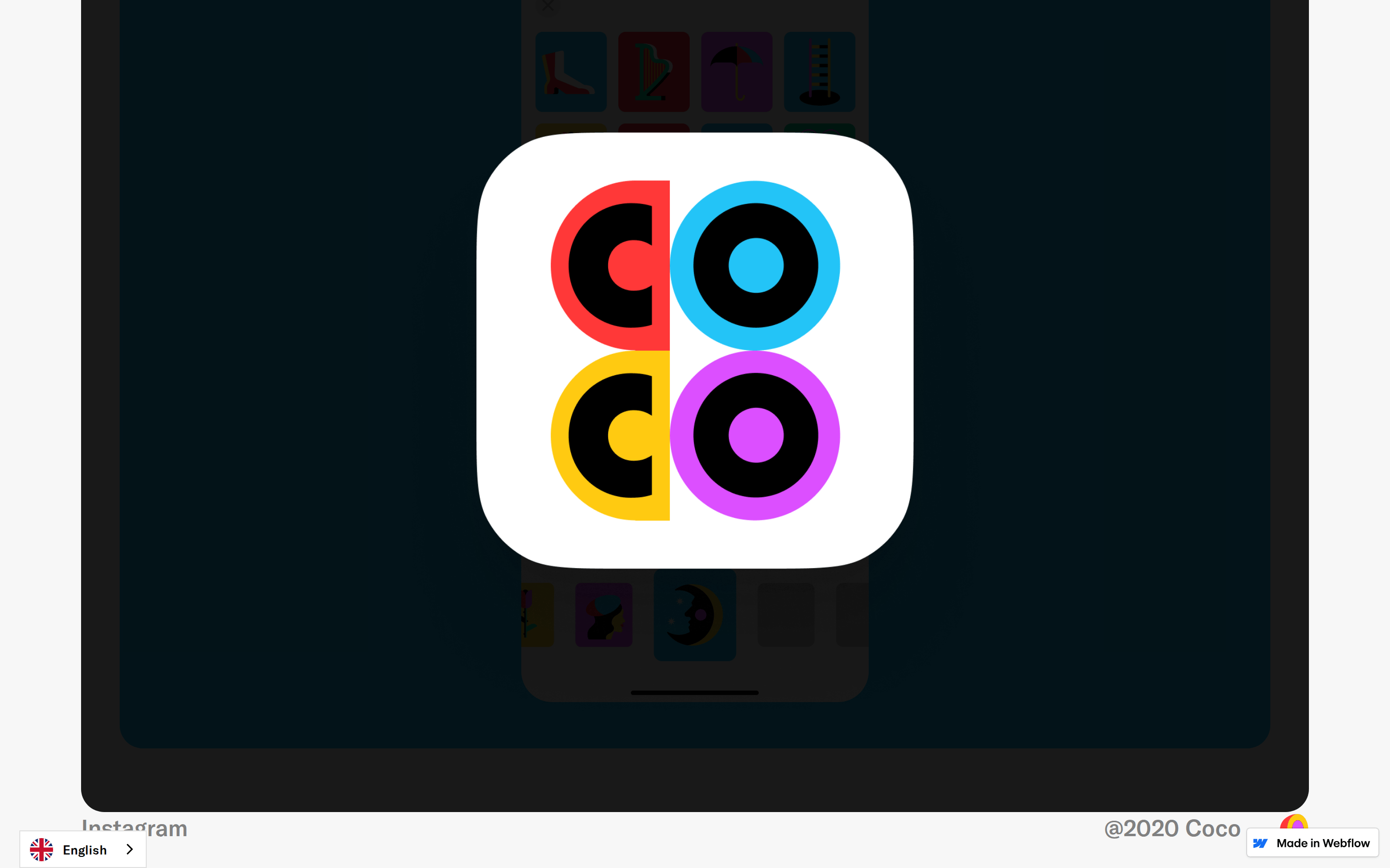
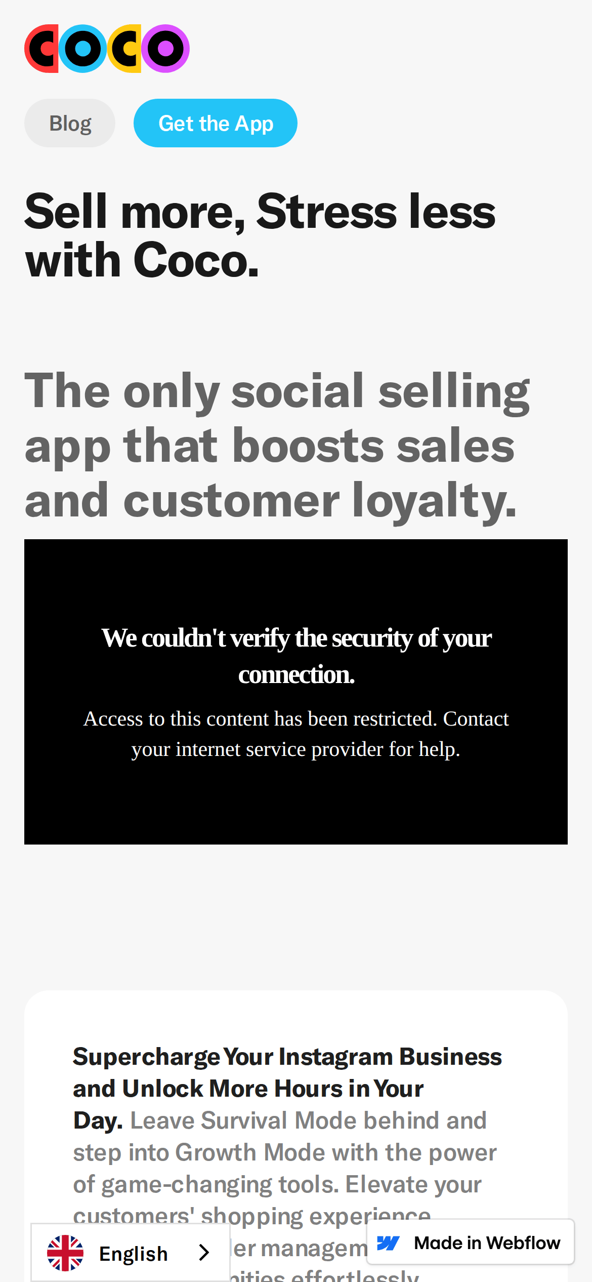
Inside the pack — real screenshots
桌面首屏(hero) 桌面滚动分段(90% viewport 步进,作为视觉证据) 桌面滚动分段(90% viewport 步进,作为视觉证据) 桌面滚动分段(90% viewport 步进,作为视觉证据) 桌面滚动分段(90% viewport 步进,作为视觉证据) 桌面滚动分段(90% viewport 步进,作为视觉证据) 桌面滚动分段(90% viewport 步进,作为视觉证据) 桌面滚动分段(90% viewport 步进,作为视觉证据) 桌面滚动分段(90% viewport 步进,作为视觉证据) 桌面滚动分段(90% viewport 步进,作为视觉证据) 桌面滚动分段(90% viewport 步进,作为视觉证据) 移动首屏 Captured from the live site · real computed styles
11
System prompt
This is a SaaS landing page for a social selling app called Coco. It features a clean, white background with bold, geometric sans-serif typography (GT America). Key hex colors include #FFFFFF for the background, #000000 for the main ink, and a vibrant electric blue (#23C4F7) for primary CTAs and accents. The layout is spacious with generous padding (24px-48px). Critical donts: do not use small font sizes, do not use sharp corners, and do not use a dark color scheme. The design is playful, utility-focused, and high-contrast.
More from the library en · zh-CN · zh-TW · ja · ko
OpenDesign · curated web aesthetics for AI-readable design DNA · opendesign.cc
Why we curated this: A great example of a modern, playful SaaS landing page that uses bold typography and vibrant accents to create a friendly and empowering brand voice.