← OpenDesign CURATED · OPEN · FREE
Mapbox
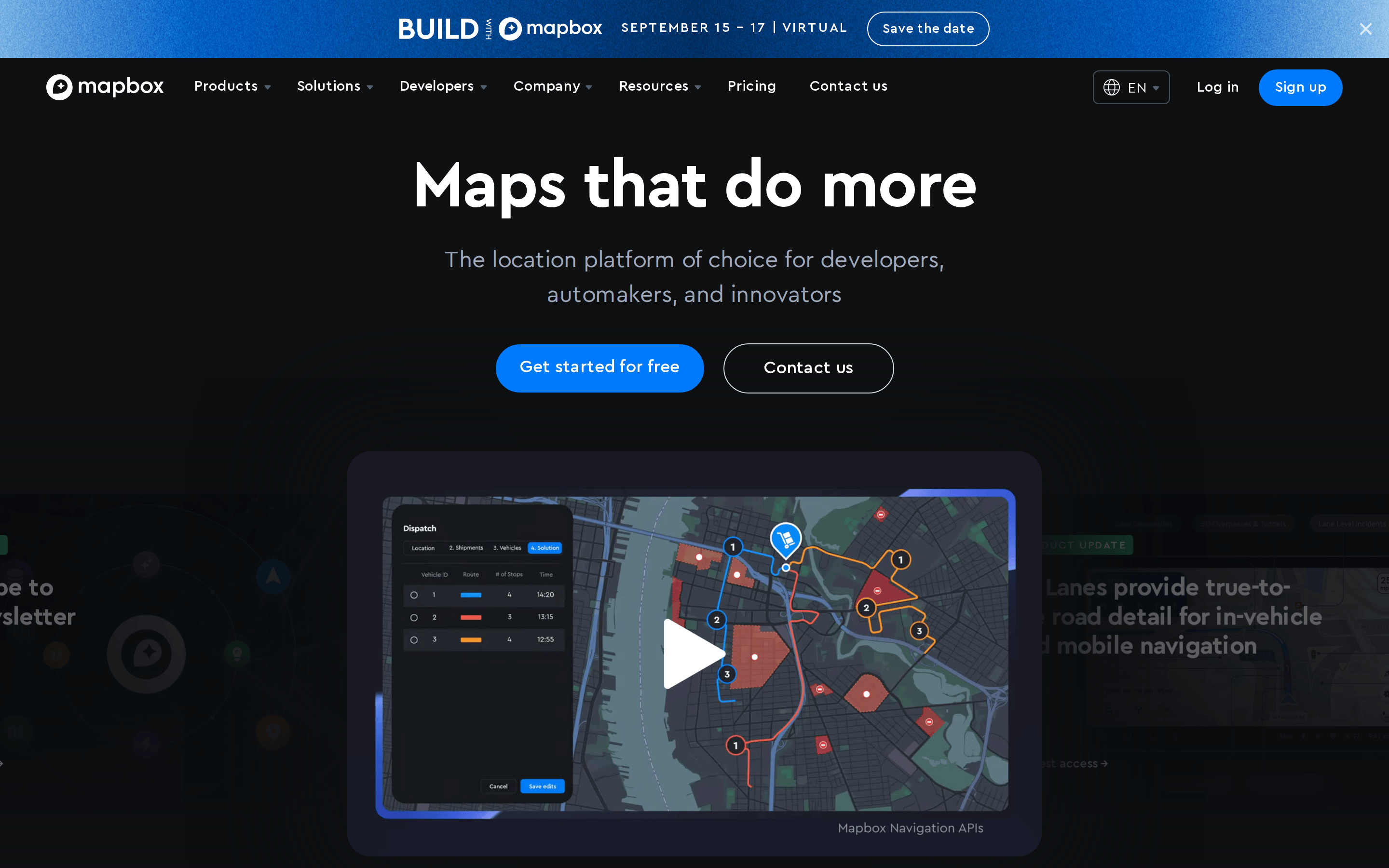
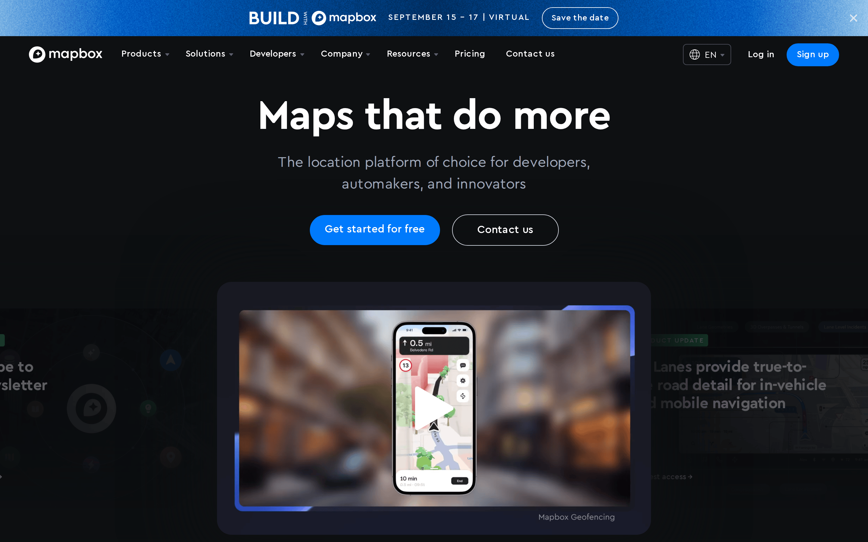
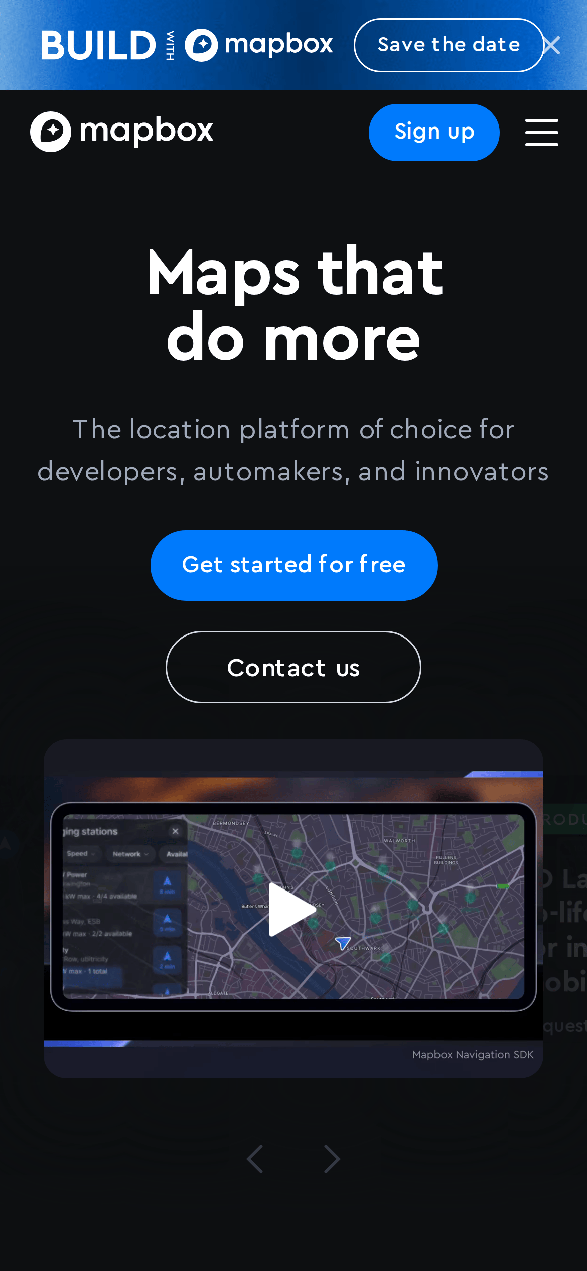
The location platform of choice for developers, automakers, and innovators.
SaaS Developer Tools Bold Typography Clean Calm
01
Identity DNA
geospatial mapping location platform navigation
A powerful toolkit for builders who want to overlay intelligence on the physical world.
02
Color
#007AFCAccent
#FFFFFFInk
#A0AABAInk soft
#0E1012BG
#15171BBG soft
#333943Muted
rgba(51, 57, 67, 1)Line
High-contrast dark mode designed to make colorful map data and blue accents stand out.
03
Typography
geometric-sans · humanist-sans · monospace
display 64px · 500body 20px · 400Primary headlines use a geometric sans-serif. · Body text relies on a legible humanist sans-serif. · UI elements use standard sans-serif fallbacks.
04
Spacing
4px
8px
16px
24px
32px
48px
64px
96px
Standard 4px grid base.
05
Surfaces
sm · 4px
md · 8px
lg · 24px
pill · 100px
Subtle 1px borders using muted dark gray (#333943) to define elements without harshness.
0px 0px 100px 50px rgb(14, 16, 18)
06
Layout
1280 container
12 columns
24px gutter
768 / 1024 breakpoints
Centered, content-heavy layout typical of a SaaS platform.
07
Motion & Interaction
150ms micro
400ms small
800ms medium
cubic-bezier(0.19, 1, 0.22, 1) easing
Smooth hover transitions on navigation and buttons.
Subtle color shifts and opacity changes. · Immediate response with slight transform.
08
Components
button Pill-shaped (border-radius: 100px) with solid accent fills or subtle outlines. card Dark panels (bg: #15171B) with soft shadows and generous rounded corners. chip Small, outlined text elements with high border-radius. input Subtle dark inputs with clear contrast text. hero Centered massive typography with dual-action buttons. 09
Voice & Don'ts
Tone Professional, technical, and authoritative. Headlines Concise, action-oriented, and bold. CTAs Clear, benefit-driven, and inviting. Don't use light backgrounds — screenshot shows a dark-themed interface. Don't use decorative serif fonts — screenshot shows clean sans-serif typography. Don't use sharp, square corners on buttons — screenshot shows pill-shaped buttons. Don't use neon or overly saturated colors — screenshot shows a focused blue accent. Don't use thin, delicate lines for borders — screenshot shows clear 1px borders. Don't overcrowd the hero section — screenshot shows generous whitespace and large type. Avoid: Jargon without context Avoid: Overly casual language Avoid: Hype without substance Avoid: Dense blocks of text in the hero 10
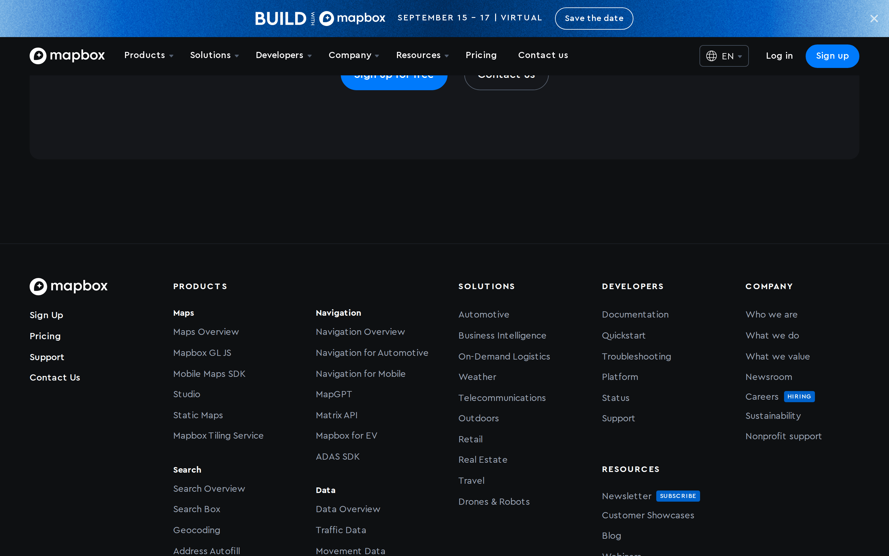
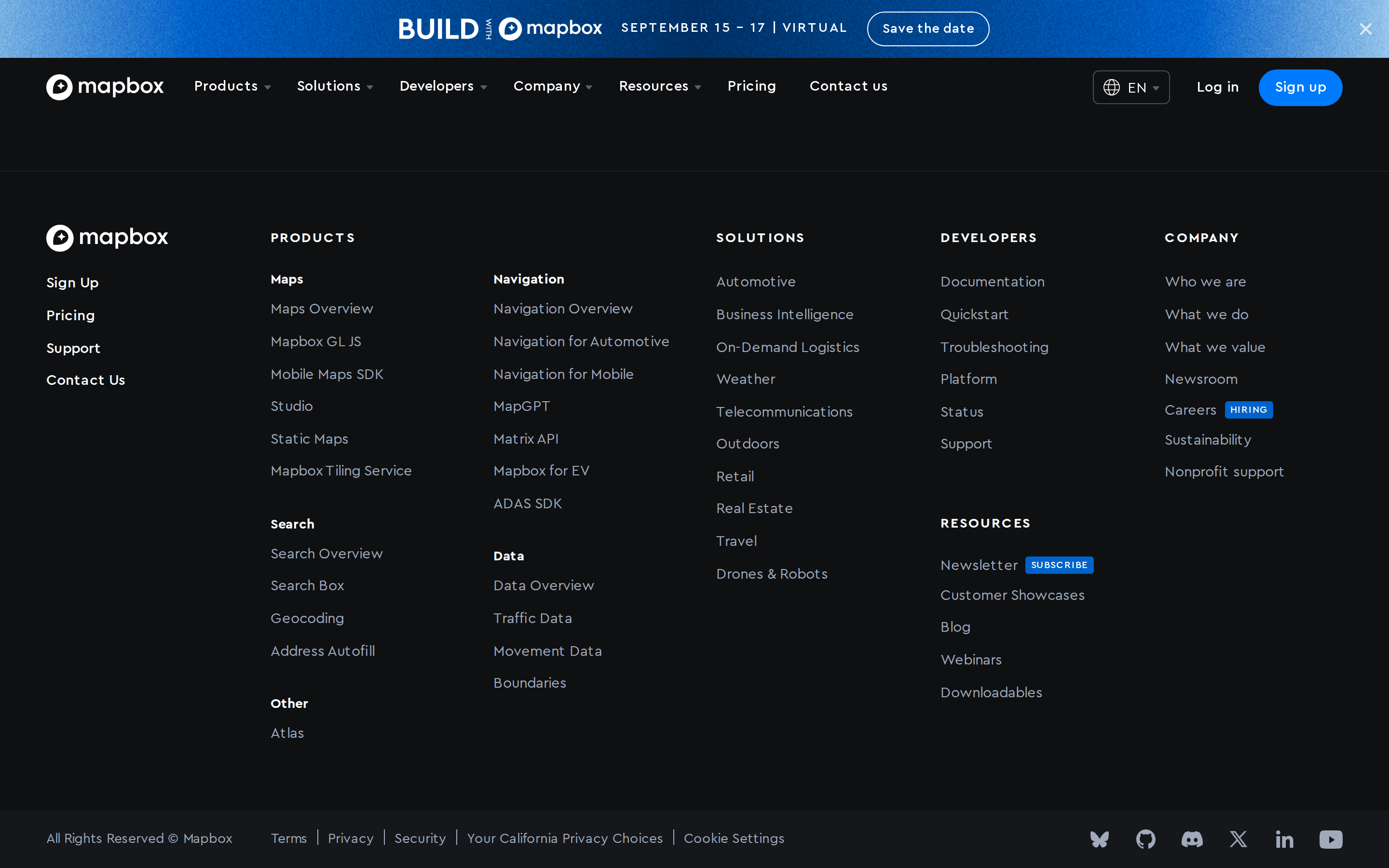
Inside the pack — real screenshots
桌面首屏(hero) 桌面滚动分段(90% viewport 步进,作为视觉证据) 桌面滚动分段(90% viewport 步进,作为视觉证据) 桌面滚动分段(90% viewport 步进,作为视觉证据) 桌面滚动分段(90% viewport 步进,作为视觉证据) 桌面滚动分段(90% viewport 步进,作为视觉证据) 桌面滚动分段(90% viewport 步进,作为视觉证据) 桌面滚动分段(90% viewport 步进,作为视觉证据) 桌面滚动分段(90% viewport 步进,作为视觉证据) 桌面滚动分段(90% viewport 步进,作为视觉证据) 移动首屏 Captured from the live site · real computed styles
11
System prompt
Mapbox is a premium SaaS developer platform for mapping and location intelligence. It uses a deep dark background (#0E1012) with crisp white text and a vibrant blue accent (#007AFC). Typography is primarily geometric and humanist sans-serif, with large, bold headlines and clear body text. The layout is spacious and centered. Critical don'ts: avoid light themes, serif fonts, square buttons, neon colors, thin borders, and cluttered hero sections.
More from the library en · zh-CN · zh-TW · ja · ko
OpenDesign · curated web aesthetics for AI-readable design DNA · opendesign.cc
Why we curated this: Mapbox provides a definitive example of a high-end developer tool aesthetic, balancing technical power with visual restraint.