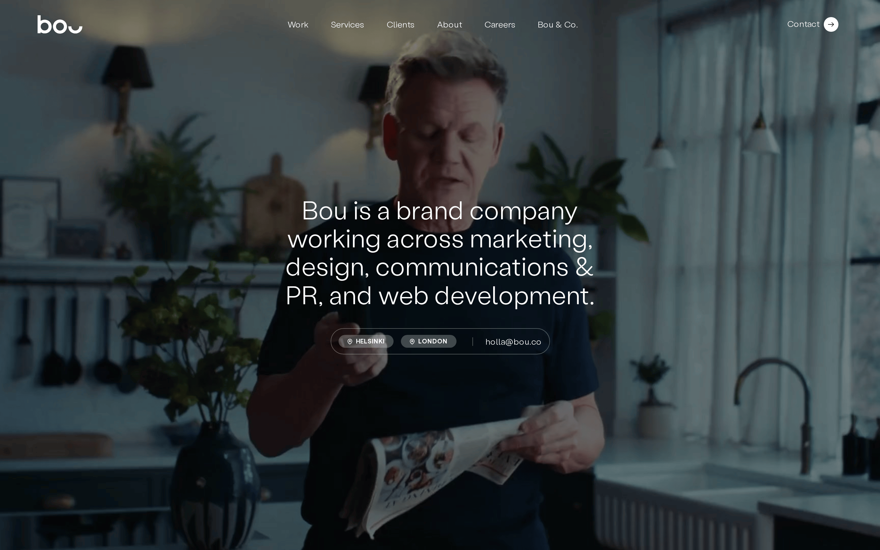
A premium design studio that blends high-end photography with clean, editorial typography to create a sophisticated and professional digital presence.
02
Color
#0A0A0AInk
#DBD7DCInk soft
#EBEBEBBG
rgba(10,10,10,0.15)Line
Monochromatic and desaturated with a strict black-and-white core, allowing photography to provide all color and warmth.
03
Typography
humanist-sans
display42px · 300
body16px · 300
caption14px · 300
Use weight 300 for all primary text to maintain an elegant, light feel. · Apply uppercase transformation only to small labels like 'SERVICES' or 'HELSINKI'. · Maintain generous line-height (1.4 to 1.5) for optimal readability.
04
Spacing
4px
8px
12px
16px
24px
32px
48px
64px
96px
A consistent 8px or 16px vertical rhythm is used for padding and gap between elements, ensuring a structured, breathable layout.
05
Surfaces
sm · 4px
md · 8px
lg · 12px
pill · 1400px
1px solid rgba(10,10,10,0.15) or 1px solid rgb(219, 217, 220)
rgba(0, 0, 0, 0.3) 0px 32px 68px 0px
06
Layout
1280container
12columns
24pxgutter
768 / 1024breakpoints
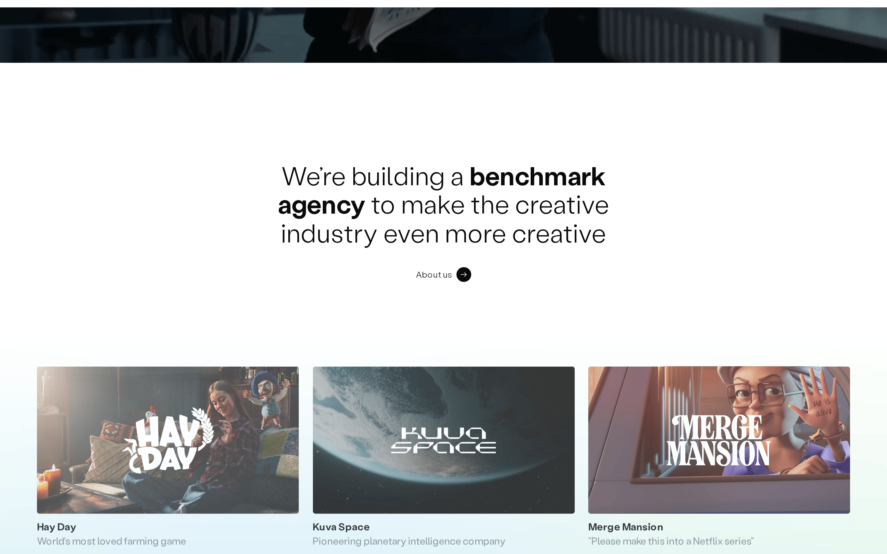
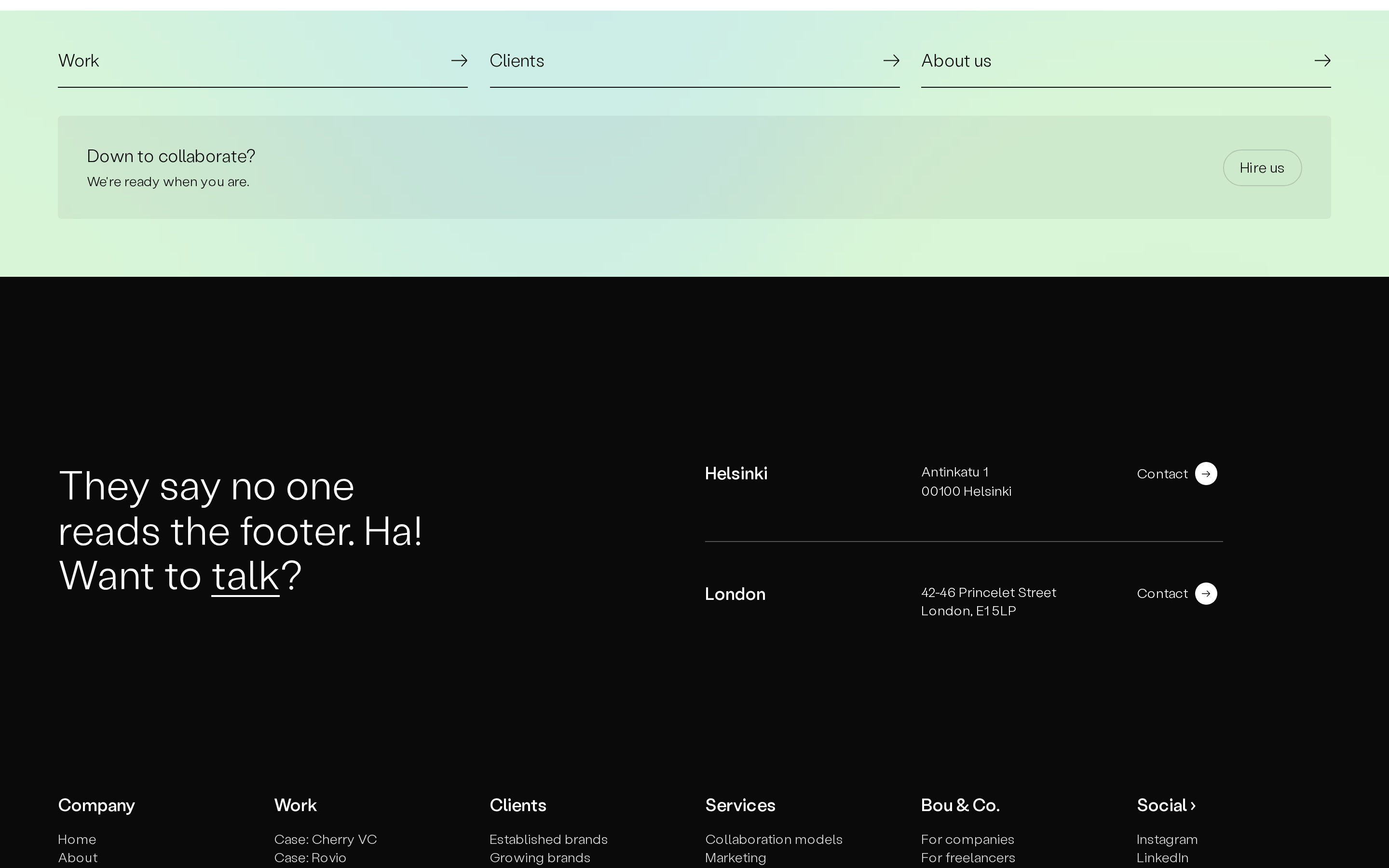
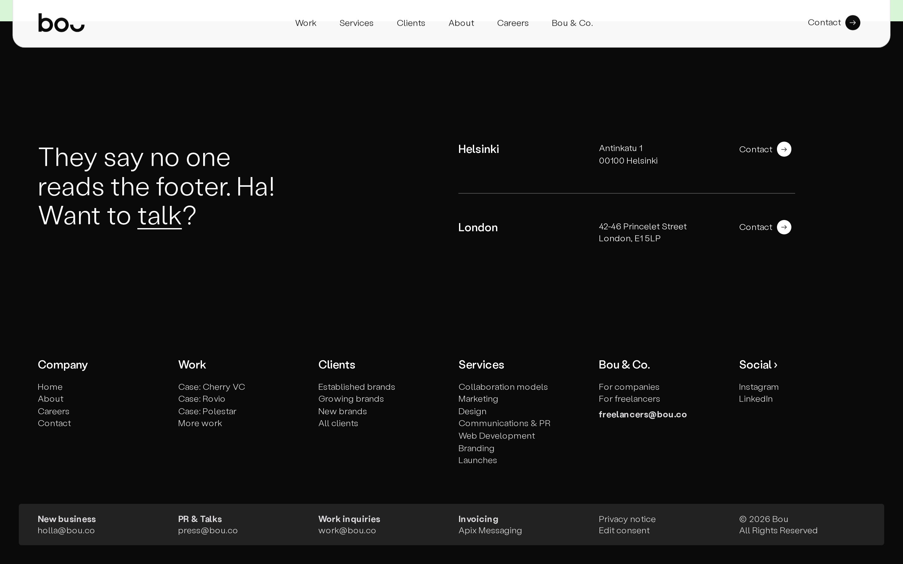
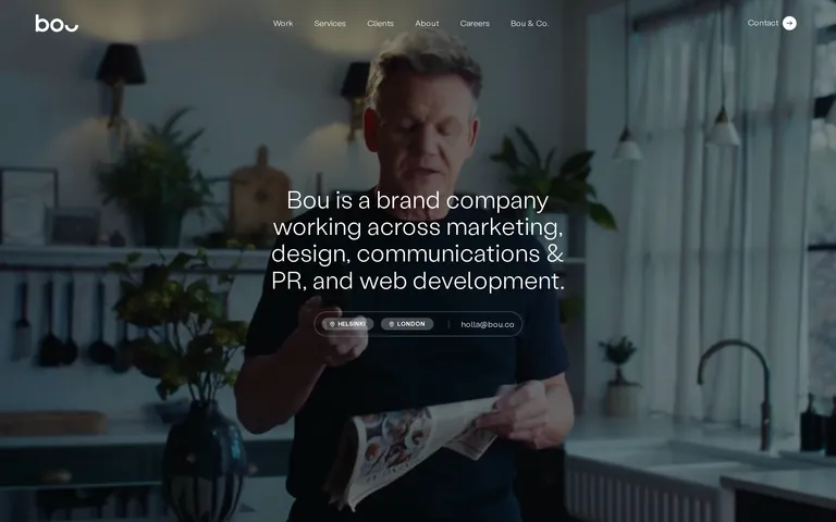
A full-width photographic hero followed by a two-column split for content and services, using a 12-column grid for flexible alignment.
07
Motion & Interaction
200msmicro
300mssmall
500msmedium
cubic-bezier(0.29, 0.48, 0.5, 0.99)easing
Smooth color transitions for links and buttons. · Subtle fade-ins for content sections as they enter the viewport.
Subtle color shifts or opacity changes on links and buttons. · Immediate response with a smooth transition effect.
08
Components
buttonPill-shaped buttons with a black background and white text, or minimalist ghost buttons with white borders on dark backgrounds.
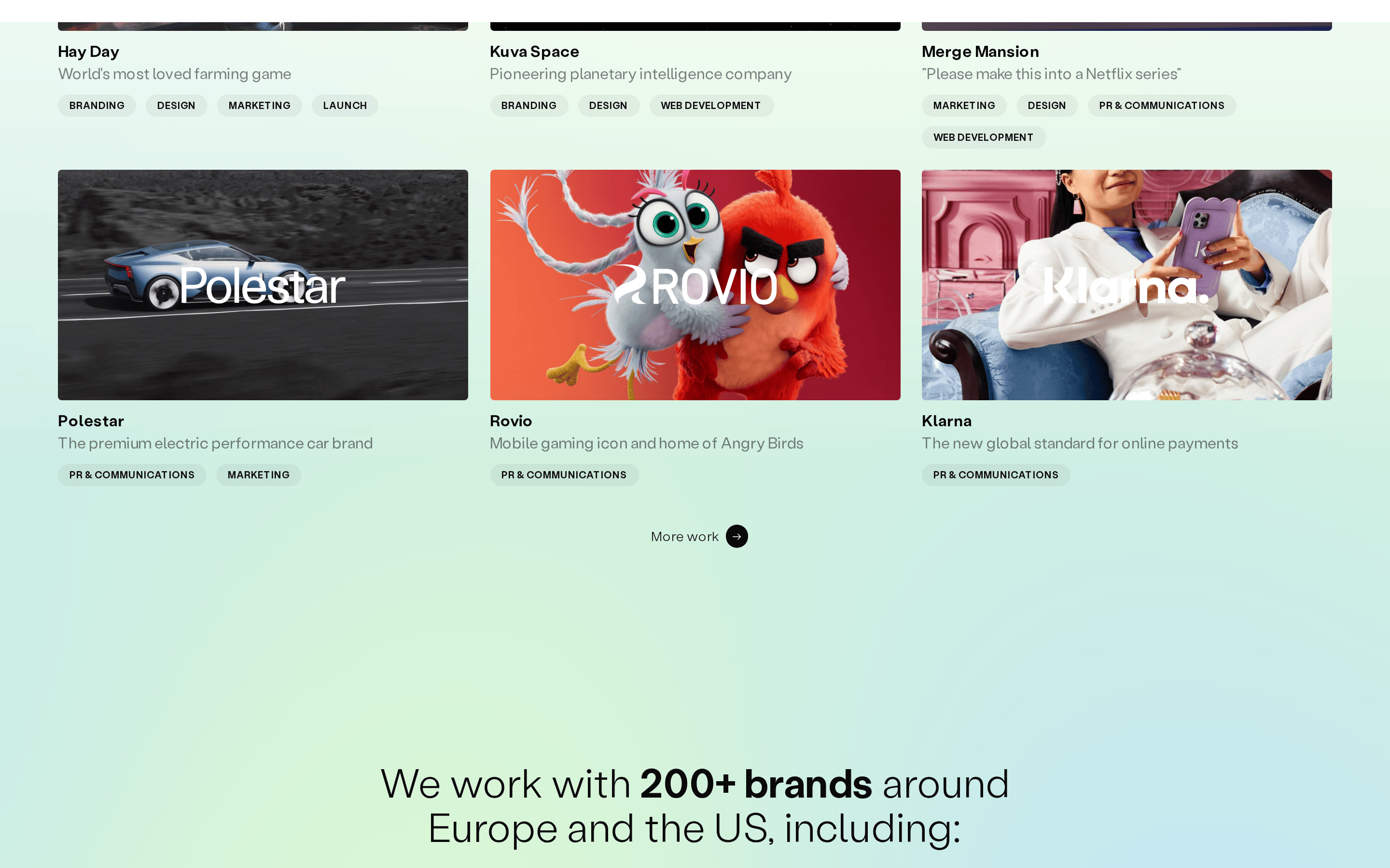
cardMinimalist, borderless cards that rely on large photography and clean typography for hierarchy.
chipSmall, pill-shaped tags with uppercase text and thin borders, used for locations or categories.
inputMinimalist inputs with a simple 1px bottom border and no background.
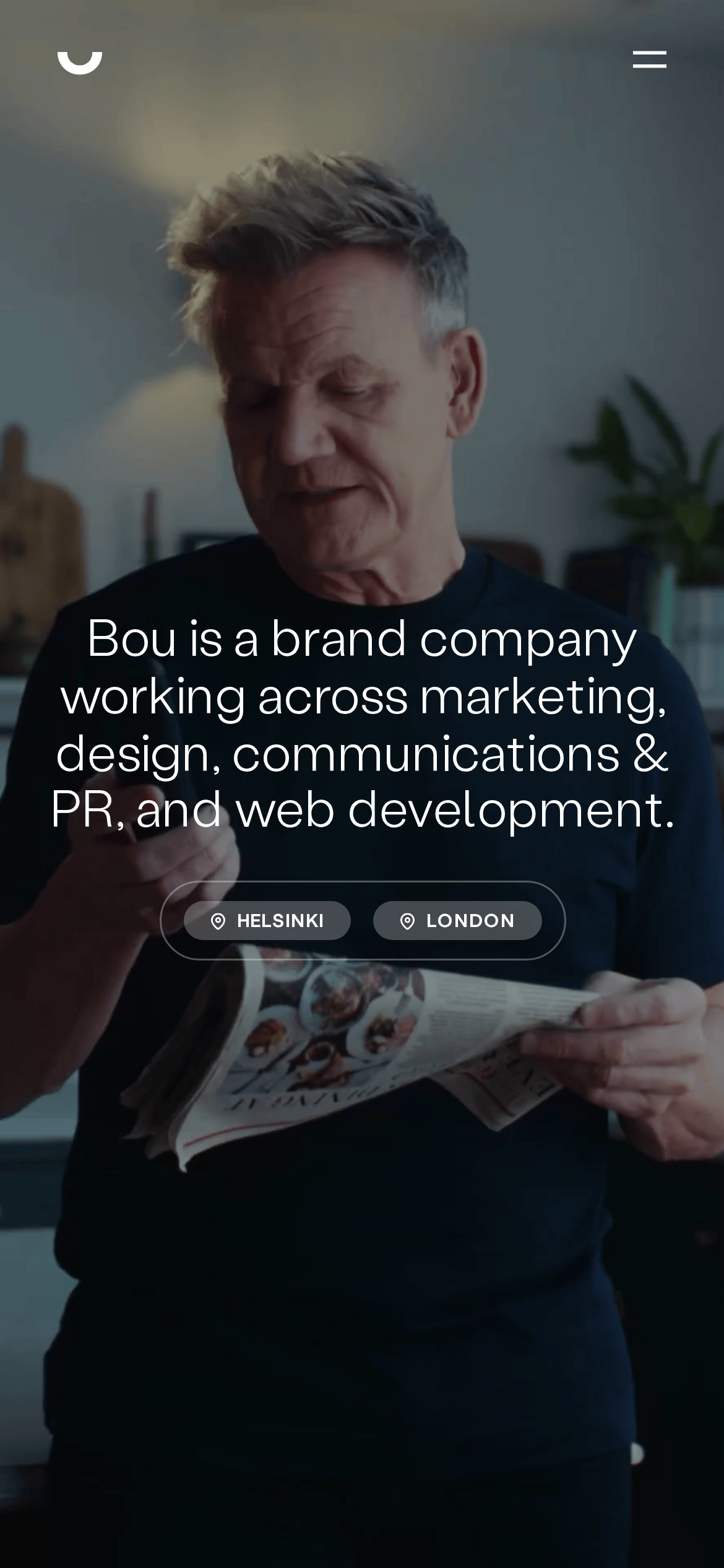
heroA full-viewport cinematic photograph with centered, large-scale typography overlayed.
09
Voice & Don'ts
ToneProfessional, confident, and direct.
HeadlinesClean, elegant, and descriptive, focusing on the agency's core services.
CTAsMinimalist, using simple text links or small pill-shaped buttons.
don't use high-saturation colors — screenshot shows a strictly monochromatic black-and-white palette.
don't use heavy, bold typography — screenshot shows a dominant use of weight 300 for a light, elegant feel.
don't use rounded cards with shadows — screenshot shows flat, borderless layouts where photography defines edges.
don't use small, cramped spacing — screenshot shows generous padding and gaps (8px-16px) for a breathable feel.
don't use decorative borders — screenshot shows minimal 1px borders only for functional elements like chips or inputs.
don't use complex, multi-color gradients — screenshot shows a clean, solid-color background with photographic depth.
Avoid: Avoid overly casual or slang language.
Avoid: Avoid excessive use of exclamation marks.
Avoid: Avoid complex or technical jargon not essential to the service.
Captured from the live site · real computed styles
11
System prompt
This is a premium agency website for 'Bou', a brand company. The design is editorial and sophisticated, using a strict monochromatic palette of black (#0A0A0A) and light gray (#EBEBEB), allowing high-quality photography to provide all visual interest. Typography is humanist-sans at weight 300, creating a light and elegant feel. The layout is clean and grid-based, with generous spacing. Critical donts: 1. Never use high-saturation colors, as the design is strictly monochromatic. 2. Never use bold, heavy typography; maintain the light, refined weight 300. 3. Avoid decorative borders or heavy shadows; keep surfaces flat and photography-driven. The overall voice is professional and direct.
Bring this taste to your agent
Hand your AI agent a machine-readable spec of this design — tokens, type, motion, the whole DNA.