A high-end design agency portfolio focused on global tech brands.
02
Color
#ff5319Accent
#000000Ink
#ffffffBG
#f7f7f7BG soft
#999999Muted
rgba(0,0,0,0.1)Line
High-contrast monochrome base with a single vibrant orange accent used sparingly for emphasis and calls-to-action.
03
Typography
geometric-sans
display56px · 400
heading43px · 400
body16px · 400
caption14px · 400
Use tight negative letter spacing for headlines. · Maintain generous vertical whitespace between sections. · Avoid heavy font weights; rely on size and spacing for hierarchy.
04
Spacing
4px
8px
16px
24px
32px
48px
64px
96px
Generous whitespace with clear separation between grid items.
05
Surfaces
sm · 4px
md · 8px
lg · 10px
pill · 999px
Minimal to no visible borders; structure is defined by spacing and background contrast.
06
Layout
1280container
12columns
24pxgutter
768 / 1024breakpoints
Standard 12-column grid that collapses to a 2-column grid on mobile.
07
Motion & Interaction
220msmicro
400mssmall
800msmedium
cubic-bezier(0.1, 0, 0.3, 1)easing
Smooth opacity and transform transitions for page elements. · Horizontal scrolling marquee for announcements.
Subtle opacity or color transitions. · Direct navigation or smooth scroll.
08
Components
buttonPill-shaped primary CTA with a pencil emoji; secondary options are text links.
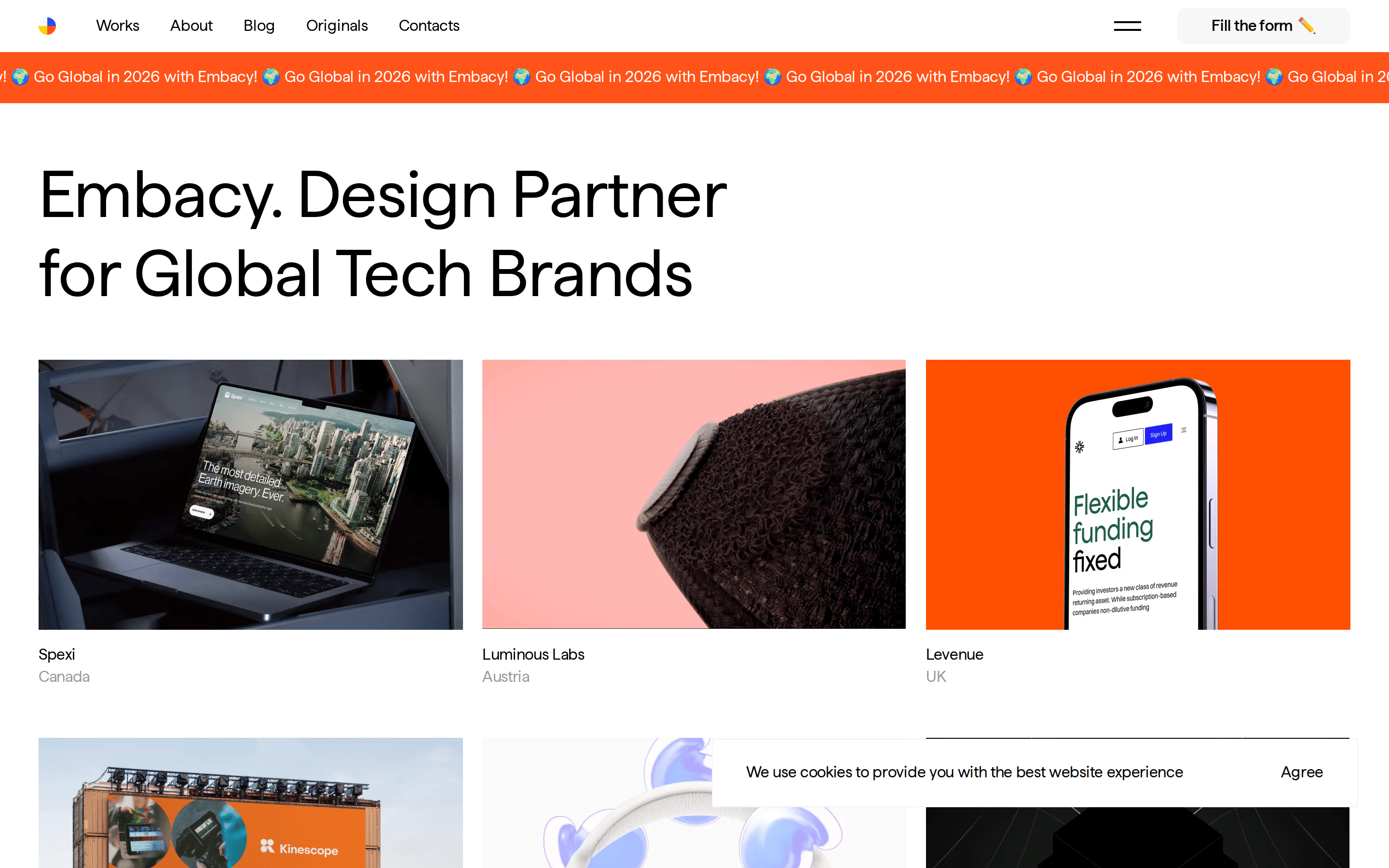
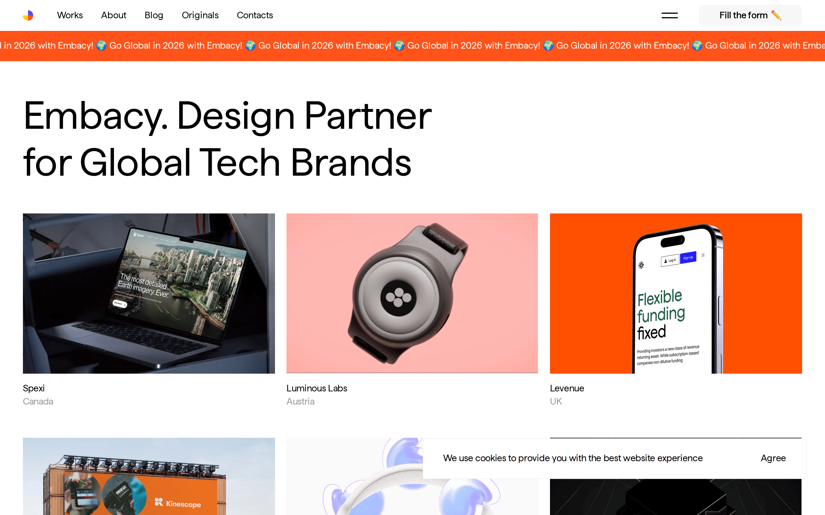
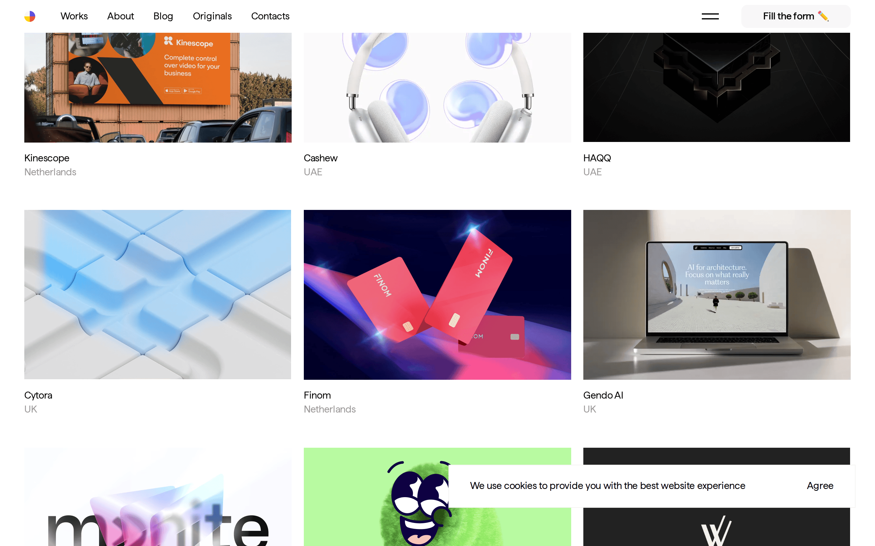
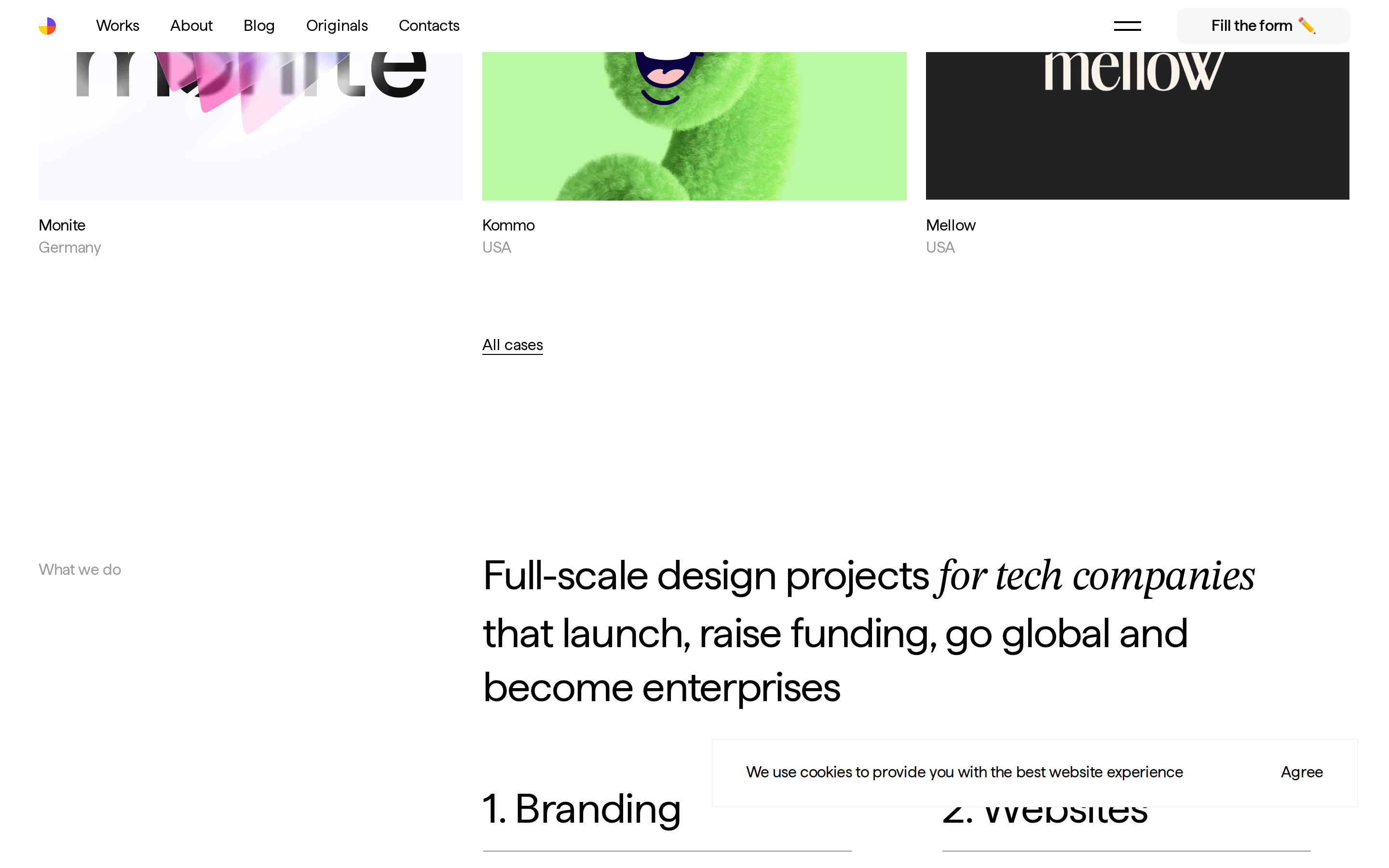
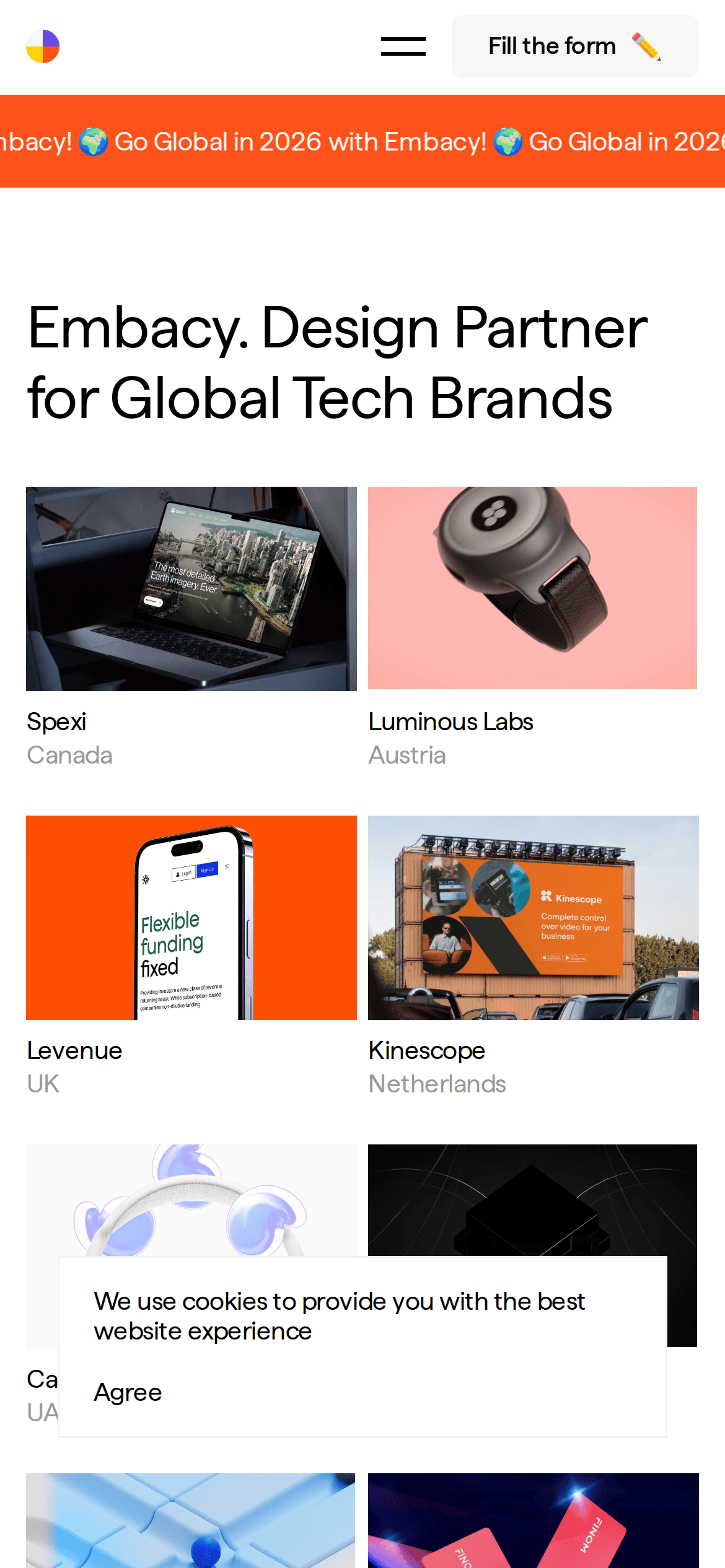
cardProject cards consisting of a full-width image, project name, and country.
chipNone visible.
inputNone visible.
heroMassive left-aligned typography introducing the agency.
09
Voice & Don'ts
ToneProfessional, direct, and confident.
HeadlinesMinimal, large-scale, and declarative.
CTAsPlayful yet clear, using emojis as visual anchors.
Don't use multiple bright accent colors — screenshot shows only one dominant orange.
Don't use heavy font weights like bold or black — screenshot shows predominantly 400-weight text.
Don't add decorative borders to cards — screenshot shows structure through spacing and image content.
Don't use wide letter spacing for headlines — screenshot shows tight, negative tracking.
Don't clutter the interface with many UI components — screenshot shows a very clean, minimal layout.
Don't use drop shadows for depth — screenshot shows a flat design aesthetic.
Captured from the live site · real computed styles
11
System prompt
This is a design agency portfolio for Embacy, a 'Design Partner for Global Tech Brands'. The design relies on a high-contrast monochrome palette with a single vibrant orange (#FF5319) accent. Typography uses a geometric sans-serif (Haffer) with large, tightly tracked headlines and generous whitespace. Critical donts include avoiding heavy font weights, multiple accent colors, decorative borders, wide tracking, cluttered UIs, and drop shadows. The layout is clean and editorial, focusing on large imagery and bold text.
Bring this taste to your agent
Hand your AI agent a machine-readable spec of this design — tokens, type, motion, the whole DNA.