← OpenDesign CURATED · OPEN · FREE
Onroadmap
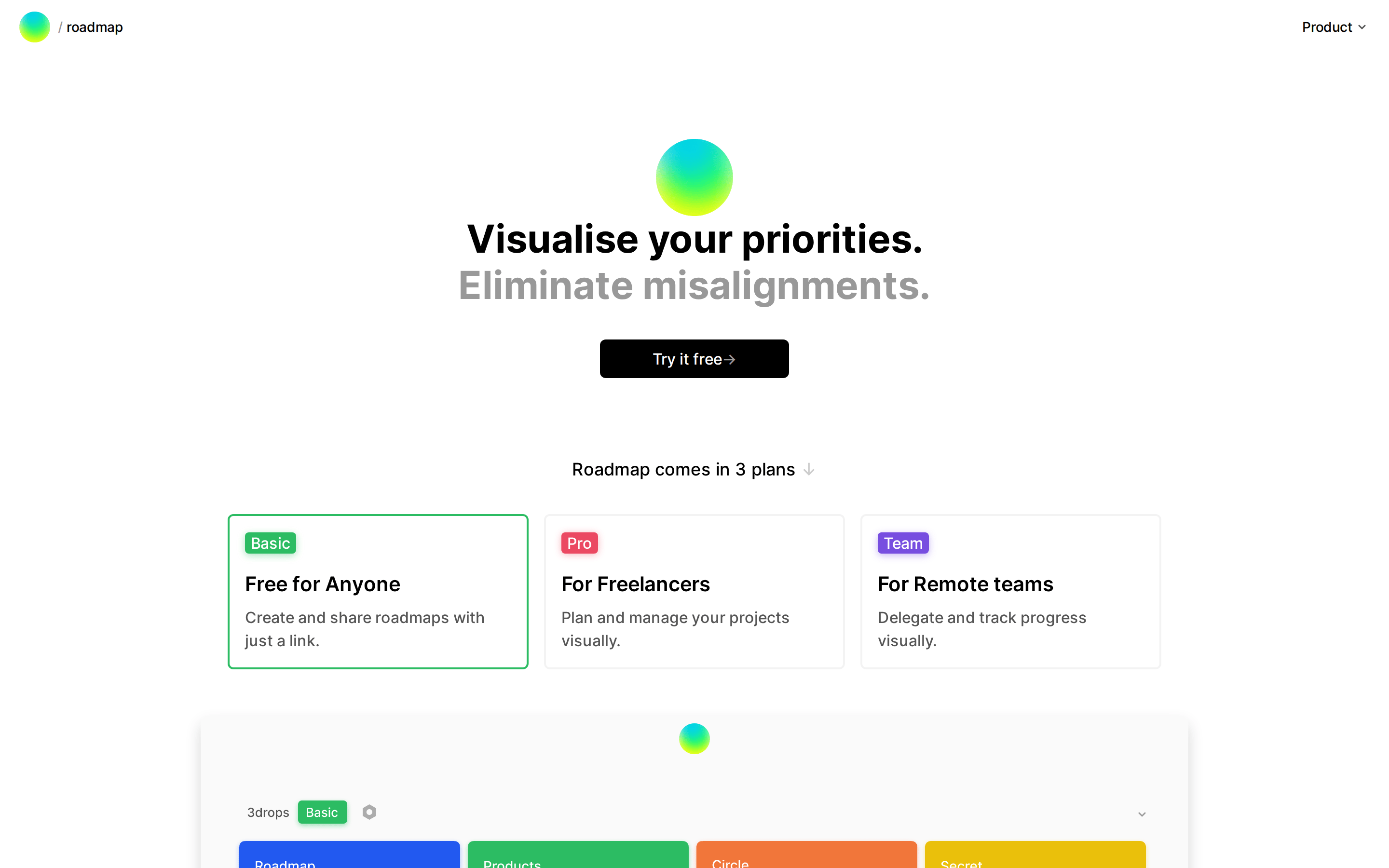
A minimalist roadmap tool for aligning teams and visualizing priorities.
Productivity SaaS Clean Collaboration Calm
01
Identity DNA
roadmap planning alignment visual priority
A clean whiteboard for team priorities
02
Color
#000000Ink
#222222Ink soft
#FFFFFFBG
#FAFAFABG soft
#F3F3F3BG quiet
#999999Muted
rgba(243, 243, 243, 1)Line
Neutral canvas with vibrant, multi-colored accents representing roadmap tracks.
03
Typography
geometric-sans · humanist-sans
display 40px · 700h2 32px · 700h3 21px · 500body 16px · 400caption 14px · 400Headlines use bold weight with tight letter spacing · Body text maintains generous line height for readability · Secondary text uses muted ink color
04
Spacing
4px
8px
16px
24px
32px
48px
64px
96px
Generous vertical rhythm between sections, with tight internal padding for cards and buttons.
05
Surfaces
sm · 4px
md · 6px
lg · 8px
pill · 999px
Subtle 2px solid borders for active states, otherwise borderless or using box-shadow for depth.
0 8px 16px rgba(0, 0, 0, 0.16) · 0 4px 16px rgba(0, 0, 0, 0.32) · 0 0 0 3px rgb(243, 243, 243)
06
Layout
1280 container
12 columns
24px gutter
768 / 1024 breakpoints
Single-column vertical flow with centered content blocks.
07
Motion & Interaction
200ms micro
400ms small
800ms medium
cubic-bezier(0.25, 0.1, 0.25, 1) easing
Subtle hover states on buttons and cards · Focus transitions on interactive elements
Buttons likely darken slightly; cards may lift with shadow. · Immediate feedback with potential slight scale or opacity change.
08
Components
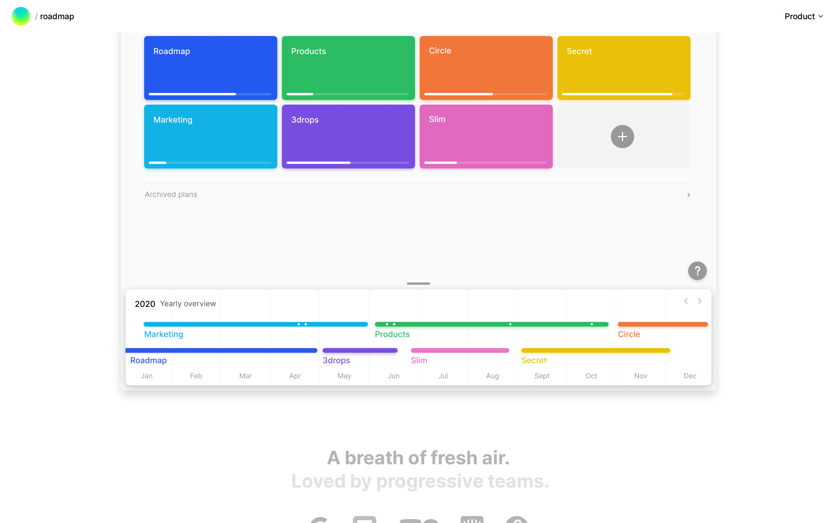
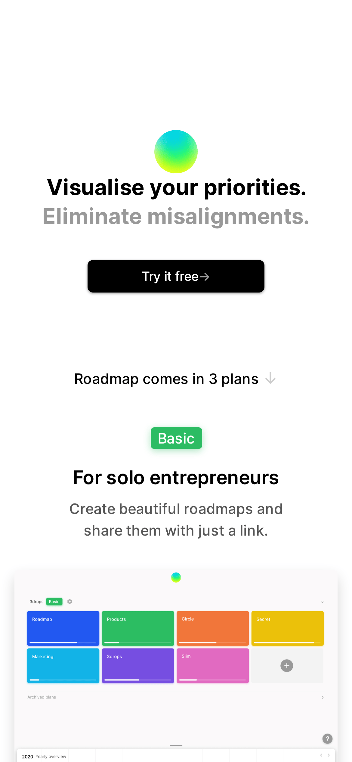
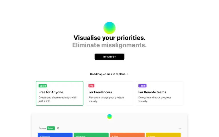
button High contrast black with white text and rounded pill shape. card White or soft gray backgrounds with subtle borders or box-shadows for elevation. chip Colorful labels (green, pink, purple) with pill shape and colored box-shadows. input Not fully visible, but likely minimal with subtle borders. hero Centered layout with large gradient sphere logo, bold dual-tone headline, and primary CTA. 09
Voice & Don'ts
Tone Direct, clear, and professional. Headlines Short, declarative sentences in bold sans-serif. CTAs Simple and action-oriented with an arrow symbol. Don't use decorative or serif fonts — screenshot shows clean geometric sans-serif headlines. Don't add complex drop shadows — screenshot shows subtle, soft box-shadows. Don't use a busy or dark background — screenshot shows a predominantly white canvas. Don't clutter the hero section — screenshot shows ample white space around central elements. Don't use rounded squares for badges — screenshot shows pill-shaped labels. Don't use heavy borders on cards — screenshot shows cards separated by subtle shadows or background changes. Avoid: Jargon-heavy language Avoid: Complex sentence structures Avoid: Visual clutter or noisy backgrounds 10
Inside the pack — real screenshots
桌面首屏(hero) 桌面滚动分段(90% viewport 步进,作为视觉证据) 桌面滚动分段(90% viewport 步进,作为视觉证据) 桌面滚动分段(90% viewport 步进,作为视觉证据) 桌面滚动分段(90% viewport 步进,作为视觉证据) 桌面滚动分段(90% viewport 步进,作为视觉证据) 移动首屏 Captured from the live site · real computed styles
11
System prompt
This is a minimalist SaaS roadmap tool website. It uses a clean white background with black text for maximum readability. Typography is a geometric sans-serif for headlines and humanist sans-serif for body text. Key colors are neutral black, white, and gray, with vibrant multi-colored accents (green, pink, purple, blue) used only for status badges and roadmap track indicators. The layout is centered with generous spacing. Critical don'ts: never use decorative fonts, never add complex shadows, never clutter the interface with unnecessary elements. The design prioritizes clarity and focus.
More from the library en · zh-CN · zh-TW · ja · ko
OpenDesign · curated web aesthetics for AI-readable design DNA · opendesign.cc
Why we curated this: This site is a great example of how a vibrant, multi-colored accent system can work within a highly restrained, clean layout to create a professional yet approachable product tool.