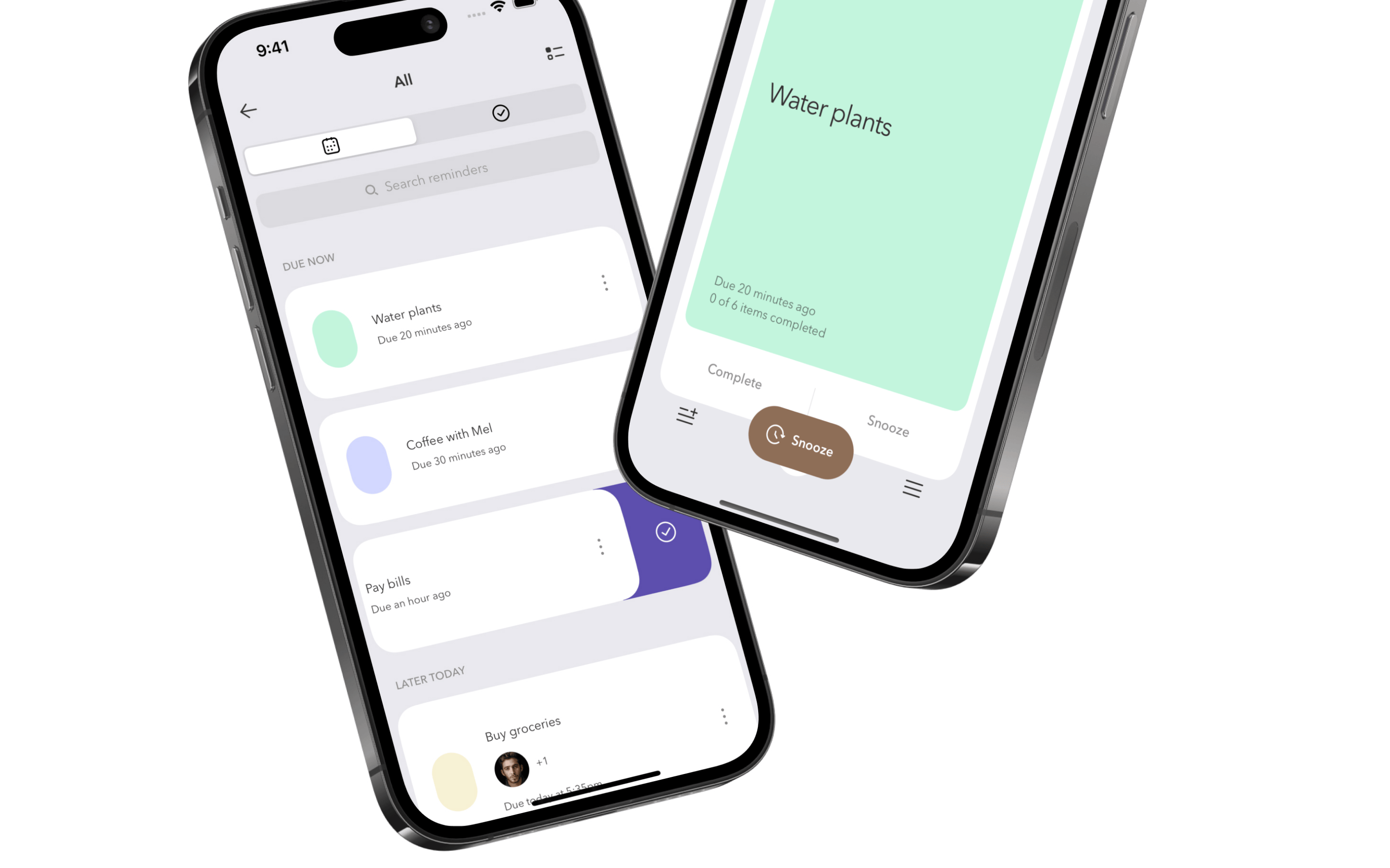
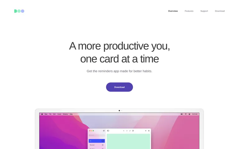
A calm, organized digital notebook for your daily tasks.
02
Color
#5550CAAccent
#383938Ink
#6E6D7AInk soft
#FFFFFFBG
#F7F7F7BG soft
#E7EFF5BG quiet
rgba(110,109,122,1.0)Line
Clean white backgrounds with a single deep violet accent and muted slate text.
03
Typography
humanist-sans
display65px · 400
heading39px · 400
body16px · 400
Use negative letter spacing for headlines to create a tight, modern feel. · Maintain a strict 400 font weight throughout to preserve a light, airy appearance. · Ensure generous vertical whitespace between headings and paragraphs.
04
Spacing
4px
8px
16px
24px
32px
48px
64px
96px
Generous vertical spacing with large padding blocks (130px) between major sections.
05
Surfaces
sm · 4px
md · 8px
lg · 30px
pill · 39px
Subtle top borders (1px solid #6E6D7A) for section dividers.
06
Layout
1280container
12columns
24pxgutter
768 / 1024breakpoints
Single-column centered layout with generous margins and high-quality device mockups.
07
Motion & Interaction
200msmicro
250mssmall
1000msmedium
ease-in-outeasing
Opacity and transform transitions on interactive elements. · Smooth transitions for hover states on navigation links.
Subtle opacity or color transitions on links and buttons. · Minimal visual feedback beyond standard pointer cursor.
08
Components
buttonPill-shaped solid purple (#5550CA) with white text and no shadow.
cardNot explicitly used as a component; content relies on device mockups.
chipNot present.
inputMinimal search input within the app mockup.
heroCentered text hero with a single call-to-action and a large device showcase below.
09
Voice & Don'ts
ToneEncouraging, helpful, and slightly casual.
HeadlinesShort, direct, and benefit-oriented phrases.
CTAsSimple, action-oriented verbs like 'Download'.
Don't use heavy drop shadows on buttons — screenshot shows flat, solid pill buttons.
Don't use all-caps for body text — screenshot shows sentence case for features and navigation.
Don't use a dark background for the primary interface — screenshot shows a clean white (#FFFFFF) background.
Don't use high-contrast black text — screenshot uses a softer dark gray (#383938) for primary ink.
Don't use complex grids for content presentation — screenshot shows a simple, single-column centered layout.
Don't use a wide variety of colors — screenshot restricts the palette to white, gray, and a single violet accent.
Avoid: Avoid overly technical jargon.
Avoid: Avoid aggressive or loud marketing language.
Avoid: Avoid cluttered layouts with multiple competing CTAs.
Captured from the live site · real computed styles
11
System prompt
This is a minimalist productivity app landing page. The primary background is pure white (#FFFFFF) with text in a soft dark gray (#383938) and a single deep violet (#5550CA) accent for the call-to-action button. The typography is a humanist-sans category (Avenir Next/Nunito Sans) with light weights and negative letter spacing for headlines. Key design rules include: use pill-shaped buttons, maintain generous vertical whitespace, and rely on high-fidelity device mockups for visual interest. Do not use dark mode, heavy shadows, or cluttered layouts. Keep the interface light, calm, and focused on the product's core value proposition of habit-building through reminders.
Bring this taste to your agent
Hand your AI agent a machine-readable spec of this design — tokens, type, motion, the whole DNA.