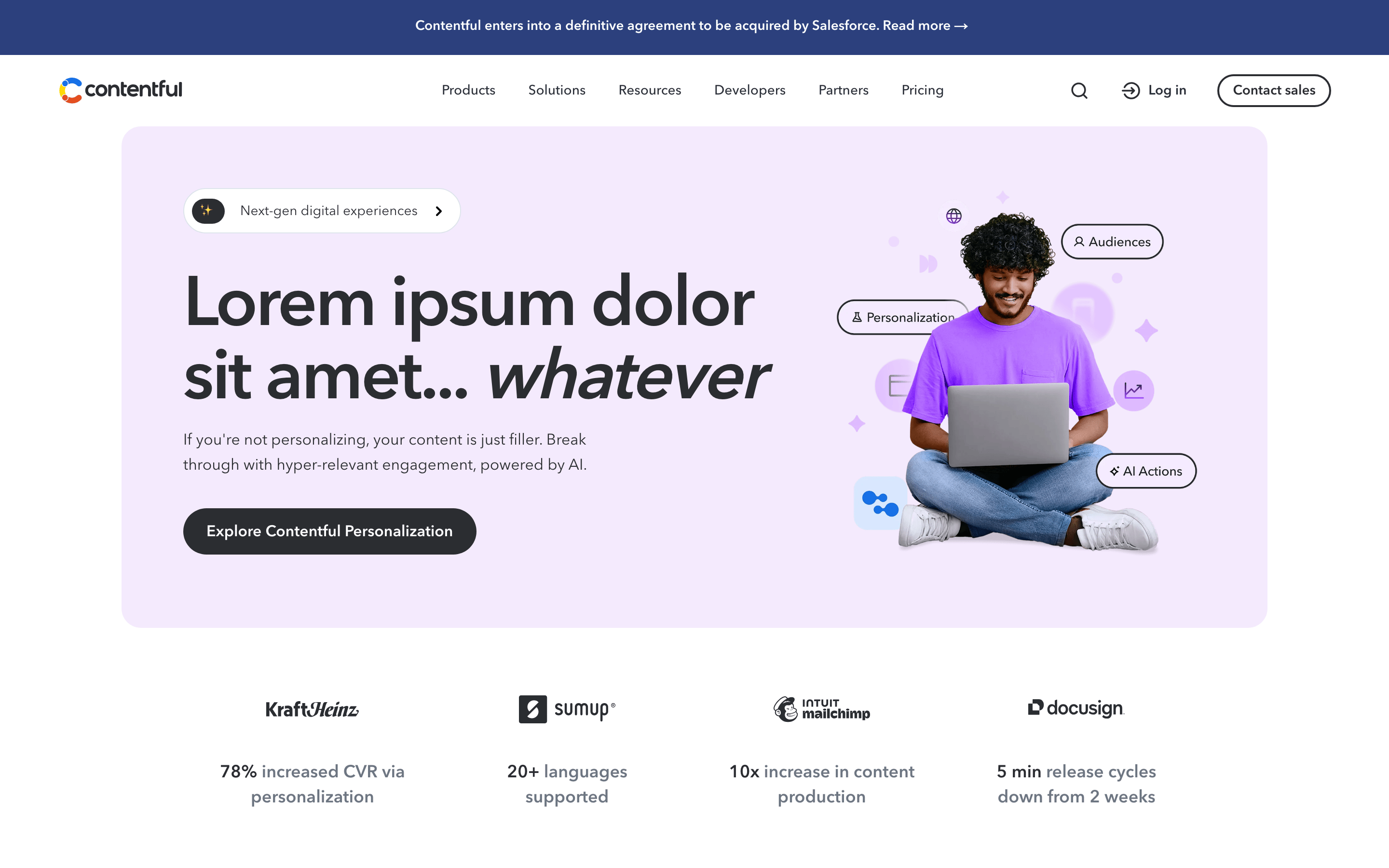
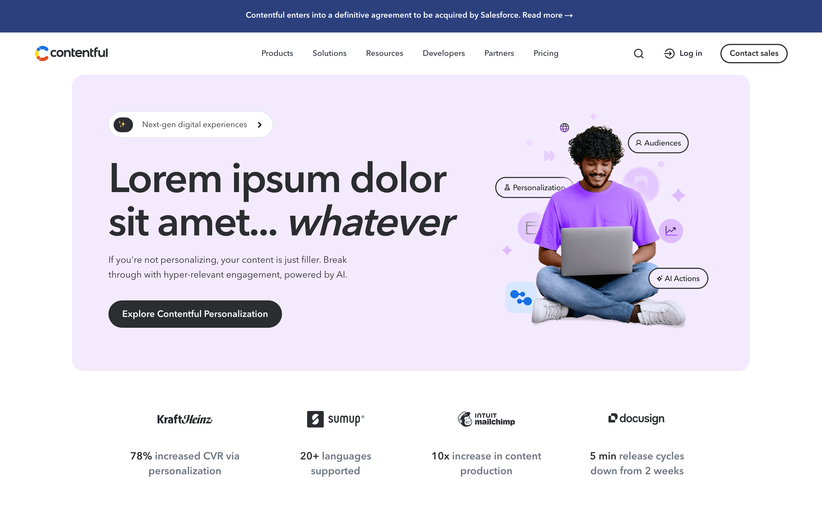
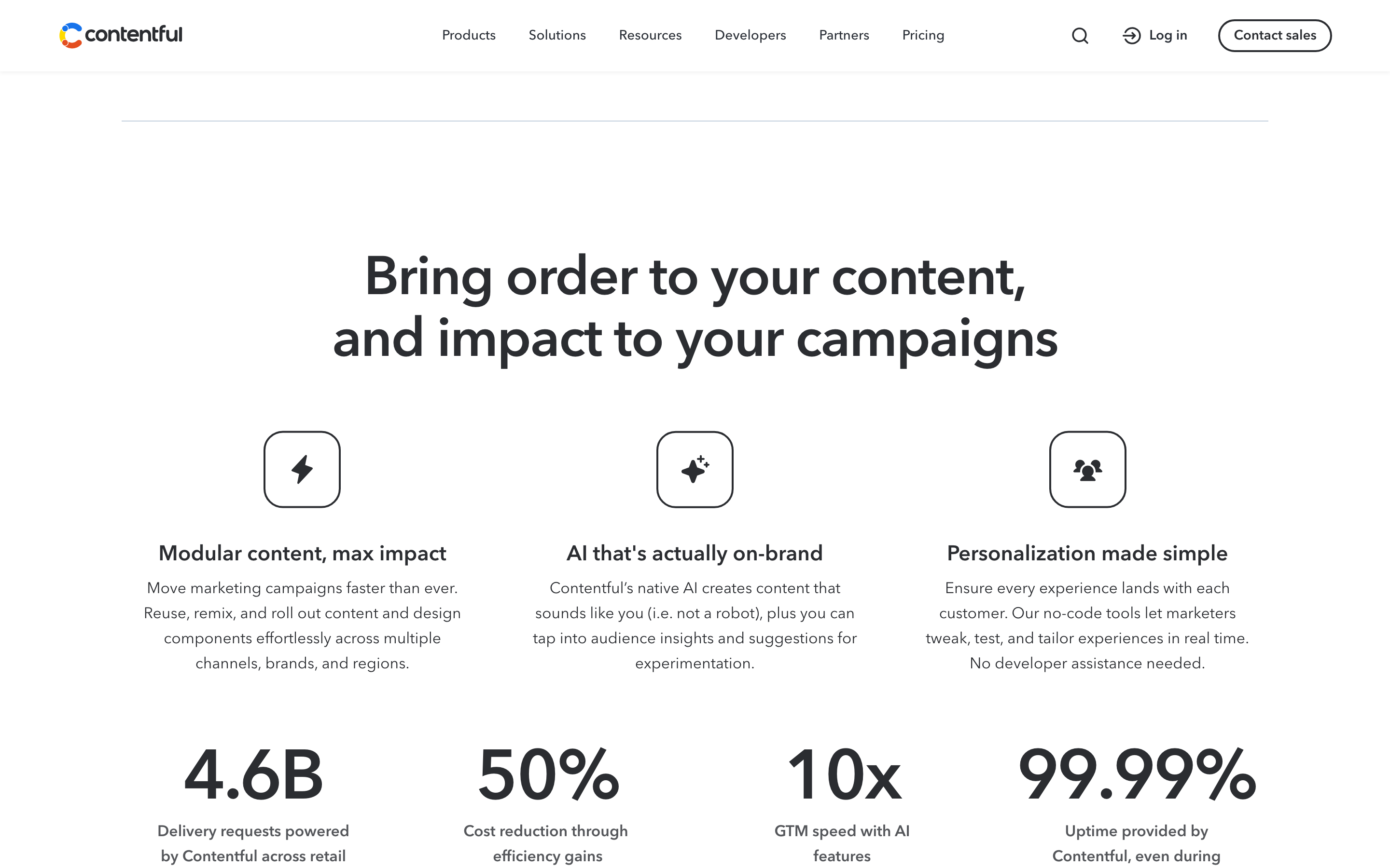
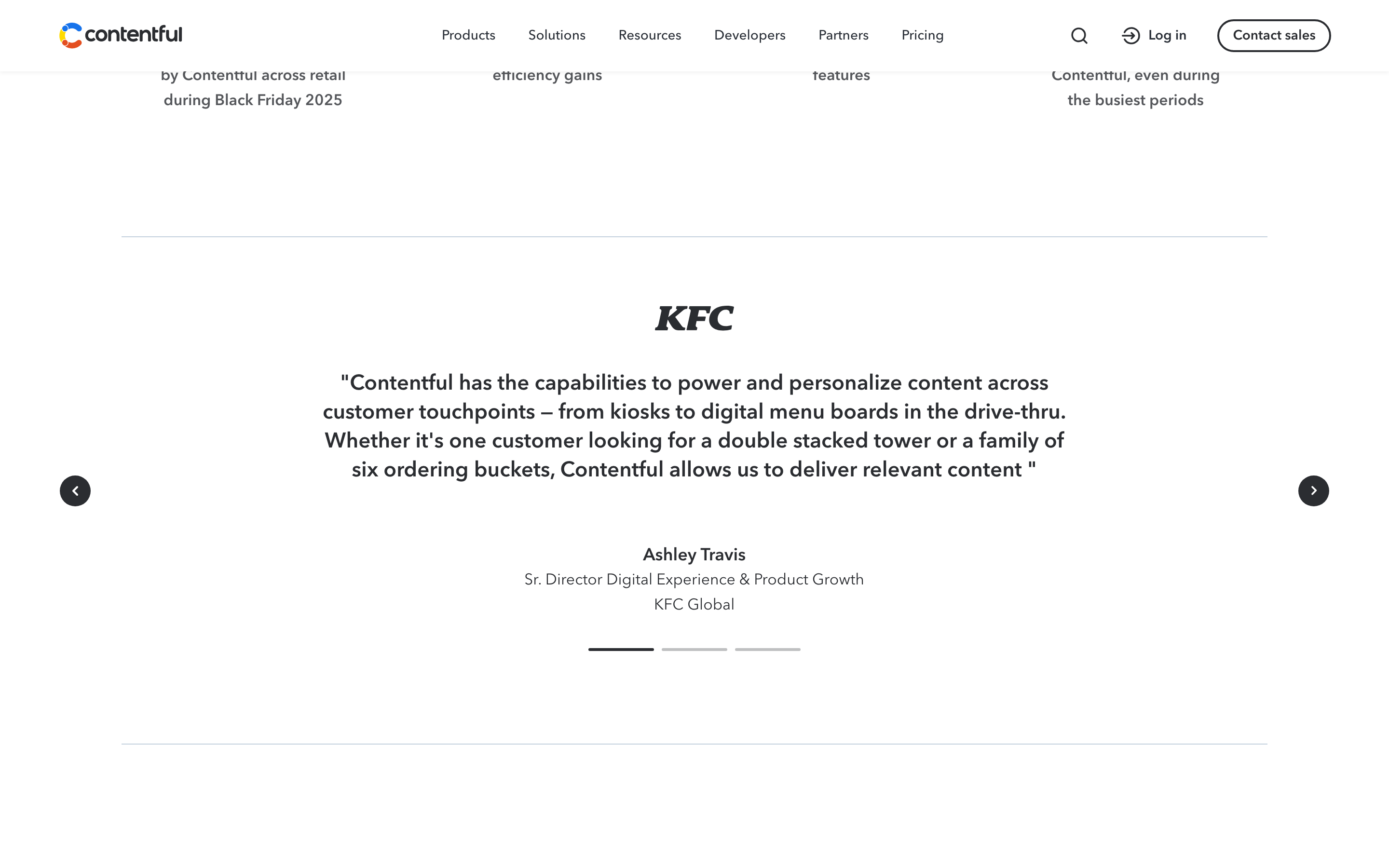
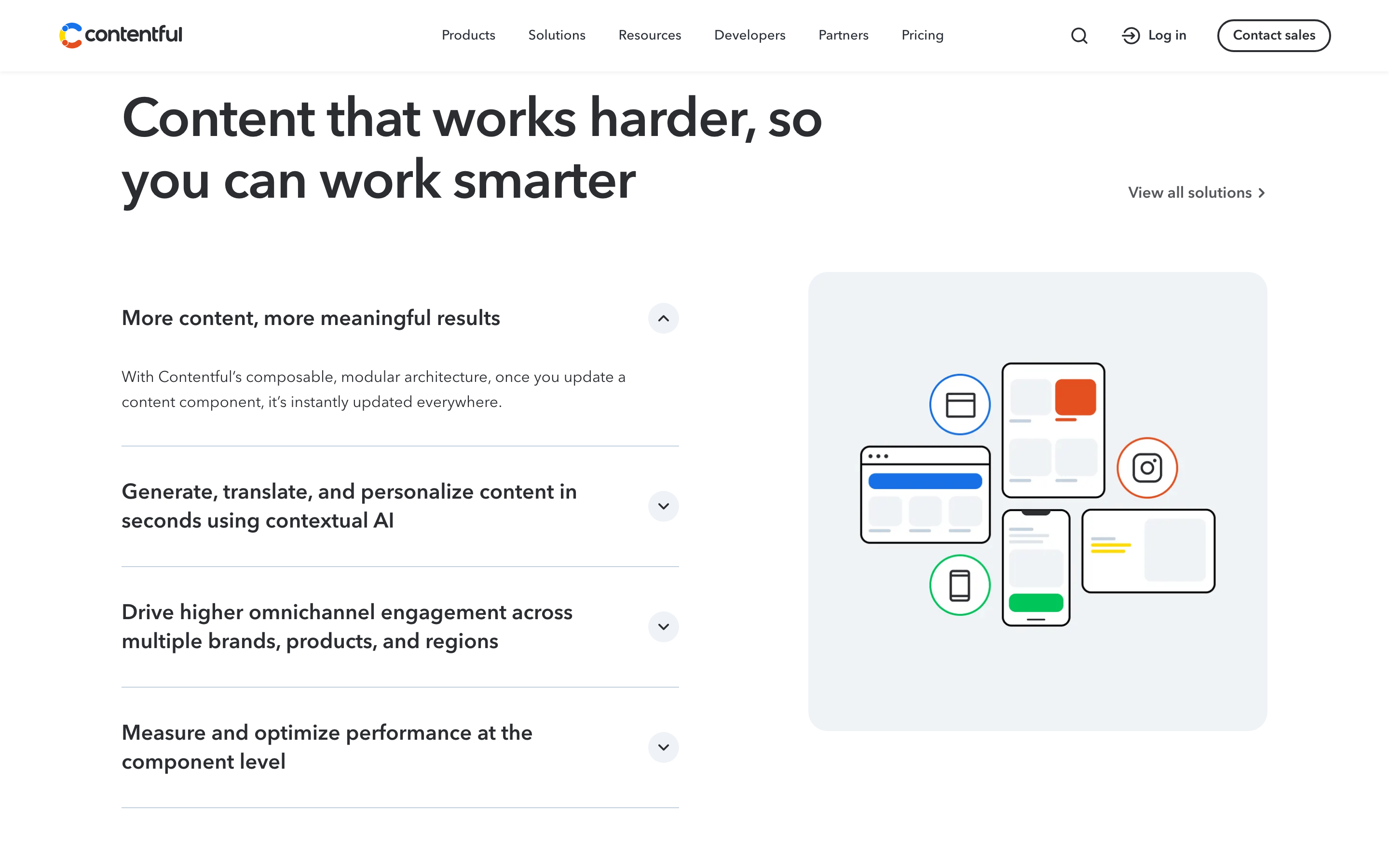
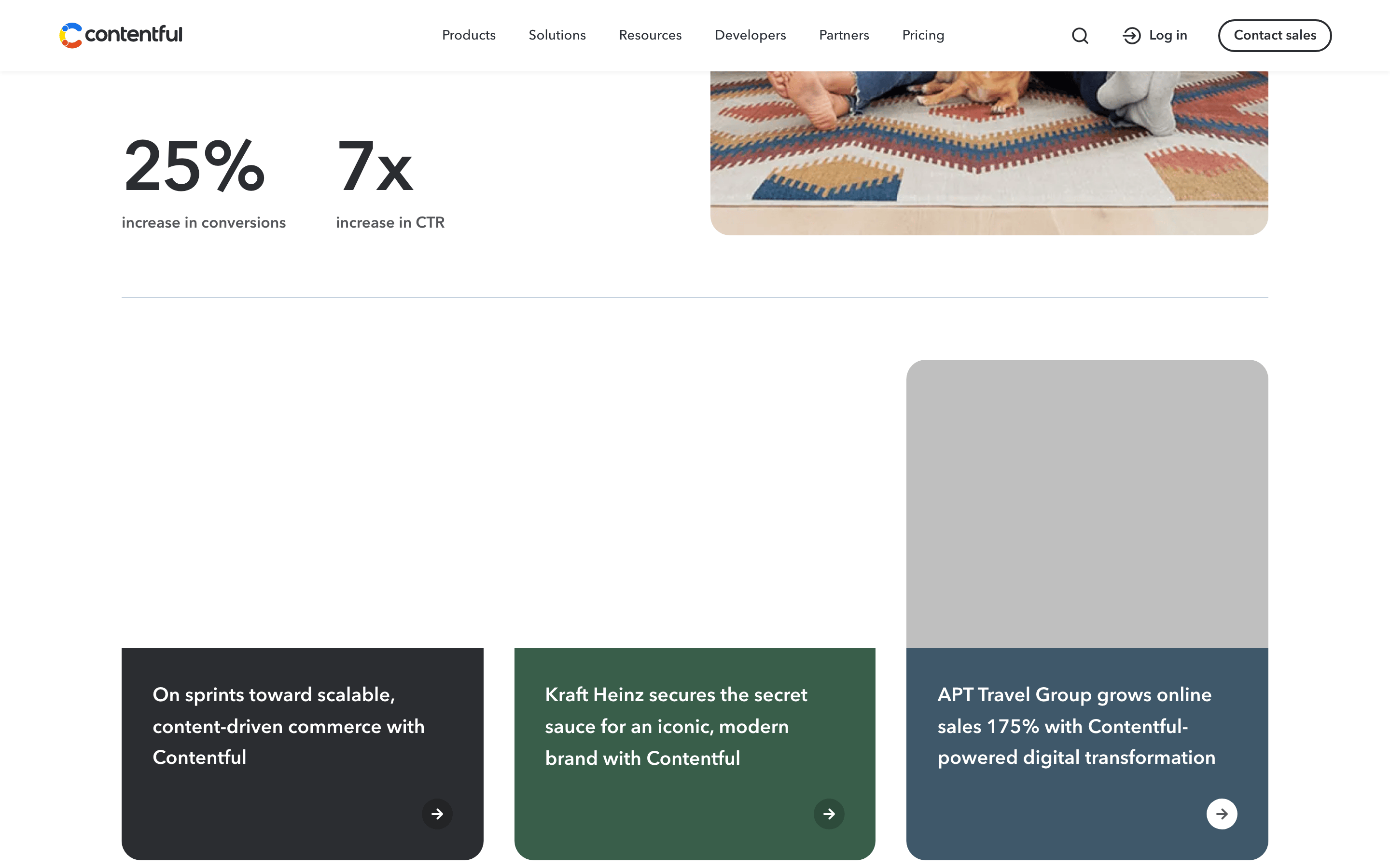
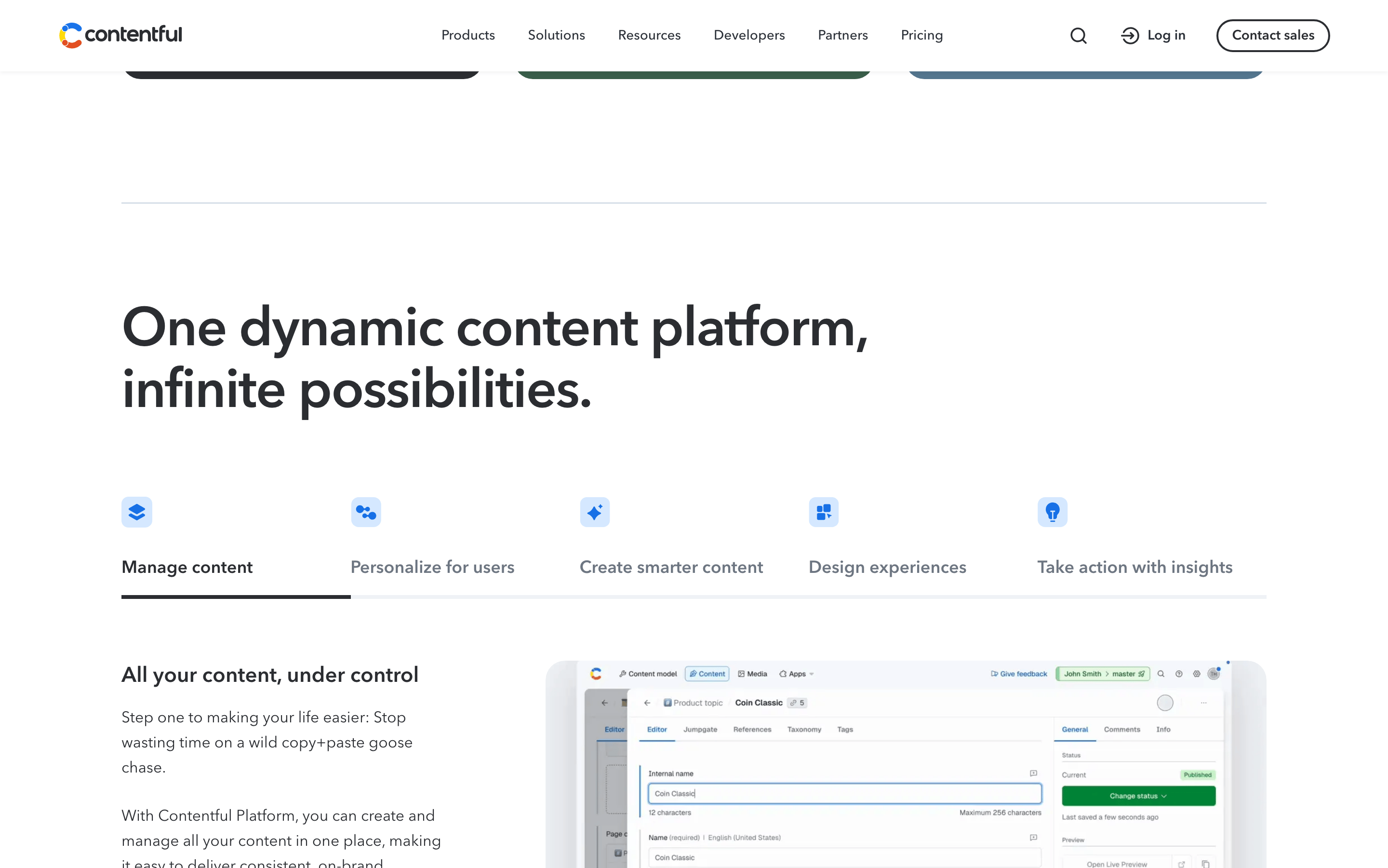
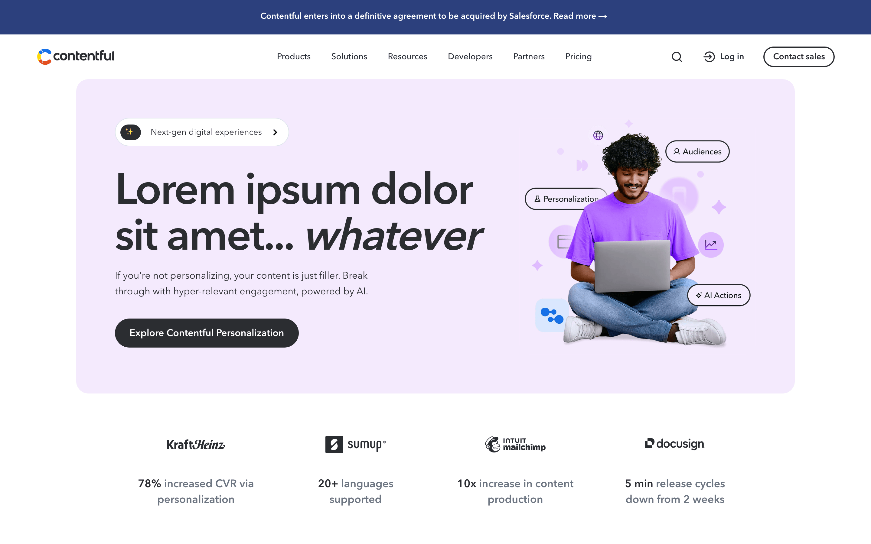
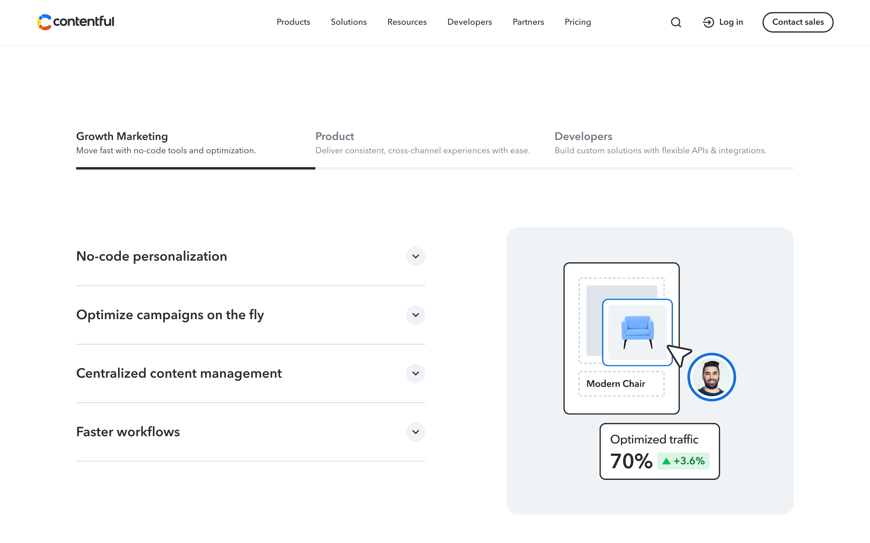
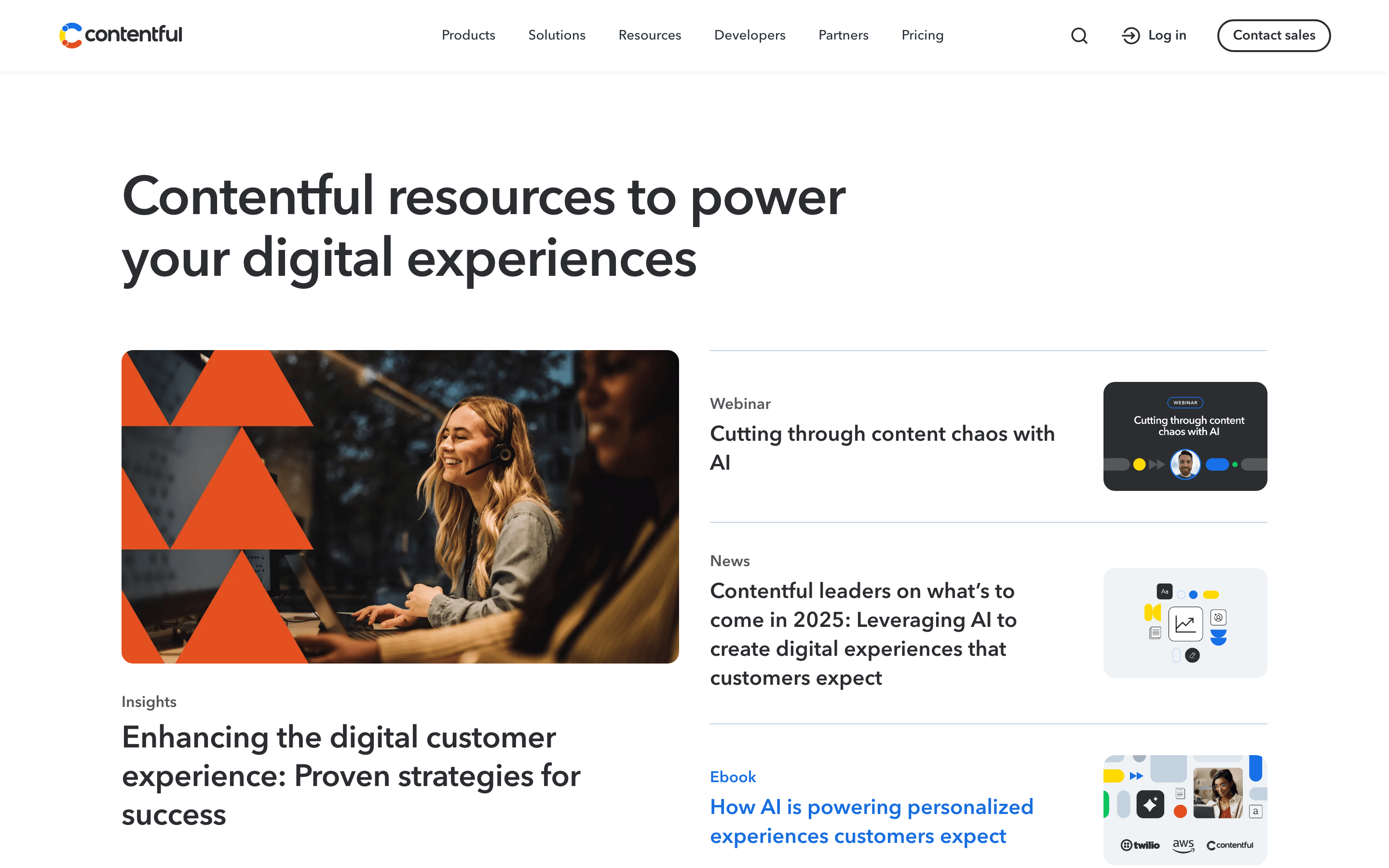
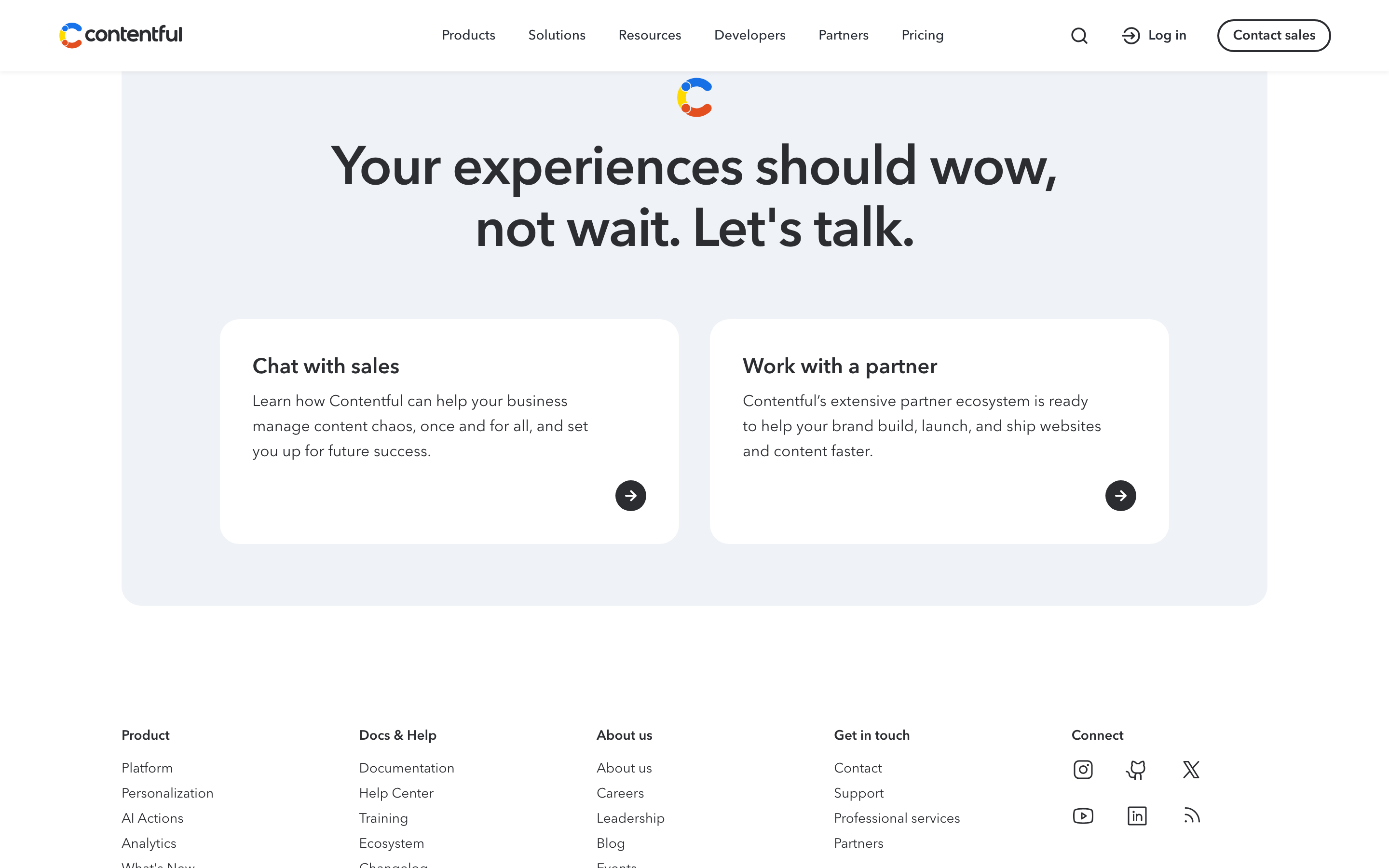
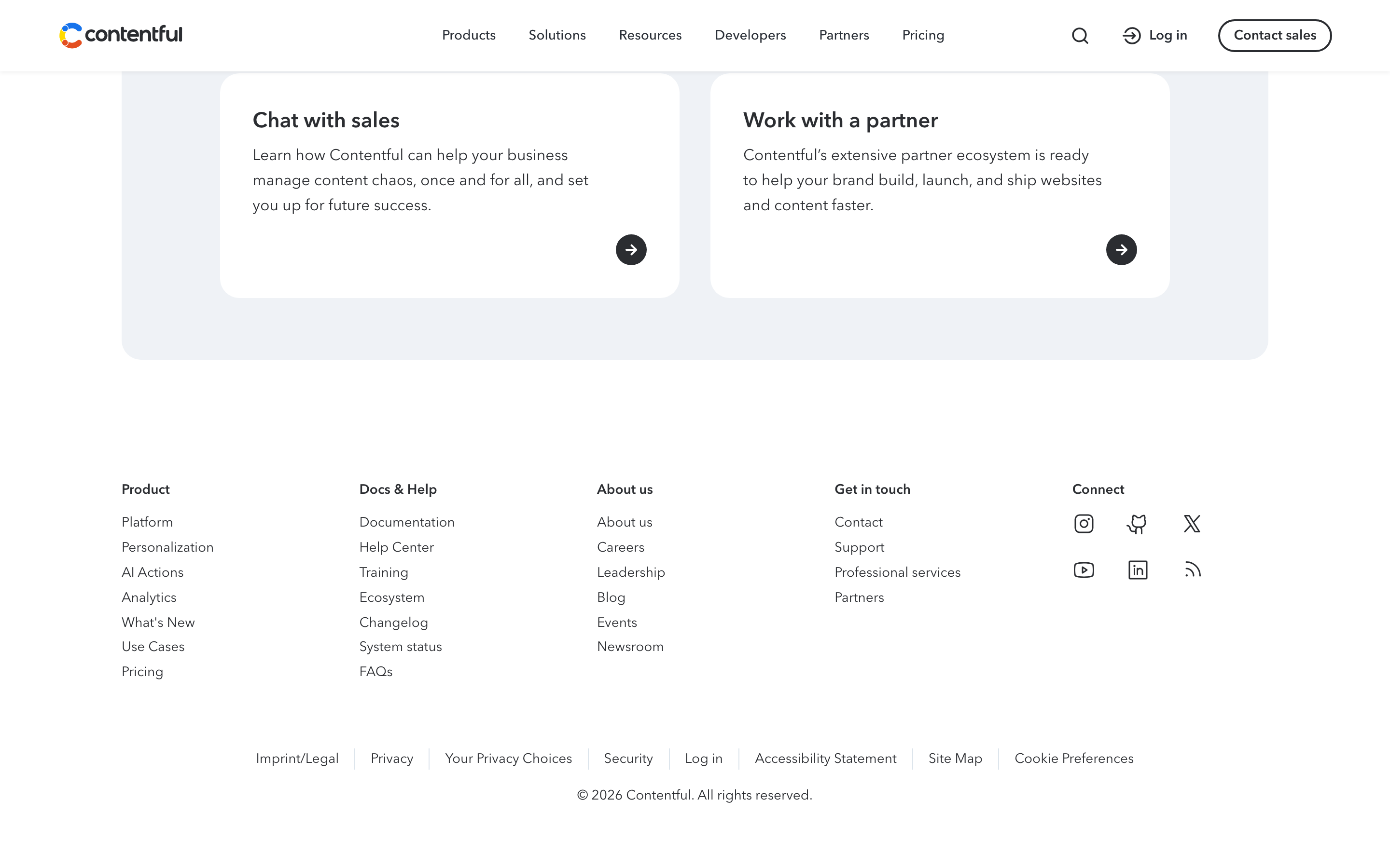
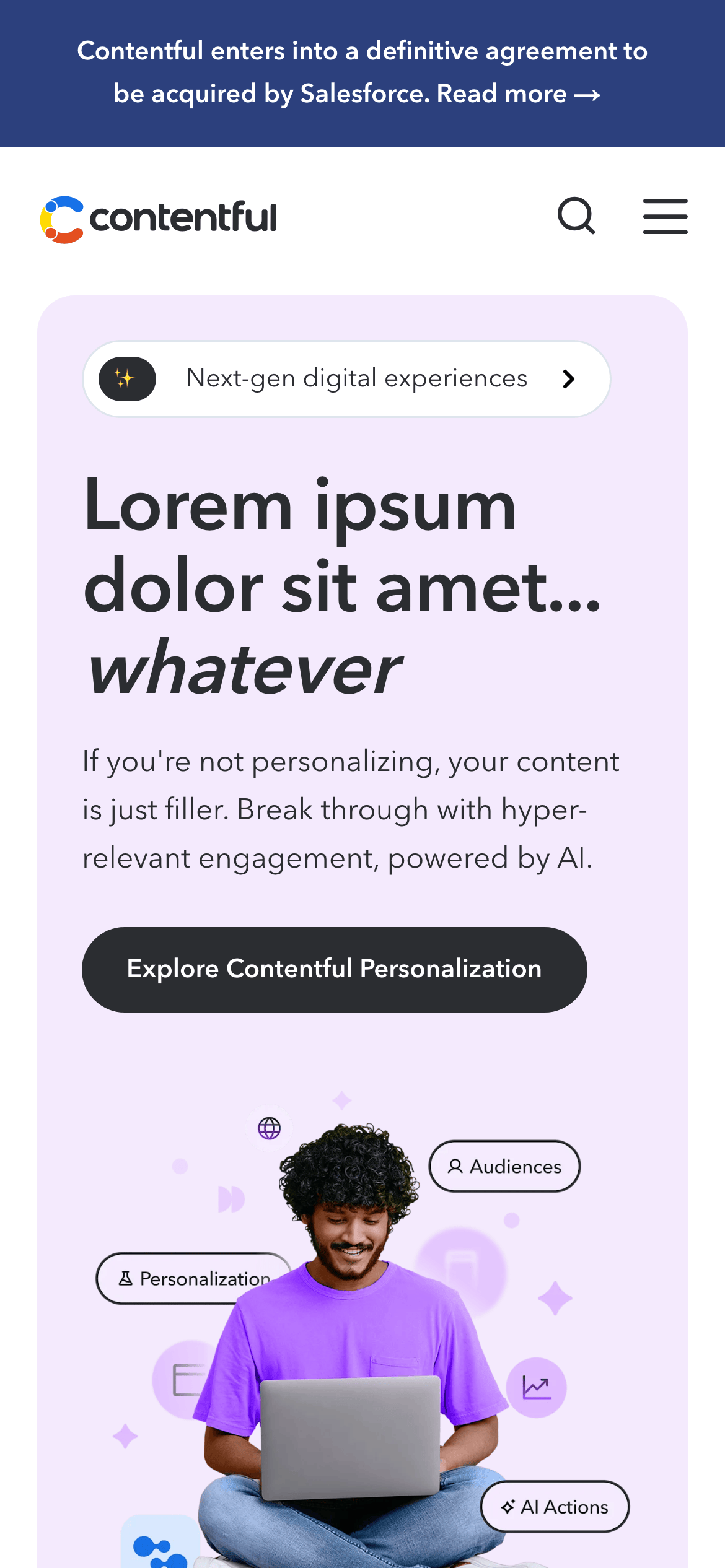
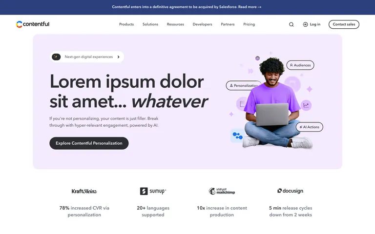
A clean, professional workspace for developers and content teams, emphasizing clarity and efficiency.
02
Color
#3C80CFAccent
#2B2D31Ink
#6D7682Ink soft
#FFFFFFBG
#F5F7F9BG soft
#E4EFF8BG quiet
#55575BMuted
rgba(229, 231, 235, 1)Line
Professional restraint with a soft blue accent palette for clarity and trust.
03
Typography
humanist-sans · monospace
display72px · 400
heading56px · 400
body-lg18px · 400
body16px · 400
small14px · 600
Headlines use tight negative letter spacing for impact. · Body text maintains generous line-height for readability. · Font weights are primarily regular (400) with semibold (600) for UI elements.
04
Spacing
4px
8px
16px
24px
32px
48px
64px
96px
Consistent 32px gap between grid items and sections.
05
Surfaces
sm · 4px
md · 8px
lg · 12px
pill · 999px
1px solid #E5E7EB
rgba(0, 0, 0, 0.25) 0px 0px 20px 0px
06
Layout
1280container
12columns
24pxgutter
768 / 1024breakpoints
Centered content with a wide navigation bar and generous vertical padding.
07
Motion & Interaction
100msmicro
400mssmall
800msmedium
cubic-bezier(0.25, 0.1, 0.25, 1)easing
Smooth color and background-color transitions on hover. · Transform and opacity transitions for UI state changes.
Color changes for text links and background shifts for buttons. · Subtle transform or opacity reduction.
08
Components
buttonPill-shaped primary buttons with solid dark backgrounds and white text, or outlined secondary buttons.
cardClean containers with subtle borders or soft backgrounds, used for features and testimonials.
chipSmall pill-shaped elements with icons for feature tags or navigation.
inputClean, minimal inputs with subtle borders and rounded corners.
heroLarge, impactful headline with a supportive illustration or photo on a soft colored background.
09
Voice & Don'ts
ToneProfessional, confident, and slightly technical, aiming to empower developers and marketers.
HeadlinesDirect, benefit-oriented, and sometimes playful (e.g., 'whatever' in hero).
CTAsAction-oriented verbs like 'Explore', 'Log in', 'Contact sales'.
Don't use serif fonts — screenshot shows a clean humanist sans-serif throughout.
Don't use neon or highly saturated accent colors — screenshot shows a muted, professional blue (#3C80CF) as the primary accent.
Don't use complex gradients in backgrounds — screenshot shows mostly solid white or very soft, flat colored sections (#F5F7F9, #E4EFF8).
Don't use heavy, dark borders everywhere — screenshot shows light, subtle borders (#E5E7EB) or borderless designs.
Don't use extremely tight line spacing for body text — screenshot shows comfortable, readable line heights (approx 1.55).
Don't use sharp, 90-degree corners on buttons or cards — screenshot shows consistently rounded corners (4px to 999px).
Captured from the live site · real computed styles
11
System prompt
This is the Contentful homepage, a professional SaaS platform for enterprise content management. The design is clean, restrained, and focused on clarity. Key colors include a white background (#FFFFFF), soft grey sections (#F5F7F9), and a primary blue accent (#3C80CF). Typography uses a humanist sans-serif (Avenir Next) with large, tightly-spaced display headlines and comfortable body text. Key donts: don't use serif fonts, don't use neon colors, don't use heavy dark borders, don't use sharp corners, don't use tight body text spacing, and don't use complex background gradients.
Bring this taste to your agent
Hand your AI agent a machine-readable spec of this design — tokens, type, motion, the whole DNA.