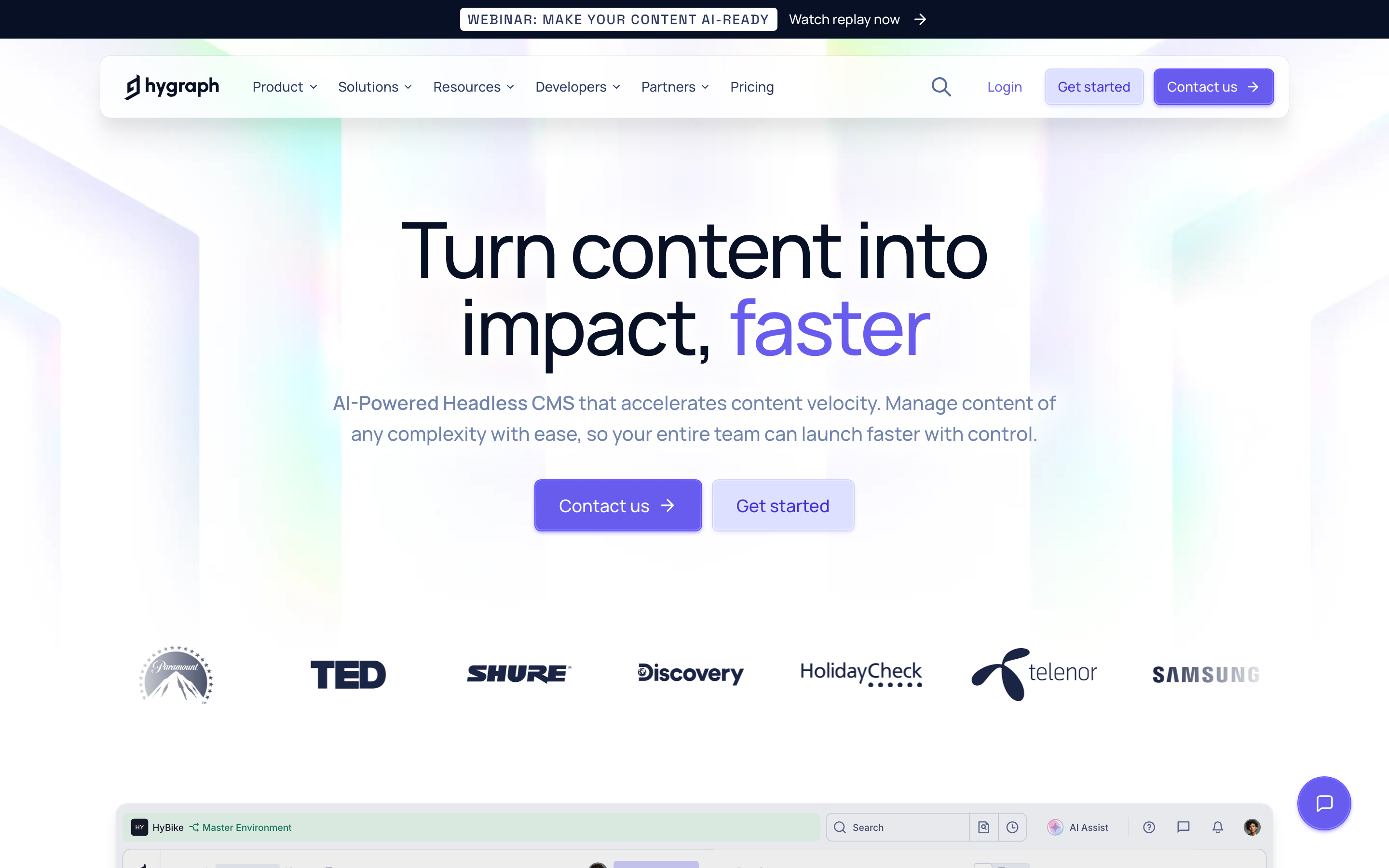
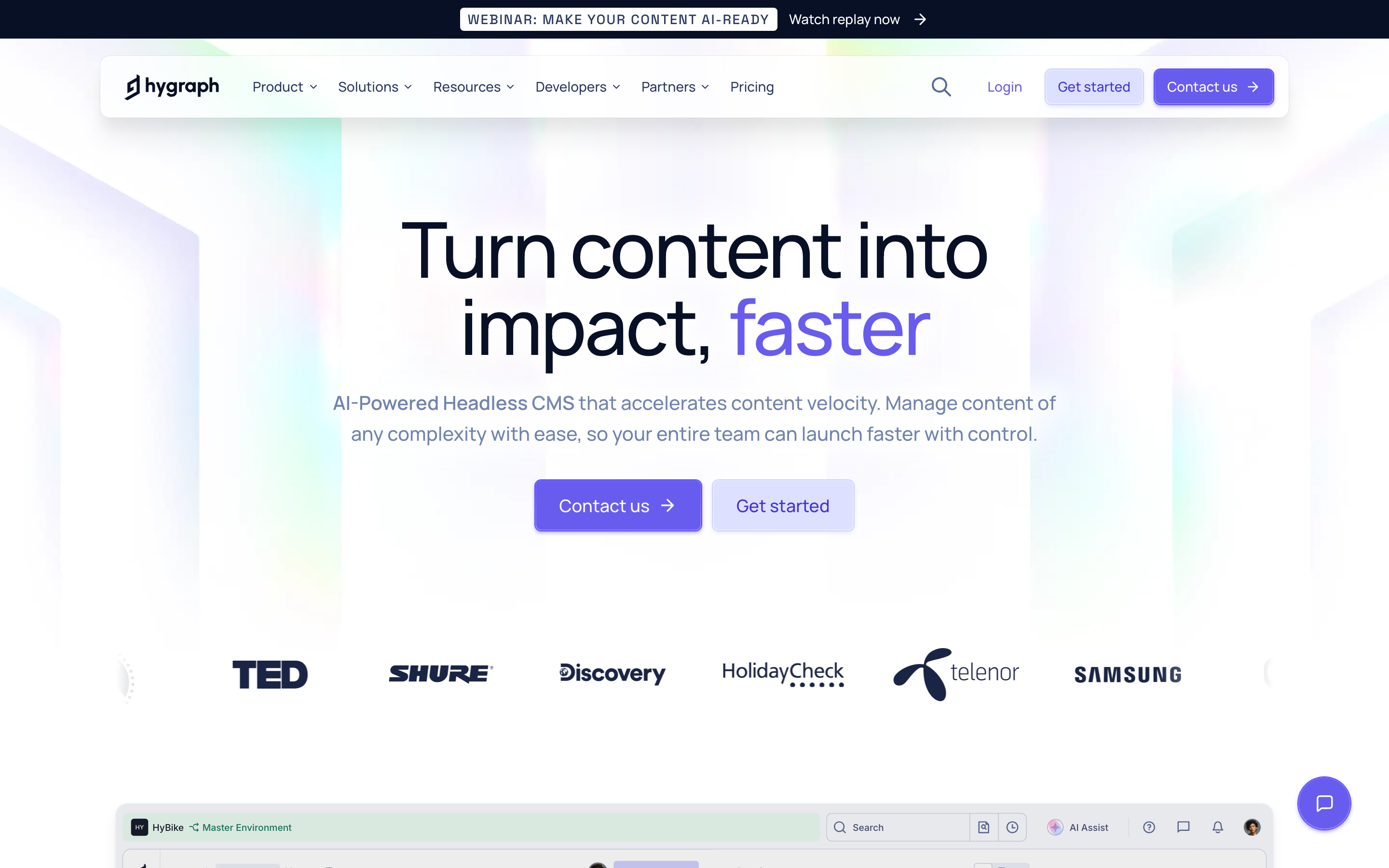
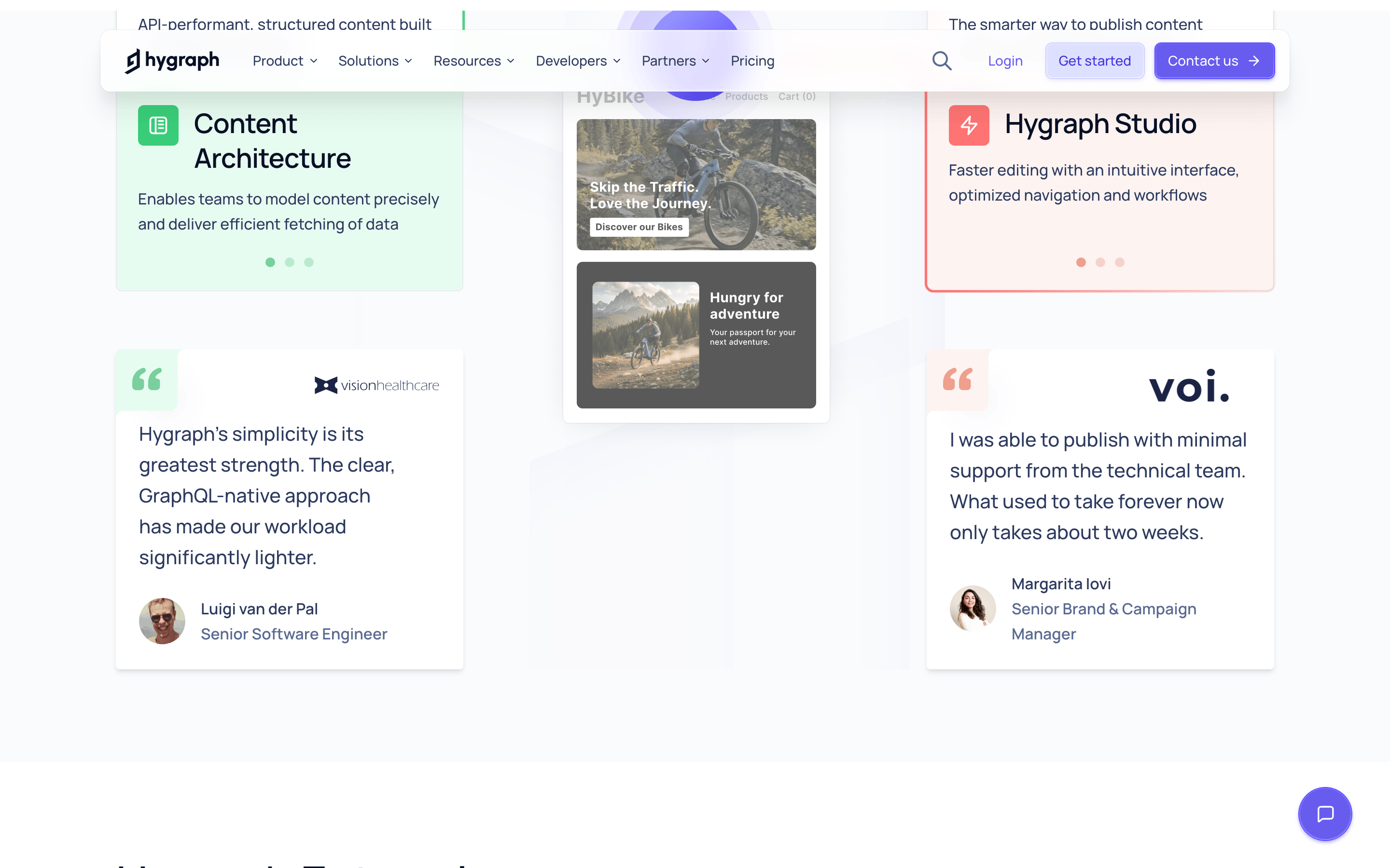
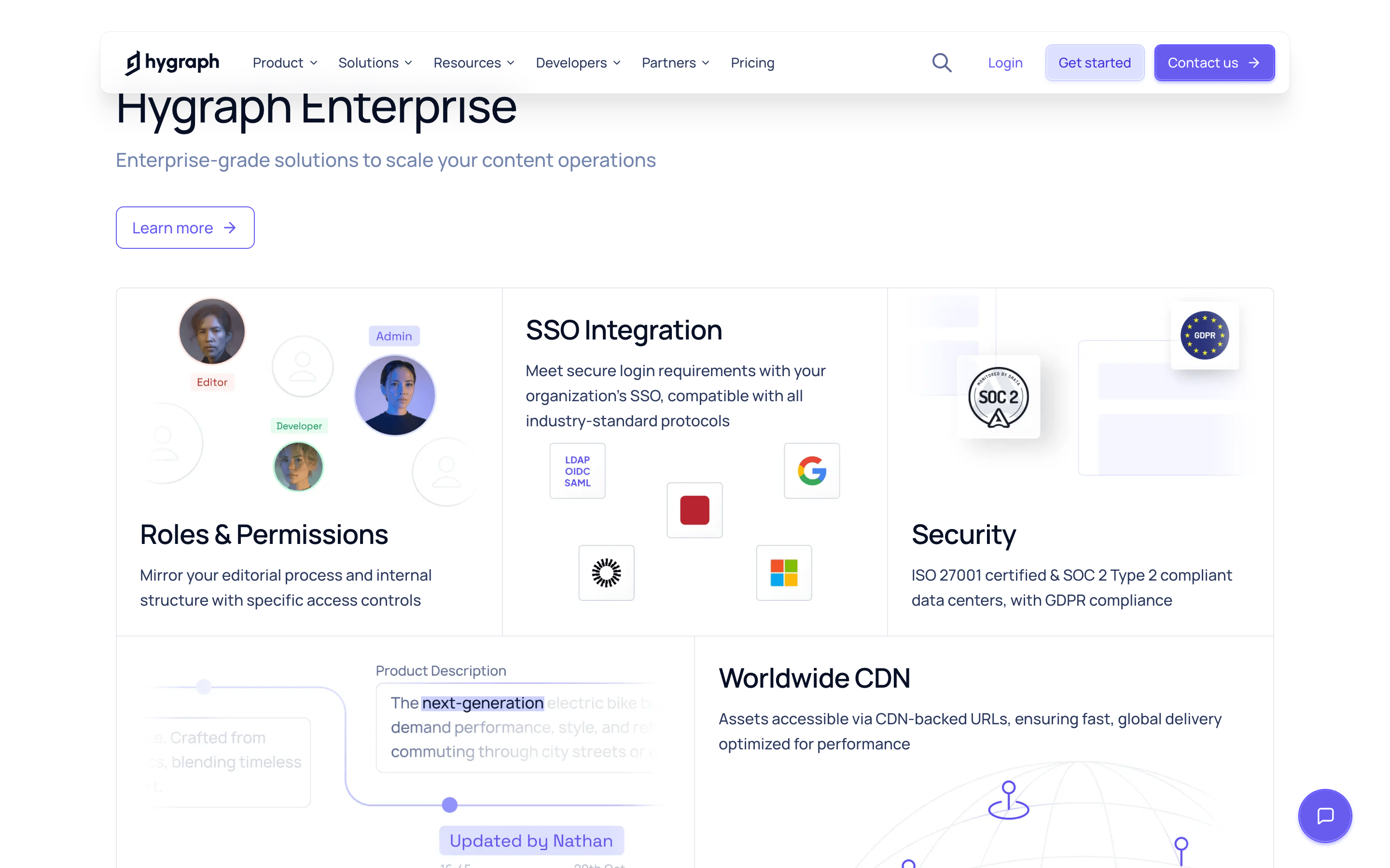
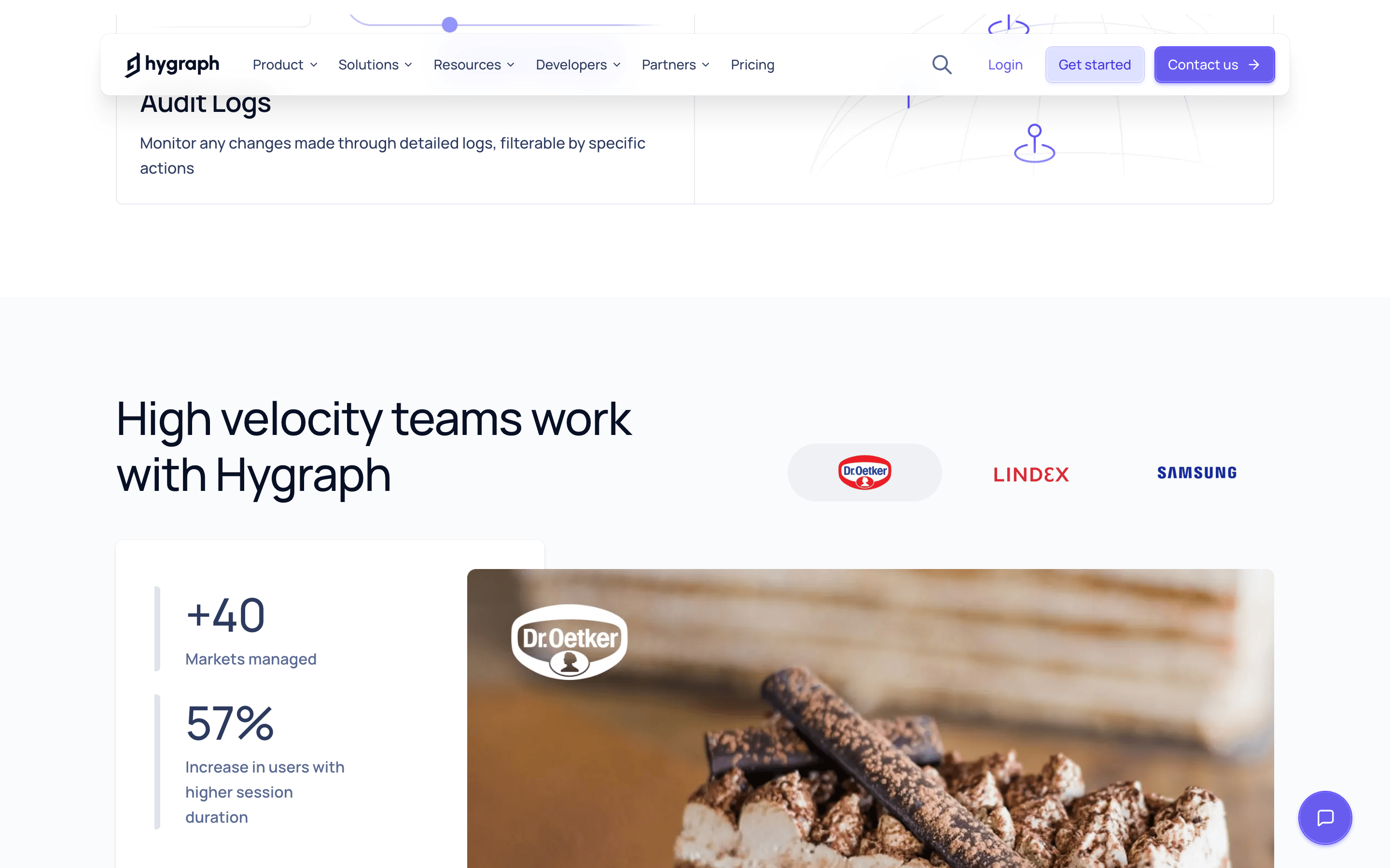
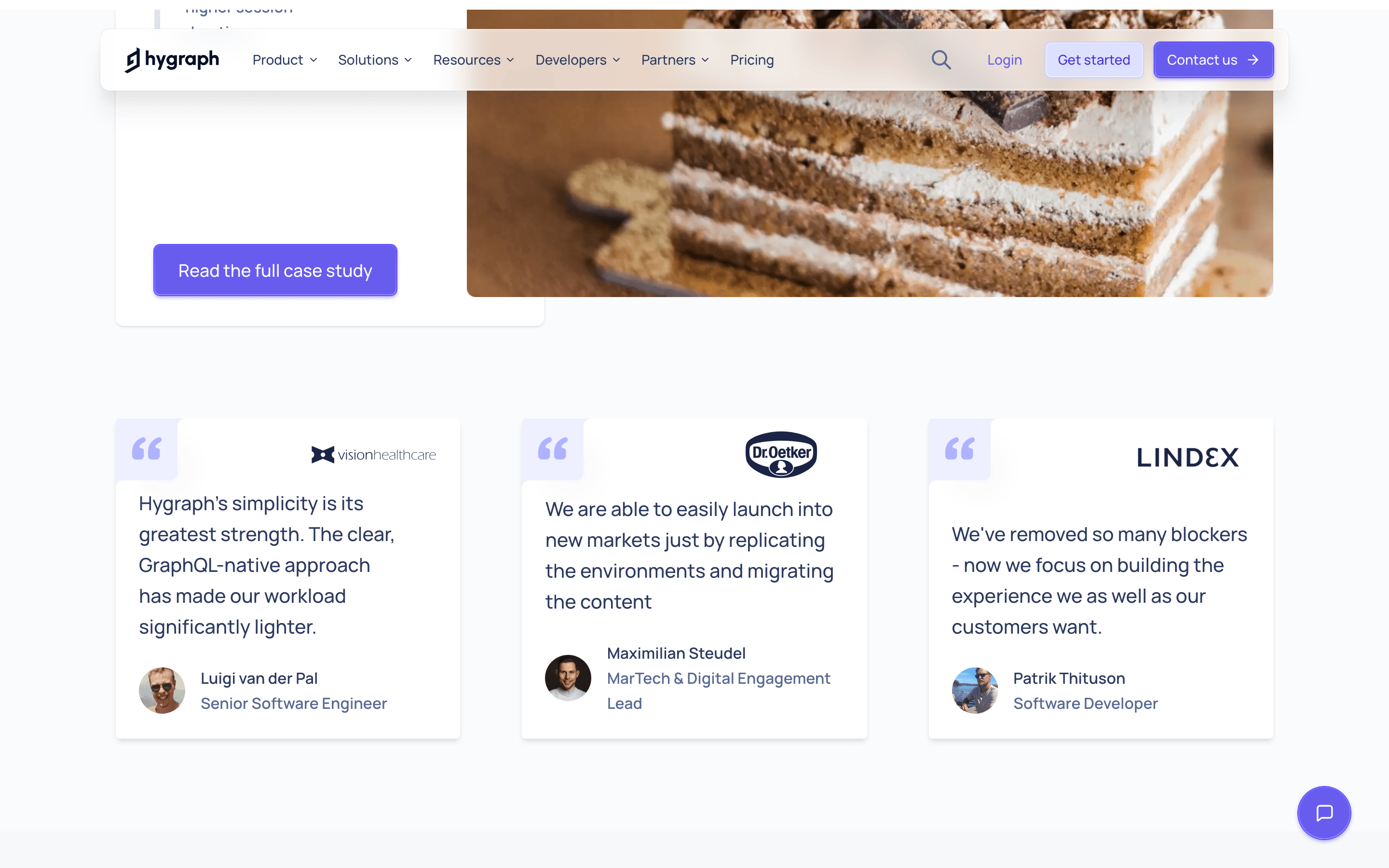
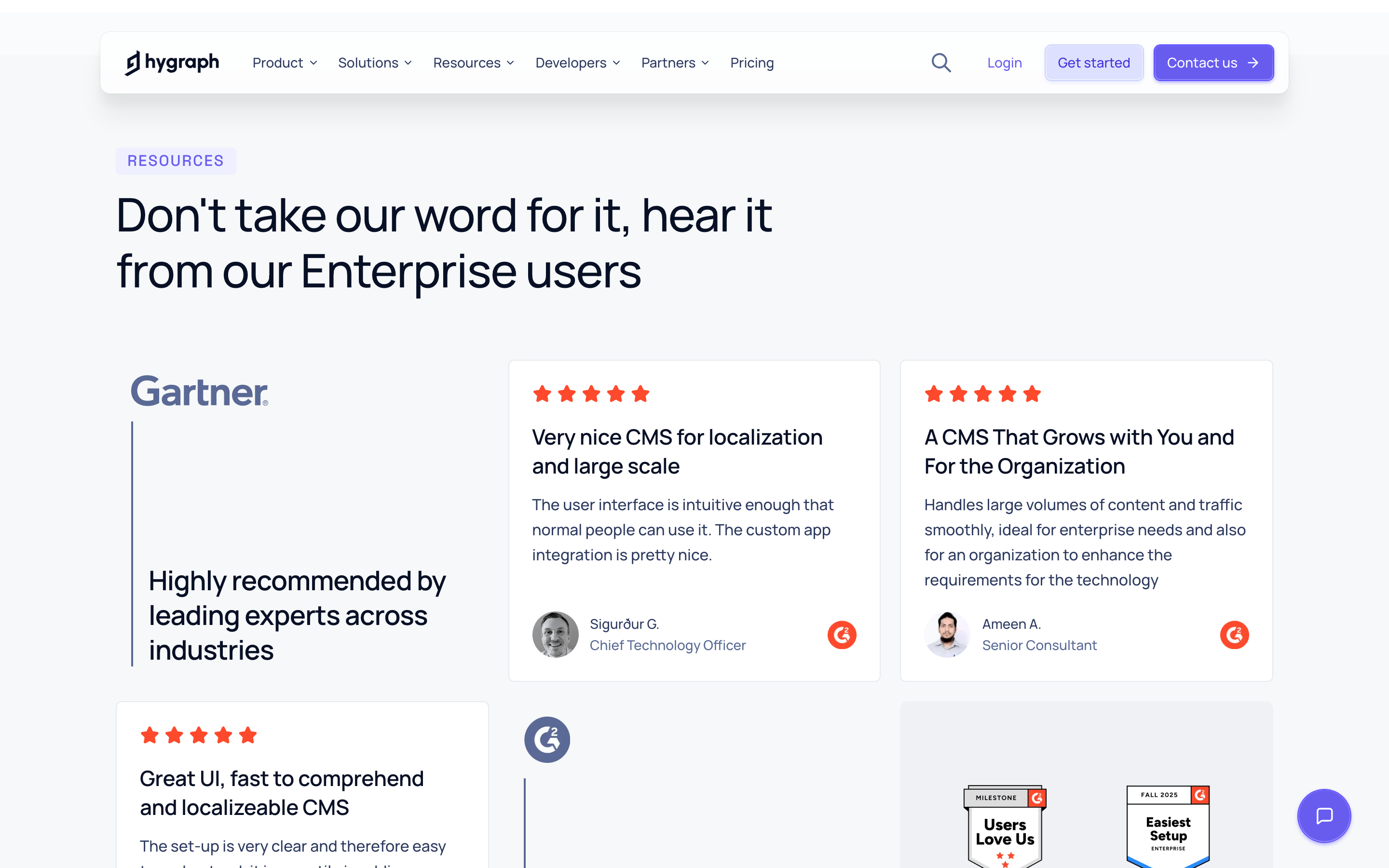
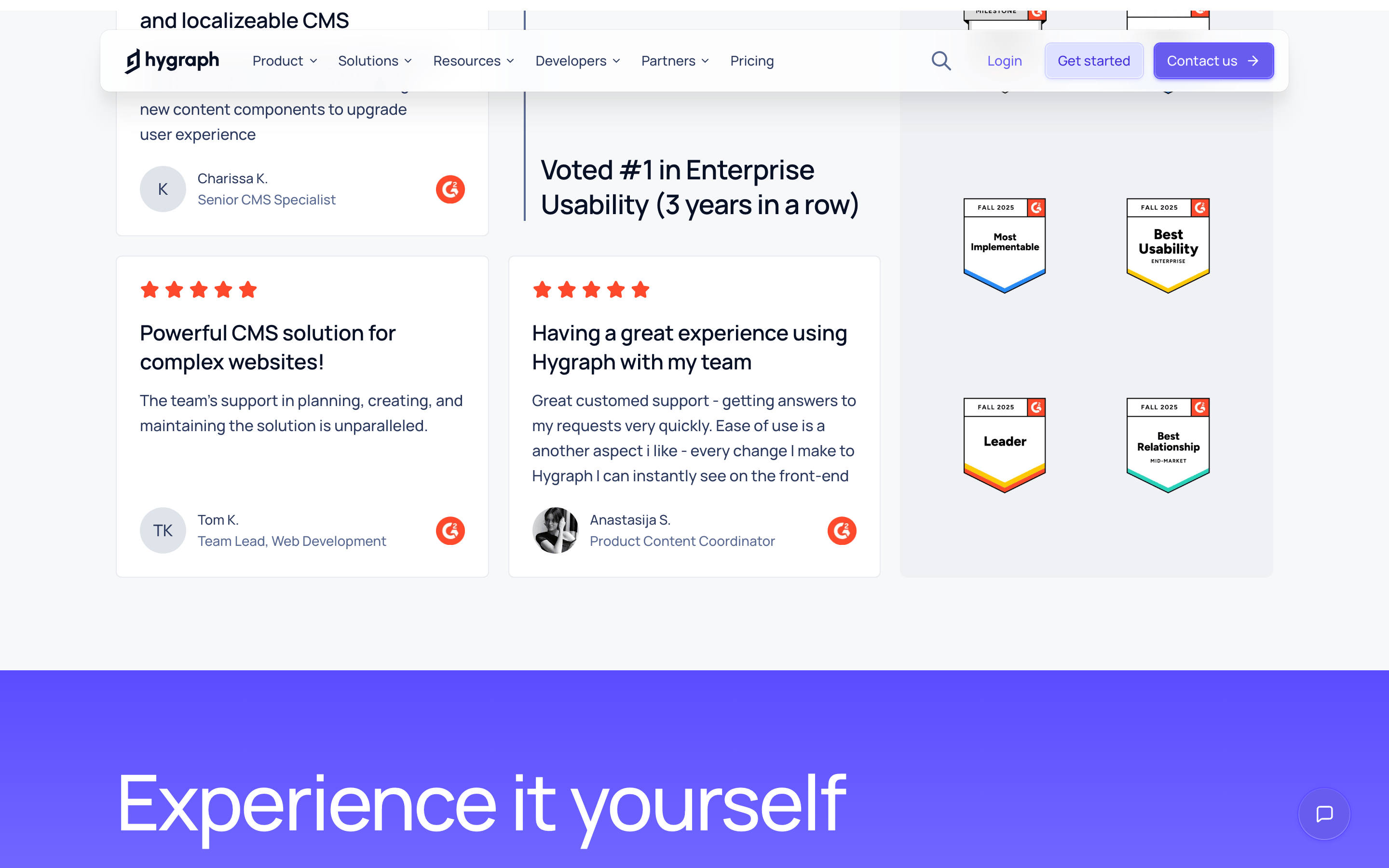
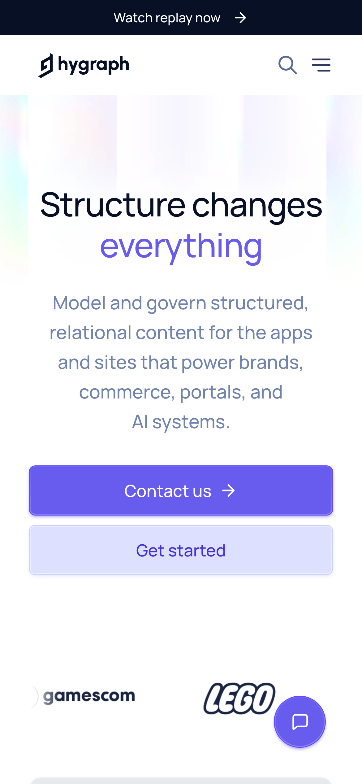
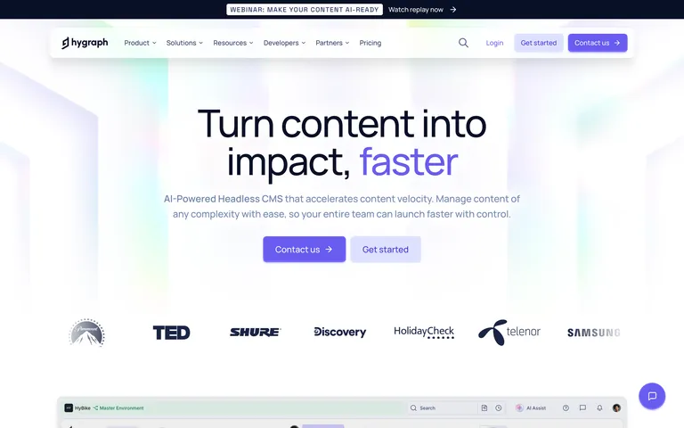
A high-performance engine for enterprise content operations.
02
Color
#685CEFAccent
#081026Ink
#2D3A5FInk soft
#FFFFFFBG
#F6F8F9BG soft
#E7EAEFBG quiet
#566A95Muted
rgba(231, 234, 239, 1.0)Line
Clean and professional with a vibrant purple accent to highlight key actions and state changes.
03
Typography
geometric-sans · humanist-sans · monospace
display56px · 500
headline40px · 500
subtitle20px · 400
body16px · 400
label14px · 500
Headlines use a geometric sans font for a modern, structured look. · Body text uses a humanist sans font for high readability. · Monospace font (Space Grotesk) is used for code snippets and technical details. · Uppercase text is used sparingly for labels and navigation elements. · Letter spacing is slightly increased for uppercase text to improve legibility.
04
Spacing
4px
8px
12px
16px
24px
32px
48px
64px
96px
A 4px base grid is used consistently for padding, margins, and layout spacing.
A standard 12-column grid system with a maximum width of 1280px and responsive breakpoints at 768px and 1024px.
07
Motion & Interaction
150msmicro
300mssmall
800msmedium
cubic-bezier(0.4, 0, 0.2, 1)easing
A subtle spring animation (cubic-bezier(0.18, 0.89, 0.31, 1.57)) is used for bouncy hover states on interactive elements. · Smooth transitions (0.15s) are used for color, background-color, and border-color changes. · Opacity fades (0.3s) are used for revealing elements.
Interactive elements like buttons and links have subtle color or background changes on hover, often accompanied by a subtle spring animation. · Clicking an element may trigger a slight transform or color change to provide feedback.
08
Components
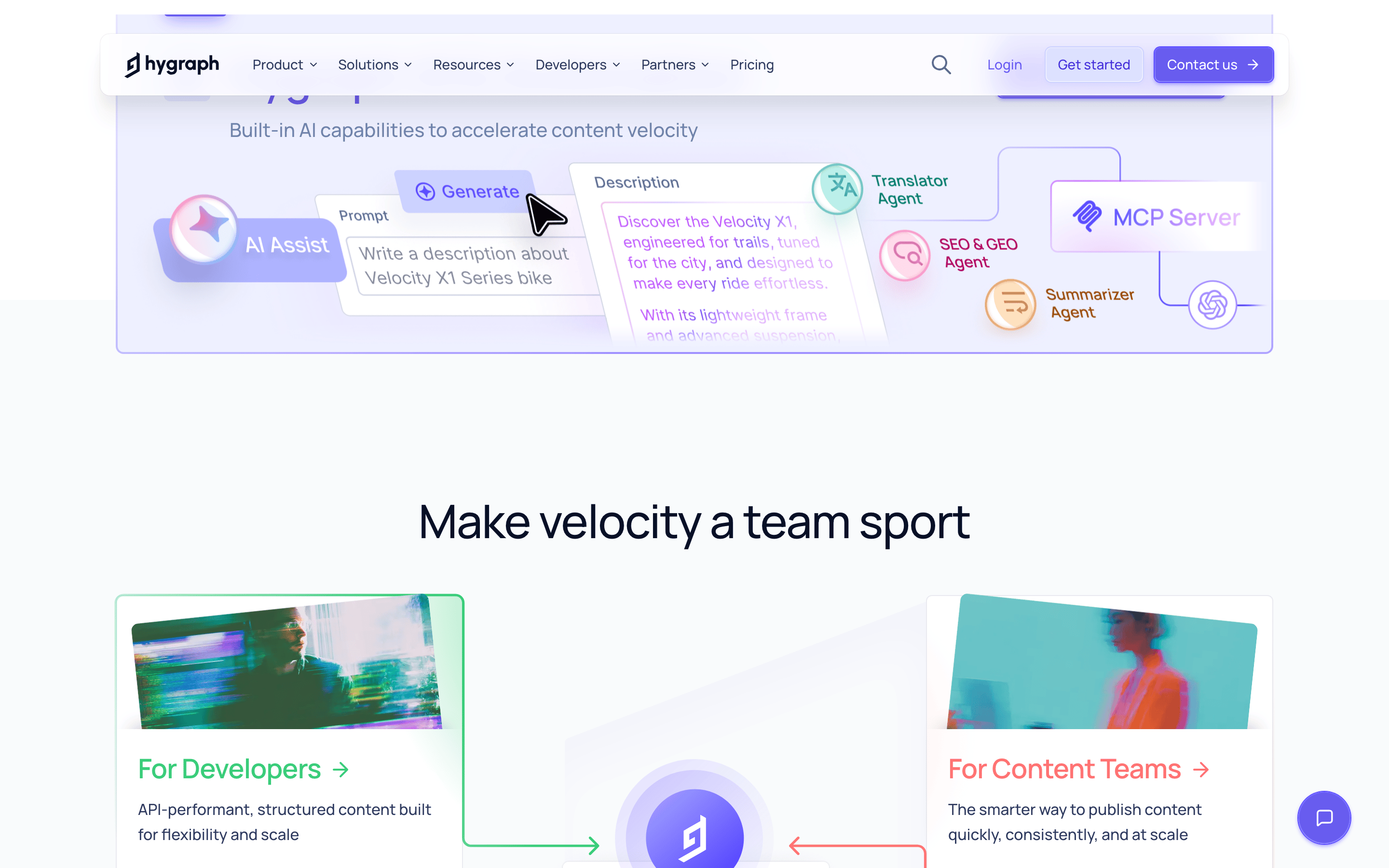
buttonPrimary buttons are pill-shaped (9999px radius) with a solid purple background (#685CEF) and white text. Secondary buttons have a light lavender background (#E8E9FF) and purple text.
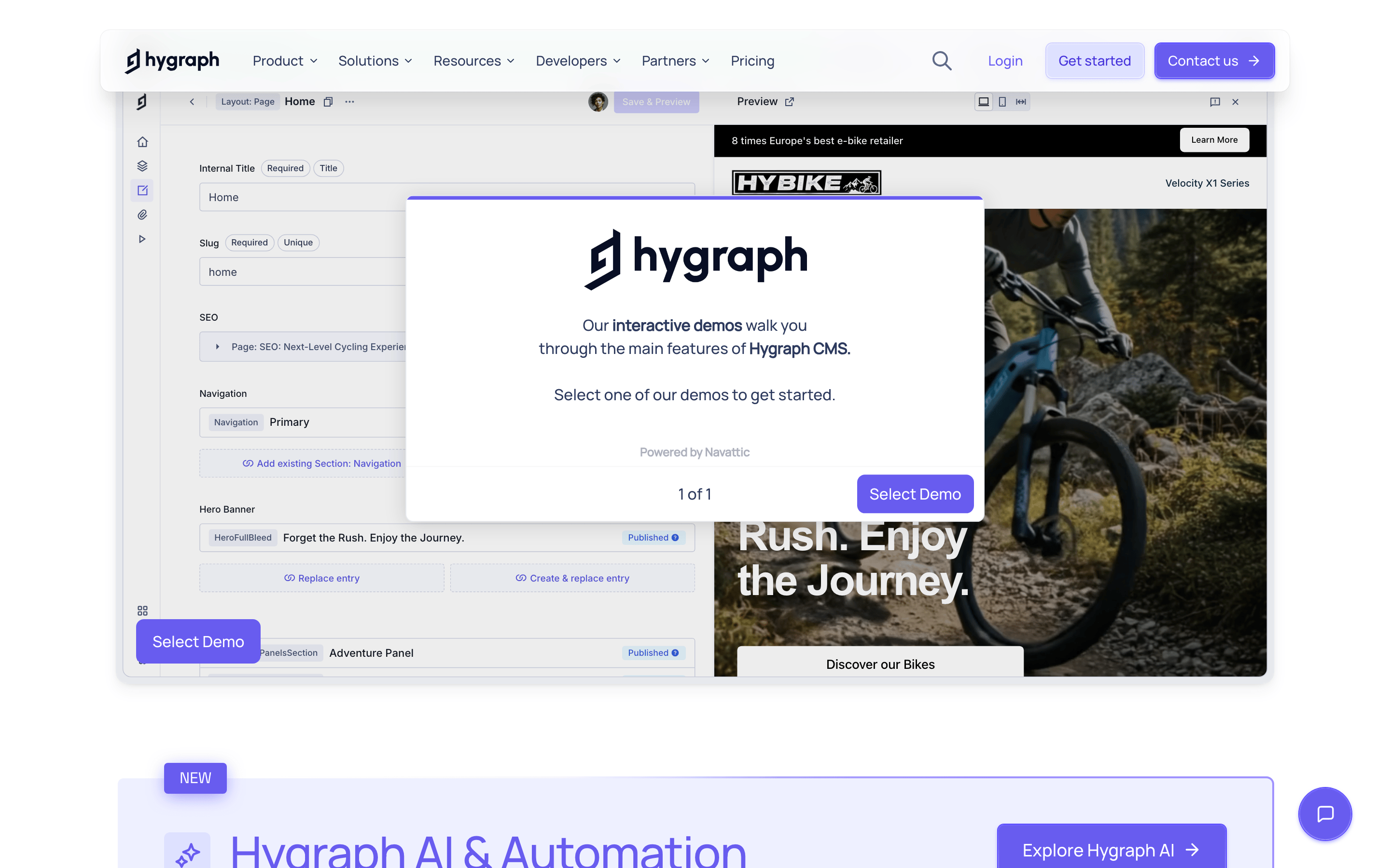
cardCards are simple containers with a subtle border, white background, and minimal shadow.
chipSmall, pill-shaped elements used for tags or labels, often with a light background and subtle border.
inputText inputs have a subtle border, rounded corners, and a clean white background.
heroA large, centered hero section with a prominent headline, subtext, and a clear call-to-action.
09
Voice & Don'ts
ToneProfessional, confident, and forward-thinking.
HeadlinesLarge, impactful headlines that state a clear value proposition.
CTAsDirect and action-oriented, such as 'Contact us' or 'Get started'.
Don't use harsh, high-saturation colors outside the established purple palette.
Don't use a heavy, blackletter or highly decorative font for headlines.
Don't use a fully dark mode theme, as the screenshot shows a light, airy interface.
Don't use sharp, 90-degree corners on buttons or cards, as the design favors softer, rounded shapes.
Don't use dense, multi-column text layouts for main content, as the design favors clean, centered reading paths.
Don't use large, complex background images that compete with the text content.
Captured from the live site · real computed styles
11
System prompt
You are designing a professional, enterprise-focused B2B SaaS website for an AI-powered headless CMS. The design should be clean, airy, and trustworthy, using a white background with a primary purple accent (#685CEF) to drive calls to action. Typography is a mix of a geometric sans for headlines and a humanist sans for body text, both highly legible. Key elements include rounded buttons (pill-shaped), subtle shadows, and a generous amount of white space. Do not use a dark mode, do not use sharp corners on interactive elements, and do not use dense, cluttered layouts. The overall feeling should be one of precision, efficiency, and modern technology.
Bring this taste to your agent
Hand your AI agent a machine-readable spec of this design — tokens, type, motion, the whole DNA.