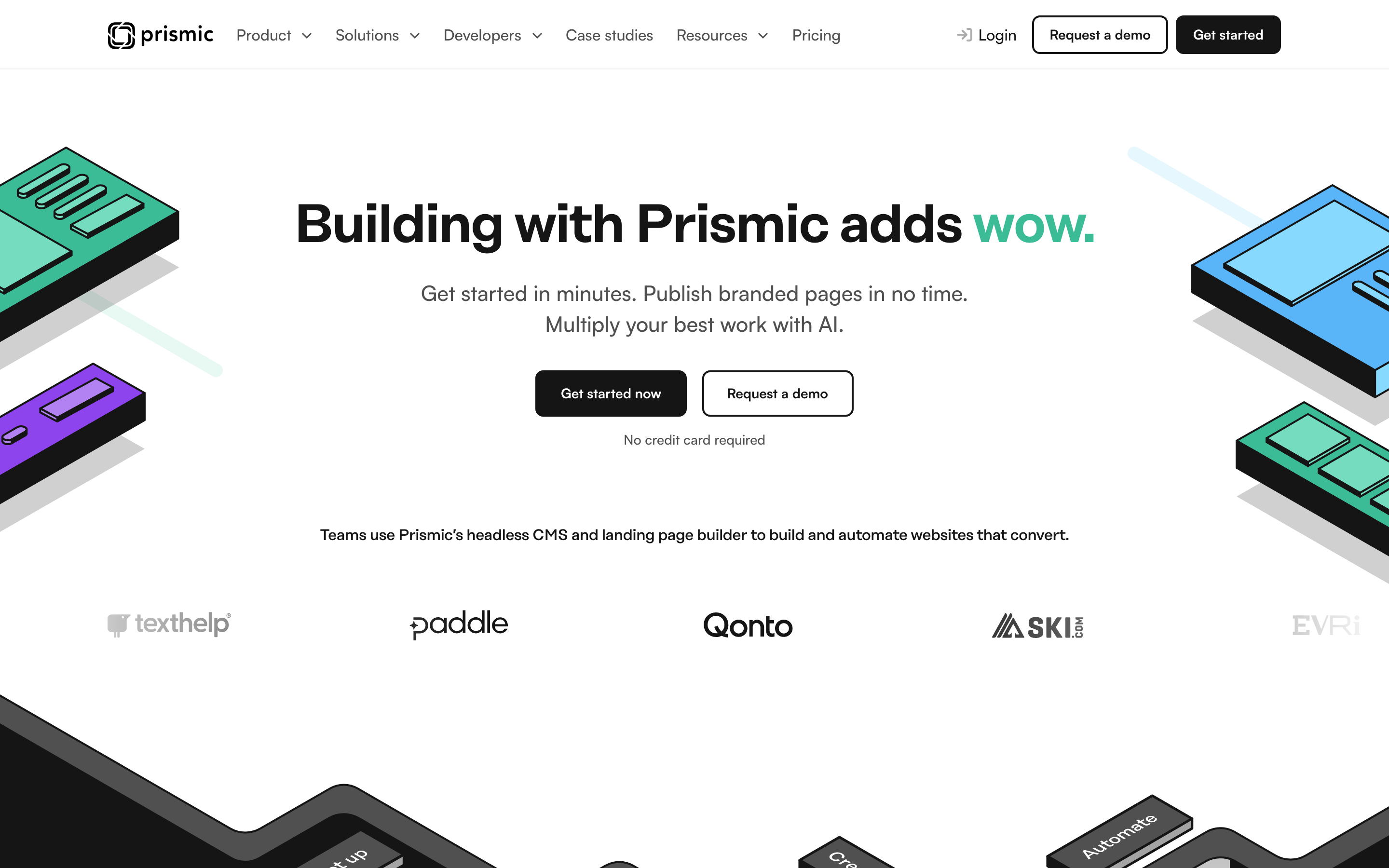
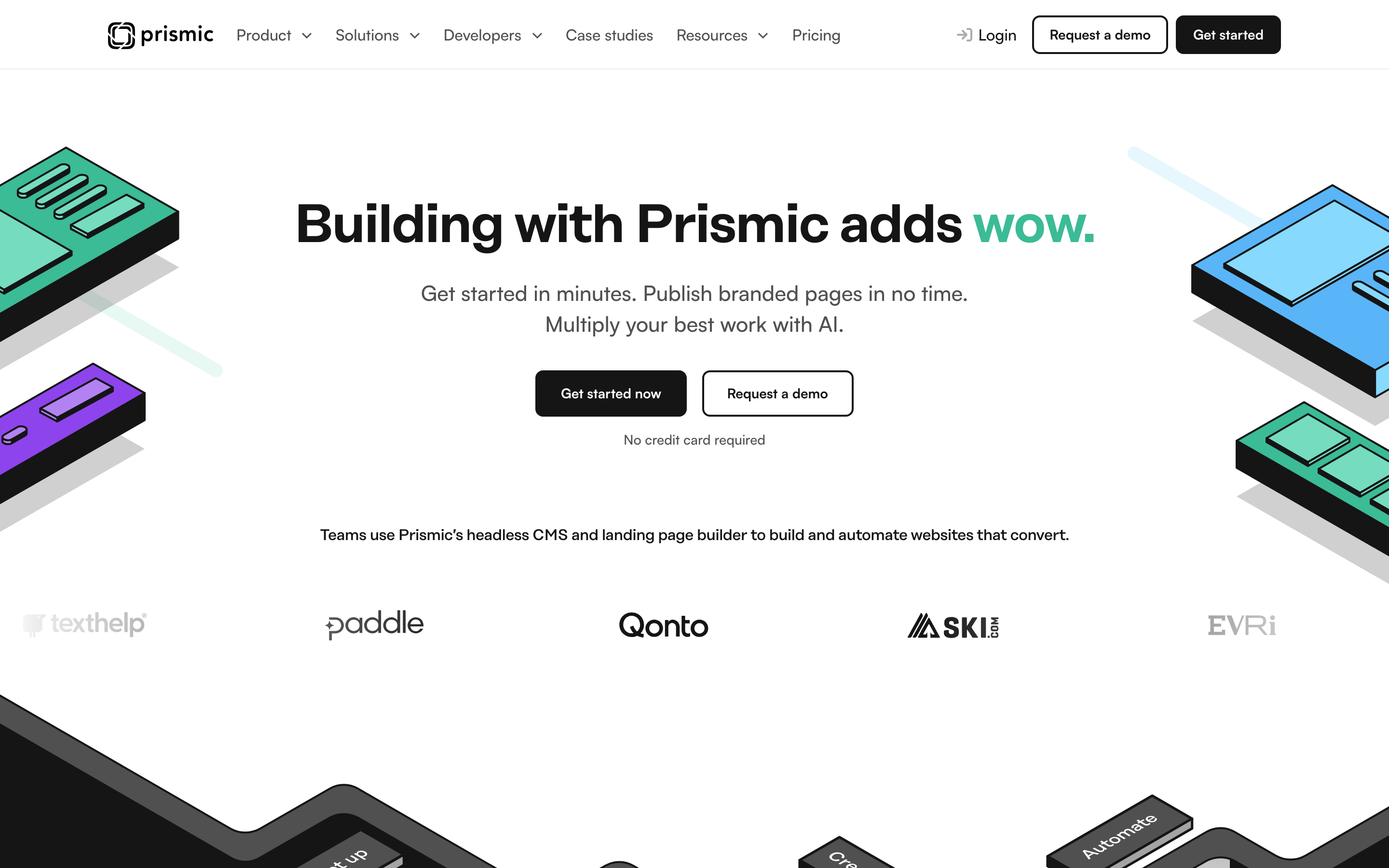
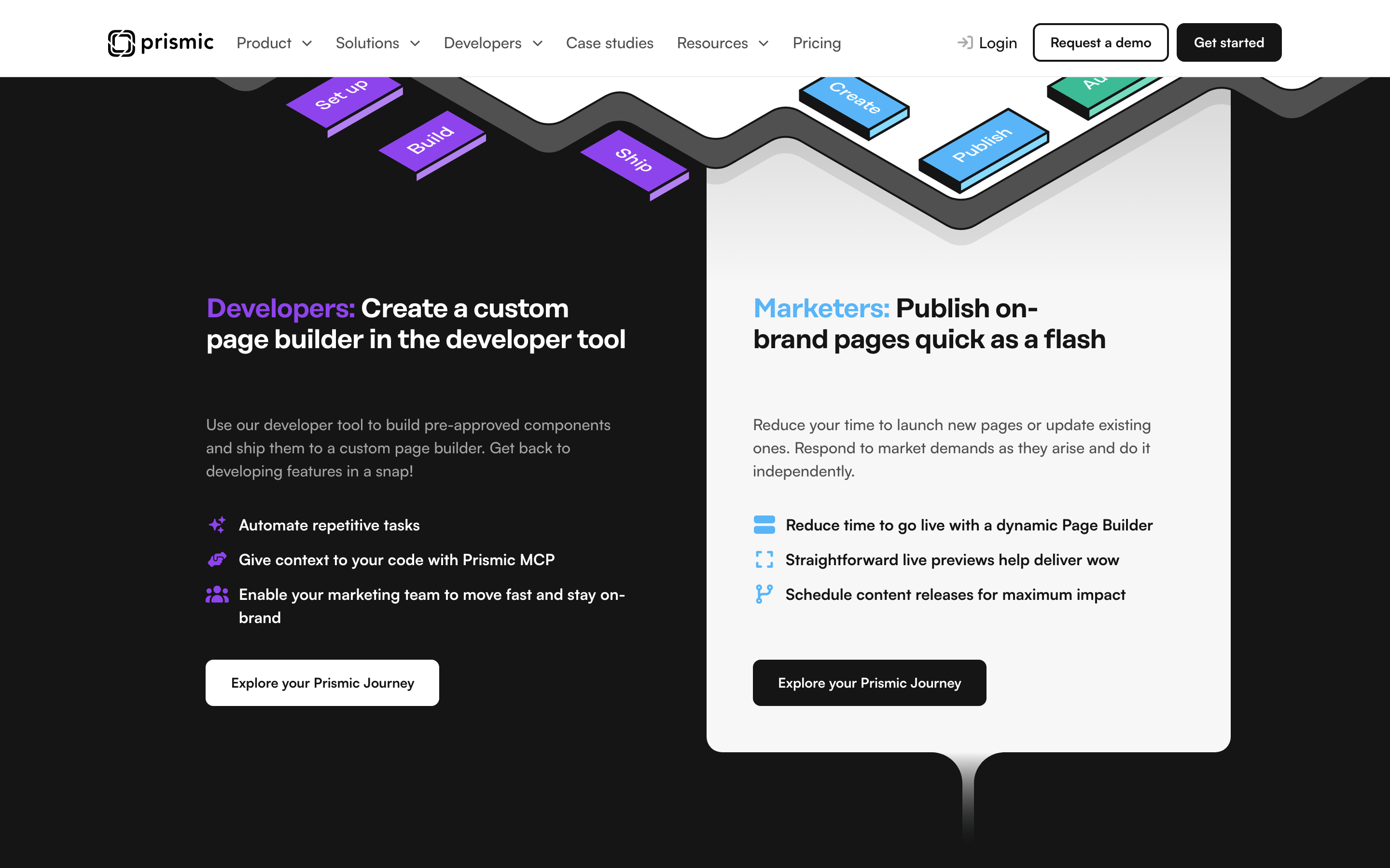
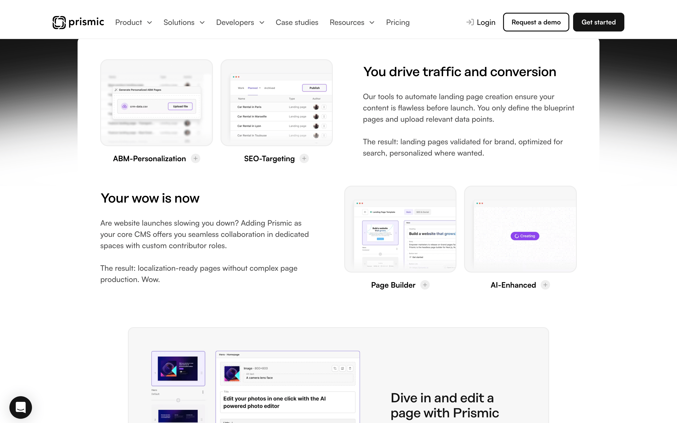
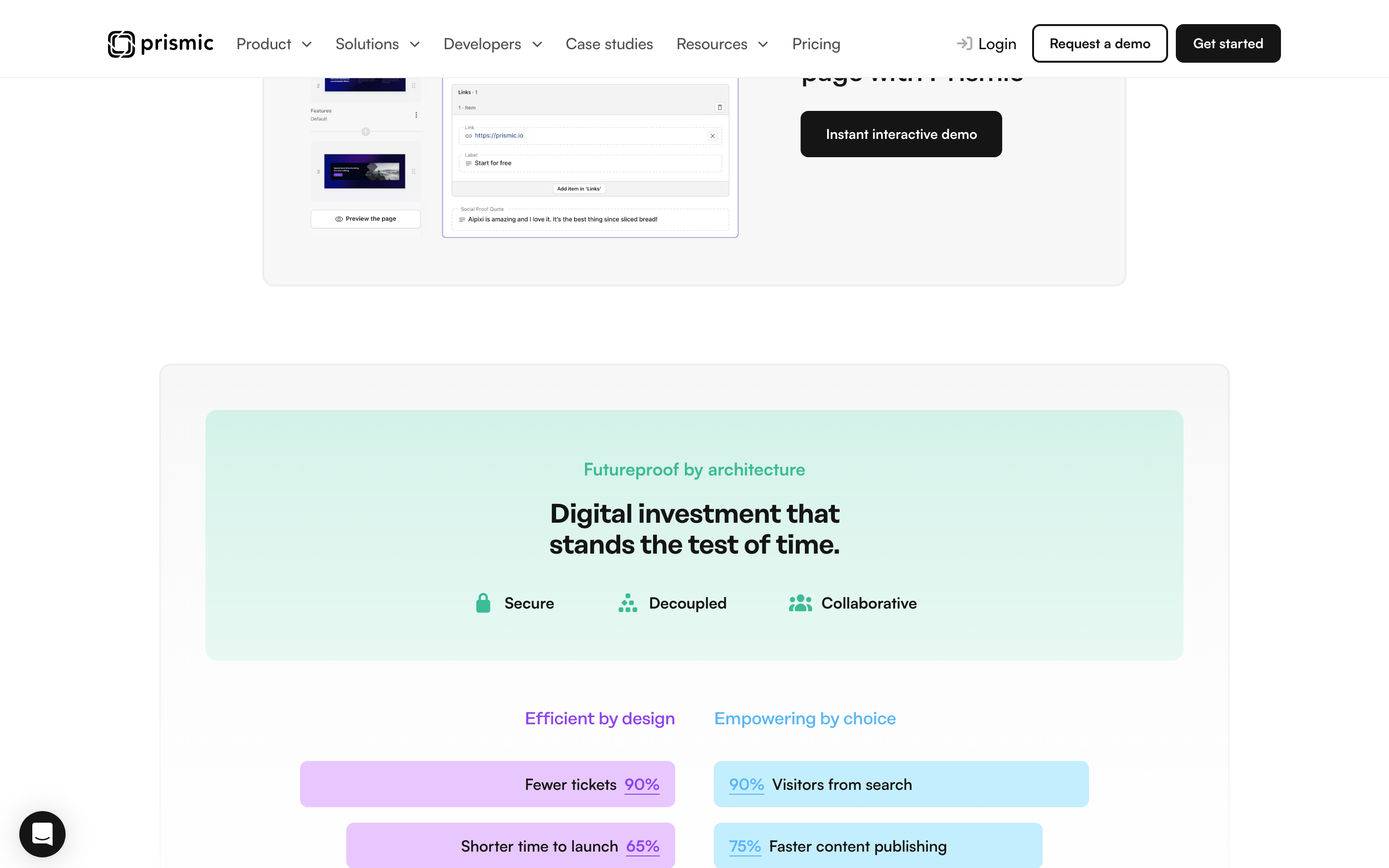
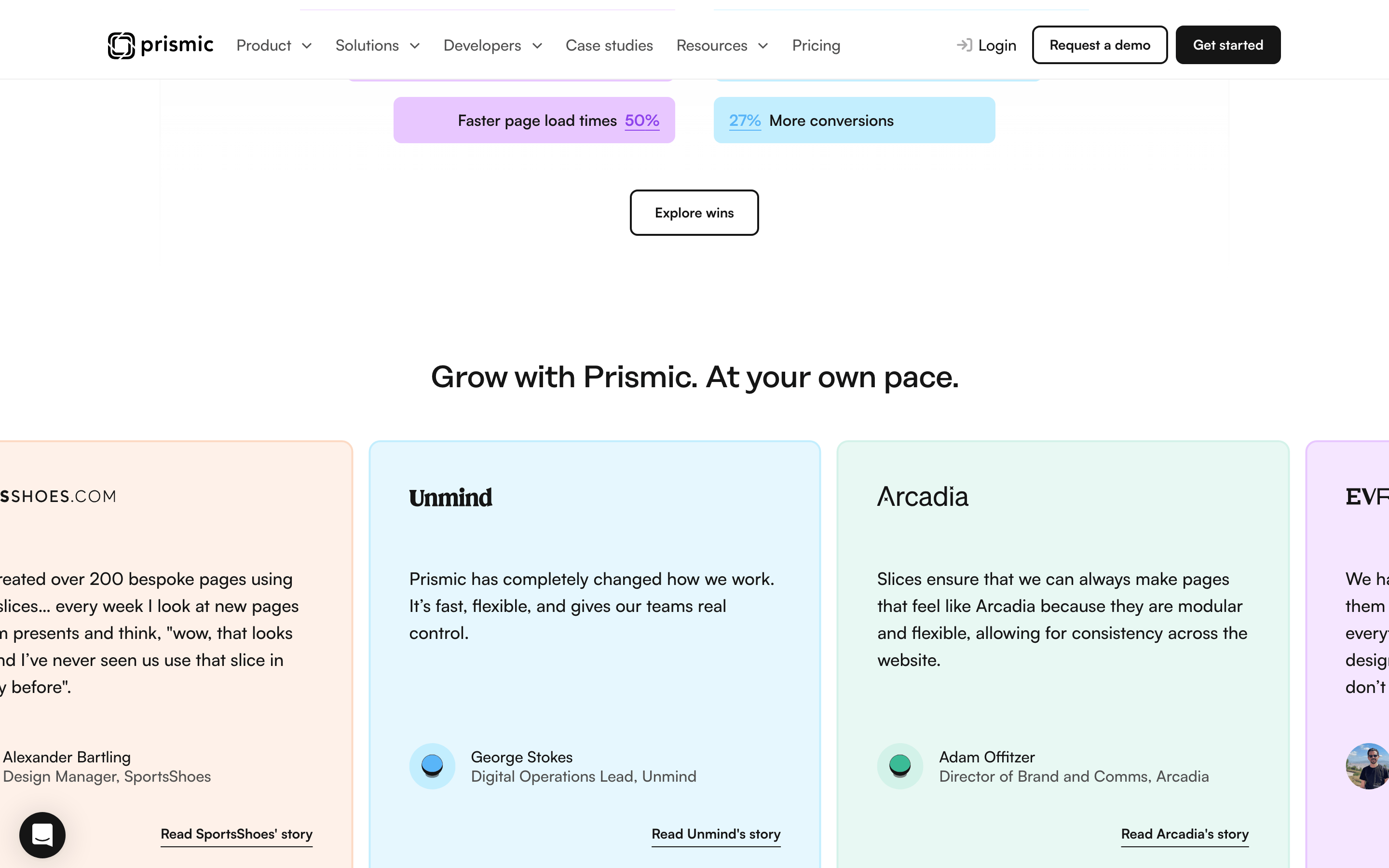
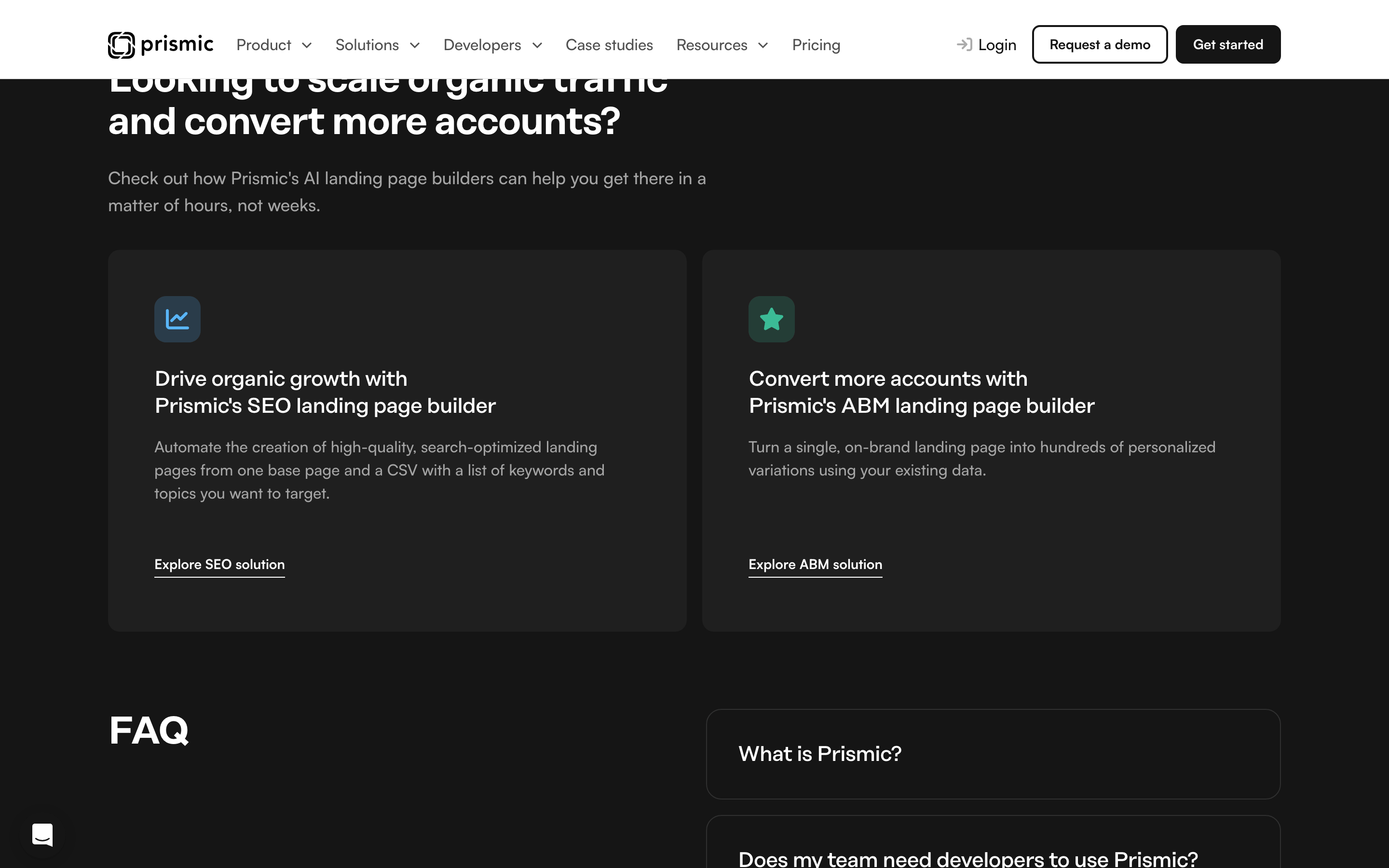
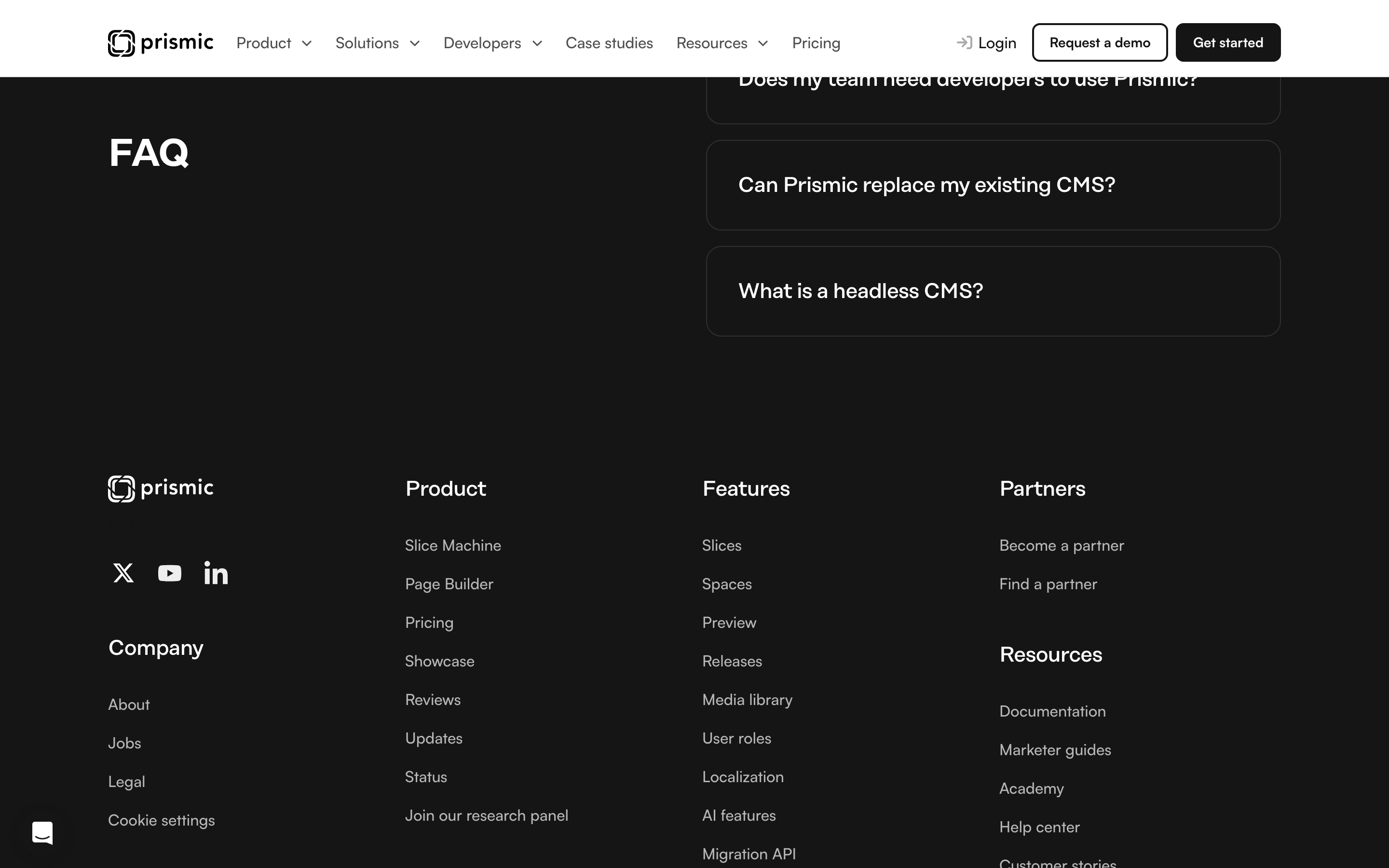
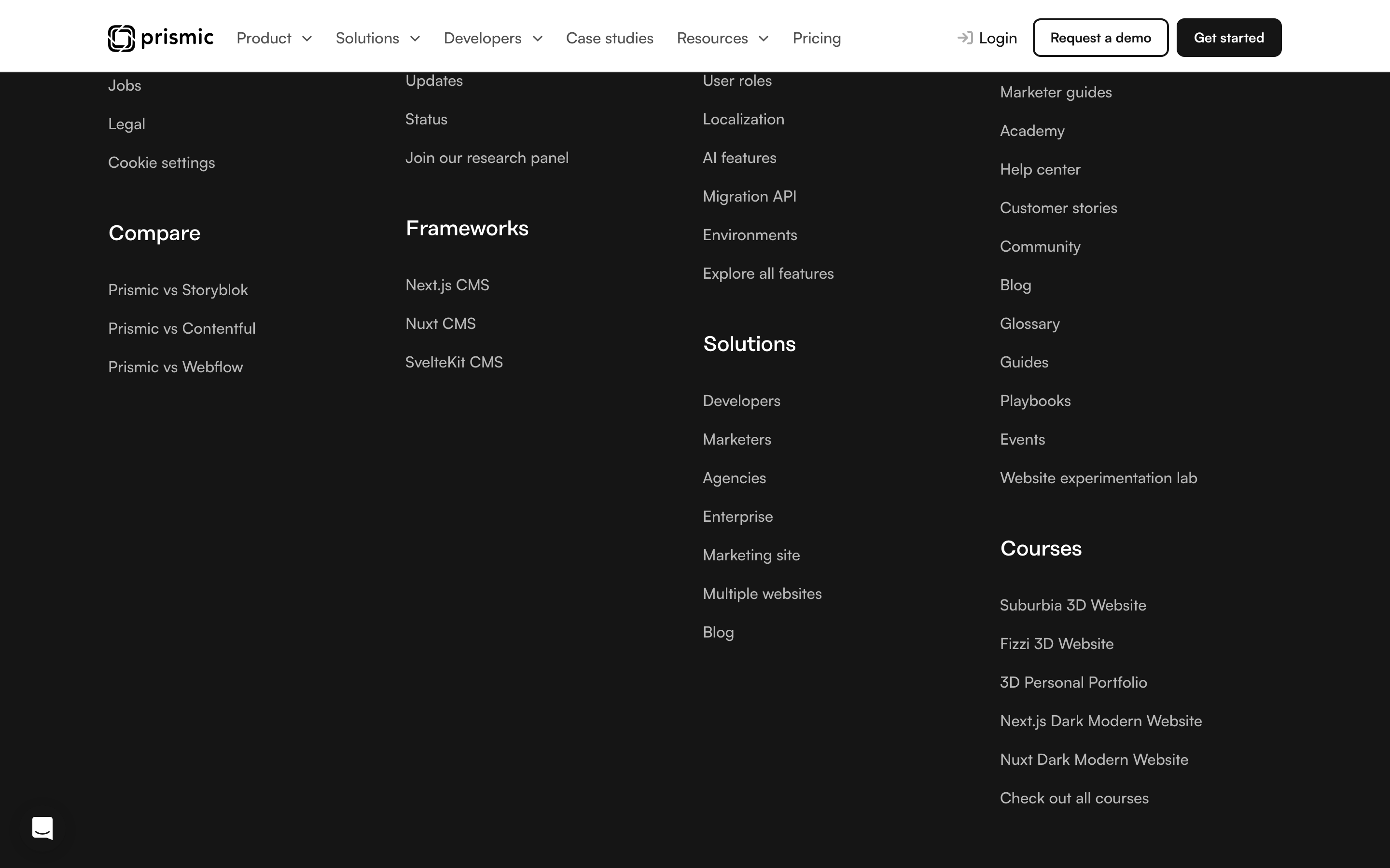
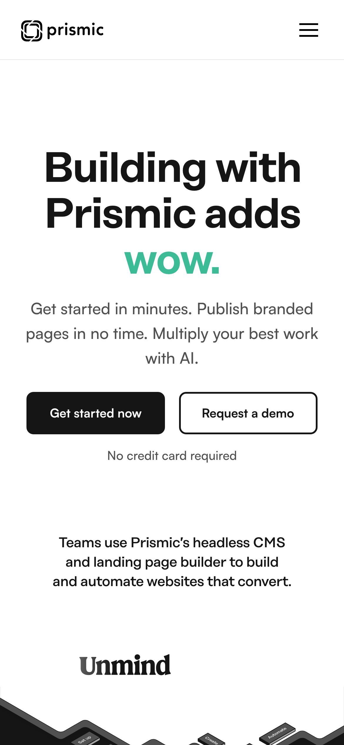
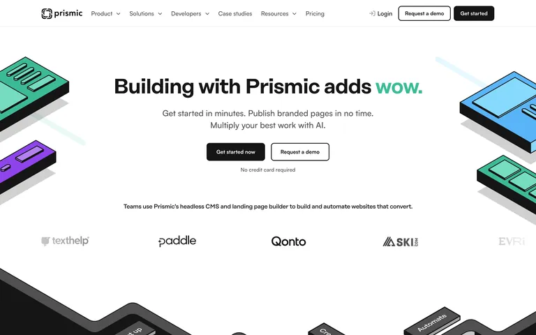
A clean, professional workspace for developers and marketing teams to build high-performing websites.
02
Color
#2BBE8BAccent
#151515Ink
#505050Ink soft
#FFFFFFBG
#A4A4A4Muted
rgba(238,238,238,1)Line
High-contrast black and white for clarity, with a single green accent to highlight key actions and emphasis.
03
Typography
geometric-sans · humanist-sans
display56px · 700
heading40px · 500
body18px · 500
small14px · 500
Use geometric-sans for headings to convey a modern, technical feel. · Use humanist-sans for body text to ensure readability. · Avoid using decorative or overly complex fonts.
04
Spacing
4px
8px
16px
24px
32px
48px
64px
96px
Consistent 4px grid with standard 16px and 32px padding/margin increments.
Captured from the live site · real computed styles
11
System prompt
This design is for a B2B SaaS developer tool, Prismic, featuring a clean, professional aesthetic. The color palette is primarily black (#151515) and white (#FFFFFF) with a vibrant green accent (#2BBE8B) used sparingly for emphasis. Typography uses a geometric-sans for headings and humanist-sans for body text, maintaining high readability. The layout is centered with generous whitespace and a clear visual hierarchy. Critical donts: avoid multiple accent colors, do not use serif typefaces, and avoid heavy, distracting shadows that would clutter the clean interface.
Bring this taste to your agent
Hand your AI agent a machine-readable spec of this design — tokens, type, motion, the whole DNA.