← OpenDesign CURATED · OPEN · FREE
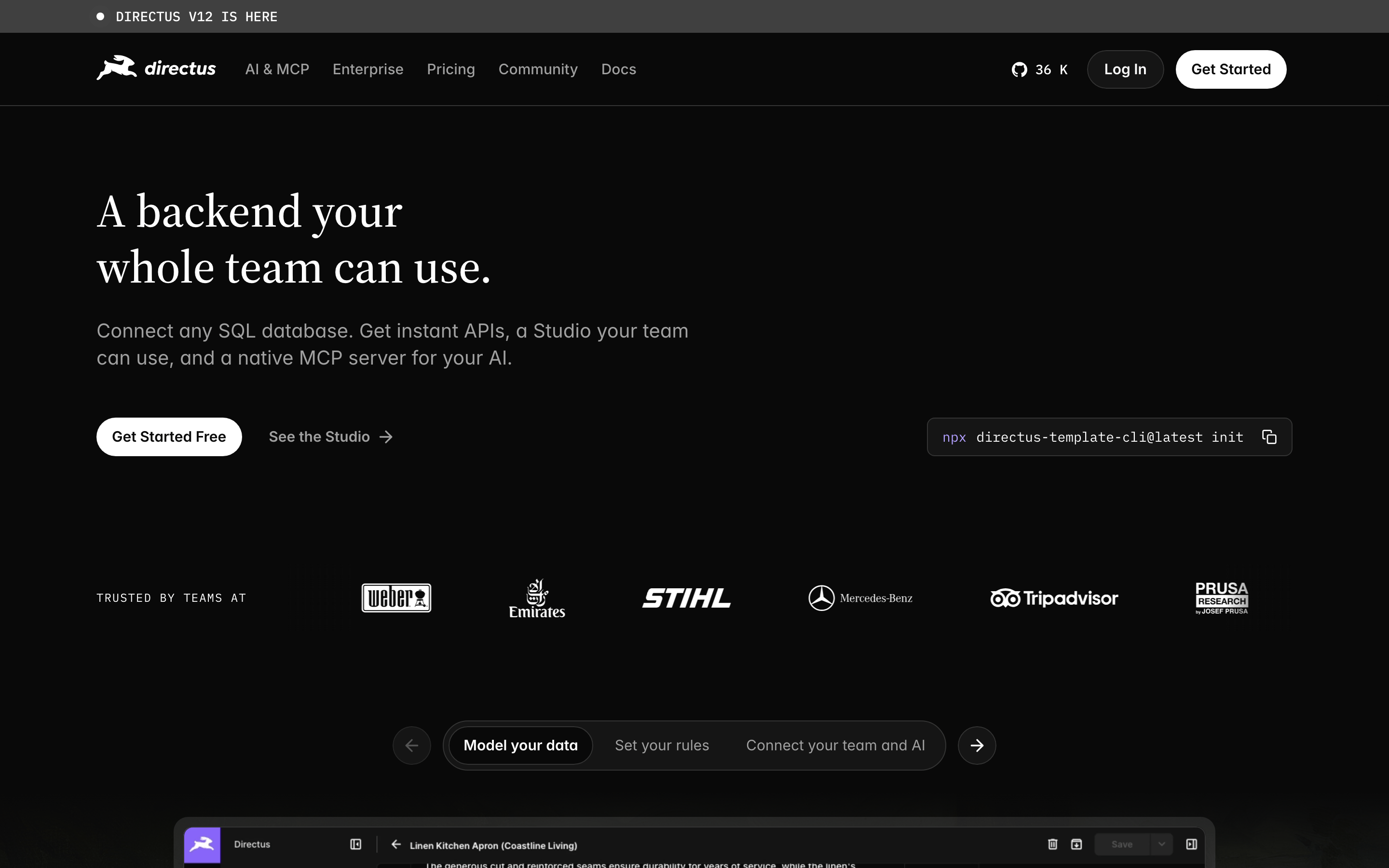
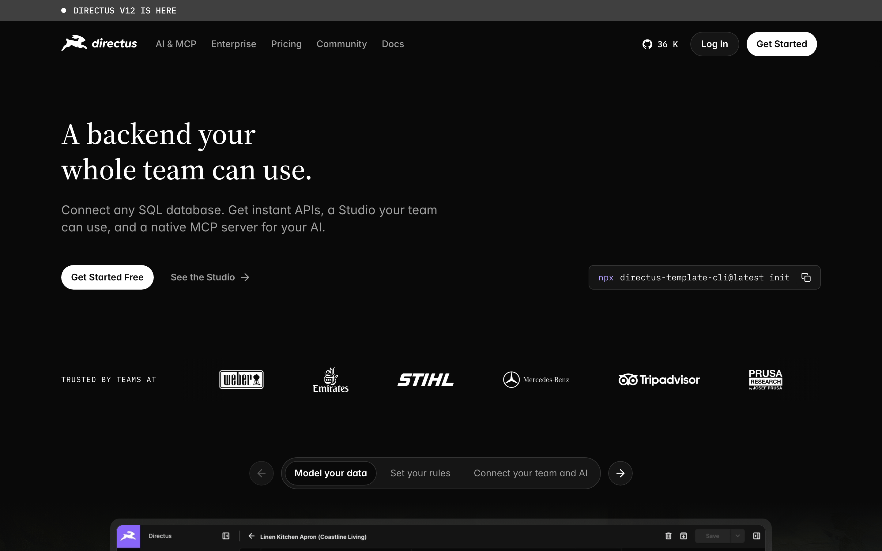
Directus
An open-source headless CMS and backend-as-a-service that lets non-technical teams manage content while developers build.
cms dev
01
Identity DNA
backend database team API no-code
A universal remote control for your entire database infrastructure.
02
Color
#FFFFFFInk
#090909BG
#151515BG soft
#A0A0A0Muted
rgba(255, 255, 255, 0.08)Line
High-contrast monochrome with subtle elevation through slightly lighter grays.
03
Typography
transitional-serif · humanist-sans · geometric-mono
display 56px · 400h1 48px · 400body 16px · 400Use serif for major headlines to add editorial weight. · Use sans-serif for all UI elements and body copy. · Reserve monospace for code snippets and technical UI elements.
04
Spacing
4px
8px
12px
16px
24px
32px
48px
64px
96px
An 8px baseline grid creates consistent vertical rhythm across large sections.
05
Surfaces
sm · 6px
md · 12px
lg · 20px
pill · 999px
1px solid rgba(255, 255, 255, 0.08)
0 4px 12px rgba(0, 0, 0, 0.3) · 0 8px 24px rgba(0, 0, 0, 0.4)
06
Layout
1280 container
12 columns
24px gutter
768 / 1024 breakpoints
A full-width dark canvas with a sticky header and centered content columns.
07
Motion & Interaction
200ms micro
400ms small
800ms medium
cubic-bezier(0.44, 0, 0.56, 1) easing
Subtle color transitions on interactive elements. · Smooth opacity fades for content reveals.
Buttons and links subtly change opacity or background brightness. · Immediate visual feedback via subtle scaling or color shifts.
08
Components
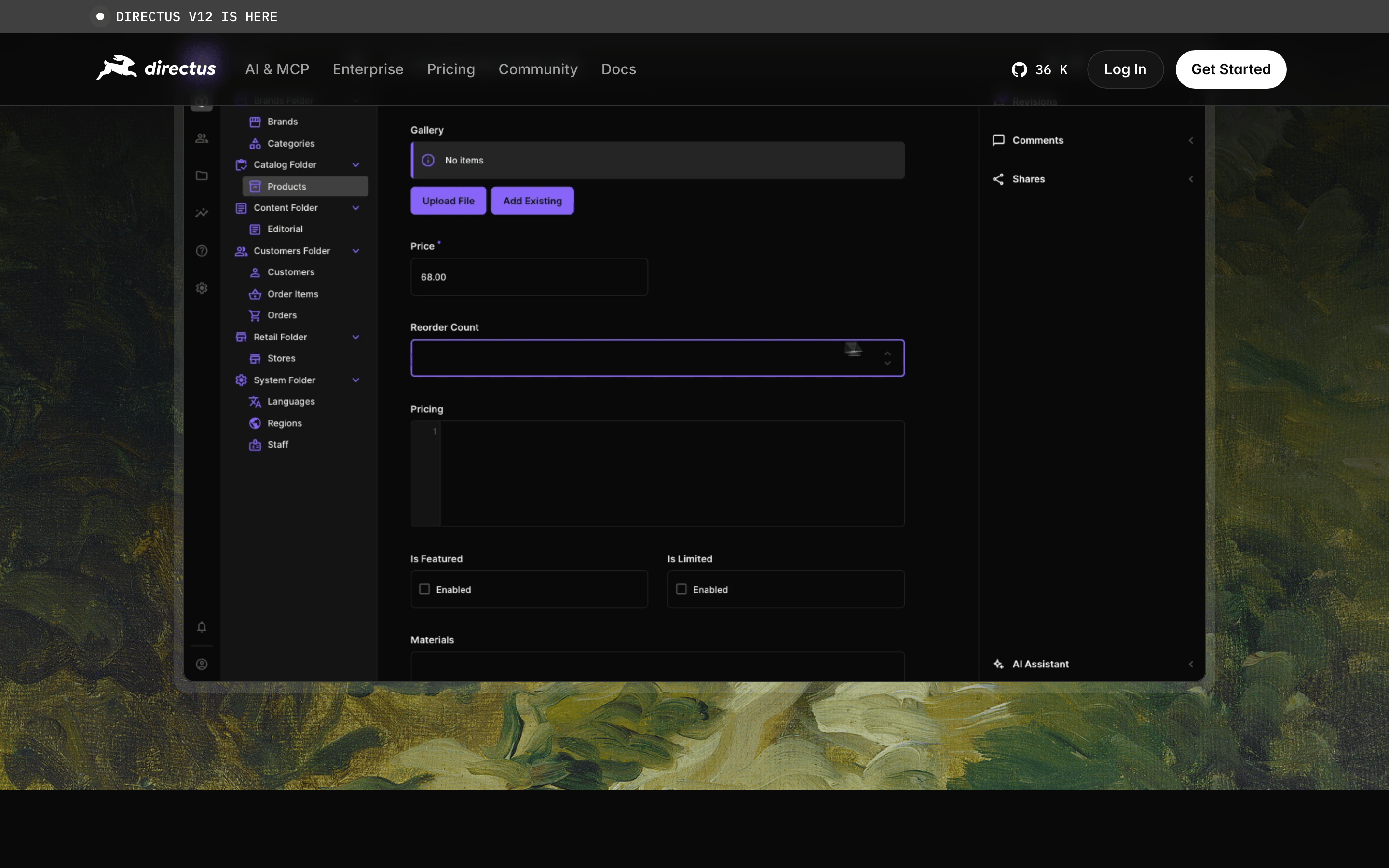
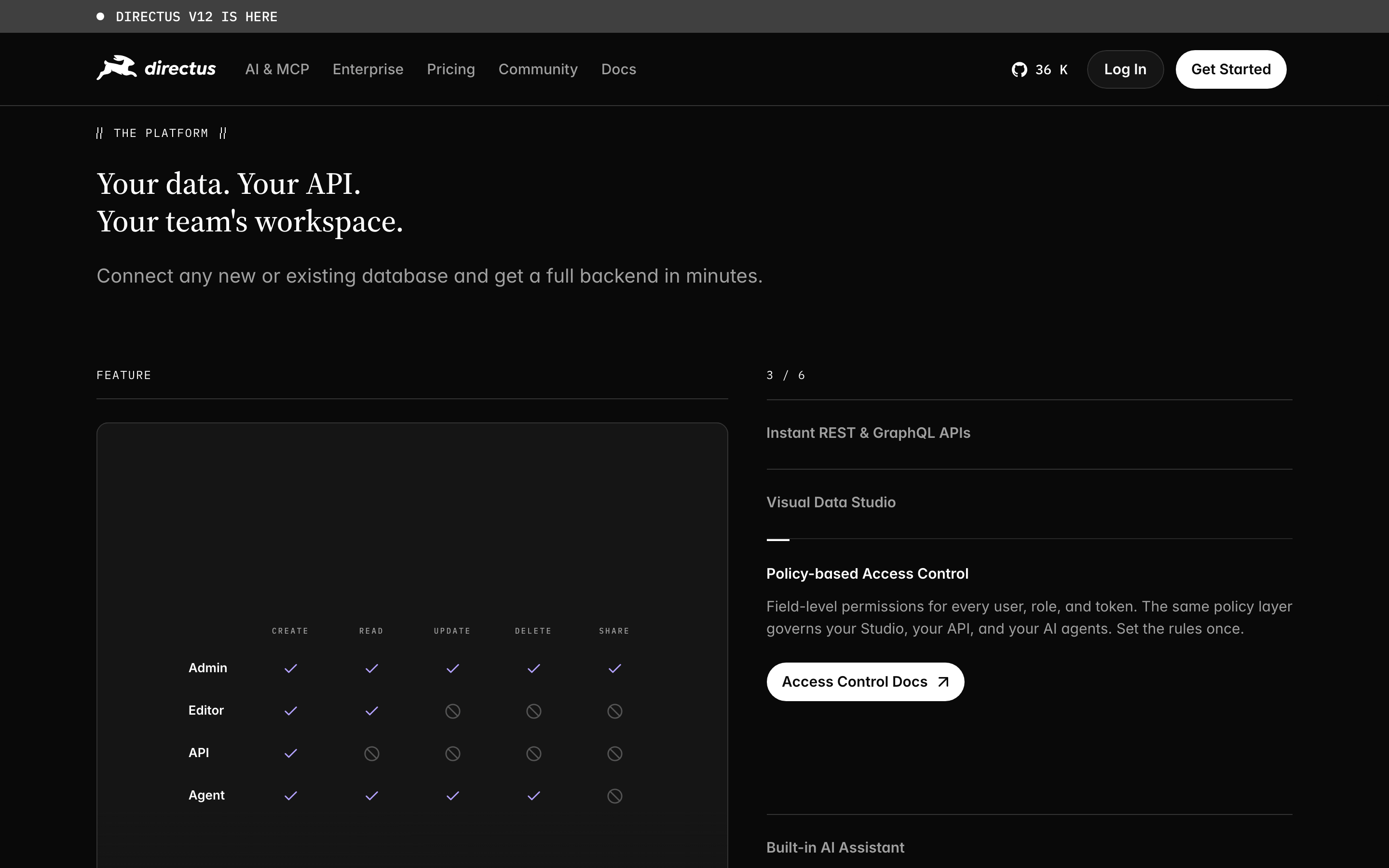
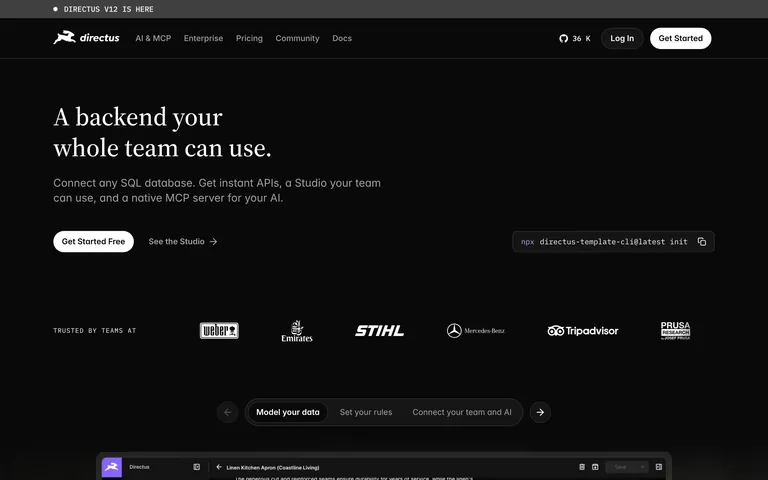
button Primary buttons are white with black text and large pill radii; secondary buttons use transparent backgrounds with white text. card Dark gray cards with subtle 1px borders and 12-20px radii, used to group feature descriptions. chip Pill-shaped navigation elements with transparent backgrounds and thin borders, highlighting the active state. input Dark gray input fields with thin borders, featuring monospace typography for code entries. hero A classic left-aligned hero featuring a large serif headline, sans-serif subtext, a code snippet, and dual CTAs. 09
Voice & Don'ts
Tone Confident, professional, and developer-friendly without being overly casual. Headlines Direct, punchy, and benefits-focused, often using a serif typeface for authority. CTAs Clear and action-oriented, such as 'Get Started Free' or 'See the Studio'. Don't use bright neon accents — screenshot shows a strictly monochrome palette. Don't use rounded square cards — screenshot shows elements with 12px to pill radii. Don't use heavy sans-serif headlines — screenshot shows a transitional serif for display. Don't use dense, small-text layouts — screenshot shows generous spacing and large, readable type. Don't use busy backgrounds or textures — screenshot shows a solid, near-black #090909 background. Don't use playful, bubbly icons — screenshot shows clean, minimal UI elements and technical icons. Avoid: Avoid overly marketing-heavy or buzzword-filled copy. Avoid: Avoid playful or whimsical illustrations. Avoid: Avoid overly complex or cluttered layouts. 10
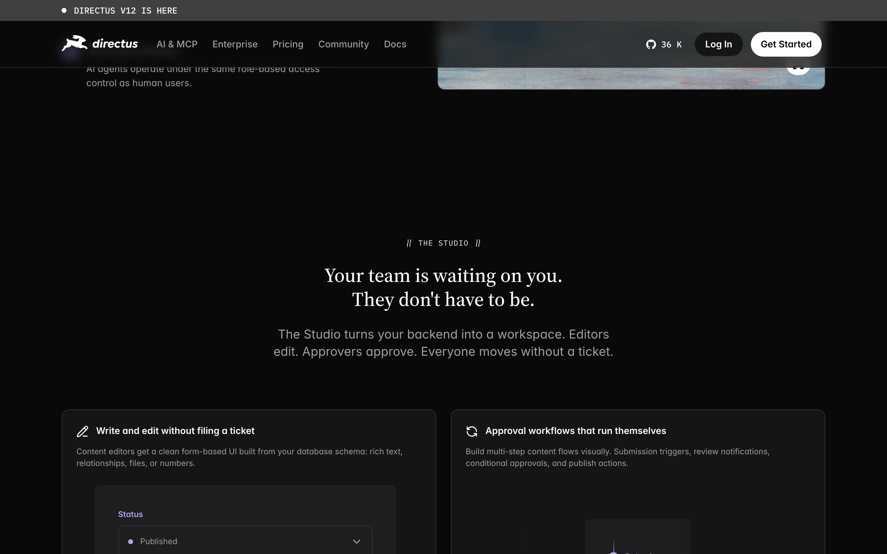
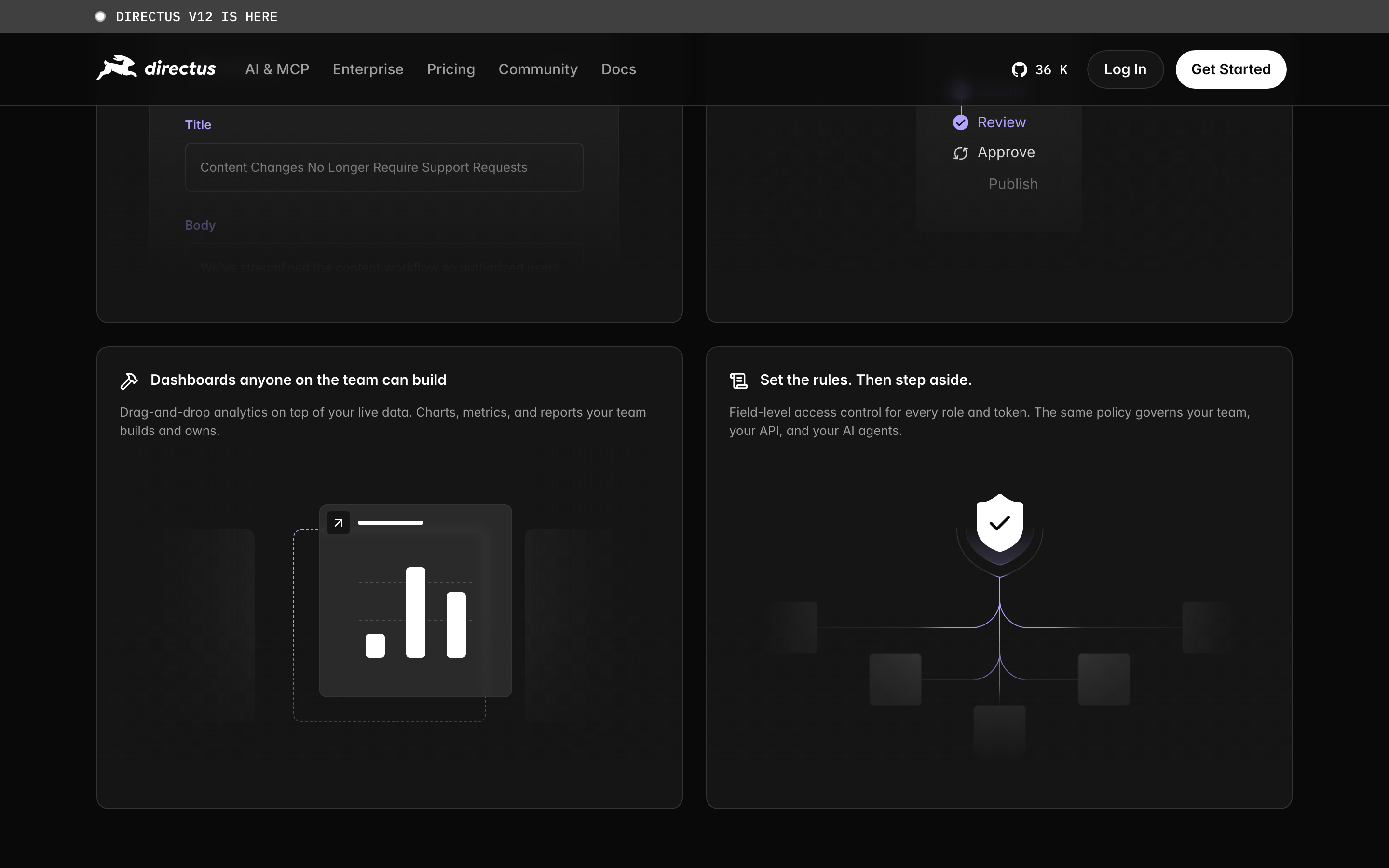
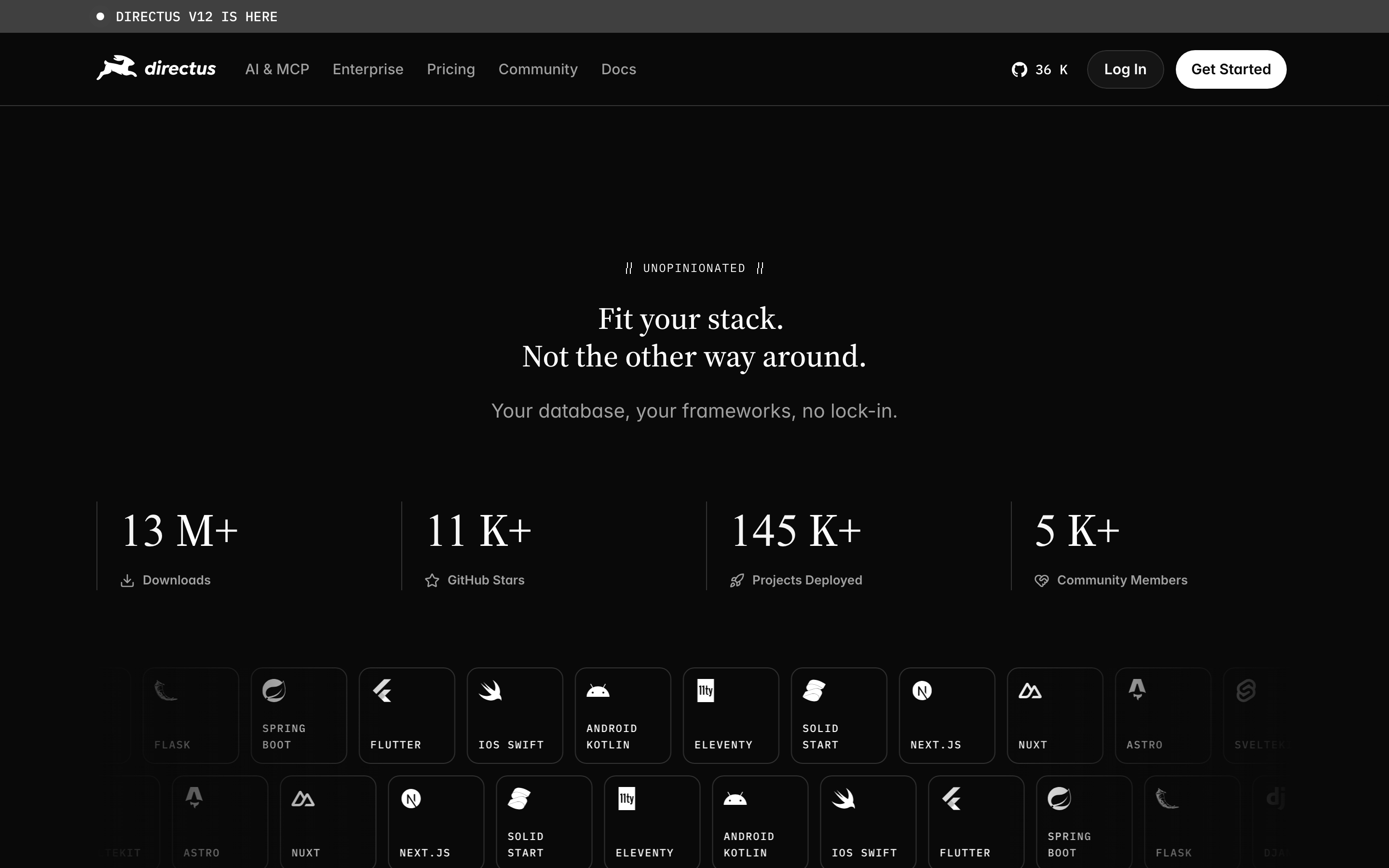
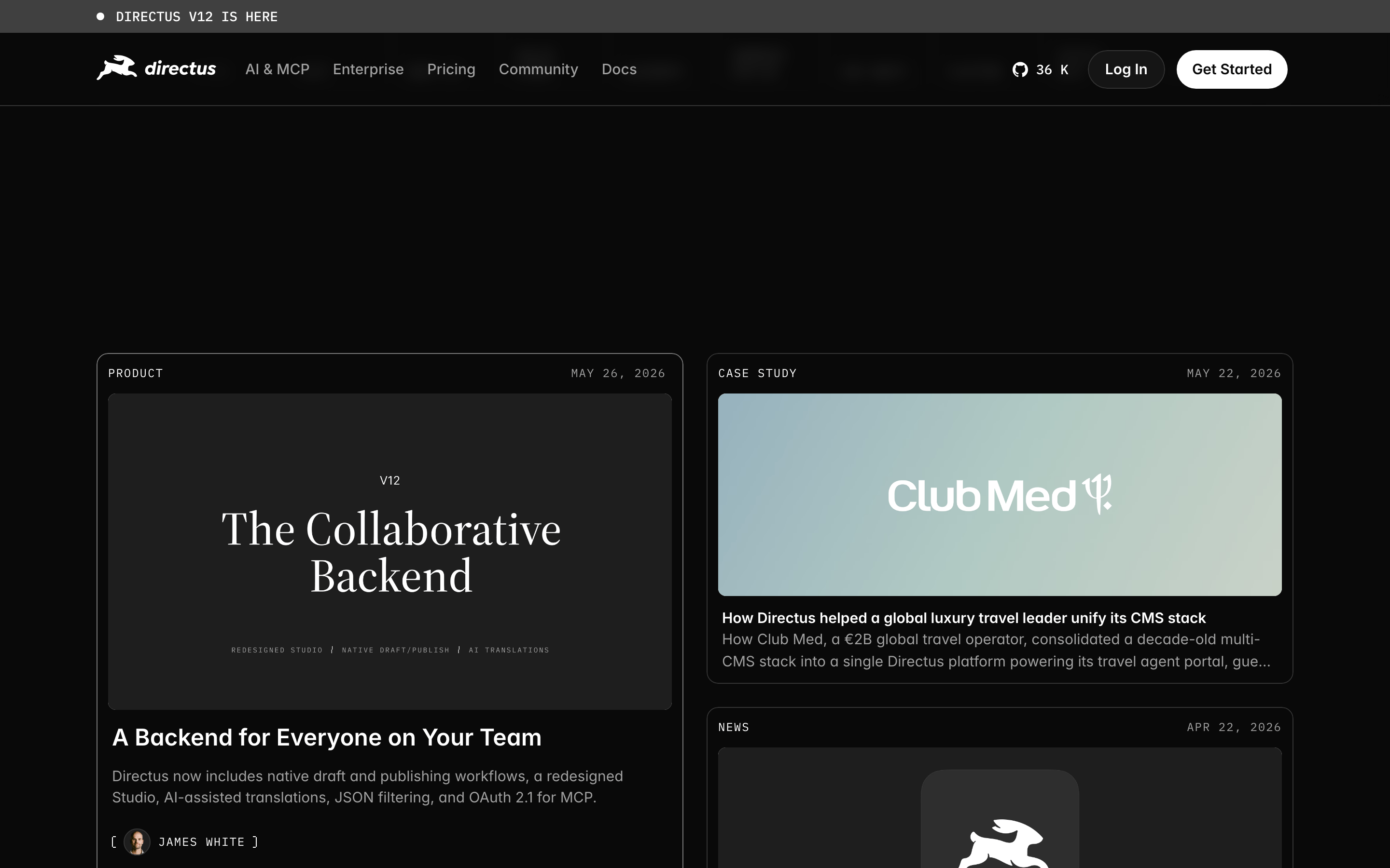
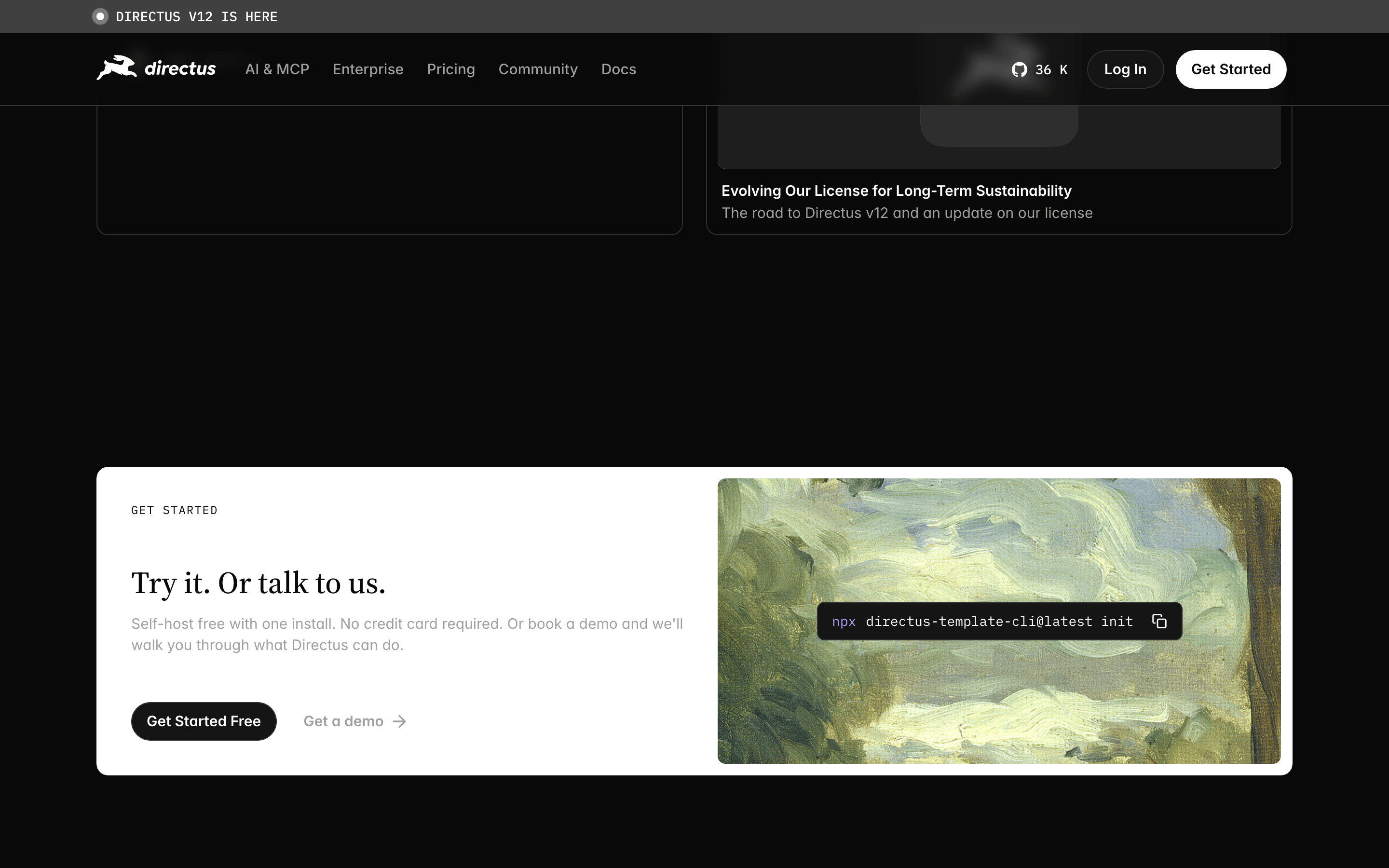
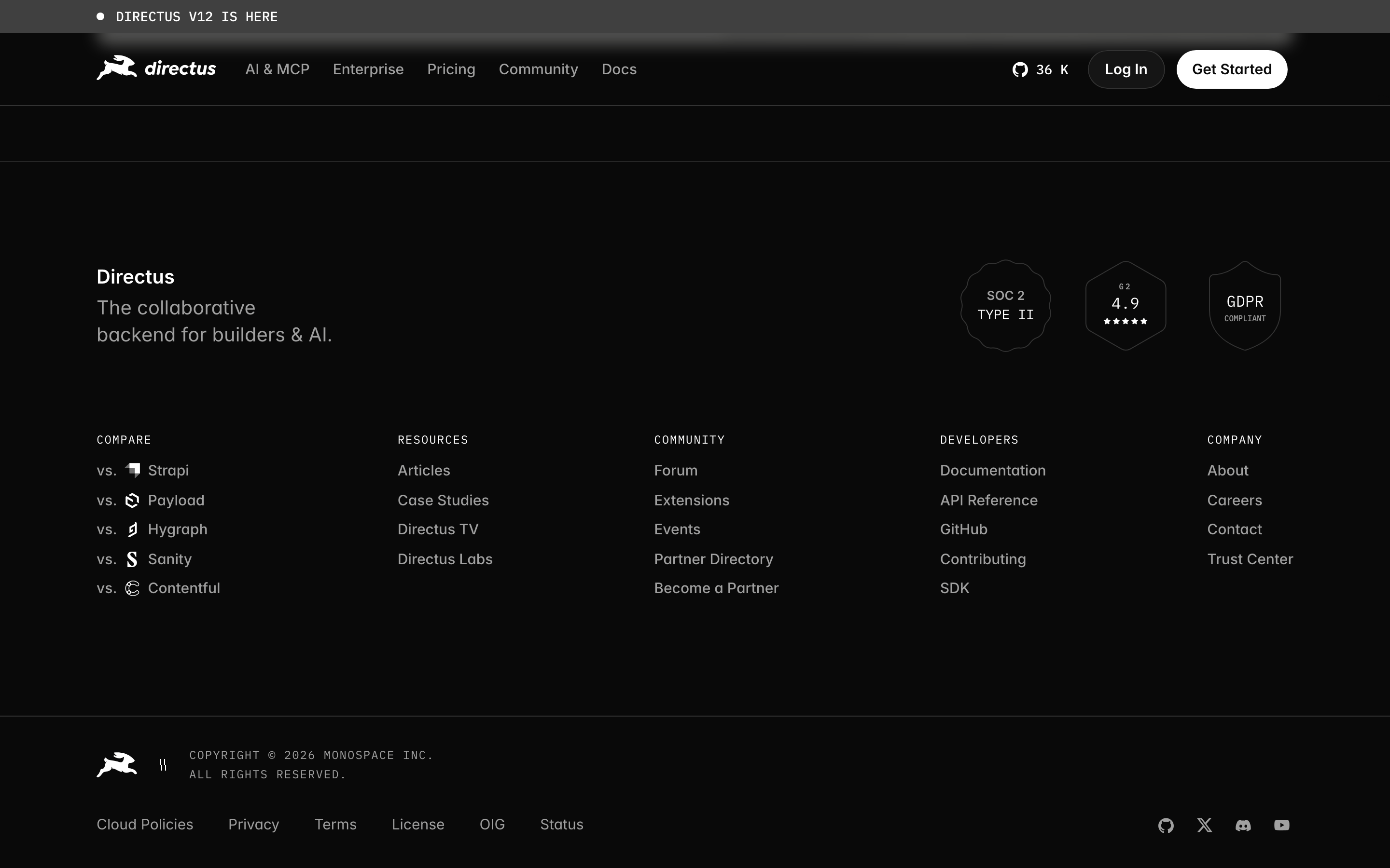
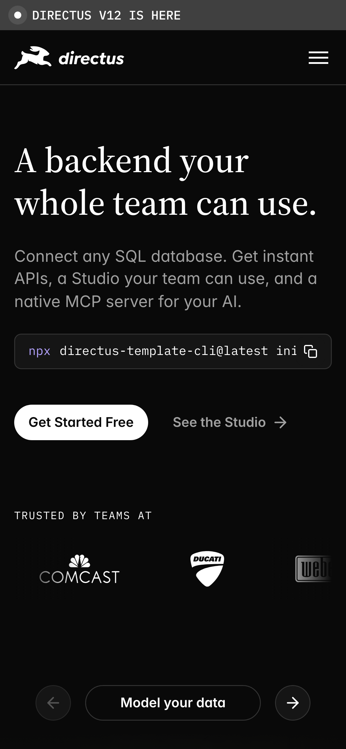
Inside the pack — real screenshots
桌面首屏(hero) 桌面滚动分段(90% viewport 步进,作为视觉证据) 桌面滚动分段(90% viewport 步进,作为视觉证据) 桌面滚动分段(90% viewport 步进,作为视觉证据) 桌面滚动分段(90% viewport 步进,作为视觉证据) 桌面滚动分段(90% viewport 步进,作为视觉证据) 桌面滚动分段(90% viewport 步进,作为视觉证据) 桌面滚动分段(90% viewport 步进,作为视觉证据) 桌面滚动分段(90% viewport 步进,作为视觉证据) 桌面滚动分段(90% viewport 步进,作为视觉证据) 桌面滚动分段(90% viewport 步进,作为视觉证据) 桌面滚动分段(90% viewport 步进,作为视觉证据) 桌面滚动分段(90% viewport 步进,作为视觉证据) 桌面滚动分段(90% viewport 步进,作为视觉证据) 桌面滚动分段(90% viewport 步进,作为视觉证据) 移动首屏 Captured from the live site · real computed styles
11
System prompt
Directus is a developer-focused backend-as-a-service platform with a refined, monochromatic dark mode aesthetic. The design relies on a near-black #090909 background and white #FFFFFF text, accented by subtle grays (#151515, #A0A0A0). Typography is a mix of transitional serif for bold headlines and humanist sans for UI, with geometric monospace for code. The layout is spacious and centered. Critical donts: avoid bright colors, don't use bubbly UI elements, and don't clutter the interface. The voice is professional and benefits-driven, targeting technical teams.
More from the library en · zh-CN · zh-TW · ja · ko
OpenDesign · curated web aesthetics for AI-readable design DNA · opendesign.cc
Why we curated this: This site is a strong example of a developer-oriented SaaS brand that balances technical authority with high-end editorial design through its use of serif headlines in a dark mode interface.
浙ICP备2021038972号-5