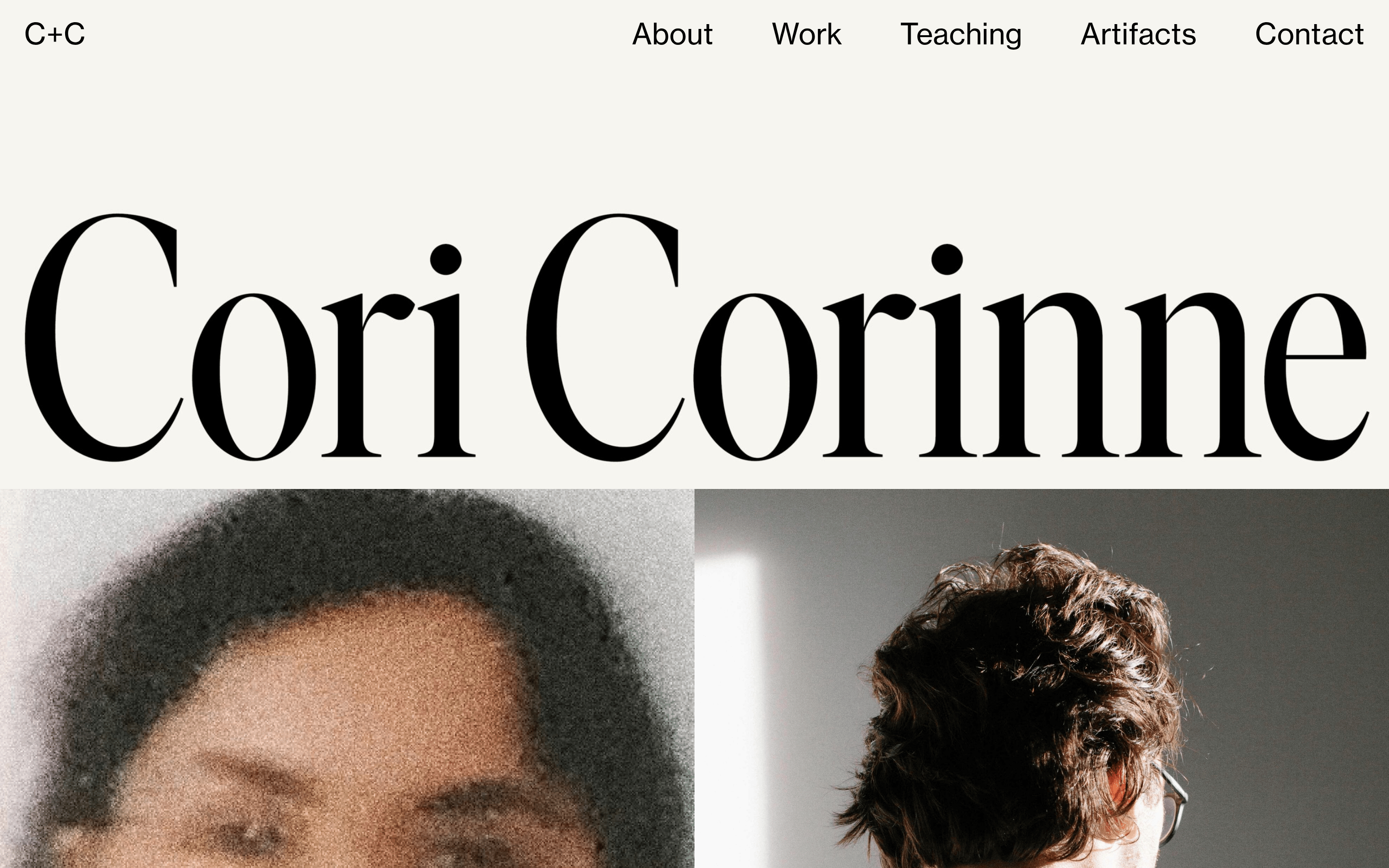
Use didone-serif for primary display text to create a high-fashion editorial feel. · Use humanist-sans for navigation and functional text for high legibility. · Maintain tight letter-spacing on large display type.
04
Spacing
4px
8px
16px
24px
30px
48px
64px
125px
Loose vertical rhythm with generous whitespace to emphasize typography
05
Surfaces
sm · 0px
md · 0px
lg · 0px
pill · 0px
None visible, relies entirely on spacing and typography for separation
06
Layout
1440container
12columns
30pxgutter
768 / 1024breakpoints
Full-width image grid with minimal padding
07
Motion & Interaction
220msmicro
400mssmall
800msmedium
cubic-bezier(0.25, 0.1, 0.25, 1)easing
Fade-in and slide-up on load · Smooth background-color transitions
Background-color transition on links · Immediate feedback via pointer cursor
08
Components
buttonMinimal text links with cursor pointer
cardEdge-to-edge photographic panels
heroMassive typographic display with full-width background color
Captured from the live site · real computed styles
11
System prompt
This is a minimalist, editorial-style personal portfolio for a designer. It features a strict neutral palette of warm off-white (#F6F5F0) and near-black (#292A2C) with no bright accents. The typography is the primary focus, using a high-contrast didone-serif for massive display text and a clean humanist-sans (Open Sans) for navigation. Critical constraints: Avoid any rounded corners or drop shadows; maintain strictly flat, sharp-edged surfaces. Do not introduce colorful accents or busy patterns. Prioritize massive whitespace and large typographic scale over density.
Bring this taste to your agent
Hand your AI agent a machine-readable spec of this design — tokens, type, motion, the whole DNA.