A secure, high-tech command center for global financial infrastructure.
02
Color
#22E6A8Accent
#FFFFFFInk
#808080Ink soft
#000000BG
#181818BG soft
rgba(128,128,128,0.5)Line
High-contrast dark mode with a single mint-green accent, using stark white text on deep black and muted gray for secondary information.
03
Typography
geometric-sans · monospace
display56px · 400
h240px · 400
body16px · 400
Use 'The Future' (geometric-sans) for all text to maintain a clean, modern, and highly legible hierarchy. · Keep font weight consistent at 400 for a lightweight and professional feel. · Use tight letter-spacing for large display text to create a more cohesive and impactful visual block.
04
Spacing
4px
8px
12px
16px
24px
32px
48px
64px
96px
A consistent 4px-based grid system that ensures uniform spacing between elements, with larger multiples used for major sections and layout containers.
05
Surfaces
sm · 4px
md · 8px
lg · 20px
pill · 9999px
Minimal and functional, using 1px borders primarily for structural definition in navigation and buttons.
none
06
Layout
1280container
12columns
24pxgutter
768 / 1024breakpoints
A full-width hero with a 2-column split (text left, illustration right) followed by a centered 1-column content section with horizontal cards.
07
Motion & Interaction
150msmicro
200mssmall
300msmedium
cubic-bezier(0.4, 0, 0.2, 1)easing
Smooth transitions for background-color, border-color, and fill on interactive elements. · Transform-based animations (scale, translate) for hover states on buttons and links. · Opacity transitions for fading elements in and out.
Subtle background color shifts and transform-based scaling on interactive elements like buttons and navigation links. · Immediate feedback through micro-transforms (scale) and color transitions.
08
Components
buttonPill-shaped buttons with white background and black text, featuring a small '+' icon and subtle rounded corners.
cardHorizontal cards with a soft off-white background, rounded corners, and a clear left-to-right flow (icon, title, description, badge).
chipSmall, pill-shaped tags with a light gray background and dark text, used for categorization.
inputSimple text fields with minimal styling, focusing on clear typography and ample padding.
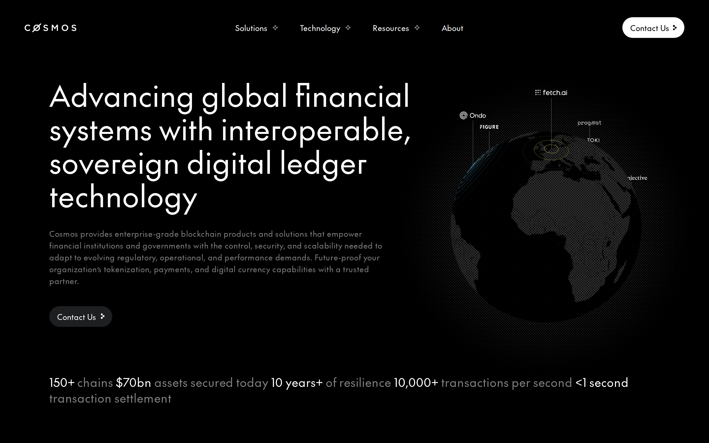
heroA high-impact dark section featuring large-scale typography on the left and a detailed, dotted-globe illustration with overlapping lines and labels on the right.
09
Voice & Don'ts
ToneAuthoritative, professional, and forward-looking, emphasizing security, scalability, and global impact.
HeadlinesBold, large-scale, and declarative statements that clearly articulate the value proposition.
CTAsDirect and action-oriented, using simple phrases like 'Contact Us' within a prominent pill-shaped button.
Don't use bright, multi-colored gradients — the screenshot shows a stark, high-contrast dark theme with a single mint-green accent.
Don't use heavy, ornate typography — the screenshot shows a clean, geometric sans-serif font with consistent weight.
Don't use sharp, square corners for buttons and cards — the screenshot shows soft, rounded, and pill-shaped elements.
Don't use busy, photographic backgrounds in the hero — the screenshot shows a stylized, technical dotted-globe illustration.
Don't use excessive drop shadows or 3D effects — the screenshot shows flat, surface-based design with minimal depth.
Don't use small, cramped spacing — the screenshot shows generous padding and clear separation between elements.
Don't use a wide variety of colors — the screenshot shows a limited palette of black, white, gray, and a single accent color.
Avoid: Avoid overly casual language or slang.
Avoid: Avoid excessive use of exclamation points or hype-driven adjectives.
Avoid: Avoid complex jargon without clear explanation.
Avoid: Avoid cluttered layouts that distract from the core message.
Captured from the live site · real computed styles
11
System prompt
Design a sophisticated, enterprise-grade technology website for a blockchain company. Use a deep black (#000000) background with high-contrast white (#FFFFFF) text and muted gray (#808080) for secondary elements. Incorporate a single, vibrant mint-green (#22E6A8) accent for key highlights. Employ a clean, geometric sans-serif font (like 'The Future') with a tight, professional scale. Maintain a strict 4px spacing grid and use soft, pill-shaped components. The layout should feature a powerful 2-column hero with a technical illustration and a clear, 1-column content section with horizontal cards. Ensure all interactions are smooth with subtle 0.2s transitions. Focus on clarity, authority, and a premium, futuristic aesthetic. Never use heavy shadows, sharp corners, or cluttered multi-color palettes.
Bring this taste to your agent
Hand your AI agent a machine-readable spec of this design — tokens, type, motion, the whole DNA.