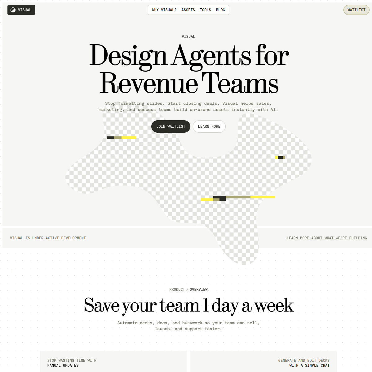
A modern design studio powered by AI for B2B teams.
02
Color
#FFF347Accent
#2C2C26Ink
#6D6E5EInk soft
#F6F6F4BG
#979886Muted
rgba(0,0,0,0.1)Line
A restrained, warm neutral palette with high-contrast typography, using a single bright yellow accent for functional highlights.
03
Typography
transitional-serif · monospace
display64px · 400
Use monospace for all UI text, navigation, and paragraphs. · Reserve transitional serif for high-impact display headings. · Apply tight tracking to large serif type.
04
Spacing
4px
8px
16px
24px
32px
48px
64px
96px
8px base grid with generous whitespace for a clean, editorial feel.
05
Surfaces
sm · 4px
md · 8px
lg · 12px
pill · 999px
1px solid #000000 or #6D6E5E used for buttons and structural dividers.
None visible
06
Layout
1280container
12columns
24pxgutter
768 / 1024breakpoints
Centered, single-column editorial layout with wide margins and heavy whitespace.
07
Motion & Interaction
150msmicro
200mssmall
400msmedium
cubic-bezier(0.4, 0, 0.2, 1)easing
Smooth color and transform transitions on interactive elements.
Subtle background color shifts or outline highlights. · Immediate visual feedback via color or scale.
08
Components
buttonPill-shaped with thick black outlines and uppercase monospace text.
cardSimple containers with transparent backgrounds, using 3D pixel art as visual anchors.
inputMinimal, likely monospaced with subtle borders.
heroLarge serif headline, monospace subtext, and a floating 3D abstract shape.
09
Voice & Don'ts
ToneProfessional, direct, and authoritative with a touch of modern flair.
HeadlinesConcise, benefit-driven, and visually heavy.
CTAsDirect commands (JOIN WAITLIST, LEARN MORE) in uppercase monospace.
Don't use gradient backgrounds — the screenshot shows solid warm neutrals.
Don't use sans-serif for body text — the screenshot shows monospace for all UI and paragraph text.
Don't use soft, rounded corners on primary buttons — the screenshot shows pill-shaped buttons with thick outlines.
Don't use a dark mode default — the screenshot shows a light, off-white background.
Don't use multiple bright colors — the screenshot shows a restricted palette of black, grey, and a single yellow accent.
Don't use heavy drop shadows — the screenshot shows flat or subtly outlined components.
Avoid: Overly casual or playful language.
Avoid: Dense, technical jargon without context.
Avoid: Bright, multi-colored gradients.
Avoid: Rounded, bubbly UI components.
Avoid: Serif fonts for body text.
Avoid: Low-contrast text on light backgrounds.
11
System prompt
Design stripe is a premium B2B SaaS tool for AI-driven asset creation. The visual DNA is defined by a stark, editorial layout using a warm off-white background (#F6F6F4) and dark charcoal text (#2C2C26). Typography is strictly split between a high-contrast transitional serif for hero display and a utilitarian monospace for all other UI elements. A single high-chroma yellow (#FFF347) acts as a functional accent for highlights and progress indicators. Critical constraints: do not use multiple accent colors, do not use sans-serif for body copy, and do not use soft, bubbly component shapes. Keep the layout spacious, centered, and focused on clear, uppercase typographic hierarchies.
Bring this taste to your agent
Hand your AI agent a machine-readable spec of this design — tokens, type, motion, the whole DNA.