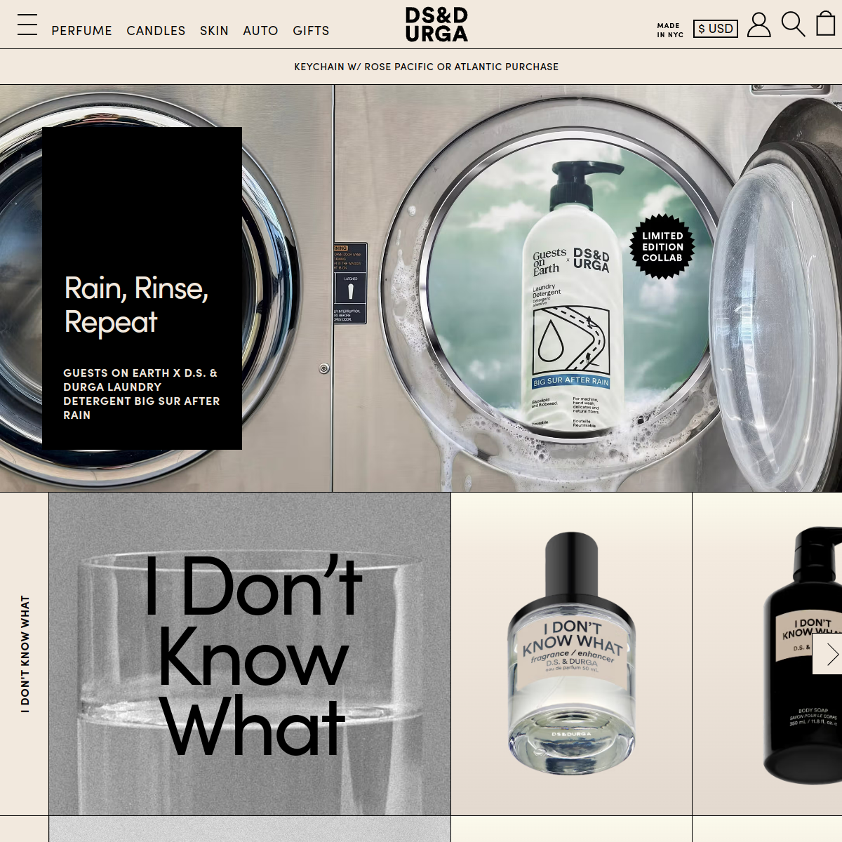
A premium fragrance and lifestyle brand using bold, brutalist-inspired typography and a grid-heavy editorial layout to create a stark, avant-garde aesthetic.
A high-end magazine layout meets a brutalist industrial warehouse.
02
Color
#1A1A1AInk
#555555Ink soft
#F2EDE4BG
#EAE4D9BG soft
#FFFFFFBG quiet
#888888Muted
rgba(26, 26, 26, 0.15)Line
High-contrast black-on-cream typography with large photographic hero elements, avoiding bright accents to maintain a sophisticated, utilitarian feel.
03
Typography
grotesque-sans
display64px · 700
headline28px · 700
body14px · 400
Use all-caps for navigation and small labels · Use tight line-height (0.9 - 1.0) for large display text · Maintain a strict typographic hierarchy using weight and case rather than varied font families
04
Spacing
8px
16px
24px
32px
48px
64px
80px
120px
Irregular grid-based rhythm dictated by the photographic layouts and large typography blocks, prioritizing visual impact over strict vertical rhythm.
05
Surfaces
sm · 0px
md · 0px
lg · 0px
pill · 999px
Thin 1px solid black lines used to define grid cells and borders, creating a strict, structured layout.
06
Layout
1440container
12columns
1pxgutter
768 / 1024breakpoints
A strict grid-based layout with large, high-impact photographic elements and overlaid typography blocks. Often uses full-bleed images divided by hard borders.
07
Motion & Interaction
200msmicro
300mssmall
500msmedium
cubic-bezier(0.4, 0, 0.2, 1)easing
Subtle fade-ins for text overlays · Smooth sliding for carousels
Subtle opacity changes on links and buttons. · Immediate feedback with slight scale or opacity reduction.
08
Components
buttonSimple text links or pill-shaped buttons, often uppercase.
cardGrid cells defined by hard borders, containing imagery and overlaid typography.
chipSimple text tags or badges (e.g., 'LIMITED EDITION COLLAB')
inputMinimalist text fields with thin borders.
heroLarge, full-width photographic imagery with overlaid bold typography.
09
Voice & Don'ts
ToneConfident, direct, and slightly enigmatic.
HeadlinesShort, punchy, and often conceptual or provocative.
CTAsMinimalist and functional, often just an arrow or simple text link.
Don't use drop shadows or soft gradients — screenshot shows a flat, brutalist aesthetic with hard borders.
Don't use multiple font families — screenshot relies on a single, consistent sans-serif typeface family.
Don't use bright, saturated accent colors — screenshot shows a muted palette of black, cream, and photography.
Don't use rounded corners on containers — screenshot shows sharp, 90-degree angles on grid cells.
Don't use center-aligned text for large blocks — screenshot frequently uses left-aligned or flush-left typography.
Don't hide navigation behind complex hierarchies — screenshot shows a flat, visible top navigation bar.
Avoid: Excessive exclamation points
Avoid: Overly descriptive adjectives
Avoid: Generic marketing jargon
11
System prompt
DS&DURGA is a premium, New York-based fragrance and lifestyle brand. Its website utilizes a brutalist, editorial design approach. Key colors are cream (#F2EDE4), deep black (#1A1A1A), and a muted off-white (#EAE4D9). Typography is consistently a bold, tight-tracked grotesque sans-serif used across both display and body text. Critical design constraints: never use drop shadows or rounded corners on primary UI elements, avoid bright saturated accent colors, and do not use multiple font families. The layout is strictly grid-based with hard borders, prioritizing high-impact photography and large, punchy text overlays.
Bring this taste to your agent
Hand your AI agent a machine-readable spec of this design — tokens, type, motion, the whole DNA.